16 White Living Room Paint Ideas to Brighten Your Space
Choosing the perfect white paint sounds like the easiest task in the world, right? You walk into the store, grab a can labeled “white,” and you are done. But once you stand in front of that wall of color chips, you realize the truth. There are hundreds of shades, and they all look slightly different.
Some look yellow, some look blue, and others barely look white at all. Getting this wrong can make your living room feel sterile like a hospital or dingy like an old sheet. But when you get it right, white paint transforms your home into a bright, airy sanctuary.
I have compiled 16 practical ideas and tips to help you navigate the tricky world of white paint. These ideas will ensure you pick the perfect shade for your living room.
1. Check the Light Reflectance Value (LRV)
Before you fall in love with a swatch, I always recommend checking the Light Reflectance Value, or LRV. This is a measurement that tells you exactly how much light a color reflects.
The scale runs from 0 to 100. Pure black is 0, and pure white is 100. Most “white” paints fall in the 82 to 94 range.
If you want a bright, reflective room, look for a higher number. A lower number means the paint absorbs more light and might look moodier or softer on your walls.
2. Test Samples on a Moveable Board
I never paint samples directly on the wall anymore. The existing color of your wall can trick your eye and change how the new paint looks.
Instead, paint two coats on a large piece of white foam board. This allows you to move the color around the room.
You can hold it up against your furniture, the floor, and different walls. This trick gives you a much more accurate idea of how the finished room will look.
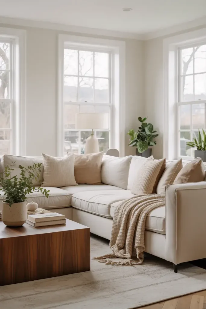
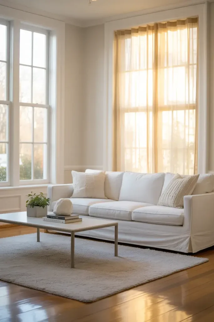
3. Select a Warm White for Coziness
If you want your living room to feel inviting, I suggest looking for a warm white. These shades have subtle yellow or red undertones that remove the chill from a room.
Sherwin-Williams Alabaster (SW 7008) is a fantastic example. It has an LRV of roughly 82, meaning it reflects plenty of light but stays soft.
It creates a cozy backdrop that feels like a warm hug rather than a stark white box.
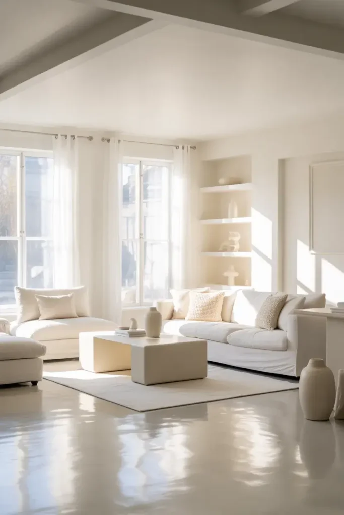
4. Opt for a Cool White for Modern Vibes
For a sleek, contemporary look, I lean towards cool whites. These paints have blue or gray undertones that make a space feel crisp and clean.
Benjamin Moore’s Chantilly Lace (OC-65) is a top contender here. It sits in the high 90-92 LRV range, making it incredibly bright.
Use this in rooms with lots of natural light to create a sharp, gallery-like atmosphere.
5. Try the “Designer’s Favorite”
Sometimes, it helps to trust the experts. Benjamin Moore’s White Dove (OC-17) is widely considered a go-to choice for interior designers.
It strikes a delicate balance. It isn’t too yellow and isn’t too gray. It works in almost any lighting condition.
With an LRV of about 83, it is bright enough to open up a small living room but soft enough to keep it comfortable.
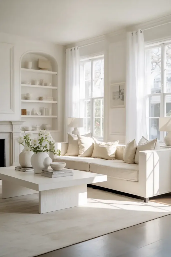
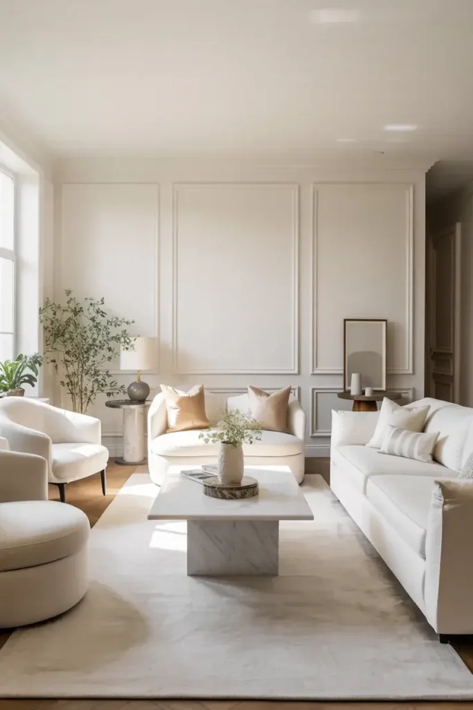
6. Embrace the “Gallery” Aesthetic
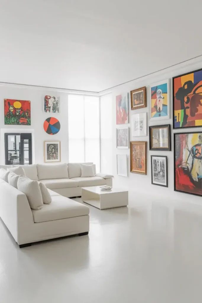
If you have colorful art or furniture, I recommend a pure, unpigmented white. Farrow & Ball’s All White (No. 2005) contains no other pigments.
This creates a true blank canvas. It doesn’t lean cool or warm; it just looks clean.
This approach lets your decor take center stage while the walls fade into the background.
7. Don’t Ignore the Trim Color
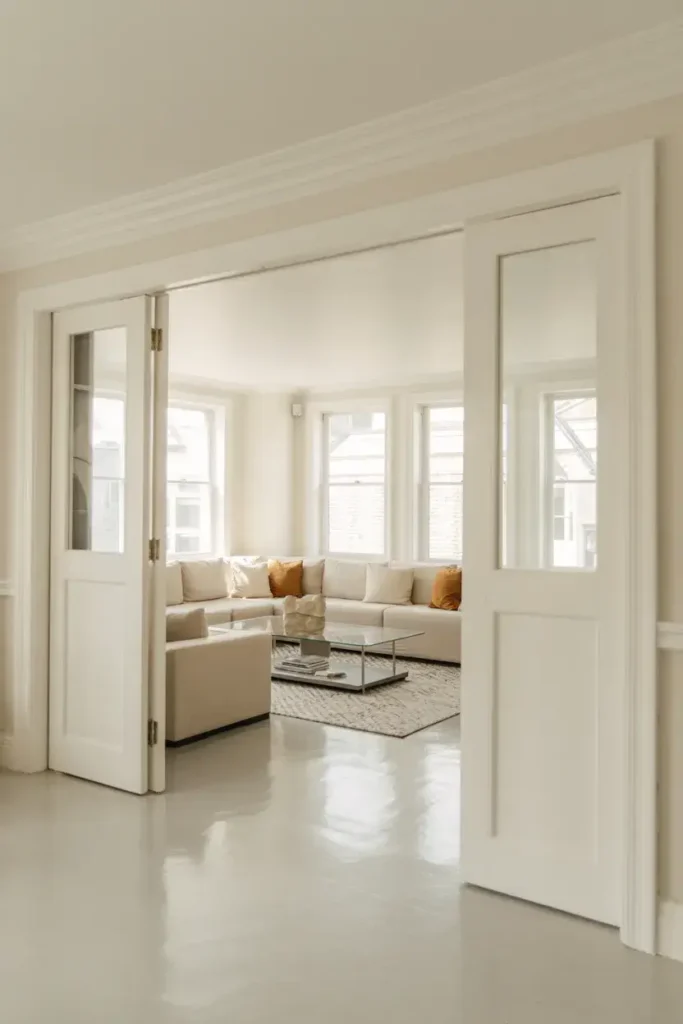
Your walls aren’t the only thing that needs attention. The color you choose for your baseboards and window trim matters just as much.
I often paint the trim the exact same color as the walls. This makes the ceilings feel higher and the room look bigger.
If you want contrast, use a bright, stark white on the trim and a slightly creamier white on the walls.
8. Pick the Right Sheen for Durability
The finish of the paint affects both the look and the longevity of your walls. For living rooms, I usually avoid high-gloss finishes on walls.
Satin or eggshell finishes are the sweet spot. They offer a slight glow that reflects light but are tough enough to scrub clean.
Matte finishes look beautiful and velvety, but they can be harder to clean if you have kids or pets.
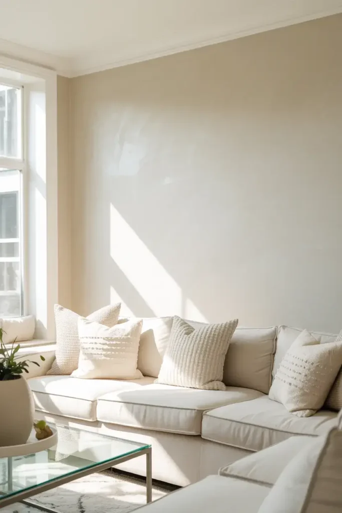
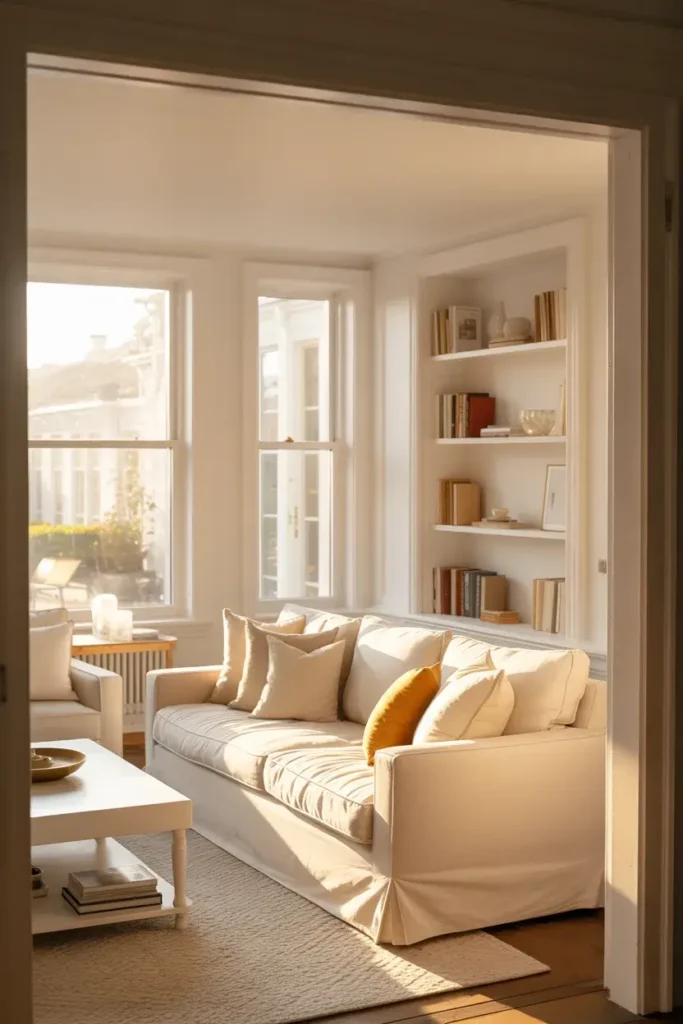
9. Consider Your Room’s Natural Light
The direction your windows face changes everything. I always check the light source before buying a gallon of paint.
North-facing rooms get cooler, bluer light. A cool white paint in these rooms can feel icy, so I counter that with a warmer creamy white.
South-facing rooms get warm, golden light. You can get away with cooler whites here without the room feeling cold.
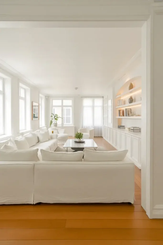
10. Layer Different Shades of White
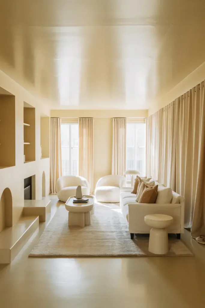
A monochromatic room doesn’t have to be boring. I love mixing different tones of white to add depth.
Paint your walls a warm white and your ceiling a bright, flat white. Then, add ivory curtains or a cream rug.
These subtle shifts in tone keep the eye moving and prevent the room from looking flat.
11. Use Flat Paint to Hide Imperfections
If your living room walls are older or have bumps and dings, I recommend using a flat or matte finish.
Glossy paints reflect light, which highlights every single dent in the drywall. Flat paint absorbs light and hides those flaws.
Sherwin-Williams offers excellent matte options that conceal imperfections while still delivering rich color.
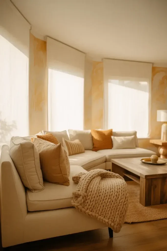
12. Add Warmth with Texture, Not Just Color
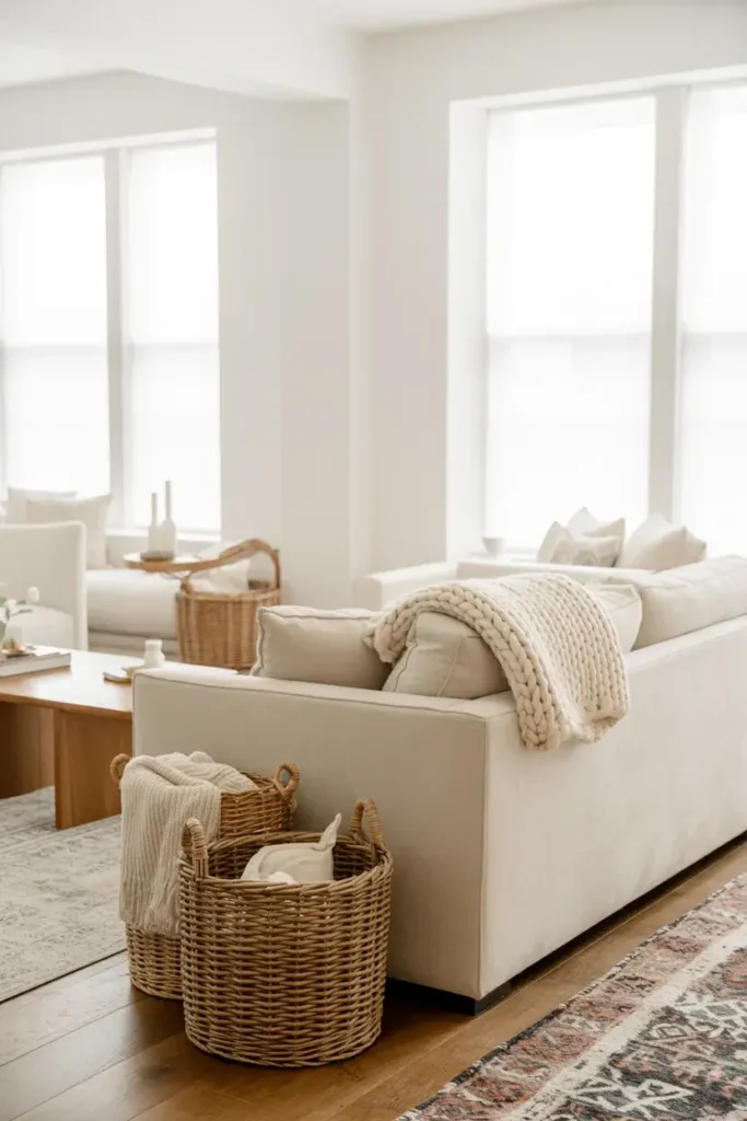
If you prefer a very stark, bright white wall, you might worry the room will feel clinical. I solve this by adding texture.
Use chunky knit blankets, woven baskets, or a velvet sofa. These elements add physical warmth that balances the visual coolness of the paint.
This allows you to keep that crisp, modern paint color without sacrificing comfort.
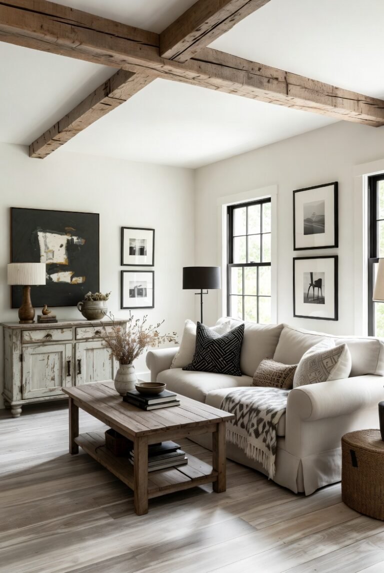
13. Contrast with Darker Accents
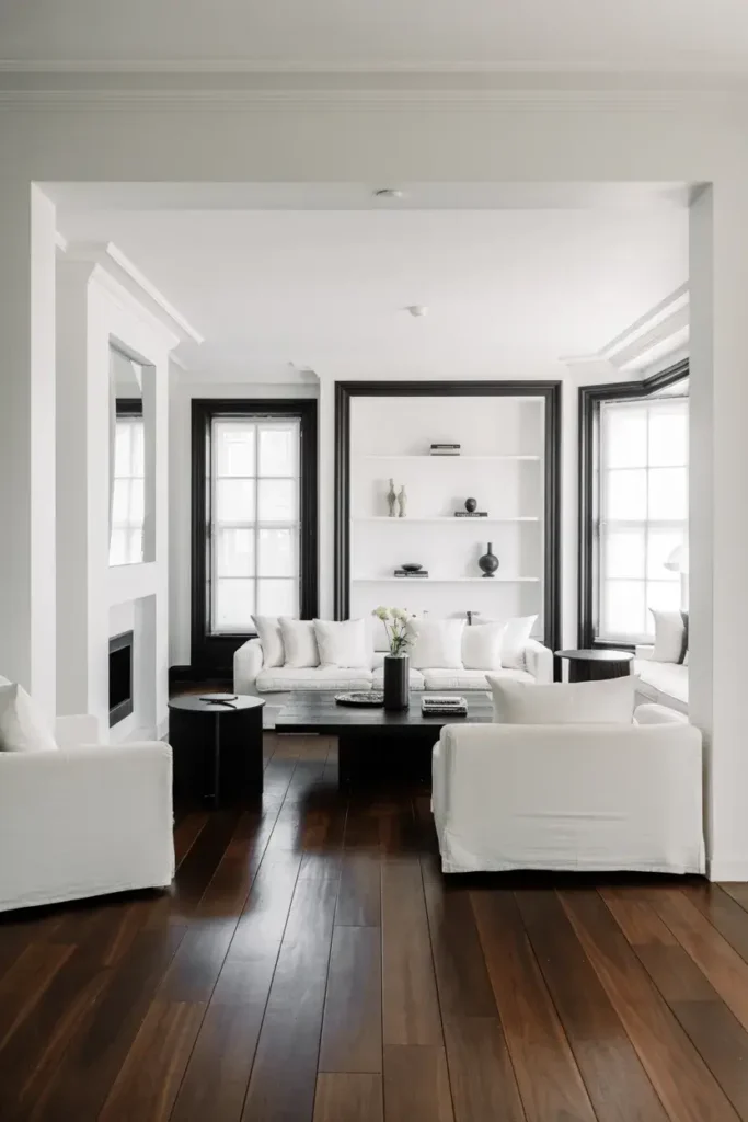
White walls look incredible when you pair them with high-contrast elements. I love the look of white walls against black window frames or dark wood floors.
This contrast makes the white paint look even brighter and crisper.
It creates a sophisticated, architectural look that feels very intentional and designed.
14. Avoid the “Dingy” Gray Cast
Some white paints have heavy gray undertones. In low-light rooms, these can end up looking like dirty concrete rather than white paint.
To avoid this, I stick to whites with higher LRV numbers in dim rooms. You need that extra reflectivity to bounce around what little light you have.
Always test your swatch in the darkest corner of the room to see if it turns dingy.
15. Use High-Gloss for Architectural Details
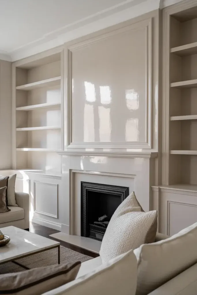
While I prefer matte walls, I love a high-gloss finish on specific details. Painting a fireplace mantel or built-in bookshelves in a high-gloss white makes them pop.
It adds a layer of luxury and draws attention to the craftsmanship of the room.
Just remember that high-gloss requires perfect prep work, as it shows every brushstroke.
16. Re-evaluate During Different Times of Day
My final tip is patience. Watch your painted sample board for a full 24 hours before you commit.
The color will change as the sun moves across the sky. A color might look perfect in the morning sun but turn yellow under your evening lamps.
You want a shade that you love at breakfast and just before bed.
Conclusion
Choosing the right white paint is the first step toward building a space you love. Whether you choose a cozy cream or a crisp gallery white, taking the time to test and compare will pay off.
If you are ready to transform your home but aren’t sure where to start, our team is here to help. Book a consultation today and let us help you find the perfect shade for your sanctuary.