15 Vertical Stripe Wall Paint Ideas to Elevate Your Space
There’s something transformative about walking into a room that feels taller, grander, and more dynamic than its square footage suggests. Vertical stripes are my secret weapon for achieving exactly that.
They don’t just add color; they trick the eye, drawing your gaze upward and creating an instant illusion of height in even the most compact spaces.
Whether you want a bold statement or a subtle texture, vertical stripes offer endless versatility. In this guide, I’ll walk you through fifteen inspiring ideas to harness this classic pattern, complete with practical tips to help you get those crisp, professional lines every time.
1. Classic Two-Tone Neutrals

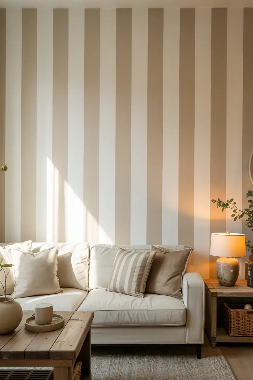
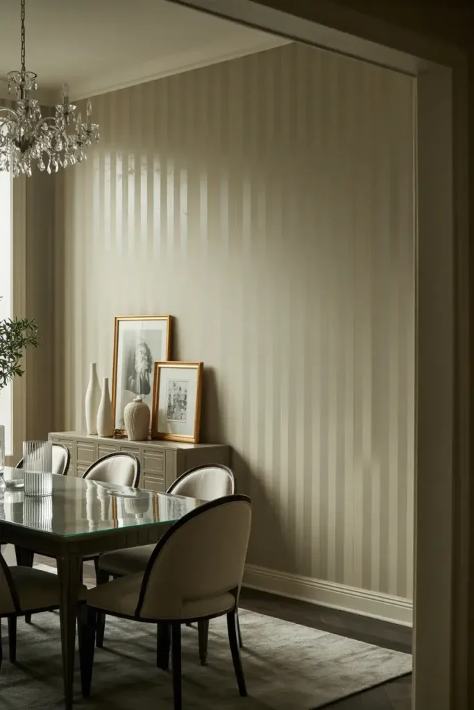
If you want a sophisticated look that won’t overwhelm your furniture, start with a two-tone neutral palette. I recommend pairing a soft white with a warm oatmeal or beige. This combination adds texture without screaming for attention.
To keep it subtle, use a matte finish for the darker stripe and an eggshell finish for the lighter one. This slight difference in sheen catches the light beautifully, adding depth to your walls that flat paint alone can’t achieve.
2. Bold Black and White
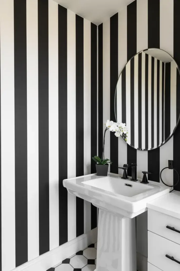
For a high-contrast statement, nothing beats the timeless drama of black and white. This “referee” style works exceptionally well in powder rooms or entryways where you want to make a strong first impression.
I suggest keeping the stripes relatively wide—around 6 to 10 inches—to avoid a dizzying vibrating effect. Use a high-quality painter’s tape like FrogTape with PaintBlock technology to ensure your black lines don’t bleed into the pristine white.
3. The Pinstripe Effect
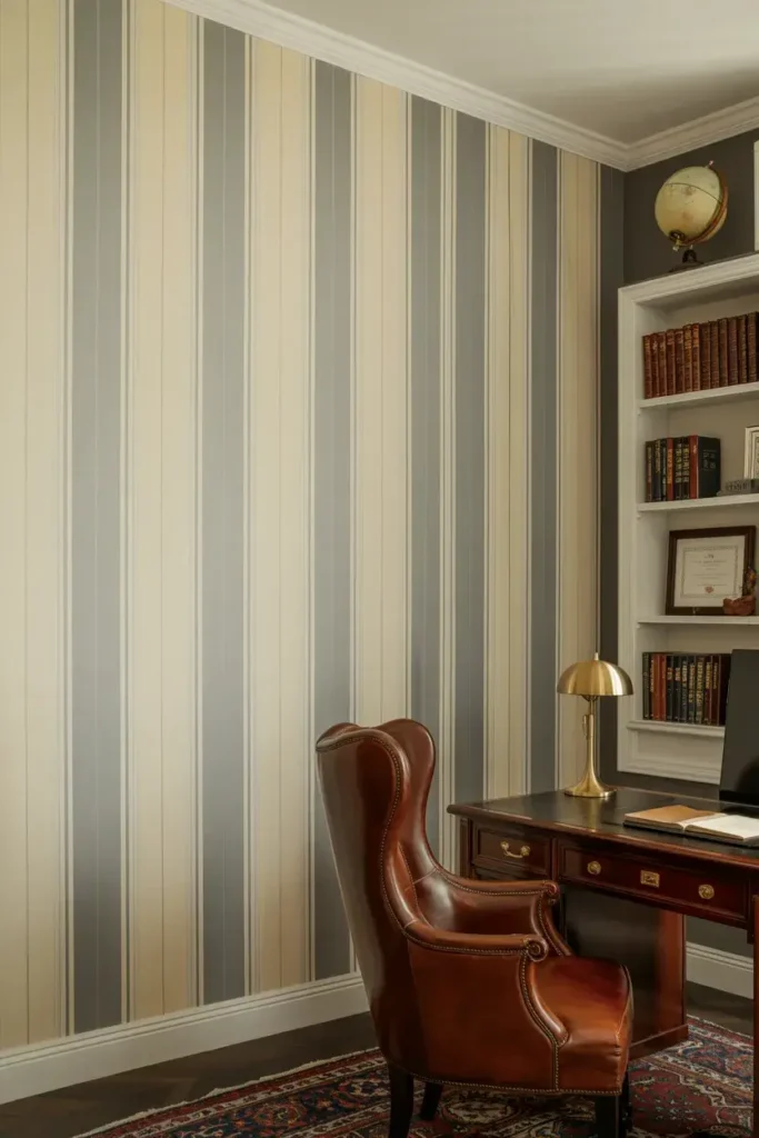
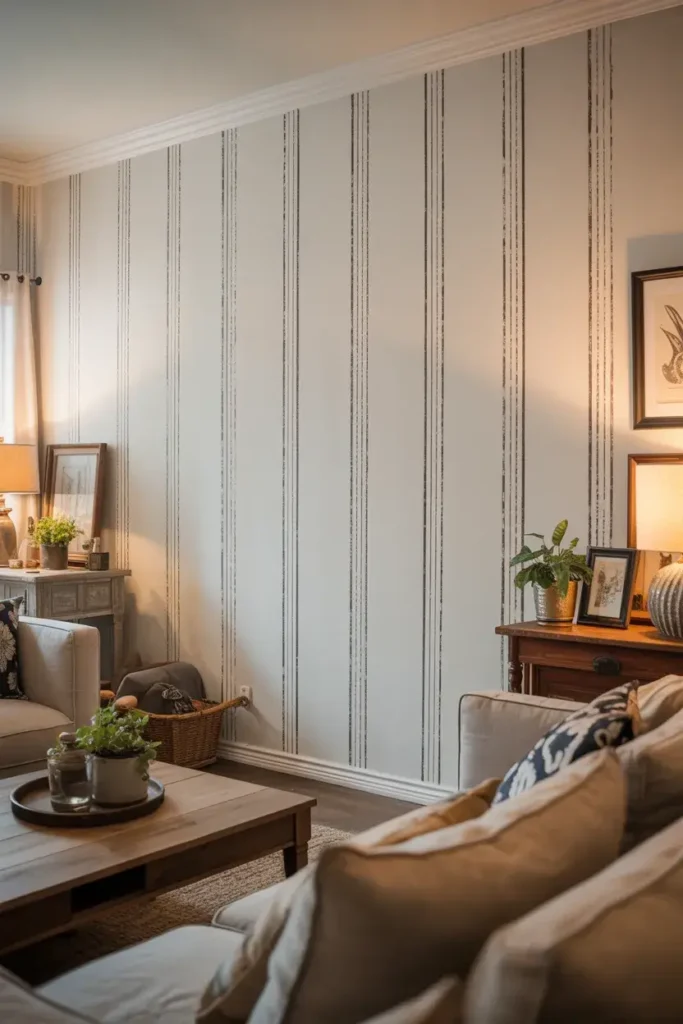
You don’t need wide bands to make an impact. Thin pinstripes mimic the look of tailored menswear, bringing a sharp, refined energy to a home office or library. This look often resembles expensive wallpaper but costs a fraction of the price.
Creating thin lines requires patience and a steady hand. I use a laser level to establish my initial plumb line, ensuring that every subsequent pinstripe remains perfectly vertical from ceiling to floor.
4. Ombré Vertical Stripes
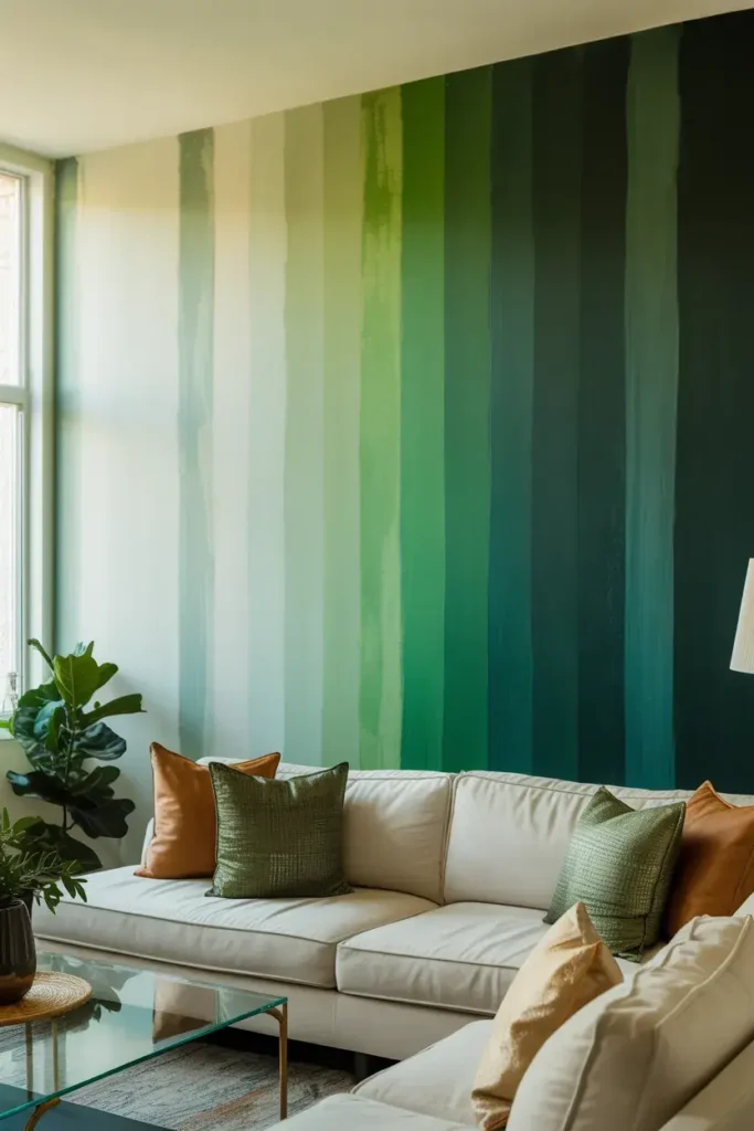
Why stick to just two colors? An ombré effect uses multiple shades of the same color family, transitioning from light to dark as you move across the wall. This creates a soft, watercolor-like gradient that feels modern and artistic.
I pick a single paint card from the hardware store and buy sample pots of four or five consecutive shades. Painting them in order creates a harmonious flow that looks professionally curated.
5. Varying Widths (The Barcode Look)
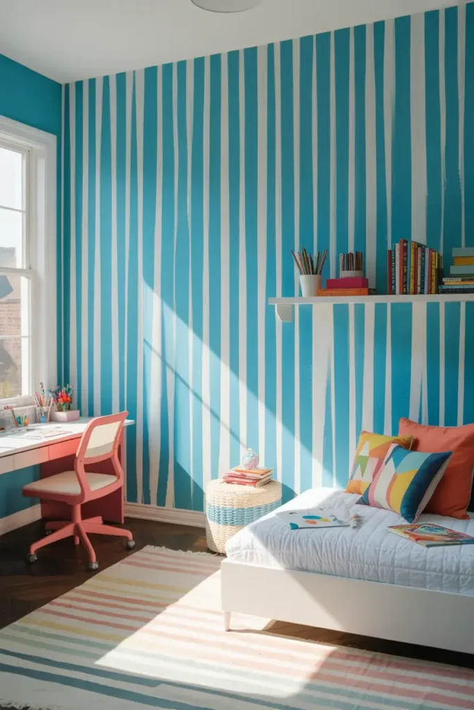
Uniformity isn’t mandatory. Mixing thick and thin stripes creates a dynamic, “barcode” rhythm that feels spontaneous and playful. This works particularly well in kids’ rooms or creative studios.
I map this out on paper first. A random pattern often looks better than a mathematically perfect one here. Try a 10-inch stripe followed by a 2-inch stripe, then a 5-inch one to keep the eye moving.
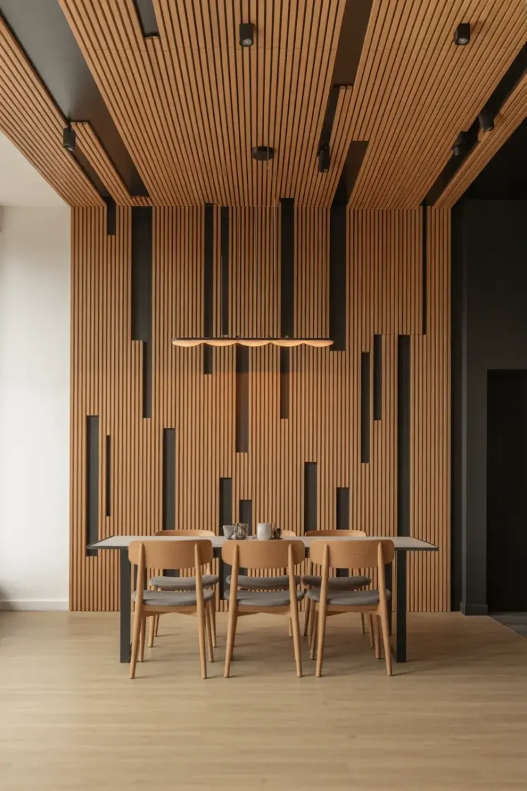
6. Ceiling-High Extensions
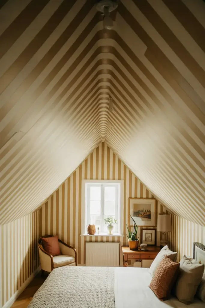
Don’t stop at the crown molding. Carrying your vertical stripes up onto the ceiling creates a canopy effect that makes the room feel infinite. This technique is brilliant for attic rooms or spaces with sloped ceilings.
I treat the ceiling as a fifth wall. By continuing the line unbroken from the baseboard to the center of the ceiling, you blur the boundaries of the room, making it feel significantly larger.
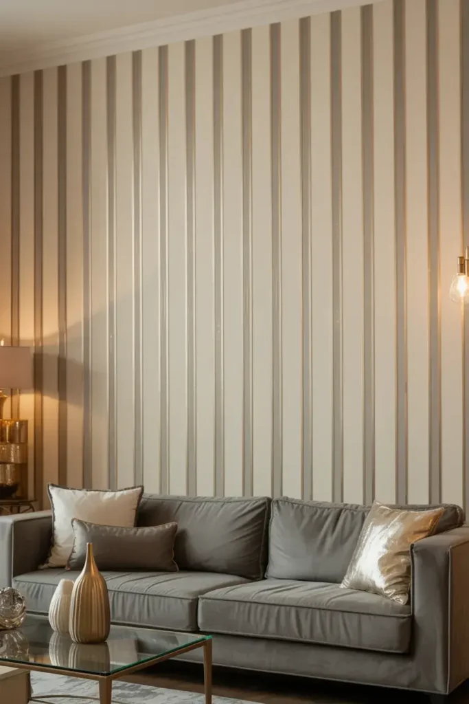
7. Tone-on-Tone Gloss
If you love the idea of stripes but fear color commitment, try using the same color in two different finishes. Paint the entire wall in a matte base, then tape off stripes and paint them with a high-gloss glaze in the exact same shade.
The result is a ghost stripe that only appears when the light hits it. It’s an elegant, understated way to add architectural interest to a dining room or master bedroom without introducing a new color palette.
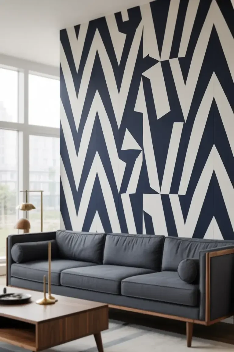
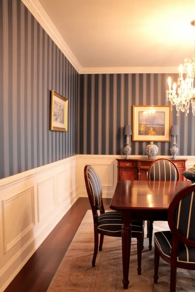
8. Nautical Navy and White
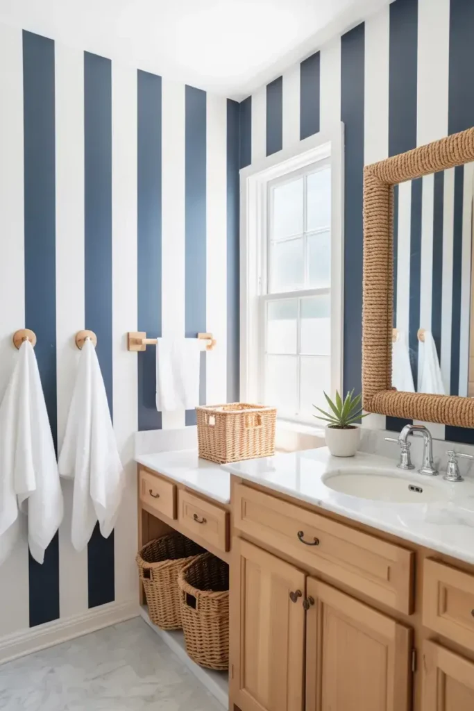
Channel a coastal vibe with crisp navy blue and white stripes. This classic pairing instantly makes a bathroom or sunroom feel breezy and fresh. It pairs perfectly with natural wood accents and woven textures.
To prevent the navy from darkening the room too much, I keep the white stripes slightly wider than the blue ones. This maintains a bright, airy atmosphere while still delivering that punch of nautical contrast.
9. Pastel Candy Stripes
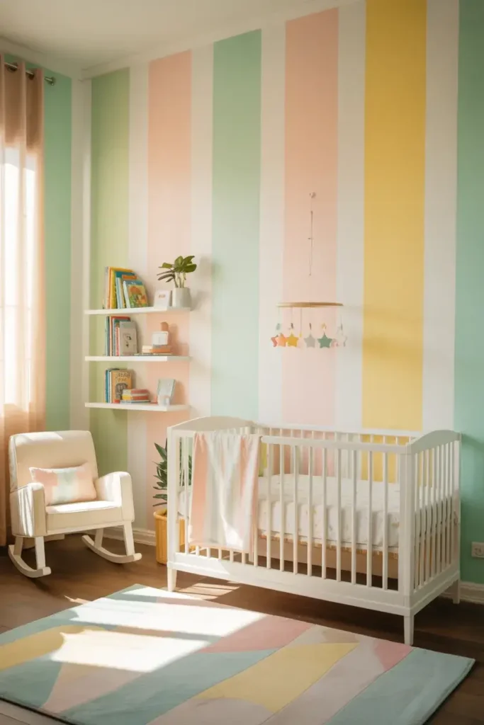
Soft pastels like mint, blush, and lemon yellow create a whimsical, carnival-inspired look. This is a fantastic choice for a nursery or a playful breakfast nook.
I often alternate white with two different pastel shades for a “candy stick” effect. Keep the colors muted rather than neon to ensure the space feels soothing rather than chaotic.
10. Metallic Accents
Introduce a touch of glamour by incorporating a metallic gold, silver, or copper stripe. A single thin metallic line nestled between wider matte stripes adds a layer of luxury and reflects light beautifully.
Metallic paint can be tricky to apply evenly. I use a small foam roller rather than a brush to avoid visible stroke marks, ensuring the metallic finish looks smooth and foil-like.
11. The Chair Rail Split
You don’t have to stripe the entire wall height. Installing a chair rail allows you to paint vertical stripes on the bottom half while keeping the top solid (or vice versa). This grounds the room without dominating it.
I love using darker, heavier stripes below the rail and a solid, lighter color above. This visual weight at the bottom makes the room feel cozy and anchored, perfect for a dining space.
12. Rough-Edged Hand Painted
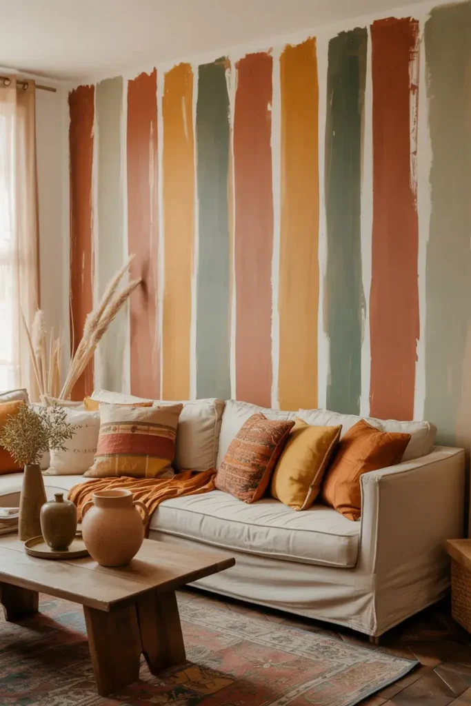
Not every line needs to be laser-sharp. For a bohemian or rustic look, ditch the tape and hand-paint your vertical lines. The imperfect, organic edges add warmth and a human touch that feels artisanal.
I use a flat artist’s brush and trust my eye. The goal here isn’t perfection; it’s texture. This style looks incredible with earthy tones like terracotta, sage, or mustard.
13. Grayscale Gradient
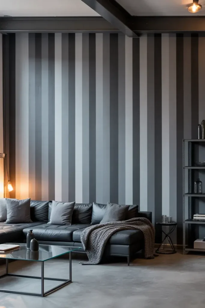
For a sleek, modern aesthetic, use a grayscale palette. Alternate between charcoal, slate, and dove gray. This monochromatic approach adds pattern without introducing clashing colors.
I find this works best in industrial-style lofts or modern living rooms. It pairs exceptionally well with metal furniture and concrete floors, softening the hard edges with visual rhythm.
14. Vibrant Multi-Color
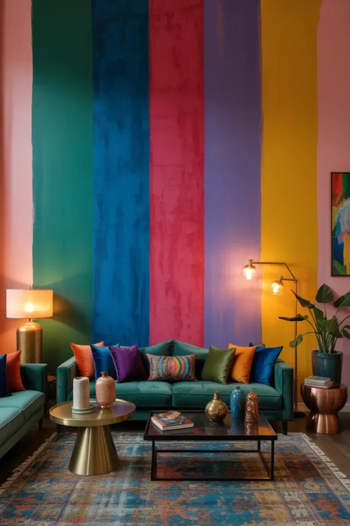
If you’re a maximalist, embrace the rainbow. Using four or five distinct, vibrant colors in a repeating vertical pattern creates a show-stopping feature wall that acts as art.
To keep it cohesive, I ensure all the colors share the same saturation level—all jewels tones or all brights. This connects them visually even though the hues are different.
15. Faux Board and Batten
You can use paint to mimic architectural details. By painting thin, dark vertical lines at regular intervals on a white wall, you create the optical illusion of board and batten paneling from a distance.
I measure carefully for this one, spacing the lines exactly 12 or 16 inches apart to mimic standard stud spacing. It adds a sense of structure and history to a plain drywall box.
Conclusion
Vertical stripes are more than just a paint choice; they are a design tool that changes how you perceive space. Whether you opt for the subtle elegance of tone-on-tone gloss or the bold drama of black and white, the vertical line remains a powerful ally in home design.
Ready to get started? Grab your laser level, invest in high-quality painter’s tape, and start measuring. A taller, more stylish room is just a few coats of paint away.