16 Paint Colors That Go With Wood Trim (And Boost Home Value)
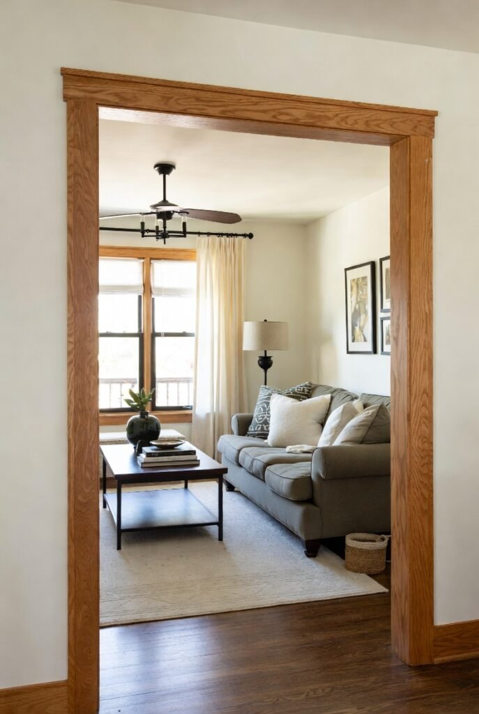
I admit it—I used to think the only solution for wood trim was to paint over it. But after seeing how the right wall color can transform a dated orange oak into a warm, mid-century modern statement, I have completely changed my tune.
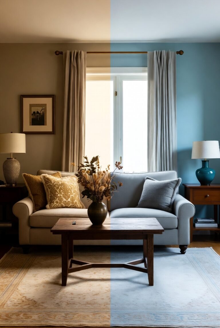
Wood trim adds a character and warmth that modern builds often lack. The trick is simply finding a paint color that harmonizes with the wood’s undertones rather than fighting against them.
Get this right, and it pays off literally. Zillow research found that homes with specific paint colors can sell for nearly $2,600 more. Whether you are refreshing a bedroom or updating your entire home, here are the 16 best paint colors to make your wood trim shine.
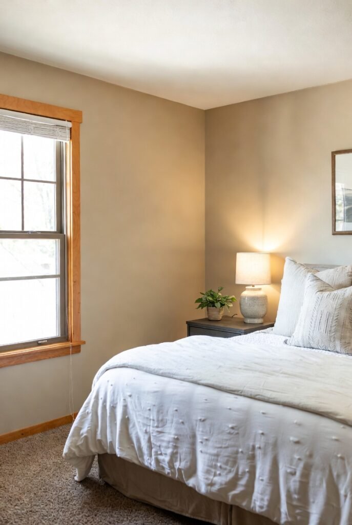
1. Sherwin-Williams Alabaster
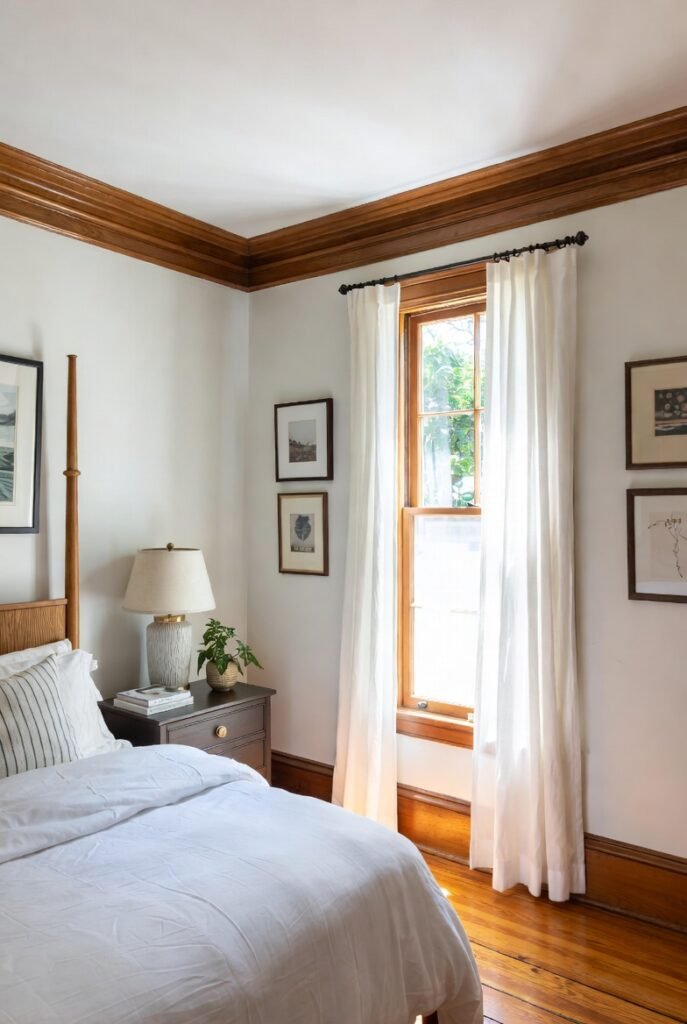
If you fear white walls will look stark against wood, Alabaster is your safety net. I love this color because it is a soft, creamy white that bridges the gap between modern brightness and traditional warmth.
It works exceptionally well with honey oak trim. The subtle warm undertones in the paint pick up the glow of the wood without making it look yellow. Use a matte finish on the walls to let the sheen of the wood trim take center stage.
2. Benjamin Moore White Dove
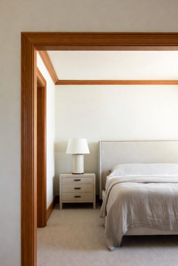
White Dove is a cult favorite for a reason. It has a tiny drop of gray and a touch of yellow, making it incredibly versatile. I find it works best in bedrooms where you want a serene, airy vibe but have heavy, dark wood molding.
The softness of White Dove keeps the contrast from feeling too harsh. It brightens the room significantly while maintaining a cozy atmosphere that pure white simply cannot achieve.
3. Benjamin Moore Chantilly Lace
Sometimes, you need a crisp, clean slate. Chantilly Lace is a much cooler, brighter white than the previous two. I recommend this specific shade if you have cherry or mahogany trim.
The reddish tones in cherry wood pop beautifully against a crisp, cool white. This high-contrast look feels intentional and sophisticated, instantly modernizing older wood features.
4. Sherwin-Williams Snowbound
Snowbound sits right in the sweet spot between warm and cool. It has a slight gray undertone that pairs beautifully with walnut or weathered wood trim.
I often suggest this for hallways or living areas where you want a neutral backdrop that feels fresh but not sterile. It reflects light well, making smaller spaces feel larger without washing out the texture of your woodwork.
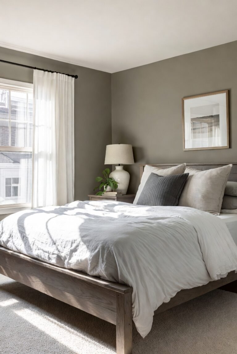
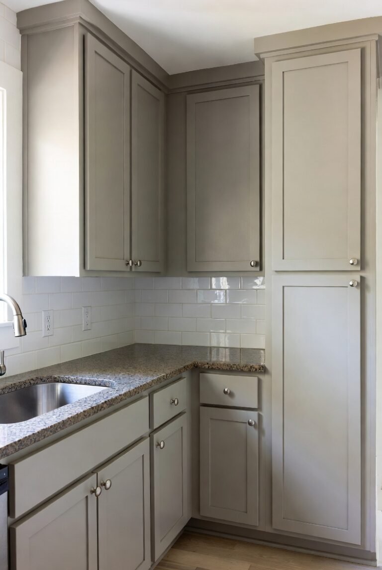
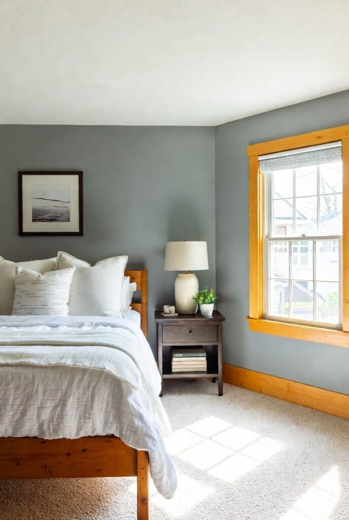
5. Benjamin Moore Revere Pewter
This is the ultimate “greige” (gray-beige). Revere Pewter is an earthy, warm gray that looks stunning with almost any medium-tone wood.
It creates a harmonious, monochromatic look that feels very calming in a bedroom. Because it shares earthy qualities with wood, it softens the transition between the wall and the trim, making the room feel larger and more cohesive.
6. Sherwin-Williams Accessible Beige
If your wood trim leans very warm or orange (looking at you, 1990s pine), Accessible Beige is a fantastic choice. Unlike cool grays that can make orange wood look jarring, this warm beige neutralizes it.
I love using this in North-facing rooms that don’t get much sunlight. It brings its own warmth to the space, ensuring your bedroom feels cozy rather than dreary.
7. Sherwin-Williams Agreeable Gray
Agreeable Gray is arguably the most popular paint color for resale, and for good reason. It is a warm gray that plays nice with everything.
Zillow data suggests that neutral tones appeal to the widest range of buyers. This color works particularly well to update yellow-toned wood trim, toning down the brassiness while keeping the space light and airy.
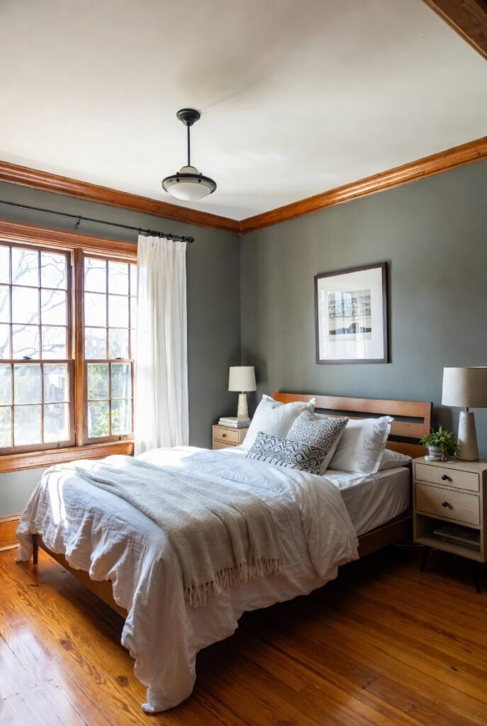
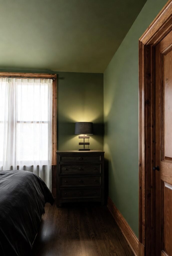
8. Sherwin-Williams Evergreen Fog
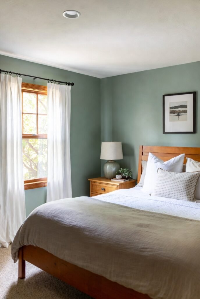
Green is having a huge moment in interior design. Evergreen Fog is a chameleon color—a blend of green and gray with a hint of blue.
I find this pairs effortlessly with natural oak trim. The nature-inspired hue connects with the organic material of the wood, creating a “bring the outdoors in” feeling that is perfect for a relaxing bedroom retreat.
9. Benjamin Moore Saybrook Sage
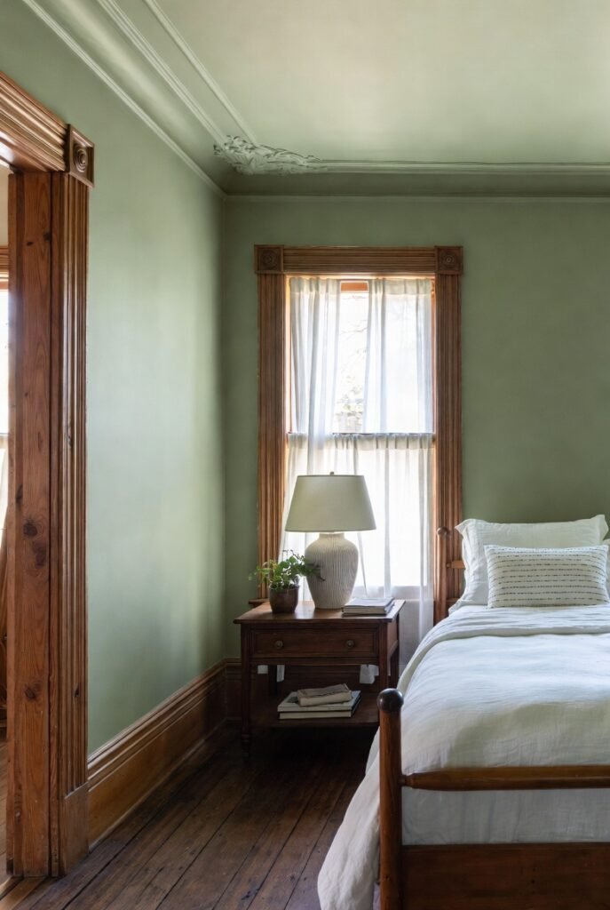
For a lighter, more cottage-core aesthetic, Saybrook Sage is a winner. It is a soft, aloe-toned green that looks beautiful against darker, antique wood trim.
It adds color without overwhelming the space. If you have a historic home with intricate molding, this color highlights the craftsmanship without screaming for attention.
10. Sherwin-Williams Ripe Olive
If you want drama, go for Ripe Olive. According to Zillow, homes with dark, moody hues like olive green in the kitchen can sell for $1,600 more. I think this logic applies perfectly to a moody, den-like bedroom or office.
This deep green looks incredible next to medium or dark wood. It creates a rich, library-esque atmosphere that feels expensive and timeless.
11. Sherwin-Williams Naval
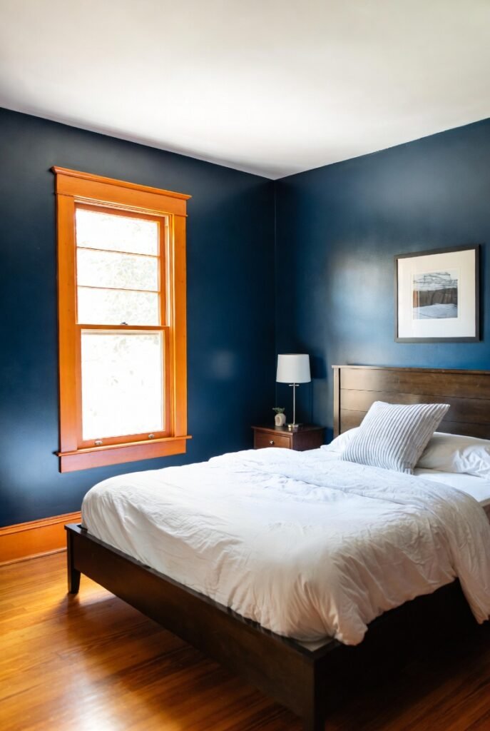
Navy blue is a powerhouse for value. Zillow’s analysis found that buyers would pay an estimated $1,815 premium for a home with a navy blue bedroom.
Naval is a deep, confident blue. I love pairing this with orange-toned wood trim. Since blue and orange are opposites on the color wheel, they balance each other out perfectly, making the wood look rich rather than dated.
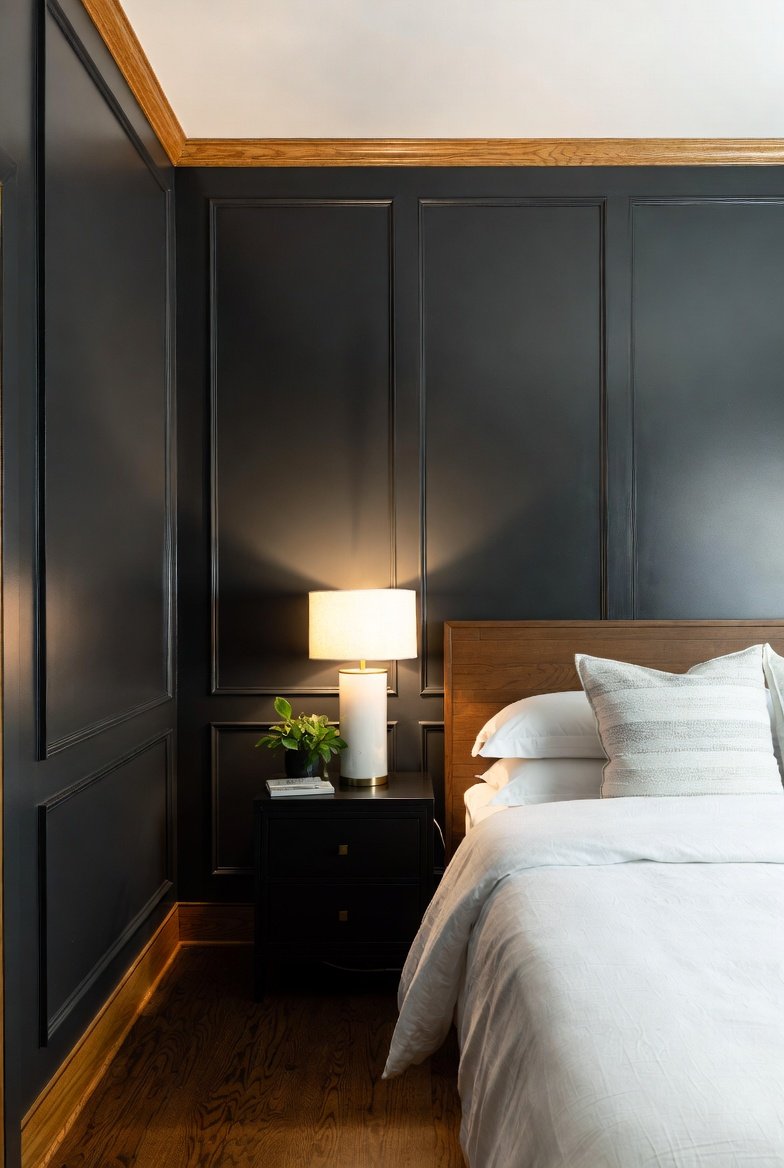
12. Benjamin Moore Hale Navy
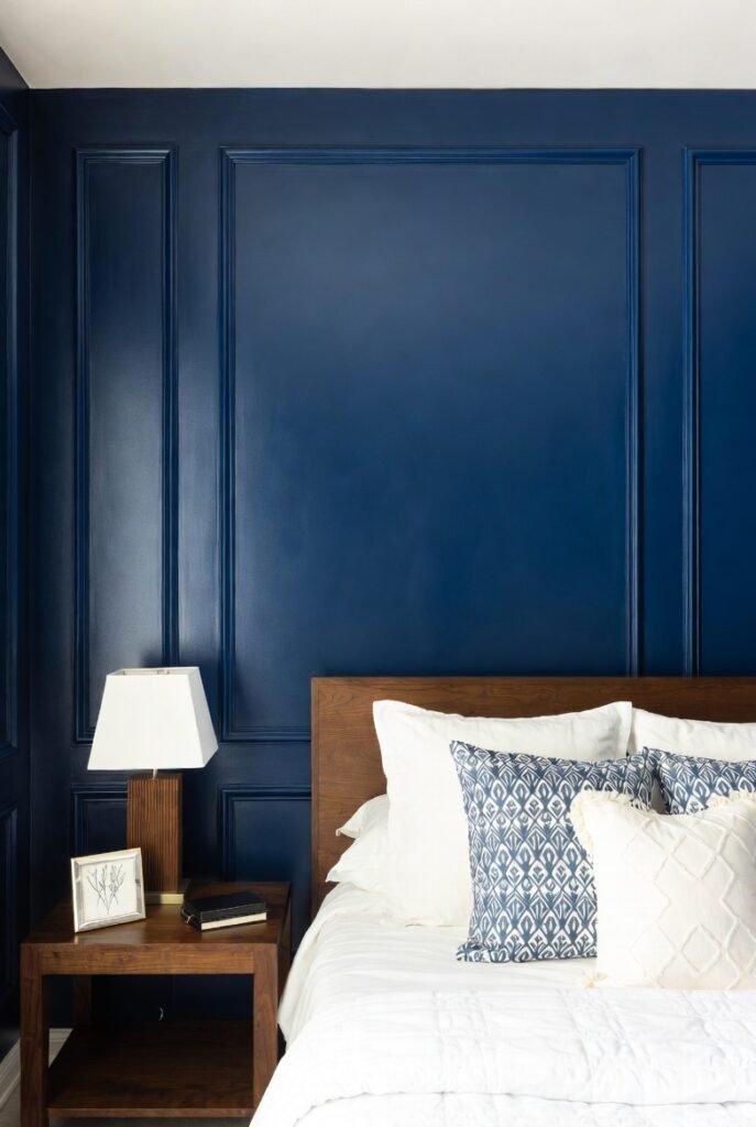
Hale Navy is a classic, deeply saturated blue that feels historic and nautical. It pairs beautifully with crisp white linens and dark wood furniture or trim.
I use this when I want to create a focal point, like an accent wall behind a bed. It grounds the room and makes the wood trim pop in a very elegant way.
13. Sherwin-Williams Silvermist
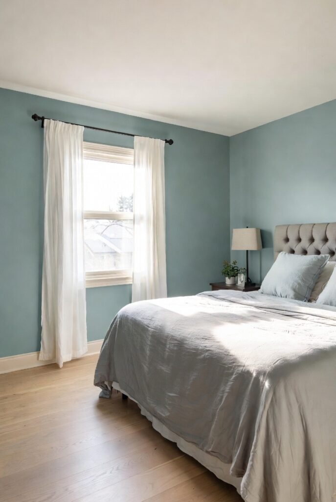
Not ready for a dark navy? Silvermist is a dusty, blue-green-gray mix. It is soothing and spa-like, making it a top tier choice for a master suite.
It works well with lighter woods like ash or maple. The cool undertones in the paint balance the warmth of the wood, creating a serene environment that encourages sleep and relaxation.
14. Sherwin-Williams Cyberspace
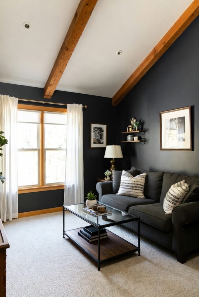
Dark gray is the new neutral for modern homes. Cyberspace is a deep charcoal that almost reads as black in certain lights.
Zillow research highlights that dark gray living rooms can boost offers by nearly $2,600. In a bedroom with wood beams or trim, it creates a cozy cocoon effect that is incredibly stylish and modern.
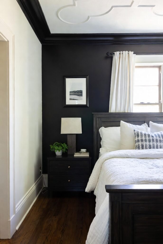
15. Sherwin-Williams Iron Ore

Iron Ore is a soft, charcoal black that is less harsh than a true black. I find it creates a stunning, sophisticated backdrop for honey oak trim.
The dark wall absorbs the light, while the wood trim reflects it, creating a beautiful contrast. It turns the “problem” of orange wood into a deliberate design feature.
16. Sherwin-Williams Tricorn Black
For the boldest look, Tricorn Black is the gold standard. It is a true, neutral black with no undertones.
I recommend using this on an accent wall or in a powder room with wood accents. It instantly modernizes the space and makes old wood trim look like a high-end, custom design choice.
Conclusion
Choosing the right paint color is the single most cost-effective way to increase your home’s value and fall in love with your space again. You don’t need to rip out that quality wood trim—you just need the right partner for it.
Ready to find the perfect palette for your unique space? Book a design consultation with us today and let’s turn your vision into reality.