13 Nursery Paint Ideas to Spark Joy and Serenity
Preparing a nursery is one of the most exciting parts of expecting a new baby. You want a space that feels safe, welcoming, and conducive to sleep (for both the baby and you!). While furniture and decor play a big role, the color on the walls sets the entire mood of the room.
Studies in color psychology suggest that the colors surrounding us impact our emotions and behaviors.
For a nursery, choosing the right shade can mean the difference between a restless infant and a calm one. Whether you prefer timeless neutrals or bold, creative statements, this guide explores 13 inspiring nursery paint ideas to help you create the perfect sanctuary for your little one.
1. Soft Grays for a Calming Effect
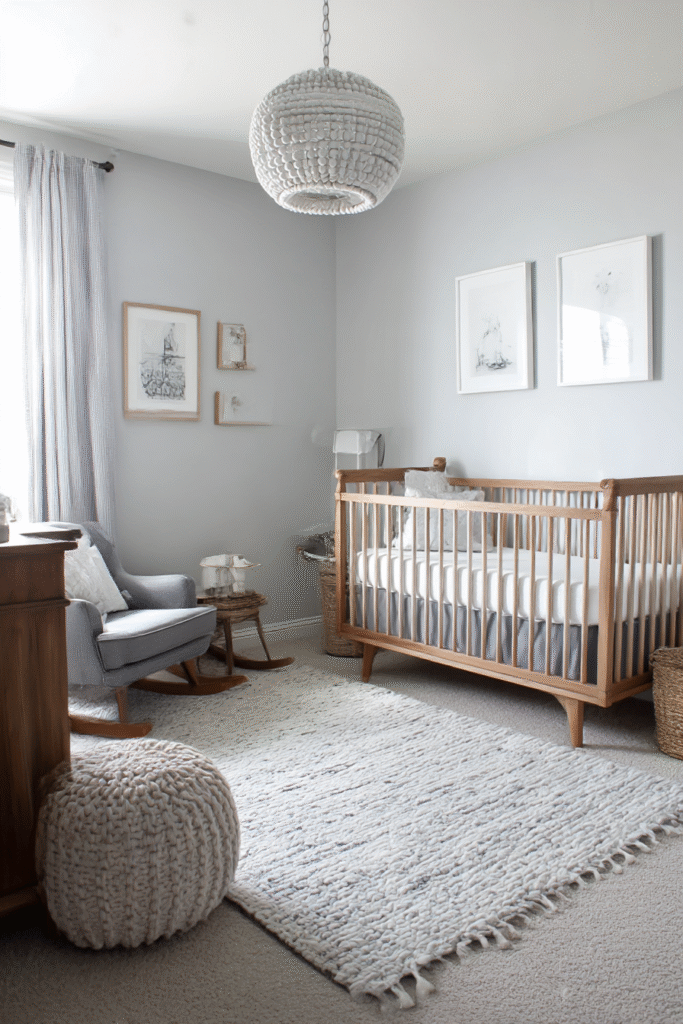
Gray remains a top choice for modern nurseries because of its incredible versatility. A soft, dove gray creates a sophisticated backdrop that works with any accent color you choose later.
It provides a soothing environment that doesn’t overstimulate a baby’s developing vision. To keep the room from feeling too cold, pair gray walls with warm wood furniture or textured rugs.
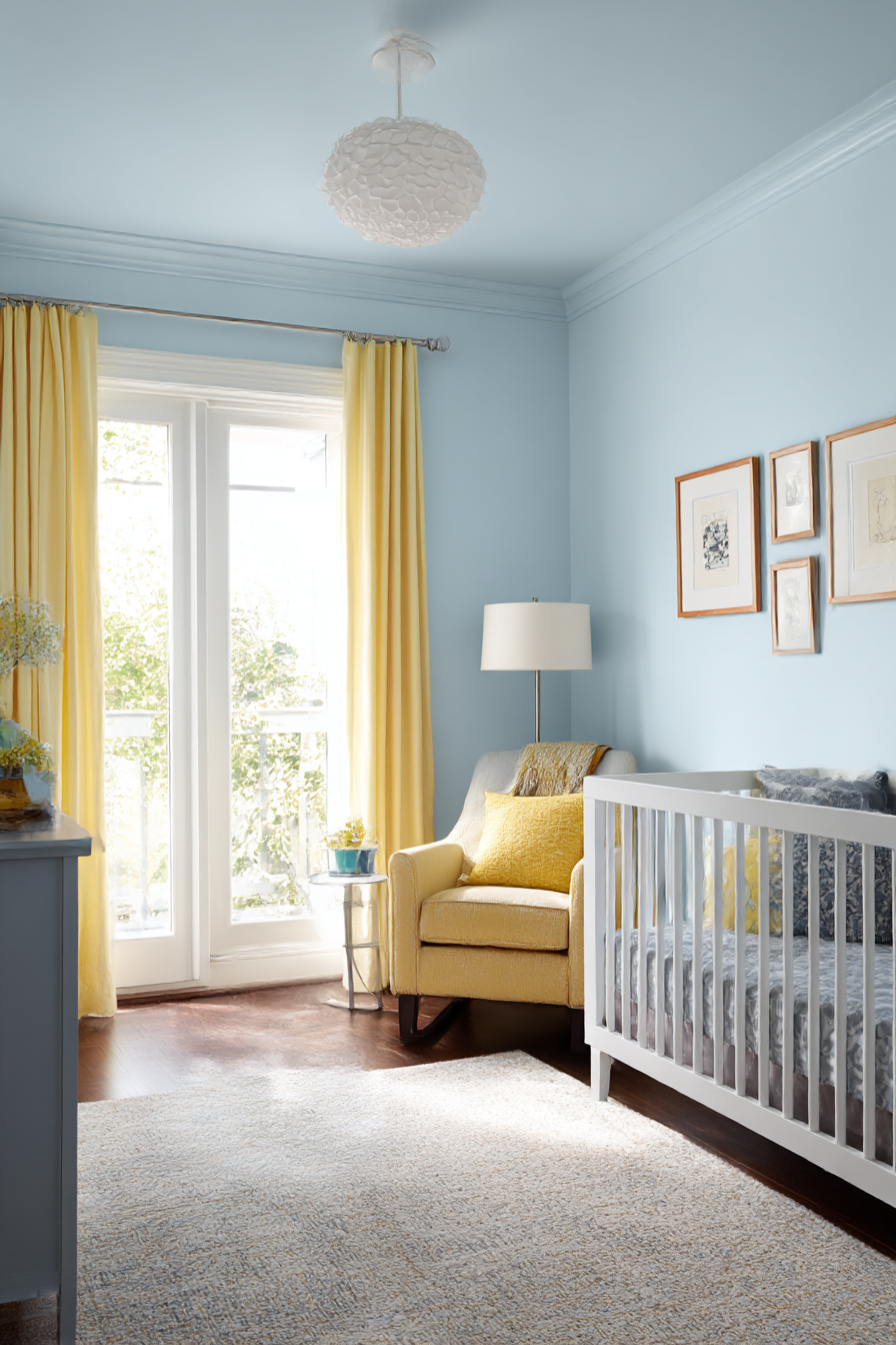
2. Gentle Blues for a Serene Space
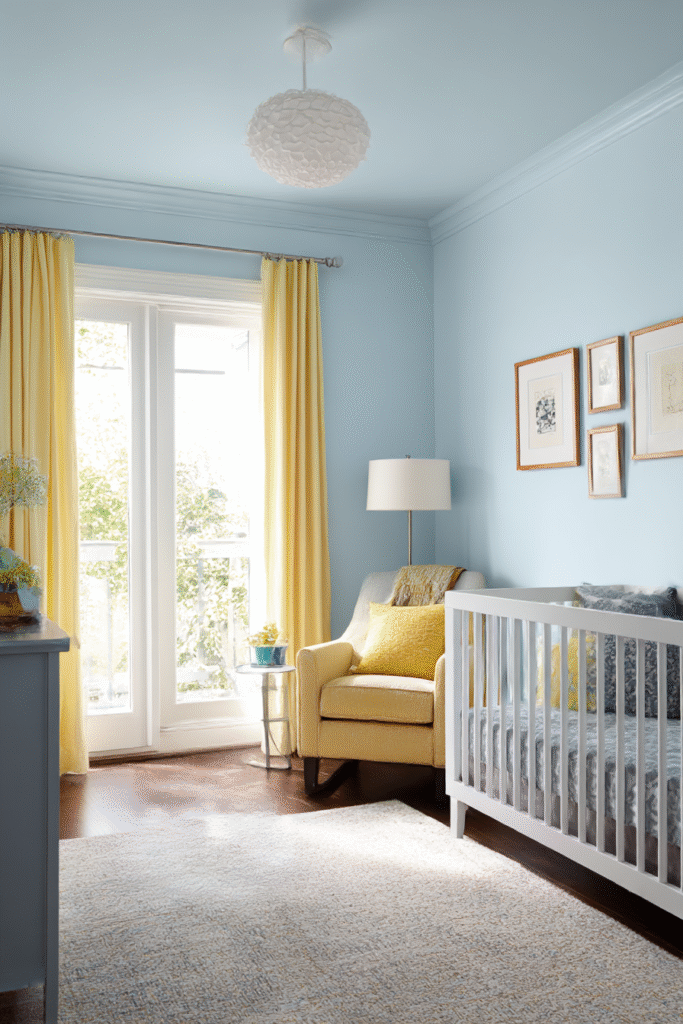
Blue isn’t just for boys anymore. Soft, powdery blues evoke feelings of the sky and sea, promoting relaxation and lower heart rates.
This color works beautifully in rooms with plenty of natural light. If you want a more contemporary look, try pairing a pale blue with crisp white trim and mustard yellow accessories for a pop of contrast.
3. Warm Yellows for a Cheerful Room
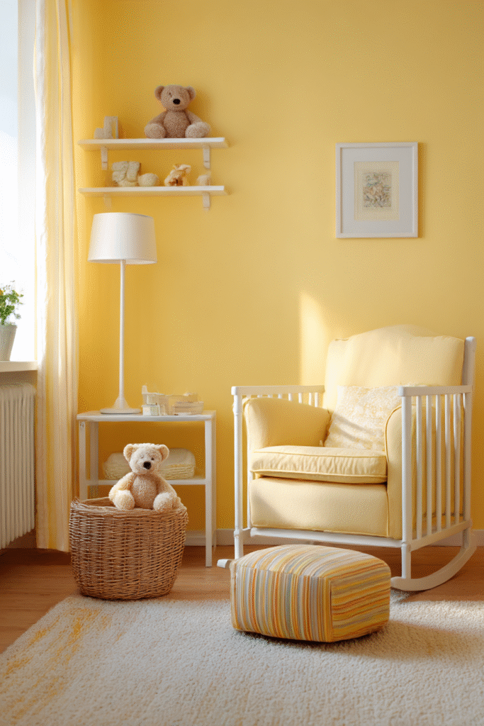
Yellow is the color of happiness and sunshine. A buttery, warm yellow instantly brightens a room and creates a cozy, welcoming atmosphere.
However, experts recommend avoiding neon or overly bright yellows, as they can be agitating to young eyes. Stick to pastel or muted gold tones to keep the energy positive but peaceful.
4. Muted Greens for Nature-Inspired Nurseries
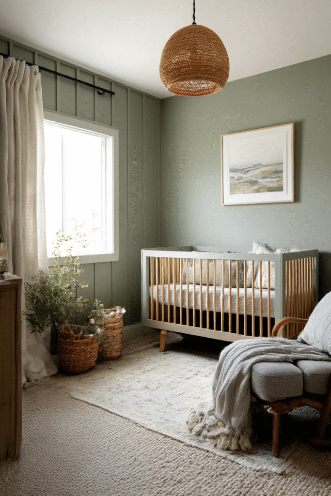
Bring the outdoors in with shades of sage, olive, or mint. Green is often associated with health and growth, making it a symbolic and beautiful choice for a baby’s room.
Muted greens pair effortlessly with natural materials like rattan, bamboo, and unpainted wood. This color choice creates a gender-neutral space that feels fresh and organic.
5. Pale Pinks for a Classic Touch
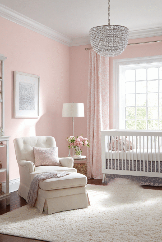
Blush and pale pinks offer a soft, nurturing vibe without being overly sugary. These shades add warmth to a room and reflect light beautifully, giving the space a rosy glow.
To modernize this classic look, combine pale pink with gray or navy blue accents. This prevents the room from looking too “frilly” and allows the design to grow with your child.
6. Neutral Whites for Versatility
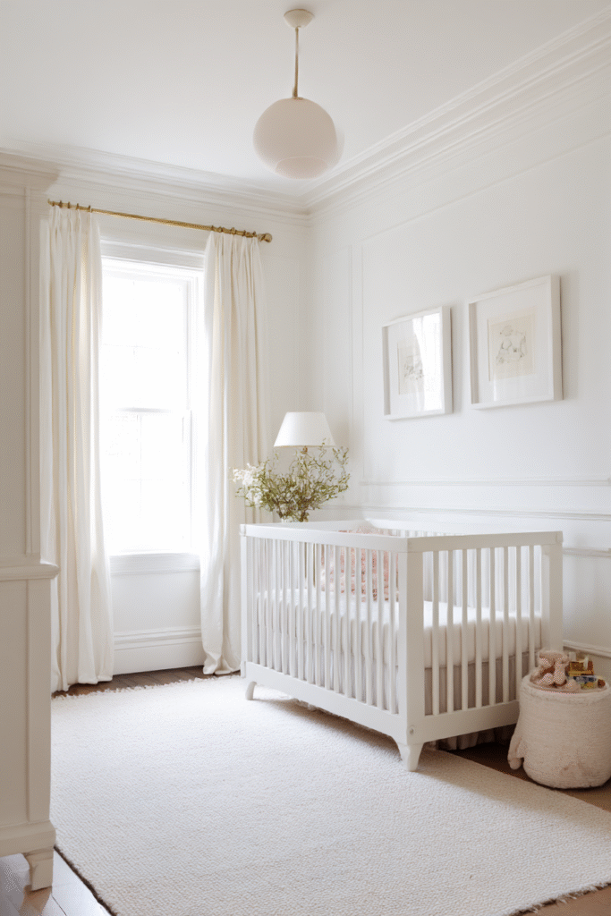
White walls are the ultimate blank canvas. They make small nurseries feel larger and airier. Plus, an all-white backdrop allows your toys, books, and art to serve as the main focal points.
The key to a white room is choosing the right undertone. Look for creamy whites with yellow or red undertones to ensure the space feels cozy rather than sterile or hospital-like.
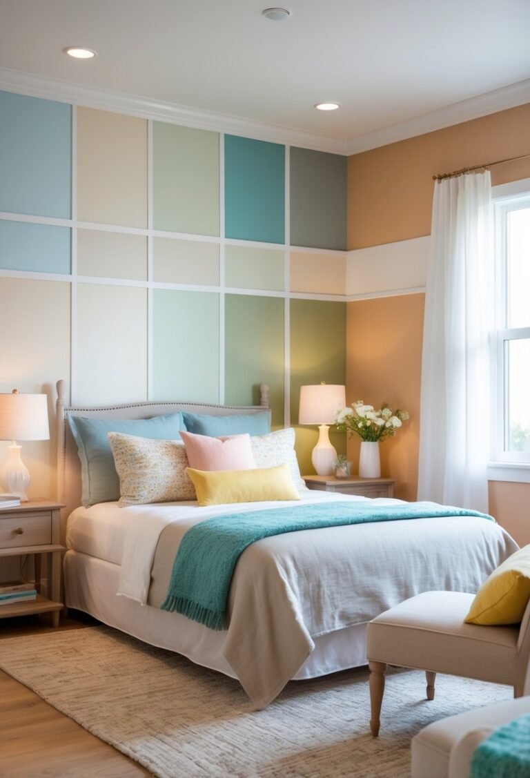
7. Accent Walls with Geometric Patterns
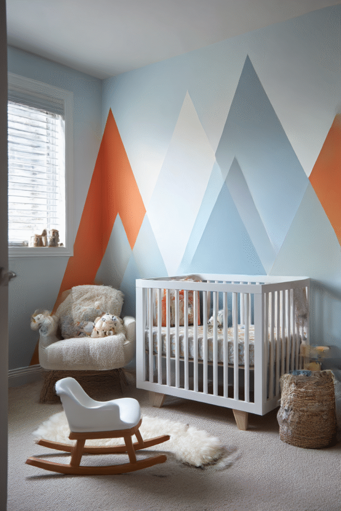
If painting the whole room feels too plain, try a geometric accent wall. Using painter’s tape, you can create triangles, mountains, or diamonds to add visual depth.
This technique stimulates a baby’s cognitive development, as high-contrast patterns capture their attention. Stick to three complementary colors to keep the design cohesive and not chaotic.
8. Murals for a Creative Atmosphere
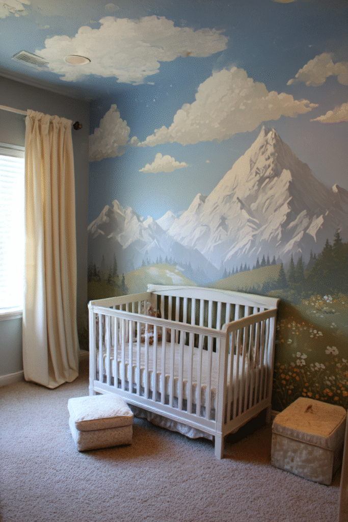
Hand-painted murals turn a nursery into a storybook world. Whether it’s a mountain range, a floral garden, or a starry night sky, a mural adds a unique, personal touch.
You don’t need to be a professional artist to achieve this. Many parents use stencils or projectors to trace outlines before painting, making the process simple and achievable.
9. Metallic Accents for Subtle Elegance
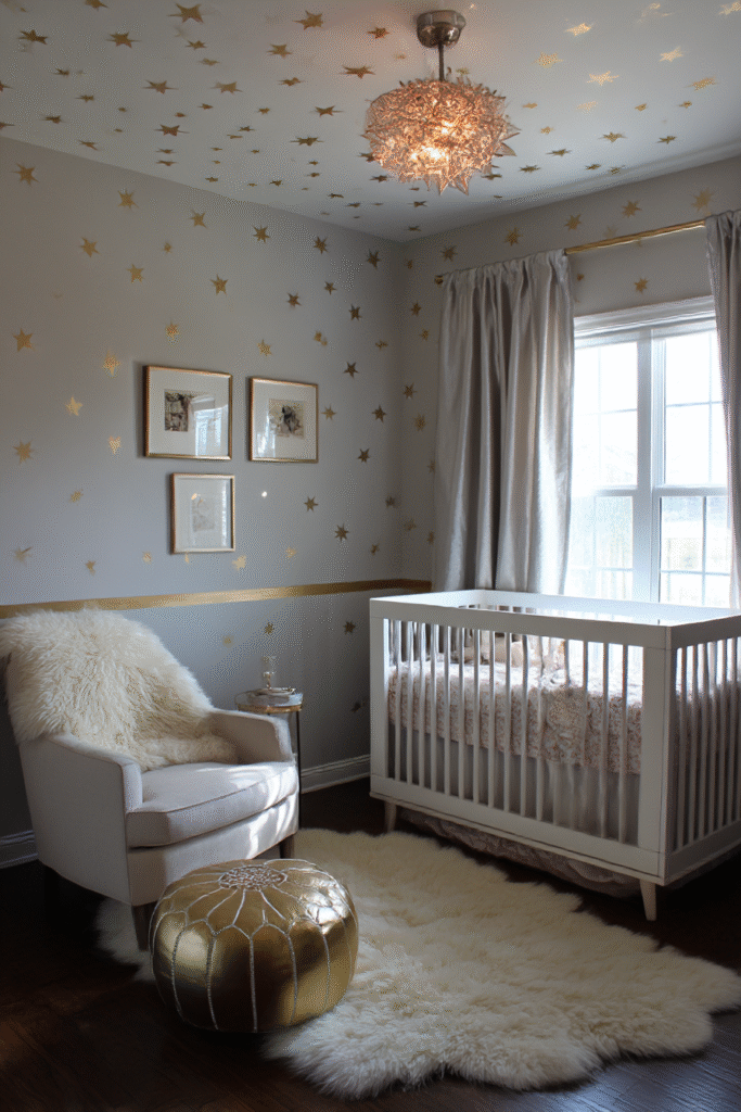
A little shimmer goes a long way. Using metallic gold, silver, or copper paint for stenciled stars or polka dots adds a touch of magic to the room.
Keep the metallic elements minimal so they catch the light without overwhelming the space. A subtle gold stripe near the ceiling can add a surprising amount of elegance.
10. Striped Walls for Visual Interest
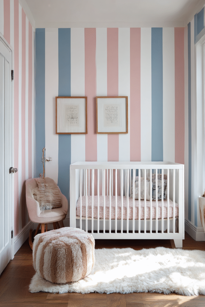
Stripes are a classic design element that can manipulate how large a room feels. Vertical stripes make low ceilings feel higher, while horizontal stripes make a narrow room feel wider.
Thick, bold stripes in contrasting colors create a modern look. For a subtler approach, paint stripes using the same color but alternate between matte and semi-gloss finishes.
11. Two-Toned Walls for Contrast
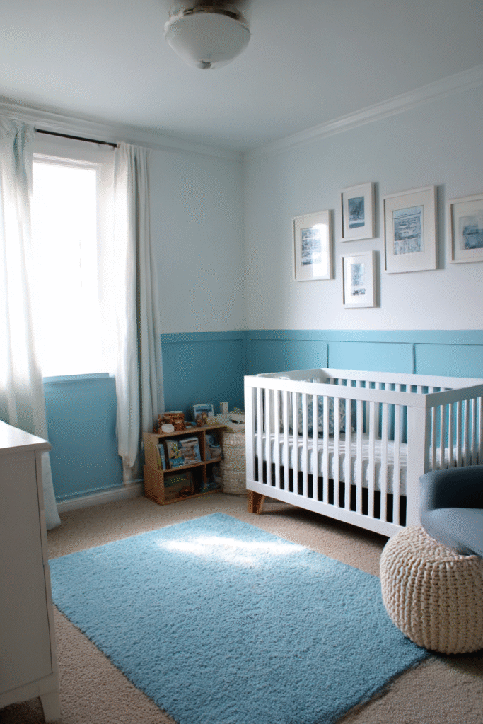
Painting the bottom half of the wall one color and the top half another is a practical and stylish choice. It adds character and architectural interest, even in a boxy room.
Use a darker color on the bottom third to hide scuff marks from toys and sticky fingers. A lighter color on top keeps the room feeling open and bright.
12. Lavender for a Restful Retreat
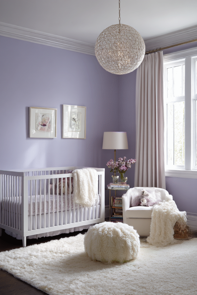
Lavender creates a tranquil environment that encourages sleep. It combines the calmness of blue with the warmth of red, offering a balanced and sophisticated look.
This shade works particularly well with white furniture and soft, fluffy textiles. It’s a distinct alternative to pink that still feels soft and gentle.
13. Beige and Taupe for Earthy Warmth
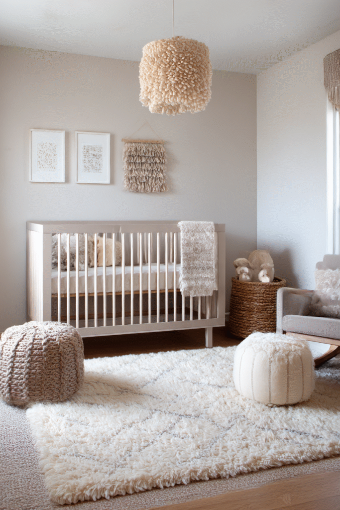
Earthy neutrals like beige, sand, and taupe are trending in nursery design. They create a grounded, “Boho” feel that is incredibly relaxing.
These colors are easy to update as your child’s tastes change. Simply swap out rugs and throw pillows to completely transform the room without picking up a paintbrush again.
Creating Your Dream Nursery
Choosing the paint color is just the first step in building a world for your little one. By considering the mood you want to set and how the light works in your room, you can create a space that nurtures both creativity and rest.
Ready to find the furniture that matches your perfect shade? Browse our collection of sustainable, handcrafted cribs and dressers to complete your nursery vision today.