16 Neutral Paint Colors That Will Transform Your Living Room
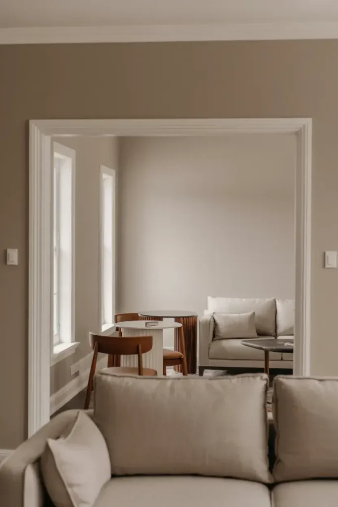
Choosing a paint color for your living room is one of the most high-stakes design decisions you can make. It sets the tone for the entire house, serving as the backdrop for movie nights, holiday gatherings, and lazy Sunday afternoons.
But if you’ve ever stared at a wall of paint chips, you know that “neutral” is far more complex than just picking a shade of beige. With hundreds of whites, grays, and taupes to choose from, finding the one that feels right can be overwhelming.
In this guide, I’m sharing 16 of the best neutral paint colors that top designers and homeowners swear by. I’ll break down exactly why they work, how light affects them, and which colors pair best with them, so you can pick up that roller with total confidence.
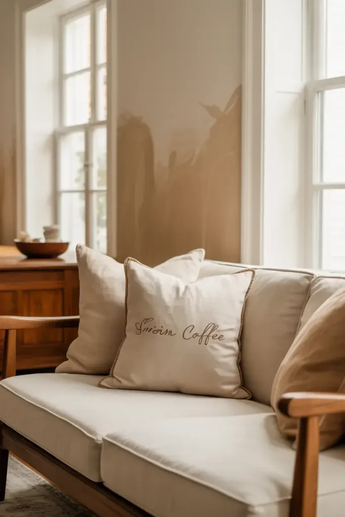
1. Sherwin-Williams Alabaster (SW 7008)
I often recommend Alabaster when a client wants a white that doesn’t feel sterile or cold. It was Sherwin-Williams’ 2016 Color of the Year for a reason. This soft, warm off-white creates a cozy atmosphere without sacrificing brightness.
It has an LRV (Light Reflectance Value) of 82, meaning it reflects a significant amount of light but stops short of being blinding.
Pro Tip: Use Alabaster in north-facing rooms to counteract the cool natural light. Pair it with warm wood tones and brass accents for a timeless, inviting look.
2. Benjamin Moore Revere Pewter (HC-172)
Revere Pewter is widely considered the ultimate “greige”—a perfect blend of gray and beige. It acts as a bridge between warm and cool tones, making it incredibly versatile for open-concept homes where you might have different furniture styles.
Because it has an LRV of roughly 55, it provides enough depth to contrast beautifully against crisp white trim without making the room feel dark.
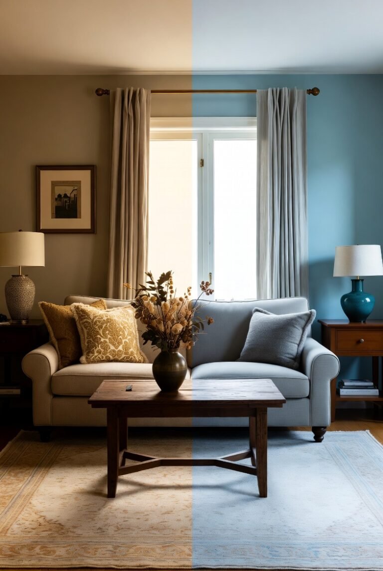
Pro Tip: This color can look grayer in north-facing light and more beige in south-facing light. Always test a swatch on multiple walls to see how the sun changes the hue throughout the day.
3. Farrow & Ball Ammonite (No. 274)
Named after the fossils found on the Dorset coast, Ammonite is a naturally understated gray that feels incredibly sophisticated. It is neither too warm nor too cool, striking a delicate balance that works well in both modern and historic homes.
I love using this shade because it has a hushed quality that brings an immediate sense of calm to a busy living space.
Pro Tip: Combine Ammonite with Farrow & Ball's "All White" on the ceiling and trim. The subtle contrast enhances the soft gray tones and makes your architectural details pop.
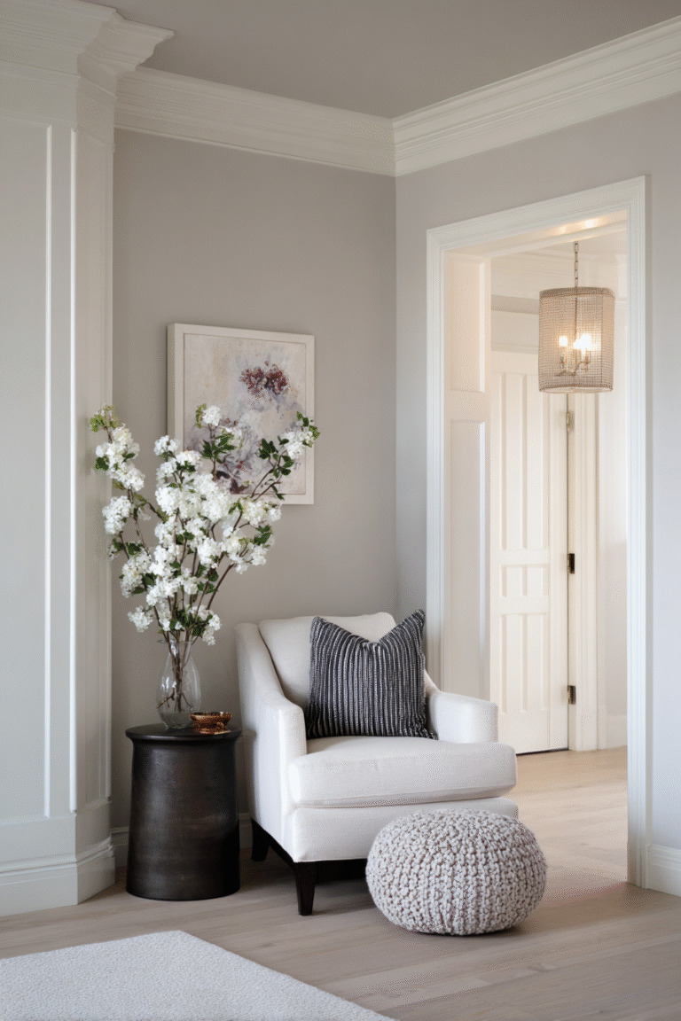
4. Sherwin-Williams Agreeable Gray (SW 7029)
Agreeable Gray is Sherwin-Williams’ number one best-selling paint color, and it’s easy to see why. It essentially works with everything. It has a warm, taupe undertone that prevents it from feeling like concrete, yet it stays true to a clean gray aesthetic.
With an LRV of 60, it reflects a good amount of light, keeping your living room airy even on cloudy days.
Pro Tip: If your living room has honey oak floors or cabinets, Agreeable Gray is a lifesaver. Its warmth harmonizes with the yellow wood tones rather than clashing with them.
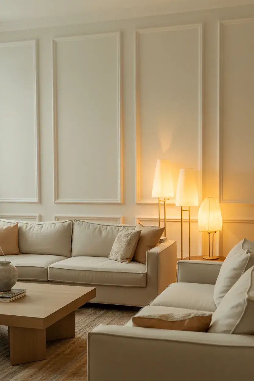
5. Benjamin Moore White Dove (OC-17)

White Dove is a cult favorite among interior designers for its soft, creamy luminosity. It is a clean white with a tiny hint of yellow, which adds warmth and dimension. This prevents the room from feeling stark or hospital-like.
I find it reflects light beautifully, creating a soft glow in the evening when lamps are turned on.
Pro Tip: This is an excellent choice for walls if you want to highlight colorful artwork or a bold rug. It serves as a quiet, supportive background that lets your decor take center stage.
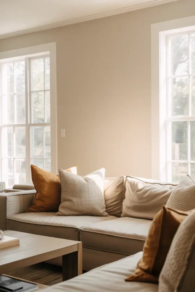
6. Sherwin-Williams Accessible Beige (SW 7036)
If you are tired of gray but scared of yellow-based beiges, Accessible Beige is your solution. Unlike many traditional beiges, it has a gray undertone. This crucial difference keeps the color feeling fresh and modern rather than dated.
It sits comfortably in the mid-range with an LRV of 58, offering a cozy, snug feel that wraps around you.
Pro Tip: Pair this color with "Super White" trim for a crisp, tailored look. It also looks stunning alongside natural stone fireplaces or rustic wooden beams.
7. Benjamin Moore Classic Gray (OC-23)
Classic Gray is part of Benjamin Moore’s Off-White collection, but I consider it a very pale gray. It is essentially a “whisper” of color. It is perfect for those who want just a hint of pigment to distinguish the walls from the ceiling.
Because it is so light (LRV roughly 74), it can make small living rooms feel significantly larger and more open.
Pro Tip: This shade is incredibly sophisticated when paired with dark charcoal or navy accents. Use it in a gallery wall setting to let your frames stand out.
8. Sherwin-Williams Sea Salt (SW 6204)
While technically a color, Sea Salt functions as a stunning neutral in many homes. It is a gray-green with blue undertones that shifts dramatically depending on the light. In bright light, it feels fresh and coastal; in dim light, it reads as a muted gray.
I recommend this for living rooms where you want to induce relaxation. Color psychology suggests soft greens reduce stress.
Pro Tip: Avoid pairing this with yellow-based trim, as it can make the green look muddy. Stick to crisp, cool whites like "Extra White" (SW 7006) for the cleanest look.
9. Farrow & Ball Skimming Stone (No. 241)
Skimming Stone has a warm, stony feel that mimics the color of skimmed milk or plaster. It sits right in the middle of the neutral spectrum—not quite gray, not quite cream. It has a depth and texture to it that many flat latex paints miss.
I appreciate how this color brings a historic, lived-in character to a room, even if the house is a new build.
Pro Tip: This color pairs exceptionally well with darker, moodier grays like "Elephant's Breath." Use the darker shade on a feature wall or fireplace breast for a cohesive, designer look.
10. Sherwin-Williams Shoji White (SW 7042)
Shoji White is a creamy, warm white that leans slightly towards greige. It is fantastic for open floor plans because it flows effortlessly from room to room. It has a rich, velvety quality that feels luxurious without being showy.
With an LRV of 74, it is bright but has enough body to hide minor wall imperfections better than a stark white would.
Pro Tip: Use matte black hardware and lighting fixtures in a room painted Shoji White. The high contrast looks incredibly modern and chic.
11. Benjamin Moore Edgecomb Gray (HC-173)
Edgecomb Gray is a timeless shade that sits squarely between gray and beige. It is slightly lighter than Revere Pewter, making it a better choice if your living room doesn’t get a ton of natural light.
I love that it feels earthy and organic. It provides a soft, welcoming backdrop that feels very natural.
Pro Tip: This color looks beautiful with linen fabrics and woven textures like jute rugs. It amplifies that organic, "California Casual" aesthetic.
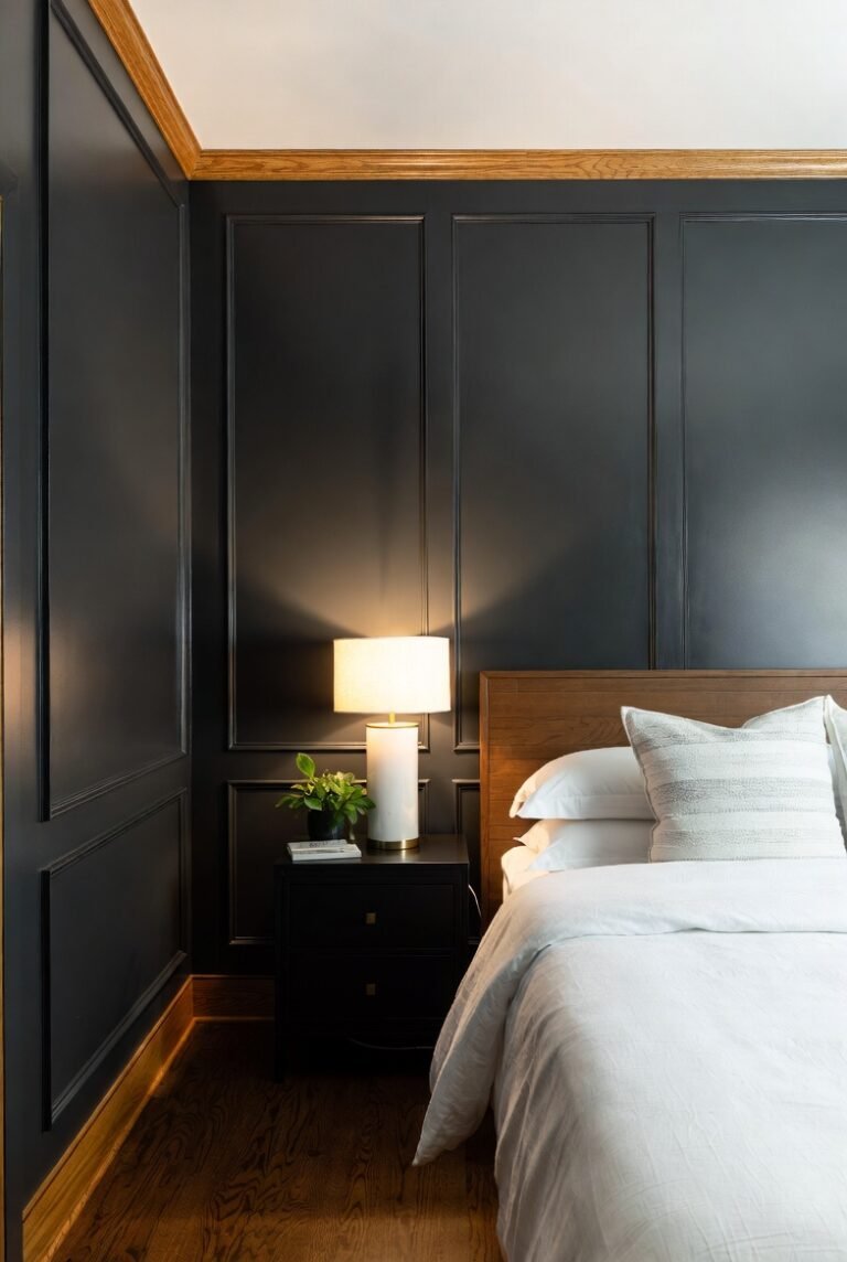
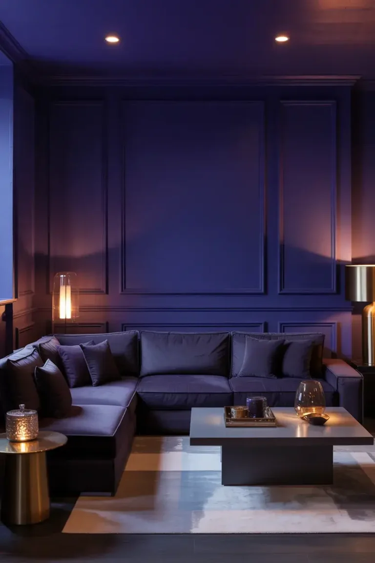
12. Sherwin-Williams Urbane Bronze (SW 7048)
Who says neutrals have to be light? Urbane Bronze is a rich, grounding brownish-gray that adds instant drama. It was the 2021 Color of the Year, celebrated for its ability to create a sanctuary-like feel.
I encourage clients to be bold and use this on all four walls for a cozy, “cocooning” effect, or use it on built-in bookshelves.
Pro Tip: If you paint the walls this dark, keep the ceiling light to prevent the room from feeling like a cave. Add plenty of warm ambient lighting to keep the space inviting.
13. Benjamin Moore Chantilly Lace (OC-65)
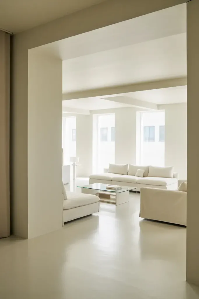
If you are hunting for the purest, cleanest white, look no further than Chantilly Lace. It has almost no visible undertones, making it a true neutral white. It reflects light purely, creating a bright, crisp, and clean environment.
I use this often in modern, minimalist living rooms where the architecture speaks for itself.
Pro Tip: Because it has no undertones, it picks up the colors of things around it (like a green lawn outside). Be aware of your surroundings before committing to a whole room.
14. Sherwin-Williams Repose Gray (SW 7015)
Repose Gray acts as a true gray but has a slight warmth that keeps it from turning blue or purple, which is a common problem with gray paints. It is incredibly reliable and reads consistently in various lighting conditions.
It has an LRV of 58, providing a perfect mid-tone backdrop that feels substantial and intentional.
Pro Tip: This color plays very well with dark wood floors. The slight contrast highlights the richness of the wood grain without competing with it.
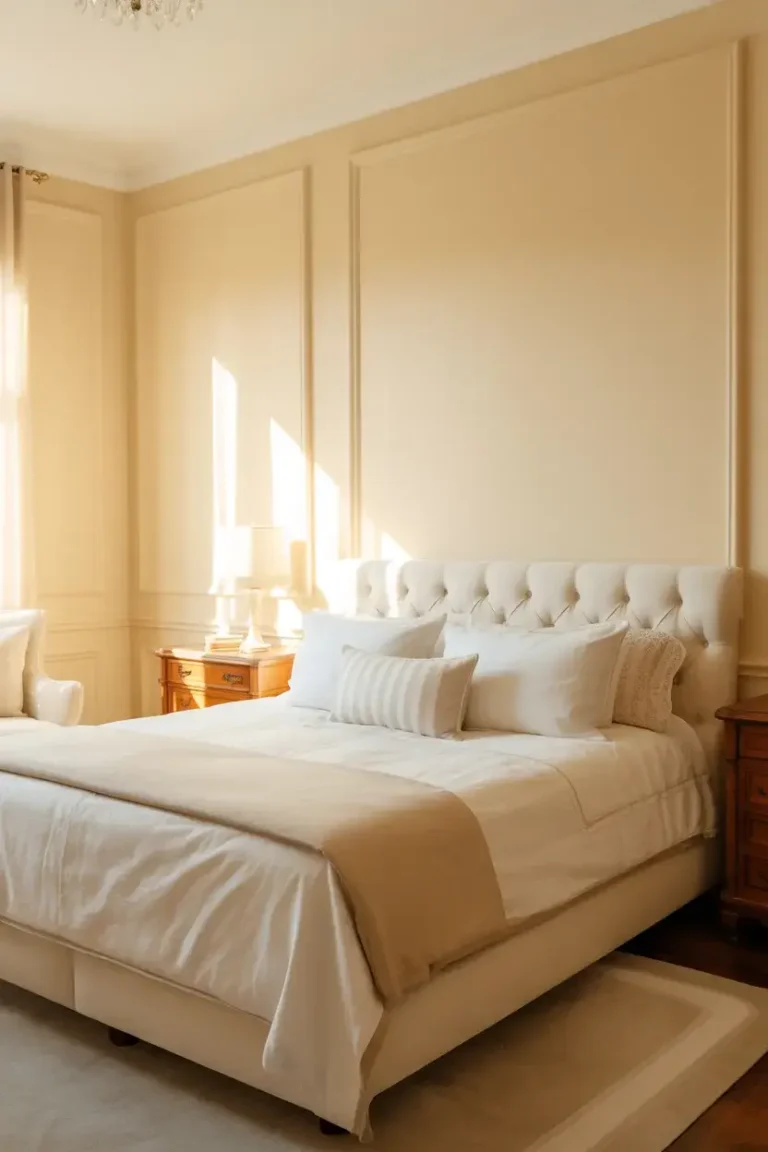
15. Benjamin Moore Swiss Coffee (OC-45)
Swiss Coffee is a go-to warm white that has been a designer favorite for decades. It is creamy and soft, invoking the feeling of a warm latte. It is less yellow than some creams but definitely warmer than a stark white.
I find it adds a layer of history and charm to a room, making it feel established and comfortable.
Pro Tip: This is a top choice for traditional or farmhouse-style living rooms. It pairs wonderfully with antique furniture and brass finishes.
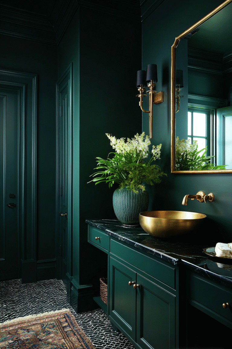
16. Sherwin-Williams Tricorn Black (SW 6258)
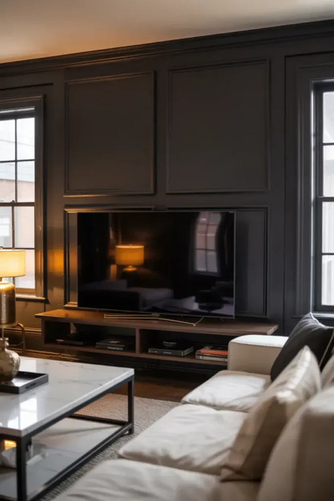
Black is the ultimate neutral. Tricorn Black is a deep, saturated black with virtually no undertones. Using it in a living room is a bold move that pays off by blurring the lines of the room and making walls recede.
I love using this for an accent wall behind a TV (it camouflages the screen!) or for painting interior window sashes to frame the view.
Pro Tip: Use a matte or eggshell finish when painting walls black. Higher sheen finishes will reflect too much light and highlight every bump in the drywall.
Conclusion
Your living room walls are the canvas for your life, and choosing the right neutral color is the first step in creating a home you love. Whether you lean towards the cozy warmth of Accessible Beige or the crisp, modern feel of Chantilly Lace, there is a perfect shade on this list for you.
If you’re ready to start your transformation but need a second opinion, book a consultation with our design team today. Let’s make your dream living room a reality.