15 Neutral Bedroom Accent Wall Ideas That Will Transform Your Space
I often hear people say that neutral colors are boring, but I couldn’t disagree more. When done right, a neutral palette brings a sense of calm and sophistication that bold colors simply can’t match.
If you want to refresh your bedroom without committing to a wild color scheme, a neutral accent wall is the perfect solution. It adds depth and character while keeping the vibe serene.
Plus, it’s a smart investment. According to recent data from Angi, a fresh interior paint job can provide a return on investment (ROI) of around 107%.
I’ve gathered 15 of my favorite ideas to help you create a stunning focal point in your sanctuary.
1. The Classic Warm Beige
Paint is the easiest way to start. I always gravitate towards warm beige tones because they make a room feel cozy instantly. Benjamin Moore experts note that neutrals like beige and gray consistently dominate their bestseller lists for this exact reason.
Instead of a flat white, choose a beige with warm undertones. It reflects light beautifully and keeps the room from feeling sterile.
Tip: Check the Light Reflectance Value (LRV) on your paint swatch. Sherwin-Williams explains that this 0-100 scale measures how much light a color reflects. I recommend aiming for a higher LRV (above 50) if your room lacks natural light.
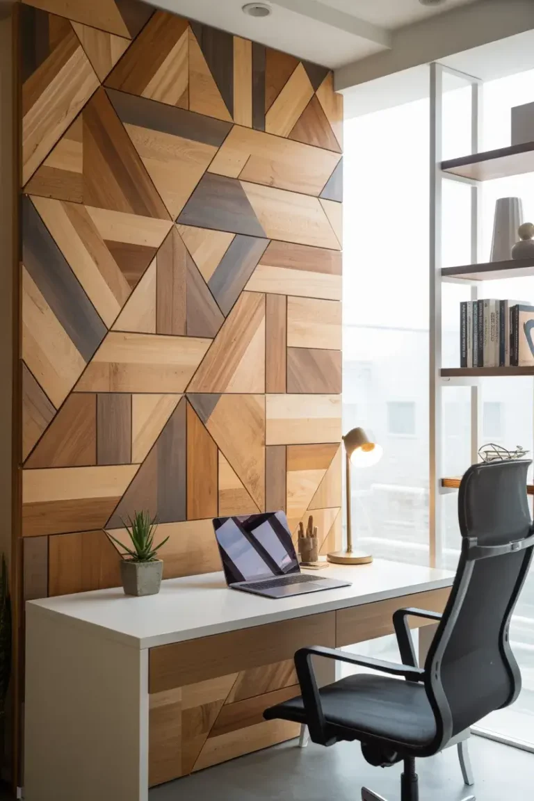
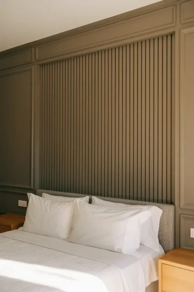
2. Vertical Wood Slats
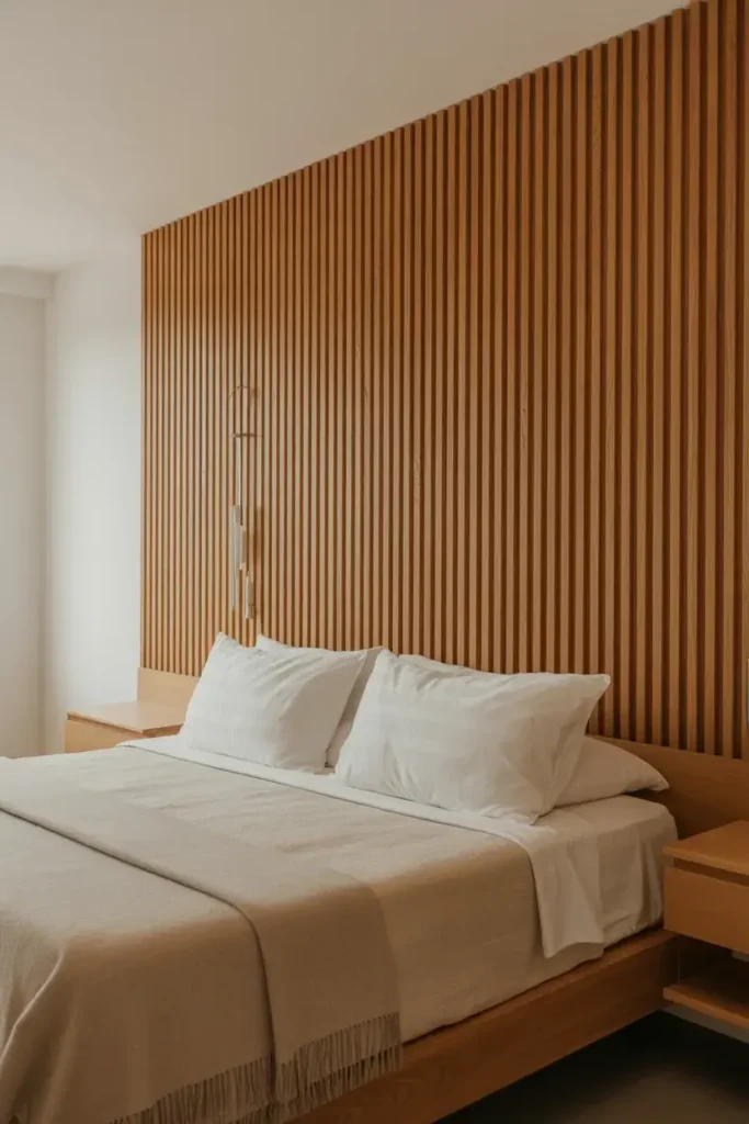
If you want texture, wood slats are my top pick. This look has exploded in popularity recently, with interior designers identifying it as a major trend for 2025.
I love how the vertical lines draw the eye upward, making your ceilings look higher. You can leave the wood natural for a Scandi vibe or paint the slats the same color as the wall for a subtle, monochromatic look.
Tip: Install the slats behind your bed to act as a floor-to-ceiling headboard. It frames the sleeping area perfectly without needing extra furniture.
3. Textured Limewash
Limewash paint creates a cloudy, suede-like texture that feels ancient yet modern. I find this technique adds incredible movement to a flat wall without being overwhelming.
The chalky finish absorbs light rather than reflecting it, which creates a super soft, dreamy atmosphere. It’s perfect for a bedroom where you want to wind down.
Tip: Use a large block brush and apply the paint in X-strokes. This technique creates that signature cloudy effect that makes limewash so special.
4. Modern Board and Batten
Board and batten isn’t just for farmhouses anymore. I use it to add architectural interest to plain drywall. By arranging the battens in a grid or geometric pattern, you get instant sophistication.
Paint the entire wall, including the trim, in a calming greige (gray-beige). This “color-drenching” technique makes the molding look built-in and expensive.
Tip: Measure your wall twice before buying materials. I always map out my spacing with painter's tape first to ensure the grid looks balanced.
5. Grasscloth Wallpaper
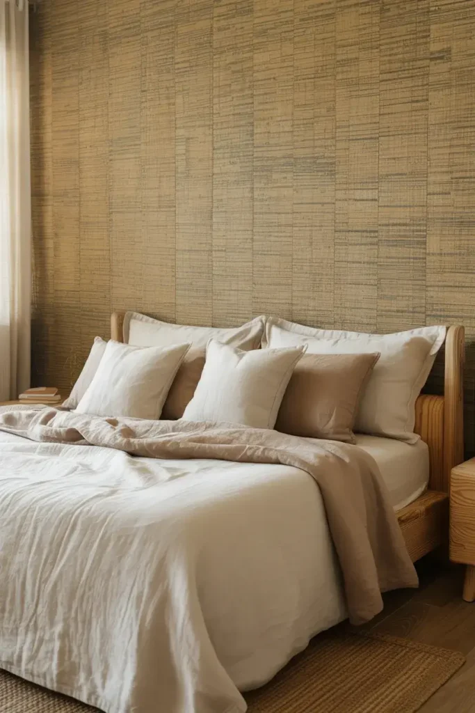
For a touch of nature, I recommend grasscloth wallpaper. It is made from natural fibers, so every roll has slight variations that add rich texture to the room.
It usually comes in earthy tones like wheat, seagrass, and taupe. It feels organic and pairs beautifully with linen bedding.
Tip: Keep in mind that real grasscloth has seams that will be visible. I consider this part of its charm, but if you prefer a seamless look, opt for a high-quality faux vinyl version.
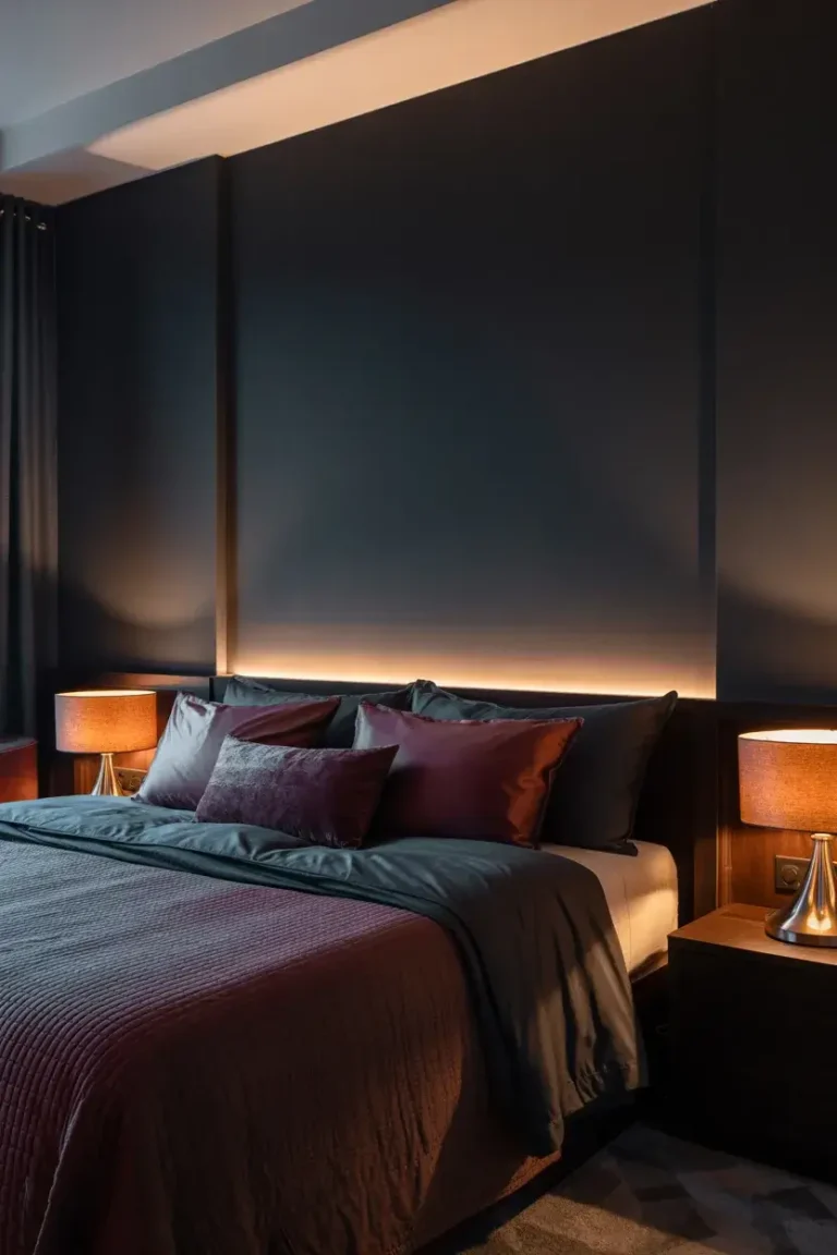
6. The Painted Arch
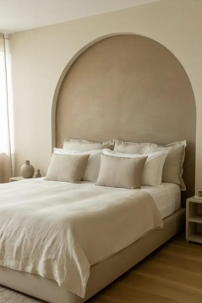
You don’t need to paint the whole wall to make a statement. I love painting a large arch directly behind the bed or a vanity area. It creates a focal point that anchors your furniture.
I usually choose a shade two or three tones darker than the main wall color. It provides just enough contrast to pop without breaking the neutral palette.
Tip: Use a string and a pencil to draw your arch curve. Pin the string to the center point of your circle, hold the pencil at the end, and swing it like a compass for a perfect arc.
7. Concrete Texture
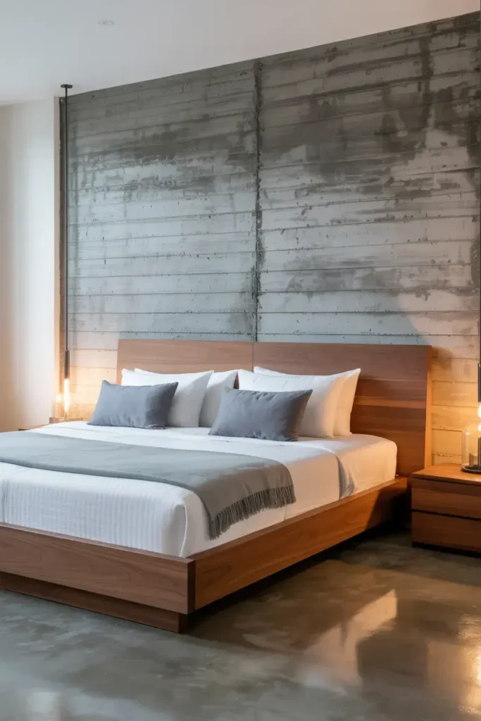
Industrial style can still be cozy. I use faux concrete finishes to bring an edgy, urban feel to a bedroom. You can achieve this with specialized plasters or even concrete-effect wallpapers.
The cool gray tones work amazingly well with warm wood furniture. It creates a balance of temperature that feels very high-end.
Tip: Soften the look with plenty of textiles. I always add a chunky knit throw or velvet pillows to contrast against the "hard" look of the concrete.
8. Shiplap Cladding
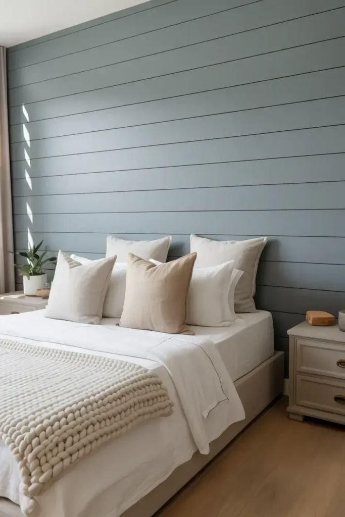
Shiplap offers a timeless, coastal feel that I find very relaxing. The horizontal lines widen the room visually, which is great for smaller bedrooms.
While white is traditional, I prefer painting shiplap in a soft dove gray or a creamy mushroom color. It keeps the texture visible but feels more contemporary than stark white.
Tip: Use nickel gap boards for cleaner lines. They have a consistent gap that looks sharper and more modern than traditional overlapping boards.
9. Two-Tone Split Wall

This is one of the easiest DIYs I recommend. Paint the bottom half of your wall a darker neutral, like charcoal or taupe, and leave the top half light.
It grounds the space and adds visual weight near the floor, which can make the room feel taller. Plus, darker paint hides scuff marks better, making it practical for busy homes.
Tip: Install a chair rail or a thin piece of trim where the two colors meet. It gives a crisp, finished edge and hides any imperfect paint lines.
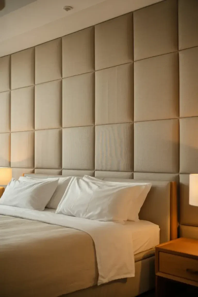
10. Upholstered Wall Panels

For the ultimate luxury, I suggest upholstering the accent wall. Large fabric panels add softness and soundproofing, making your bedroom quiet and hotel-like.
I stick to durable fabrics like linen or velvet in neutral shades. It turns the entire wall into a massive, comfortable headboard.
Tip: If custom panels are out of budget, I use peel-and-stick upholstered tiles. They are affordable and easy to install yourself in an afternoon.
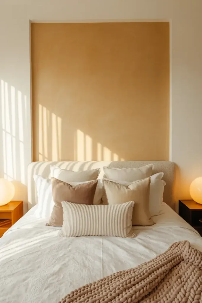
11. Subtle Geometric Mural
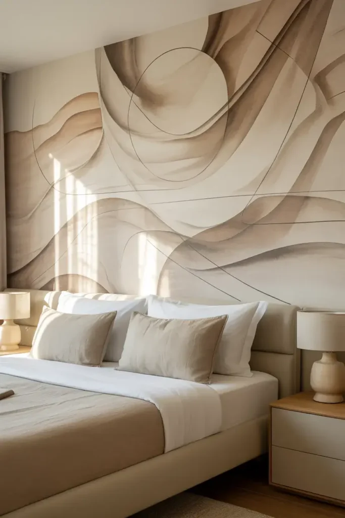
Murals don’t have to be loud. I love creating large-scale geometric shapes using slightly different shades of the same color.
Think large circles or abstract flowing lines in varying tints of beige. It looks like art, but because the contrast is low, it remains peaceful.
Tip: Draft your design on paper first. I take a photo of the wall and sketch over it on my phone to visualize the scale before I start painting.
12. Stone Veneer
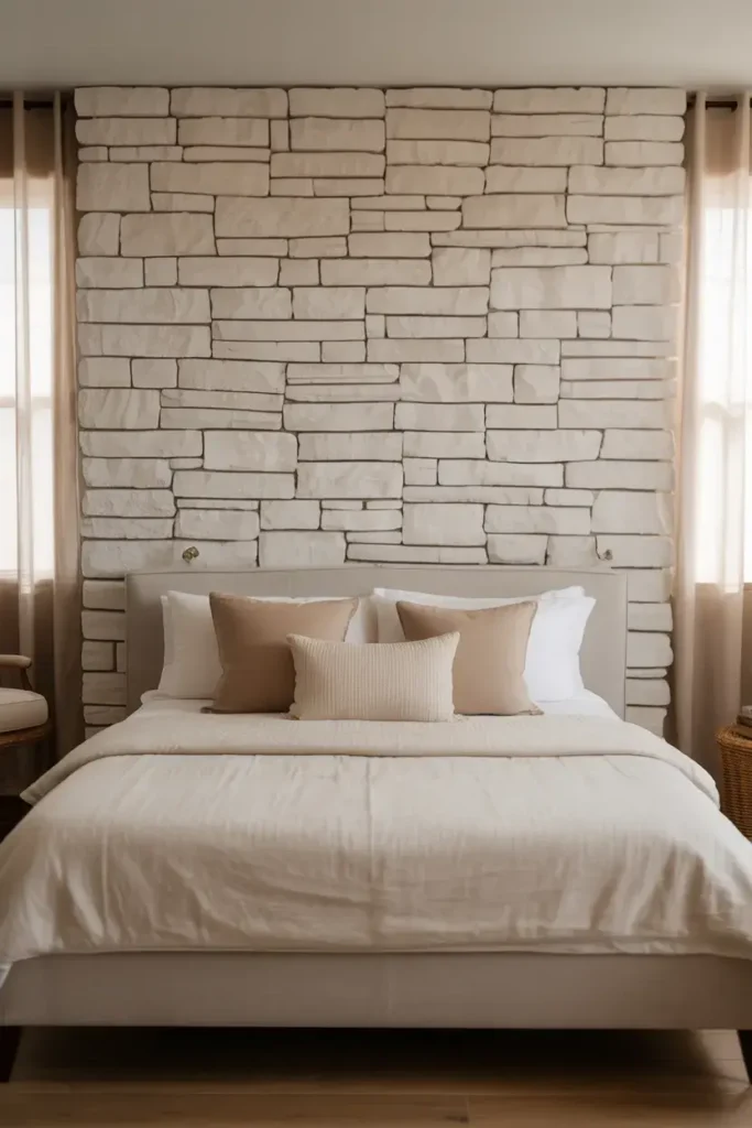
Bringing the outdoors in is a trend that isn’t going away. I use lightweight stone veneer to create a feature wall that feels rustic and solid.
Stacked stone in white or cream adds immense texture. It works particularly well behind a bed or framing a fireplace if you’re lucky enough to have one in your bedroom.
Tip: Lighting is key here. I install wall sconces or track lighting aimed at the stone to cast shadows and highlight the rough texture.
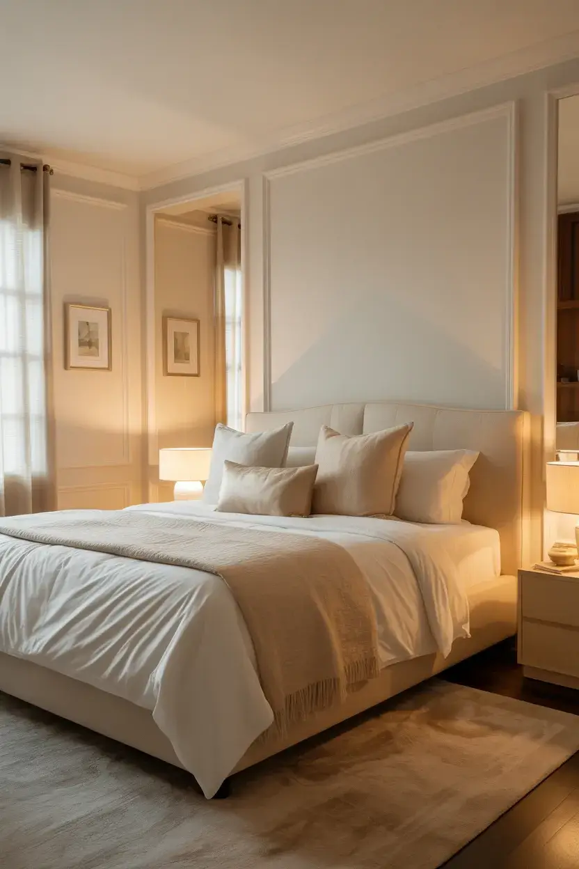
13. Tone-on-Tone Picture Frame Molding
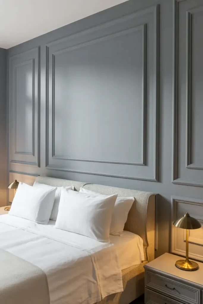
This is a classic that elevates any room. I apply simple picture frame molding to the walls and paint everything—molding, baseboards, and wall—in the same matte neutral color.
The shadow lines created by the molding provide the “accent” without needing a different color. It feels incredibly elegant and Parisian.
Tip: Use a spacer block when installing. I cut a small piece of wood to the exact width I want between boxes so I don't have to measure every single gap.
14. Ombre Effect
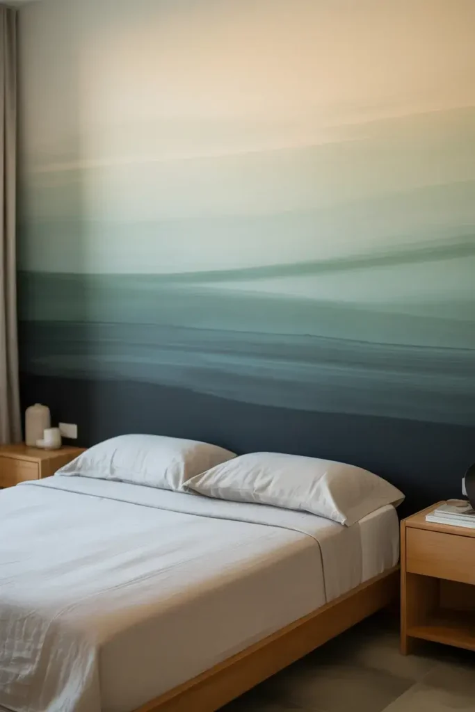
I find an ombre wall to be very dreamy. By blending a darker neutral at the bottom into a lighter shade at the top, you create a soft, gradient effect.
It mimics the look of a sunrise or a misty horizon. This lack of hard lines is perfect for a sleep environment where you want to reduce visual noise.
Tip: Work while the paint is wet. I use a dry brush to blend the two colors where they meet in the middle to get a smooth transition.
15. Oversized Gallery Wall
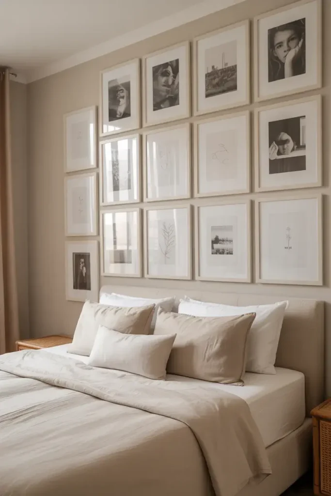
Sometimes the wall itself stays simple, and the “accent” comes from what you put on it. I love a floor-to-ceiling gallery wall using frames in the same neutral color family.
Keep the art monochromatic—black and white photos, line drawings, or botanical prints. It adds personality and visual interest without introducing chaotic colors.
Tip: Lay out your frames on the floor first. I arrange them until I’m happy with the balance, then snap a picture to use as a reference guide for hanging.
Conclusion
Creating a neutral accent wall is one of the best ways to upgrade your space without a massive renovation. Whether you grab a paint roller or install some wood slats, you will love the new focal point in your room.
If you’re ready to get started but aren’t sure which neutral tone suits your lighting, grab a few samples and test them out this weekend!