15 Moody Bedroom Walls That Feel Luxurious
I used to believe that small rooms needed white walls to feel open, but I have completely changed my mind. There is something incredibly comforting about stepping into a bedroom wrapped in deep, saturated color. It feels less like a box and more like a warm embrace.
If you are looking to transform your sleeping space into a high-end sanctuary, going dark is the way to do it. From soft blacks to earthy browns, moody walls add instant sophistication and can actually improve your sleep by reducing visual noise.
Here are 15 moody bedroom wall ideas that feel undeniably luxurious.
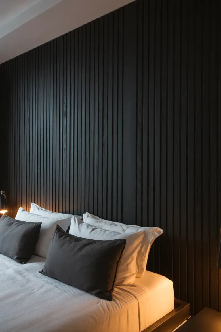
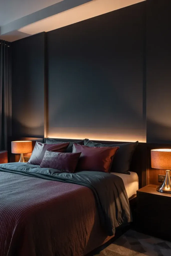
1. Embrace Soft Black for New Energy
I know painting a room black sounds intimidating, but it is actually one of the warmest choices you can make. I specifically love “Cracked Pepper” by Behr because it isn’t a harsh pitch-black; it’s a soft charcoal that feels cozy.
Research from Behr actually backs this up. They found that 54% of Americans believe black tones create a new energy in the home, and 61% of millennials say it gives a space an instant fresh look. I suggest pairing this shade with warm wood furniture to keep the vibe grounded rather than gothic.
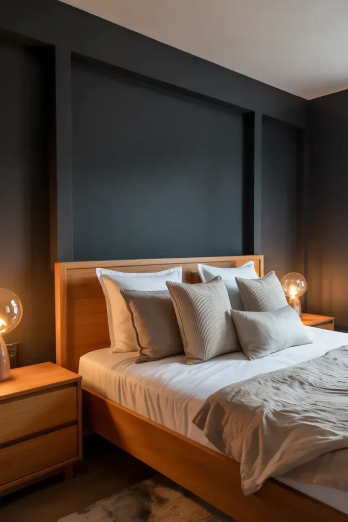
2. Drench the Room in Color
I always tell people that if you want a truly immersive experience, you shouldn’t stop at the walls. “Color drenching” is a technique where you paint the trim, baseboards, and even the ceiling the same color as the walls.
Designer Dan Mazzarini predicts we will see more requests for this, noting that it makes the room feel “coated” in color. I find this technique blurs the boundaries of the room, which oddly makes small bedrooms feel larger and infinitely more expensive.
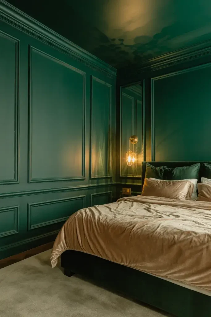
3. Create a Sanctuary with Deep Olive
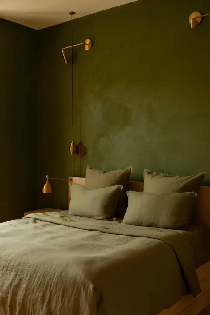
If you want your bedroom to feel like a retreat, deep olive green is my top recommendation. Dutch Boy Paints named “Ironside”—a deep, dark olive—their color of the year because it taps into our need for wellness.
Ashley Banbury from Dutch Boy notes that creating a space for wellness is a driving factor in everyday life right now. I love pairing this shade with brass lighting fixtures; the gold tones pop beautifully against the dark green backdrop.
4. Explore the Cosmos with Violet-Blue
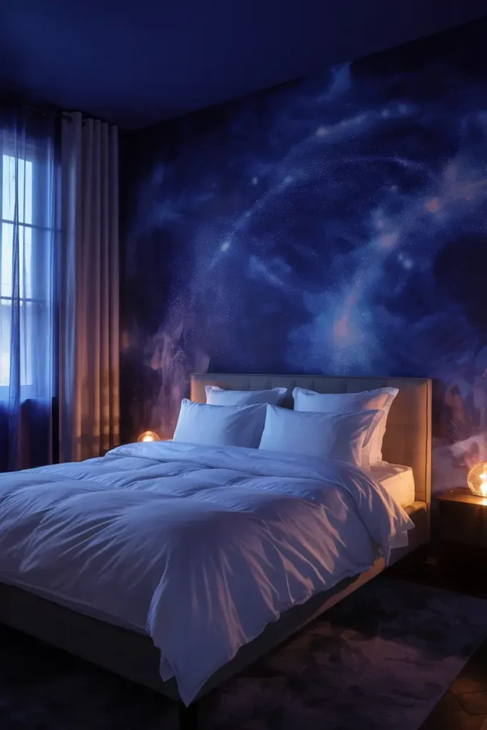
For a color that feels a bit more mysterious, I suggest looking at deep violet-blues. Benjamin Moore’s “Blue Nova” is a perfect example of this. It balances depth with intrigue, inspired by the formation of new stars in space.
I think this color works exceptionally well in bedrooms because it changes with the light. In the morning, it feels energizing, but at night, it settles into a sleepy, soothing indigo that helps you wind down.
5. Switch to Earthy Brown
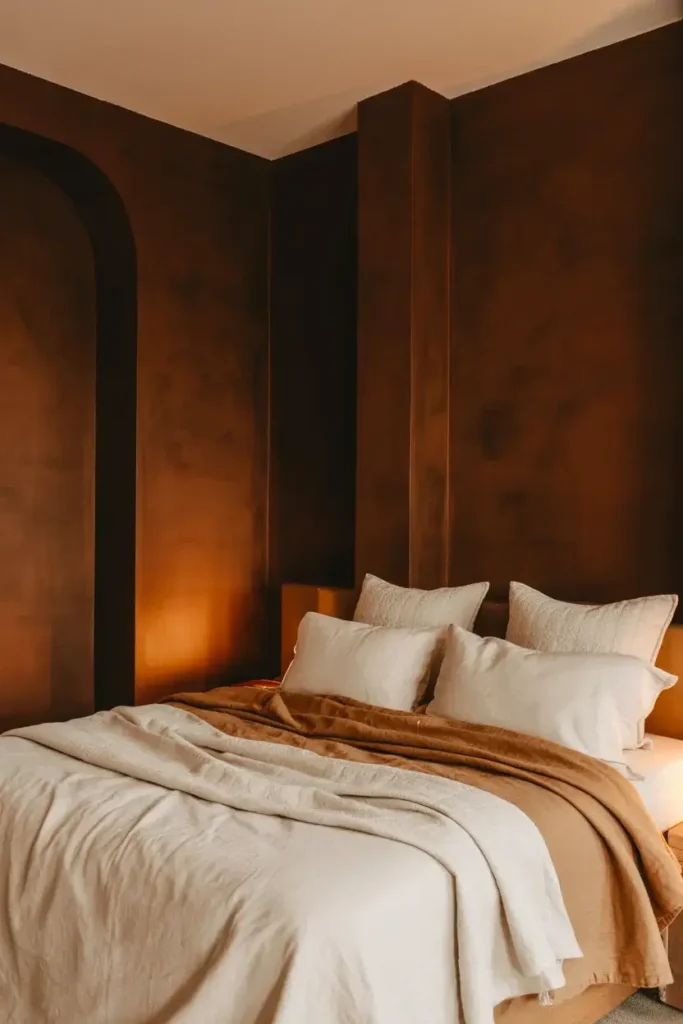
I am seeing a huge shift away from gray and toward brown. It is becoming the new standard for neutrals. Designer Shea McGee notes that we are moving toward colors “rooted in brown with earthy undertones.”
I recommend trying a shade like Sherwin Williams’ “Sable.” It feels rich and chocolatey without being muddy. To prevent it from feeling too heavy, I like to mix in lighter linens and cream-colored throws.
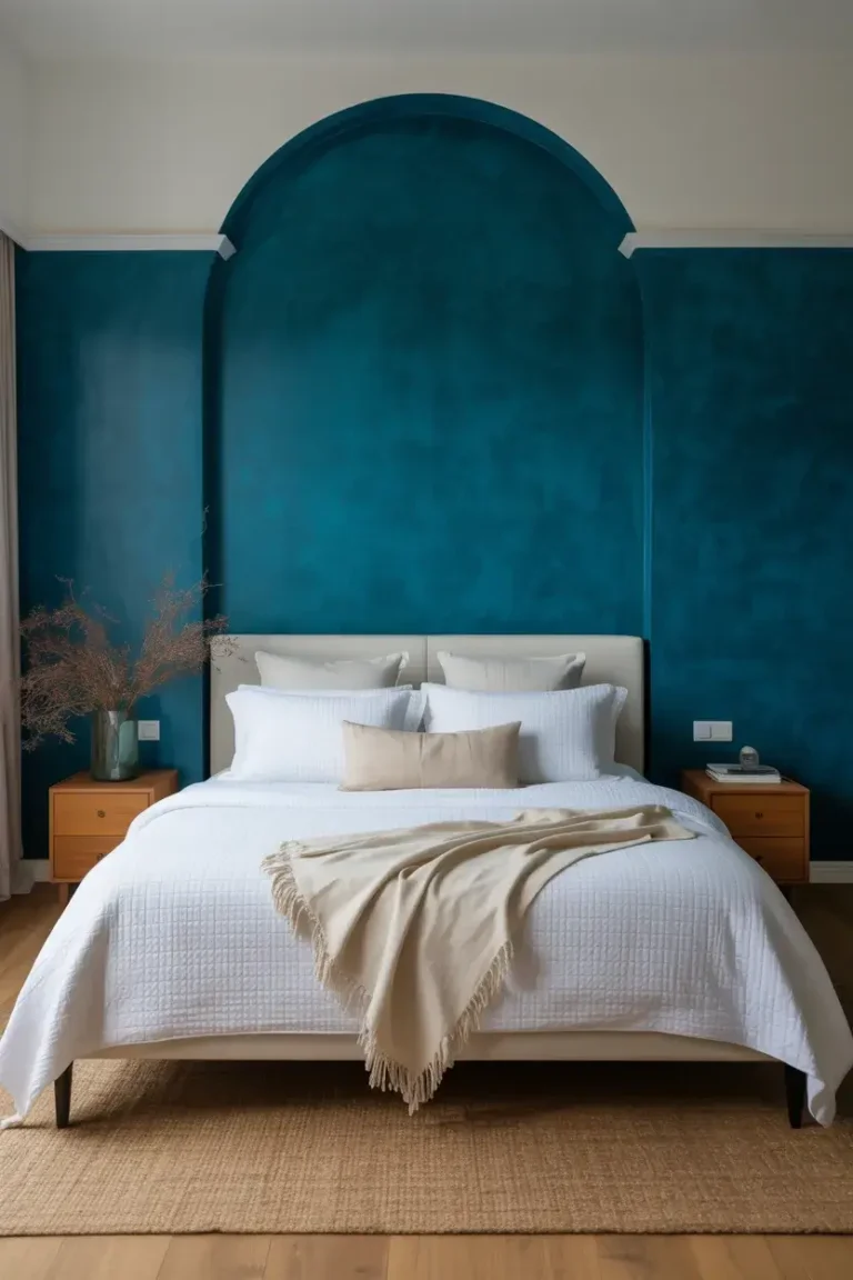
6. Indulge in Jewel-Tone Teal
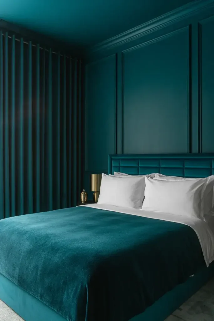
If you want high drama, nothing beats a deep teal. Designer Brad Ramsey created a stunning dining room using Benjamin Moore’s “Dark Harbor,” and I think this look translates perfectly to a primary bedroom.
He suggests getting ready for “rooms drenched in color,” from walls to drapery. I advise matching your velvet curtains to your wall color. It creates a seamless, monochromatic look that screams luxury hotel.
7. Find Romance in Aubergine
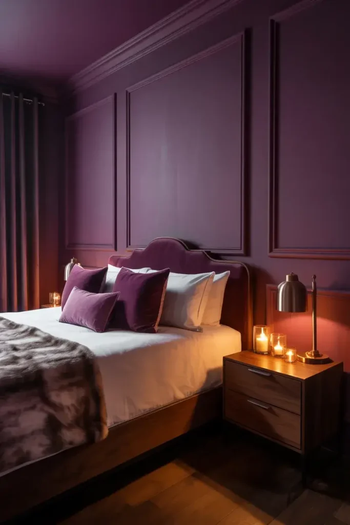
Purple is having a major comeback, specifically in dark, moody shades like eggplant and aubergine. Benjamin Moore’s “Shadow” is a rich amethyst that brings instant drama.
I find that these purple hues pair wonderfully with dark wood textures. It makes the space feel enveloping and intimate, which is exactly what you want in a romantic bedroom setting.
8. Test Your Lighting First
My final tip isn’t a color, but a method. Dark colors change drastically depending on your lighting. A color that looks luxurious in a store might look like mud in your bedroom.
I strongly advise using peel-and-stick samples and looking at them at night with your lamps on. Moody rooms rely heavily on artificial lighting, so you need to ensure the color holds its richness when the sun goes down.
9. Warm Up with Terracotta
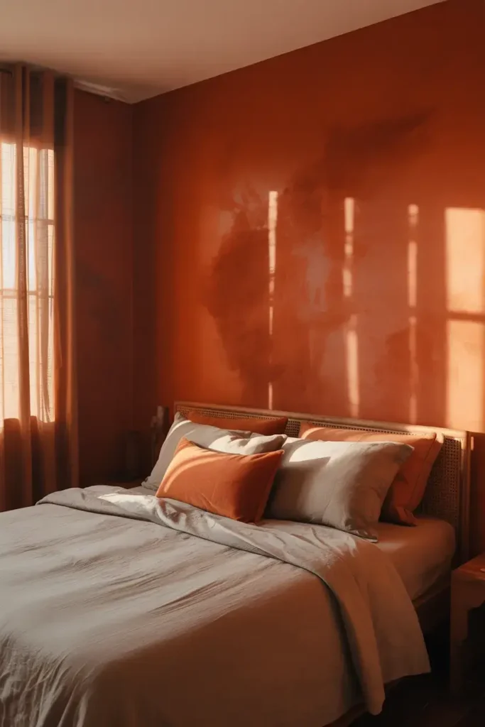
If you aren’t a fan of cool blues or greens, I suggest a deep terracotta. Shades like HGTV Home’s “Persimmon” balance the energy of tangerine with grounded neutral undertones.
I feel this color is perfect for waking up to. It is moody enough to feel cozy at night but brings a unique warmth that feels like a sunrise in the morning.
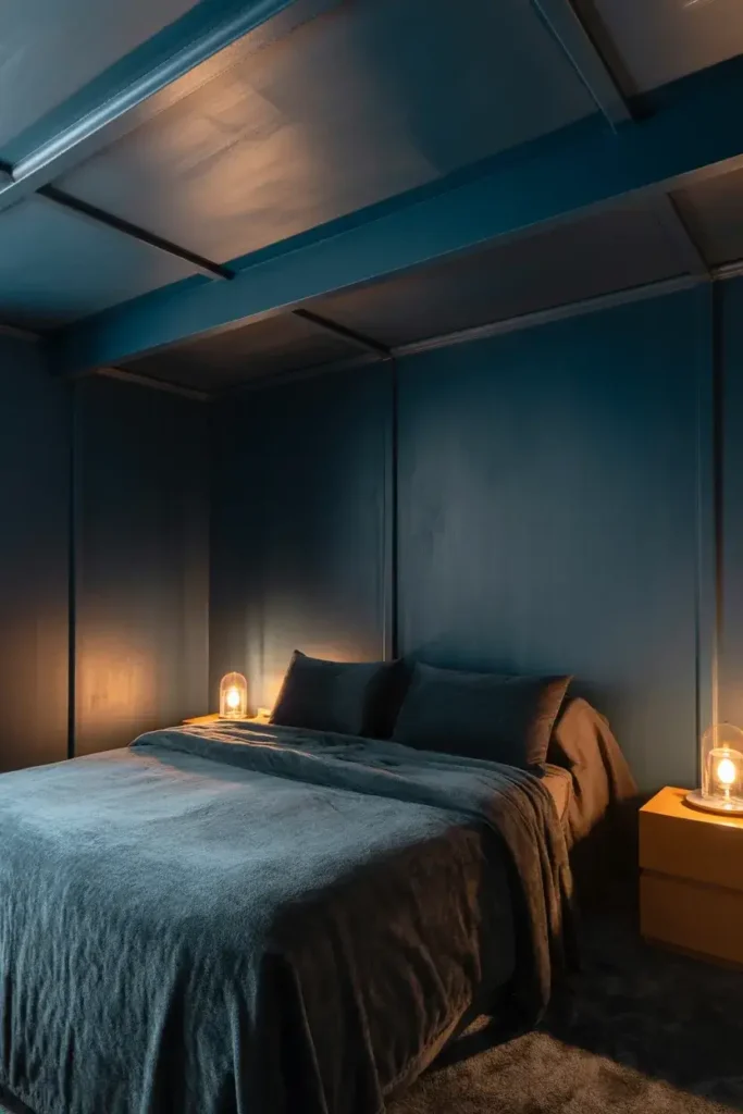
10. Calm Down with Steely Blue-Gray
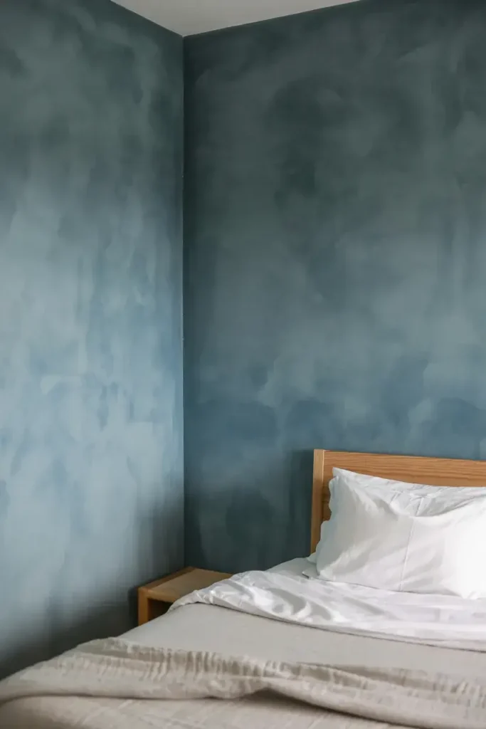
If you want to dip your toe into moody walls without going too dark, a steely blue-gray is a safe bet. Dunn-Edwards’ “Skipping Stones” creates a sense of mystery and thoughtfulness.
I view this as a “stepping stone” color. It adds that desired moodiness and depth but remains fresh and serene, making it a timeless choice that won’t feel dated in a few years.
11. Make a Statement with Crimson
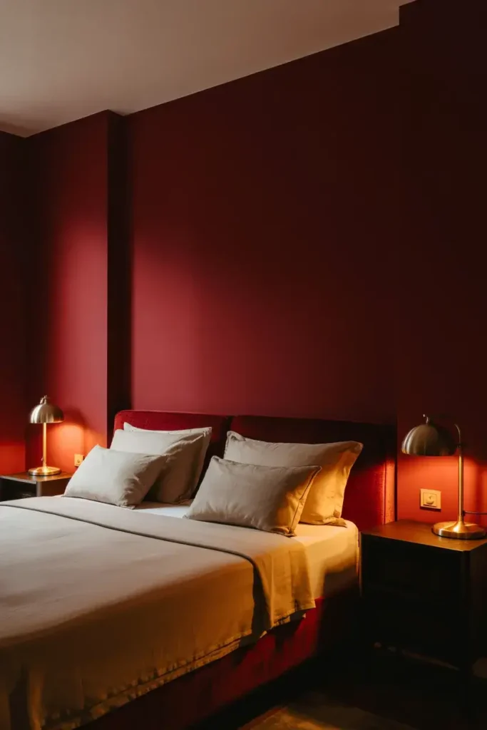
Red is a bold choice, but when done right, it is stunning. Designer Sarah Stacey tried 96 different shades of red before finding the perfect crimson for a project.
I recommend looking for “spicier” colors like burnt orange or deep burgundy rather than fire engine red. These warmer, darker tones feel sophisticated rather than aggressive, especially under warm lamp light.
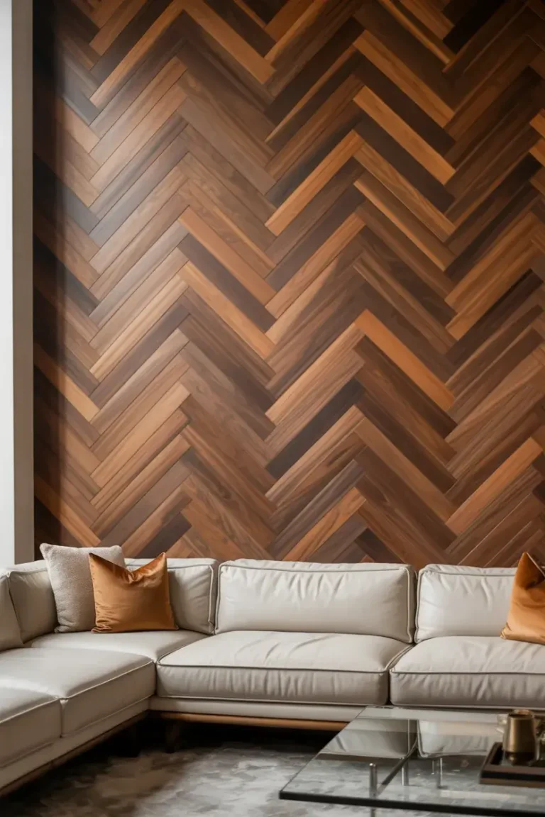
12. Mix Brown with Black Metals
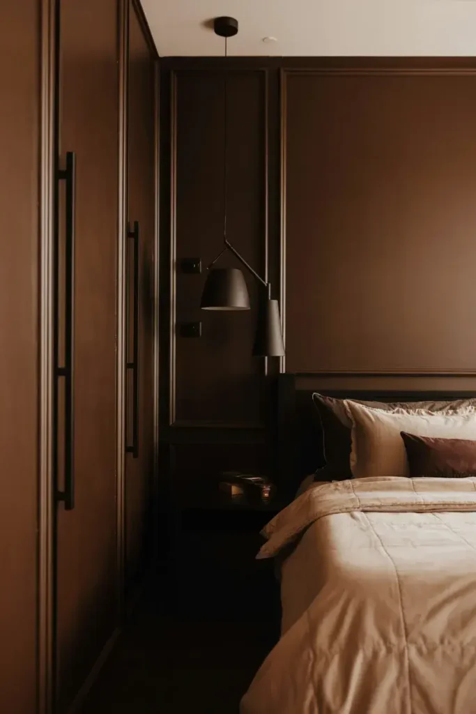
I used to think you couldn’t mix brown and black, but I was wrong. Designer Brittany Hakimfar loves combining dark brown walls with black metal trim accents.
I think this combination modernizes brown walls instantly. By adding black matte light fixtures or door handles, you take the room from “traditional library” to “modern luxury suite.”
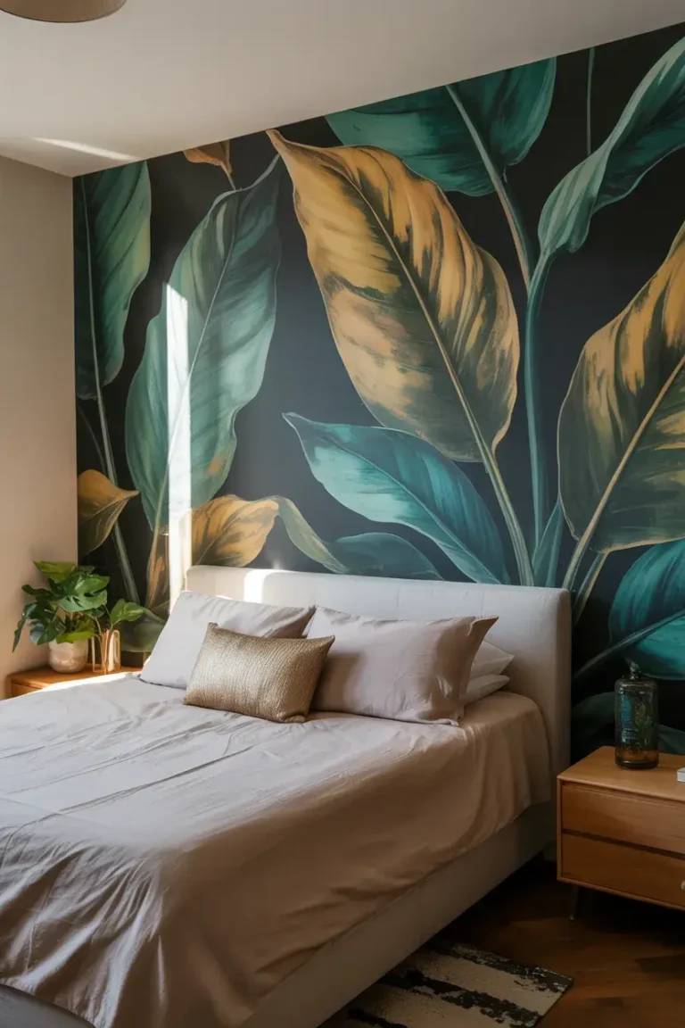
13. Layer with Dark Wallpaper
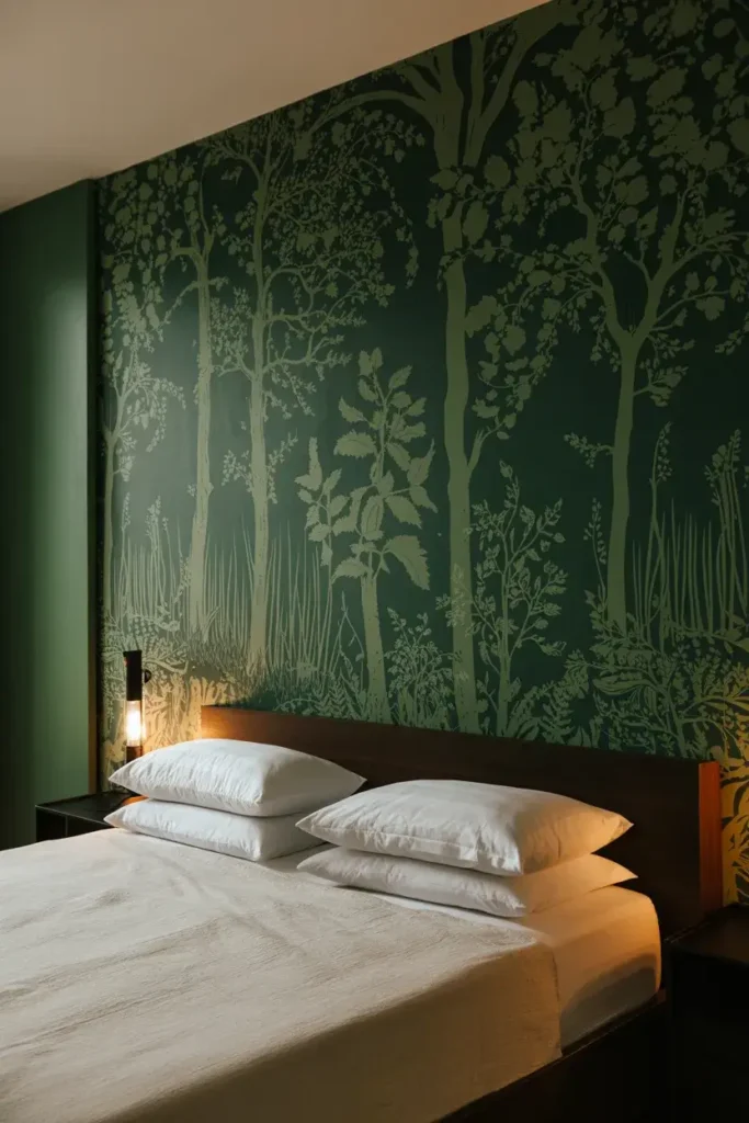
Sometimes paint isn’t enough. I love the look of a dark, forest-inspired wallpaper. Graham & Brown’s “New Eden Emerald” design features dramatic forestscapes that add texture and depth.
I suggest using this on the wall behind your bed as a focal point. It draws the eye immediately and sets a lush, organic tone for the rest of the room.
14. Paint the Ceiling Dark
I often see white ceilings in dark rooms, and I think it kills the vibe. It creates a harsh line that draws your eye up and away from the design.
I recommend painting your ceiling the same dark shade as your walls, or even a shade darker. It creates a “jewelry box” effect where the room feels complete and contained.
15. Opt for Moody Plums
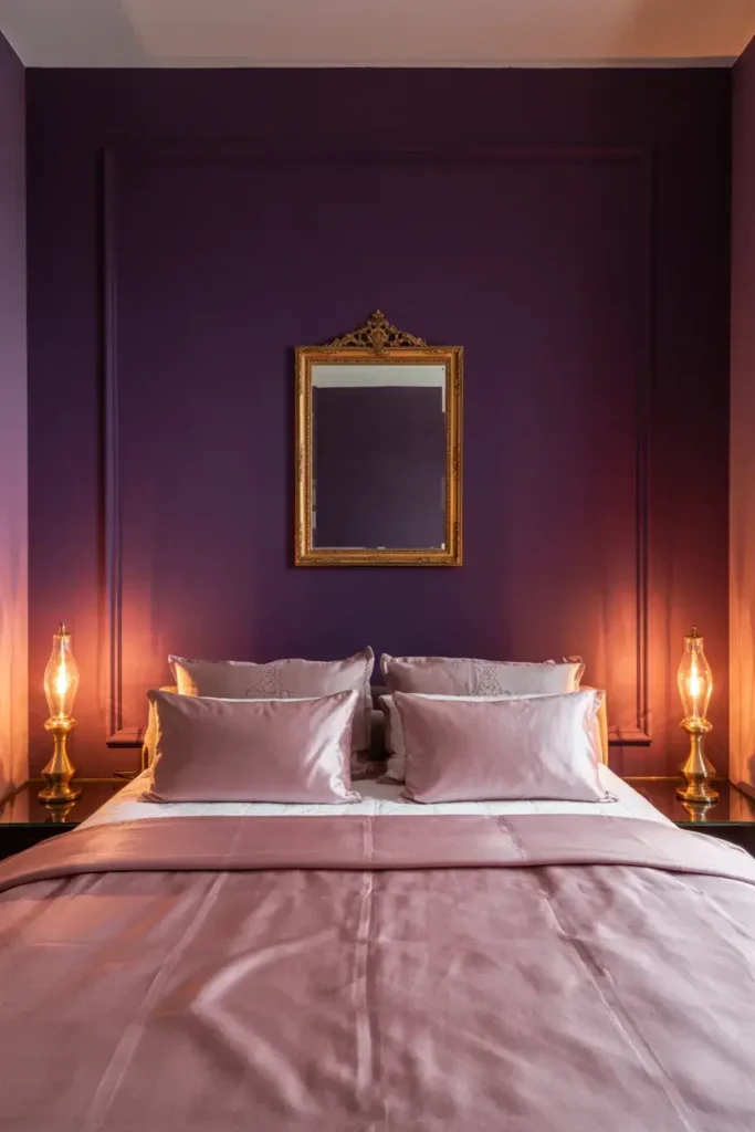
Designer Melanie Nead predicts that plums and pinks are going to have a big moment. A deep plum wall offers a richness that you just don’t get from standard grays or blues.
I find that plum walls serve as an excellent backdrop for gold or brass mirrors. The contrast between the warm metal and the cool purple undertones is visually striking.
Conclusion
Creating a moody, luxurious bedroom is easier than you think, but choosing the right shade is crucial. If you are ready to take the plunge but aren’t sure which dark hue suits your space, we can help.