15 Light Green Paint Colors to Refresh Your Home
I used to think white was the only way to make a room feel open and airy. I painted every apartment I lived in the same shade of “safe” eggshell, assuming color would make the walls close in on me. But then I discovered the transformative power of light green.
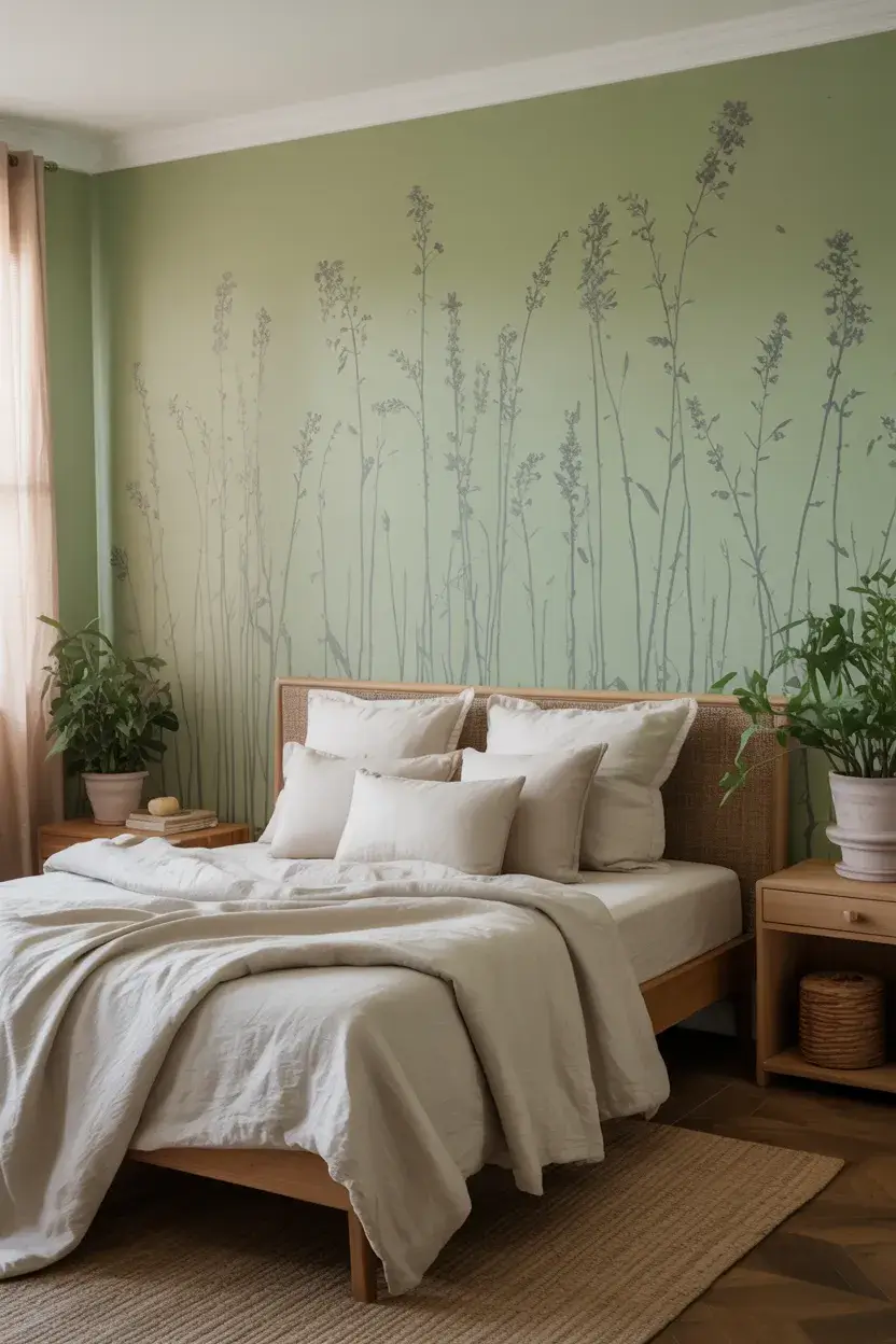
It brings the outdoors in without the mess of house plants you might forget to water. It offers a sense of calm that pure white often lacks, turning a sterile space into a sanctuary. Whether you want a minty freshness for a bathroom or a sage-like whisper for a bedroom, green is incredibly versatile.
I have compiled a list of 15 stunning light green paint colors that can breathe new life into your home decor. These shades range from cool, blue-leaning hues to warm, sun-drenched tones.
Why I Love Light Green for Interiors
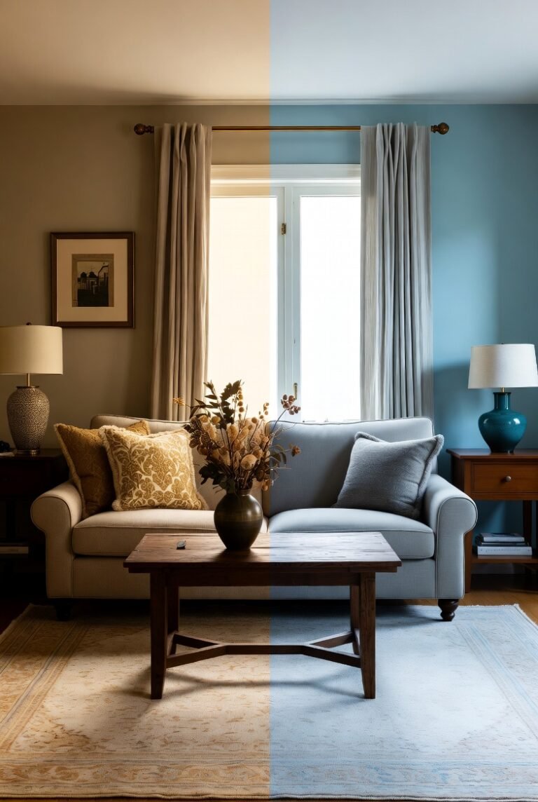
Green sits right in the middle of the visible color spectrum, which is why our eyes require very little adjustment to see it. This makes it the most restful color for the human eye.
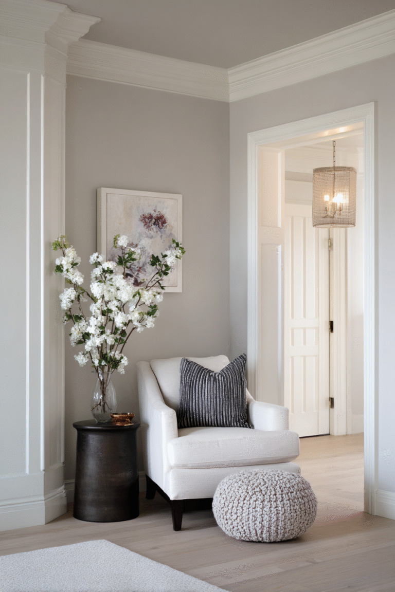
When you choose a light shade, you get that restorative quality while keeping the room bright. I find that light green works as a “new neutral.” It pairs beautifully with wood tones, crisp whites, and even bold blacks.
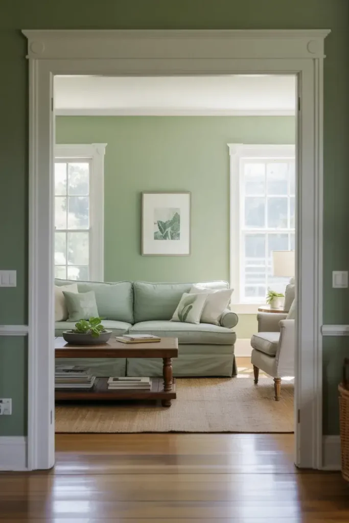
If you are looking to create a space that feels expansive, light green is your best friend. It reflects light in a way that mimics nature, making walls recede and rooms feel larger than they actually are.
The Best Light Green Paint Colors
Here are my top picks for light green paints that are trending in home decor right now.
1. Sherwin-Williams Filmy Green (SW 6190)
I adore this shade for its coolness. Sherwin-Williams describes Filmy Green as having a “delightfully nature-inspired vibe,” and I completely agree. It brings a splash of tranquility that is perfect for a living room or a study where you need to focus.
This color doesn’t shout; it whispers. It provides a subtle backdrop that lets your furniture shine. I recommend pairing it with crisp white trim like Opaline or Pure White to really make the green undertones pop.
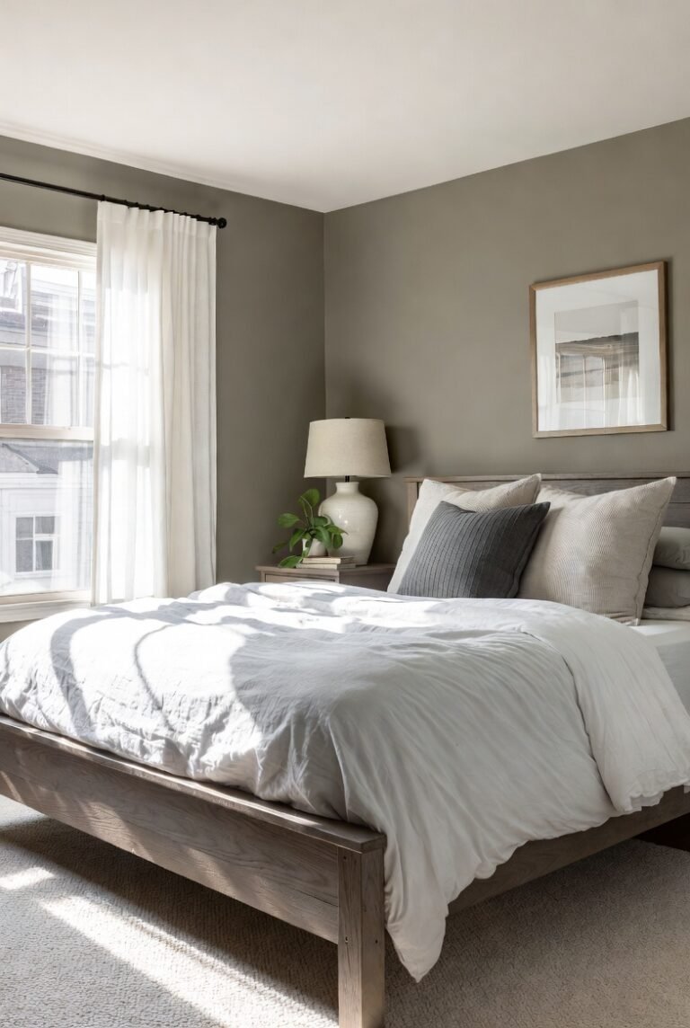
2. Benjamin Moore October Mist (1495)

This color is evocative of a flower stem, and it anchors a room beautifully. It is a gently shaded sage that feels both grounding and uplifting. I love that it has a bit of a gray cast, which stops it from feeling too pastel or nursery-like.
With a Light Reflectance Value (LRV) of roughly 46, it is a bit richer than some other lights, but it still reads as soft and airy. It works wonders in a bedroom where you want a cozy, organic feel.
3. Sherwin-Williams Sea Salt (SW 6204)
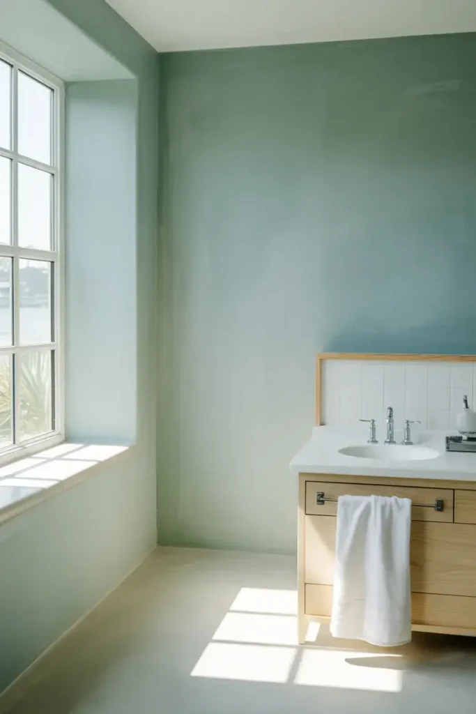
Sea Salt is a legend in the design world for a reason. It is a green with distinct gray undertones, reminiscent of cloudy days at the beach. I find it incredibly relaxing, making it a top choice for a bathroom or laundry room.
The magic of Sea Salt is its chameleon-like ability to change with the light. In bright natural light, it looks greener; in lower light, it leans into its gray side. It creates a spa-like atmosphere that I think everyone deserves in their home.
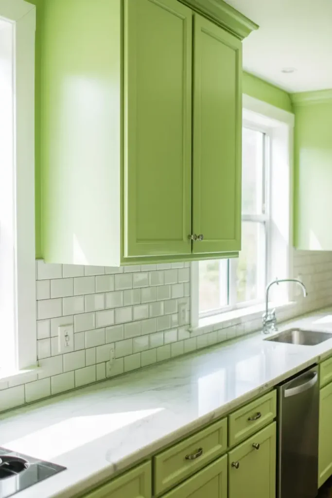
4. Sherwin-Williams Honeydew (SW 6428)

If you want something fresher, look at Honeydew. As the June 2024 Color of the Month, it is having a major moment. It feels vibrant and juicy, just like the melon it is named after.
I see this color working perfectly in a kitchen or a breakfast nook. It has an energy to it that wakes you up in the morning. It pairs well with light wood cabinetry and creamy whites.
5. Benjamin Moore Soft Fern (2144-40)
Soft Fern is a pleasing pale green that is misted with gray tones. I appreciate how delicate this color is. It has an LRV of roughly 56, meaning it reflects a good amount of light without being blinding.
This shade feels very sophisticated. It is the kind of color I would use in a formal dining room or a guest suite. It coordinates beautifully with classic whites like White Dove and softer neutrals like Swiss Coffee.
6. Sherwin-Williams Copen Blue (SW 0068)
Don’t let the name fool you. While it sits on the border, this is a green paint color with heavy blue undertones. It offers a subtle warmth despite its cool base.
I love using this in north-facing rooms. These rooms often get cool, gray light, and Copen Blue balances that out while maintaining a calm vibe. With an LRV of 59, it provides just enough light reflection to keep a dim bedroom feeling inviting.
7. Sherwin-Williams Celery (SW 6421)
Celery is exactly what you imagine—crisp, clean, and vegetative. It is an “Expert Pick” for a reason. It brings a crispness to walls that feels very modern and clean.
I would use this in a space that feels a bit dark or dreary. It acts like a shot of chlorophyll for your decor, instantly brightening the mood. It looks fantastic against stark white subway tiles or marble countertops.
8. Sherwin-Williams Parakeet (SW 6711)
Sometimes I want a green that has a bit of retro flair. Parakeet has distinct yellow undertones that remind me of Mid-Century Modern design. It is a lively green that doesn’t take itself too seriously.
This is a great choice for a basement rec room or a playful powder room. It invokes a vintage flair while adding warmth. If you love furniture with tapered legs and walnut finishes, this paint will tie everything together.
9. Benjamin Moore Pale Smoke (1584)
This is where blue meets gray to create a smoky, light, and cool neutral. While it leans towards the blue-gray side of the spectrum, it reads as a very sophisticated, airy aquatic green in certain lights.
I include this because it captures that “sea glass” aesthetic perfectly. It is a great choice for those who want the calming effect of green but prefer a cooler, icier palette. It looks stunning with silver fixtures and cool-toned fabrics.
10. Sherwin-Williams Overt Green (SW 6718)
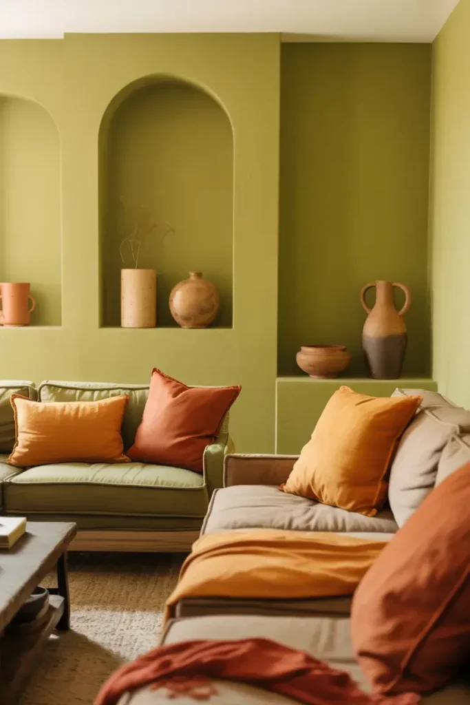
Similar to Parakeet, Overt Green uses yellow undertones to warm up a space. It feels organic and sunny. I find that greens with yellow bases are generally friendlier and more welcoming.
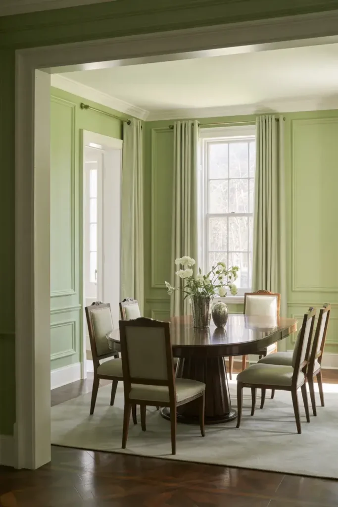
Use this in a living area where you host guests often. It creates a convivial atmosphere. It pairs surprisingly well with warm terracottas and rust oranges if you want an earthy, grounded palette.
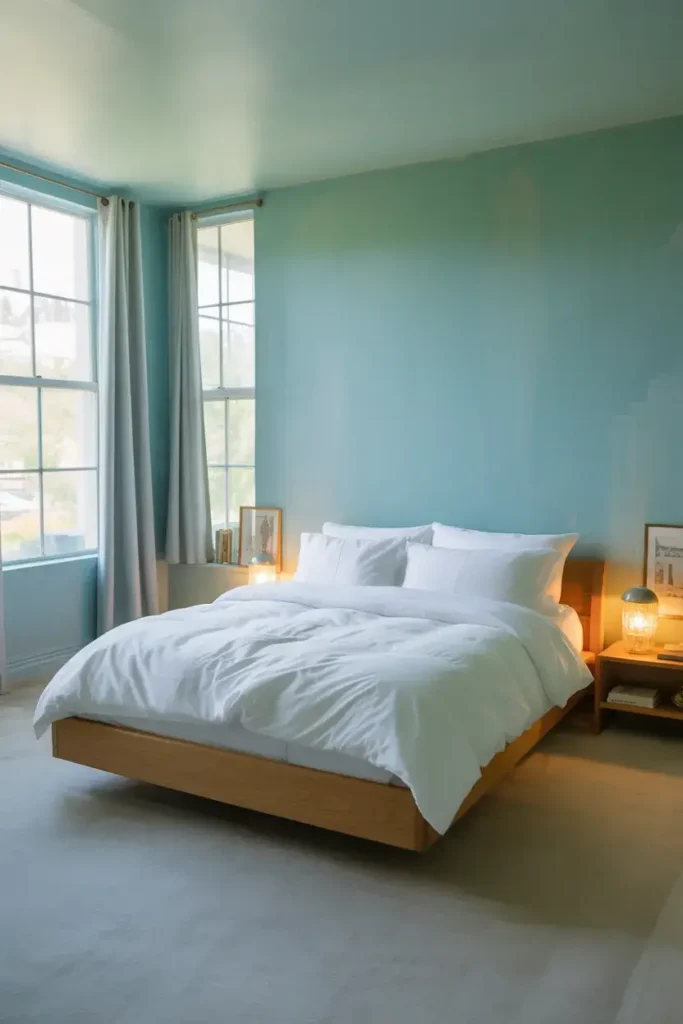
11. Sherwin-Williams Breaktime (SW 6463)
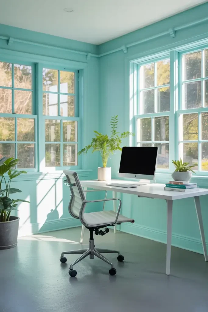
The name says it all. Breaktime feels like taking a deep breath. It is a soft, minty aqua that sits squarely between blue and green. It feels incredibly clean and fresh.
I love this for a home office. It is stimulating enough to keep you awake but soothing enough to prevent stress. It reflects light beautifully, helping to maximize daylight in smaller rooms.
12. Sherwin-Williams Cucumber (SW 6722)
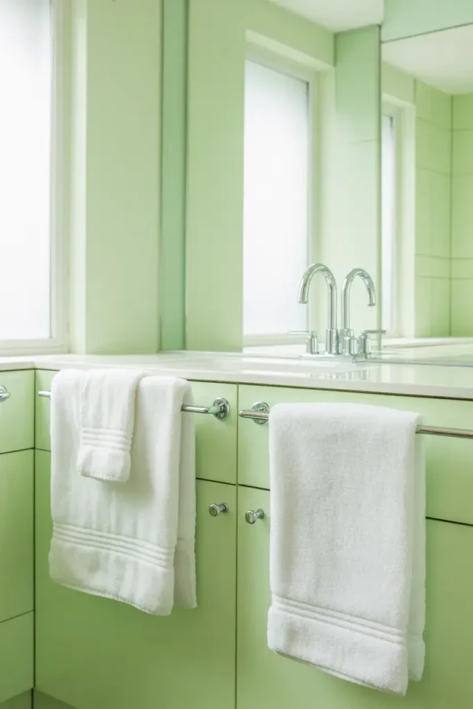
Cucumber is cool, watery, and very pale. It is almost a white with a green tint, which makes it perfect for minimalists who want just a hint of color.
I think this color shines in a bathroom with white fluffy towels and chrome fixtures. It feels hygienic and spa-like. It’s also a safe bet for ceilings if you want to try something other than standard ceiling white.
13. Sherwin-Williams Sprout (SW 6427)
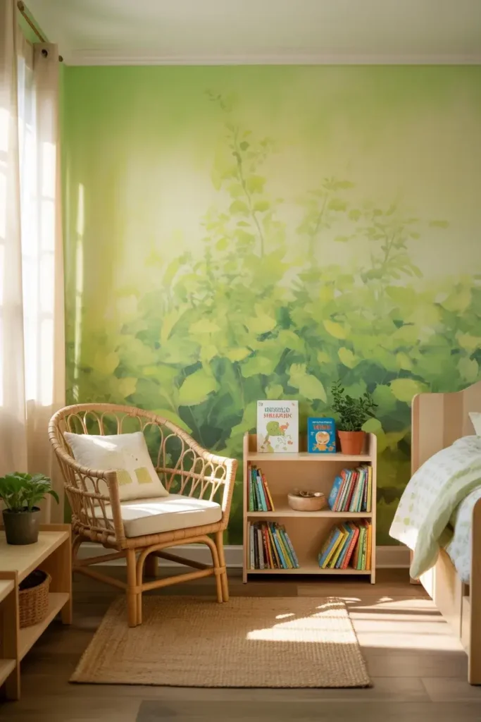
Sprout is a tender, yellow-green that mimics the color of new leaves in spring. It represents growth and renewal. I find it very optimistic.
This shade works well in nurseries or children’s rooms because it feels youthful and energetic. It isn’t harsh, but it definitely has a personality. It pairs well with natural fibers like rattan and jute.
14. Sherwin-Williams Moonraker (SW 6701)
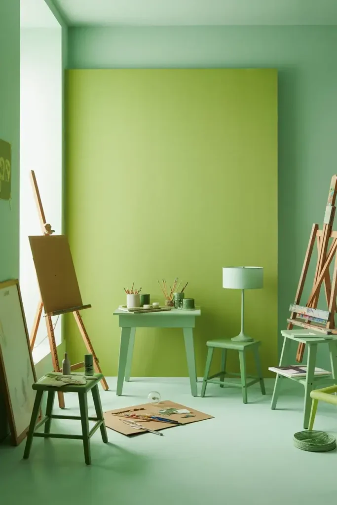
Moonraker is a bit more saturated but still falls into the light category. It has a vibrancy that draws the eye. I like using this as an accent wall if painting the whole room feels too bold.
It works well in creative spaces, like a craft room or a studio. It stimulates the imagination. Pair it with lighter, cooler greens for a monochromatic look that feels very designed and intentional.
15. Sherwin-Williams Renwick Olive (SW 2815)
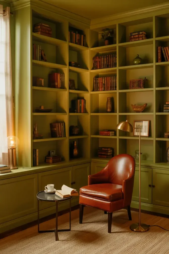
While olive is often dark, lighter variations like Renwick Olive offer a warm, earthy alternative. It is very grounding because it is so reminiscent of nature.
I recommend this for people who love neutrals but want to dip their toes into color. It works well on exteriors, but I love it for a cozy den or library. It wraps you up like a warm blanket.
How I Choose the Perfect Shade
Picking the right green isn’t just about pointing at a swatch and saying “that one.” You have to consider the room itself.
Check the Compass
I always check which direction the windows face. If you have a north-facing room, the light will be cool and blue. A green with gray or blue undertones might look too cold there. I would opt for a green with yellow undertones, like Overt Green, to warm it up.
Conversely, south-facing rooms get warm, golden light. They can handle cooler greens like Filmy Green or Sea Salt without feeling chilly.
Watch the LRV
The Light Reflectance Value (LRV) tells you how much light a color reflects. If you want your space to look bigger, I suggest choosing a paint with an LRV of about 60 or higher.
Light greens with high LRV bounce natural light into the shadows. This is crucial for basements or hallways that lack windows.
Test Before You Commit
I never buy a gallon without buying a sample pot first. Paint a large square on the wall and watch it for 24 hours. See how it looks in the morning sun and under your artificial lamps at night.
Sea Salt, for example, might look completely gray at night and bright turquoise in the morning. You need to be happy with the color in all its phases.
Conclusion
Green is more than just a pigment; it is a feeling. It reconnects us with the natural world, even when we are stuck inside staring at screens.
By choosing one of these light green shades, you aren’t just decorating. You are setting a mood. You are creating a backdrop for your life that is soothing, organic, and welcoming.
Whether you go for the misty vibes of October Mist or the retro kick of Parakeet, you can’t really go wrong. Grab a brush and start your transformation. Your walls will thank you.