How to Make Lime Green Paint: Complete Color Mixing Guide
Making lime green paint involves mixing two primary colors: yellow and blue. The key to achieving the perfect lime green shade is balancing these colors correctly, usually using more yellow than blue. By adding white to the mixture, one can lighten the green, producing a bright, fresh lime green color.
Understanding the basics of color mixing is essential for creating lime green. Since lime green is a lighter shade of green, it starts with a standard green made from yellow and blue. Adjusting the ratios and adding white or small amounts of blue can help fine-tune the hue to the desired brightness or depth.
Even if one color is missing, substitutes can be used to approximate lime green. For example, raw sienna or burnt umber can replace yellow, while Payne’s grey or ultramarine blue can stand in for blue. These alternatives still allow for a successful mix that results in a lime green shade with the right combination of tones.
Essential Supplies and Materials
Creating lime green paint requires specific supplies to ensure accurate color mixing and a smooth application. Proper selection of paint types, tools for blending, and attention to paint consistency all contribute to achieving the desired vibrant lime green hue with ease.
Choosing Paint Types for Lime Green
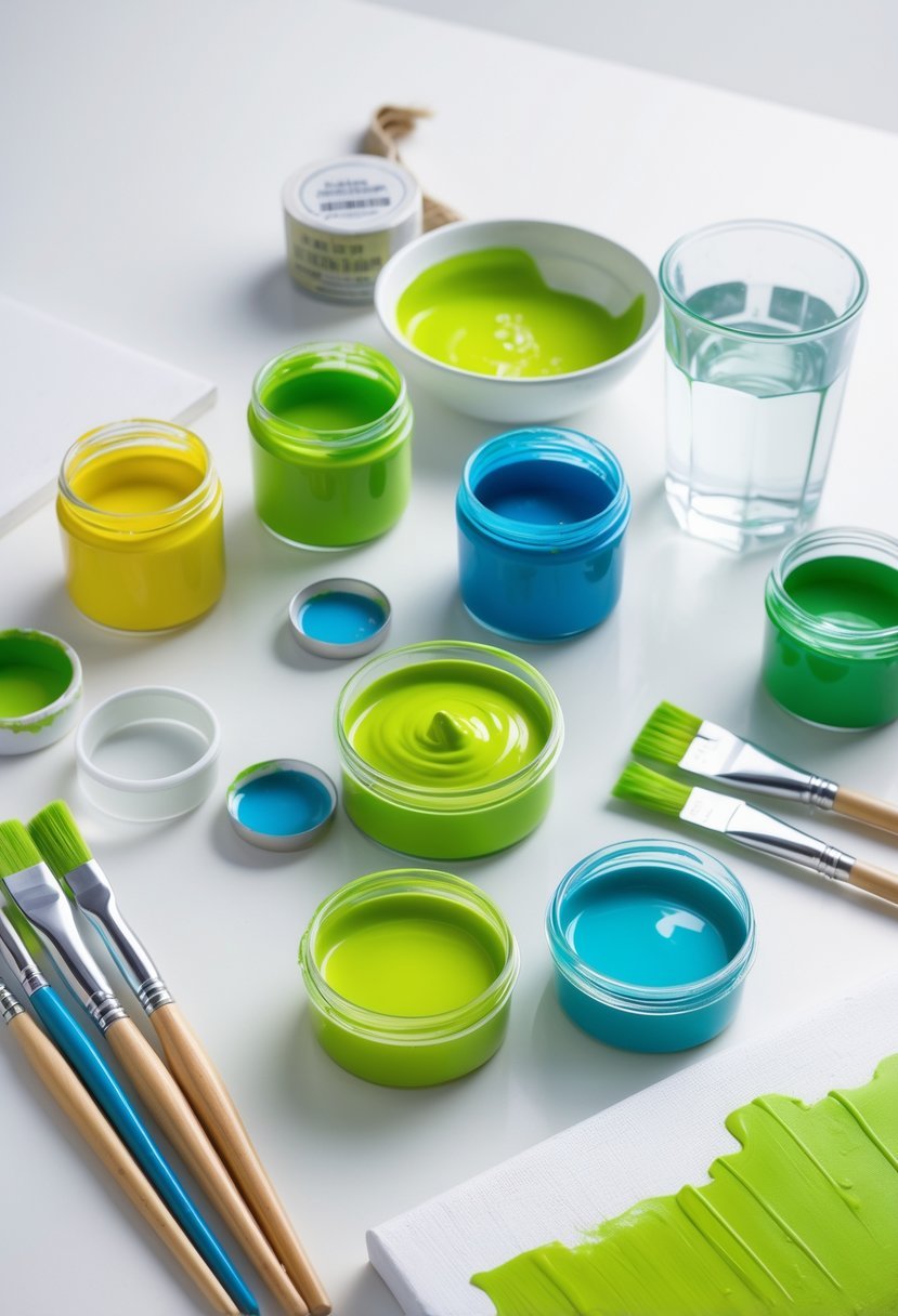
Selecting the right paint type depends on the intended surface and finish. Acrylic paints are a practical choice due to their fast drying time and versatility on various surfaces like canvas, wood, or fabric. They also mix well with pure yellow and blue paints to create lime green.
Oil paints offer richer blending capabilities but require longer drying times. For translucent effects, watercolors can be used by adjusting pigment concentration and water ratios. When mixing lime green, starting with a bright yellow (such as lemon yellow or cadmium yellow) and a clear, vibrant blue (like ultramarine or phthalo blue) is essential. White paint can be added later to create softer, pastel lime green shades.
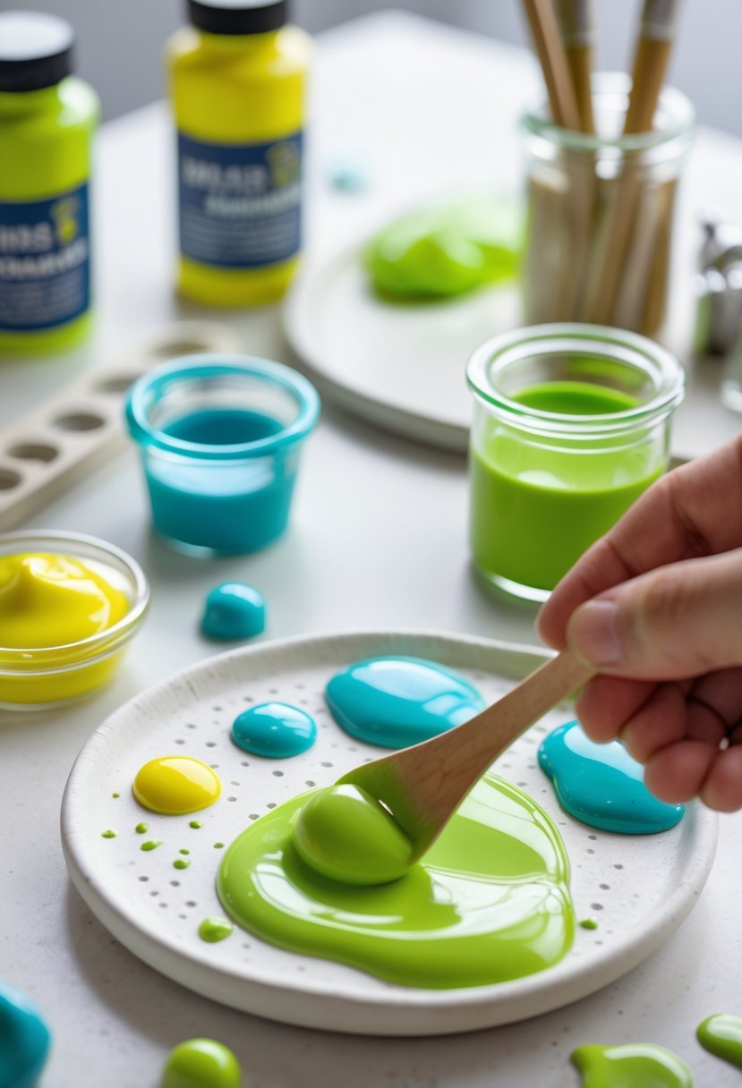
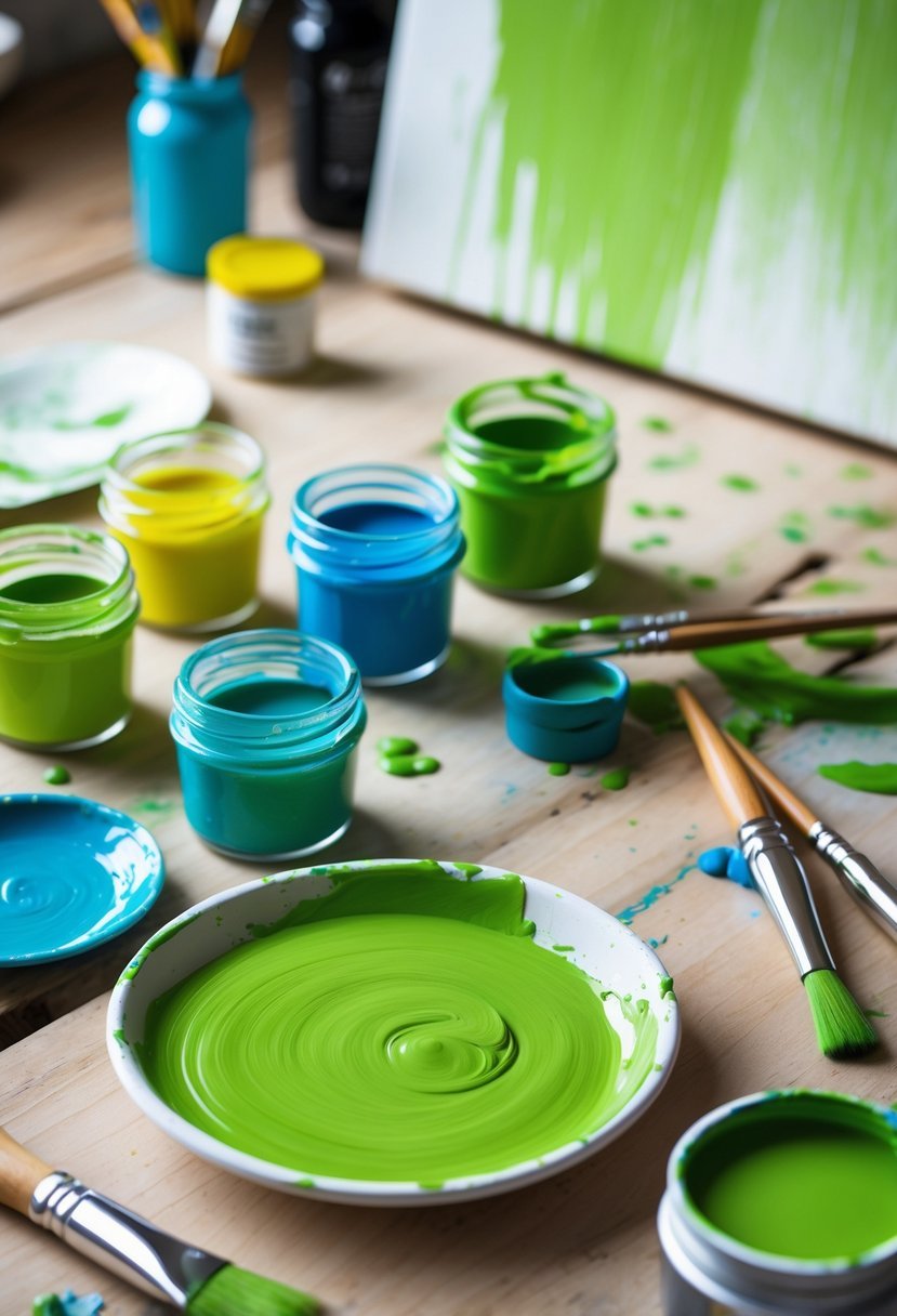
Selecting Mixing Tools and Trays
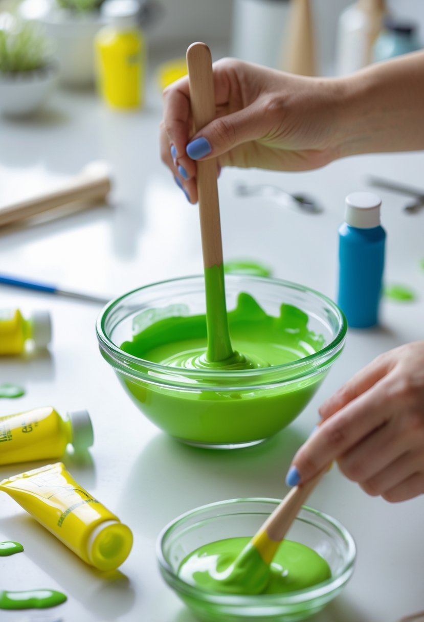
Using proper tools ensures thorough blending and precise control of the paint shades. A mixing tray with separate wells or compartments allows for mixing different proportions without contamination. Plastic or ceramic palettes are popular since they are easy to clean and durable.
Palette knives or spatulas assist in combining paints evenly, especially when mixing thick acrylic or oil paints. Small brushes can be used for testing color samples on paper or canvas before committing to larger areas. Clean water or solvent containers should be on hand to maintain tool cleanliness throughout the process.
Importance of Paint Consistency
Maintaining proper paint consistency is crucial for both color uniformity and application quality. If the paint mixture is too thick, it may become difficult to spread evenly and lead to uneven drying. Conversely, overly thin paint can result in patchy coverage and washed-out colors.
Adding small amounts of water for acrylics or appropriate solvents for oil paints helps achieve a smooth texture. When adjusting consistency, testing the lime green mixture on a sample surface reveals whether it spreads easily and retains vibrancy. Consistent paint ensures the lime green color appears uniform and maintains its intended brightness under different lighting conditions.
Color Theory Fundamentals for Lime Green
Creating lime green paint relies on a clear understanding of how colors interact. It involves grasping the structure of the color wheel, the function of primary colors, and the links between secondary and tertiary colors. These concepts form the foundation for mixing the precise shade of lime green.
Understanding the Color Wheel
The color wheel is a circular diagram used to visualize relationships between colors. It organizes colors in a continuous spectrum where primary colors—red, yellow, and blue—are spaced evenly apart. Between these primaries lie secondary colors, created by mixing two primary colors. For example, green results from mixing yellow and blue.
Lime green occupies a position between yellow and green on the wheel, making it a tertiary color. This location indicates that lime green carries stronger yellow undertones than pure green. Knowing this helps in selecting the right hues and mixing proportions to produce lime green effectively.
Role of Primary Colors in Mixing
Primary colors—red, yellow, and blue—are the building blocks for all other colors, since they cannot be created by mixing others. In creating lime green, yellow and blue are used as the fundamental components. Yellow contributes brightness and warmth, while blue adds coolness and depth.
The exact shades matter; for example, lemon yellow offers a vivid, zesty quality, and ultramarine blue adds rich darkness. By adjusting the ratio of these two primaries, one can control the intensity and tone of the lime green. Starting with more yellow keeps the color bright, while adding blue shifts it towards a cooler green.
Relationship Between Secondary and Tertiary Colors
Secondary colors arise from mixing two primary colors: green (yellow + blue), orange (red + yellow), and purple (red + blue). Tertiary colors form by combining a primary with an adjacent secondary color, creating intermediate hues like lime green, which is yellow-green.
Because lime green is a tertiary color, it blends the vibrancy of its base yellow with the depth of green. This relationship allows artists to modulate lime green’s warmth or coolness by tipping the balance toward yellow or green components. Understanding this connection is essential for achieving precise control over paint mixtures.
Mixing Lime Green Paint: Step-by-Step Instructions
Making lime green paint involves using a precise blend of primary colors and adjusting tones carefully. The process requires first creating a balanced green from yellow and blue, then lightening it to achieve the distinctive lime shade. Fine-tuning the brightness and shade ensures the paint matches the intended color.
Creating Green from Primary Colors
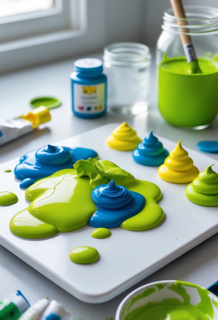
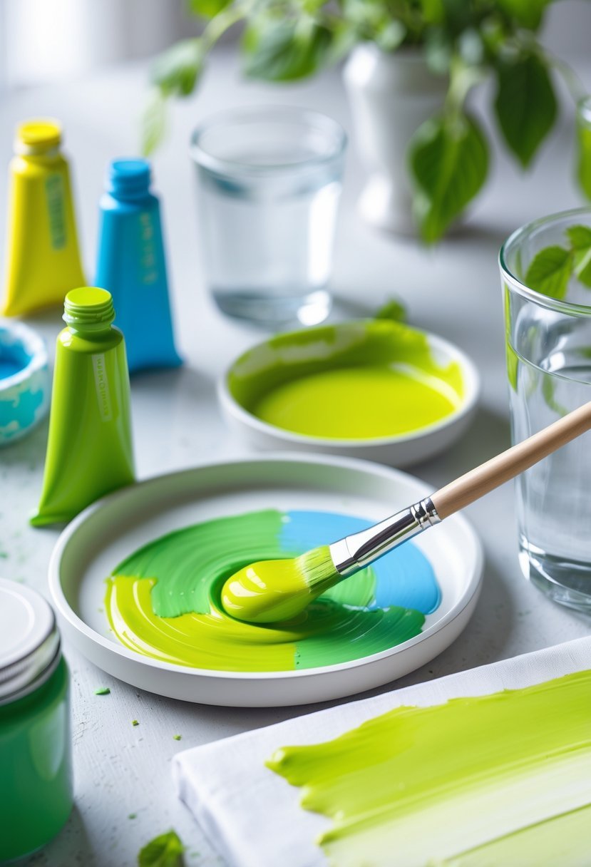
The foundation of lime green paint is a solid green color, made by mixing yellow paint and blue paint. Yellow should be the dominant color in this blend. A common ratio is about three parts yellow to one part blue, which produces a vibrant green base.
Using too much blue can darken the green, so it’s important to add it gradually while mixing thoroughly. Stir the paints well to avoid streaks and get an even color. If equal parts of yellow and blue are mixed, the result is a standard green, which serves as the starting point for lime green.
Formulating Lime Green from Green
Once the green is mixed, it needs to be lightened to transition into lime green. Adding white paint brightens the green and gives it that sharp, fresh appearance typical of lime green.
Start by adding small amounts of white to the green and mix thoroughly after each addition. This gradual approach allows control over the color’s lightness. Adding too much white at once can wash out the green, while too little may keep it too dark.
Increasing the yellow slightly after lightening with white can strengthen the lime tone, as yellow heavily influences the final hue.
Adjusting Shade and Brightness
Balancing the shade involves careful adjustments of yellow, blue, and white paint. To darken the lime green, a tiny drop of blue can be added, but it must be minimal to avoid losing the lime brightness.
If the color appears too pale or washed out, adding more yellow can help restore vibrancy. The goal is a color that stands out with a bright, crisp green tone without becoming fluorescent or dull.
Using a mixing tray or palette and testing small batches helps achieve the desired shade precisely before mixing larger amounts.
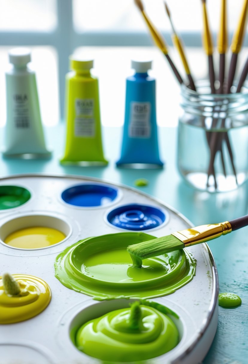
Choosing the Right Pigments and Ratios
Selecting the appropriate pigments and balancing their proportions are essential steps in creating a true lime green. The choice of specific yellows and blues shapes the color’s brightness and depth, while precise mixing influences consistency and tone. Adjustments to hue and saturation further refine the paint to match desired shades.
Effects of Different Yellows and Blues
Different yellows affect lime green’s warmth and vibrancy. Lemon yellow offers a bright, zesty tone, contributing a fresh, almost neon quality to lime green. In contrast, cadmium yellow provides a warmer, richer base, leaning more toward golden-green shades.
Blues also play a crucial role. Ultramarine blue lends a deeper, slightly muted undertone, making the mix cooler and less intense. On the other hand, phthalo blue delivers a sharp, vivid contrast that brightens the green and adds energy. Combining lemon yellow with phthalo blue yields a more electric lime, while mixing cadmium yellow with ultramarine blue creates subtler, earthier greens.
Recommended Pigment Proportions
For a balanced lime green, a common starting ratio is 2:1 or 3:1 yellow to blue. This favors yellow to keep the color bright and vibrant. Using too much blue will shift the hue closer to teal or forest green, reducing the lime’s signature brightness.
It’s best to start mixing on a mixing tray, adding yellow first, then introducing blue slowly while stirring thoroughly. This gradual approach helps prevent overpowering the yellow. Adjustments can be made by adding small increments of each pigment until the desired brightness and tone are achieved.
Fine-Tuning Hue and Saturation
Hue adjustments can be made by varying the yellow and blue balance, but saturation control often requires adding white or black. Adding a small amount of white can mute the lime green, creating pastel variations suitable for softer looks.
Black, used sparingly, darkens the mixture for more muted or shadowy lime greens. Artists should mix thoroughly after each addition to gauge the effect accurately.
Testing the paint on different surfaces and under varied lighting conditions helps identify if further fine-tuning is necessary. Keeping track of proportions ensures reproducibility of the perfect lime green mix.
Troubleshooting and Common Mistakes
Creating lime green paint requires attention to detail in mixing ratios and pigment choices. Problems often arise from overpowering colors or unbalanced blends. Consistency in preparation helps maintain the desired shade across multiple batches.
Avoiding Overpowering Pigments
Blue paint is a strong pigment and can quickly dominate the mixture. When too much blue is added to yellow, the result shifts from lime green to a darker or dull green. It is essential to start with a base of yellow and add blue sparingly, mixing thoroughly after each addition.
Using bright, warm yellows like cadmium yellow light helps maintain vibrancy. If the mixture turns too bluish or dull, more yellow should be added to rebalance it. Clean brushes between colors also prevent unintended pigment contamination, which can muddy the lime green.
Correcting an Unbalanced Mixture
If the lime green looks too dark or muted, slight additions of yellow or white can lighten and brighten the color. White should be introduced cautiously to avoid washing out the green. For dull tones, a tiny amount of earthy colors like burnt sienna can bring a natural, muted quality without overwhelming the lime effect.
When the color leans too far from the intended lime green, remixing the base colors in correct proportions is often necessary. Keeping a record of exact ratios helps reproduce the right mixture and prevents recurring unbalanced blends.
Tips for Achieving Consistent Results
Consistency relies on mixing small, controlled amounts and documenting the process. Always use the same types of paint and pigments, as pigment strength can vary between brands. Mixing should take place under consistent lighting to accurately judge color.
Using titanium white over zinc white often gives better coverage and easier control over lightening lime green. Storing mixed paint in airtight containers preserves the exact color for future use. Testing small swatches before large applications prevents surprises caused by drying color shifts.
Creative Applications and Customization
Lime green paint offers numerous opportunities for artistic and practical customization. Adjusting its shade, mixing with related colors, and properly storing the paint extend its usefulness in various creative projects and ensure long-term quality.
Color Variations Using Lime Green
The tone of lime green paint can be altered by adding small amounts of other colors. To create a brighter, more luminous hue, increasing the proportion of yellow paint is effective. Adding white paint lightens the shade, producing a softer, pastel effect suitable for delicate designs.
For deeper or more muted variants, a tiny addition of black helps darken the paint, but caution is required to avoid muddying the color. Mixing in a complementary color such as red in very small quantities can tone down excessive brightness, resulting in more natural or earthy variations.
Adjustments should be done gradually, with thorough mixing, to maintain consistency and avoid abrupt color shifts.
Incorporating Tertiary Colors
Lime green results from blending a primary color (yellow) with a secondary color (green). Introducing tertiary colors like orange can create nuanced effects. Since orange contains yellow and red, its careful inclusion can warm lime green tones, shifting the paint toward yellowish-green or chartreuse shades.
However, because red is part of orange, it may dull the vibrancy if overused. Therefore, adding orange in moderation helps achieve a balanced, custom hue without overpowering lime green’s inherent brightness.
This method allows artists and designers to explore a wider spectrum within the green-yellow range, enabling tailored applications in artworks or interior accents.
Storing and Preserving Custom Paint
Proper storage preserves the quality of mixed lime green paint. It should be kept in airtight containers to prevent drying and separation. Glass jars or sealed plastic containers work well for minimizing air exposure.
Storing paint in a cool, dark place slows chemical changes that might alter the color or texture over time. If the paint thickens, gentle stirring or adding a recommended thinner compatible with the paint type can restore usability.
Labeling containers with the date and paint mixture details helps track freshness and replicate colors in future projects. Regular inspection is advised to identify and address any changes promptly.