How Do You Make the Color Orange With Paint Explained Simply and Clearly
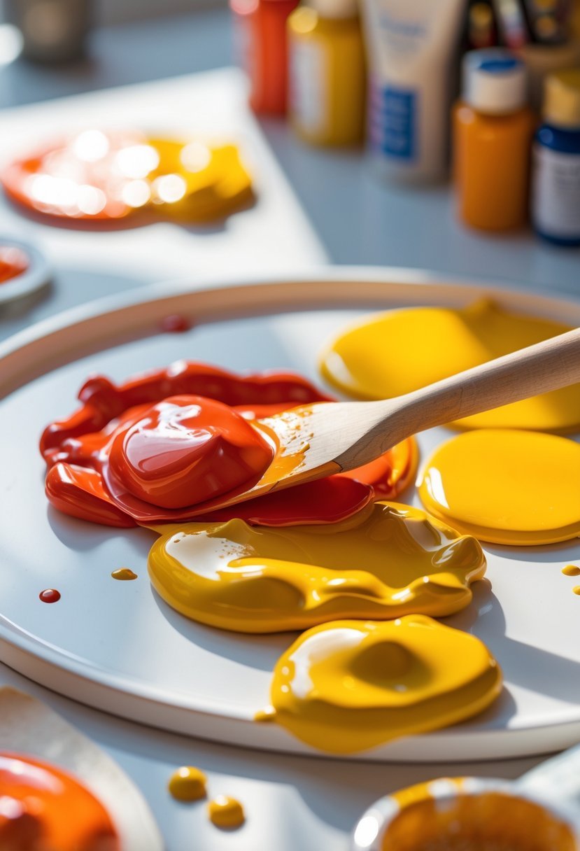
If you want to know how to make the color orange with paint, it’s actually quite simple. Orange is created by mixing the primary colors red and yellow together. The exact shade depends on the ratio you use—more red will give you a darker, warmer orange, while more yellow results in a lighter, brighter tone.
I’ve found that understanding this basic mix opens up many creative possibilities. Whether you’re painting something realistic like fruit or crafting an abstract piece, controlling the blend gives you a range of oranges to work with. This guide will help you mix the perfect orange and adjust it for different effects.
Basic Principles of Color Mixing
To make orange with paint, it’s essential to grasp how colors interact and how mixtures produce new hues. I focus on the roles of primary and secondary colors, the fundamentals of color theory, and the difference between additive and subtractive mixing methods for an accurate understanding.
Primary and Secondary Colors
Primary colors are red, yellow, and blue. These colors cannot be made by mixing other colors and serve as the foundation for creating all other colors in painting. When you mix two primary colors, you get a secondary color.
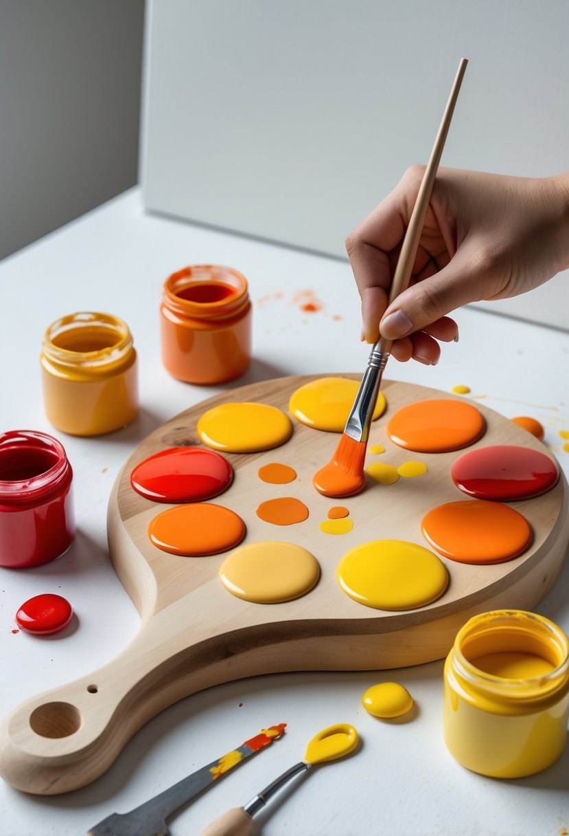
Orange is a secondary color formed by mixing red and yellow. The proportions of red to yellow affect the shade of orange you get, such as a warmer orange with more red or a lighter, brighter orange with more yellow.
Knowing which colors are primary and how they combine simplifies mixing paints and helps you achieve the exact tone you want. It’s the first step in mastering color creation.
Understanding Color Theory
Color theory explains how colors relate and combine. It involves the color wheel, which organizes colors in a circle showing primary, secondary, and tertiary colors.
Complementary colors, found opposite each other on the wheel (like blue and orange), enhance each other’s intensity when placed side by side but neutralize each other when mixed, often leading to muted tones.
Hue, saturation, and brightness are key components to control. Hue refers to the color itself, saturation to its purity, and brightness to its lightness or darkness. Mixing red and yellow to make orange is a balanced interaction of these elements.
Additive vs. Subtractive Mixing
There are two main ways colors mix: additive and subtractive.
Additive mixing applies to light, combining colors like red, green, and blue. When mixed, they create white light. This method doesn’t apply to paint but is important for understanding color in screens.
Subtractive mixing involves pigments and paints. When mixing paint, each pigment subtracts (absorbs) certain wavelengths of light and reflects others. Red and yellow pigments reflect wavelengths that combine to look orange to our eyes.
Subtracting more wavelengths results in darker, duller colors, which is why adding blue, a primary color not part of orange, can mute orange if mixed. Understanding subtractive mixing is key for working with paints.
Mixing Orange With Paint

Creating the right orange involves more than just mixing red and yellow. The choice of specific hues and their ratios directly influences the vibrancy and warmth of the resulting orange. Proper technique ensures a smooth blend and predictable color outcome.
Choosing the Right Red and Yellow
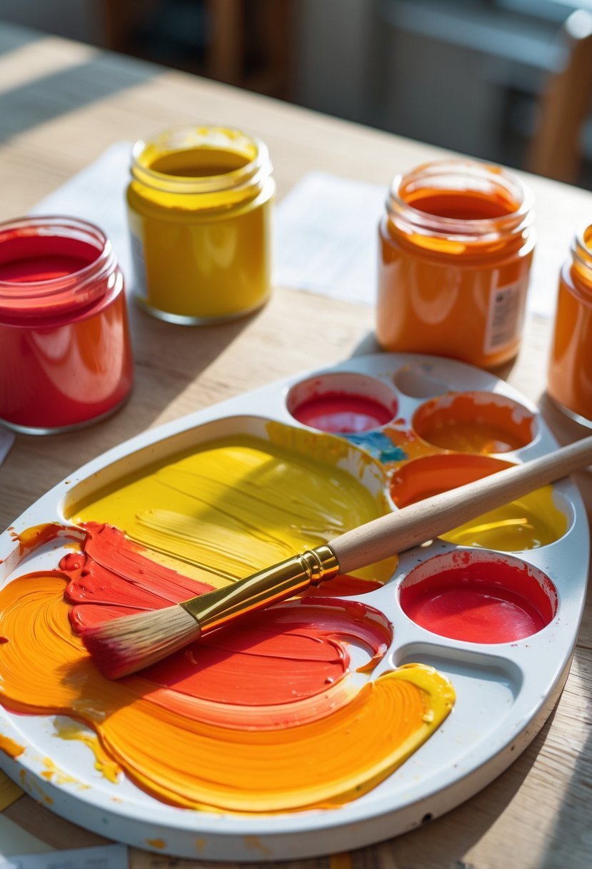
I always start by selecting reds and yellows with distinct biases to control the warmth or coolness of the orange. For example, a red with a blue undertone (like alizarin crimson) produces a deeper, cooler orange, while a warm red (such as cadmium red) results in a brighter, warmer orange.
For yellow, I often choose between a lemon yellow, which has a cooler, greenish bias, and a cadmium yellow, which leans warmer and richer. Combining a warm red with a warm yellow yields a more intense orange, while pairing a cool red with a cool yellow gives a subtler tone.
Step-by-Step Mixing Instructions
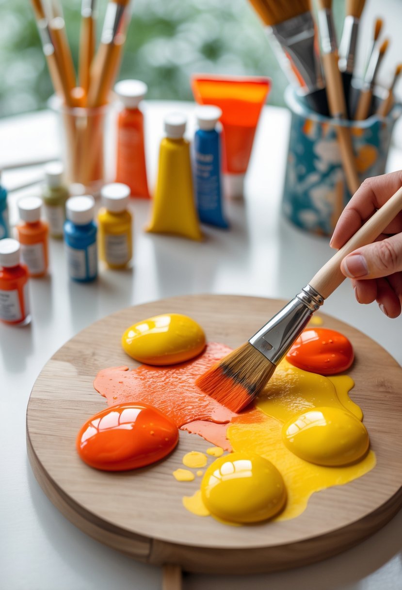
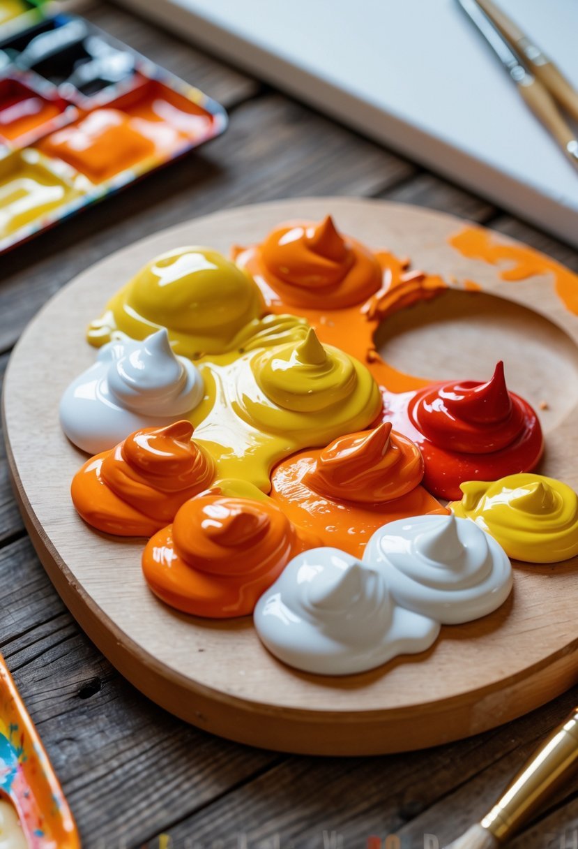
I begin by squeezing equal amounts of my chosen red and yellow onto a palette. Using a palette knife or brush, I mix the two thoroughly to avoid streaks. If the mixture appears too dark or dull, I add more yellow incrementally to brighten it.
To darken or deepen the orange, I introduce small amounts of red gradually. I keep mixing in thin layers to control the intensity carefully. If I want a muted orange, I might include a tiny bit of blue—opposite orange on the color wheel—to tone down the saturation gently.
Achieving the Perfect Shade of Orange
Adjusting orange’s shade depends on your intended use—whether for painting warmth or decorative accents. For a luminous, bright orange, I increase the yellow content while keeping the red balanced to maintain vibrancy.
If a warmer, more autumn-like orange is needed, I add red to deepen the tone but avoid overpowering the yellow, which keeps the color dynamic. Using contrast by placing orange next to blues or cool colors enhances its brightness visually without changing the pigment itself.
Small tweaks in ratios and color choice allow me to achieve a spectrum from soft peaches to fiery pumpkin shades. Constant experimentation with hue biases and quantities is key to mastering orange’s range.
Customizing Orange Shades
Adjusting the brightness, warmth, and tone of orange paint is essential for achieving the exact hue you want. I focus on three key methods: altering the value with white or black, shifting the temperature to warm or cool tones, and blending orange with other colors for unique effects.
Adjusting Orange With White or Black
To lighten orange, I add small amounts of white paint. This creates tints of orange, making the color softer and more pastel-like. Adding white also reduces the color’s intensity, which is useful for subtle highlights or lighter backgrounds.
For darkening orange, I mix in black cautiously. Black can quickly overpower, so I add it in tiny increments to create shades of orange that appear richer and deeper. Sometimes, instead of pure black, I use a dark brown to maintain warmth while darkening. This technique helps when I want a moodier or autumnal orange without losing vibrancy.
Creating Warm and Cool Oranges
Orange naturally sits between red and yellow, but shifting its warmth affects its feel. To make a warm orange, I increase the red proportion. This pushes the hue toward reddish, resembling tones like burnt orange or rust.
If I want a cool orange, I add more yellow or blend in a tiny bit of blue, which tempers the warmth and creates a softer, more muted hue closer to apricot. Using cooler oranges works well in balanced palettes or when I want to contrast warmer reds or browns.
Blending Orange With Other Colors
I often blend orange with other colors to enrich or shift its tone. For example:
- Mixing orange with blue enhances brightness through contrast but can also mute the color if overused.
- Adding green softens orange toward earthy or olive tones.
- Combining with brown introduces neutral warmth, useful for natural or rustic effects.
These blends allow me to customize orange beyond simple red-yellow mixes, expanding the palette for specific artistic needs.
Troubleshooting Common Issues
When mixing orange paint, problems often arise from improper color ratios, mixing techniques, or paint quality. Paying close attention to the hues, saturation, and consistency helps avoid common pitfalls while making adjustments can fix most mistakes quickly.
Avoiding Muddy Colors
Muddy colors usually result from mixing too many different pigments or using low-quality paints. To prevent this, I stick to just red and yellow when creating orange. Adding other colors carelessly can dull the vibrancy and throw off the hue.
Another key is controlling the ratio of red to yellow. Too much red makes the orange appear brownish or dark, while too much yellow can make it pale or greenish. I always mix slowly and test the color on a small area before proceeding.
Avoid overmixing, as it can blend pigments into a dull tone. Instead, gentle, gradual blending preserves brightness and clarity in the orange.
Fixing Mistakes
If the orange turns too dark or dull, I add small amounts of yellow to lighten and warm it up. For an overly bright or yellowish orange, a tiny bit of red deepens the tone.
When the mix becomes too thick or uneven, thinning with a compatible medium (like paint thinner for oil paints) improves flow and smoothness. If white is in the mix, it can alter saturation and brightness, so I add it cautiously.
For accidental color shifts, layering transparent glazes over the dried paint can restore richness without repainting completely.
Balancing Color Saturation
Maintaining the right saturation means balancing the intensity of red and yellow pigments. I prefer starting with pure, high-quality paints, which give me better control over saturation.
To adjust saturation:
- Increase vibrancy: Use more pigment, less white.
- Soften intensity: Add a touch of white or a complementary color sparingly.
I avoid mixing in too many colors, which can reduce saturation and create a muted tone. Instead, I fine-tune the base orange by adjusting the balance between red and yellow, focusing on the tone I want rather than adding unrelated colors.
Applications and Creative Uses for Orange Paint
Orange paint has practical uses beyond its vibrant appearance. Its role varies depending on the artistic method and the medium involved. I’ll cover how orange functions in various art and design contexts and how to mix it for different materials.
Orange in Art and Design
I use orange to convey warmth, energy, and attention in my artwork. It often appears in landscapes to mimic sunsets or autumn foliage, adding realism and atmosphere.
In graphic design, orange grabs attention without being as aggressive as red. It’s effective for calls to action and branding that needs a friendly, inviting tone.
Orange also balances well with blues and greens. This complementary pairing enhances visual impact. For crafts, I apply orange on surfaces to brighten dull materials or add contrast.
Mixing Orange for Specific Mediums
When mixing orange for acrylics, I combine pure red and yellow pigments directly, adjusting the ratio to shift from deep pumpkin to pale peach. Acrylics dry quickly, so I mix small batches as needed.
For oil paints, orange needs longer curing, allowing subtle blending of red and yellow. Oils let me fine-tune the hue with small additions of white or brown to refine tone.
In mediums like watercolor, mixing is more transparent. I layer yellow and red washes instead of blending fully on the palette, creating luminous oranges with varied intensity.
Each medium demands adjustments in pigment choice and mixing technique to achieve the right orange shade.