16 Gray Bedroom Paint Color Ideas to Transform Your Sleep Space
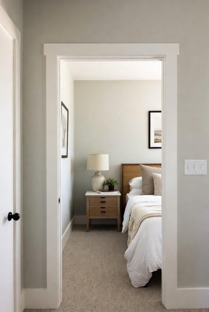
Choosing the right paint color for your bedroom is one of the most impactful design decisions you can make. It sets the tone for your mornings and helps you unwind after a long day. Gray is a fantastic choice because it offers the perfect balance of sophistication and serenity.
In this guide, I’ll walk you through 16 incredible gray paint color ideas that range from soft, barely-there hues to deep, dramatic charcoals. You’ll gain practical advice on undertones, lighting, and styling to help you create the peaceful retreat you deserve.
1. Warm Greige for Cozy Comfort
If you’re worried about gray feeling too cold, start with a “greige”—a mix of gray and beige. Sherwin-Williams’ Agreeable Gray is a top-seller for a reason; its warm beige undertone creates a welcoming atmosphere without sacrificing the modern look of gray.
I recommend pairing this shade with creamy white trim and natural wood furniture. The warmth in the wood enhances the beige notes in the paint, making your bedroom feel like a cozy sanctuary rather than a sterile box.
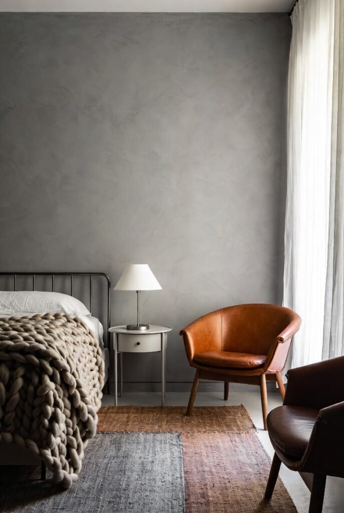
2. Cool Blue-Gray for Serenity
For a spa-like vibe, look for grays with subtle blue undertones. These shades are scientifically proven to be calming, which is exactly what you need for a restful night’s sleep. Benjamin Moore’s Gray Owl is a classic choice here, offering a crisp, fresh look that feels airy and light.
Use this color in bedrooms that get plenty of morning sunlight. The natural light will play up the blue notes, making the room feel energized and bright to help you wake up refreshed.
3. Dark Charcoal for Drama
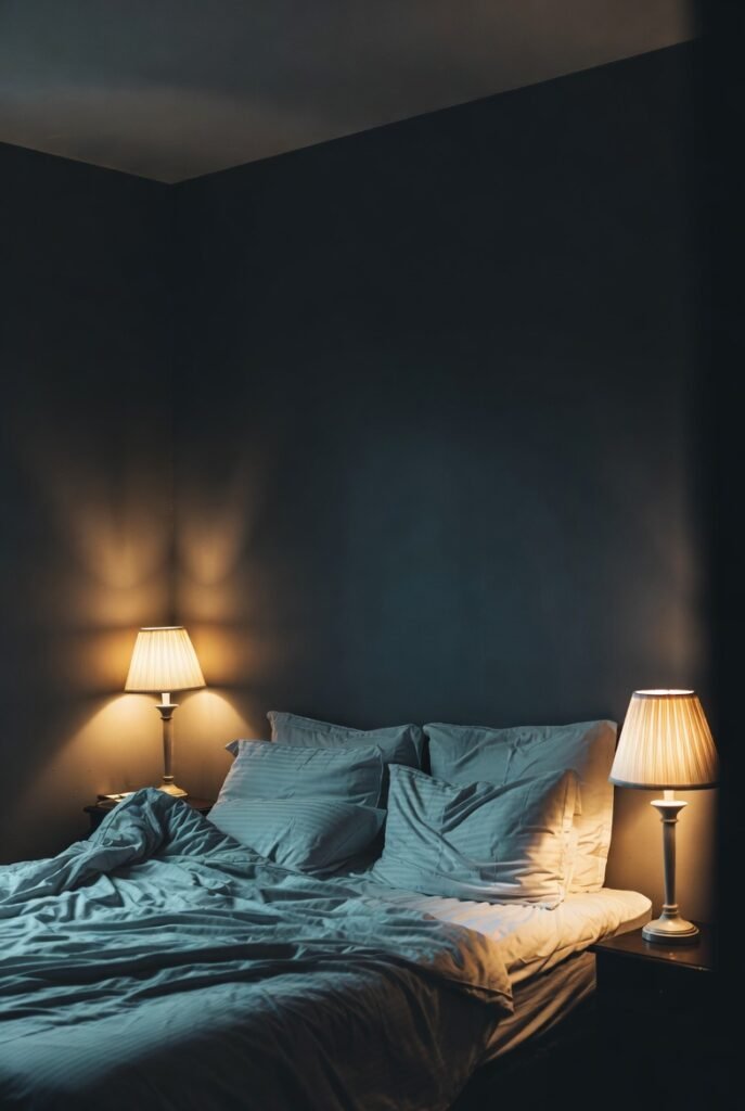
Don’t be afraid of the dark side. A deep charcoal gray can create a stunning, intimate atmosphere perfect for hibernation. Shades like Sherwin-Williams’ Iron Ore act almost like a soft black, providing a rich backdrop that makes artwork and headboards pop.
To keep the room from feeling like a cave, use high-contrast bedding in crisp white or light linen. Add plenty of ambient lighting, such as warm bedside lamps, to create a moody, sophisticated glow in the evening.
4. Silvery Gray for Elegance
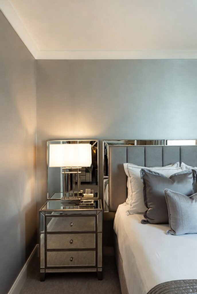
Silver-toned grays add a touch of glamour and sophistication to a bedroom. These shades reflect light beautifully, making them an excellent choice for smaller rooms that you want to feel larger. Look for paints with a slightly higher Light Reflectance Value (LRV) to maximize this effect.
I love pairing silvery grays with mirrored furniture or metallic accents like brushed nickel lamps. This amplifies the shimmering quality of the walls and gives your bedroom a luxurious, hotel-like feel.
5. Green-Gray for Nature Lovers
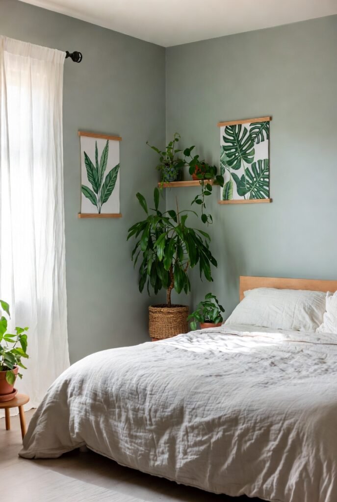
Bring the outdoors in with a gray that features subtle green undertones. This earthy connection grounds the space and promotes relaxation. Sherwin-Williams’ Sea Salt is a famous example that shifts between gray, green, and blue depending on the light.
This shade works wonders with botanical prints and real houseplants. The greenery pulls out the earthy notes in the paint, creating a harmonious, organic look that feels incredibly restorative.
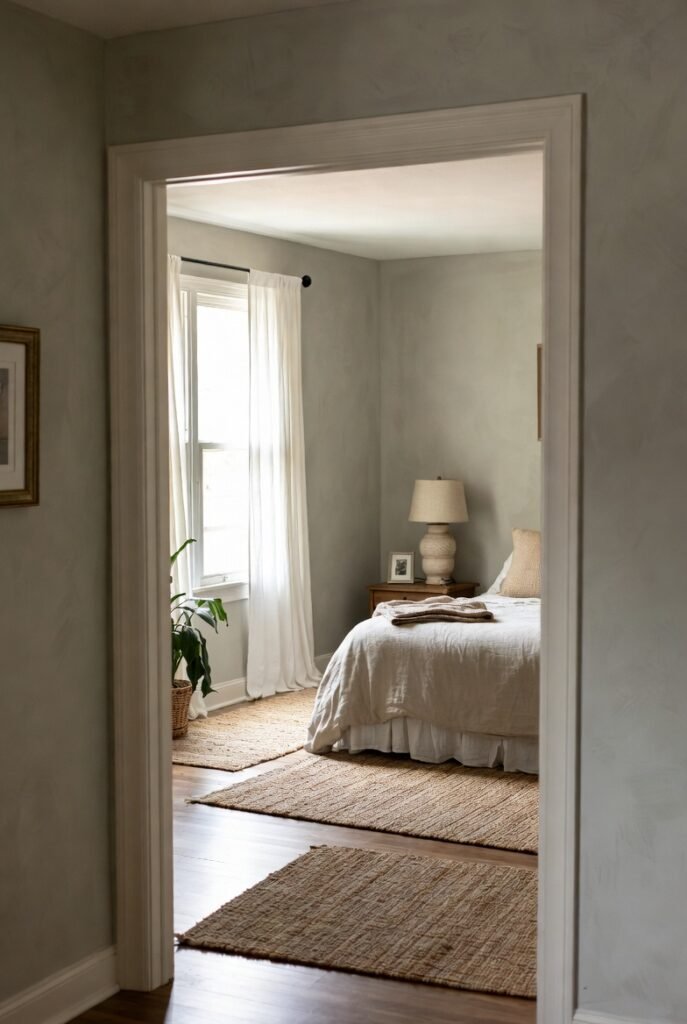
6. Classic Neutral Gray
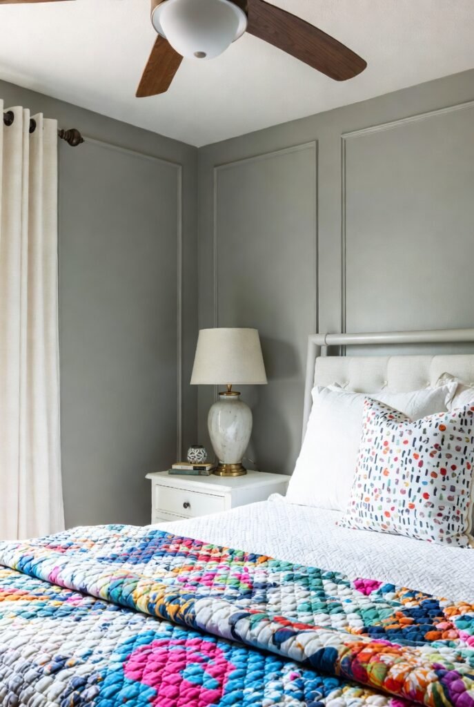
Sometimes you just want a true, neutral gray that doesn’t lean too warm or too cool. These “middle-of-the-road” shades are incredibly versatile backdrops for any decor style. Sherwin-Williams’ Repose Gray fits this bill perfectly, sitting comfortably between warm and cool.
Because it’s so neutral, you can easily switch up your bedding and accessories whenever you want a new look. Whether you love bold, colorful quilts or minimalist white duvets, a classic neutral gray supports your style without clashing.
7. Soft Mist Gray
If you prefer a minimalist aesthetic, a whisper-soft gray is your best friend. These shades are so pale they almost read as white but have enough pigment to soften the harshness of pure white walls. Benjamin Moore’s Horizon is a beautiful option that feels like morning mist.
Use a flat or matte finish for these very light colors to hide imperfections in your drywall. The lack of shine creates a velvety texture that enhances the softness of the color, making the room feel cloud-like.
8. Slate Gray for Depth
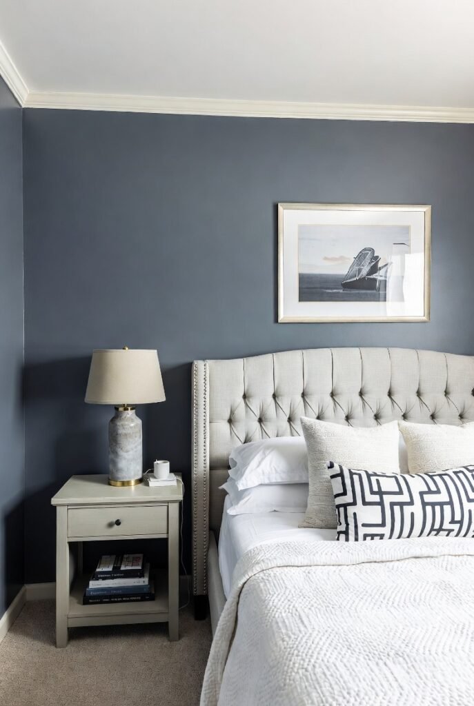
Slate gray brings a sturdy, architectural feel to a bedroom. It has a strong presence without being overpowering. These medium-dark tones often have cool blue or purple undertones that add complexity and richness to the walls.
I find that slate gray looks exceptional on a feature wall behind the bed. It anchors the room and creates a focal point, especially when paired with a tufted upholstered headboard in a lighter fabric.
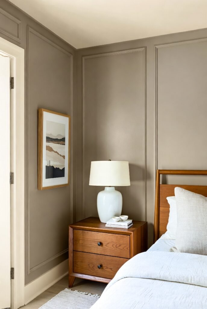
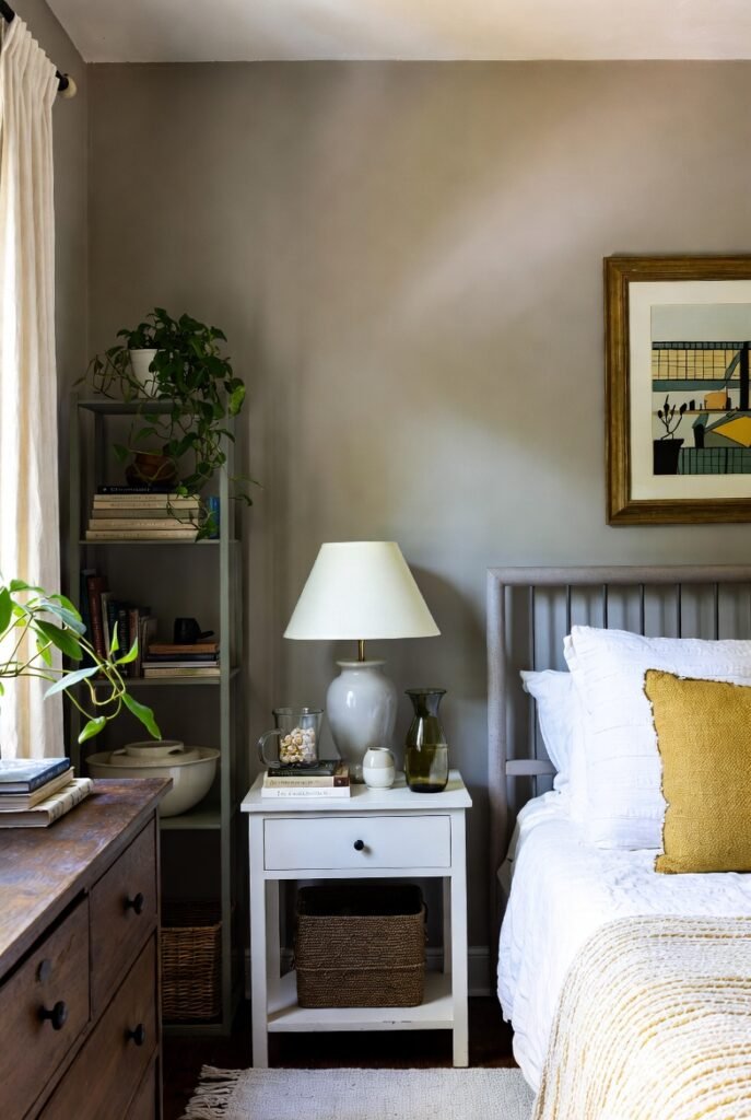
9. Taupe-Gray for Warmth
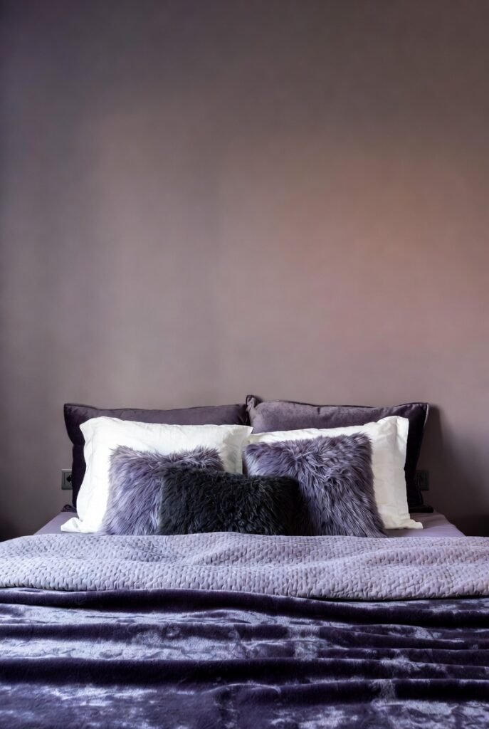
Taupe-gray is another excellent option for those who crave warmth. Unlike greige, which can sometimes look muddy, taupe-grays have a sophisticated purple or pink undertone. This adds a layer of romanticism and softness to the bedroom.
Pair these shades with soft textiles like velvet or faux fur throws. The texture complements the depth of the color, creating a space that feels luxurious and inviting—perfect for reading a book on a rainy Sunday.
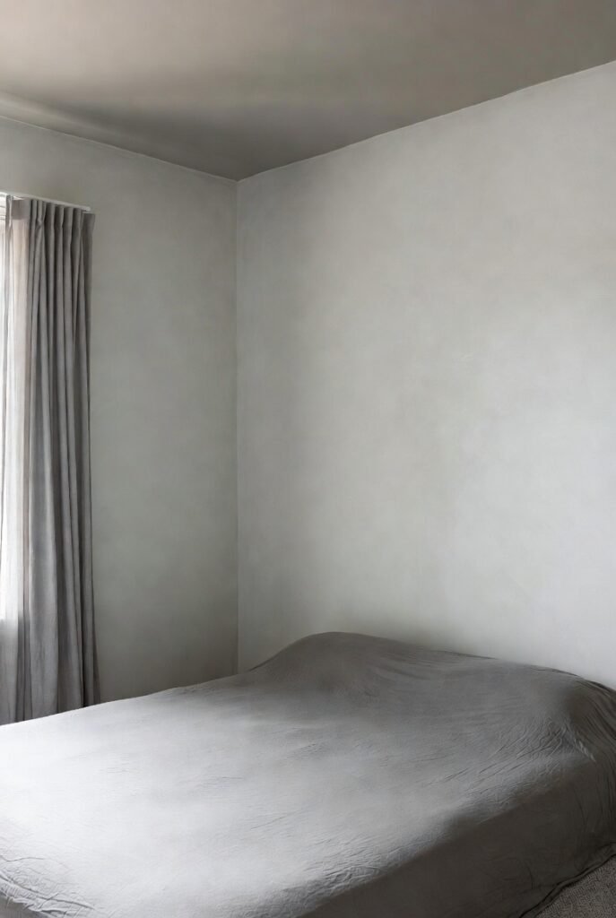
10. Industrial Concrete Gray
For a modern, urban look, embrace the aesthetic of raw concrete. You can achieve this with specific painting techniques or textured wallpapers, but a flat, cool gray paint gets you halfway there. Look for pure, cool tones without warm undertones.
To warm up an industrial gray room, rely on texture rather than color. Think chunky knit blankets, leather accent chairs, and layered rugs. These elements add physical warmth to balance the visual coolness of the walls.
11. Pebble Gray for texture
Pebble grays evoke the smooth, weathered look of river stones. They are typically medium-light shades that feel organic and restful. This color family is perfect for creating a “coastal grandma” or beachy vibe without resorting to cliché bright blues.
Combine pebble gray walls with natural fiber rugs like jute or sisal. The rough texture of the natural materials contrasts beautifully with the smooth visual of the paint, adding interest to your serene color palette.
12. Lavender-Gray for Softness
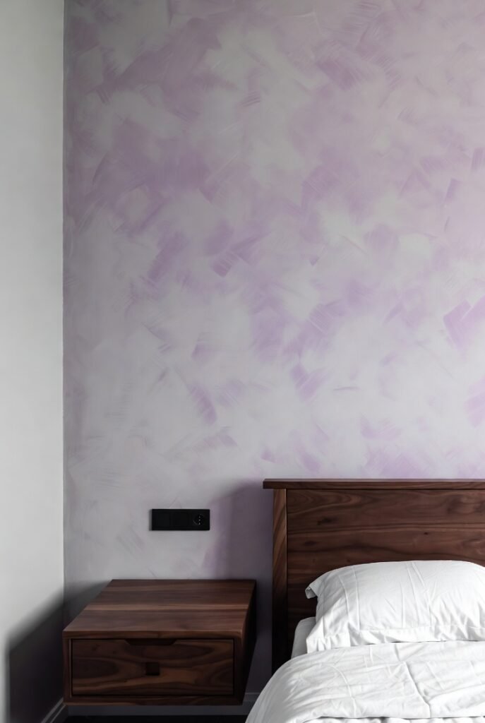
A gray with a hint of lavender is a sophisticated way to add color without overwhelming the space. It feels feminine and gentle but remains grounded enough for a shared primary bedroom.
This color pairs beautifully with dark wood furniture, which grounds the ethereal quality of the lavender notes. Keep your bedding simple and white to let the subtle wall color shine without competing for attention.
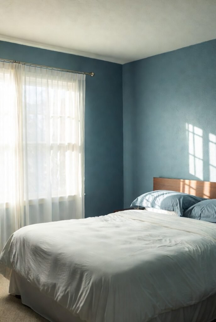
13. Blue-Black Gray for contrast
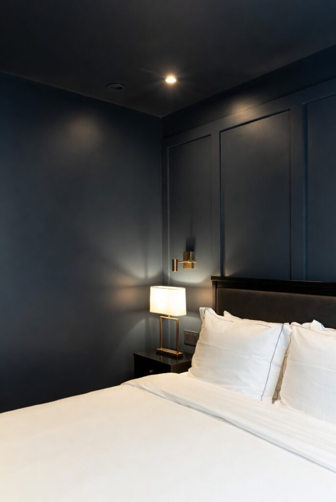
For the boldest among us, a gray that borders on black-blue is a showstopper. It’s incredibly chic and makes everything else in the room feel more expensive. Sherwin-Williams’ Cyberspace is a great example of this deep, moody hue.
Lighting is crucial here. Ensure you have layered lighting options—overhead, task, and accent—so the room doesn’t feel like a black hole at night. When lit correctly, these dark walls recede, actually making the room feel larger and more infinite.
14. Putty Gray for vintage vibes
Putty gray is a vintage-inspired shade that feels lived-in and comfortable. It has a bit of yellow or brown in it, giving it an “old world” charm. It’s less crisp than modern grays, offering a more relaxed and traditional feel.
I recommend using this shade in rooms with vintage furniture or antique finds. The paint color bridges the gap between old and new, making your eclectic collection feel cohesive and curated rather than cluttered.
15. Metallic Gray for Accents

While you might not paint an entire room in metallic paint, using a metallic gray for an accent wall or ceiling detail can be stunning. It reflects light in unique ways, adding movement and energy to the space.
Try painting a tray ceiling in a metallic gray to draw the eye upward and add a touch of unexpected luxury. It captures the glow of your light fixtures, creating a warm and shimmering ambiance overhead.
16. Off-White Gray
Finally, consider the barely-there grays that are just a shade away from white. These are perfect for those who love the all-white trend but want a bit more depth. They provide a clean slate that feels fresh and airy.
To make this look work, paint your trim a pure, bright white. The subtle contrast between the off-white gray walls and the bright white trim highlights the wall color, proving that it is indeed gray and not just plain white.
Conclusion
Whether you prefer the cozy warmth of a greige or the dramatic flair of charcoal, there is a gray paint color out there that is perfect for your bedroom. Remember to test your chosen color on your walls and observe it at different times of the day before committing.
Ready to start your bedroom transformation? Pick up a few samples this weekend and see how the right gray can change your sleep sanctuary for the better.