
16 Front Door Paint Colors to Transform Your Home’s Curb Appeal
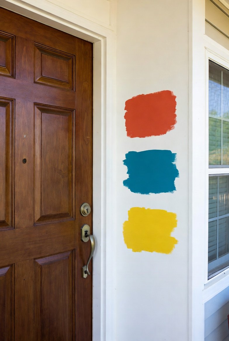
Choosing the right front door paint color is a simple way to enhance your home’s curb appeal and express your personal style. I’ve gathered sixteen versatile colors that work well across different home exteriors, helping you find the perfect shade to make a strong yet tasteful impression.
The best front door colors balance aesthetics with the architecture and setting of your home, creating an inviting and cohesive look. Whether you prefer classic or bold options, these color choices can transform your entryway without requiring major renovations.
1) Classic Black
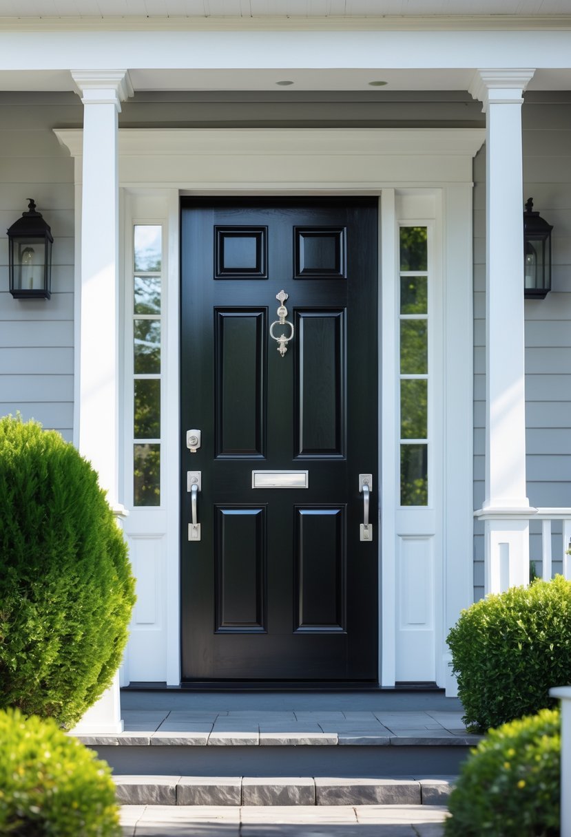
I often recommend classic black for front doors because of its timeless appeal. It creates a bold contrast, especially on lighter-colored exteriors, making your entryway stand out.
Black never goes out of style. Shades like deep jet black or rich onyx provide an elegant and sophisticated look. For a softer touch, I sometimes suggest matte black or charcoal tones, which add subtle depth without harshness.
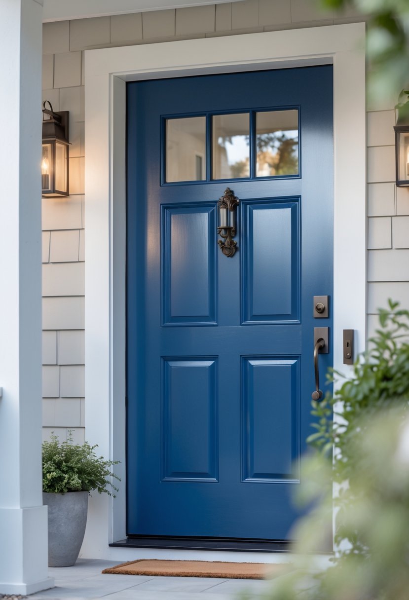
2) Navy Blue
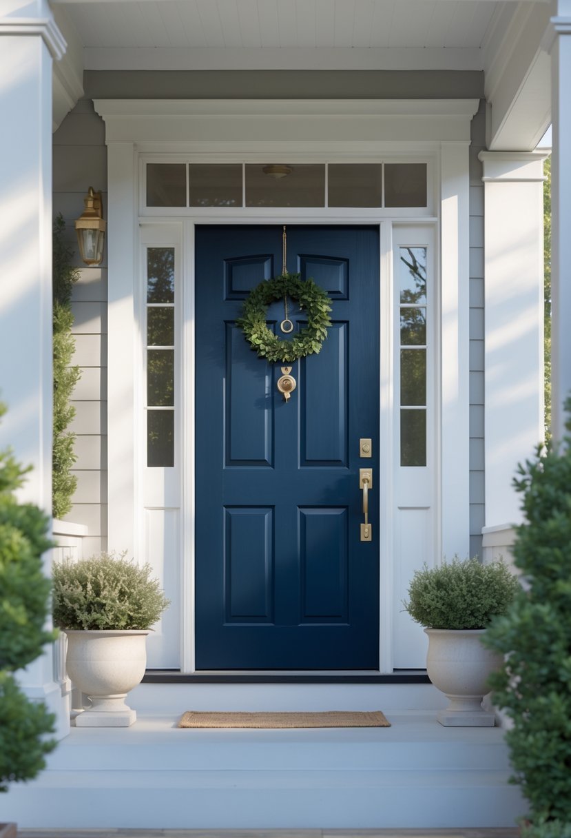
I find navy blue to be a versatile choice for a front door. It brings a sense of calm and elegance without being too bold. Navy pairs well with many exterior colors, like white, beige, gray, and even brown.
In my experience, the key to using navy successfully is choosing the right finish and complementary hardware. It works especially well on homes that have a classic or coastal style. Navy offers a timeless look that feels both welcoming and sophisticated.
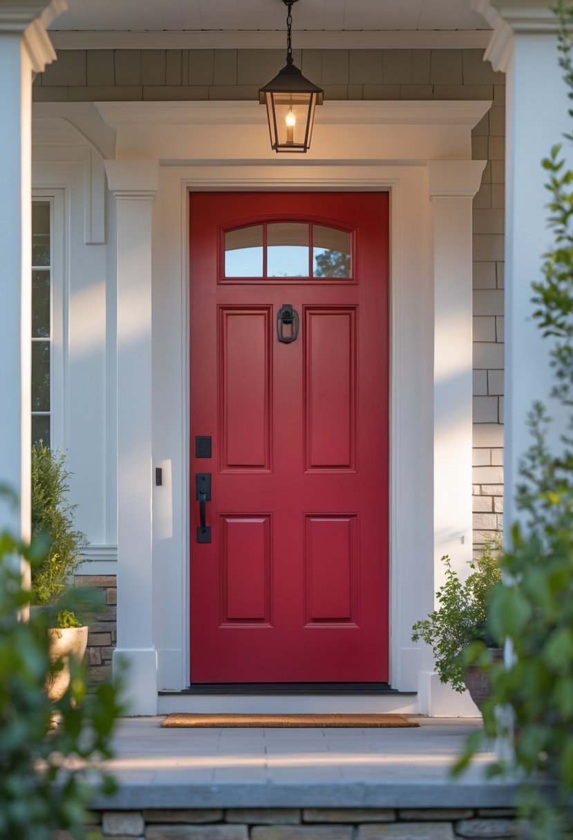
3) Cherry Red
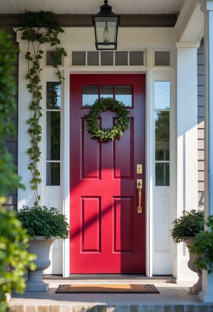
I find cherry red to be a bold, classic choice for a front door. It adds warmth and instant curb appeal without overwhelming the overall look.
Its vibrant tone works well with neutral exteriors, offering a striking contrast that draws the eye. Cherry red can range from bright and playful to deeper, richer shades depending on how much black or white is mixed in.
When I choose cherry red, I always recommend testing samples first. Lighting and surrounding colors can change how the shade appears on your door.
4) Hunter Green
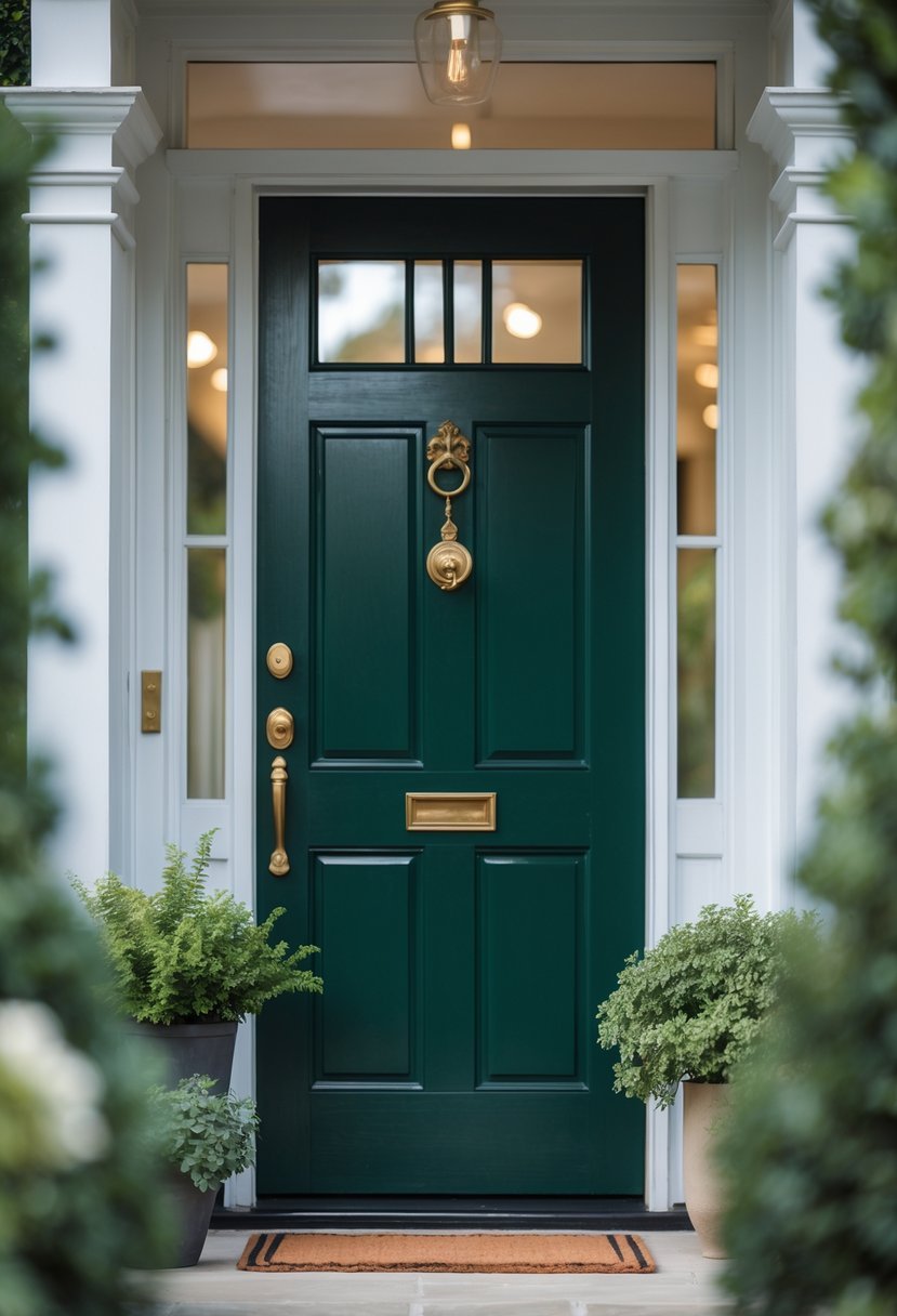
I find hunter green a timeless choice for front doors. It carries a deep, rich tone that adds elegance without being overpowering.
This color works well with both traditional and modern homes. Its subtle warmth invites guests while maintaining a sophisticated look.
Hunter green also pairs nicely with neutral exteriors like beige or gray. For me, it offers a perfect balance between bold and classic.
5) Sunny Yellow
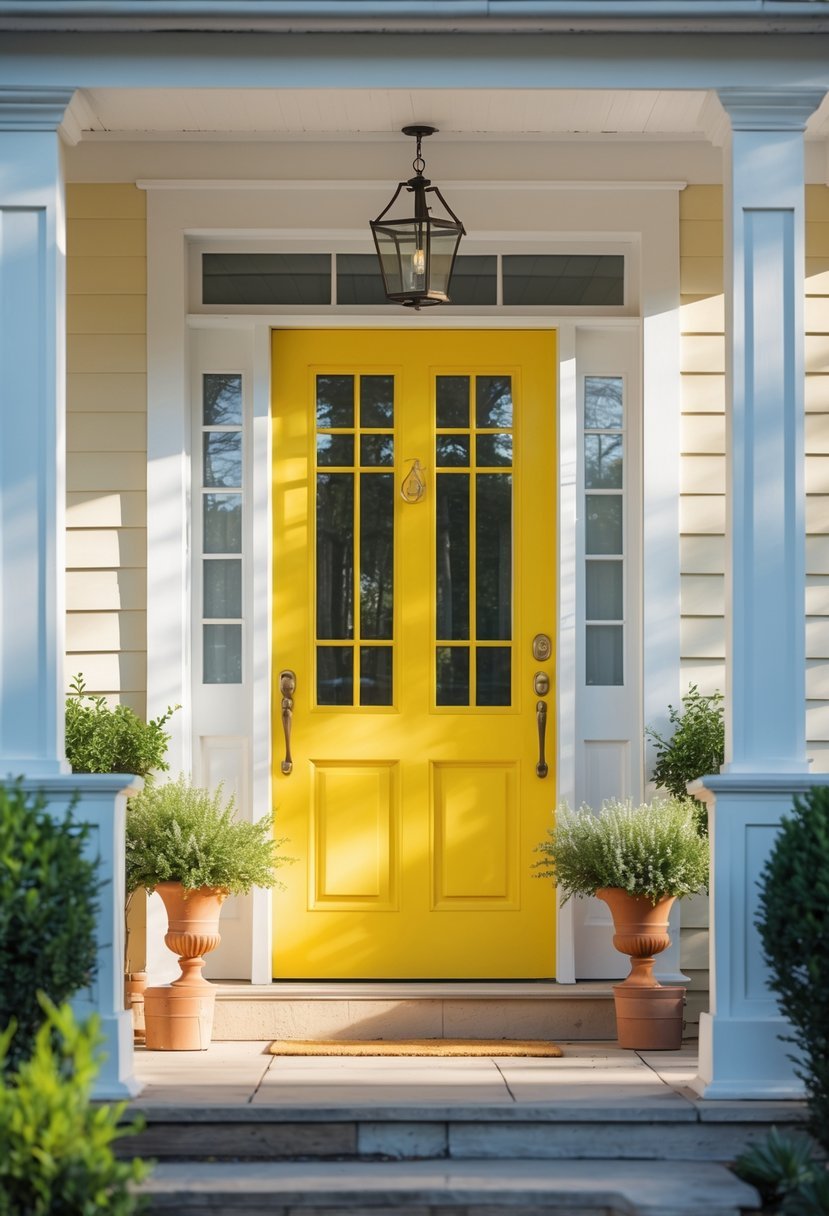
I find sunny yellow to be a strong choice for front doors. It instantly brightens the entrance and adds warmth without overwhelming the overall look.
Yellow pairs well with many styles, from modern to traditional homes. I often suggest combining it with crisp white or charcoal trim to increase contrast and visual impact.
This color also withstands various weather conditions, maintaining vibrancy over time. When choosing yellow, I recommend testing shades to match your home’s character and surrounding environment.
6) Crisp White
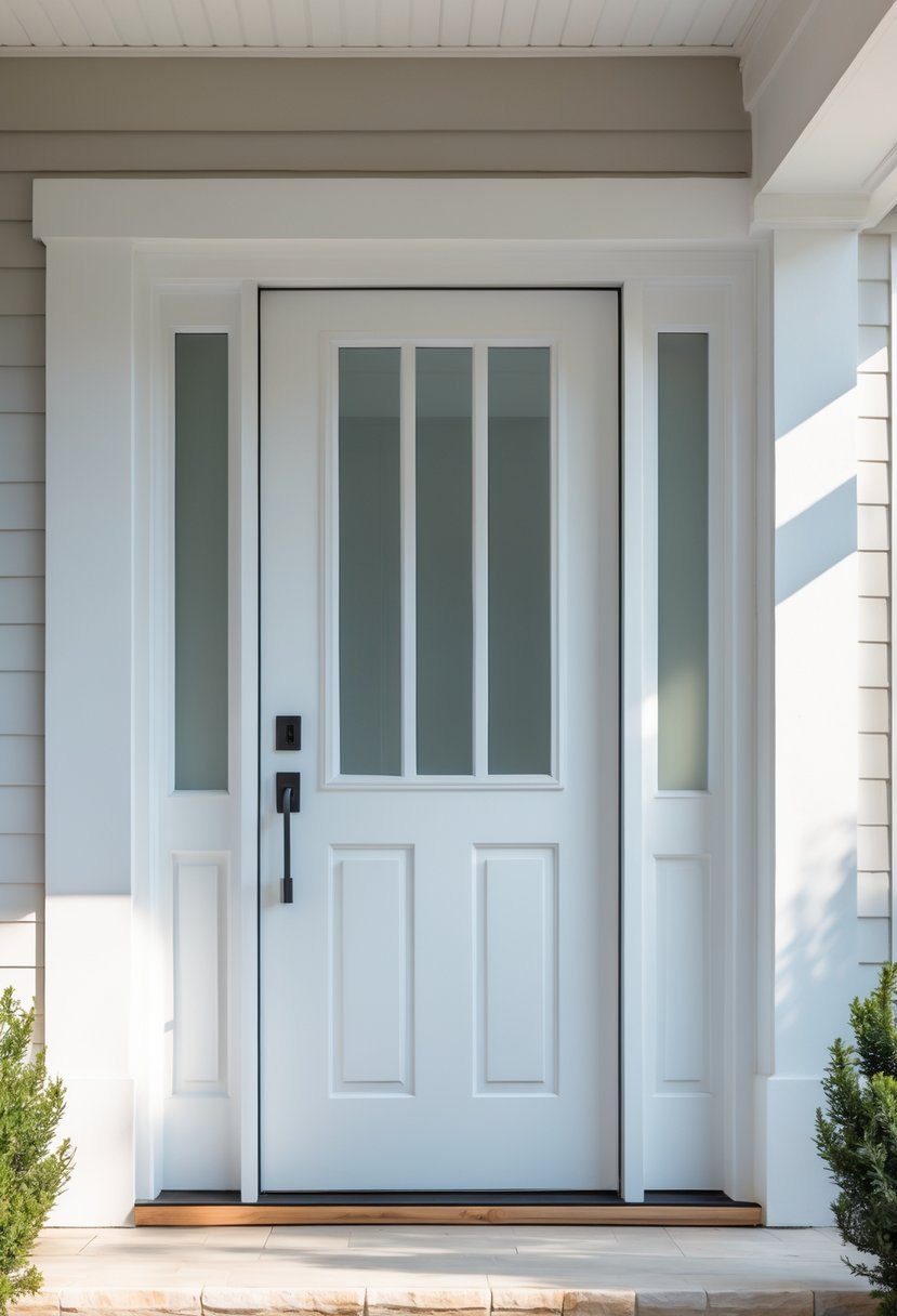
I often recommend crisp white for a front door when you want a clean, classic look. White symbolizes purity and simplicity, making it a timeless choice that works with almost any exterior color.
This color creates a fresh, inviting entry without overwhelming other design elements. It pairs especially well with natural wood accents or black hardware, adding subtle contrast while maintaining elegance.
7) Charcoal Gray
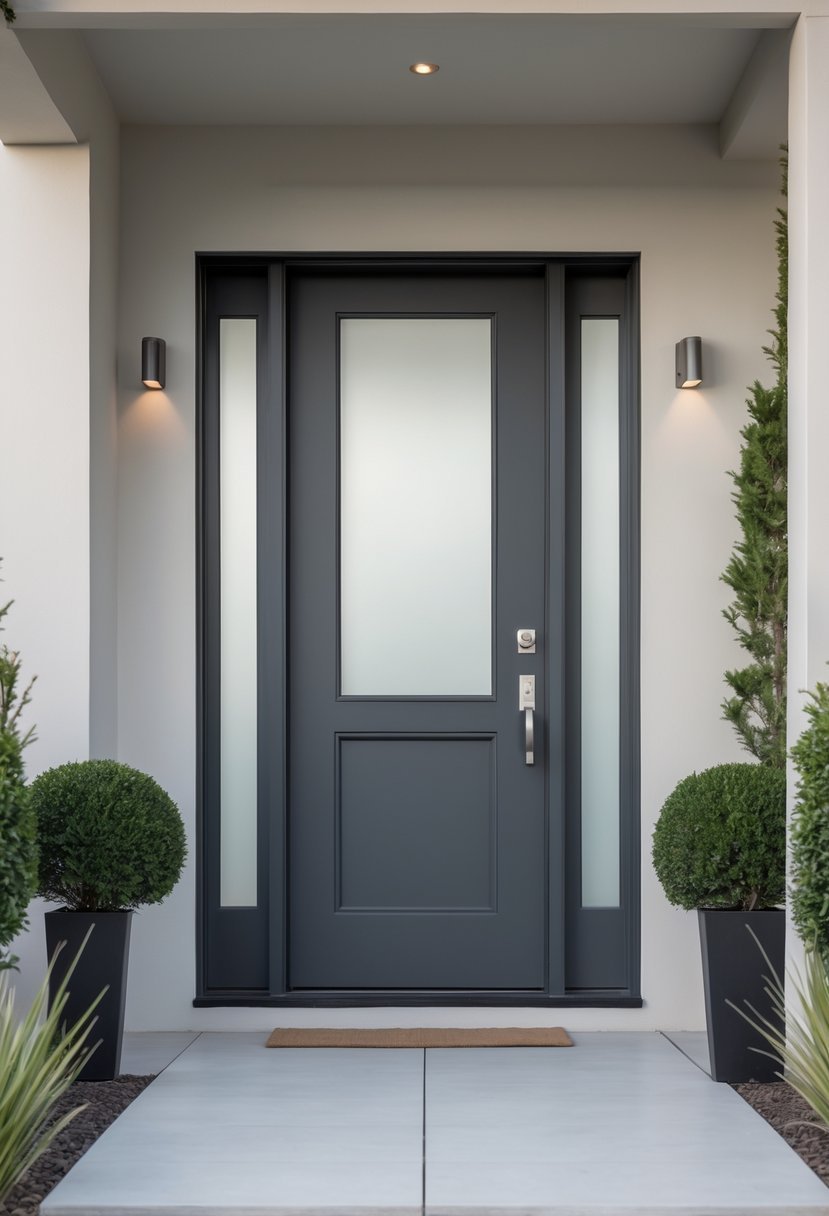
I find charcoal gray to be one of the most refined front door colors for gray homes. It creates a sleek, cohesive look without overwhelming the exterior.
Charcoal blends well with many gray shades, offering tonal harmony that feels elegant and understated.
This color also hides dirt effectively, making it practical for busy households. I recommend pairing it with brass or matte black hardware for a modern finish.
8) Deep Teal
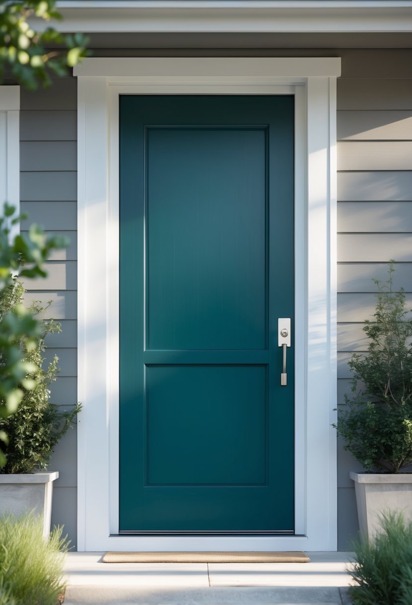
I find deep teal to be a strong choice for a front door color. Its blend of blue and green offers depth without overwhelming the exterior.
This shade works well as an accent, especially on doors and shutters. I recommend checking paint durability to ensure it holds up well outdoors.
Deep teal adds character to various home styles, from traditional to modern. It creates a subtle but distinct statement that complements many color palettes.
9) Burnt Orange
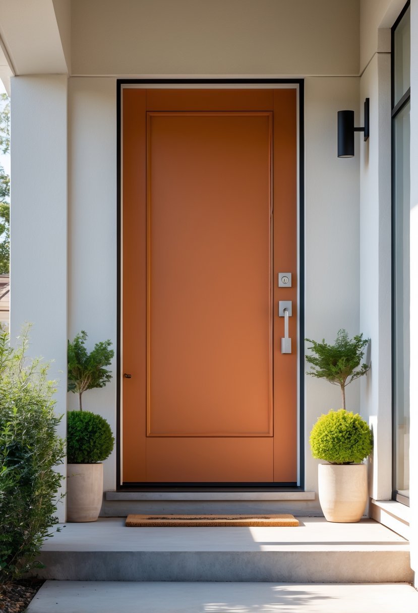
I find burnt orange to be a strong choice for a front door color. It offers warmth without being too bright, striking a good balance between energy and subtlety.
This hue works well across various architectural styles and adds a distinct touch that stands out without overwhelming. I also appreciate how burnt orange pairs nicely with neutral tones like gray or beige for a cohesive look.
Choosing burnt orange can elevate curb appeal while maintaining a grounded, inviting feel to your home’s entrance.
10) Mountain Berry Red
Mountain Berry Red is a rich, deep shade that adds warmth without overwhelming a home’s exterior. I find it works well on a range of architectural styles, from traditional to modern.
This color offers a balance between bold and subtle, making it a versatile choice. It pairs nicely with neutral siding and stone, creating a welcoming, grounded look.
11) Bright Coral
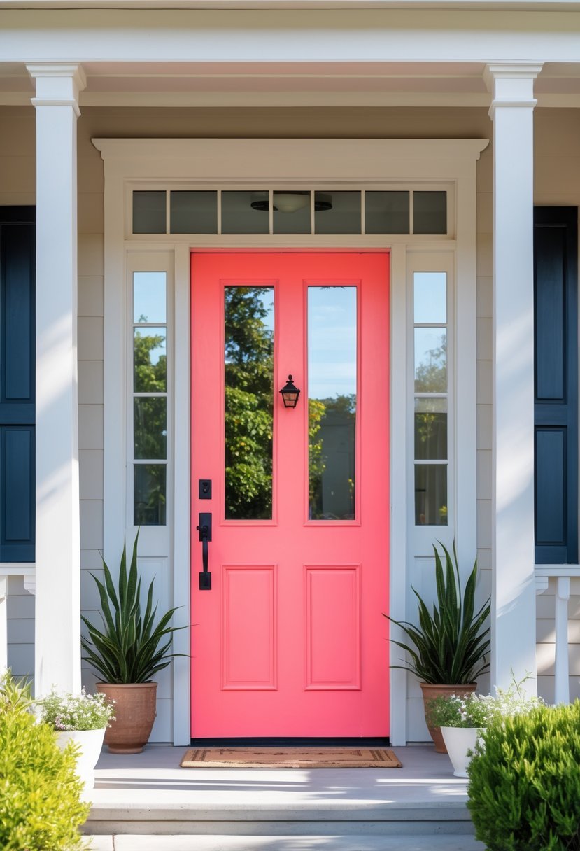
I find bright coral to be a vibrant choice that instantly adds warmth and energy to a front door. It balances boldness with approachability, making it a great option if you want your entryway to feel inviting but also eye-catching.
Pairing bright coral with neutral tones like black and white creates a classic, elegant look. It’s also versatile enough to complement various exterior styles, from modern to traditional. Testing the color in different lighting helps ensure it fits the home’s overall aesthetic.
12) Sapphire Blue
I find Sapphire Blue to be a strong, subdued shade with a slight violet undertone. It works well on front doors, giving a refined yet welcoming appearance.
This color pairs beautifully with light-toned woods, adding balance and elegance to the entrance. Sapphire Blue fits both modern and traditional homes depending on the surrounding trim and siding colors.
Choosing this shade can subtly enhance your home’s curb appeal without overwhelming the overall look. It’s a versatile option that I often recommend for those wanting a deep, rich blue.
13) Warm Taupe
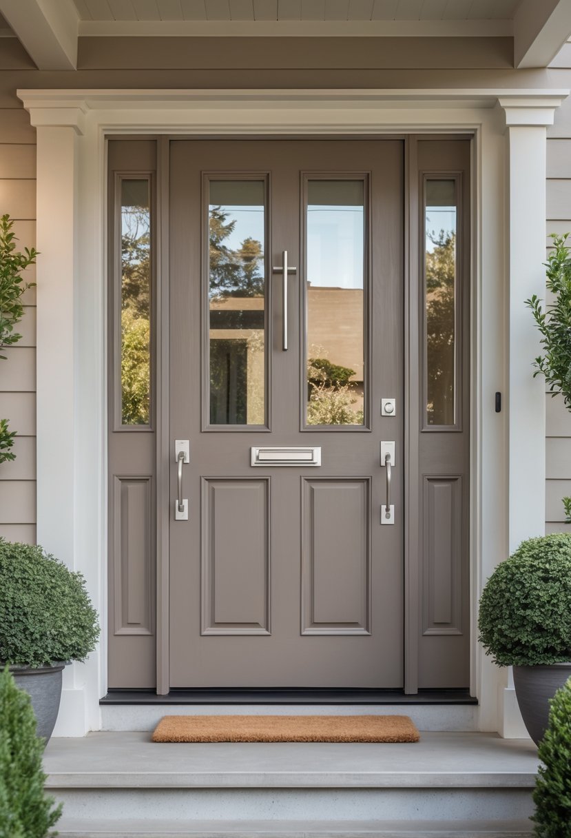
I find warm taupe to be a versatile choice for a front door. It blends brown and gray tones with a subtle warmth, creating an inviting but understated look.
This color pairs well with natural wood accents and earth-toned exteriors. It’s neutral enough to complement various trim colors without overwhelming the facade.
When I use warm taupe, it adds depth and softness. It works especially well if you want a timeless and natural feel without bold contrast.
14) Rich Burgundy
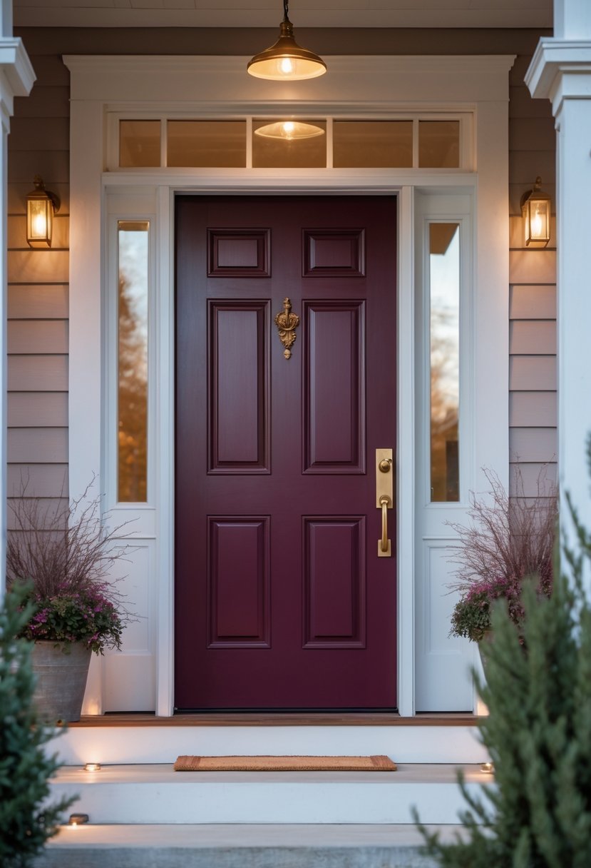
I find rich burgundy to be a timeless choice for front doors. This deep red hue blends warmth with a touch of sophistication. It can create an inviting yet elegant entryway.
Burgundy often balances between red and purple tones, depending on the shade. I like how it works well with various exterior materials like brick or stone. It makes a front door stand out without feeling too bold or overwhelming.
15) Elegant Eggplant
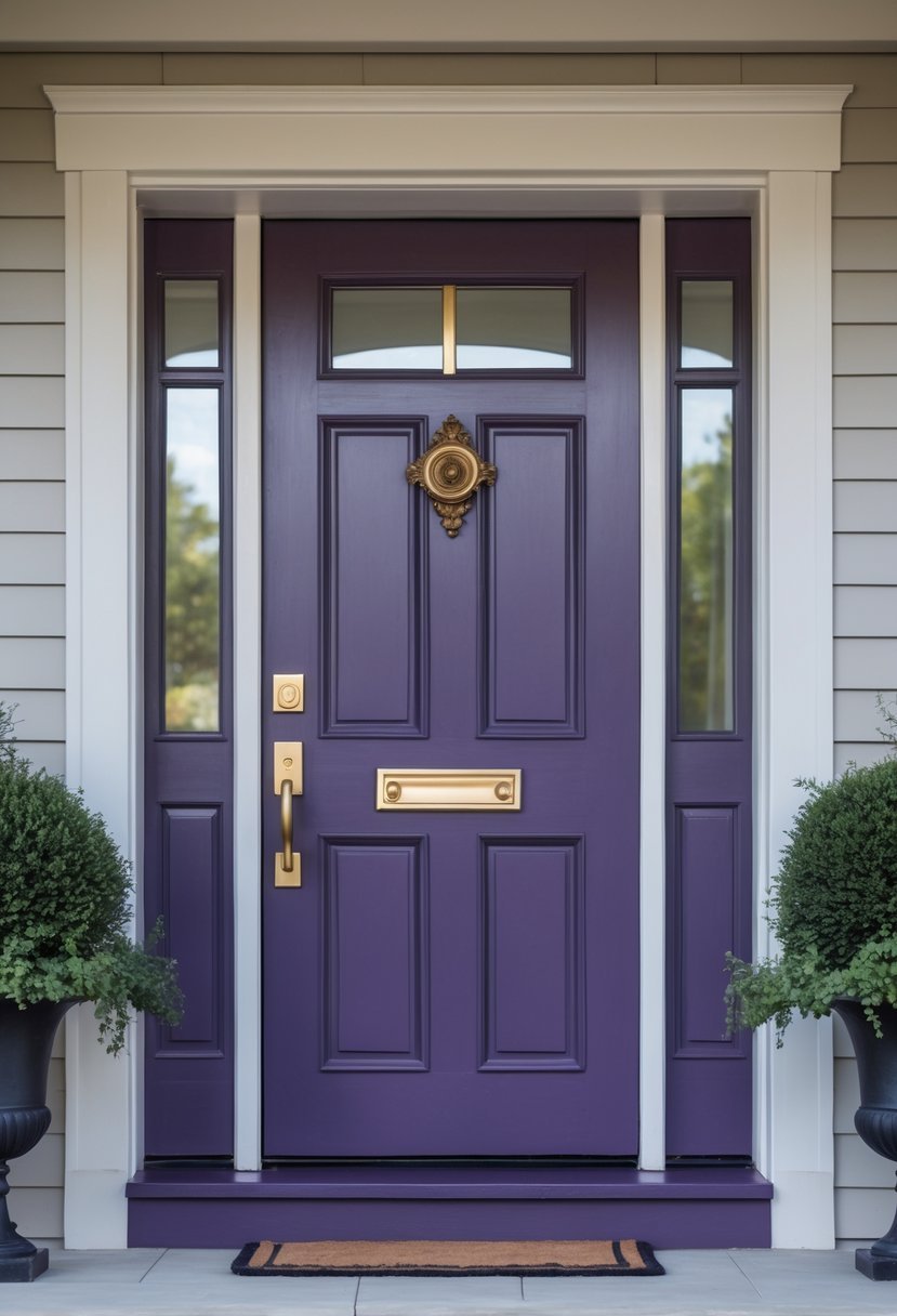
I find eggplant to be a sophisticated choice for a front door color. Its deep purple tone adds warmth without overpowering the exterior.
Eggplant pairs well with neutral shades, creating a balanced and inviting look. It can bring a touch of luxury while maintaining a cozy feel.
When selecting eggplant, I always consider lighting—natural and artificial light can change how the color appears, so testing it in different conditions is important.
16) Vibrant Turquoise
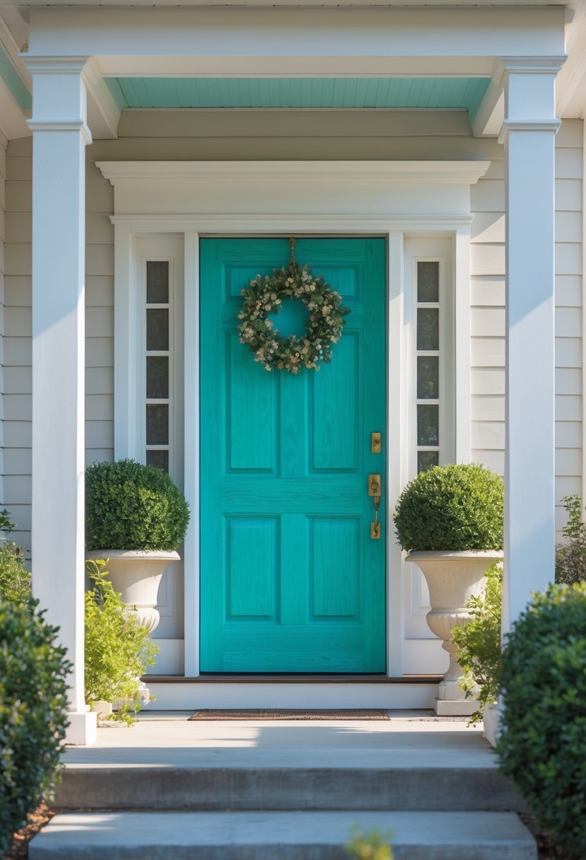
I chose vibrant turquoise for its balance between energy and calm. This color instantly lifts the exterior without overwhelming it.
Turquoise works well with various architectural styles, from traditional cottages to modern homes. I find it especially effective when paired with natural wood or neutral tones, creating a fresh, inviting look.
This shade adds personality while maintaining a timeless appeal, making my front door stand out in a subtle, confident way.