16 Farmhouse Living Room Paint Colors
Farmhouse style is all about comfort, warmth, and simplicity. It’s a design aesthetic that invites you to kick off your shoes and relax. But finding the perfect paint color to achieve that cozy, lived-in vibe can be surprisingly tricky.
In this guide, I’ll walk you through 16 of the best farmhouse living room paint colors. From creamy whites to moody accents, these shades will help you transform your space into a welcoming retreat.
1. Benjamin Moore White Dove (OC-17)
White Dove is a legendary shade in the farmhouse world, and for good reason. It has an LRV (Light Reflectance Value) of 83.16, making it bright but never blinding.
Its subtle warmth keeps it from feeling sterile, offering a soft glow that pairs beautifully with rustic wood beams or antique furniture. I love using this on walls and trim for a seamless, airy look.
Tip: Pair this with matte black hardware or lighting fixtures to add a modern industrial edge to your farmhouse vibe.
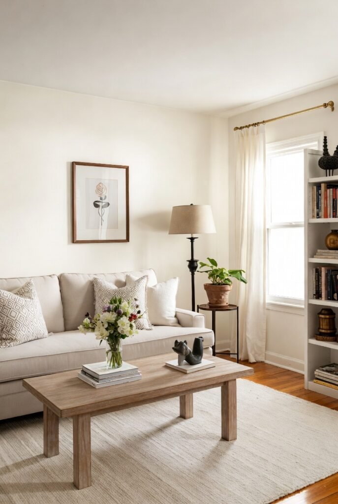
2. Sherwin-Williams Alabaster (SW 7008)
Named a Color of the Year, Alabaster is the definition of a “true neutral” for new beginnings. It provides a sense of personal solace, perfect for a space where you want to unwind.
It’s creamy without being yellow, striking a balance that feels both fresh and historic. This color works wonders on shiplap, enhancing the texture without overwhelming the room.
Tip: Use Alabaster in a room with plenty of natural light to see its subtle undertones truly shine.
3. Sherwin-Williams Accessible Beige (SW 7036)
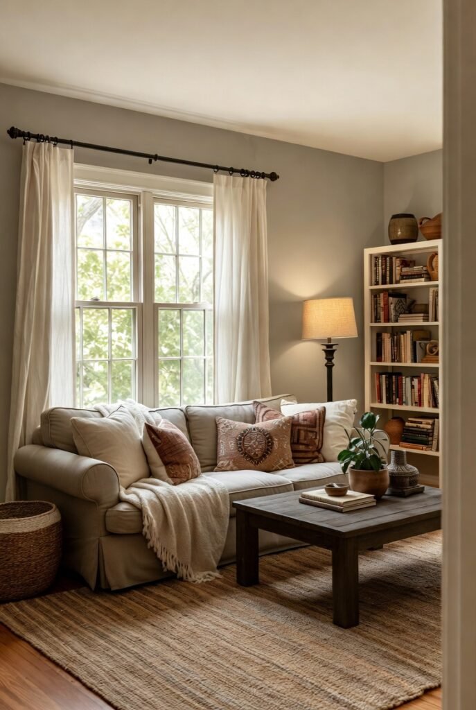
If you aren’t a fan of stark white, Accessible Beige is a fantastic alternative. Unlike many beiges that pull too yellow, this shade has gray undertones that create a warm, snug feel.
It serves as a wonderful backdrop for earthy tones and natural textures like jute rugs or linen curtains. It’s cozy, inviting, and incredibly versatile.
Tip: This color looks great with crisp white trim (like Pure White SW 7005) to create a clean, classic contrast.
4. Benjamin Moore Revere Pewter (HC-172)
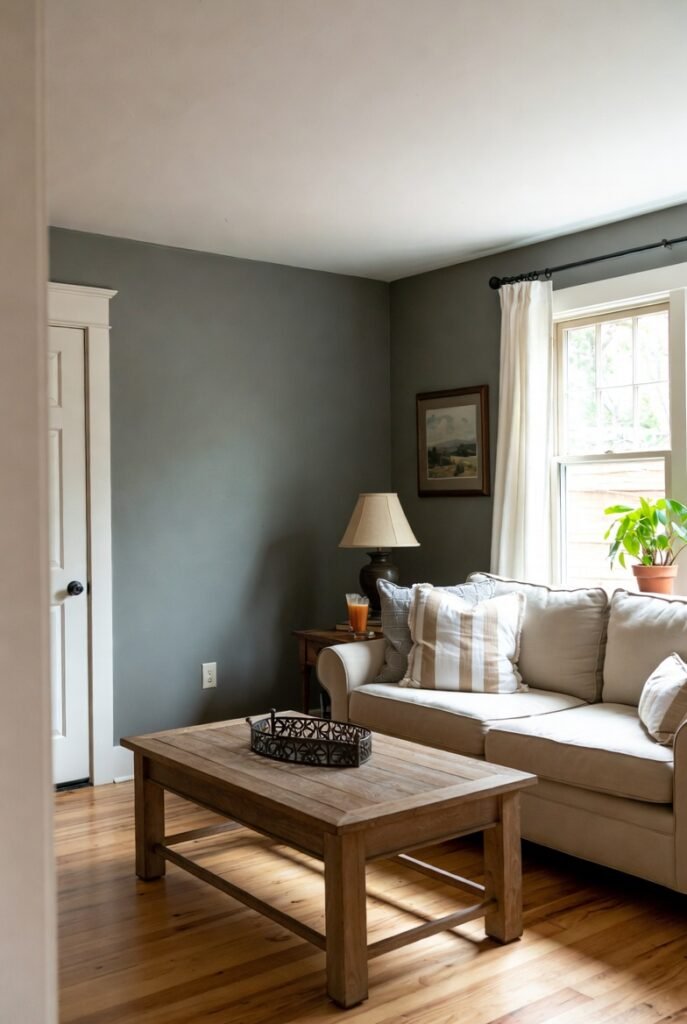
Revere Pewter acts as a bridge between warm and cool tones. With an LRV of 55.05, it is a mid-tone gray that feels grounded and substantial.
It’s often called the perfect “greige” because it adapts to its surroundings. In a farmhouse living room, it adds depth while maintaining that essential neutral palette.
Tip: This shade is perfect for open floor plans because it transitions smoothly between different lighting conditions.
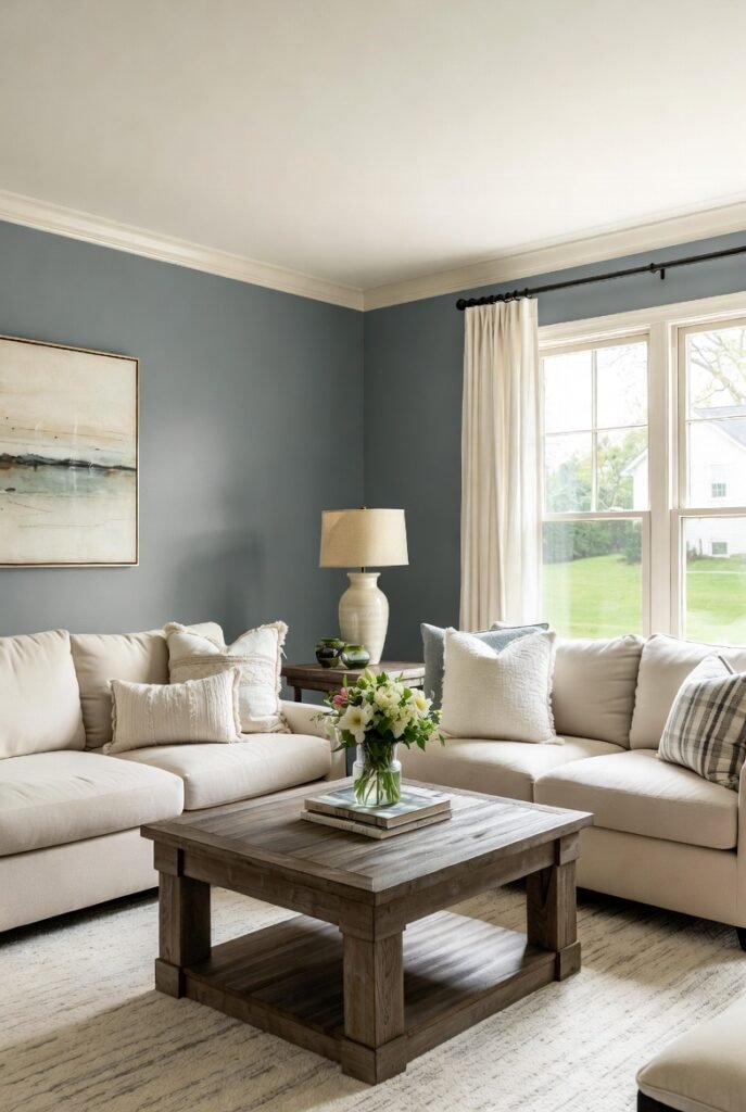
5. Sherwin-Williams Sea Salt (SW 6204)
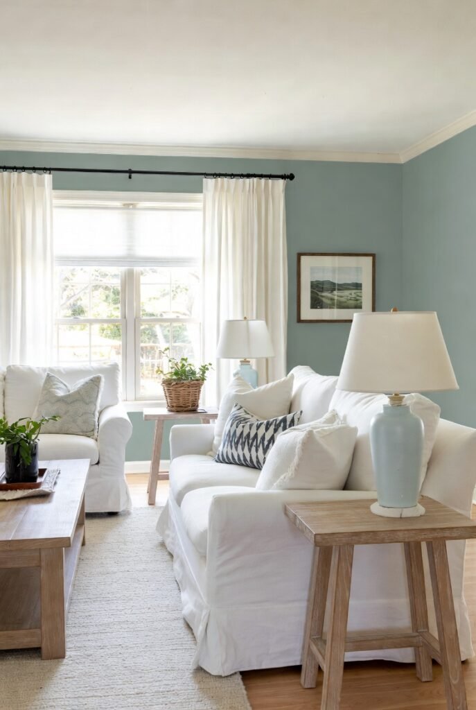
For a pop of color that remains tranquil, Sea Salt is my go-to. It’s a soft, muted green-gray that evokes the feeling of a coastal farmhouse.
It brings a breath of fresh air into the living room, pairing beautifully with white slipcovered furniture and light wood tones. It’s subtle enough to act as a neutral but interesting enough to stand out.
Tip: Combine this with silver or brushed nickel accents to play up its cool, calming undertones.
6. Benjamin Moore Hale Navy (HC-154)
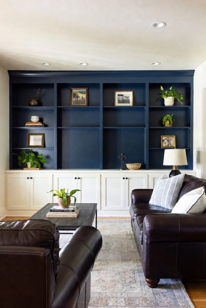
Farmhouse style isn’t just about white walls. A deep, classic navy like Hale Navy adds incredible drama and sophistication.
I recommend using this on an accent wall or built-in bookshelves. It creates a stunning focal point that anchors the room, especially when contrasted with white trim and leather furniture.
Tip: Use brass or gold accents against this dark blue for a look that feels timeless and elegant.
7. Sherwin-Williams Repose Gray (SW 7015)
Repose Gray is a light gray with a slight warmth to it, preventing it from feeling icy. It’s a modern take on the farmhouse look that leans a bit more contemporary.
This shade is excellent for those who want a clean slate that still feels cozy. It creates a serene atmosphere that allows your decor pieces to take center stage.
Tip: Layer in textured throw pillows and blankets in varying shades of gray and cream to add dimension.
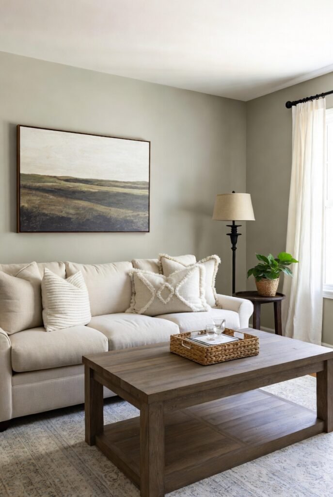
8. Sherwin-Williams Agreeable Gray (SW 7029)
Agreeable Gray is arguably one of the most popular paint colors in existence. It’s the ultimate “greige,” balancing gray and beige perfectly.
It works in almost any light and with any style of furniture. If you are paralyzed by choice, this is the safest and most reliable bet for a cohesive farmhouse living room.
Tip: Use warm wood tones in your flooring or furniture to bring out the beige warmth in this paint color.
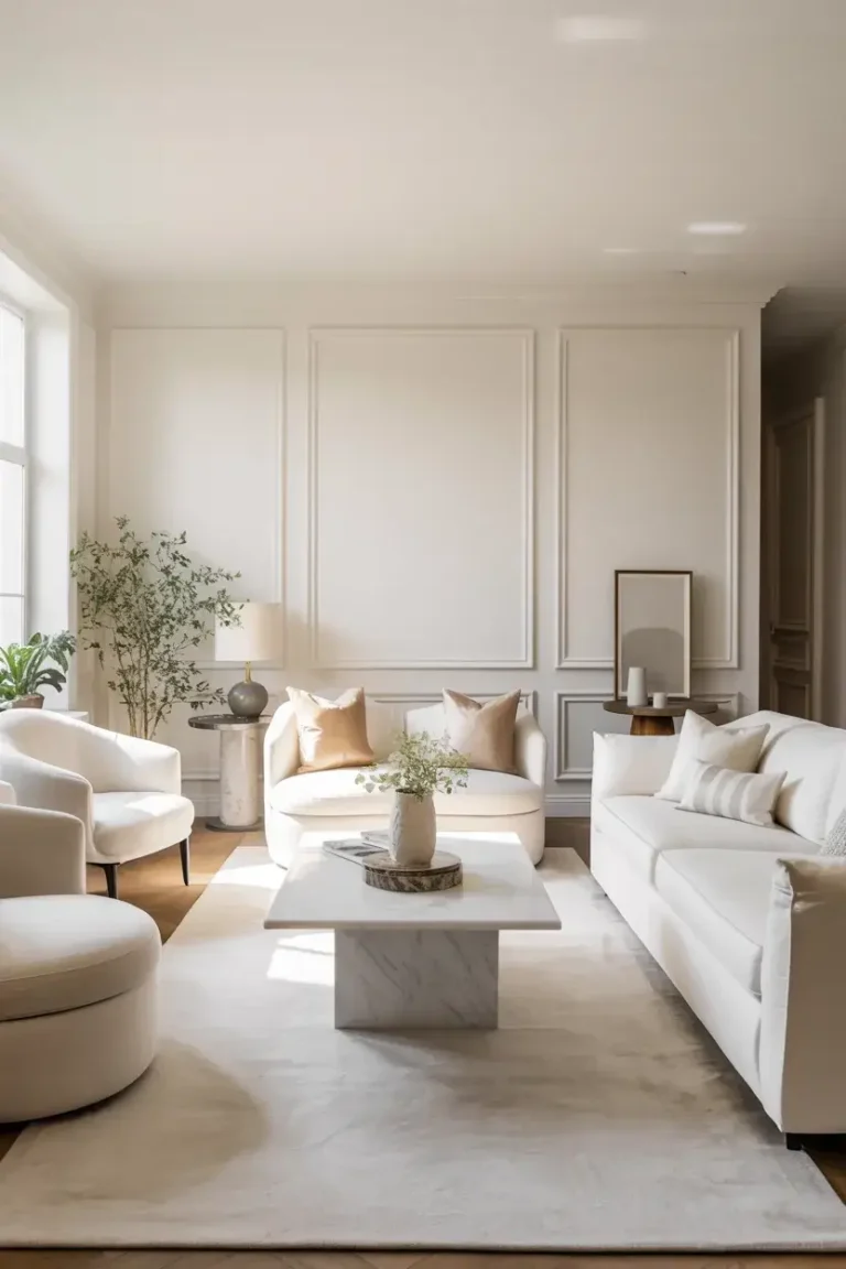
9. Benjamin Moore Chantilly Lace (OC-65)
If you want the crispest, cleanest white possible, Chantilly Lace is the answer. It has very little undertone, making it a brilliant, pure white.
It creates a stark, gallery-like backdrop that makes rustic elements pop. I love it for a “Modern Farmhouse” aesthetic where high contrast is key.
Tip: This color is unforgiving, so make sure your walls are smooth and well-prepped before painting.
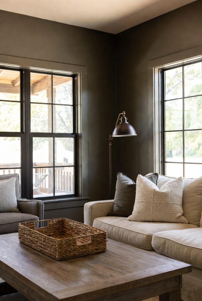
10. Sherwin-Williams Iron Ore (SW 7069)
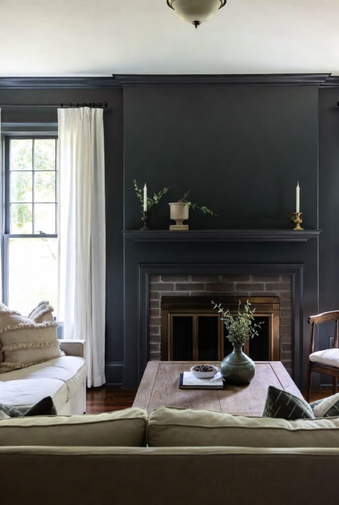
For a moody, dramatic farmhouse vibe, Iron Ore is a rich charcoal that is softer than black. It brings warmth and intimacy to a large living room.
Try painting your fireplace mantel or window sashes in this shade. It adds a historic, architectural weight to the space without darkening the entire room.
Tip: Pair this with plenty of greenery and plants to soften the look and bring life to the dark hue.
11. Farrow & Ball Hague Blue (No. 30)
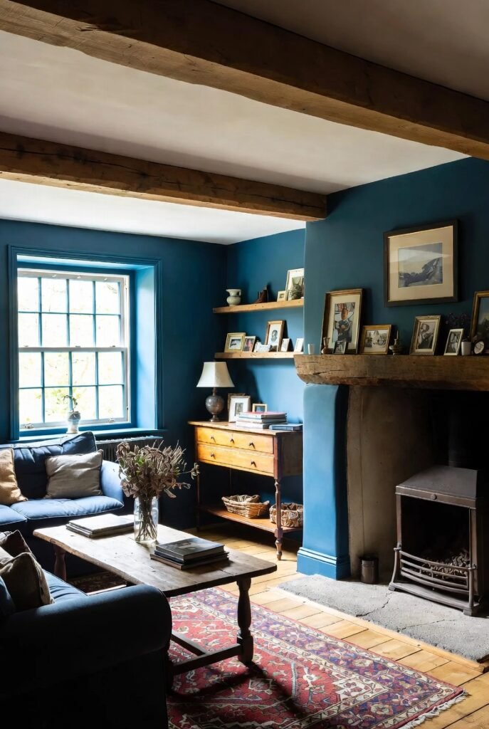
Hague Blue is a deep, dark blue with green undertones. It feels heritage and historic, perfect for a traditional farmhouse aesthetic.
It changes beautifully throughout the day, looking greener in natural light and bluer in the evening. It creates a cozy, enveloping feel that is perfect for movie nights.
Tip: This color looks incredible in a satin or semi-gloss finish, which highlights its rich depth.
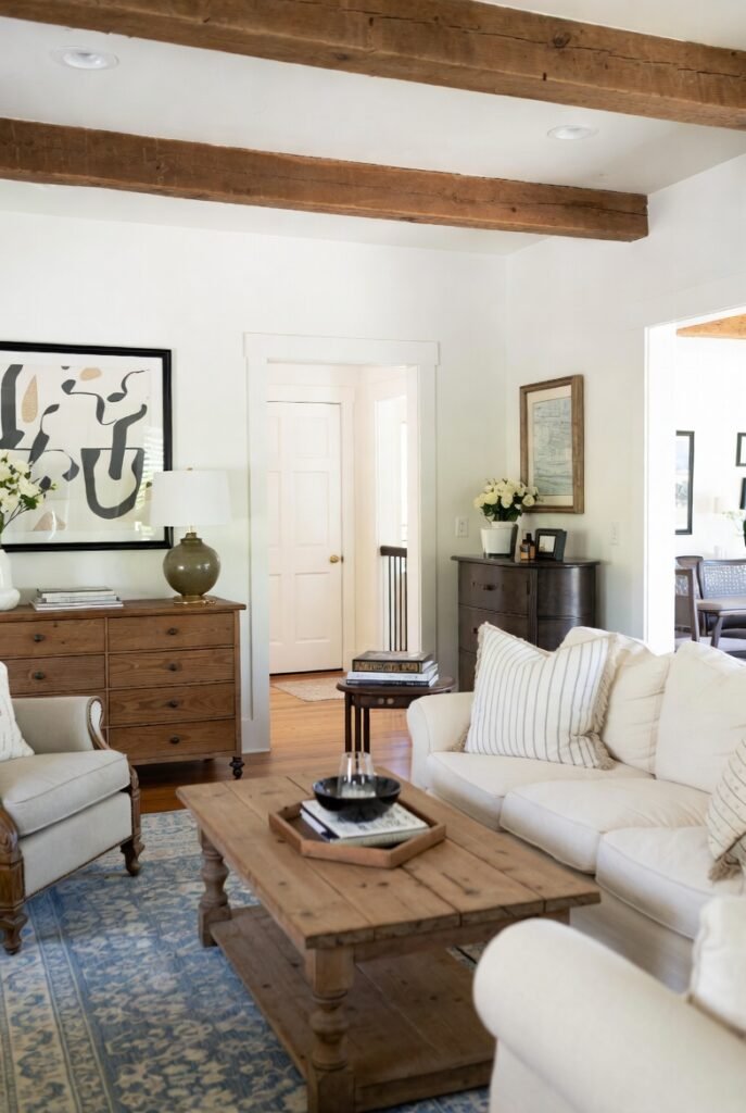
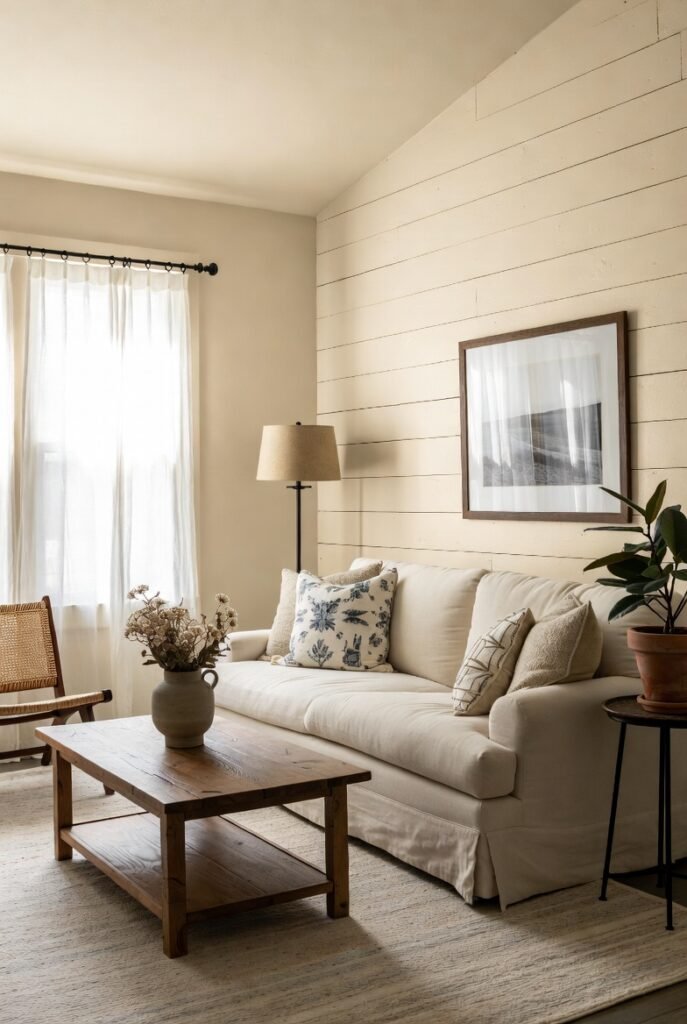
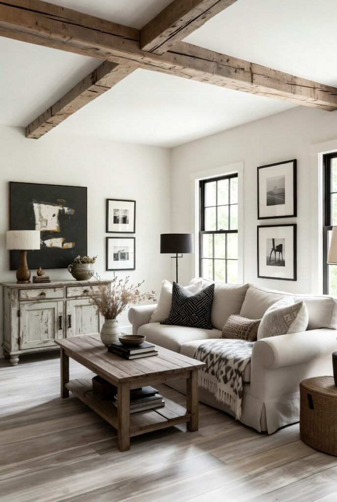
12. Benjamin Moore Swiss Coffee (OC-45)
Swiss Coffee is a warm, creamy off-white that has been a designer favorite for decades. It is softer and more inviting than a stark white.
It creates a lived-in, comfortable atmosphere that feels like a warm hug. It’s ideal for walls, cabinetry, and trim alike, offering a cohesive, monochromatic look.
Tip: Use this color in a room with southern exposure to maximize its warm, golden glow.
13. Sherwin-Williams Evergreen Fog (SW 9130)
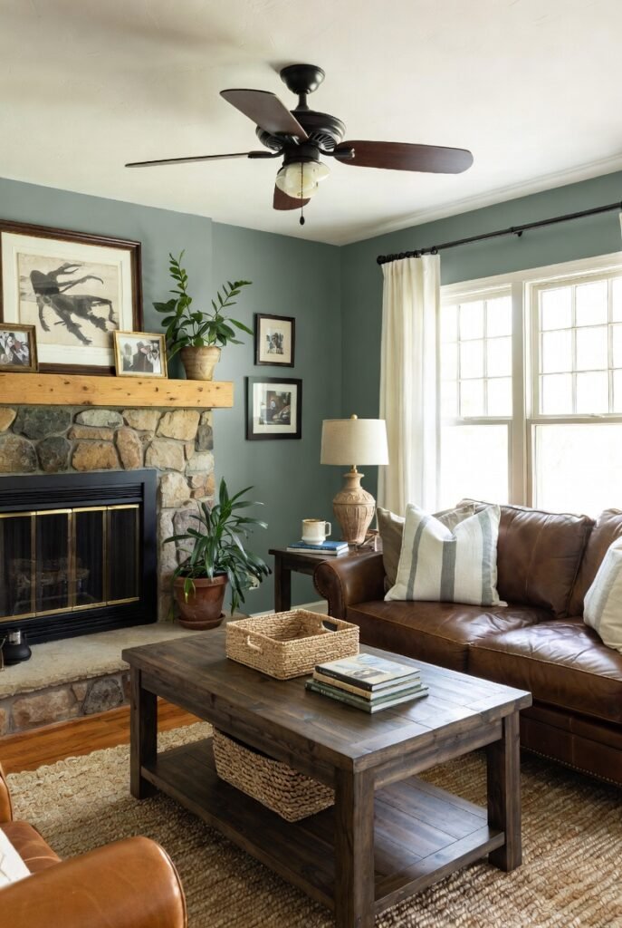
Evergreen Fog is a chameleon color—a soothing gray-green that feels organic and restorative. It was a recent Color of the Year for its calming properties.
It brings the outdoors in, which is a core tenet of farmhouse living. It pairs wonderfully with natural stone, leather, and warm wood grains.
Tip: Use this shade on wainscoting or beadboard to add color to the lower half of your walls while keeping the top neutral.
14. Sherwin-Williams Urbane Bronze (SW 7048)
Urbane Bronze is a sophisticated, grounded brownish-gray. It’s dark and moody but has an earthy quality that keeps it feeling natural.
It connects the home to nature and creates a sense of sanctuary. I love using it on interior doors or window frames to frame the view outside.
Tip: Ensure you have adequate lighting, as this dark shade absorbs light and can make a small room feel smaller.
15. Benjamin Moore Pale Oak (OC-20)

Pale Oak is a graceful, light greige that leans slightly warmer than some other grays. It reminds me of the color of white oak flooring.
It is elegant and understated, providing a quiet backdrop for your life. It reflects light beautifully, making a living room feel spacious and open.
Tip: This color pairs exceptionally well with marble and stone finishes for a refined farmhouse look.
16. Sherwin-Williams Tricorn Black (SW 6258)
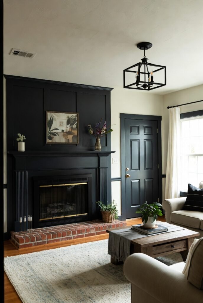
Every farmhouse room needs a touch of black to ground it, and Tricorn Black is the classic choice. It is a deep, saturated black with no visible undertones.
While bold for walls, it is perfect for accents like a painted brick fireplace, a stair railing, or an interior door. It adds instant contrast and modernity.
Tip: Use this sparingly as an accent to punctuate a mostly white or neutral room for maximum impact.
Conclusion
Choosing the right paint color is the first step in creating your dream farmhouse living room. Whether you prefer the brightness of White Dove or the moodiness of Hale Navy, there is a shade on this list for you.
Ready to get started? Grab a few samples and test them on your walls at different times of the day to see which one speaks to you. Happy painting