15 Dark Purple Paint Colors That Will Transform Your Home
I used to think of purple as a color reserved exclusively for children’s bedrooms or royalty. But lately, I’ve seen a massive shift in interior design toward moody, dramatic spaces that embrace deep hues.
Dark purple has become my secret weapon for creating rooms that feel sophisticated and cozy. It offers the depth of black or navy but adds a layer of warmth and creativity that other dark neutrals simply can’t match.
Whether you want to create a cocoon-like bedroom or a dining room that demands attention, I’ve curated a list of the best dark purple paint colors to help you take the plunge.
1. Sherwin-Williams Majestic Purple (SW 6545)
If you are looking for a shade that bridges the gap between navy blue and true purple, Majestic Purple is my top recommendation. It has a Light Reflectance Value (LRV) of just 4.86, making it incredibly deep and moody.
I love using this color in spaces where you might typically consider a dark blue. It works beautifully on an accent wall or, if you are feeling bold, on all four walls of a media room to create an immersive experience.
2. Farrow & Ball Pelt (No. 254)
Pelt is one of those colors that changes dramatically depending on the light. In dimmer spaces, it reads almost like a soft black, but when the sun hits it, you see rich, red-based purple undertones.
I suggest pairing this color with brass hardware or gold frames. The warm metallic tones pop against the deep, regal background, giving the room an instant feeling of luxury.
3. Benjamin Moore Shadow (2117-30)

This color is a masterclass in moodiness. Shadow is a rich, amethyst purple with significant gray undertones, which keeps it from looking too vibrant or “grapey.”
I find this shade works exceptionally well in bedrooms. The gray wash makes it feel calming and grounded rather than energetic, perfect for unwinding at the end of a long day.
4. Behr Plum Royale (S110-6)

For a slightly softer approach to the dark trend, Plum Royale is a fantastic choice. With an LRV of 17, it reflects a bit more light than the darkest options on this list, making it less intimidating.
I recommend this shade for dining rooms. It feels intimate and inviting, creating the perfect backdrop for long dinner parties and candlelight.
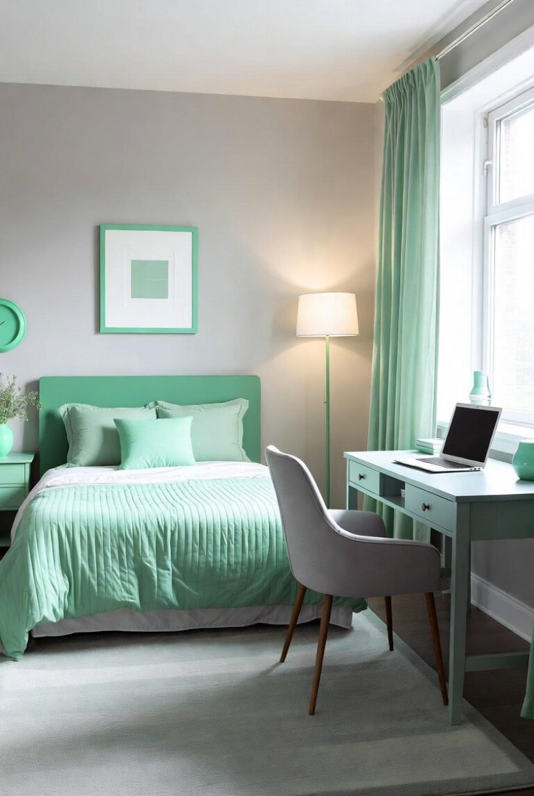
5. Sherwin-Williams Kimono Violet (SW 6839)
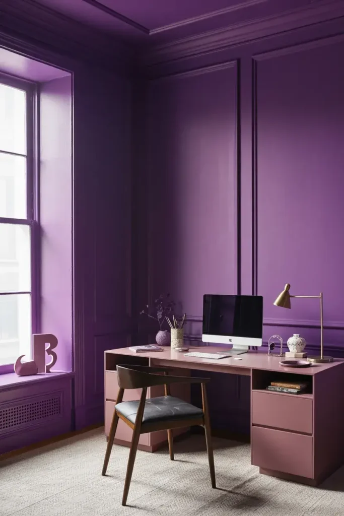
Kimono Violet is a true, rich purple that doesn’t shy away from its identity. It has a vibrancy that adds life to a space without overwhelming it.
I think this color shines in a creative home office. Purple is often associated with creativity and imagination, and this specific hue strikes the right balance between stimulating and professional.
6. Farrow & Ball Brinjal (No. 222)
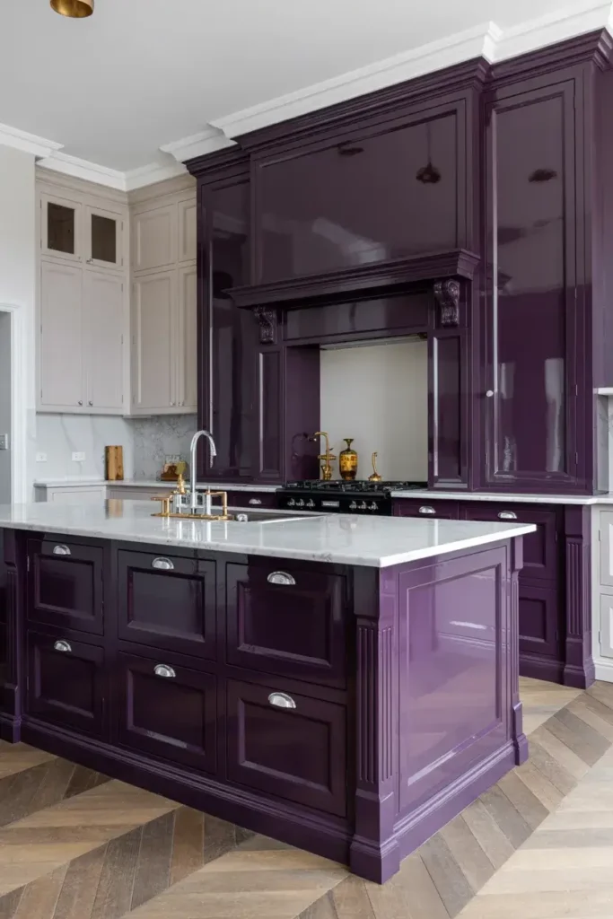
Named after the shiny skin of an eggplant, Brinjal is a sophisticated, warm aubergine. It is particularly magnificent in a high-gloss finish, which highlights its depth.
I love the idea of using this on kitchen cabinetry or a kitchen island. It provides a stunning, unexpected alternative to the standard gray or blue islands we see everywhere.
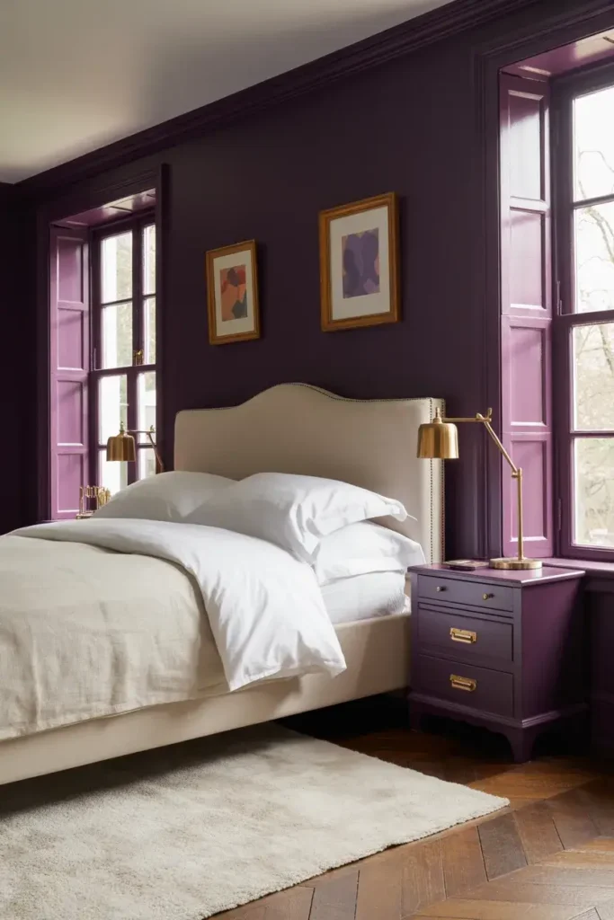
7. Benjamin Moore Carter Plum (CW-355)

Part of the Williamsburg Color Collection, Carter Plum feels historic and timeless. It has a slightly dusty quality that makes it feel lived-in and elegant right from the start.
I use this color when I want to add character to a library or a formal living room. It pairs wonderfully with dark wood furniture and leather upholstery.
8. Glidden Eggplant (PPG1247-7)
This shade delivers exactly what the name promises. It is a classic, deep purple that brings a touch of royalty to any space.
I suggest pairing this color with off-white trim to keep the room feeling crisp. The high contrast between the dark walls and bright trim highlights architectural details beautifully.
9. Sherwin-Williams Mature Grape (SW 6286)
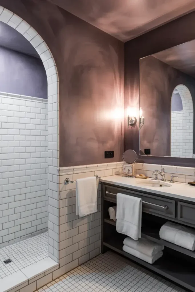
Mature Grape is another excellent option if you prefer your purple with a heavy dose of gray. It feels grounded and earthy, avoiding the brightness of a candy-colored purple.
I find this color works well in bathrooms. It creates a spa-like, enveloping atmosphere, especially when paired with crisp white tiles and fluffy towels.
10. Benjamin Moore Black Raspberry (2072-20)
This color is deep, dark, and incredibly rich. It leans heavily into the brown side of purple, giving it a chocolatey warmth that feels very cozy.
I recommend using Black Raspberry in a space with plenty of natural light. The sunlight helps reveal the complex violet undertones that might otherwise get lost in a dark room.
11. Behr Passion Plum (HDC-WR15-2)
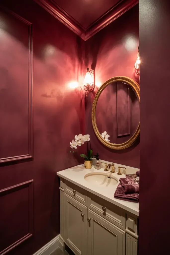
Passion Plum is a reddish-purple that feels warm and energetic. It has an LRV of 17, similar to Plum Royale, but brings a bit more fire to the table.
I think this creates a fantastic statement in a powder room. Small spaces are the best places to take big risks with color, and this hue delivers a high-impact look.
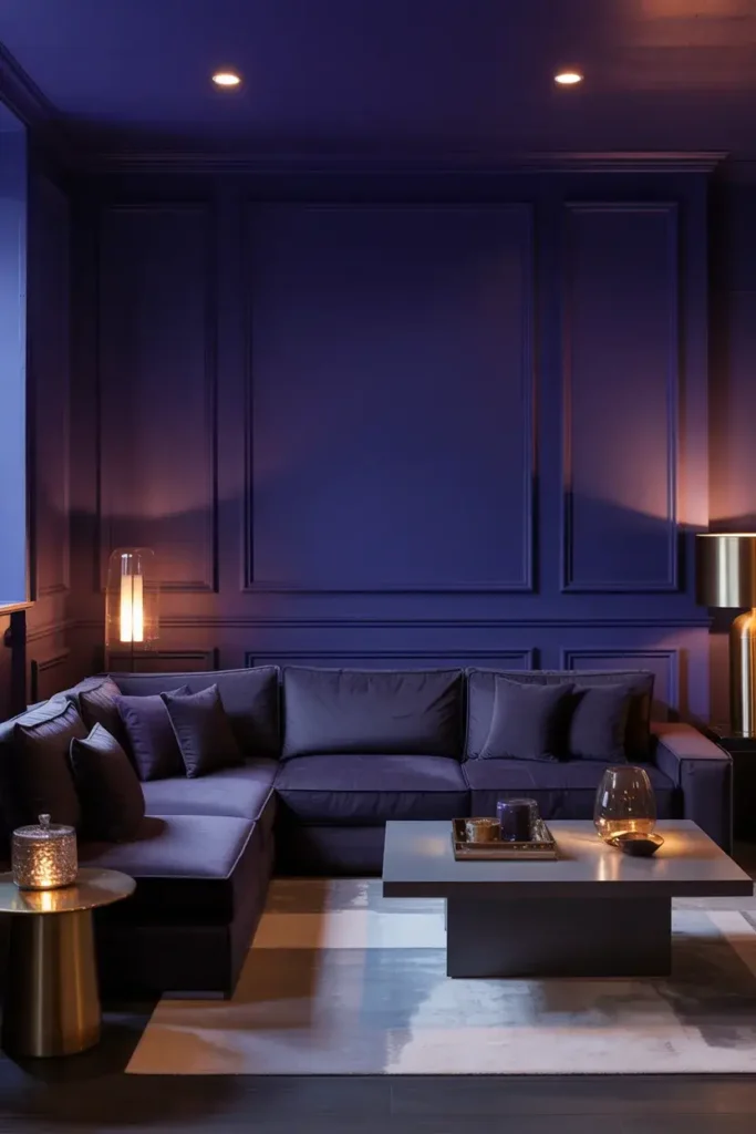
12. Benjamin Moore Velvet Cloak (CSP-480)
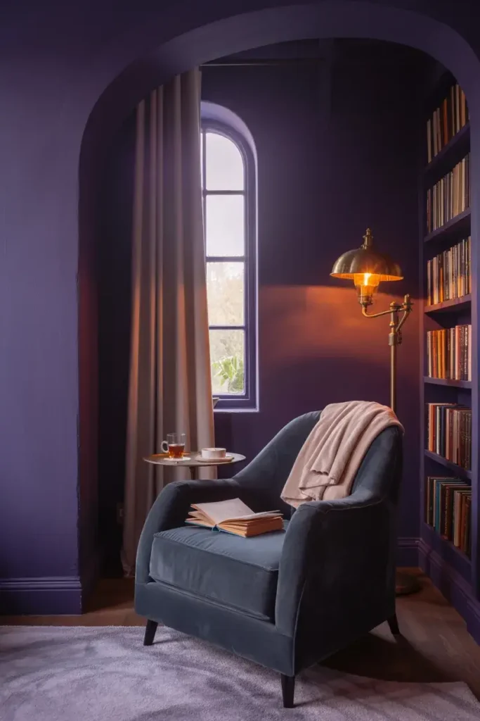
Velvet Cloak is as mysterious as it sounds. It is a blackened purple that creates deep shadows and adds instant drama to any interior.
I love using this in spaces where you want to embrace the darkness, like a home theater or a cozy reading nook. It wraps around you and shuts out the chaos of the outside world.
13. Sherwin-Williams Expressive Plum (SW 6271)
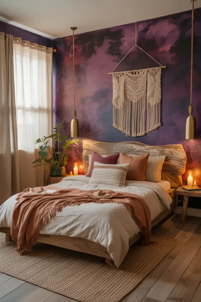
If you want a purple that leans slightly more toward a raisin or mauve tone, Expressive Plum is a great pick. It feels organic and soft despite its depth.
I find this color pairs beautifully with natural textures. Think jute rugs, linen curtains, and unfinished wood furniture to create a relaxed, bohemian vibe.
14. Benjamin Moore Kalamata (AF-630)
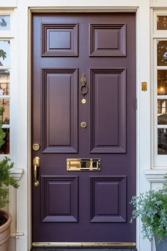
Kalamata is an earthy, deep purple that feels very grounded. It lacks the blue undertones of some other purples, making it feel warmer and more inviting.
I suggest trying this on a front door. It’s a unique way to welcome guests and sets a stylish tone before anyone even steps inside your home.
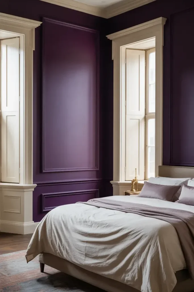
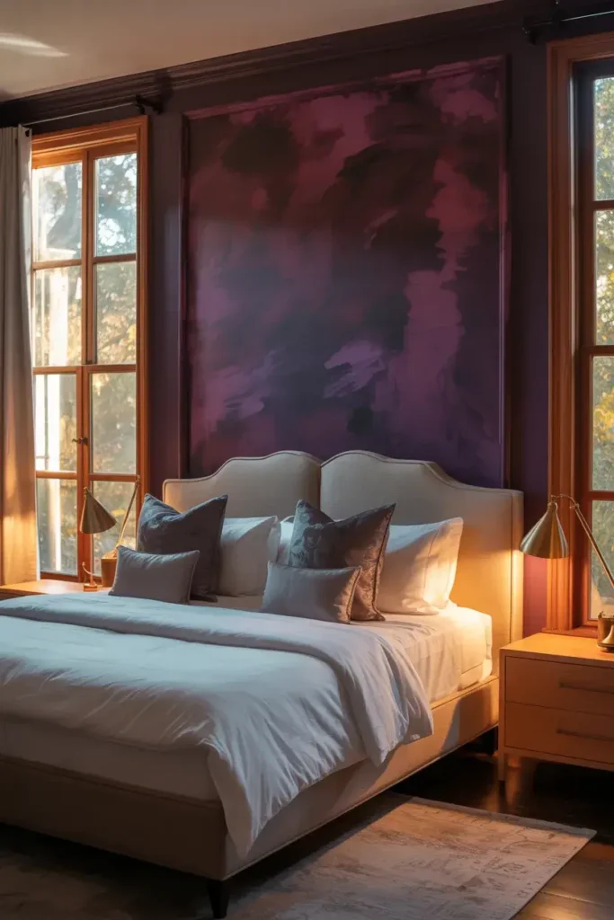
15. Benjamin Moore Dark Purple (2073-10)
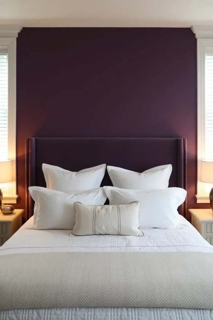
Sometimes, the best choice is the most straightforward one. Dark Purple is a bold, no-nonsense shade that delivers intense color saturation.
I would use this as an accent wall behind a headboard. It creates a focal point in the bedroom and looks stunning against crisp white bedding.
Conclusion
Choosing a dark paint color can feel like a leap of faith, but the payoff is incredible. These dark purple shades offer a way to make your home feel custom, curated, and deeply personal.
If you are ready to see how these colors look in your own space, grab a few samples and paint swatches on your walls to see how the light transforms them throughout the day.