17 Colors That Go With Yellow to Brighten Your Home
Yellow is one of those colors that people either love or fear. I totally get it—pick the wrong shade, and your living room might look more like a school bus than a sunny retreat. But when you get it right, yellow brings an unmatched sense of energy and optimism to a space. In fact, color psychology suggests that yellow stimulates mental activity and generates feelings of joy.
The secret lies in what you pair it with. I’ve found that the right partner color can ground a bright lemon or elevate a soft buttercup. Whether you want a bold, high-contrast look or something soft and soothing, I have compiled the ultimate list of 17 colors that go perfectly with yellow to help you transform your home.
1. Navy Blue
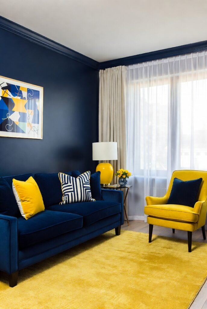
If you want a look that feels classic yet energetic, navy blue is my top recommendation. This pairing works because of the stark contrast between the deep, dark blue and the bright, happy yellow.
I often suggest using navy as the anchor—think a navy velvet sofa or dark blue walls—and adding yellow through throw pillows or a statement armchair. It feels nautical without being cliché.
2. Charcoal Gray
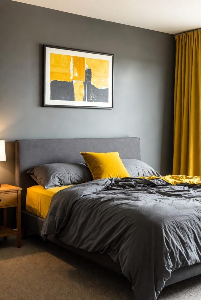
For a sophisticated, modern vibe, you can’t go wrong with charcoal gray. Gray tones down the intensity of yellow, making it livable for larger spaces like living rooms or bedrooms.
I love seeing a charcoal duvet cover paired with mustard yellow sheets. The dark gray grounds the space, while the yellow adds just the right amount of personality so the room doesn’t feel gloomy.
3. Crisp White
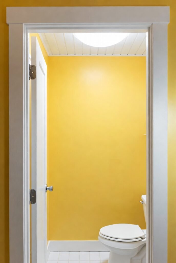
White and yellow is the ultimate “sunshine and clouds” combination. It feels fresh, clean, and incredibly airy. This duo works exceptionally well in kitchens and bathrooms where you want to emphasize cleanliness and light.
According to paint experts at Sherwin-Williams, using a high-reflective white trim can make yellow walls pop while keeping the overall room feeling open and spacious.
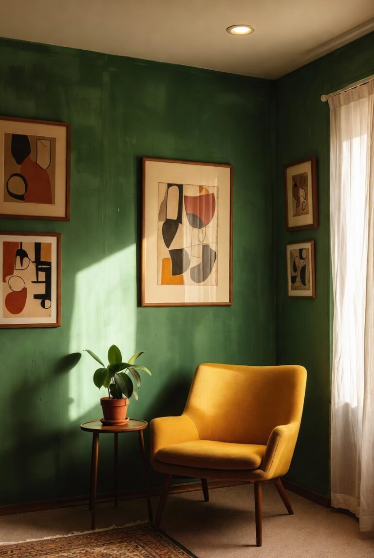
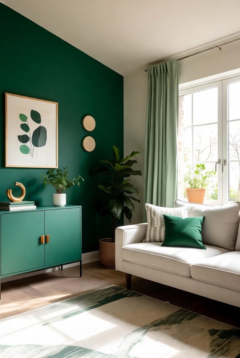
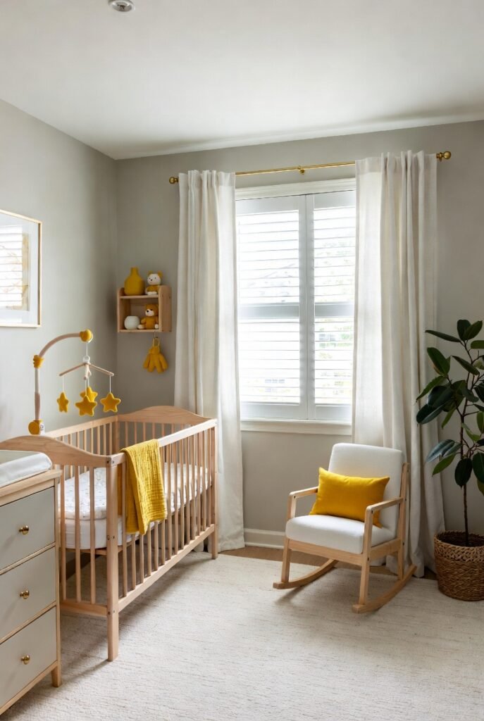
4. Sage Green
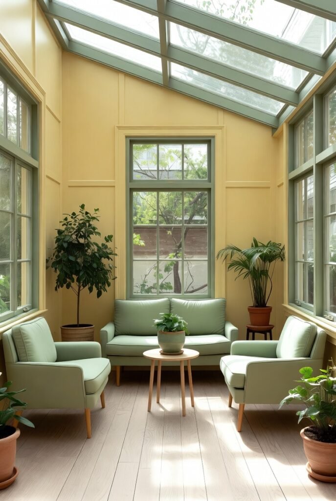
Nature provides the best inspiration, and you see yellow and green together in flowers everywhere. Sage green is muted enough to sit quietly beside a bright yellow without competing for attention.
I recommend this pairing for a nursery or a sunroom. A soft yellow wall with sage green furniture creates a calm, organic atmosphere that feels like bringing the outdoors in.
5. Lavender
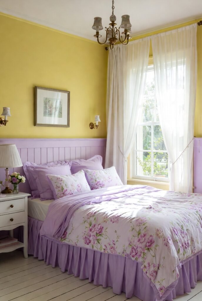
This might sound surprising, but hear me out. Purple is the complementary color to yellow on the color wheel, meaning they are direct opposites. This creates a high-impact, dynamic look.
To keep it from looking too intense, I stick to pastel shades. A pale primrose yellow paired with soft lavender creates a dreamy, romantic vibe perfect for a cottage-style bedroom.
6. Terracotta
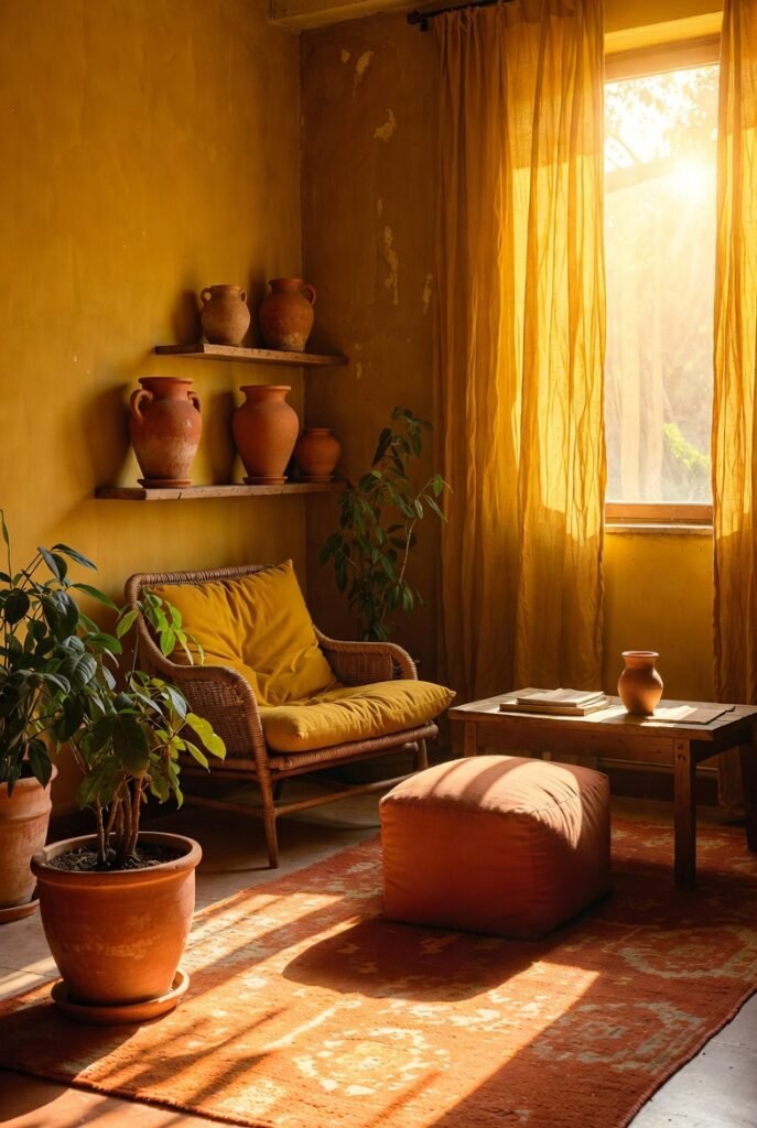
If you love earthy, bohemian styles, terracotta is your best friend. Both colors sit on the warm side of the spectrum, so they create a cozy, enveloping heat in a room.
I like to pair a mustard yellow with terracotta pots or a rug featuring rust tones. It mimics the colors of a sunset and makes a space feel instantly welcoming.
7. Black
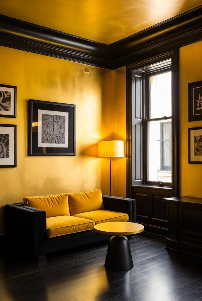
Yellow and black is a bold choice that demands attention. It is graphic, modern, and edgy. The key here is to use black sparingly so your home doesn’t look like a bumblebee.
I suggest using black for thin accents—like picture frames, lamp bases, or window trim—against a backdrop of golden yellow walls. It adds definition and sharpness to the space.
8. Teal
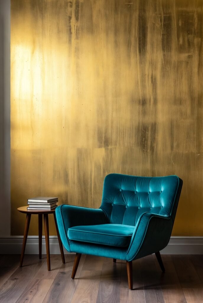
Teal adds a rich, jewel-toned depth that looks stunning against mustard or gold. This combination feels retro and mid-century modern, especially if you use velvet textures.
I love placing a teal armchair in front of a gold-painted wall. The cool blue-green tones balance out the heat of the gold, creating a sophisticated library or lounge feel.
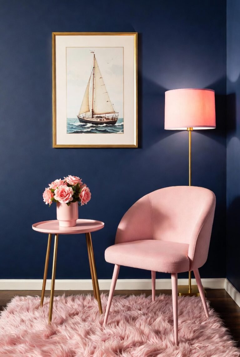
9. Blush Pink
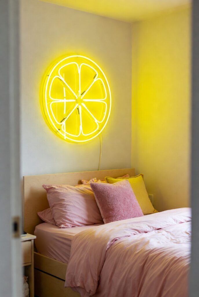
For a fun and playful aesthetic, try mixing yellow with blush pink. This combination is trendy and youthful, often seen in “Gen Z” decor styles, but it can be quite chic if you choose the right textures.
I recommend pairing a neon or bright lemon sign with soft blush bedding. It keeps the room feeling lighthearted and creative, perfect for a home office or teen’s room.
10. Chocolate Brown
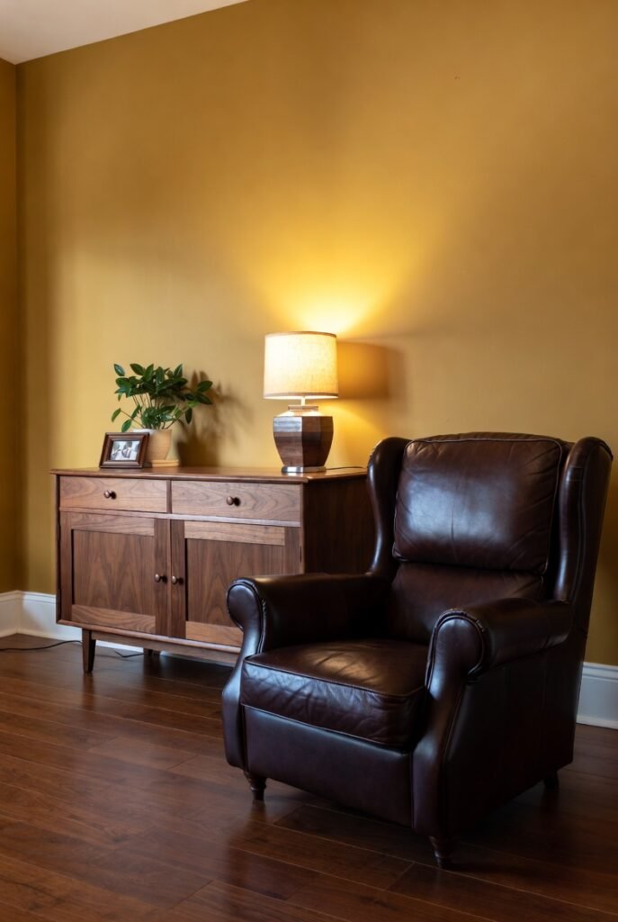
Brown and yellow creates a retro, 70s-inspired look that is making a huge comeback. It is a warm, comforting palette that feels very grounded.
I like using natural wood tones to introduce brown. A honey-yellow wall looks incredible behind a dark walnut sideboard or leather armchair.
11. Emerald Green
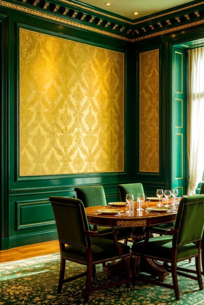
While sage is subtle, emerald green is all about luxury. When you pair a deep, saturated emerald with a metallic gold or bright yellow, you get a look that screams “glamour.”
I would use this in a dining room. Imagine emerald green wainscoting with gold wallpaper above it. It feels regal and expensive.
12. Light Gray
If charcoal feels too heavy, light gray is a fantastic alternative. It offers a subtle contrast that lets the yellow shine without the drama of black or dark blue.
This is my go-to for gender-neutral nurseries. A soft dove gray wall with yellow accessories is soothing, timeless, and easy to update as the child grows.
13. Sky Blue
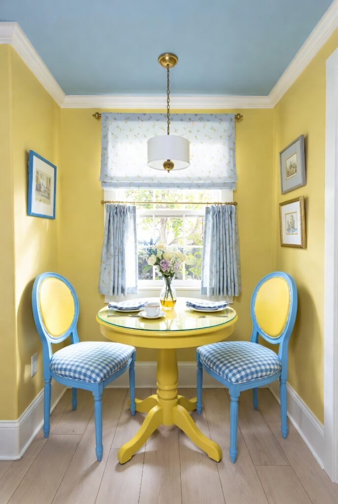
Yellow and sky blue is a cheerful, classic pairing often found in French Country decor. It feels like a summer day and works wonderfully in breakfast nooks.
I suggest using patterned fabrics, like toile or gingham, that incorporate both colors. It keeps the look cohesive and charming rather than chaotic.
14. Beige
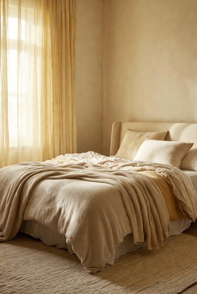
If you want a neutral space that feels warm rather than stark, pair yellow with beige or cream. It’s a monochromatic approach that relies on texture rather than contrast.
I recommend layering different shades of cream, beige, and soft yellow through throw blankets and rugs. It creates a “hygge” vibe that is incredibly cozy.
15. Aubergine (Deep Purple)
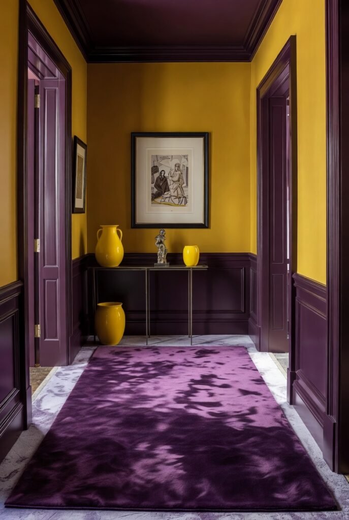
For the brave decorator, deep aubergine and mustard yellow is a power couple. As mentioned by Benjamin Moore experts, complementary pairings create the highest contrast and most dynamic energy.
I suggest using this in a formal living room or hallway. A deep purple rug anchors the room, allowing yellow accents to pop vividly against it.
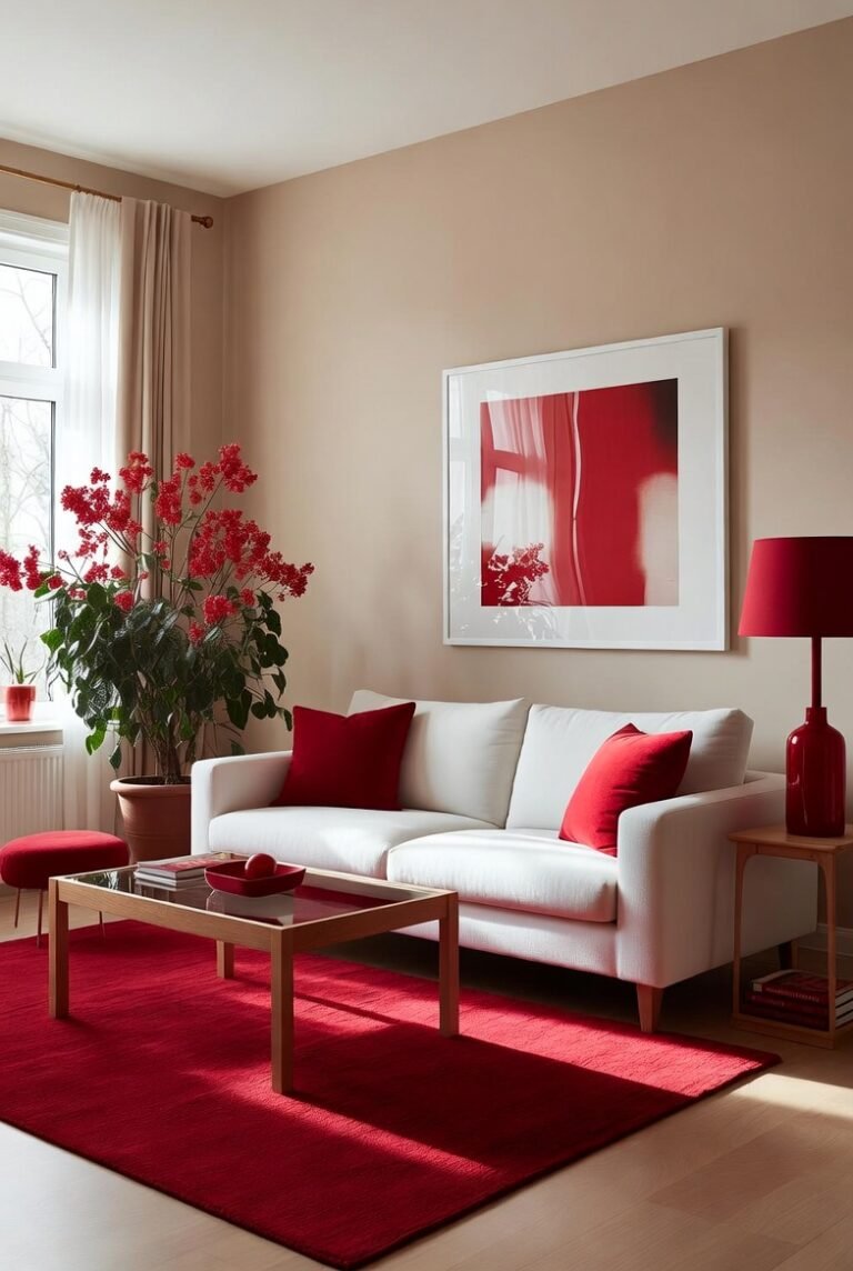
16. Red
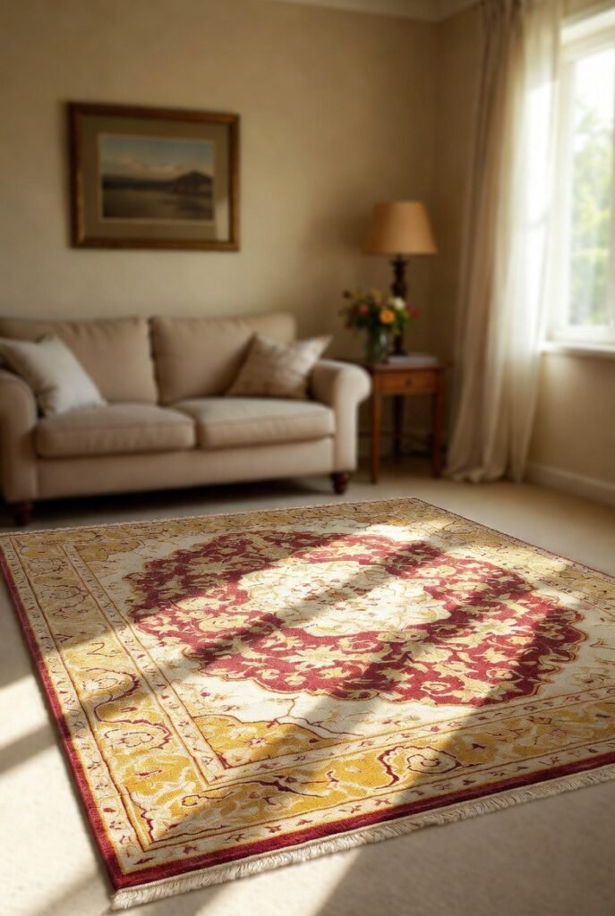
Yellow and red are analogous colors, meaning they sit near each other on the color wheel. Together, they are energetic and fiery.
I advise using this combo with caution—it can be overwhelming. Try a patterned rug that features both colors in small doses, rather than painting whole walls red and yellow.
17. Slate Blue
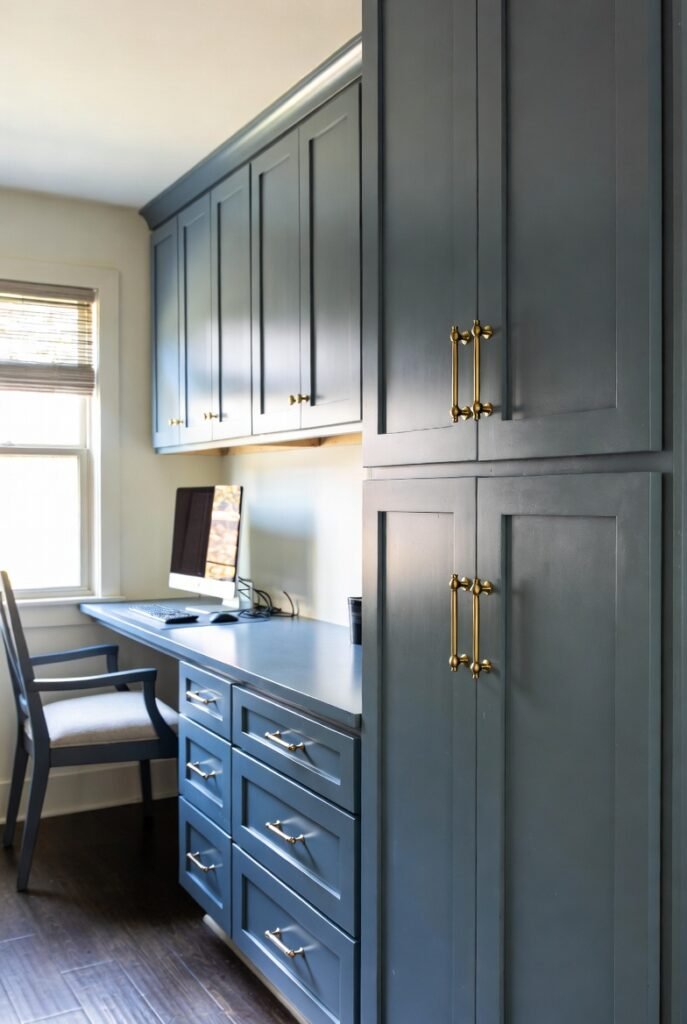
Slate blue has gray undertones that make it softer than navy but richer than sky blue. It is a sophisticated partner for deeper golds and ochres.
I love this for a home office. Slate blue cabinets with brass (yellow-toned) hardware is a subtle way to nod to this color scheme without it feeling too loud.
Bottom Lines
Yellow doesn’t have to be intimidating. By anchoring it with neutrals like gray and white, or contrasting it with blues and purples, you can design a space that feels curated and professional.
I recommend starting small—grab a few paint chips or fabric swatches and see how they look in your specific lighting before you commit. A little splash of yellow might be exactly what your home needs.