17 Stunning Colors That Go With Royal Blue to Transform Your Home
Royal blue is a powerhouse color. It sits right between cobalt and azure, bringing an intensity that instantly commands attention in any room. I find that many people love this vivid hue but hesitate to use it because they worry it won’t match their existing decor.
However, royal blue is surprisingly versatile. Whether you want a calming oasis or a high-energy space, the right pairing changes everything. In this guide, I will walk you through 17 incredible color combinations that prove royal blue belongs in your home.
1. Crisp Cool White
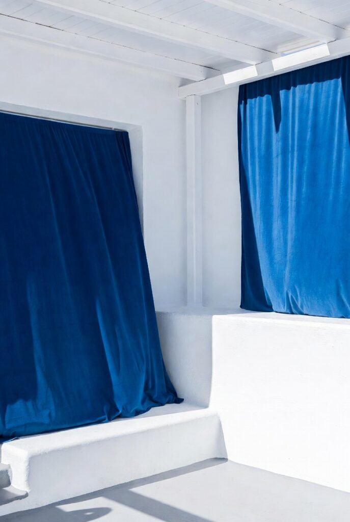
White is the most classic partner for royal blue. I love this combination because it feels fresh, clean, and reminds me of seaside Greek architecture. The stark contrast between the deep blue and the bright white creates a look that is both modern and timeless.
Designers often use this duo for a crisp, nautical vibe. Tip: Try painting your walls white and using royal blue for your upholstery or curtains. This keeps the room bright while letting the blue accents pop.
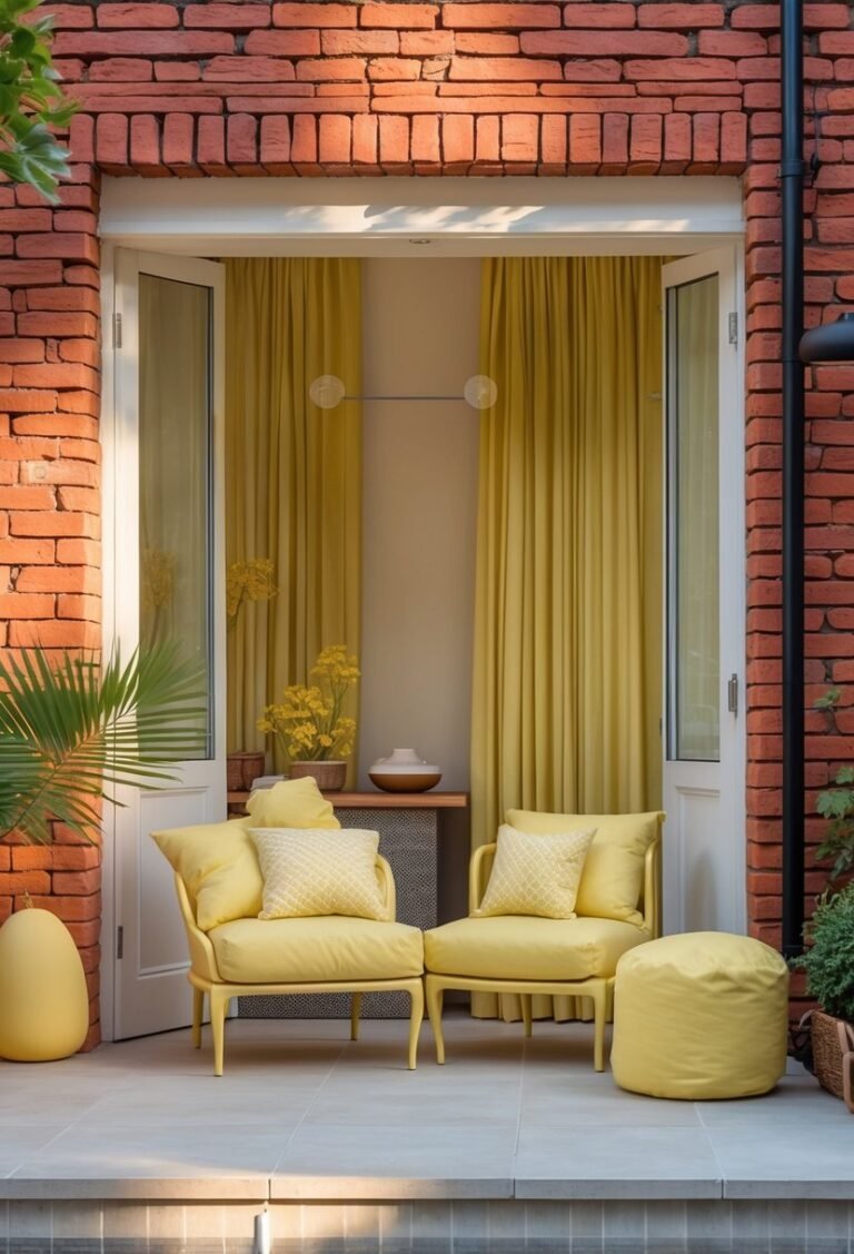
2. Mustard Yellow
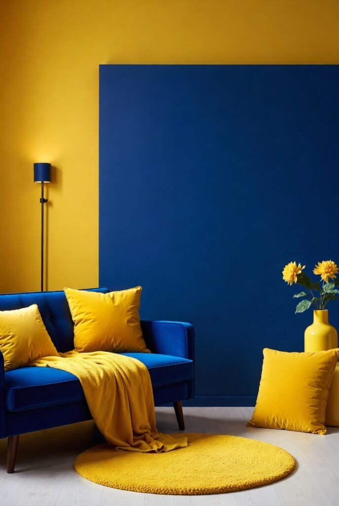
If you want a look that feels retro and cheerful, mustard yellow is your best bet. While lemon yellow can sometimes feel too bright, the deeper tones of mustard ground the space. It creates a warm counterpoint to the coolness of the blue.
I recommend using mustard for accent pieces like throw pillows or a rug. This pairing works beautifully because yellow and blue sit opposite each other on the color wheel, naturally creating a pleasing visual balance.
3. Kelly Green
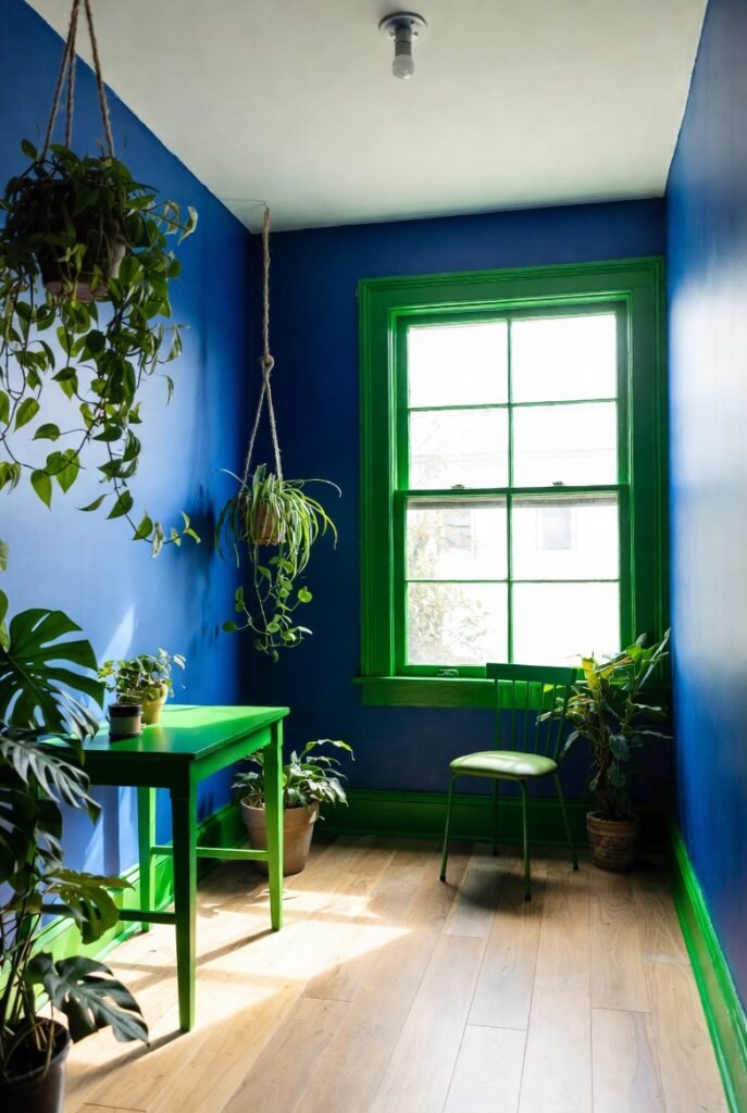
Pairing green with blue might seem unusual, but it works because they are neighbors on the color wheel. Kelly green matches the intensity of royal blue, creating a space that feels lush and energetic.
I find this combination works best in rooms with plenty of natural light. Tip: Incorporate living plants into a royal blue room. The natural green leaves provide a perfect, organic connection to the wall color.
4. Hot Pink
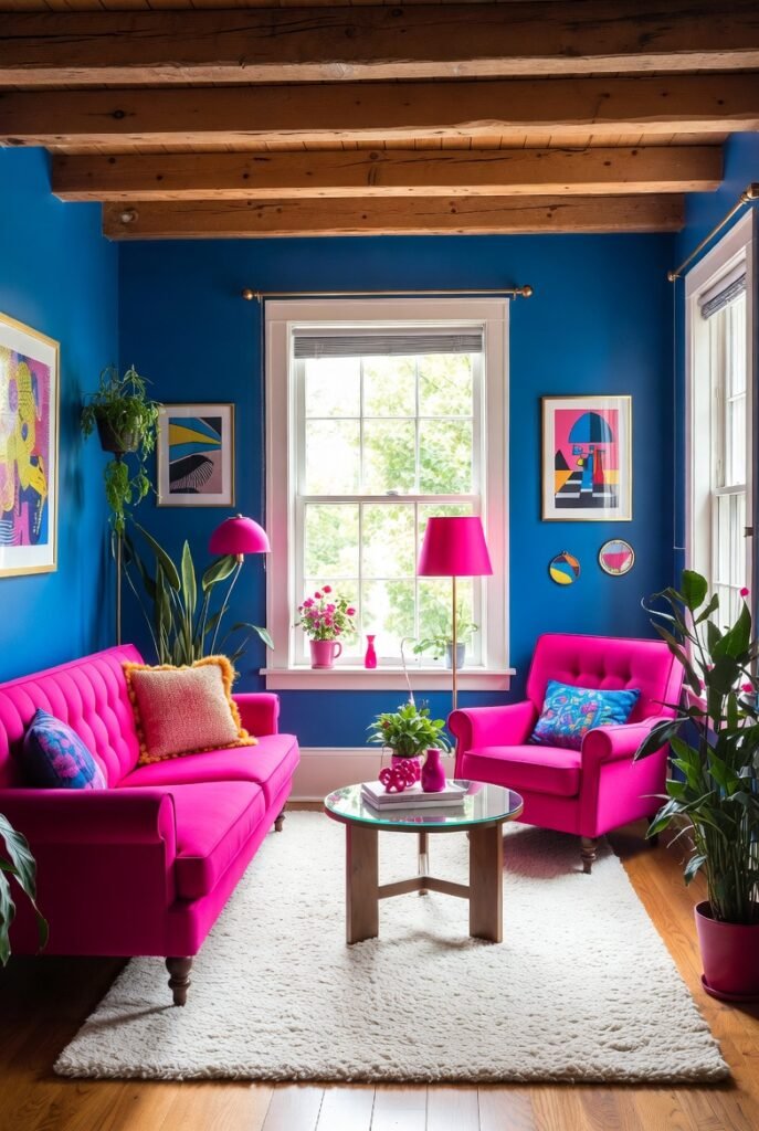
For the maximalists out there, hot pink and royal blue create a vibrant, electric atmosphere. This isn’t for the faint of heart, but I think it looks incredible in creative spaces or eclectic living rooms.
To make this work, I suggest keeping the flooring or rug neutral. This prevents the room from feeling chaotic and allows the pink and blue furniture to serve as the main focal points.
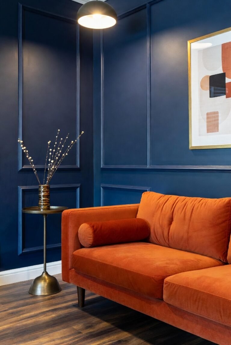
5. Terra Cotta

Terra cotta brings an earthy warmth that instantly makes royal blue feel cozier. Since orange is the direct complementary color to blue, the reddish-orange hues of terra cotta create a natural harmony that is easy on the eyes.
I love using terra cotta pots or floor tiles in a room with blue cabinetry. It gives the space a Mediterranean kitchen vibe that feels welcoming and lived-in.
6. Gold
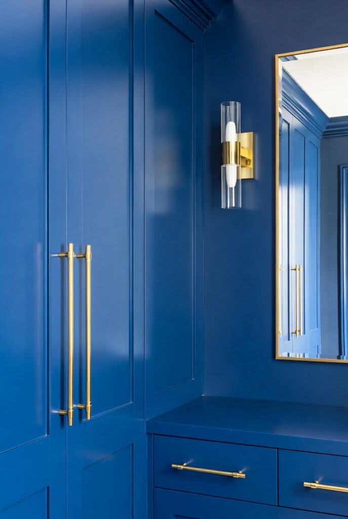
Nothing says “regal” quite like royal blue and gold. This combination exudes luxury and sophistication. The metallic sheen of gold breaks up the solid saturation of the blue, adding texture and light to the room.
Tip: You don’t need to paint walls gold. simply swap out cabinet hardware, light fixtures, or picture frames for gold metal finishes to elevate your blue room instantly.
7. Medium Gray
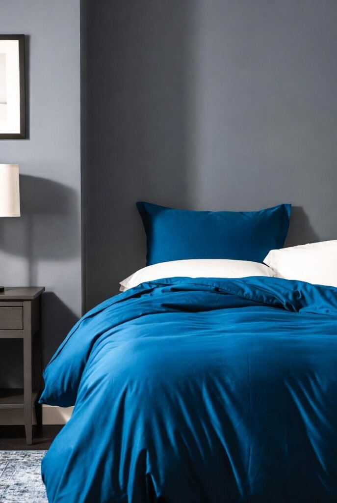
If you prefer a more subdued look, medium gray is a fantastic choice. Gray creates a soothing backdrop that allows royal blue to shine without competing for attention. I find this combination particularly effective in bedrooms where you want a restful atmosphere.
Try medium gray walls with a royal blue duvet cover. It strikes a balance between masculine structure and colorful comfort, especially when you add white sheets to crisp up the look.
8. Teal
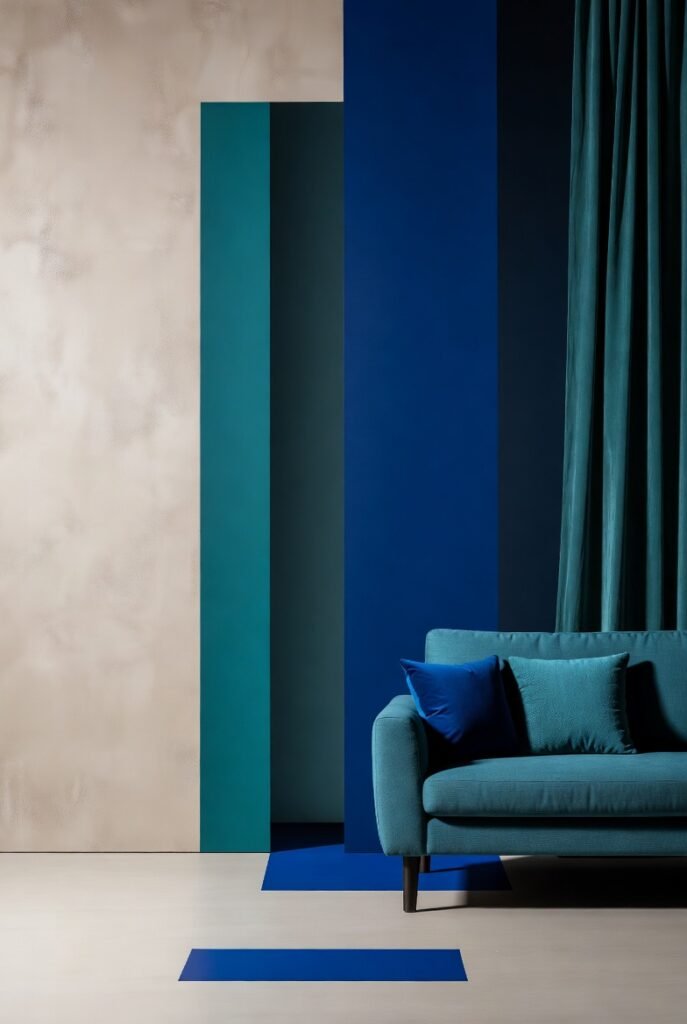
Layering different shades of blue creates a sophisticated, monochromatic look. Teal adds a greenish-blue depth that complements royal blue perfectly. It makes a room feel submerged and moody in the best way possible.
I suggest using the 60-30-10 rule here. Make a neutral color 60% of the room, use teal for 30%, and let royal blue be the vivid 10% accent that ties it all together.
9. Cream
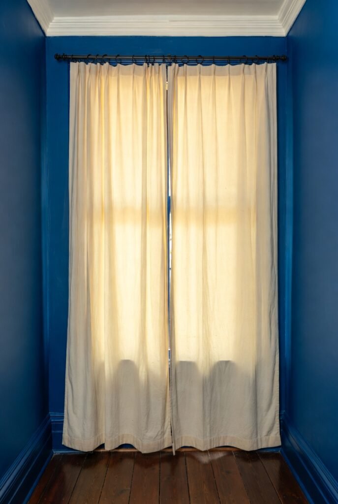
Cream offers a softer alternative to bright white. It brings out the warmth in the room and gives off a vintage or traditional aesthetic. I find that cream softens the harshness that royal blue can sometimes have.
This creates a “coastline” feel. Tip: Use cream-colored linen curtains against a royal blue wall. The texture of the fabric mixed with the paint color creates a rich, tactile experience.
10. Matte Black
Black and blue is a sleek, modern pairing that breaks traditional design rules. I love how a matte black finish against a royal blue wall creates a moody, dramatic, and masculine vibe.
To keep it from feeling too dark, ensure you have good lighting. Use black for linear elements like curtain rods, chair legs, or picture frames to outline and define the space.
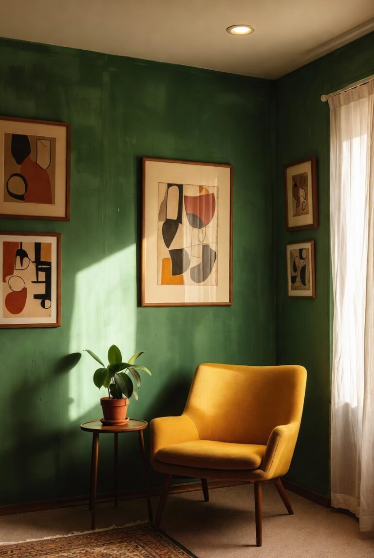
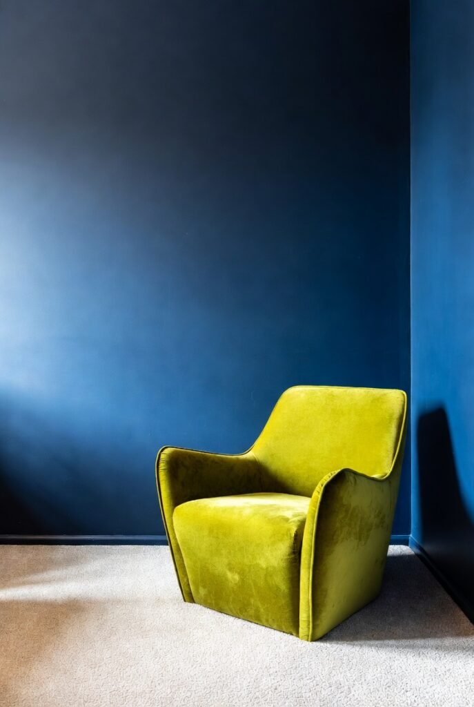
11. Chartreuse or Lime Green
Chartreuse is a yellow-green hue that feels electric next to royal blue. This high-contrast pairing creates a modern, zesty look that energizes a space immediately. It is perfect for a home office or a playroom.
I recommend using chartreuse sparingly. A single chartreuse velvet chair in a royal blue room makes a massive style statement without overwhelming the senses.
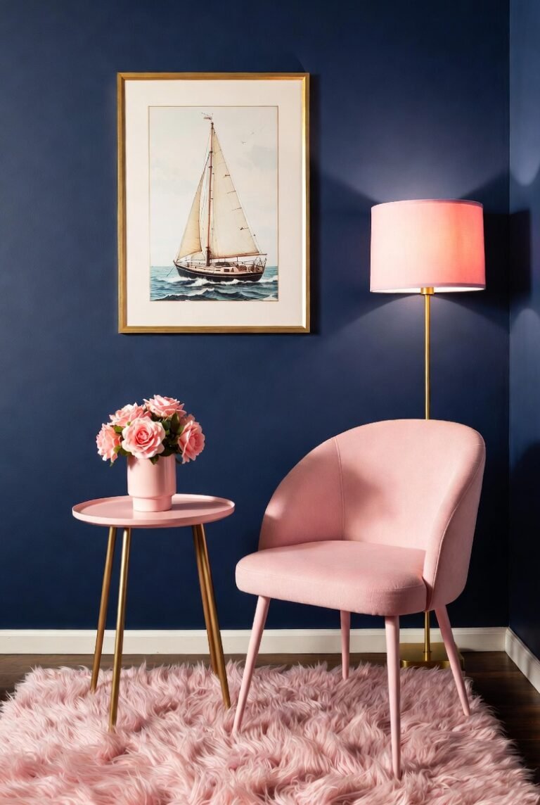
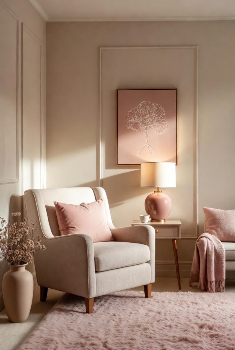
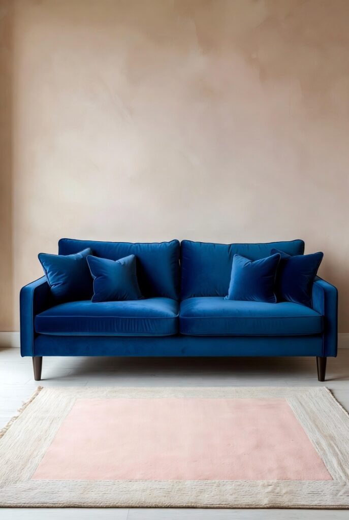
12. Blush Pink
If hot pink is too loud for you, blush pink is the perfect alternative. The soft, pastel nature of blush tones down the intensity of royal blue, creating a space that feels balanced and approachable.
I often see this combination in modern living rooms. Tip: A blush pink rug under a navy or royal blue sofa creates a soft foundation that lightens the visual weight of the furniture.
13. Cognac and Wood Tones
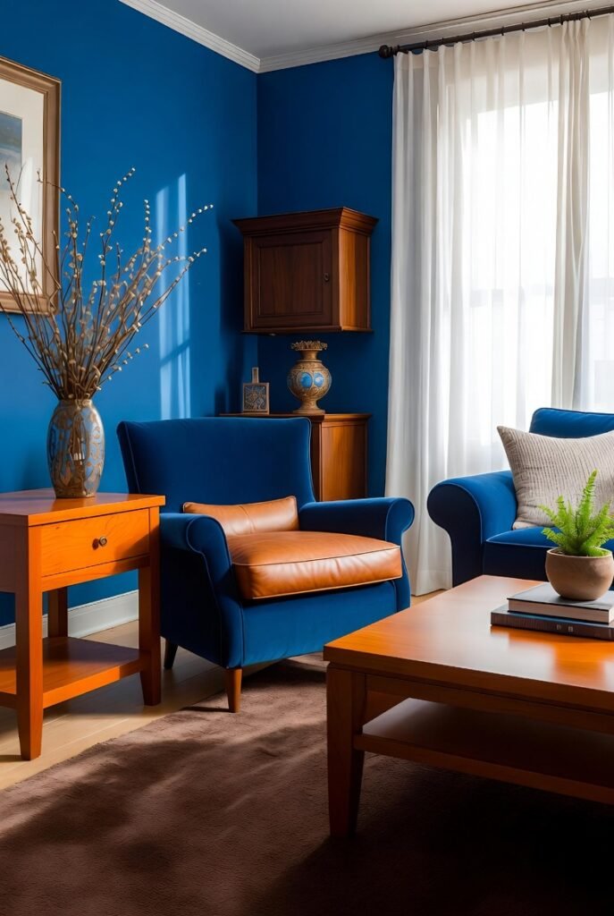
You cannot go wrong with natural wood tones. Cognac-colored leather or warm wood furniture grounds royal blue and stops it from feeling too “primary school.” The orange undertones in the wood naturally complement the blue.
I think a cognac leather armchair is the ultimate accessory for a royal blue living room. It adds a sense of history and classic style that fabric upholstery sometimes lacks.
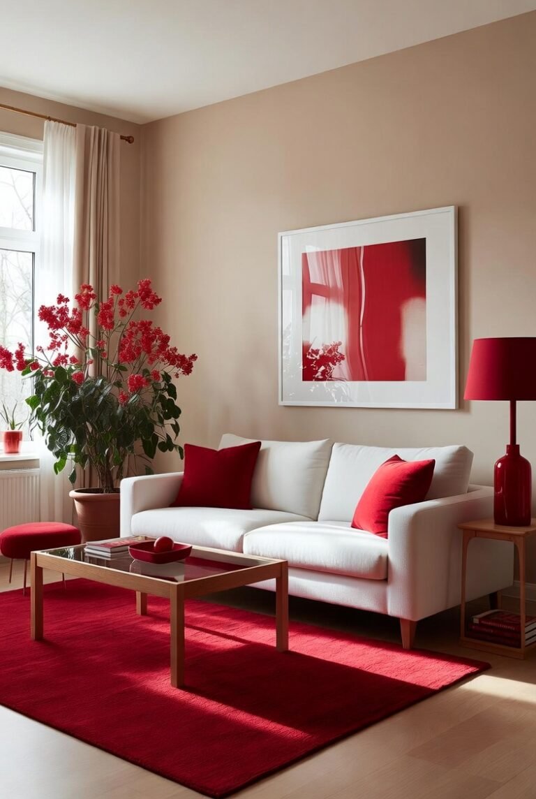
14. Bright Red
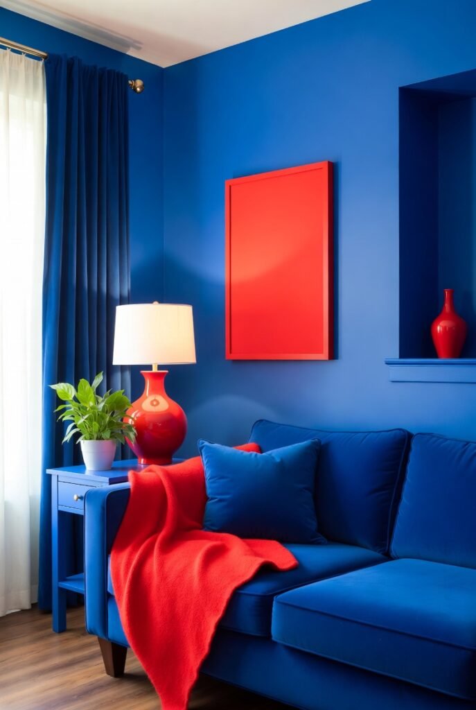
This is a classic Americana combination. Red and blue are high-energy colors that create a bold, patriotic feel. However, I advise using red as a deliberate accent rather than a dominant color to avoid it looking like a flag.
Tip: Use small doses of red, such as in artwork or a throw blanket. This adds a pop of heat to the cool blue room without taking over the design scheme.
15. Mint Green

Mint green provides a cooling effect that pairs lovely with royal blue. It offers a fresh, breezy vibe that works exceptionally well in bathrooms or kitchens. The lightness of the mint prevents the royal blue from making a small room feel claustrophobic.
I love seeing mint green tiles paired with royal blue towels or accessories. It feels clean, aquatic, and very refreshing to walk into in the morning.
16. Violet or Amethyst
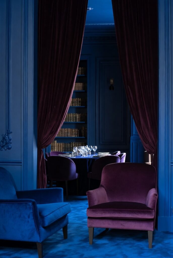
For a moody, jewel-box effect, pair royal blue with deep violet or amethyst. These analogous colors sit next to each other on the color wheel, creating a harmonious and rich environment.
I find this works best in a library or a formal dining room. Use velvet textures in both colors to enhance the feeling of luxury and depth in the space.
17. Navy Blue
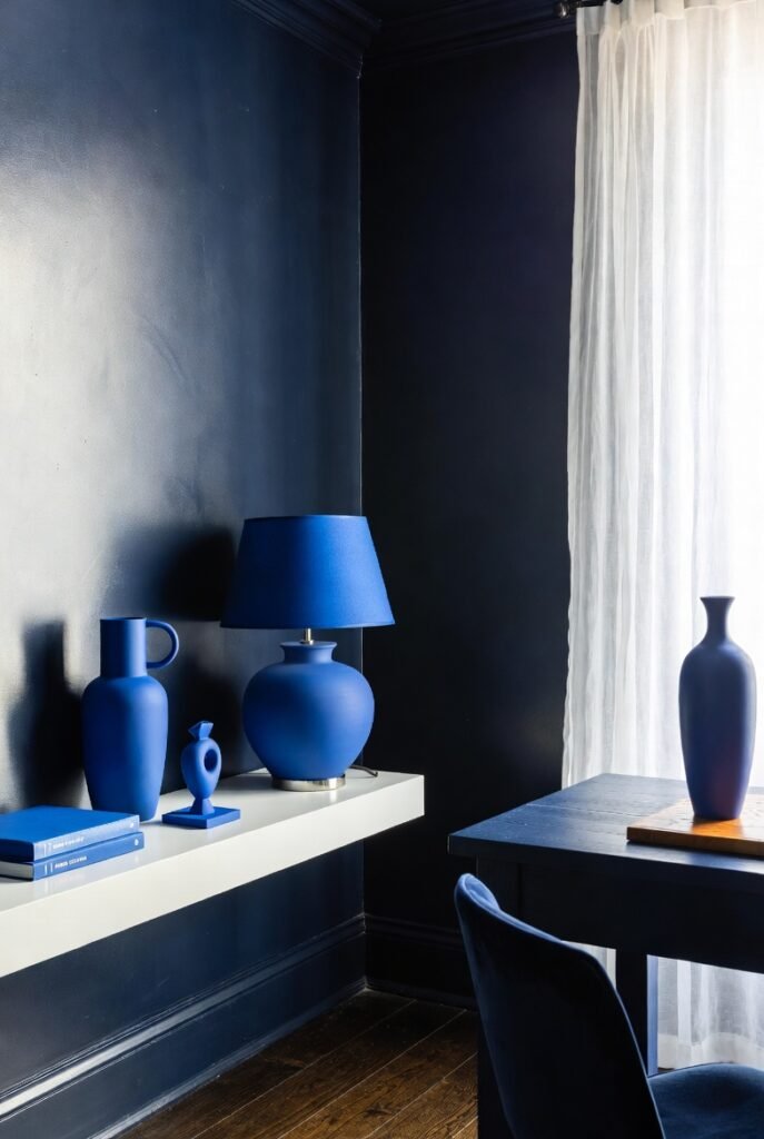
Finally, don’t be afraid to pair royal blue with its darker cousin, navy. Using navy helps ground the brighter royal blue, providing a shadow tone that adds dimension to the space.
I recommend painting walls navy and using royal blue accessories. The brighter royal blue will pop against the dark background, creating a sophisticated, layered look.
Final Words
Royal blue is a bold choice, but as you can see, it plays well with others. Whether you want the earthy grounding of cognac leather or the electric pop of chartreuse, there is a combination here for your unique style.
I encourage you to grab a few paint swatches or fabric samples and see which of these pairings speaks to you. Start small, experiment, and enjoy the energy this color brings to your home.