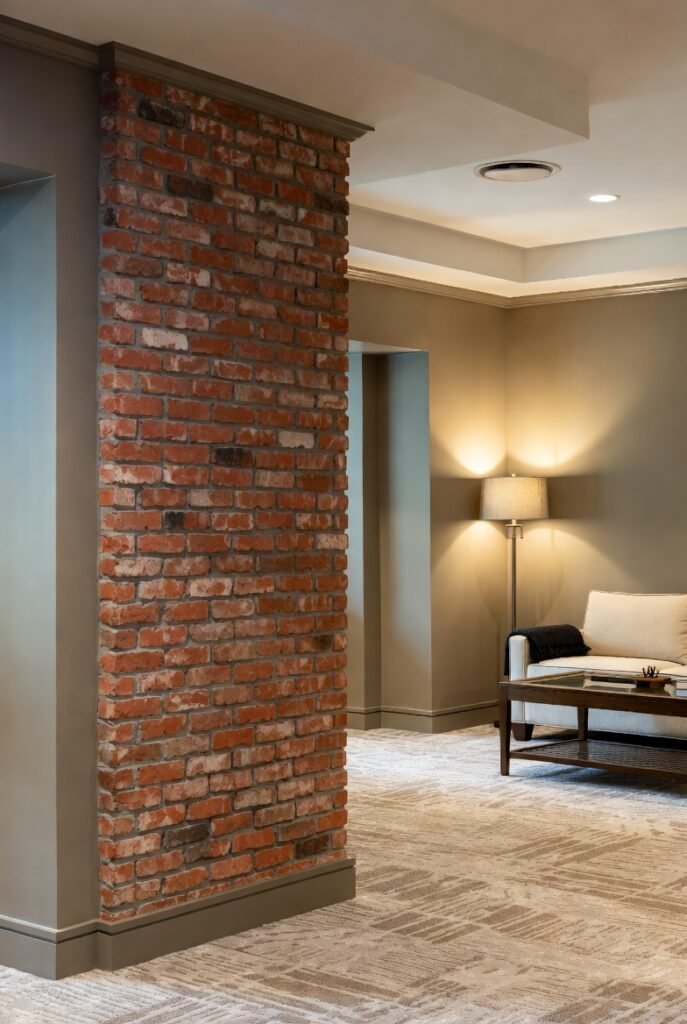
18 Colors That Go With Red Brick For Timeless Home Design Ideas
Red brick adds warmth and texture to interior spaces, making color choices important when designing around it. Choosing the right paint colors helps create a balanced and cohesive look that enhances the brick’s natural tones.
The key to working with red brick is finding colors that either complement its warmth or provide a pleasing contrast without overwhelming the space.
In this article, I’ll share 18 paint colors that work well with red brick to help you create an inviting and harmonious interior.
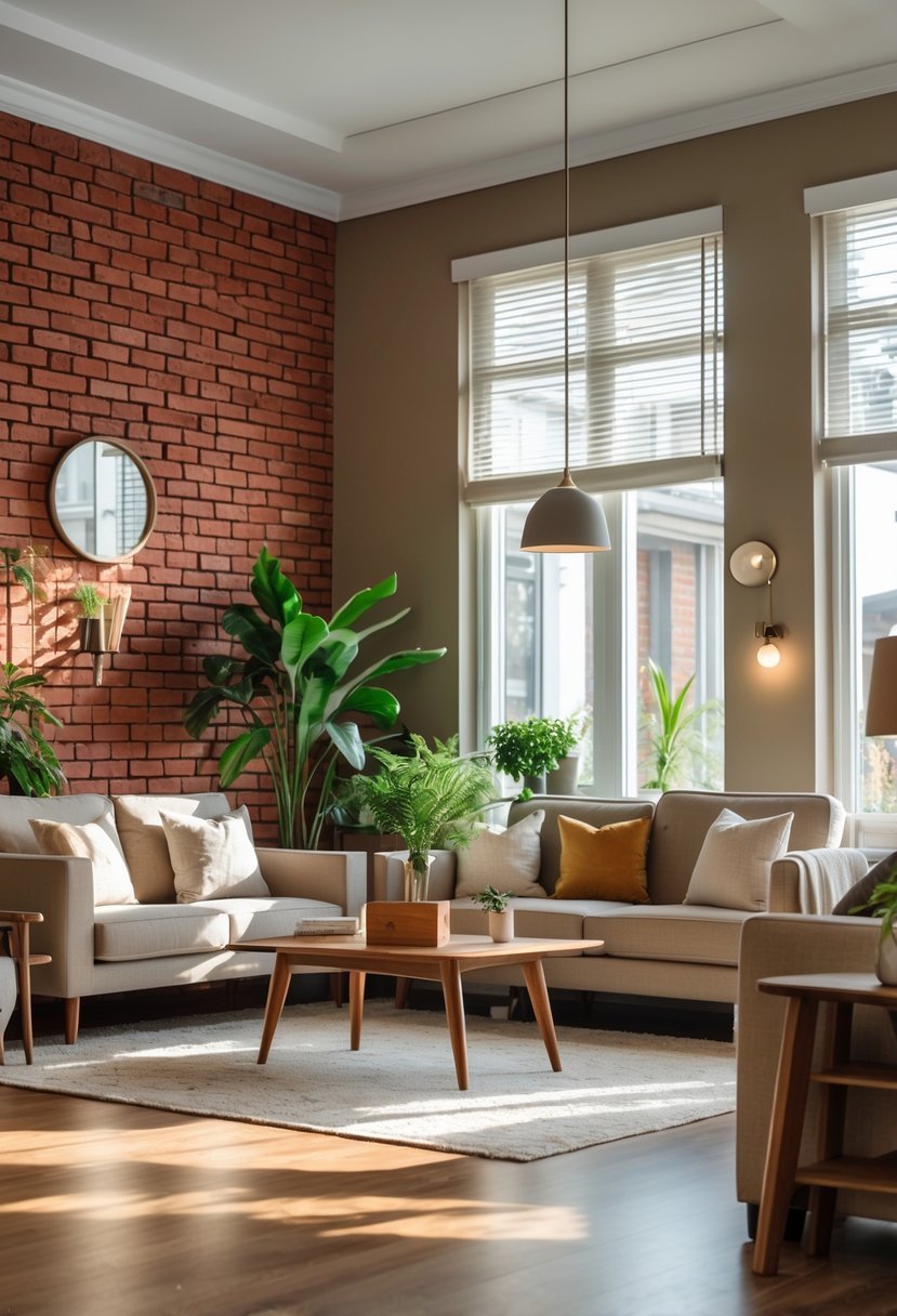
1) Creamy White
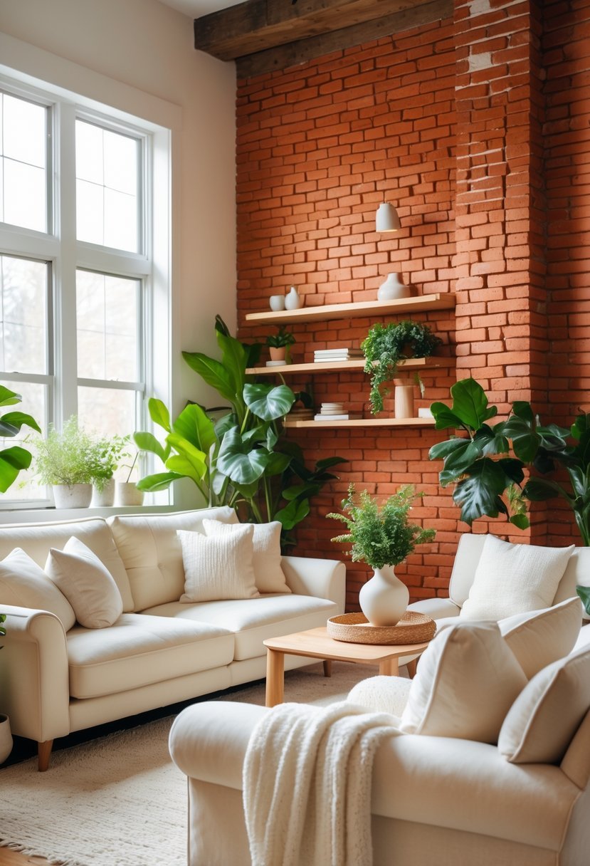
I find creamy white to be one of the most versatile colors when pairing with red brick. Its soft warmth balances the brick’s natural richness without overwhelming it.
In interior design, creamy white creates a calm backdrop that enhances the brick’s texture and deep tones. It allows other elements, like wood or metal accents, to stand out while maintaining an inviting atmosphere.
Using creamy white also brightens the space, making rooms feel open but still cozy alongside the brick’s earthy character.
2) Sage Green
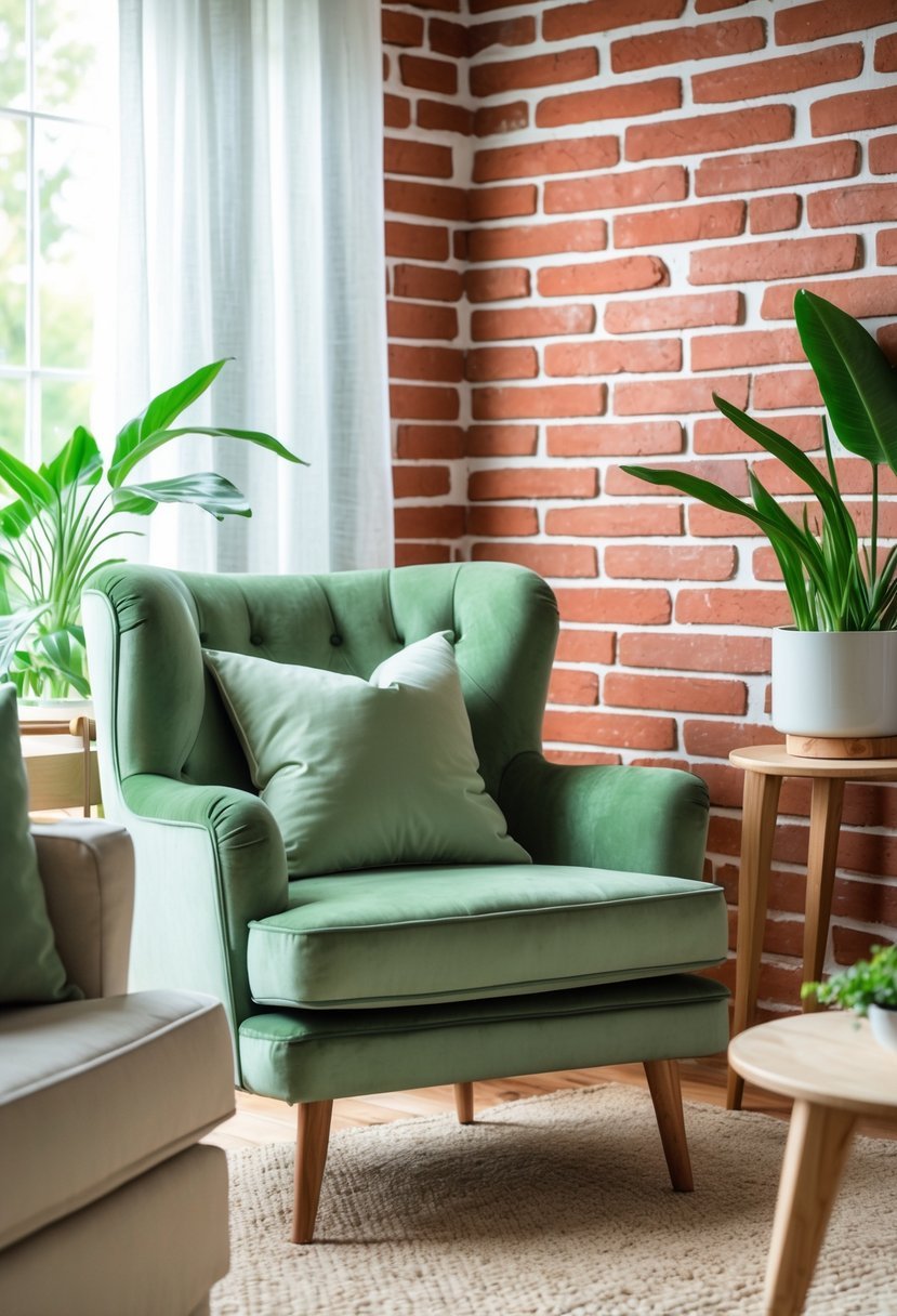
I find sage green pairs naturally with red brick, offering a calm, earthy contrast without overpowering the space. Its muted tone introduces a subtle freshness that balances the warmth of brick tones.
Using sage green in trim, furniture, or accent walls creates a grounded, harmonious color scheme. It works well with neutral accessories and organic textures to enhance a relaxed, inviting interior.
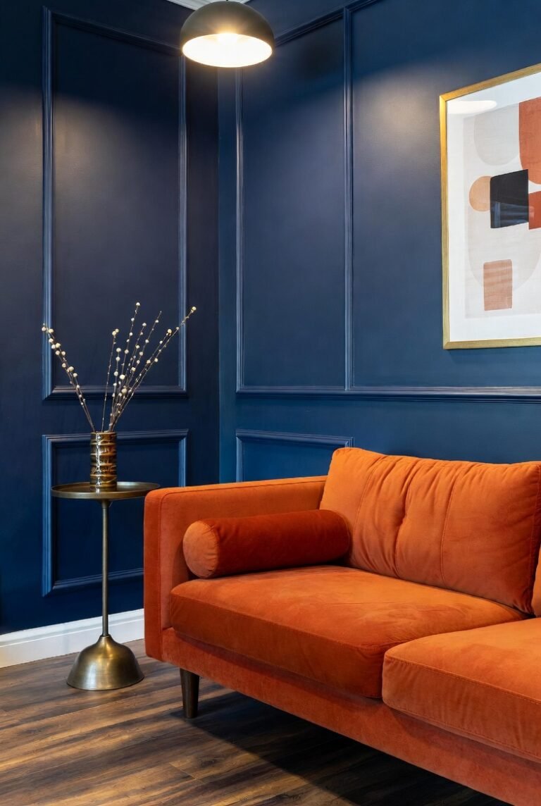
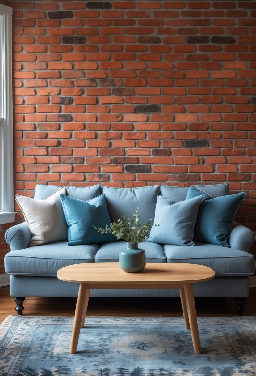
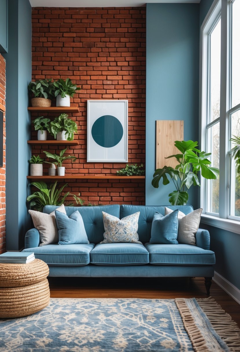
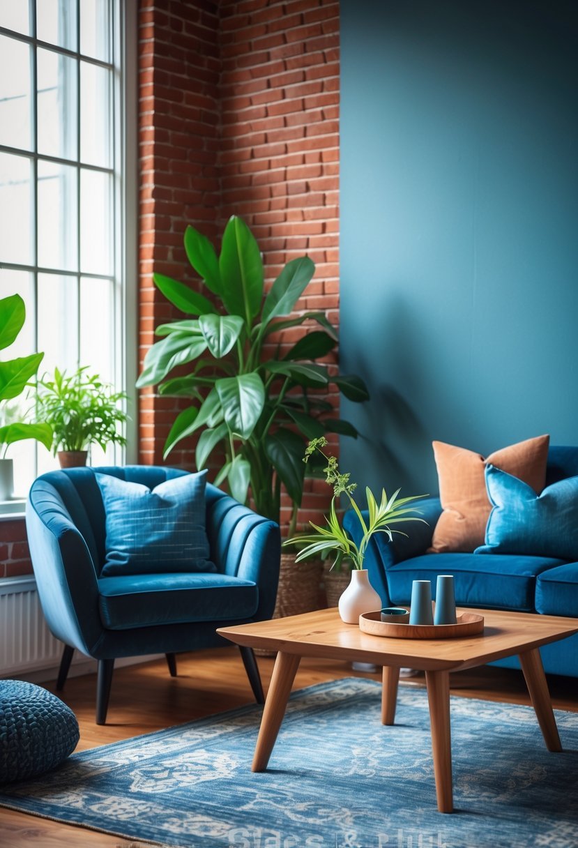
3) Navy Blue
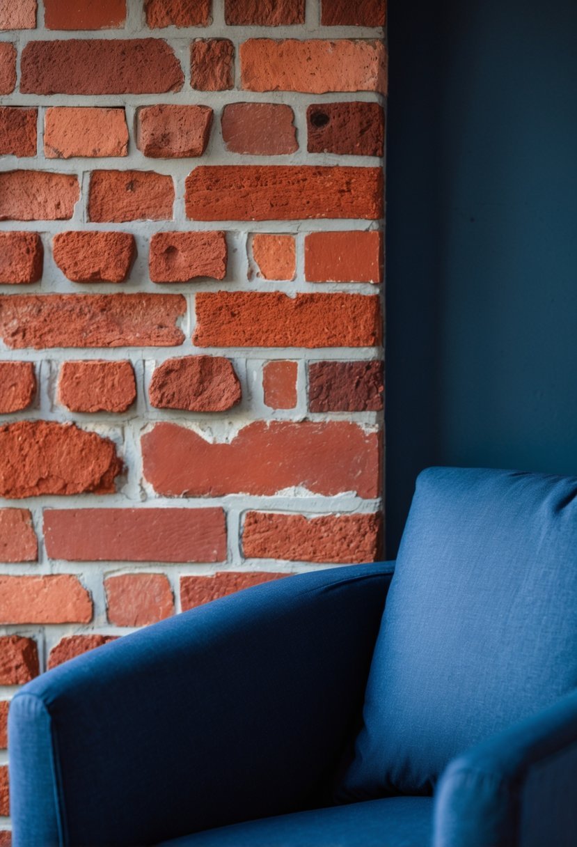
I find navy blue offers a strong, sophisticated contrast against red brick that works well in interior spaces. It brings depth without overwhelming the warm tones of the brick.
Using navy on walls or cabinetry creates a bold statement while complementing the earthy reds. It pairs nicely with white trim or light wood accents to keep the room balanced and inviting.
Navy blue often anchors a space, making it perfect for living rooms or kitchens where you want a grounded, timeless feel alongside the natural texture of red brick.
4) Greige
I find greige to be a versatile choice when pairing with red brick. Its blend of gray and beige tones complements the brick’s warmth without competing for attention.
When used in interior design, greige offers a neutral backdrop that balances bold red brick while adding subtle sophistication. It works well on walls, trim, or even furniture.
The color’s adaptability allows me to mix in various textures and accent colors, making the space feel cohesive and inviting. Overall, greige helps soften the intensity of red brick while maintaining a modern, clean aesthetic.
5) Soft Gray
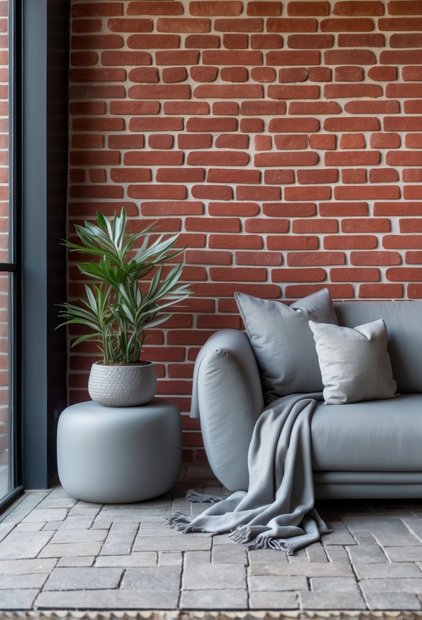
I find soft gray to be a versatile choice when working with red brick interiors. It adds a calming, subtle contrast that balances the brick’s warm, rich tones without overwhelming them.
The gentle hues of soft gray create a cozy atmosphere, making spaces feel inviting yet modern. This color works well on walls or trim, enhancing the texture of the brick while keeping the palette understated.
Soft gray blends easily with other neutrals and can anchor bolder accent colors if you want to introduce more variety. Its quiet elegance pairs effortlessly with the rustic character of red brick.
6) Teal
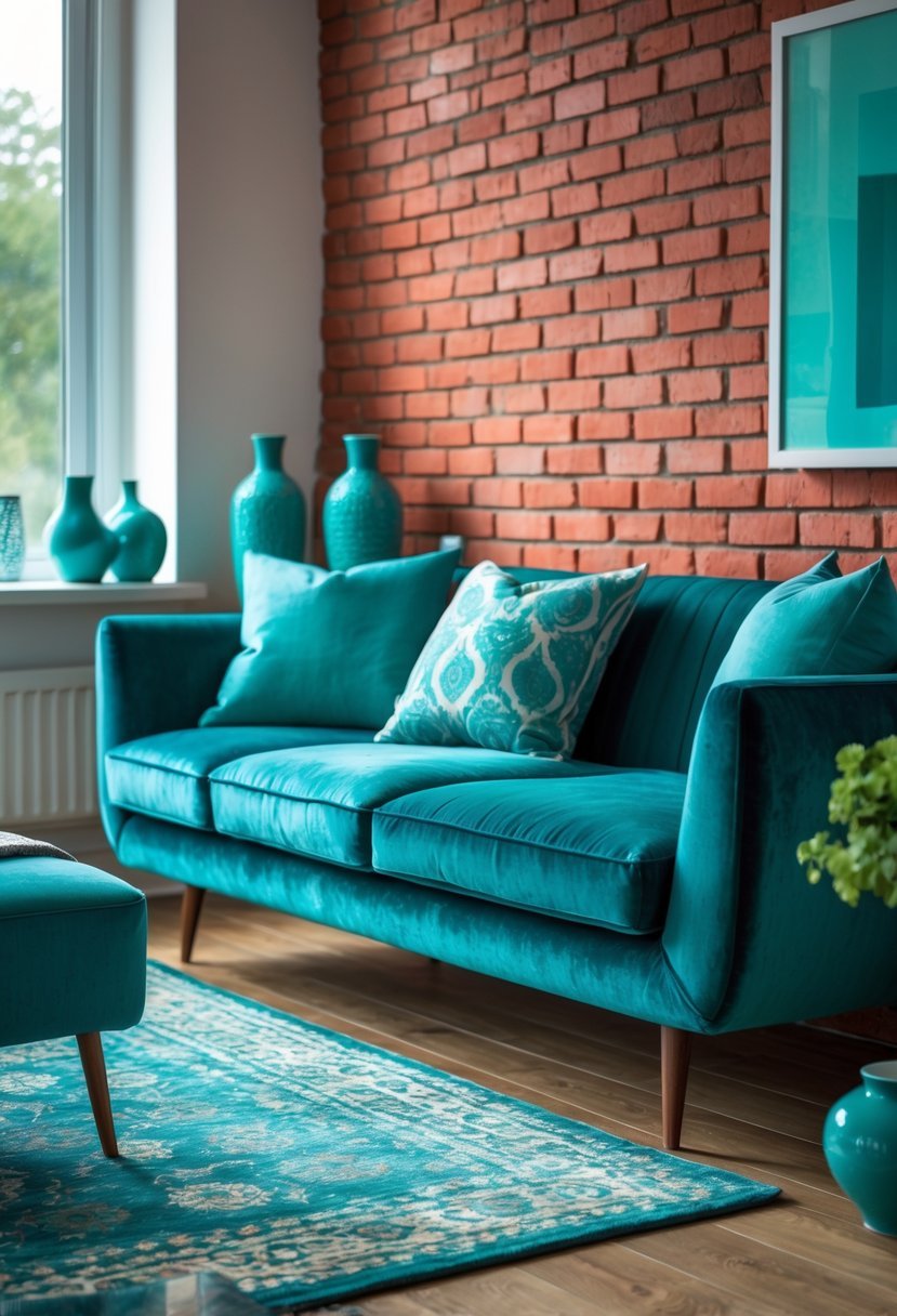
I find teal to be a striking choice when paired with red brick in interior design. Its deep, jewel tones contrast the warm, earthy reds without clashing.
Using teal on accent walls, furniture, or accessories can add sophistication and balance. It creates a refreshed look that feels both bold and harmonious.
Teal works well with natural materials like wood and brass, enhancing a space’s texture and depth. I recommend it for those seeking a lively yet refined color scheme.
7) Muted Blue
I find muted blue works well with red brick because it softens the brick’s natural warmth without clashing. This shade introduces a calm, subtle contrast that balances the space.
In interior design, muted blue creates a grounded atmosphere. It pairs nicely with wood tones and neutral accents, enhancing the texture of exposed brick walls.
Using muted blue in furniture or wall paint near red brick adds depth without overwhelming the senses. It’s a versatile choice that feels both modern and timeless.
8) Charcoal Gray
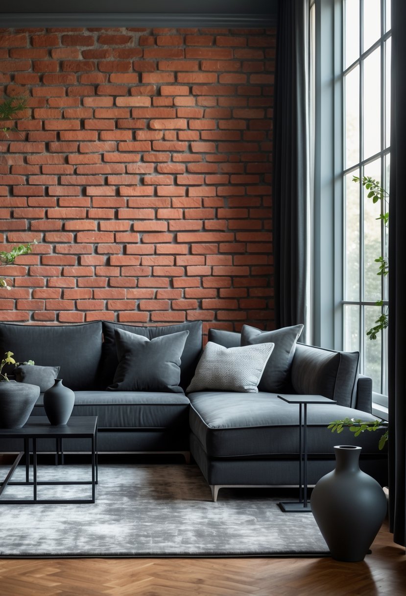
I find charcoal gray to be a strong choice when pairing with red brick in interior design. It offers a modern, sophisticated contrast without overwhelming the space.
Using charcoal gray on larger surfaces like walls or cabinetry adds depth, while smaller accents can highlight the brick’s warm tones. This balance keeps the room grounded but visually interesting.
9) Warm Beige
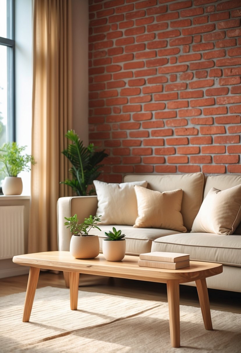
I find warm beige to be a reliable choice when pairing colors with red brick. Its soft, earthy tones create a cozy atmosphere without overwhelming the natural brick texture.
Using warm beige in interiors balances the richness of red brick by introducing subtle warmth. It works well on walls or larger surfaces, blending smoothly with both traditional and modern styles.
In my experience, warm beige also pairs nicely with dark trims or wood accents, adding depth to the overall color scheme while maintaining a natural, inviting feel.
10) Olive Green
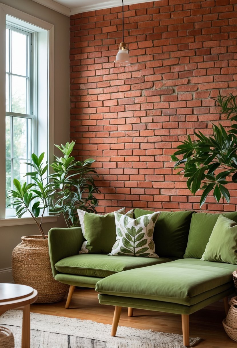
I find olive green to be a versatile choice when working with red brick interiors. Its earthy, muted tone complements the warm, natural hues of brick without overpowering the space.
This color adds depth and a subtle contrast, creating a grounded, organic feel. I often use olive green on accent walls or in furniture to balance the warmth of red brick. The yellow and brown undertones in olive green harmonize well with the brick’s natural palette, making the overall design cohesive and inviting.
11) Dusty Blue
I find dusty blue to be a versatile choice when working with red brick interiors. It offers a soft contrast that cools down the warmth of the brick without overpowering it.
Using dusty blue in furniture or accent walls creates a calming atmosphere while maintaining a balanced look. Pairing it with neutral tones like cream or beige further enhances this effect.
In my experience, dusty blue works well in living rooms or bedrooms, providing depth and subtle elegance alongside red brick features.
12) Classic Black
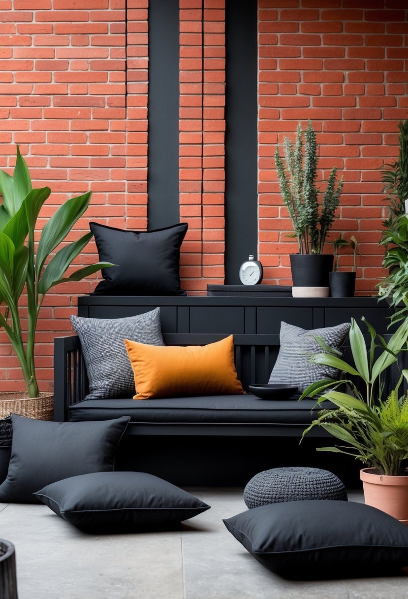
I find classic black to be a strong, grounding choice when paired with red brick. It provides a sharp contrast that enhances the brick’s rich, warm tones without overwhelming the space.
Using black in trim, cabinetry, or accent walls creates a sophisticated and timeless look. It works especially well in modern interiors, adding depth and definition while keeping the palette balanced and elegant.
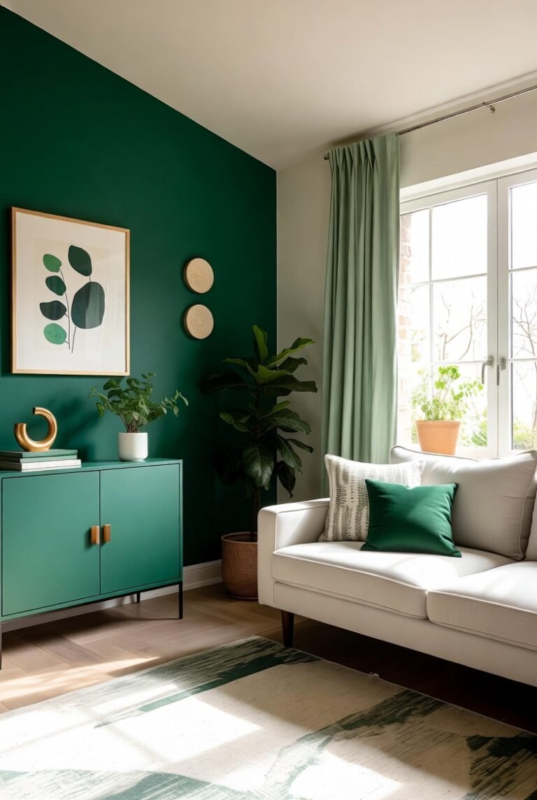
13) Hunter Green
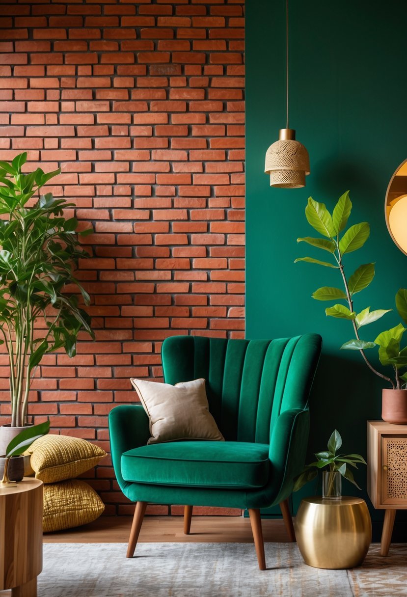
I find hunter green pairs well with red brick, creating a strong and grounded color scheme. The deep green balances the warm, earthy tones of the brick, adding depth without overpowering the space.
In interiors, using hunter green on cabinets, trim, or accent walls can highlight red brick features. It brings a classic feel that feels both timeless and refined.
14) Pale Yellow
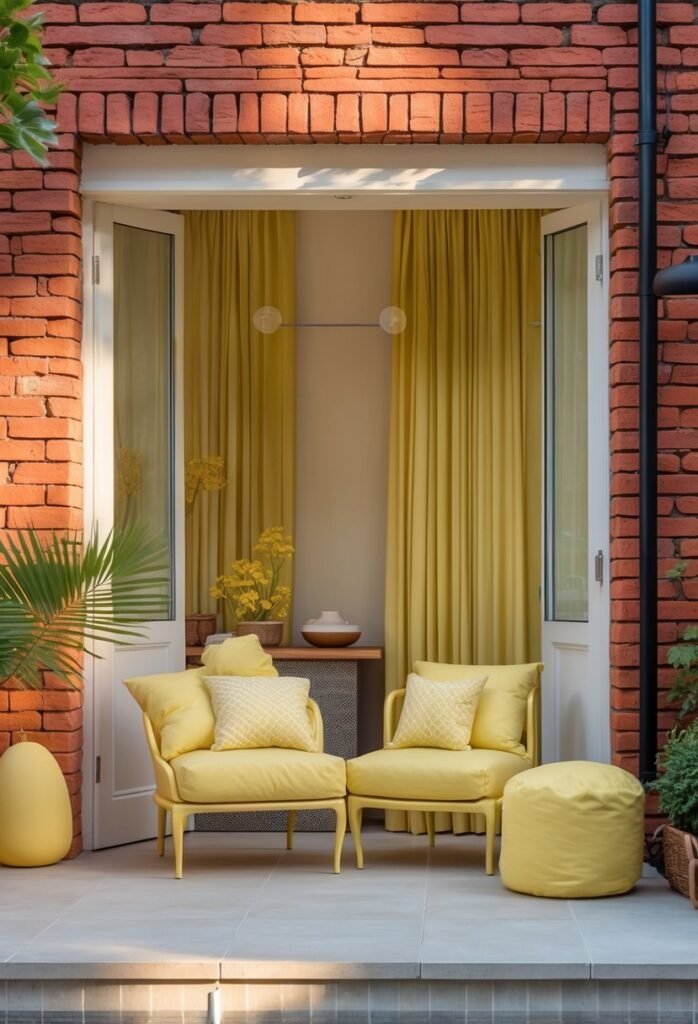
I find pale yellow to be a subtle, warm complement to red brick in interior design. It brightens the space without competing with the rich, earthy tones of the brick.
Using pale yellow on walls or trim creates a soft contrast that feels inviting and fresh. It works especially well in rooms with plenty of natural light, enhancing the brick’s natural warmth.
Pairing pale yellow with natural wood or neutral textiles balances the color scheme, making the space feel cohesive and calm.
15) Rust Orange
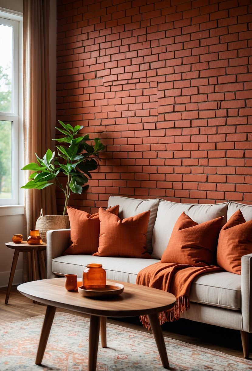
I often use rust orange in interiors with red brick walls to enhance warmth without overwhelming the space. It pairs well with natural materials like wood and leather, creating a cohesive, grounded look.
This color adds depth and complements the brick’s earthy tones. I find it works best as an accent in textiles or decor rather than large surfaces, balancing vibrancy with subtlety.
16) Soft Taupe
I find soft taupe to be a versatile choice when pairing with red brick interiors. Its earthy undertones complement the warm, natural tones of brick without competing for attention.
Using soft taupe on walls or larger surfaces creates a calm, neutral backdrop. It balances the richness of red brick and allows other elements, like furniture or textiles, to stand out.
In trim or accents, soft taupe adds subtle depth. It brings a sophisticated, grounded feel that enhances the overall color scheme without overwhelming the space.
17) Slate Blue
I find slate blue to be a reliable choice when working with red brick interiors. Its muted tones create a calming contrast without overwhelming the space.
In my experience, choosing slate blue shades with gray undertones helps maintain a balanced look. This color harmonizes with the warmth of brick while adding subtle depth.
Using slate blue on walls or furniture softens the brick’s boldness. It brings a sense of tranquility and sophistication that suits various room styles.
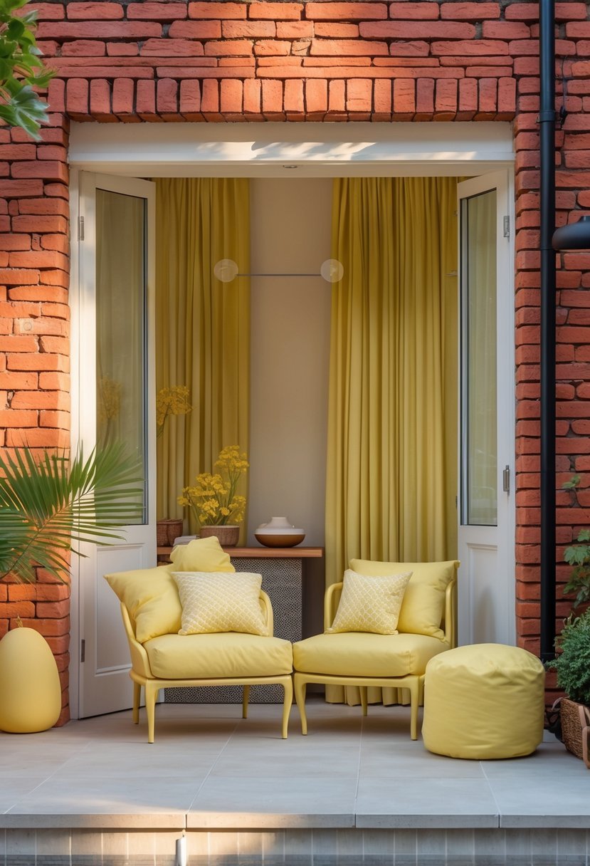
18) Mustard Yellow
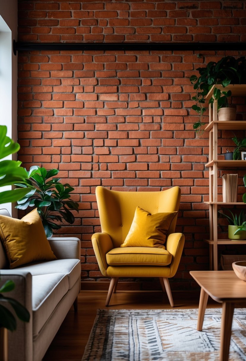
I find mustard yellow to be a strong choice for pairing with red brick. Its warm, earthy tone complements the natural richness of brick without overwhelming it.
Using mustard yellow in accents like pillows or throws adds warmth and a cozy feel. It works particularly well in living rooms or bedrooms where a relaxed yet vibrant atmosphere is desired.
Incorporating mustard yellow alongside neutral tones can balance the boldness. This color enhances a space while maintaining harmony with red brick elements.