16 Colors That Go With Purple: The Ultimate Guide to Perfect Pairings
Purple often feels like a risky choice in design. I know many people shy away from it because they worry it will look too childish or overwhelming. However, when you pair it correctly, purple communicates originality, ingenuity, and visionary thinking.
In fact, Pantone describes their Color of the Year, Ultra Violet, as a shade that “lights the way to what is yet to come.” By mastering this color, you join over 10 million designers who use color theory to create moods that range from regal and luxurious to soft and romantic.
I have compiled this list to help you confidently mix and match this complex hue. Whether you are dressing for an event or redecorating your living room, here are 16 colors that go perfectly with purple.
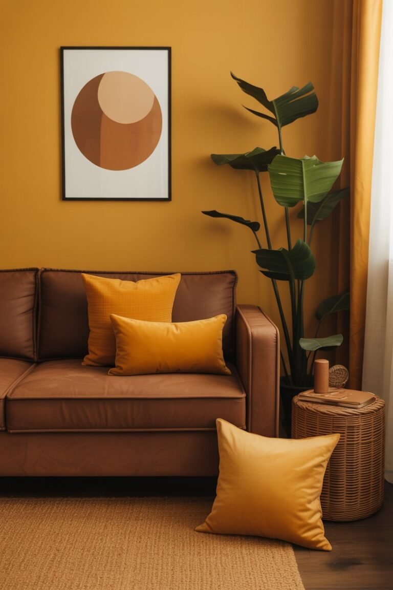
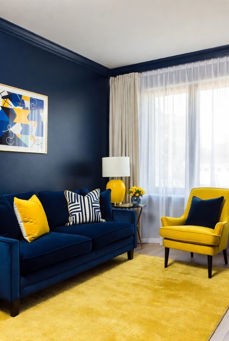
1. Mustard Yellow
I always look to the color wheel first when finding a match. Yellow sits directly opposite purple, making them complementary colors.
This combination creates high-impact contrast. I love using mustard yellow specifically because it feels more sophisticated than a bright primary yellow. The warmth of the mustard balances the cool undertones of most purples.
Tip: Use this duo in small doses to avoid overwhelming the eye. I suggest a mustard yellow throw pillow on a deep violet armchair.
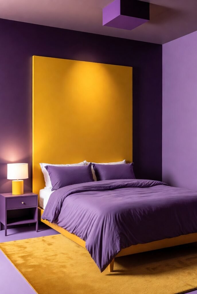
2. Gold
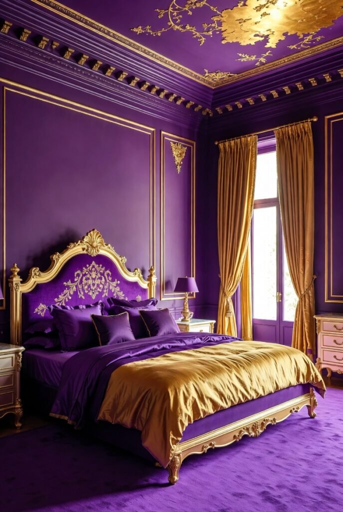
If you want to channel royalty, you cannot go wrong with gold. Purple has a long history of association with wealth and majesty, and gold amplifies that luxurious feel.
I find that gold acts like a jewelry accent for purple. It adds a layer of shine and texture that flat matte colors simply cannot achieve.
Tip: Incorporate gold hardware, such as drawer pulls or light fixtures, in a room with purple walls for an instant upgrade.
3. Charcoal Gray
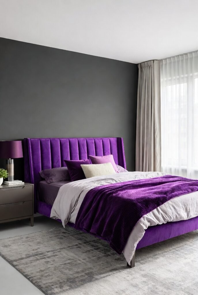
I recommend charcoal gray for anyone who wants a modern, sleek aesthetic. Gray acts as a neutral ground that allows purple to pop without competing for attention.
While black can sometimes feel too harsh against lighter lavenders, charcoal offers a softer transition. It provides enough depth to ground the design but keeps the vibe airy and contemporary.
Tip: Pair a charcoal gray suit with a lavender tie or pocket square for a sharp, professional look.
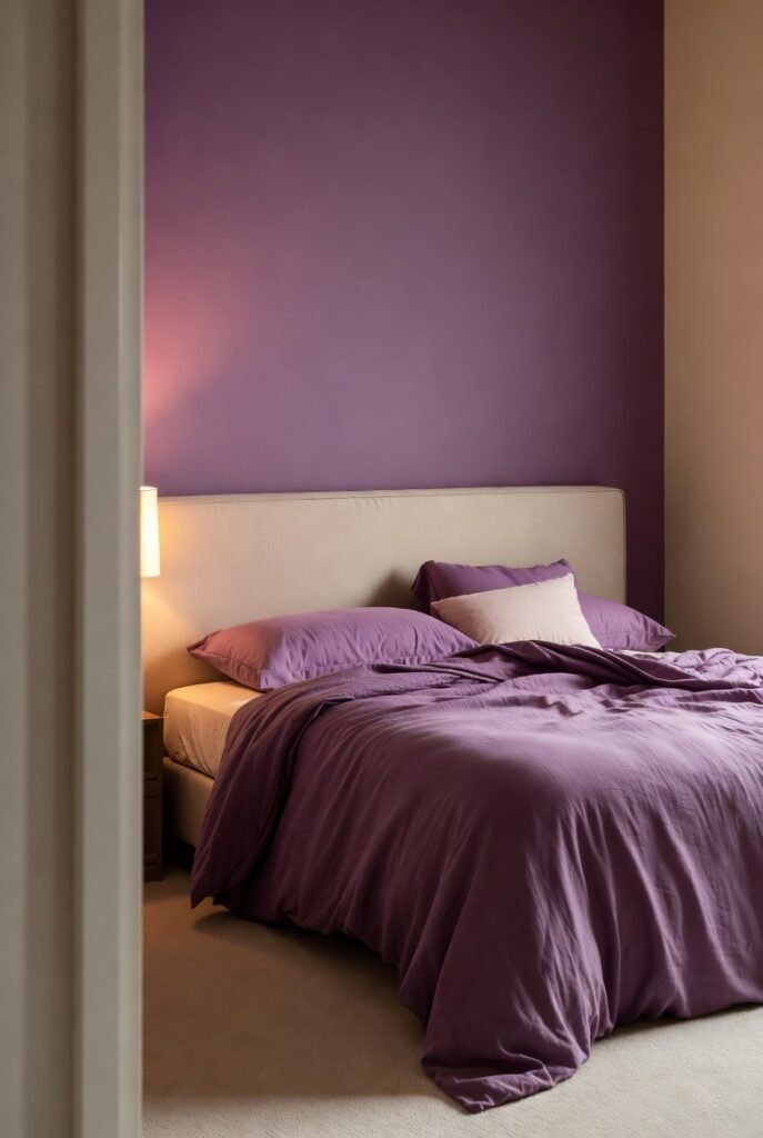
4. Crisp White
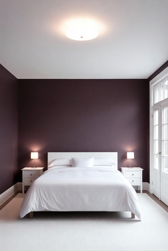
White is the ultimate palate cleanser. I love pairing bright white with deep plum or eggplant because the contrast is crisp and refreshing.
This combination works particularly well in bathrooms or bedrooms where you want a sense of cleanliness and calm. The white prevents the purple from making the space feel dark or small.
Tip: Paint your walls a soft lavender and keep all trim and molding a bright, high-gloss white.
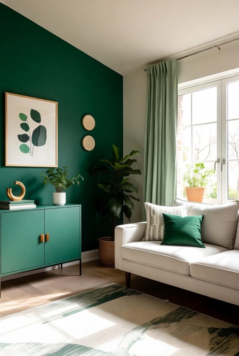
5. Emerald Green
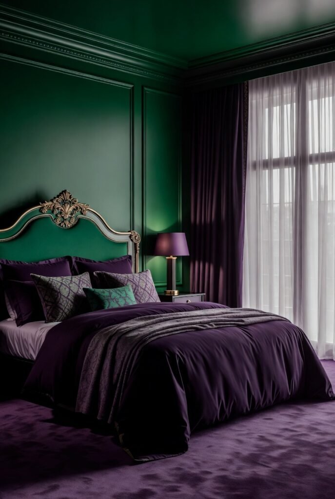
Green and purple are a natural fit because they appear together in nature constantly—think of a violet flower on a green stem.
I prefer emerald green because its jewel-tone richness matches the intensity of deep purple. This pairing feels lush, moody, and very high-end.
Tip: Try a velvet texture for both colors. An emerald velvet sofa looks stunning against a purple rug or wall.
6. Blush Pink
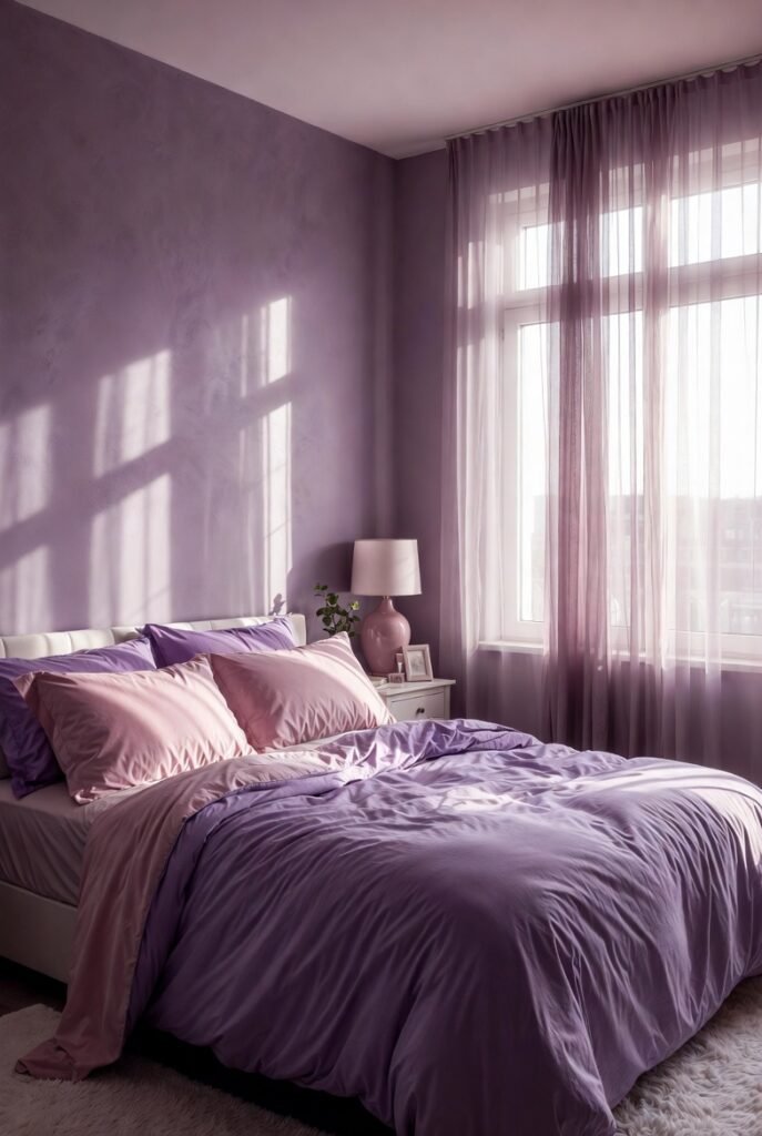
For a softer, more romantic approach, I turn to blush pink. Since pink and purple are analogous colors (meaning they sit next to each other on the color wheel), they create a harmonious, low-contrast look.
I find this combination soothing and feminine. It works exceptionally well in nurseries or calming creative spaces.
Tip: Layer different textures, like a chunky knit pink blanket over smooth purple bedding, to add interest without adding visual chaos.
7. Navy Blue

If you want a moody, monochromatic vibe without using the exact same shade, navy blue is my go-to.
Navy shares the cool undertones of purple, creating a seamless flow between the two. I think this pairing looks incredibly sophisticated and avoids the “Halloween” vibe that black and purple can sometimes accidentally create.
Tip: Wear dark wash denim (navy) with a bright violet top for an easy, stylish casual outfit.
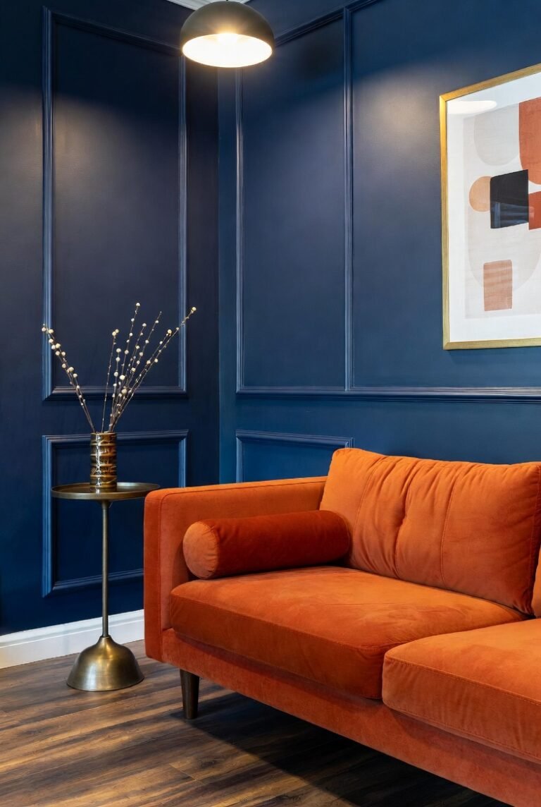
8. Burnt Orange
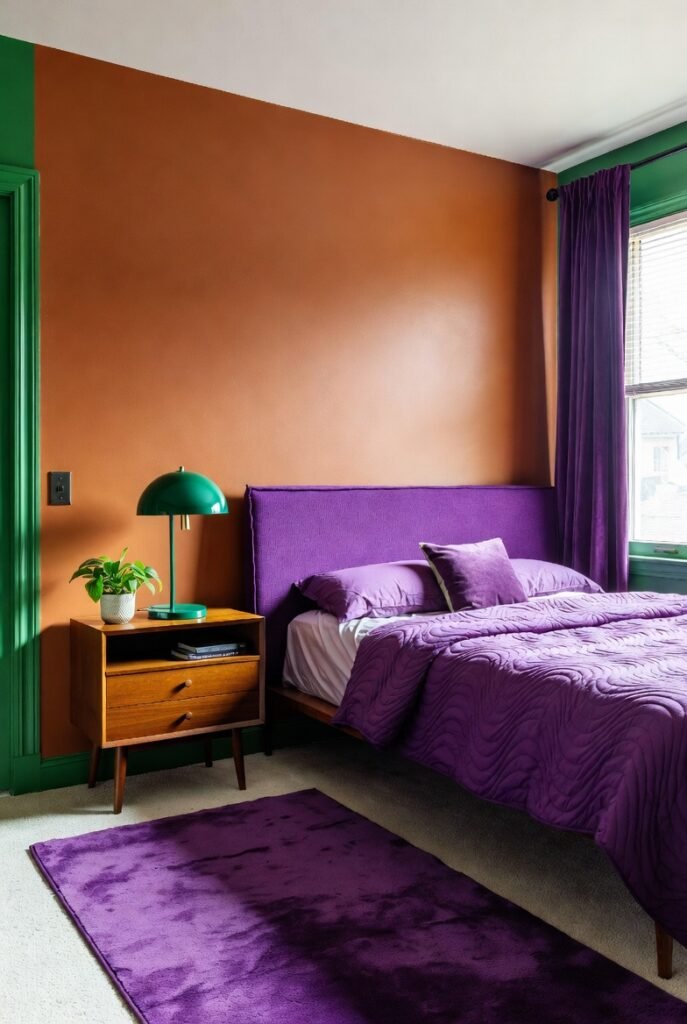
This pairing might surprise you, but I find it incredibly energetic. Orange and purple form a “triadic” color scheme (along with green), meaning they are evenly spaced on the color wheel.
Burnt orange brings a retro, mid-century modern feel to purple. It warms up the space and adds a funky, artistic edge that shows you aren’t afraid of color.
Tip: Use art prints that feature both burnt orange and purple to tie the room together effortlessly.
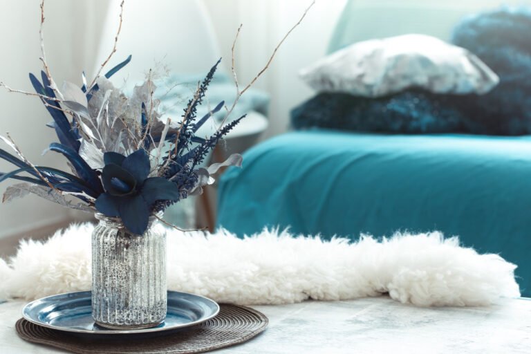
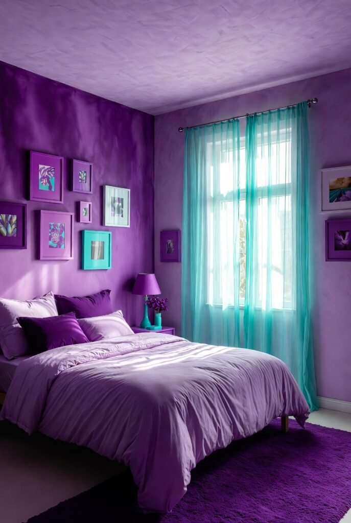
9. Teal
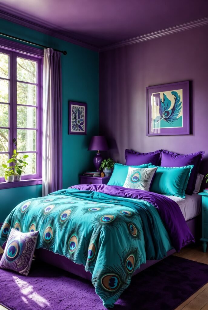
Teal is another jewel tone that stands up well against purple. I love this combination because it feels exotic and vibrant, reminiscent of peacock feathers.
The blue-green mix of teal bridges the gap between the cool blue undertones of purple and the contrasting nature of green. It is bold, creative, and lively.
Tip: Paint an accent wall teal and place a purple sideboard or console table against it.
10. Silver
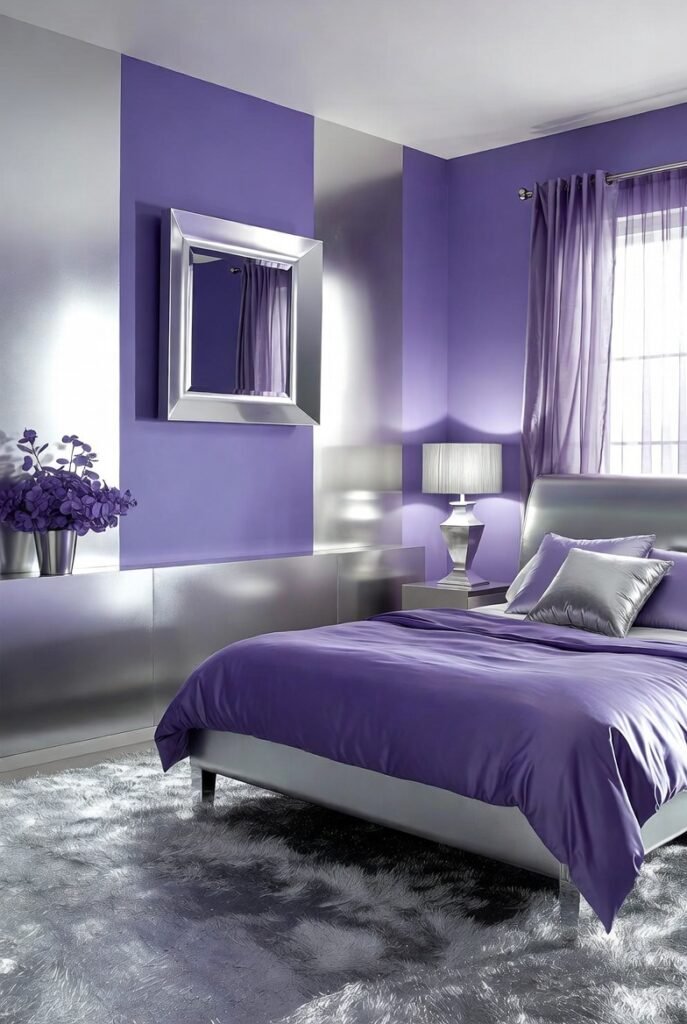
While gold adds warmth, silver adds a cool, futuristic touch. I recommend silver if you are using cooler shades of purple like lilac or periwinkle.
Silver acts as a mirror, reflecting the purple tones and making the space feel larger and brighter. It creates a frosty, elegant look that is perfect for winter wardrobes or modern interiors.
Tip: A silver dress with purple heels makes for a stunning, icy evening look.
11. Beige
I know neutrals can seem boring, but beige warms up purple in a way that white cannot.
Beige has yellow undertones, which subtly complement the purple without the intensity of a bright yellow. I find this creates a cozy, inviting atmosphere that feels very “lived-in” and comfortable.
Tip: Use natural beige materials, like linen or rattan, alongside purple accents to ground the color.
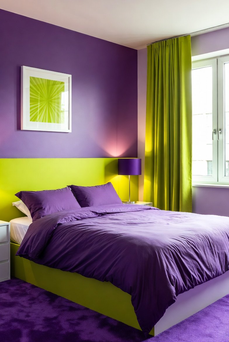
12. Lime Green

If you want high energy, lime green is your answer. I use this combination when I want to make a bold statement that screams fun and excitement.
This pairing is popular in sportswear and teen bedrooms because it is vibrant and impossible to ignore. The electric nature of lime green creates a vibrating contrast with purple.
Tip: Use this in small accessories, like a lime green notebook on a purple desk, to add a pop of energy.
13. Chocolate Brown
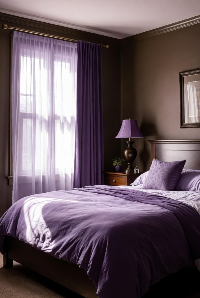
Brown grounds purple and connects it to the earth. I think this combination feels very vintage and bohemian.
A deep chocolate brown provides a dark contrast similar to black but with warmer, richer undertones. It makes purple feel sophisticated and masculine.
Tip: A leather brown armchair looks incredibly inviting next to purple velvet drapes.
14. Red
Red and purple are neighbors on the color wheel, creating a passionate and intense energy.
I advise using this pairing carefully, as both colors are dominant. However, when done right, it looks regal and fiery. Think of the “Red Hat Society”—they know this pairing demands attention!
Tip: Choose a red with blue undertones (like crimson) rather than orange undertones to ensure it clashes less with the purple.
15. Turquoise
Turquoise adds a splash of aquatic brightness to purple. I find this combination playful and spirited.
It works similarly to teal but is lighter and more energetic. This is a great palette for summer outfits or beach-themed decor that wants to avoid the traditional blue-and-white cliché.
Tip: Pair turquoise jewelry with a purple dress for a vibrant pop of color near your face.
16. Mint Green
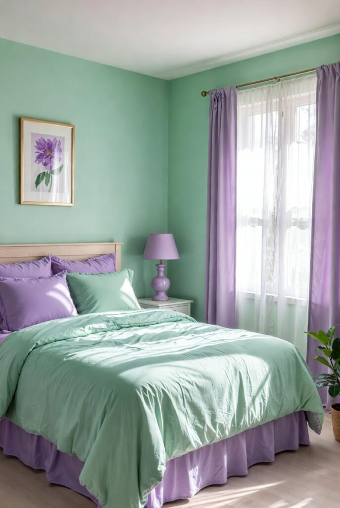
For a pastel variation of the green-purple match, I love mint.
Mint green is fresh and airy. When you pair it with lavender, you get a “springtime” palette that feels light, happy, and rejuvenating.
Tip: Use mint green tiles in a bathroom with lavender towels for a spa-like retreat.
Conclusion
Purple does not have to be the intimidating color you avoid. By understanding these pairings, you can unlock a world of creative possibilities that reflect your unique style.
I encourage you to start small—pick one color from this list and experiment with a throw pillow, a scarf, or a piece of art. You might just find that purple becomes your new favorite color to design with.