16 Colors That Go With Orange to Energize Your Home Decor
I used to be terrified of decorating with orange. It sits right between the intensity of red and the brightness of yellow on the color wheel, making it one of the most energetic—and intimidating—shades to work with. But once I started experimenting, I realized that orange is actually incredibly versatile.
Whether you want to create a cozy, mid-century modern vibe or a bold, eclectic space, the right color pairing makes all the difference.
In this guide, I’ll walk you through 16 specific colors that pair beautifully with orange, backed by design principles that actually work. You’ll learn exactly how to use these combinations to transform your home into a warm, inviting sanctuary.
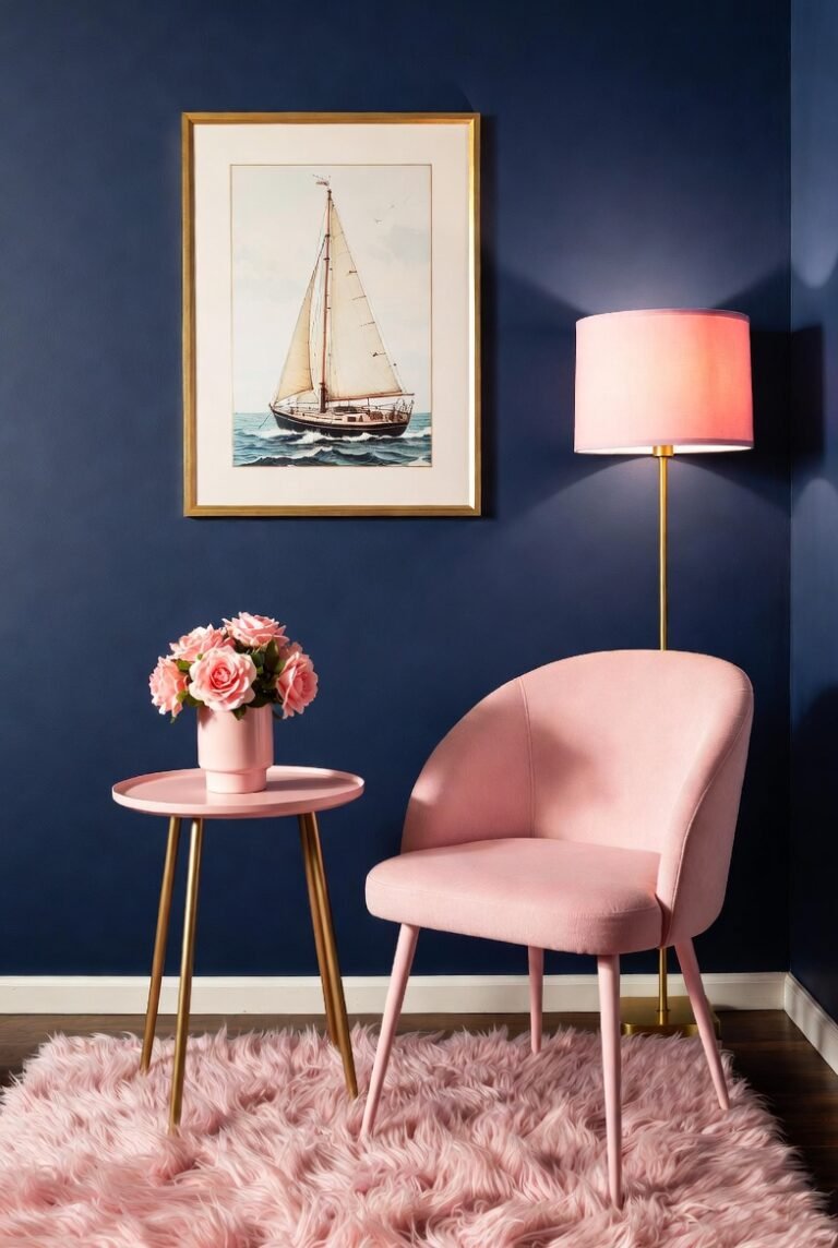
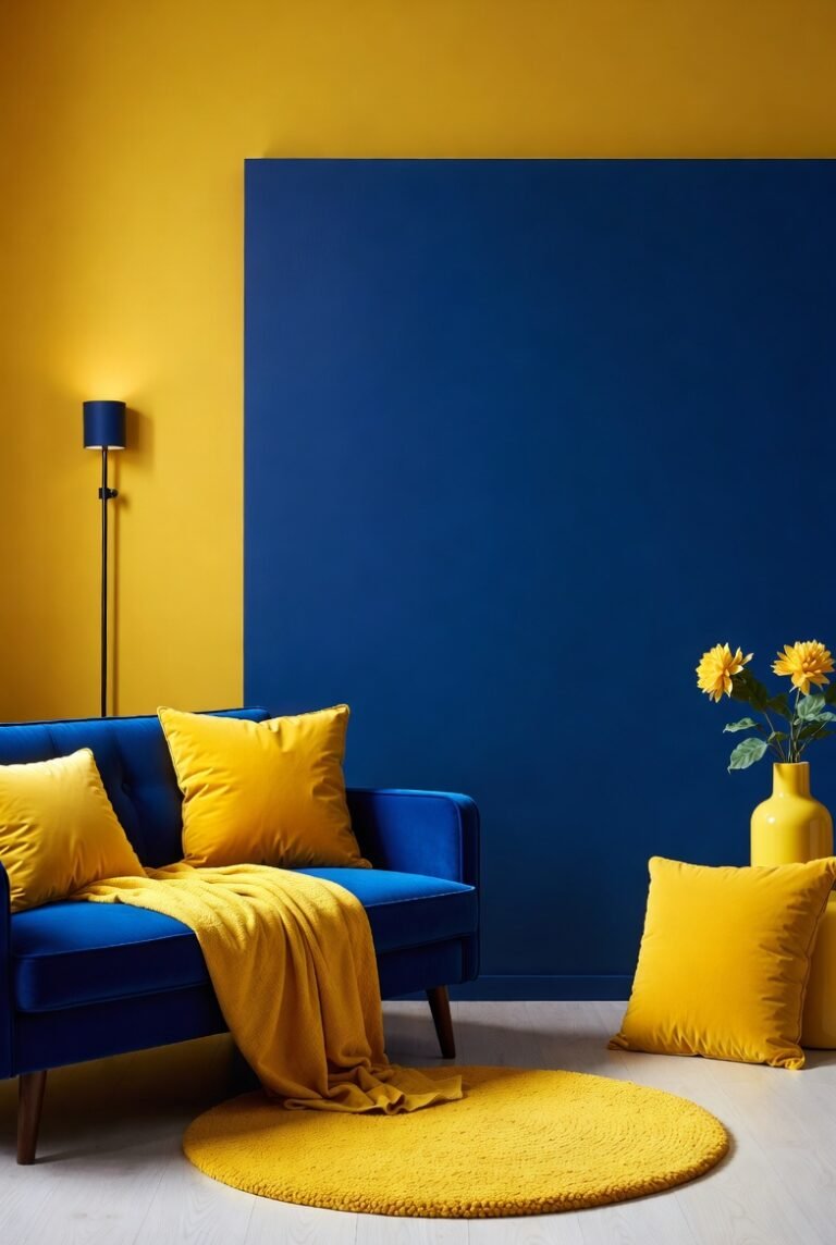
1. Deep Navy Blue
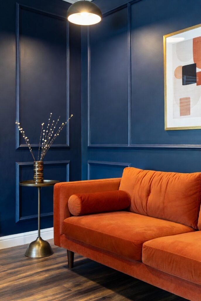
If you want to anchor a room instantly, pair orange with navy blue. Since blue sits directly opposite orange on the color wheel, they are complementary colors that naturally balance each other out.
I find that a deep navy calms down the high energy of orange without dulling its shine. Try painting your walls a rich navy and adding a burnt orange velvet sofa. The contrast creates a sophisticated, modern look that feels deliberate rather than chaotic.
2. Crisp White
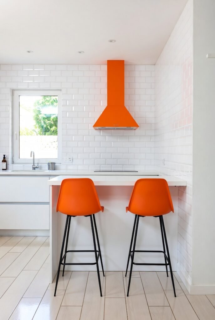
Nothing makes orange pop quite like a crisp, clean white. This combination is perfect if you want a space that feels fresh, airy, and energetic. Better Homes & Gardens suggests letting a bright tangerine shade be the star by pairing it with all-white accents.
I recommend using this palette in a kitchen or breakfast nook. White subway tiles and cabinets provide a blank canvas, allowing bright orange bar stools or a range hood to act as a vibrant focal point.
3. Emerald Green
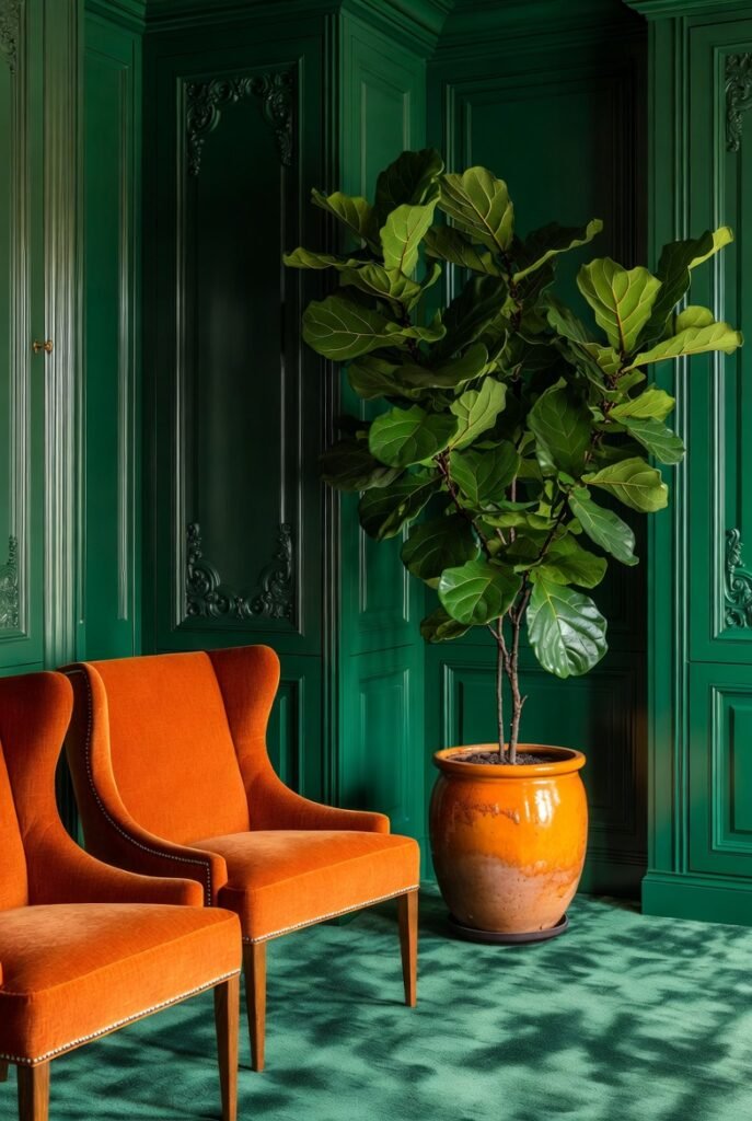
For a look that feels luxurious and grounded in nature, I love mixing orange with emerald green. This pairing brings a high-energy vibe to any room, as noted by design experts who often mix burnt orange chairs with verdant green cabinetry.
To pull this off, I suggest using plants as your bridge. Place a large fiddle leaf fig in a terracotta or orange-glazed pot against an emerald accent wall. It connects the two colors organically.
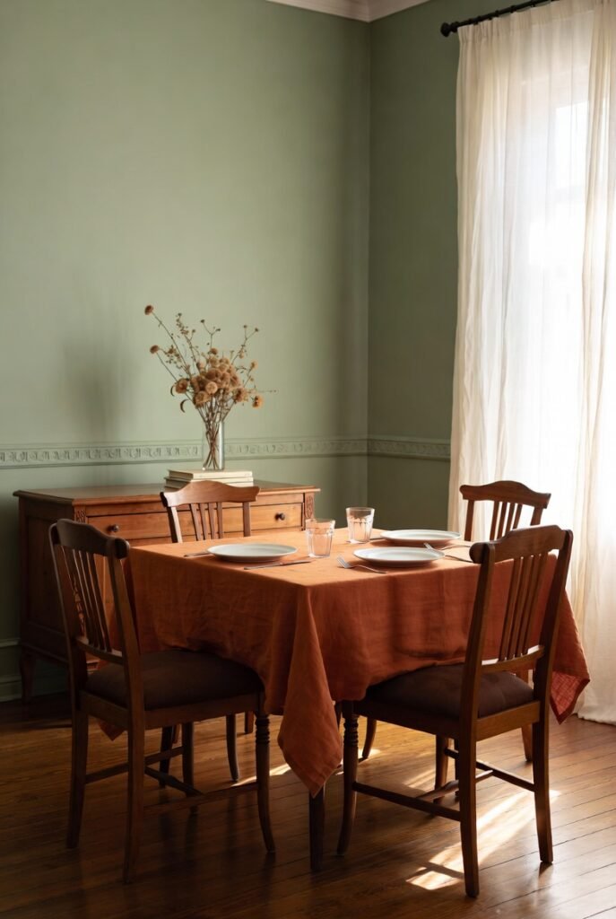
4. Teal
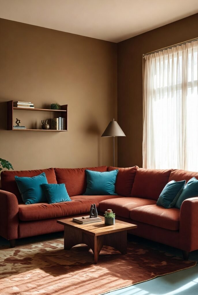
Teal is the spirited cousin of navy blue, and it creates a much more playful contrast with orange. This combination screams mid-century modern chic.
I often see this working best in living rooms. Try tossing a few teal throw pillows onto a rust-colored sectional. The cool undertones of the teal cut through the warmth of the rust, creating a dynamic visual balance.
5. Warm Brown
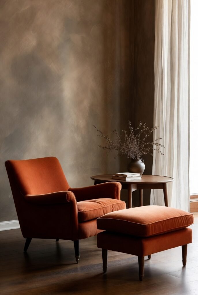
If you crave a rustic or retro aesthetic, look no further than orange and brown. This duo leans heavily into 1970s nostalgia but can look thoroughly modern with the right textures.
I focus on wood tones here. Pair a pumpkin-colored armchair with a walnut coffee table or dark wood flooring. The natural grain of the wood softens the orange, making the room feel cozy and autumnal year-round.
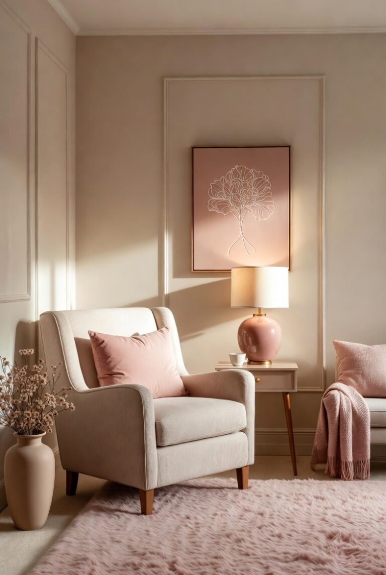
6. Blush Pink
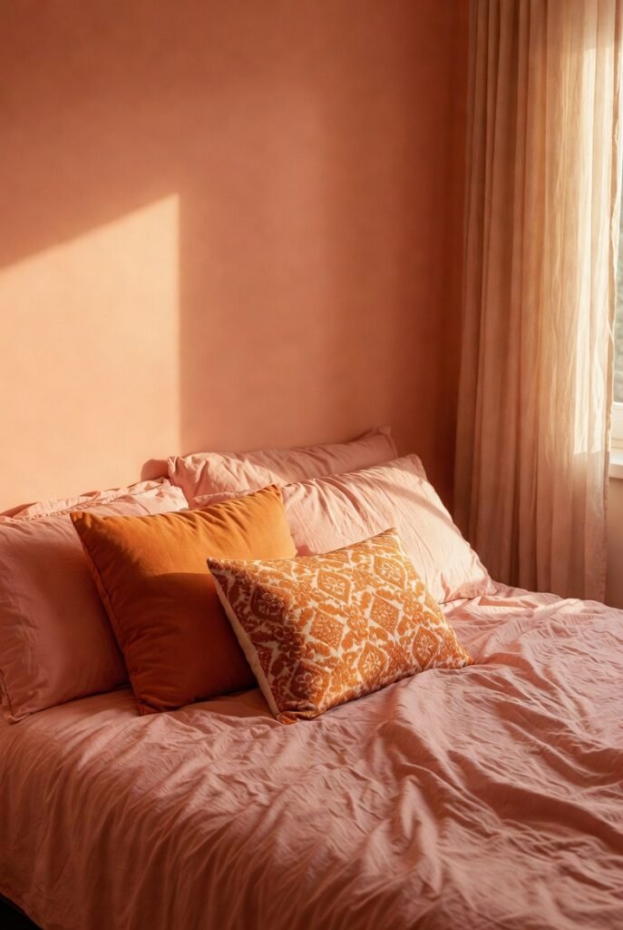
You might not expect pink and orange to work, but they sit next to each other on the color wheel, creating an analogous color scheme that feels harmonious and warm.
I like to use a soft, dusty pink to tone down brighter citrus shades. For a bedroom, try blush pink bedding with orange decorative pillows. It creates a sunset-inspired palette that feels romantic and soothing.
7. Charcoal Gray
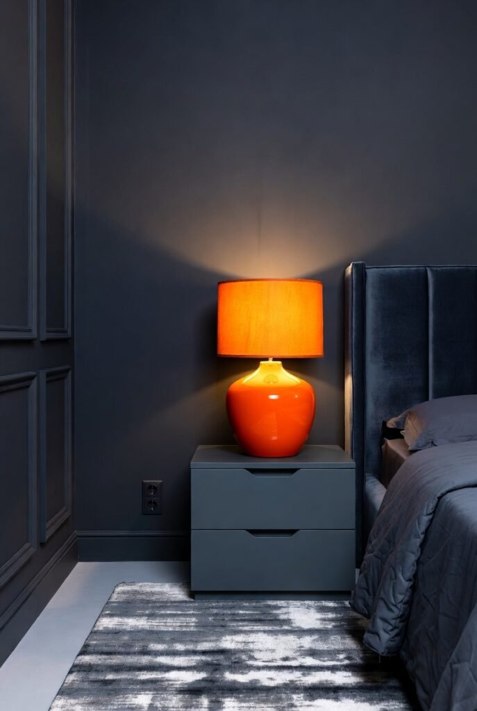
Gray brings a modern, industrial edge to orange decor. While cool grays can sometimes clash, a deep charcoal gray provides a moody backdrop that lets orange accents glow.
I recommend using charcoal for larger furniture pieces, like a rug or a headboard, and using orange for the accessories. A bright orange lamp on a charcoal bedside table looks striking and contemporary.
8. Sage Green
If emerald feels too bold, swap it for sage. This muted, earthy green pairs beautifully with deep, burnt oranges to create what some designers call the “Italian grandmother aesthetic”—cozy, curated, and timeless.
I suggest using this in a dining room. Sage green walls with warm wood furniture and orange table linens create an inviting atmosphere for long family dinners.
9. Mustard Yellow
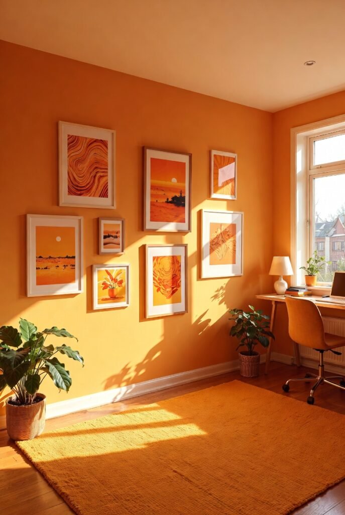
Doubling down on warm tones can result in a sunny, cheerful space. Mustard yellow and orange share a lot of DNA, so they blend seamlessly without fighting for attention.
I like to use this combination in spaces where I want to stimulate creativity, like a home office. According to color psychology experts at Benjamin Moore, orange breeds creativity and optimism. Add a mustard rug to a room with orange artwork to keep the energy high.
10. Cream
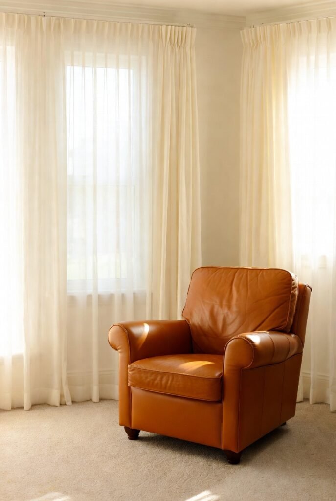
Cream is softer than bright white and adds a layer of richness that pairs perfectly with burnt orange. It creates a timeless look that feels airy but not sterile.
I love using cream as a wall color in living rooms where I have leather furniture. A cognac or orange-leather chair looks expensive and elegant against cream-colored walls and drapery.
11. Turquoise
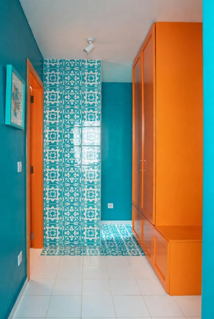
Turquoise and orange create a vibrant, high-contrast look that reminds me of Mediterranean vacations. It’s a bold choice that works well in spaces where you don’t spend hours sleeping, like a powder room or entryway.
My tip is to use turquoise in patterns. A patterned rug or wallpaper featuring turquoise and white makes a solid orange cabinet or bench feel integrated and stylish.
12. Black
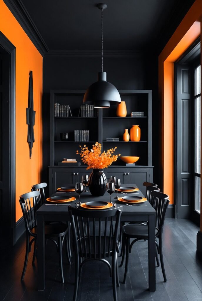
For high drama, pair bright orange with black. This combination is classic for a reason—it’s graphic and punchy. The key is to avoid looking like Halloween decorations.
I avoid using these two colors in equal measure. Instead, use black as the dominant color—perhaps on a dining table or shelving unit—and use orange sparingly as a deliberate accent color for vases or trays.
13. Powder Blue
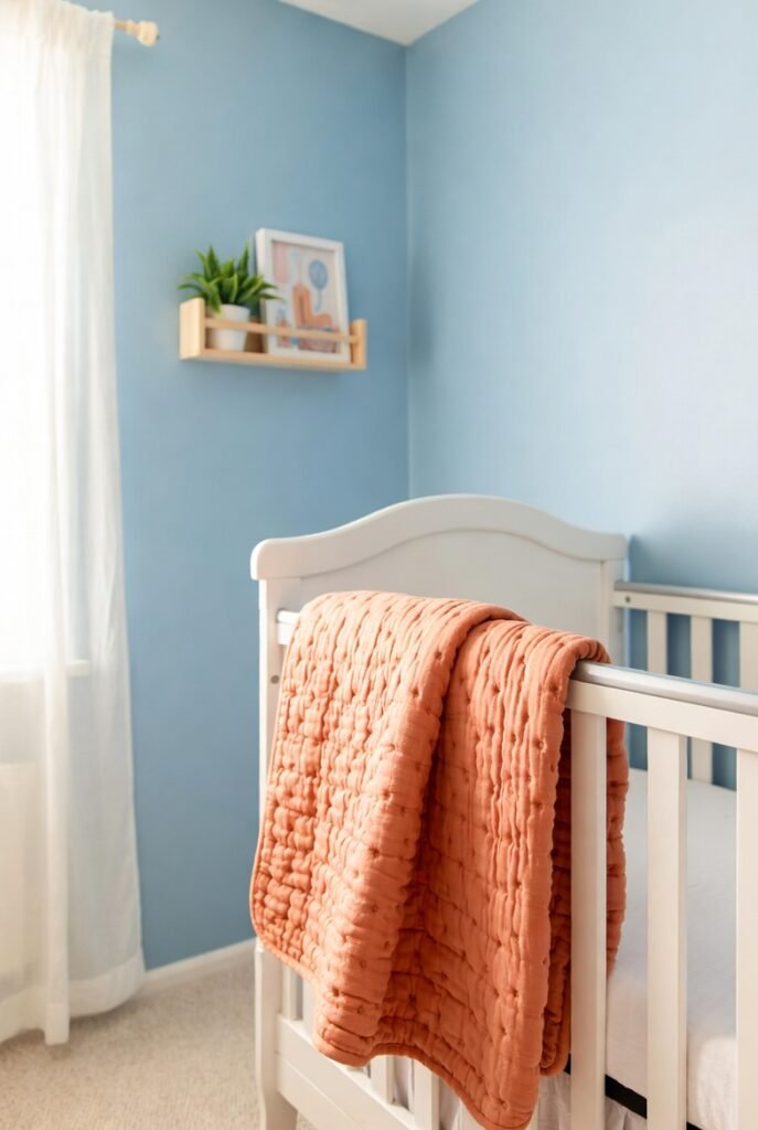
Soft powder blue cools down the heat of orange in a very gentle way. It’s a lovely combination for nurseries or guest bedrooms because it feels lighthearted and welcoming.
I suggest pairing a pale blue wall with a soft apricot orange quilt. The pastel nature of the blue ensures the orange feels cheerful rather than aggressive.
14. Gold
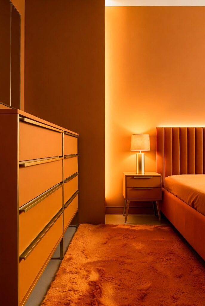
Metallic gold adds glamour to orange, elevating it from casual to chic. The warm undertones in gold reflect the warmth in orange, making the whole room glow.
I use gold hardware to upgrade orange furniture. Swapping out standard knobs on an orange dresser for brushed gold handles is an easy, low-cost hack that makes the piece look custom-made.
15. Lime Green
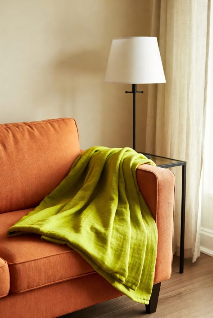
This is for the maximalists. Lime green and orange create a zesty, citrus-inspired palette that is full of life. It’s daring, but when done right, it feels fresh and energetic.
I recommend limiting this to accessories. A lime green throw blanket on a papaya-colored sofa is a fun, low-commitment way to test if you can handle this level of brightness.
16. Dusty Rose
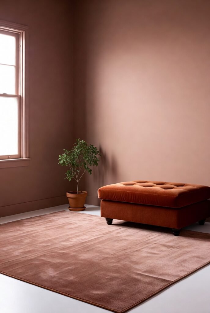
Dusty rose is a sophisticated, muted cousin of pink that brings out the earthy qualities of rust and terracotta. It’s a very trendy combination right now that feels grounded and calming.
I love this for textiles. Layering a dusty rose rug under a rust-colored velvet ottoman creates a texture-rich, monochromatic look that feels incredibly cozy underfoot.
Final Words
Orange doesn’t have to be overwhelming. By pairing it with the right partners—whether it’s a grounding navy, a calming cream, or a playful teal—you can harness its warmth and energy to build a home that truly reflects your personality.
If you’re ready to revamp your home but aren’t sure which palette suits your space best, book a consultation with our design team. We can help you pick the perfect accents to make your home shine.