16 Colors That Go With Mint Green for a Refreshing Home Makeover
I used to think mint green was a tricky color reserved for retro diners or 1950s bathrooms. But once I started experimenting with it in my own design projects, I realized just how versatile this refreshing hue actually is. whether you want a soothing sanctuary or a vibrant creative space, mint green acts as a surprising neutral that bridges the gap between fun and sophisticated.
If you are staring at a mint green wall or furniture piece and feeling stuck, you aren’t alone. Finding the perfect companion color can feel daunting.
In this guide, I will walk you through 16 incredible colors that pair perfectly with mint green, helping you create a space that feels professionally curated and uniquely yours.
1. White

I always start with white because it is the crispest, cleanest partner for mint green. This combination creates an airy, breezy atmosphere that instantly makes a room feel larger and more open.
If you are designing a small bathroom or kitchen, this duo is a lifesaver. I suggest using bright white cabinetry against mint walls to maximize light reflection. It keeps the space feeling fresh and modern without trying too hard.
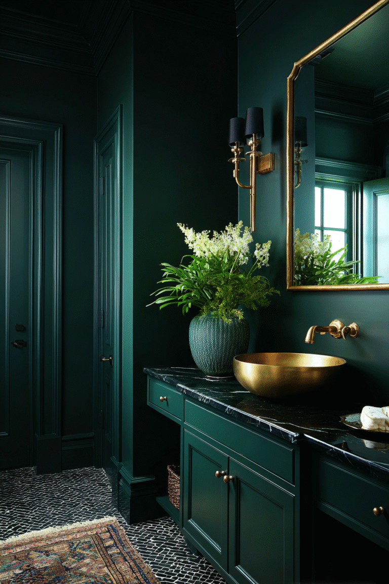
2. Forest Green
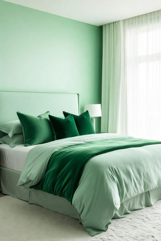
Creating a monochromatic look is one of my favorite design tricks. Pairing mint with a deep forest green adds serious depth and sophistication to a room without feeling chaotic.
The darker green grounds the space, while the mint keeps it from feeling too heavy. Try adding velvet forest green throw pillows to a mint bedding set. It creates a rich, layered look that feels cozy and luxurious.
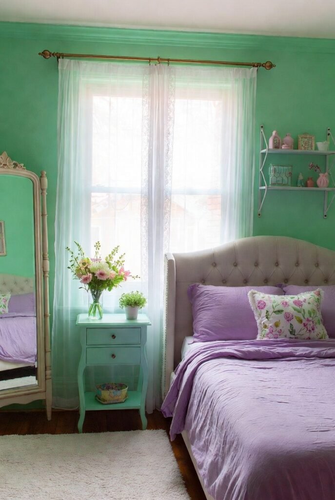
3. Blush Pink
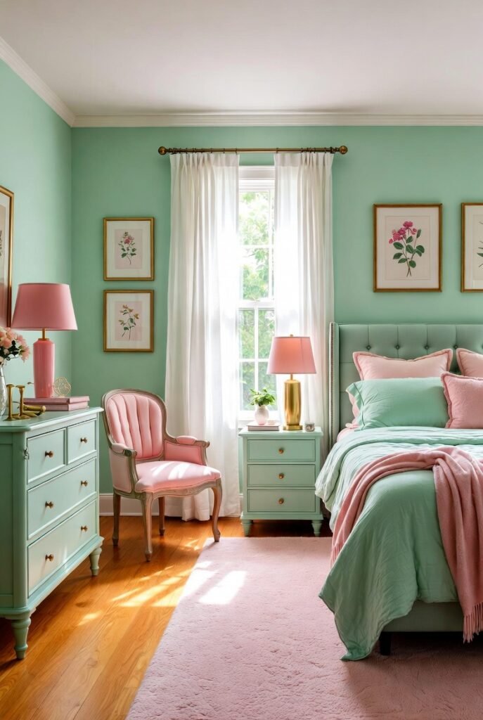
There is a reason you see this pairing all over Pinterest. Mint green and blush pink are a match made in heaven because they sit opposite each other on color wheels, creating a natural harmony.
This combo softens a bedroom beautifully. I love adding blush pink accents, like a rug or lampshade, to a mint-themed room. It evokes a romantic, gentle vibe that feels feminine but grown-up.
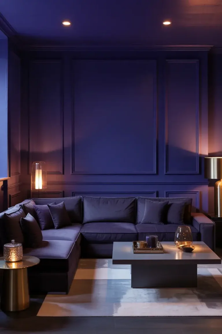
4. Navy Blue

If you want drama without the noise, pair mint with navy blue. The deep, grounding nature of navy balances the light, playful energy of mint green perfectly.
In my experience, this works exceptionally well in living rooms. Picture a navy blue sofa against a soft mint wall. It feels masculine yet inviting, and the contrast makes both colors pop.
5. Gold
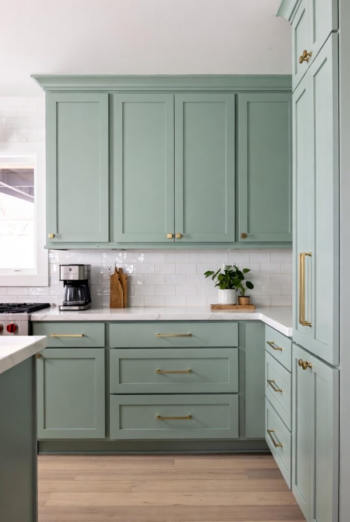
For a touch of glamour, you cannot beat gold. I find that the warm, metallic sheen of gold hardware warms up the cool undertones of mint green instantly.
This is an easy upgrade for kitchens. Swap out your cabinet handles for brushed gold ones to match your mint cabinetry. It creates a timeless, elegant look that feels expensive.
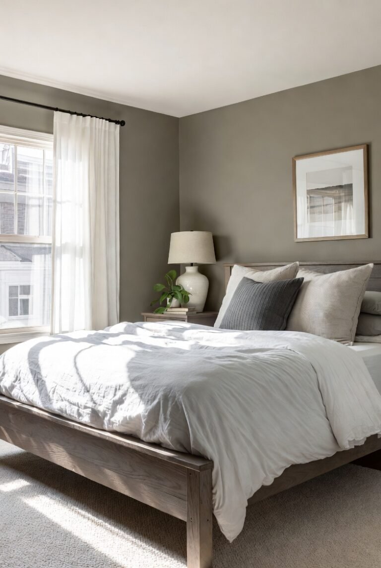
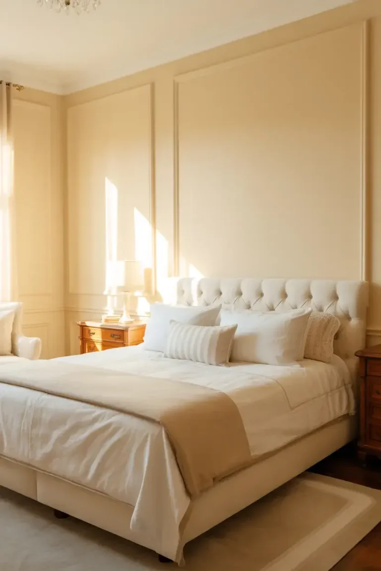
6. Beige
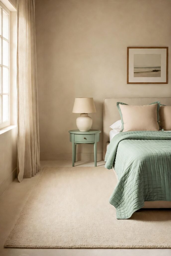
According to color psychology experts, beige helps create a distraction-free environment that promotes sleep. When you pair it with mint, you get a spa-like retreat right in your own home.
I recommend using beige as your base color—think rugs or headboards—and layering mint accents on top. It keeps the room feeling organic and calm, perfect for unwinding after a long day.
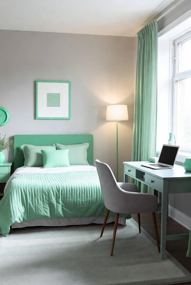
7. Gray

Mint green and gray is a modern classic. The coolness of gray complements mint’s icy undertones, creating a sleek, contemporary aesthetic.
This works best in a home office where you want clarity and focus. I suggest a light gray desk chair or curtains to pair with mint accessories. It feels professional but far from boring.
8. Coral
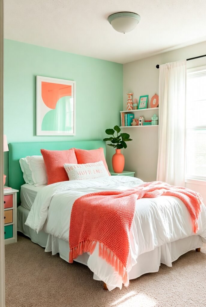
If you are bold and love energy, coral is your answer. This vibrant hue brings out the warmth in mint green and creates a lively, tropical feel.
I use this sparingly as an accent. A coral vase or piece of artwork in a mint room adds a punch of personality. It is energetic and fun, making it great for a creative studio or a playroom.
9. Lavender
For a soft, dreamy look, I adore pairing mint with lavender. These two pastels work together to create a soothing, whimsical environment that feels very youthful.
This is a fantastic palette for a nursery or a guest bedroom. Use lavender linens with mint walls for a space that feels like a breath of fresh spring air.
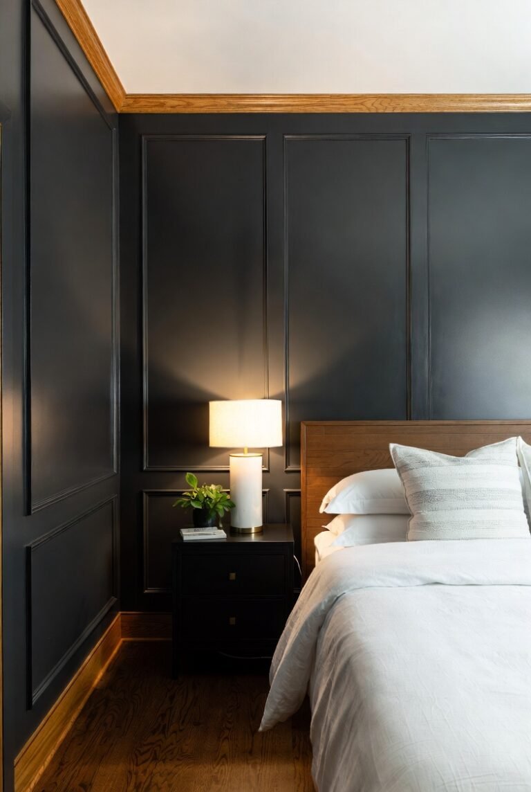
10. Black
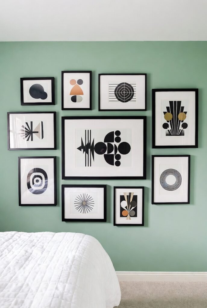
Black provides a sharp, graphic contrast that makes mint green look incredibly chic. It creates a retro, Art Deco vibe that is very trendy right now.
I love using black frames for gallery walls on a mint background. The black anchors the eye, preventing the pastel shade from floating away or looking too sweet.
11. Mustard Yellow
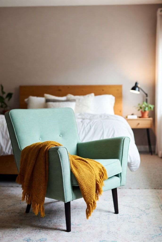
This is for the eclectic souls. Mustard yellow brings a warm, earthy weight that contrasts beautifully with the cool lightness of mint.
I often suggest a mustard throw blanket draped over a mint armchair. It adds a cozy, bohemian flair that makes a living space feel lived-in and curated rather than showroom-stiff.
12. Copper
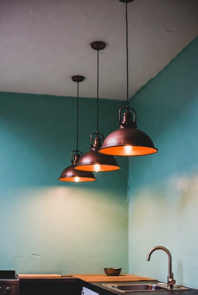
Like gold, copper adds warmth, but with a more industrial, rustic edge. The orange undertones in copper naturally complement the blue-green tints in mint.
Try hanging copper pendant lights in a mint-green kitchen. The reflection of the metal against the soft paint color creates a warm glow that makes the room feel incredibly welcoming.
13. Teak and Natural Wood
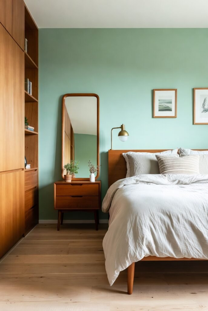
You can never go wrong with natural textures. Pairing mint with warm wood tones like teak creates a Scandinavian or mid-century modern aesthetic that is very popular.
I find that wooden furniture legs or open shelving look stunning against mint walls. The wood adds organic warmth that prevents the green from feeling too cold or clinical.
14. Peach
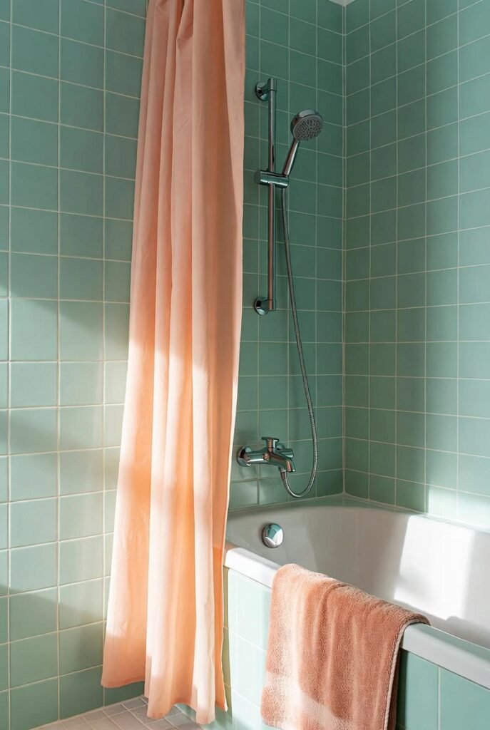
Peach is similar to coral but softer and easier to live with in large doses. It brings out the cheerfulness of mint green without overwhelming the senses.
This duo works wonders in bathrooms. A peach shower curtain or towels can warm up mint tiles, making the space feel flattering and cozy in the morning light.
15. Sky Blue
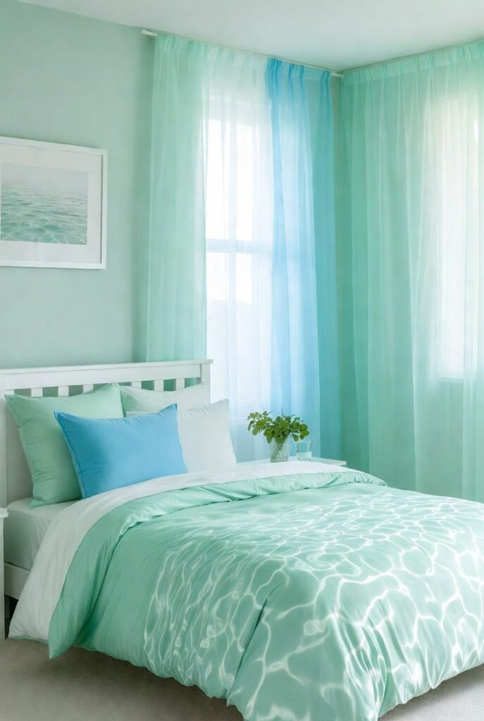
According to the Sleep Foundation, blue bedrooms actually help people get the longest average sleep per night. Pairing sky blue with mint creates an ultimate relaxation zone.
I love blending these two in bedding or curtains. Since they are analogous colors (neighbors on the color wheel), they blend seamlessly to create a serene, water-inspired theme.
16. Red
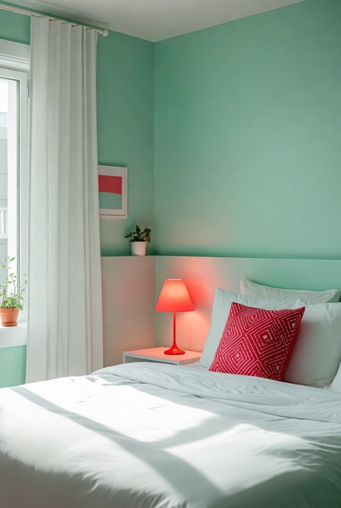
I know this sounds risky, but hear me out. A bright, poppy red can look incredible with mint if you use it as a deliberate accent. It’s high contrast and high energy.
The key is dosage. I use small red accents, like a single lamp or a patterned pillow, in a mint room. It adds a surprising twist that feels modern and brave, not like holiday decor.
Conclusion
Mint green is far more than just a passing trend; it is a versatile tool that can completely change the mood of your home. Whether you choose the calming stability of navy or the vibrant energy of coral, the right pairing can turn a simple room into a design masterpiece.
Ready to give your home the refresh it deserves? Grab a few paint swatches of your favorite combinations from this list and start testing them on your walls today—you might just find your new favorite color palette.