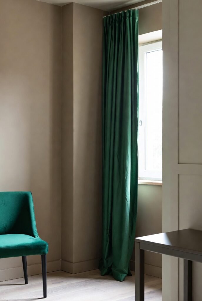
16 colors that go with emerald green
I used to find emerald green intimidating. It is such a rich, bold jewel tone that I worried it would overpower my space or feel too dark. However, once I started experimenting with different color combinations, I realized just how versatile this shade really is. It brings an instant sense of luxury and depth to any room, whether you use it on walls or furniture.
In this guide, I will walk you through the best color pairings to help you style emerald green with confidence. You will discover how this sophisticated hue transforms your home when matched with the right partners.
1. Gold
I find that gold and emerald green is the ultimate power couple in interior design. This combination instantly creates a regal and sophisticated atmosphere. The warm metallic shine of gold cuts through the deep, cool tones of the green, which creates a stunning contrast that catches the eye immediately.
You don’t need to paint walls gold to make this work. I suggest you introduce gold through hardware, such as cabinet handles or light fixtures. Even a simple gold-framed mirror against an emerald wall adds a layer of timeless elegance that feels expensive without costing a fortune.
2. Crisp White
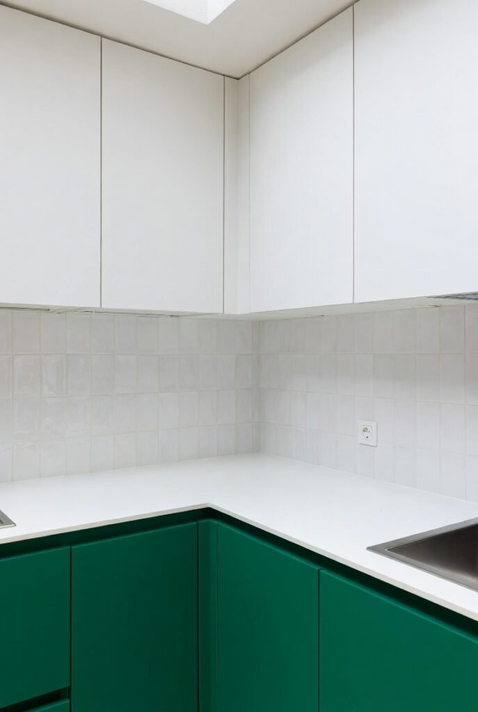
If you want a look that feels fresh and modern, white is your best bet. I love how white acts as a clean backdrop that allows emerald green to take center stage. High-contrast pairings like this often make spaces feel larger and more open, which is perfect for smaller rooms.
Try painting your kitchen cabinets emerald green while keeping the walls and backsplash a crisp white. This prevents the bold green from feeling too heavy. You create a balanced, airy environment where the green feels vibrant rather than overwhelming.
3. Matte Black
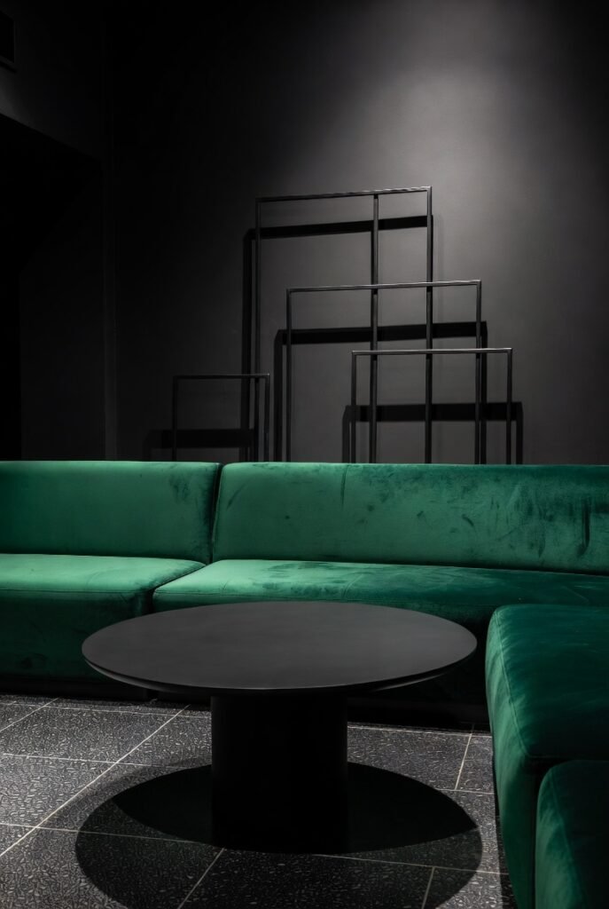
For those who love moody and dramatic interiors, black is the way to go. I often see designers pair black and emerald to achieve a masculine or industrial vibe. The darkness of the black creates a seamless transition into the deep green, which adds incredible depth to the room.
I recommend you start small if you are nervous about dark colors. A black coffee table or black metal picture frames look fantastic against emerald upholstery. This combination works exceptionally well in dining rooms or home offices where you want to foster a sense of focus and seriousness.
4. Blush Pink
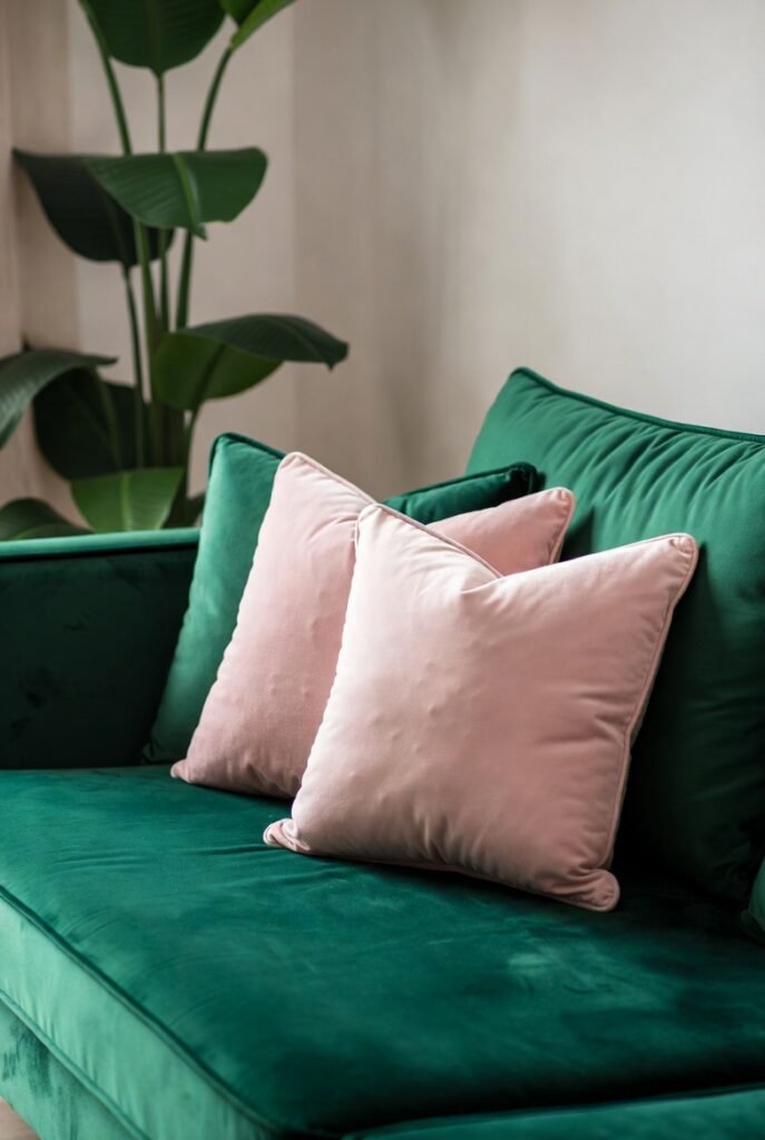
This might surprise you, but pink and green are complementary colors on the color wheel. I find that soft blush pink softens the intensity of emerald green perfectly. It adds a touch of femininity and playfulness to a room that might otherwise feel too serious or traditional.
You can easily incorporate this by tossing a few blush pink pillows onto an emerald velvet sofa. The contrast between the deep jewel tone and the light pastel creates a harmonious balance. It feels trendy yet timeless, and it creates a very welcoming atmosphere for guests.
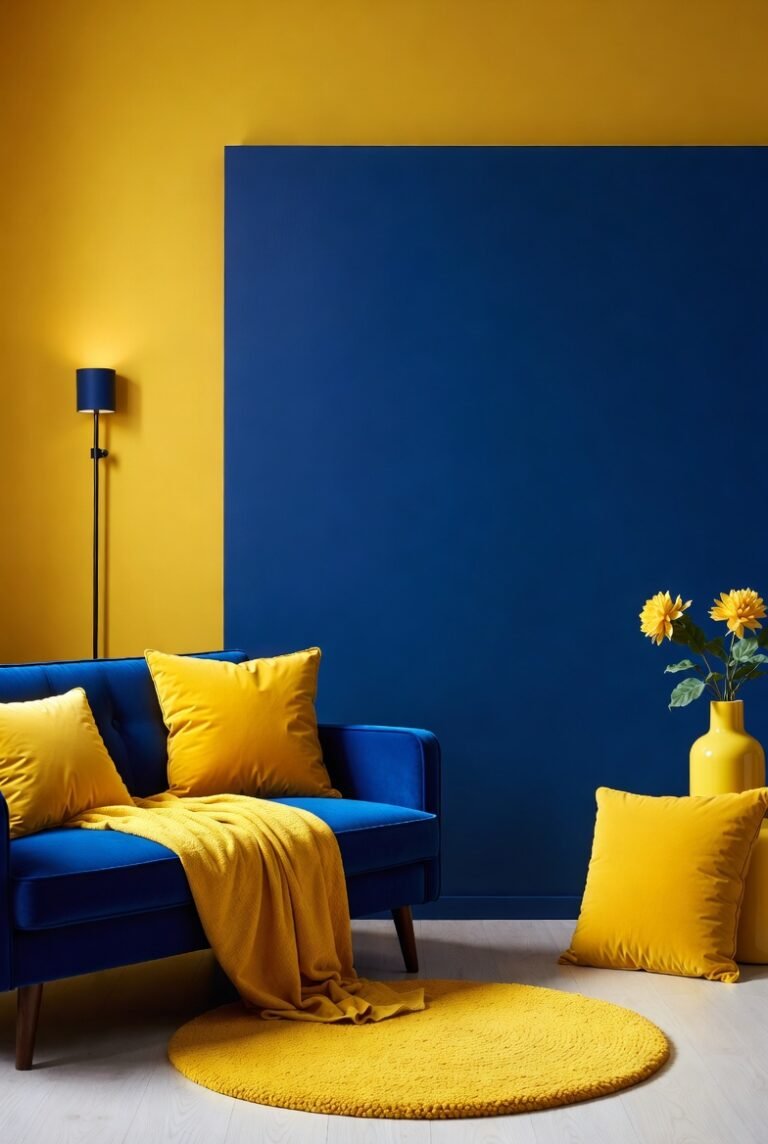
5. Navy Blue
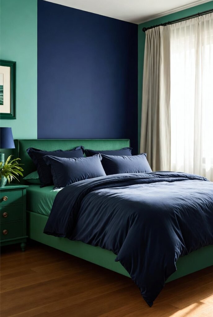
When you place two dark, cool tones together, you get a very sophisticated look. I love pairing navy blue with emerald because they sit near each other on the color spectrum. This “analogous” color scheme feels natural and calming to the human eye, much like looking at a deep ocean or a forest at twilight.
I suggest using this combo in a bedroom to promote relaxation. You could layer navy bedding on an emerald green bed frame. To keep it from feeling too dark, ensure you have plenty of natural light or add a few lighter accents to break up the deep tones.
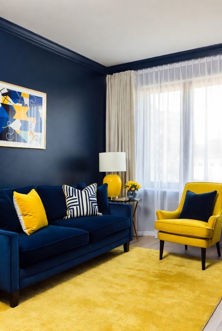
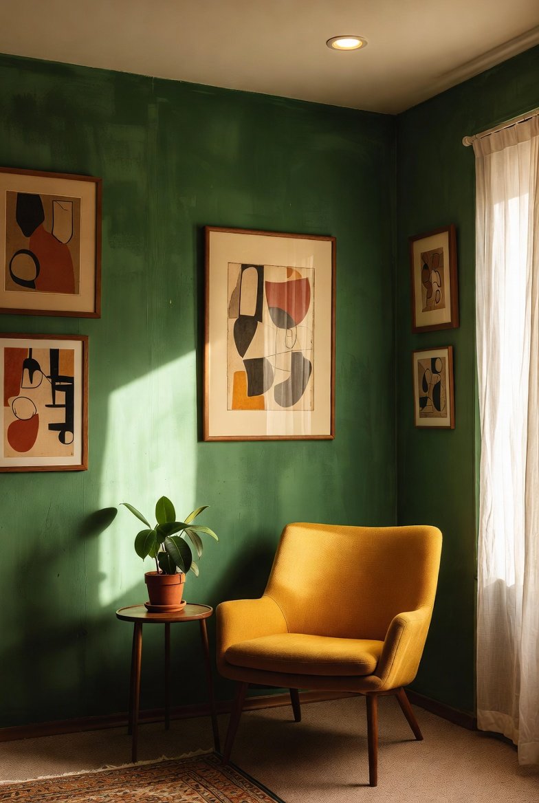
6. Mustard Yellow

If you want to inject energy into a space, mustard yellow is the answer. I find that the earthy warmth of mustard grounds the jewel-toned green. It creates a retro, mid-century modern vibe that is very popular in design trends right now.
Try adding a mustard yellow accent chair to a living room with emerald walls. The pop of yellow brings warmth and prevents the green from feeling too cold. It is a bold choice, but one that pays off by making the room feel curated and artistic.
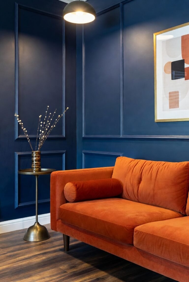
7. Burnt Orange
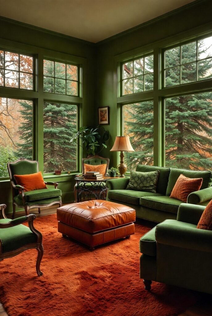
Similar to mustard, burnt orange brings a rustic warmth that pairs beautifully with emerald. I think of this combination as “nature-inspired,” as it reminds me of autumn leaves against evergreen trees. It creates a cozy, inviting environment that makes you want to curl up and relax.
I recommend using a burnt orange rug or leather ottoman in a room with green elements. This works particularly well in living areas where you want to encourage conversation and comfort. The earthy tones ground the space and make the luxury of emerald feel more approachable.
8. Cream or Beige
If bright white feels too stark for you, cream or beige is a fantastic alternative. I prefer these warmer neutrals because they bridge the gap between the cool green and the rest of the room. They provide a soft, calming background that lets the emerald green shine without the harsh contrast of pure white.
You can paint your walls a soft beige and use emerald green for your curtains or upholstery. This creates a sanctuary-like vibe. It is subtle, elegant, and easy to live with, making it a great choice for living rooms or nurseries.
9. Charcoal Grey
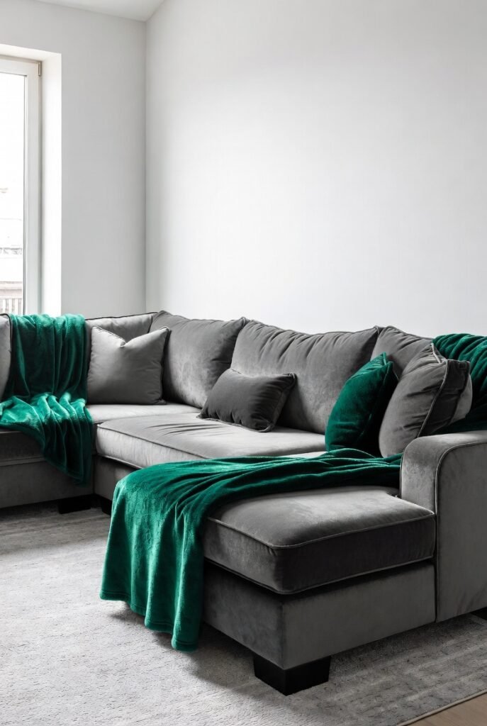
Charcoal grey is a modern neutral that adds sophistication without the severity of black. I find that this color creates a sleek, contemporary look when paired with emerald. The grey acts as a quiet supporter, allowing the green to provide the personality and color pop.
Consider a charcoal grey sectional sofa with emerald green throw blankets. This creates a cozy yet tailored look. It is perfect for modern apartments or homes where you want a clean aesthetic that still feels warm and lived-in.
10. Teal
For a monochromatic look that feels rich and layered, I suggest pairing emerald with teal. Since they both belong to the blue-green family, they flow together seamlessly. This creates a sense of depth and immersion, almost like being underwater or deep in a jungle.
I advise using different textures to make this work. For example, pair a smooth teal vase with a rough emerald wool blanket. The difference in texture helps distinguish the colors so they don’t blend into one big blob, keeping the design interesting.
11. Coral
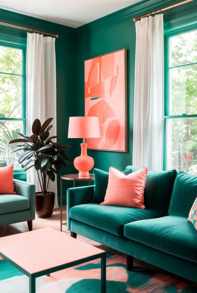
Coral is a vibrant, punchy cousin to pink that adds serious zest to emerald green. I love this combination for summer homes or sunrooms. The brightness of the coral lifts the heaviness of the green, creating a tropical and energetic vibe that feels very happy.
You don’t need much coral to make an impact. A piece of abstract art with coral tones or a coral lamp base is enough. It provides a striking focal point against an emerald backdrop, ensuring the room feels lively and fun.
12. Lavender
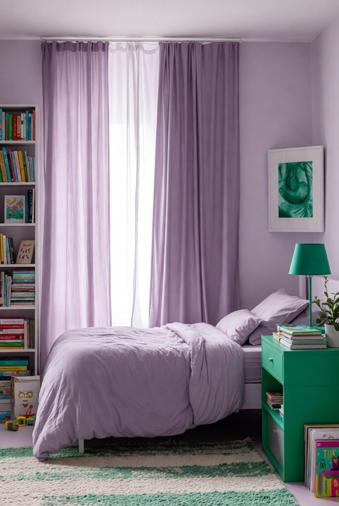
Lavender and emerald create a whimsical, almost magical pairing. I find that the cool undertones of lavender complement the cool nature of emerald, but the lightness of the purple provides necessary contrast. It feels unique and creative, perfect for a space where you want to spark imagination.
Try lavender bedding or curtains in a room with green accents. This is a lovely choice for a creative studio or a child’s bedroom. It feels fresh and unexpected, moving away from standard color pairings into something more personal.
13. Wood Tones
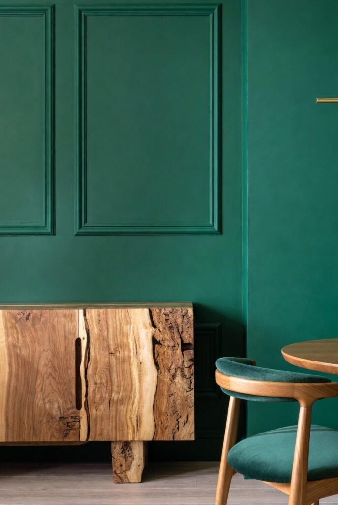
While not a paint color, natural wood tones are essential to mention. I believe that emerald green looks best when paired with medium to dark wood, like walnut or oak. This connects the color back to its roots in nature, creating an “organic modern” style that is very soothing.
I suggest choosing furniture with exposed wood legs or frames if you have green upholstery. Alternatively, placing a wooden sideboard against an emerald wall highlights the grain of the wood. It brings texture and warmth that paint simply cannot achieve on its own.
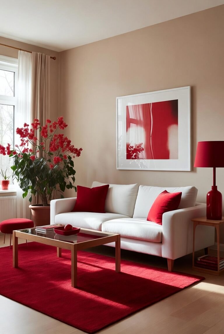
14. Deep Red
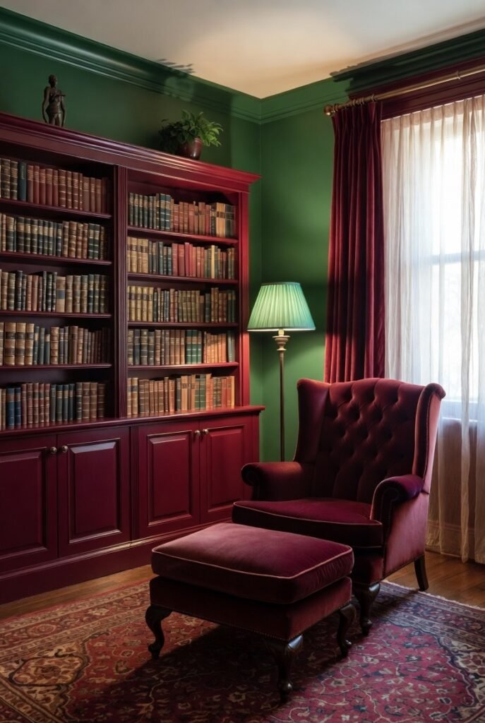
Red and green are opposites on the color wheel, which means they offer high contrast. I know people worry this looks like Christmas, but if you choose a deep, rich red like burgundy or maroon, it looks incredibly traditional and academic. It creates a “library” feel that is very cozy.
I recommend using this in a vintage rug that incorporates both deep reds and greens. This anchors the room and gives it a sense of history. Keep the other elements in the room neutral to stop the red and green from competing for attention.
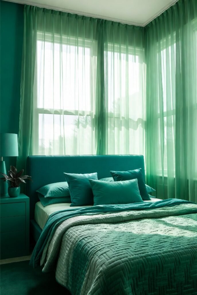
15. Mint Green
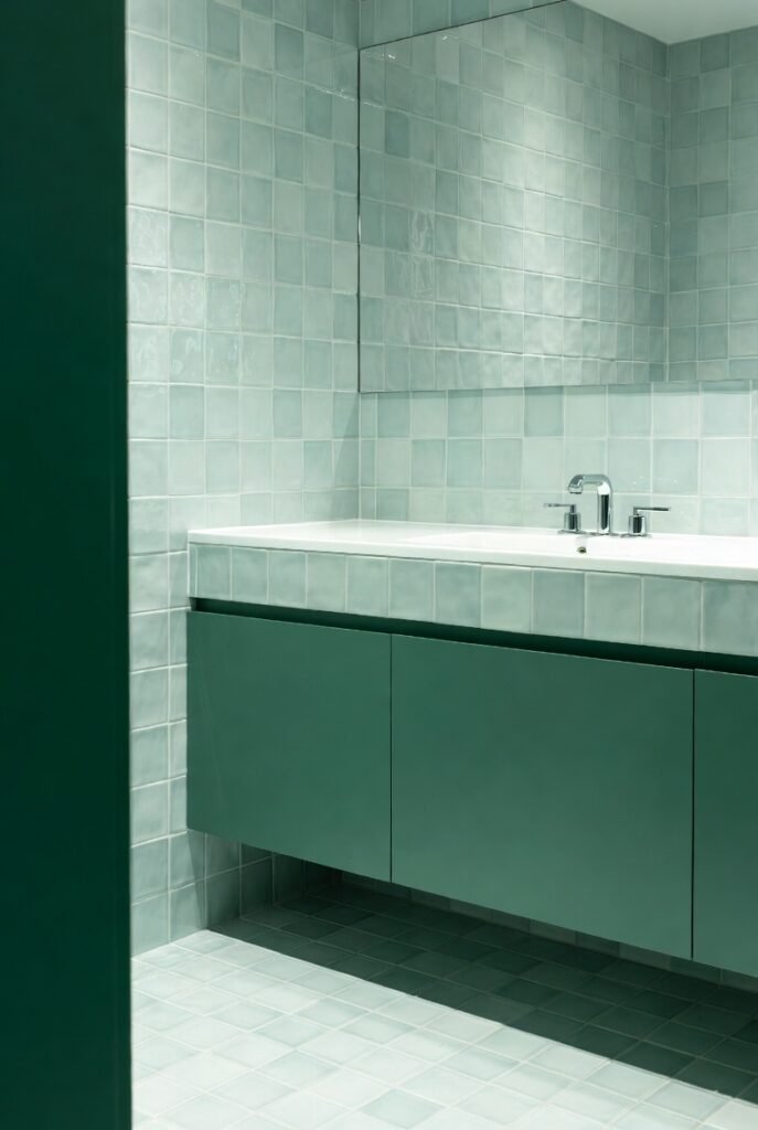
Layering different shades of green is a trend I absolutely love. Mint green is much lighter and airier than emerald. When I use them together, the mint acts as a highlight, while the emerald acts as a shadow. This makes the room feel three-dimensional and lush.
You could use mint green tiles in a bathroom with an emerald vanity. The lighter color keeps the small space from feeling claustrophobic, while the dark vanity anchors the design. It feels cohesive because the tones share the same DNA.
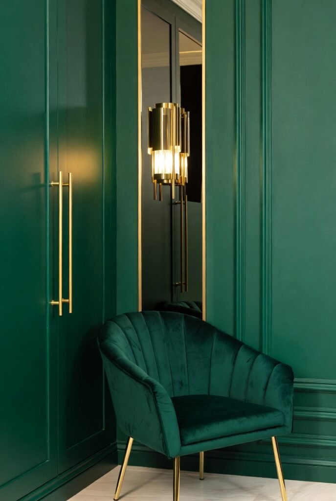
16. Silver
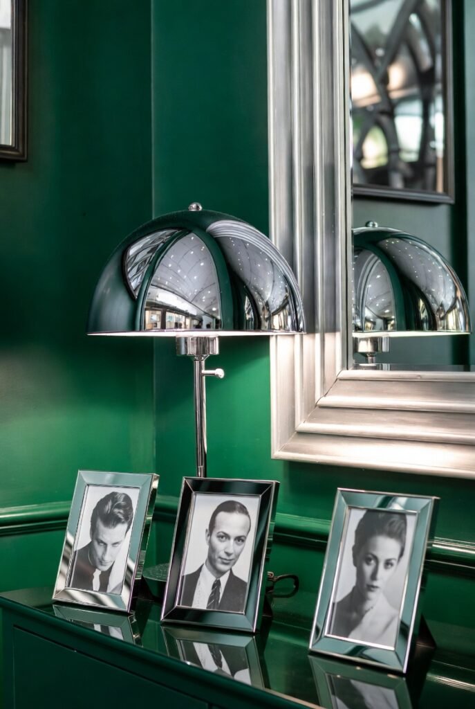
While gold adds warmth, silver adds a cool, futuristic sleekness to emerald green. I find that silver works best in modern or Art Deco-inspired spaces. It reflects light, which helps brighten up the darker green tones and adds a bit of sparkle to the room.
Try using chrome lamps, silver photo frames, or a mirror with a silver edge. These metallic accents cut through the visual weight of the green. It creates a sharp, clean look that feels very polished and high-end.
Conclusion
Emerald green is clearly one of the most versatile colors you can choose for your home. Whether you want the high drama of black and gold or the soft comfort of beige and wood, there is a combination here for you. Don’t be afraid to grab a few paint swatches and see what speaks to you.
If you are still unsure which palette suits your home best, let us help you create your dream space.