15 Ceiling Paint Colors That Will Instantly Make Your Room Look Bigger
Do you ever feel like the walls are closing in on you? I know the feeling of standing in a small room and wishing I could magically push the ceiling up a few feet. While we can’t actually change the structure of our homes without a major renovation, I have found that paint is the next best thing.
Choosing the right ceiling color changes how light moves through your space, creating an optical illusion of height and openness.
In this list, I will guide you through 15 specific paint colors and styles that trick the eye and maximize your square footage.
1. Pure Bright White
I always start with the classic option because it works. A pure, bright white is the standard for ceilings because it reflects the maximum amount of light. In the paint world, we measure this using Light Reflectance Value (LRV), which runs on a scale from 0 to 100.
A bright white typically hits an LRV of 90 or higher, meaning it bounces nearly all the light back into the room. This blurs the boundaries between the walls and ceiling, making the ceiling feel distant and the room feel instantly taller.
2. Cool Off-White
If a stark white feels too clinical for your taste, I suggest trying a cool off-white. These shades have a tiny hint of blue or gray undertone that creates a crisp, clean look without the harshness of a pure white.
Cool colors naturally recede visually, meaning our eyes perceive them as being further away than they truly are. By painting the ceiling a cool off-white, I essentially force the ceiling to “step back,” which opens up the vertical space in the room.
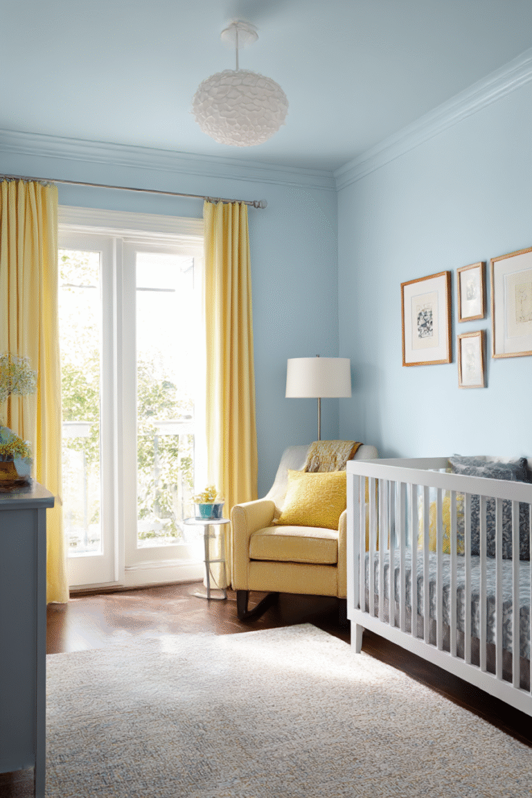
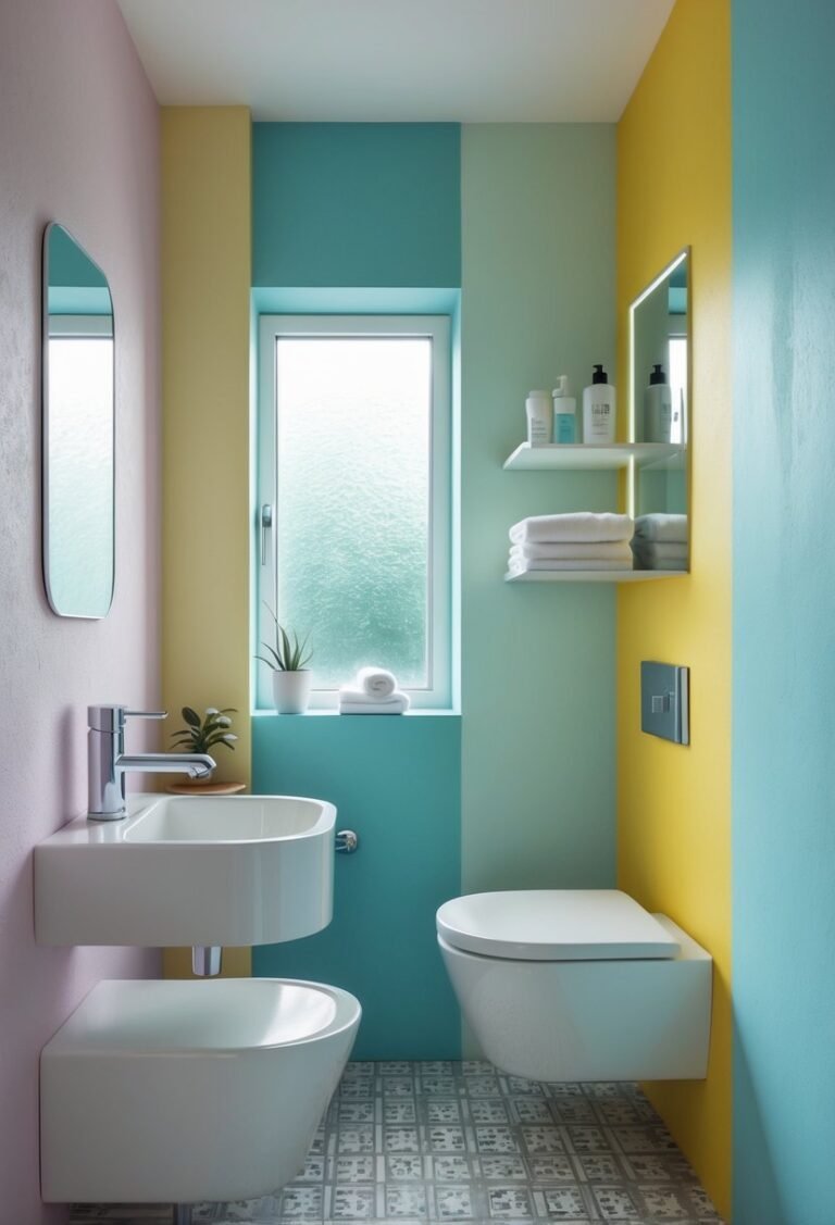
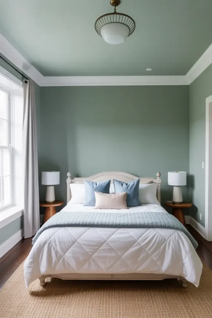
3. Pale Sky Blue
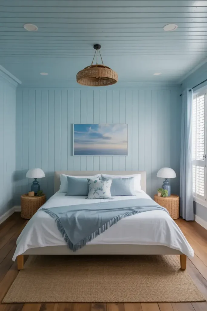
I love bringing nature indoors to expand a room. A pale sky blue mimics the feeling of the open sky above us, which subconsciously tricks our brains into sensing limitless space.
This color works exceptionally well in bedrooms or bathrooms where you want a serene atmosphere. I recommend choosing a shade with an LRV of around 77, as experts suggest this level of lightness maintains an airy feel while adding a touch of personality.
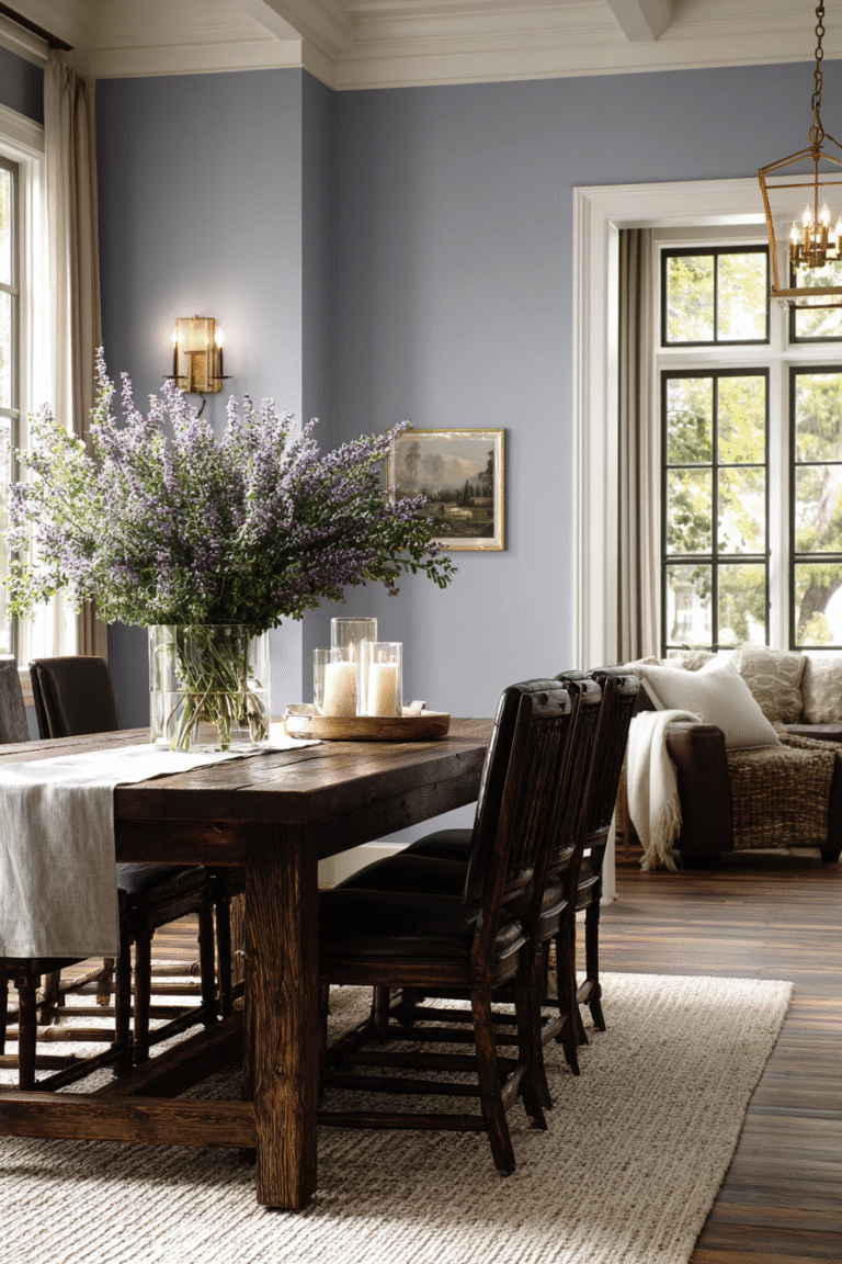
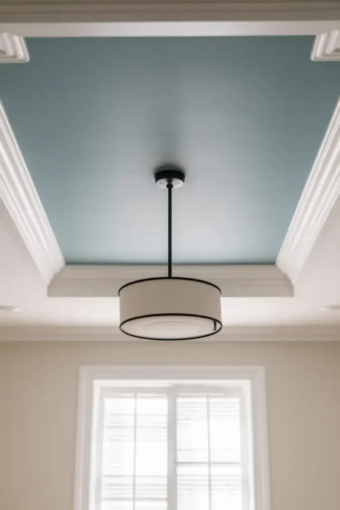
4. Light Blue-Gray
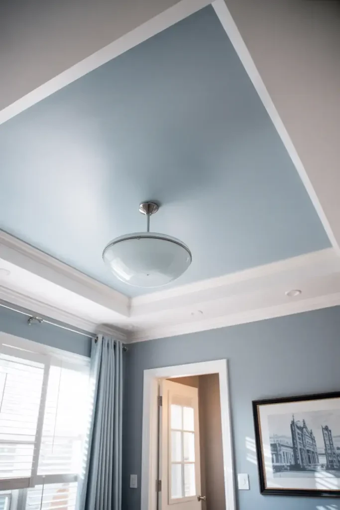
For a more sophisticated take on the sky concept, I often turn to light blue-gray. This color offers the receding benefits of blue but adds a modern, neutral gray tone that pairs beautifully with most wall colors.
The gray undertone grounds the space while the blue keeps it feeling expansive. I find this color particularly effective in living rooms where you want to create an illusion of height without committing to a vibrant pigment.
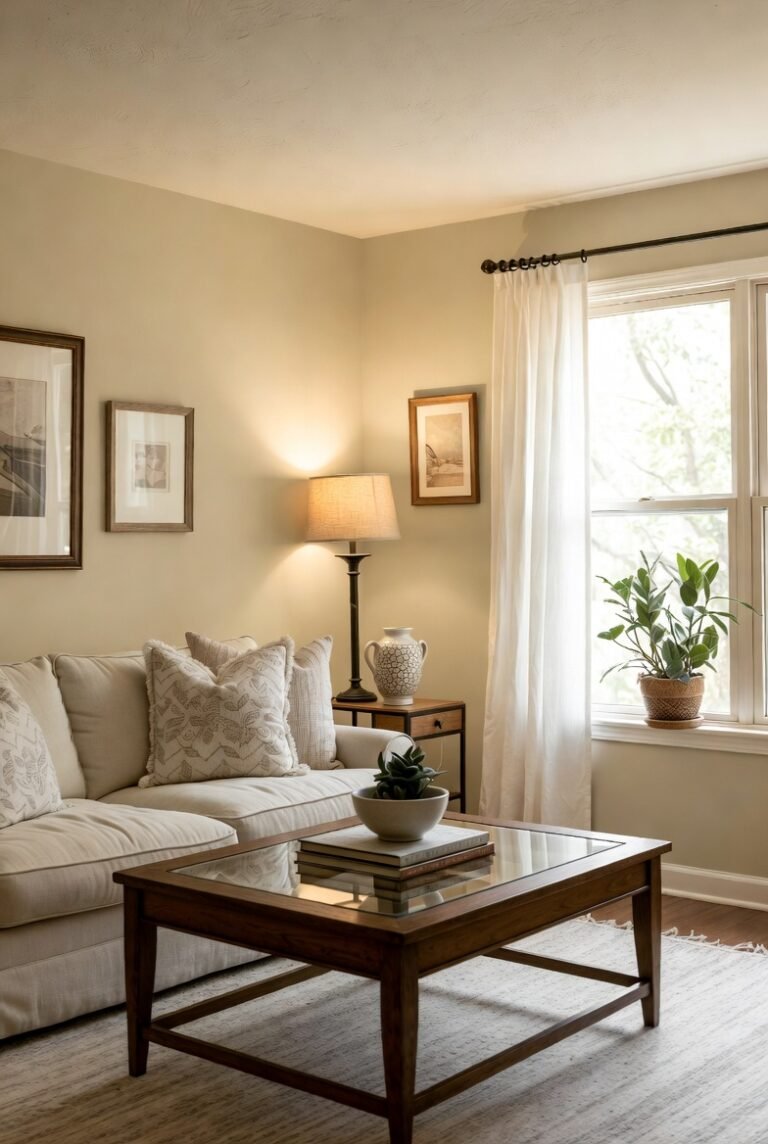
5. Creamy Ivory
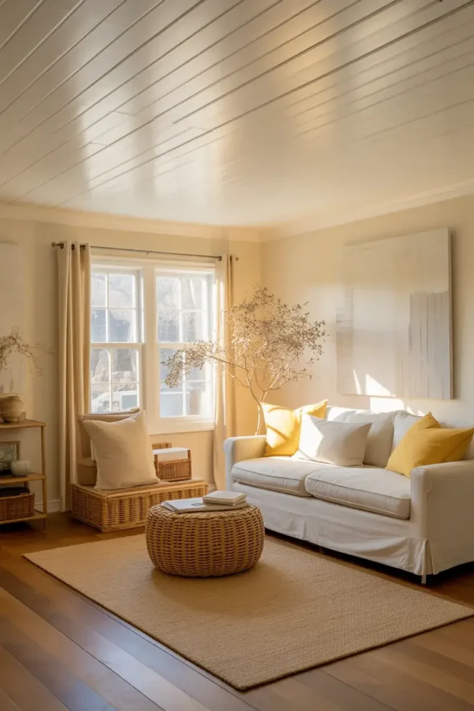
If your home features warm wood floors or earthy decor, a stark white ceiling might clash. In these cases, I opt for a creamy ivory. This color maintains a high LRV, usually in the 80s, so it still reflects plenty of light.
However, the slight yellow or beige undertone softens the edges of the room. It creates a cozy, glowing effect that makes the space feel larger in a welcoming way, rather than a cold or sterile one.
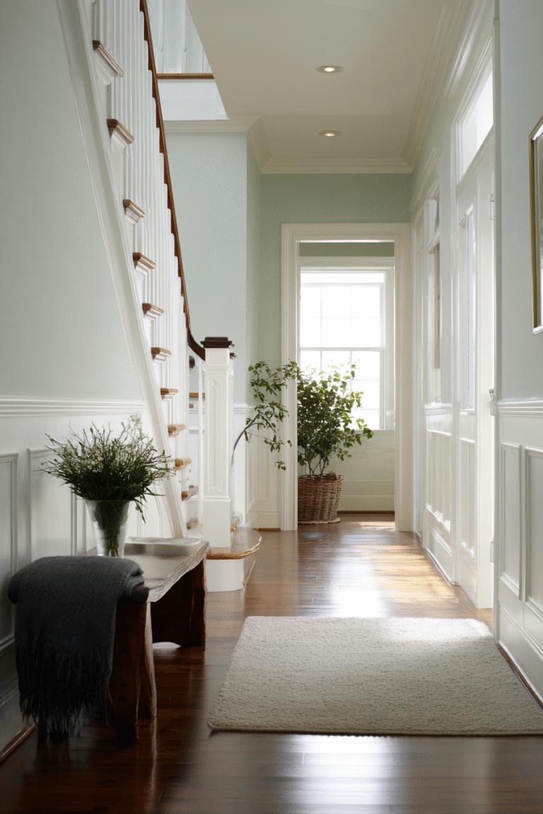
6. Soft Mist Green
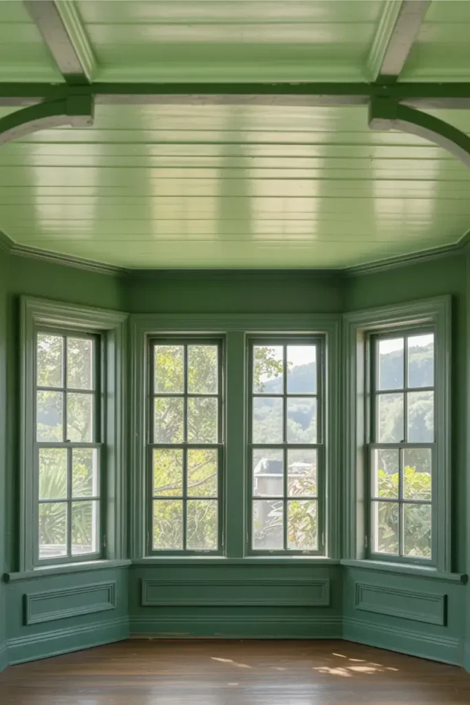
I find that green creates a seamless connection to the outdoors, similar to blue. A soft mist green on the ceiling acts like a canopy of leaves or a distant hill, pushing the visual boundary upwards.
This is a great choice for rooms with windows facing a garden. By matching the ceiling tone to the greenery outside, I extend the line of sight through the window, making the interior feel like a continuation of the outdoors.
7. Barely-There Lavender
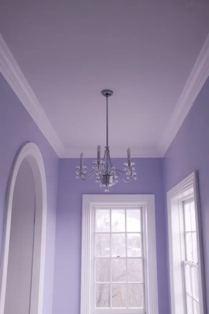
For a unique twist that adds depth, I recommend a barely-there lavender. Like blue, purple is a cool color on the spectrum, so it naturally recedes away from the viewer.
A very pale lavender reads almost like a cool gray but with added dimension. It adds a layer of depth that a flat white lacks, making the ceiling feel like a deep, distant surface rather than a solid lid on the room.
8. Icy Mint
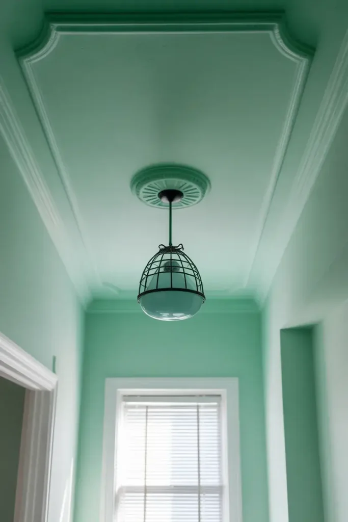
I use icy mint when I want to inject energy into a small, dark space. This color combines the receding nature of cool blue with the brightness of green. It reflects light dynamically, especially if you have decent natural light sources.
Just ensure the mint is very pale; if the color is too saturated, it will feel heavy and lower the ceiling. I aim for a shade that looks white in the can but reveals its minty tint once it dries on the surface.
9. Light Greige
Greige—a blend of gray and beige—is the ultimate neutral. I find that a light greige ceiling works wonders when you have white walls. It offers a subtle contrast that highlights architectural details like crown molding.
While it seems counterintuitive to go darker than white, a pale greige with an LRV around 70 still reflects substantial light. It adds sophistication and depth, making the room feel designed and spacious rather than just small and plain.
10. Blush-Tinted White
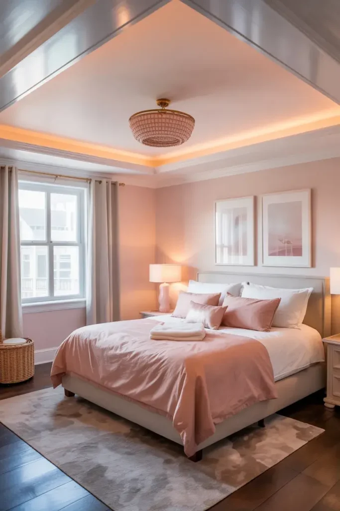
I consider blush-tinted white a secret weapon for small, dimly lit rooms. This color has a warm pink undertone that mimics the glow of sunrise. It doesn’t just reflect light; it warms it up.
This warmth bounces around the room, eliminating dark, shadowy corners that often make a space feel cramped. It creates a soft, expansive glow that flatters both the room’s dimensions and the people inside it.
11. Whisper Violet
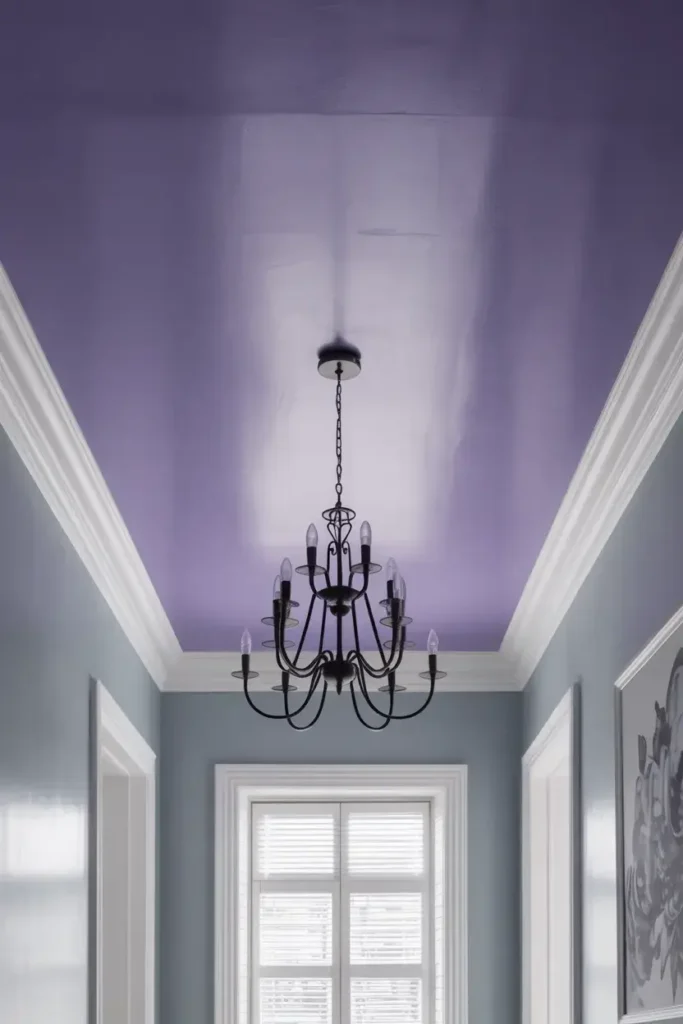
Similar to lavender but leaning more towards the blue side, whisper violet is an elegant choice for expanding a room. I find it adds a regal touch to dining rooms or entryways without overwhelming the senses.
The coolness of the violet pushes the ceiling upward visually. It pairs exceptionally well with cool gray walls, creating a harmonious, monochromatic look that stretches the walls vertically.
12. Silver Gray
I love using silver gray to add a modern, sleek touch to a small room. A pale silver reflects light in a slightly different way than white, adding a shimmering quality that diffuses brightness into corners.
If you choose a silver with a satin finish, you amplify this effect. The slight sheen reflects even more light than a flat finish, though I caution that it will show surface imperfections more clearly.
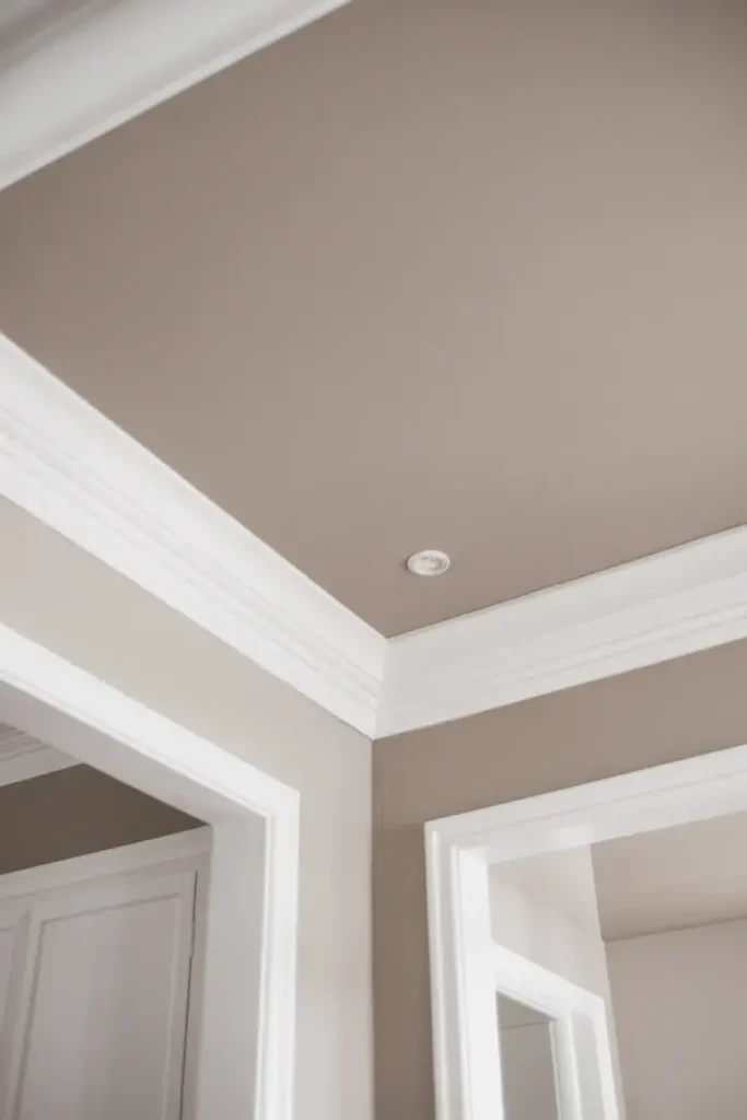
13. Light Taupe
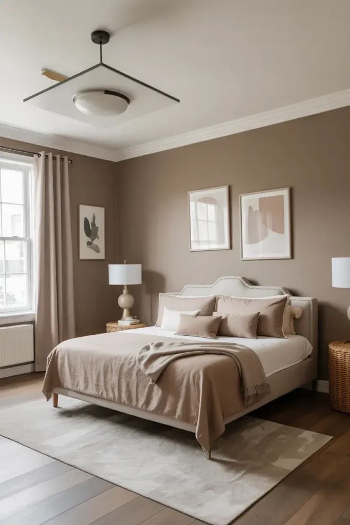
Light taupe is my go-to for making a room feel grounded yet spacious. It works best in monochromatic schemes where the walls are a slightly darker shade of taupe.
By keeping the color family consistent, I remove visual breaks that stop the eye. Your gaze travels smoothly from the floor up the walls and across the ceiling, creating a seamless envelope that feels much larger than it is.
14. 50% Strength Wall Color
One of my favorite professional tricks is to take the wall color and ask the paint store to mix it at 50% strength. This creates a lighter version of your wall color for the ceiling.
This technique guarantees that your undertones match perfectly. It also raises the LRV of the paint by roughly 6 to 8 points, ensuring the ceiling reflects more light than the walls while maintaining a cohesive, expansive flow.
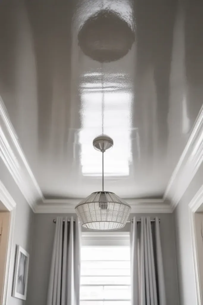
15. High-Gloss White
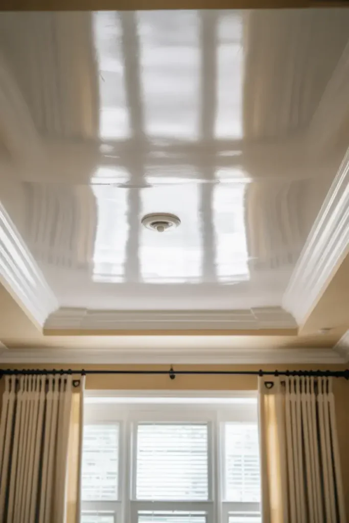
While technically a finish rather than a hue, I treat high-gloss white as a distinct color choice because of its powerful effect. A high-gloss finish acts almost like a mirror on your ceiling.
It reflects the room below and the light from windows, doubling the visual depth of the space. I only recommend this if your ceiling is perfectly smooth, as the gloss will highlight every bump, but the space-enhancing payoff is incredible.
Bottom Lines
A small room doesn’t have to feel limiting. By understanding how light and color interact, I can trick the eye into seeing more space than physically exists. Whether you choose a receding cool blue or a light-reflecting high-gloss white, the right ceiling paint is the key to unlocking your home’s potential.
If you are ready to make your rooms feel airy and expansive, grab a few samples of these high-LRV colors and test them out in your unique lighting conditions.