16 Best Paint Colors to Warm Up Your North Facing Room
If you’ve ever painted a north-facing room a “neutral gray” only to watch it turn into a chilly, lilac-tinted disaster, you aren’t alone. North-facing rooms are notoriously tricky. They receive the least amount of direct sunlight, and the light they do get is often cool, gray, and blue-cast. This lighting can quickly wash out colors or make them feel sterile.
But don’t worry—I’ve done the research to help you navigate this. The secret lies in choosing paint colors with warm undertones (think yellow, red, or orange) and the right Light Reflectance Value (LRV).
By picking shades that counteract the cool northern light, you can transform a dim space into a cozy sanctuary. Here are 16 of the best paint colors to bring warmth and life to your north-facing room.
1. Benjamin Moore Swiss Coffee (OC-45)
If you are looking for a reliable off-white that isn’t too yellow, Swiss Coffee is a fantastic choice. It is a warm, creamy white that softens the harshness of northern light without looking buttery.
With an LRV of around 84, it reflects plenty of light, helping to brighten up dimmer spaces. It works beautifully on trim or walls, providing a sophisticated backdrop that feels inviting rather than stark.
2. Sherwin-Williams Antique White (SW 6119)
For a room that feels perpetually cold, Antique White acts like a warm hug. It has a rich, yellow-beige undertone that significantly warms up the cool, blue-gray light typical of northern exposure.
This color is deeper than a standard white, meaning it won’t wash out in low light. It creates a cozy, traditional atmosphere that pairs well with warm wood tones and textured fabrics.
3. Benjamin Moore Gray Owl (OC-52)
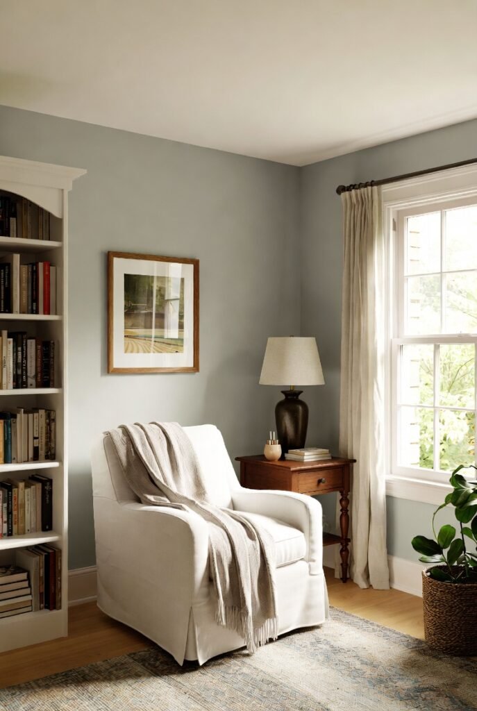
You might think gray is off-limits for north-facing rooms, but Gray Owl is the exception. It is a light gray with a subtle warm undertone that prevents it from turning icy blue in cool light.
It’s a versatile color that bridges the gap between modern and cozy. Just be sure to test it first; in very dark corners, it can lean slightly green, but generally, it remains a clean, usable neutral.
4. Sherwin-Williams Accessible Beige (SW 7036)
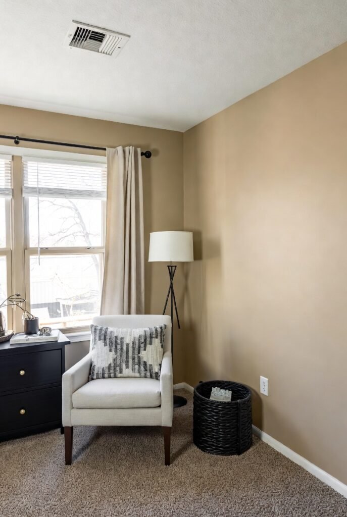
Accessible Beige is a favorite for a reason. It is a greige (gray-beige) that leans heavily into its beige side, making it perfect for counteracting cool light.
Unlike cooler grays that can look flat in north-facing rooms, this shade maintains its warmth. It serves as an excellent neutral backdrop that allows other colorful accents in your room to pop.
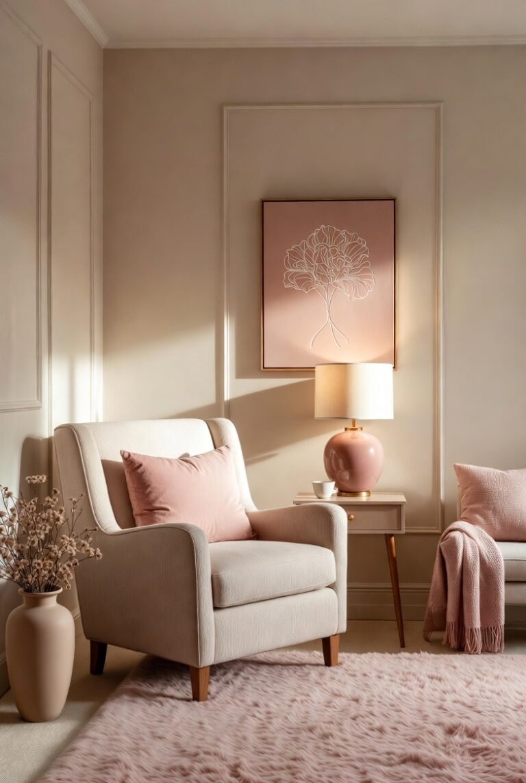
5. Benjamin Moore Cotton Balls (OC-122)
When you need a white that feels fresh but not sterile, Cotton Balls is a top contender. It has a slight yellow undertone that gives it a “glow” rather than a glare.
This is particularly helpful in north-facing rooms where pure white can look gray and shadowy. It keeps the space feeling airy and bright, especially when used on both walls and ceilings.
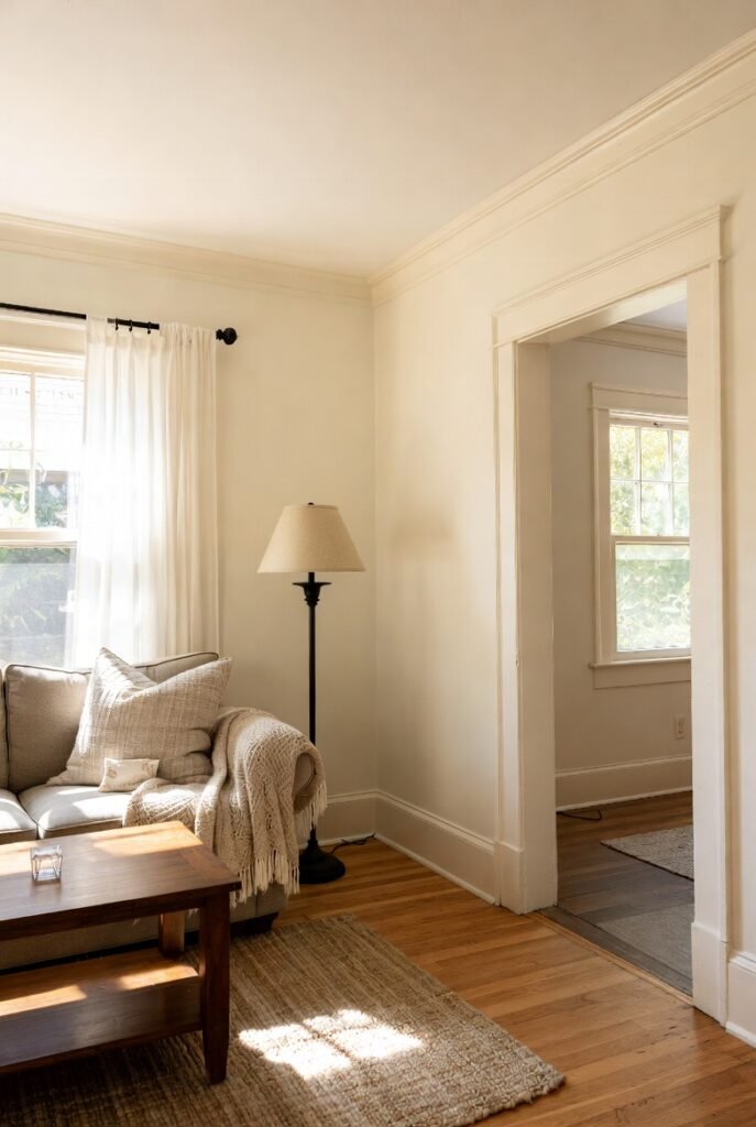
6. Sherwin-Williams Greek Villa (SW 7551)
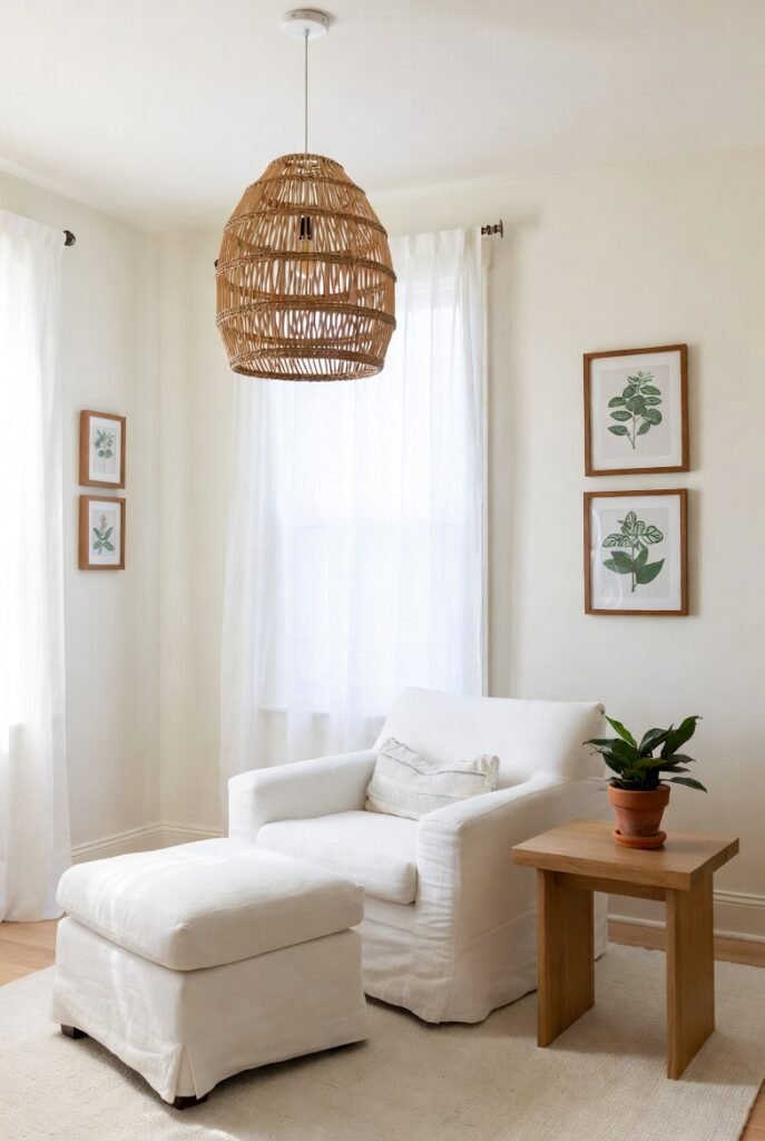
Greek Villa is a soft, warm white that avoids the starkness of cooler whites. It has a gentle yellowish undertone that helps balance out the blue cast of northern light.
It’s an excellent choice if you want a minimalist look that still feels homey. It pairs wonderfully with natural materials like rattan, linen, and light oaks.
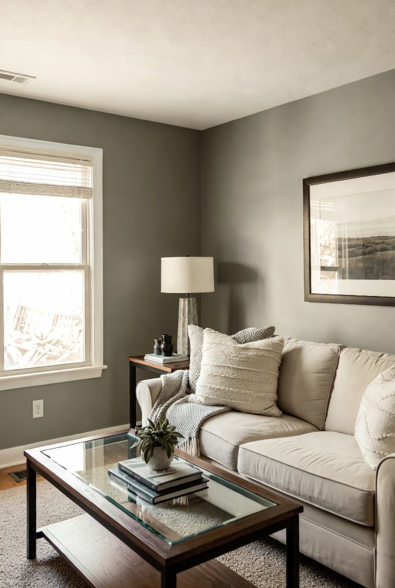
7. Benjamin Moore Revere Pewter (HC-172)

Often called the perfect “greige,” Revere Pewter is a warm gray that works surprisingly well in difficult lighting. Its earthy, warm undertones ground the space and prevent it from feeling chilly.
In a north-facing room, it tends to look more like a light, warm stone color. It provides enough depth to hold its own against the gray light without making the room feel cave-like.
8. Sherwin-Williams Repose Gray (SW 7015)
While Repose Gray is technically a cool gray, it has a unique purple/brown undertone that can read surprisingly warm in certain lights. It is a bit riskier than a beige, but worth sampling.
In north-facing light, it often appears as a true, soft gray rather than a blue-gray. It’s a great option if you want a modern aesthetic that doesn’t feel clinical.
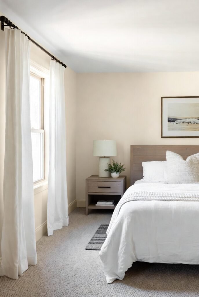
9. Benjamin Moore Muslin (OC-12)
Muslin is a classic, warm neutral that sits somewhere between beige and tan. It is perfect for north-facing rooms because it brings a definite sense of warmth that lighter off-whites might miss.
It has an easygoing, organic feel that works well in living rooms and bedrooms. The color is saturated enough to withstand the washing-out effect of low light.
10. Sherwin-Williams Drift of Mist (SW 9166)
If you prefer a lighter, airier gray, Drift of Mist is a strong option. It has an LRV of 69, which is high enough to bounce light around a darker room.
It has soft, warm undertones that keep it from looking dreary. It’s a subtle color that provides a calm, serene background for a home office or nursery.
11. Benjamin Moore Woodlawn Blue (HC-147)
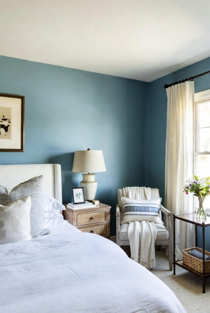
Who says you can’t do blue in a north-facing room? The trick is choosing a blue with a healthy dose of green in it, like Woodlawn Blue.
The green undertone adds warmth, preventing the blue from looking frosty. It creates a tranquil, spa-like vibe that feels intentional and cozy rather than cold and dark.
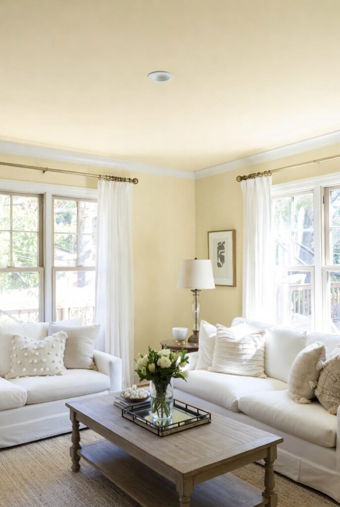
12. Sherwin-Williams Rivers Edge (SW 7517)
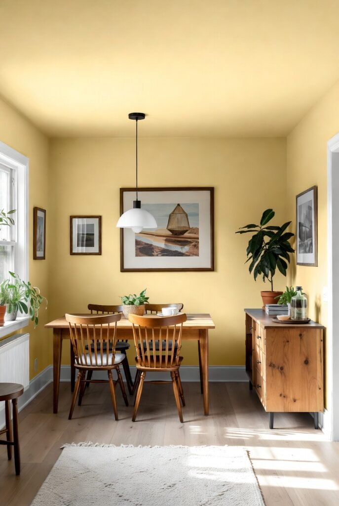
Rivers Edge is a pale, warm yellow-tan that excels in low-light environments. It essentially mimics the sunlight that your room is missing.
This color adds an instant cheeriness to a space. It works particularly well in kitchens or breakfast nooks where you want to create an energetic, welcoming vibe despite the lack of direct sun.
13. Benjamin Moore Edgecomb Gray (HC-173)
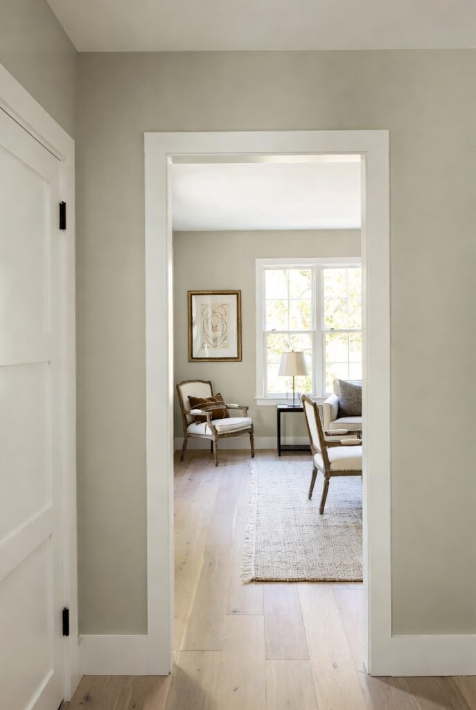
Edgecomb Gray is a light, airy beige that sits on the fence between gray and cream. It is adaptable and soft, making it a safe bet for many north-facing spaces.
It warms up the room without demanding attention. It’s a sophisticated choice for hallways or open-concept living areas that don’t get much natural warmth.
14. Sherwin-Williams Iron Ore (SW 7069)
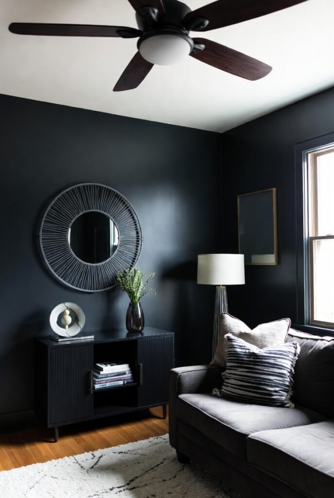
Sometimes, the best strategy is to embrace the dark. Iron Ore is a rich, dark charcoal that can make a north-facing room feel cozy, moody, and dramatic.
Since northern light is already low, fighting it with white doesn’t always work. A dark color like this wraps the room in warmth, making it perfect for a media room or a cozy den.
15. Benjamin Moore Pale Oak (OC-20)
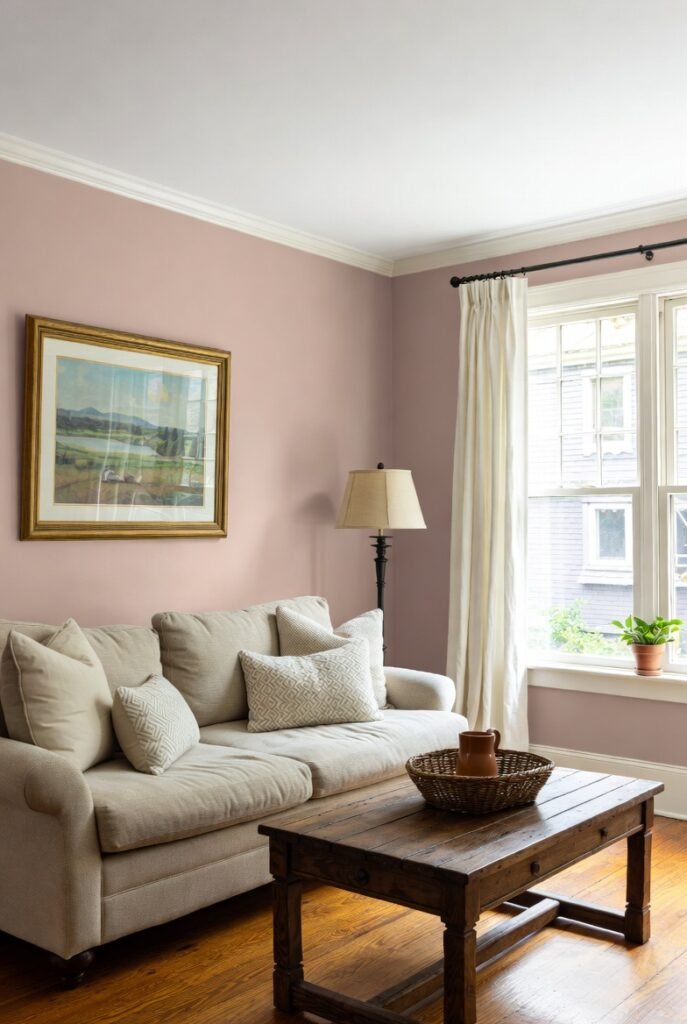
Pale Oak is a light, warm greige that leans slightly into pink/purple undertones. While that sounds odd, it actually helps neutralize the green/gray cast of northern light.
It reflects a good amount of light while adding a layer of softness to the walls. It is elegant and timeless, working well with both modern and traditional decor.
16. Sherwin-Williams Rainwashed (SW 6211)
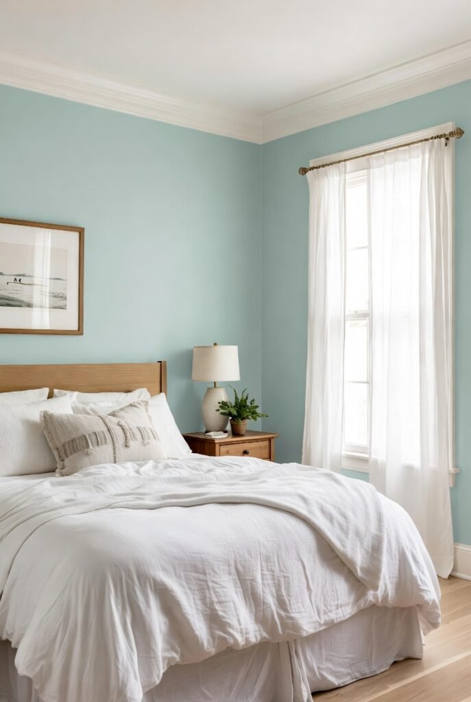
Rainwashed is a soft, blue-green that feels natural and airy. Like Woodlawn Blue, the green component helps keep the color from feeling too icy.
It’s a soothing choice for a bedroom or bathroom. It brings a touch of nature indoors, helping a north-facing room feel fresh and peaceful rather than gloomy.
Conclusion
Choosing the right paint color for a north-facing room is all about understanding the light. By leaning into warmer undertones and checking the LRV, you can correct the cool, gray cast that plagues these spaces.
Remember, paint looks different in every home. Always test your choices with large samples (at least 12 inches square) and observe them in the morning, afternoon, and evening before you commit. A little testing now will save you from a “chilly” surprise later.