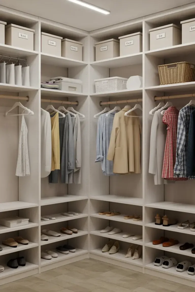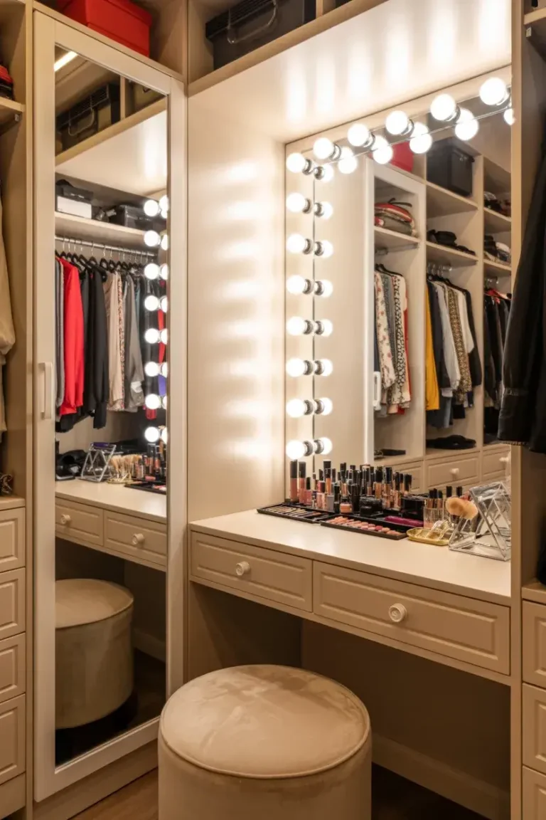
17 Best Paint Colors for Inside of Closet
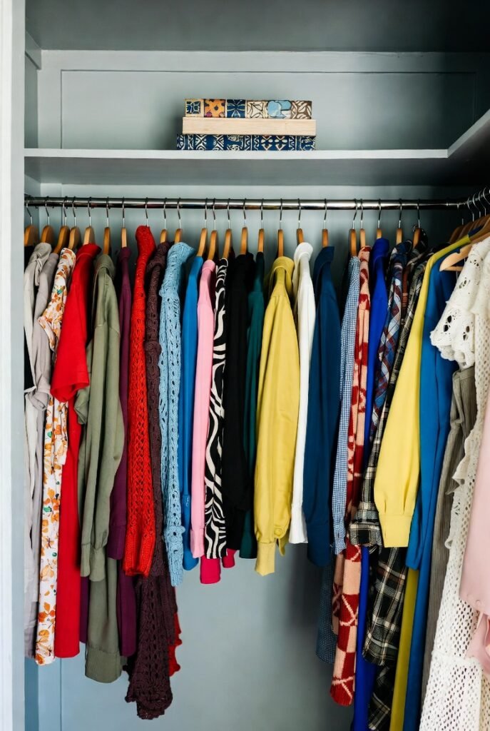
I often find that closets are the most neglected spaces in our homes. We obsess over living room walls and kitchen cabinets, but the inside of a closet usually gets stuck with whatever leftover white paint we had on hand five years ago.
But here is the thing: painting your closet the right color can completely change how you start your day. A bright, reflective color helps you see your clothes better, while a moody shade can make your wardrobe feel like a high-end boutique.
Today, I am sharing the 17 best paint colors to transform your closet into a space you actually enjoy using.
1. Crisp Bright White
If you have a small closet with poor lighting, you simply cannot go wrong with a pure, crisp white. It acts like a reflector, bouncing whatever little light you have around the space to eliminate shadows.
Experts measure this reflectivity using something called Light Reflectance Value (LRV). A bright white typically has an LRV near 85, meaning it reflects about 85% of the light that hits it. This is the ultimate choice for visibility.
2. Warm Off-White
Sometimes, a stark white can feel a bit too clinical or harsh, especially under cool LED lighting. I love using a warm off-white because it offers that same brightening effect but feels much cozier.
It creates a soft backdrop that lets your clothes take center stage without blinding you first thing in the morning.
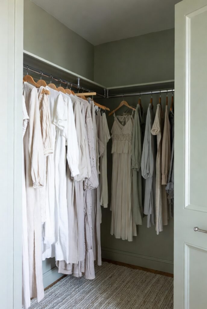
3. Light Greige

Greige—a mix of gray and beige—is my secret weapon for almost any room, and closets are no exception. It brings the modern feel of gray but adds the warmth of beige.
This color works beautifully if you have wood shelving or organizers, as the neutral tone complements natural textures perfectly.
4. Soft Dove Gray
For a clean and sophisticated look, I recommend a soft dove gray. It creates a serene background that looks fantastic behind colorful clothing.
Because gray is a cool tone, it recedes visually, which can trick your eye into thinking the closet is slightly larger than it actually is.
5. Creamy Beige
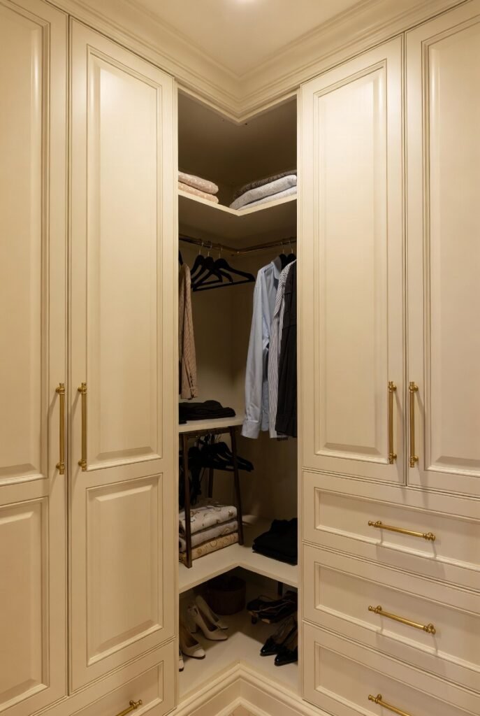
If you want your closet to feel like a warm hug, go with a creamy beige. This shade adds a touch of luxury and pairs incredibly well with gold or brass hardware.
Just be sure to check your lighting; warm bulbs can make beige look yellow, so I suggest testing a swatch first.
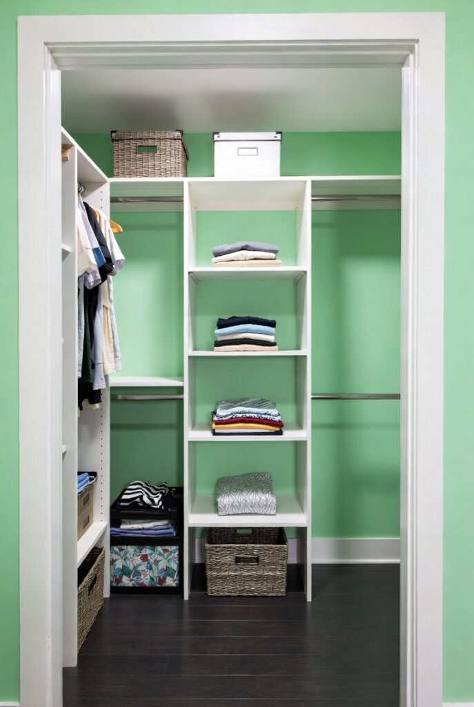
6. Pale Sage Green
Bringing a bit of nature inside always lifts my mood. A pale sage green is calming and fresh, making your closet feel like a peaceful retreat rather than a chaotic storage unit.
It is colorful enough to be interesting but neutral enough not to clash with your wardrobe.
7. Deep Charcoal

I know painting a small space dark sounds counterintuitive, but hear me out. A deep charcoal gray creates incredible contrast.
When you hang light-colored shirts or dresses against a dark wall, they pop instantly. It gives the space a custom, built-in look that feels very expensive.
8. Classic Navy Blue
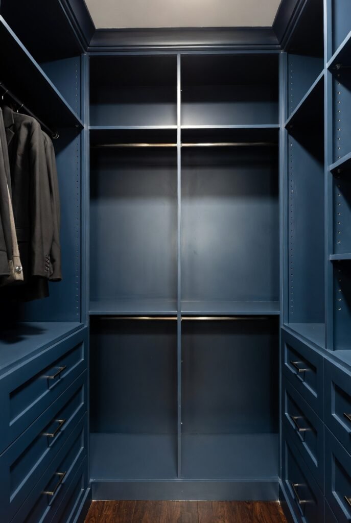
Similar to charcoal, navy blue adds depth and drama. I find this works exceptionally well in walk-in closets where you have a bit more room to play with lighting.
To keep it from feeling like a cave, use a paint with a Satin finish. The slight gloss reflects light and is much more durable against scuffs than a flat finish.
9. Blush Pink
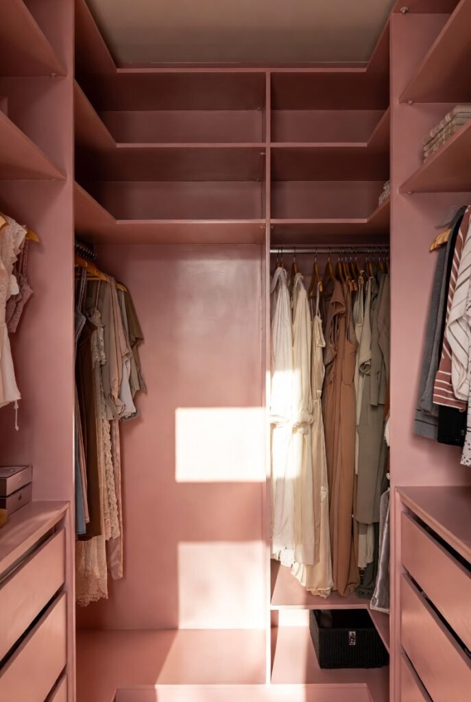
For a touch of femininity and brightness, blush pink is a winner. It reflects light beautifully, giving your skin a nice glow when you are looking in the mirror.
It is a fun way to add personality to a space that is usually hidden behind closed doors.
10. Airy Sky Blue
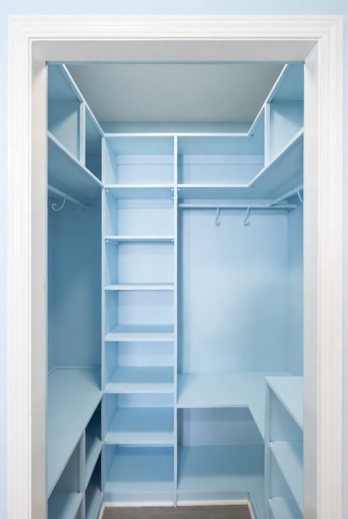
Sky blue creates a feeling of openness, similar to looking at the sky. If your closet feels cramped or stuffy, this cool tone can make it feel airier and more breathable.
It pairs wonderfully with crisp white shelving and trim.
11. Soft Lavender
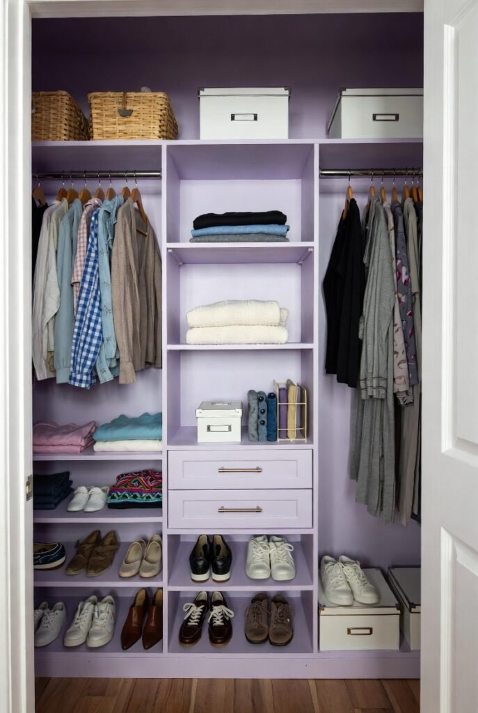
Lavender is an unexpected choice that feels incredibly chic. It is a gentle color that adds character without overpowering the space.
I think it works particularly well in linen closets or children’s closets for a playful yet soothing vibe.
12. Warm Taupe
Taupe is darker than beige but warmer than gray. I find it to be a very grounding color that hides scuff marks better than white.
Since closets are high-traffic areas where clothes hangers constantly bang against the walls, a forgiving color like taupe is a practical lifesaver.
13. Fresh Mint Green
Mint green is energetic and clean. If you struggle to wake up in the morning, opening your closet to this zesty shade might be just the boost you need.
It looks especially crisp against white trim and organizers.
14. Muted Slate Blue
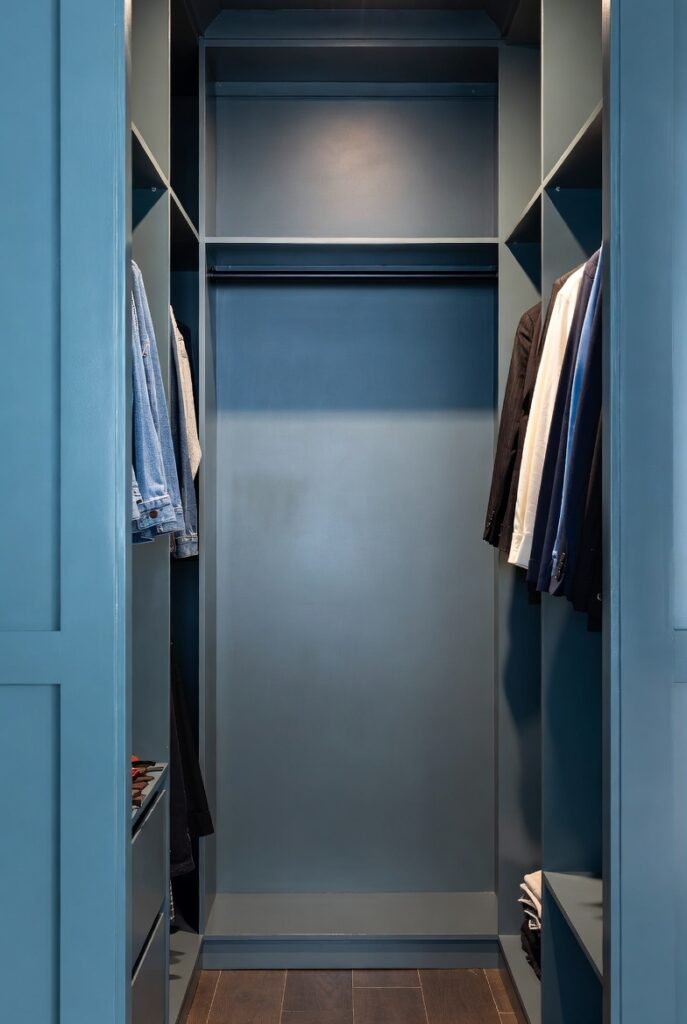
Slate blue has gray undertones, making it more subdued than a bright sky blue. It feels very mature and masculine.
This is a great option if you want color but are afraid of it looking childish. It serves as a strong, neutral backdrop for denim and suits.
15. Butter Yellow
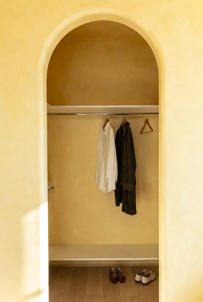
If your closet has absolutely no natural light, you have to fake it. A soft butter yellow mimics sunshine and warms up the entire space instantly.
Just stick to a pale, buttery shade rather than a neon lemon to keep it easy on the eyes.
16. Earthy Terracotta
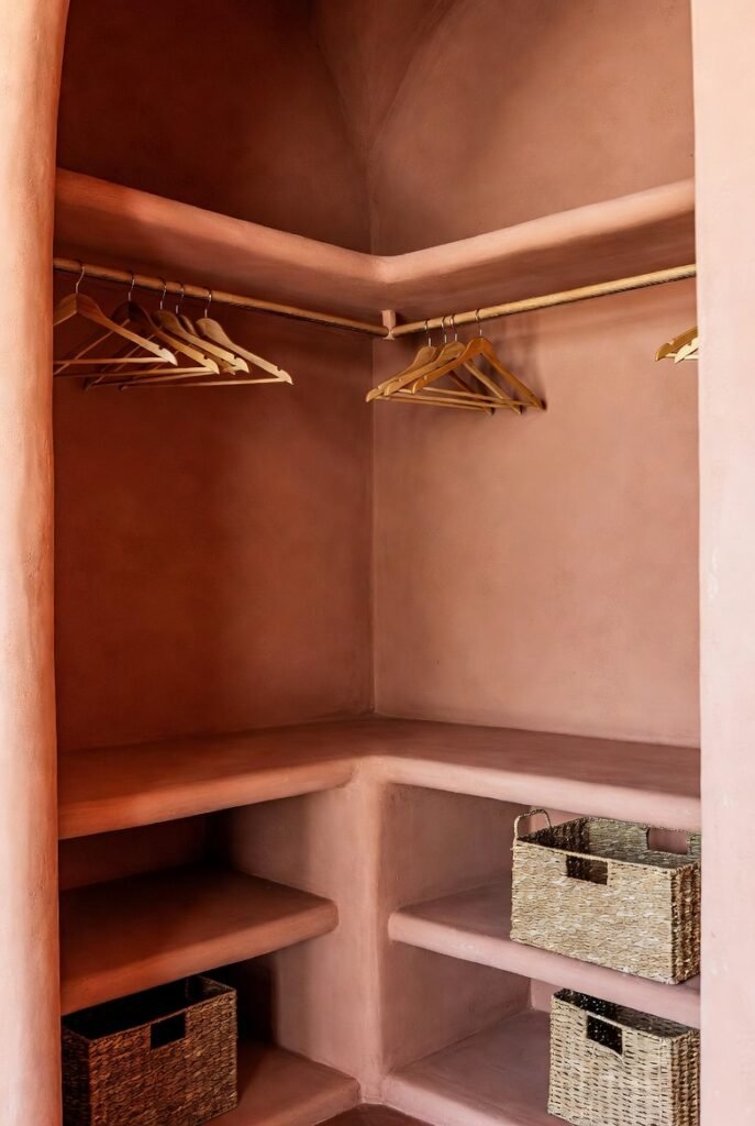
For those who follow trends, terracotta is having a huge moment. It brings a rich, earthy warmth that feels very organic and bohemian.
I would pair this with wood hangers and woven storage baskets to complete the natural aesthetic.
17. Jet Black
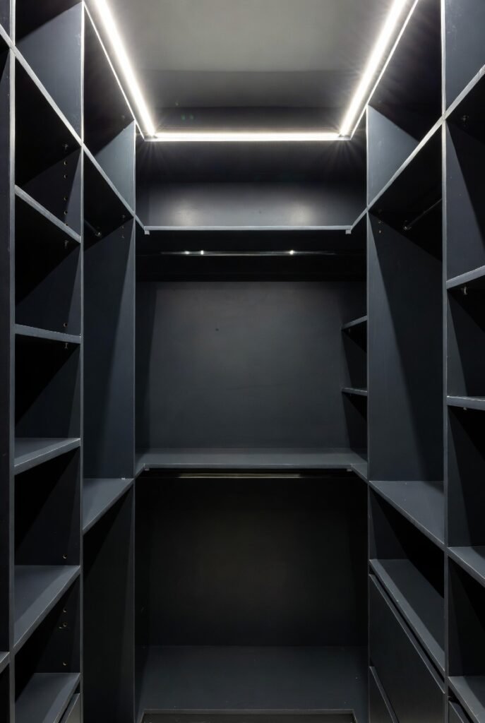
If you are brave enough, jet black is the ultimate statement. It blurs the corners of the room, which can oddly make the boundaries of the space disappear.
However, you must have excellent lighting installed. Without bright overhead lights, you won’t be able to distinguish a navy sock from a black one!
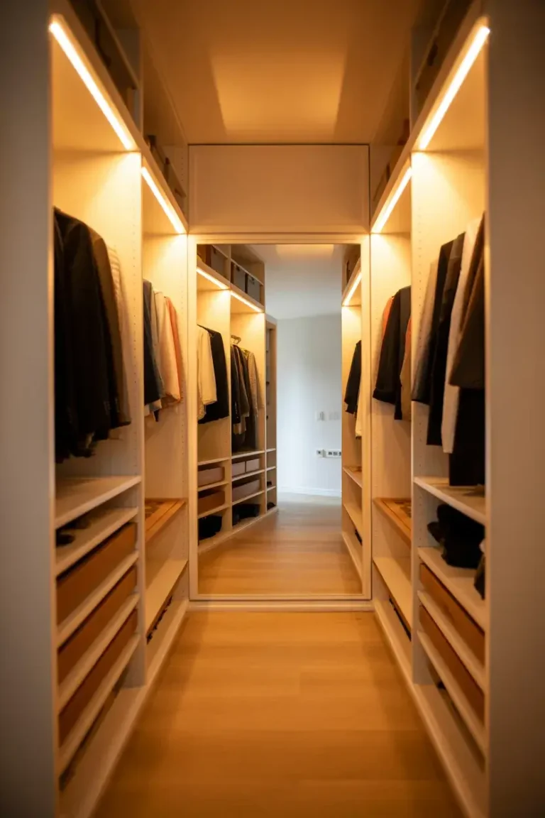
Choosing the Right Finish and Light
Before you head to the store, I have one final tip regarding the paint finish. For closets, I always recommend a Satin finish.
According to painting experts, Satin contains more resins than Eggshell or Flat paints, creating a tougher surface. This means it stands up better to scrubbing and cleaning—essential for a tight space where walls get touched often.
Also, remember that Light Reflectance Value (LRV) matters. For small, windowless closets, try to stick to colors with an LRV of 60 or higher to keep the space feeling open.
Your closet deserves to be more than just a dumping ground. Grab a brush, pick a shade that makes you smile, and turn that small space into a highlight of your home.