16 Best Paint Colors for Cabinets to Transform Your Kitchen
I firmly believe that painting your cabinets is the single most effective way to upgrade a kitchen. You don’t need to tear out perfectly good boxes to get a fresh look. In fact, keeping existing cabinets and updating the finish is a smart financial move.
A minor kitchen remodel allows homeowners to recoup a staggering 96% of the cost at resale. That is nearly double the return of a major upscale remodel.
If you are ready to grab that ROI and breathe new life into your home, you need the right shade. I have compiled the 16 best paint colors for cabinets, ranging from timeless whites to trending earth tones, to help you make the perfect choice.
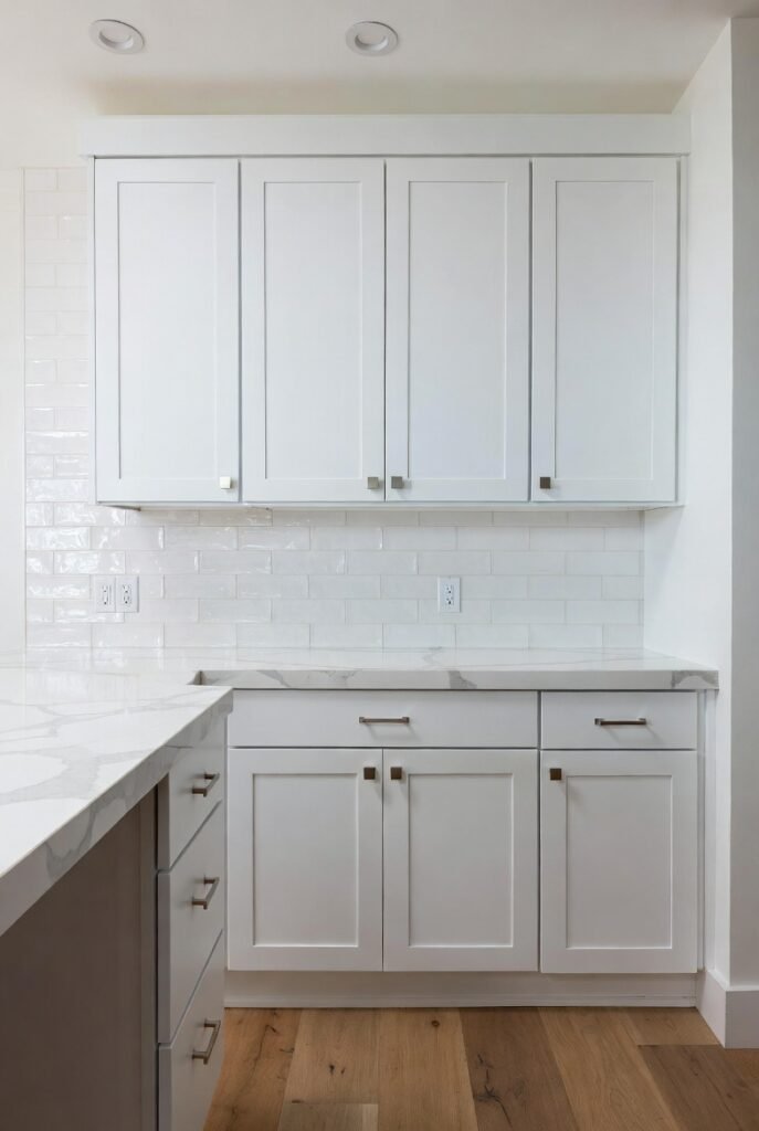
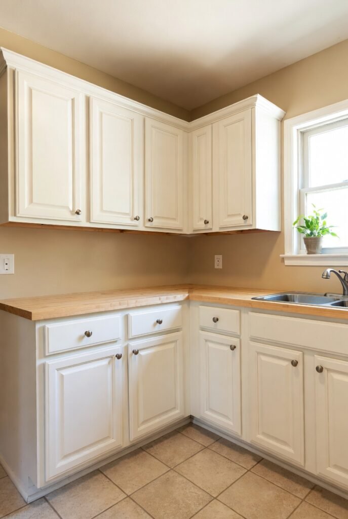
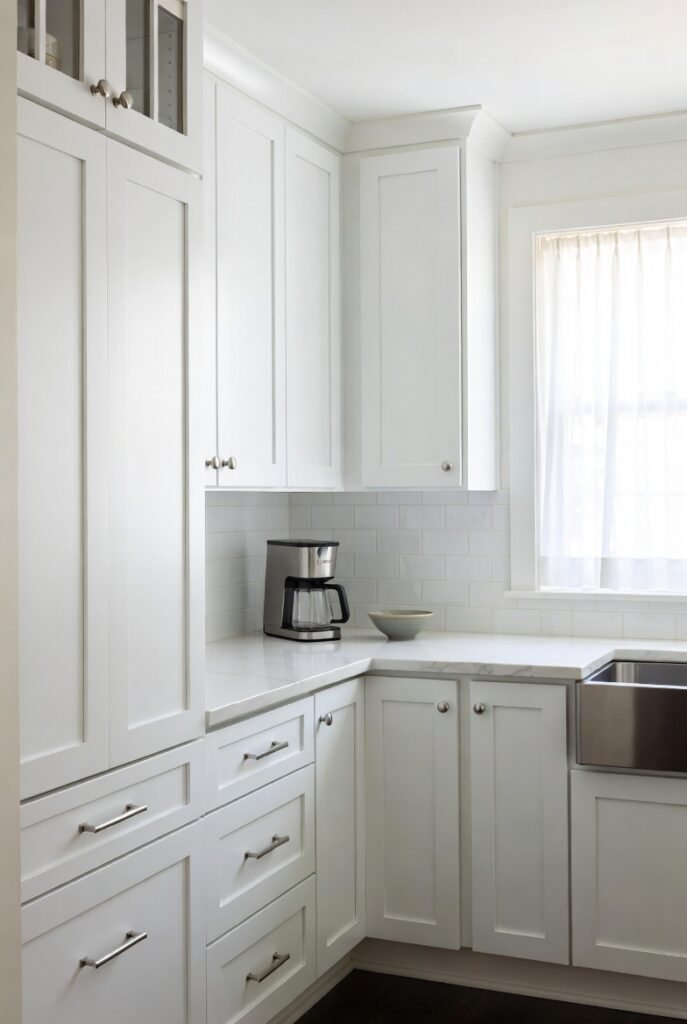
1. Benjamin Moore White Dove (OC-17)
I reach for White Dove more than almost any other color. It serves as the industry standard for a reason. It offers a soft, warm white that never feels yellow or dingy.
This color strikes a perfect balance. It works beautifully in kitchens with limited natural light because its subtle warmth prevents the space from feeling sterile.
2. Sherwin-Williams Pure White (SW 7005)
If you want a versatile white that pairs with everything, I recommend Pure White. It sits right in the sweet spot between a stark modern white and a creamy traditional white.
I love using this shade when clients have crisp white quartz countertops. It bridges the gap between the cool counters and warmer wood floors seamlessly.
3. Benjamin Moore Chantilly Lace (OC-65)
Designers often call this the “purest” white available. I use Chantilly Lace when I want a clean, crisp backdrop that lets other elements in the kitchen shine.
It has a high Light Reflectance Value (LRV), meaning it bounces a lot of light around. If your kitchen feels small or dark, this color wakes it right up.
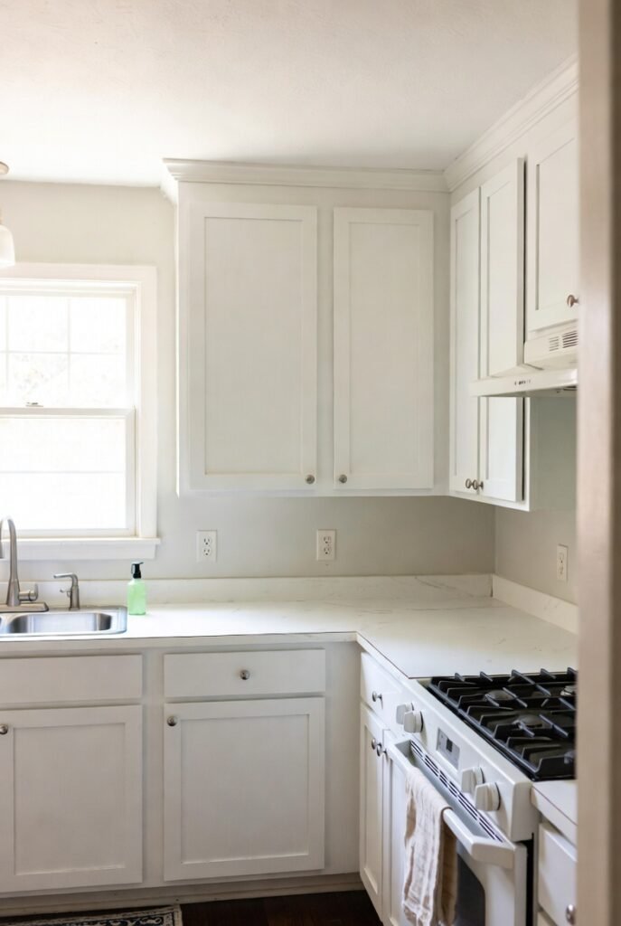
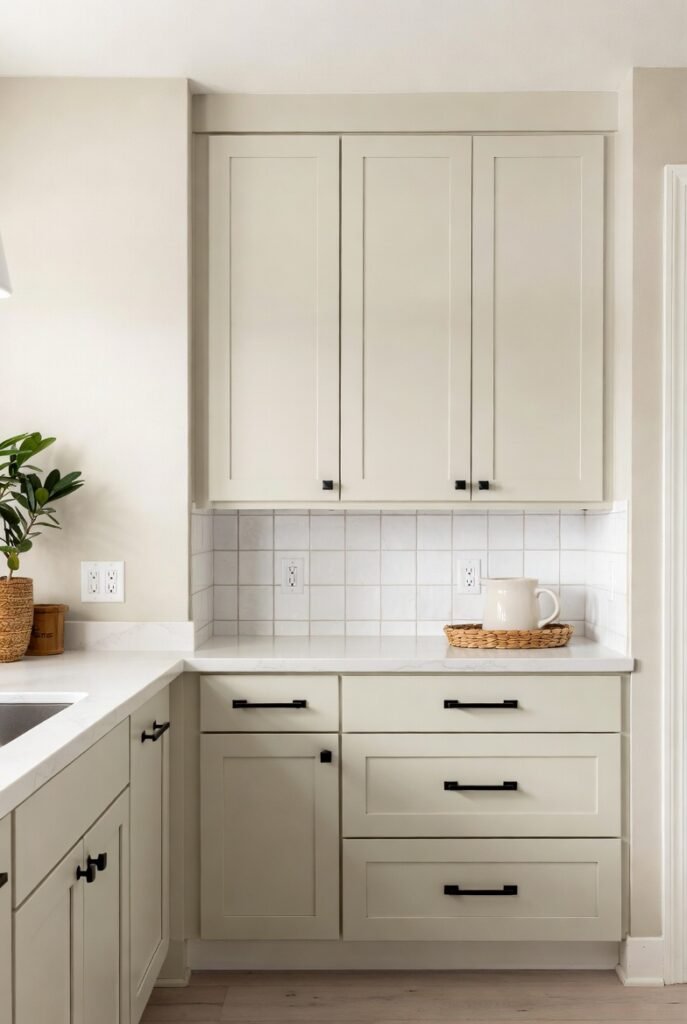
4. Sherwin-Williams Alabaster (SW 7008)
Alabaster is my top pick for farmhouse-style kitchens. It is creamy and soft, offering a cozy vibe that feels lived-in rather than showroom-stiff.
While it is undeniably warm, it rarely reads as yellow. It provides a comforting glow that makes a large kitchen feel welcoming.
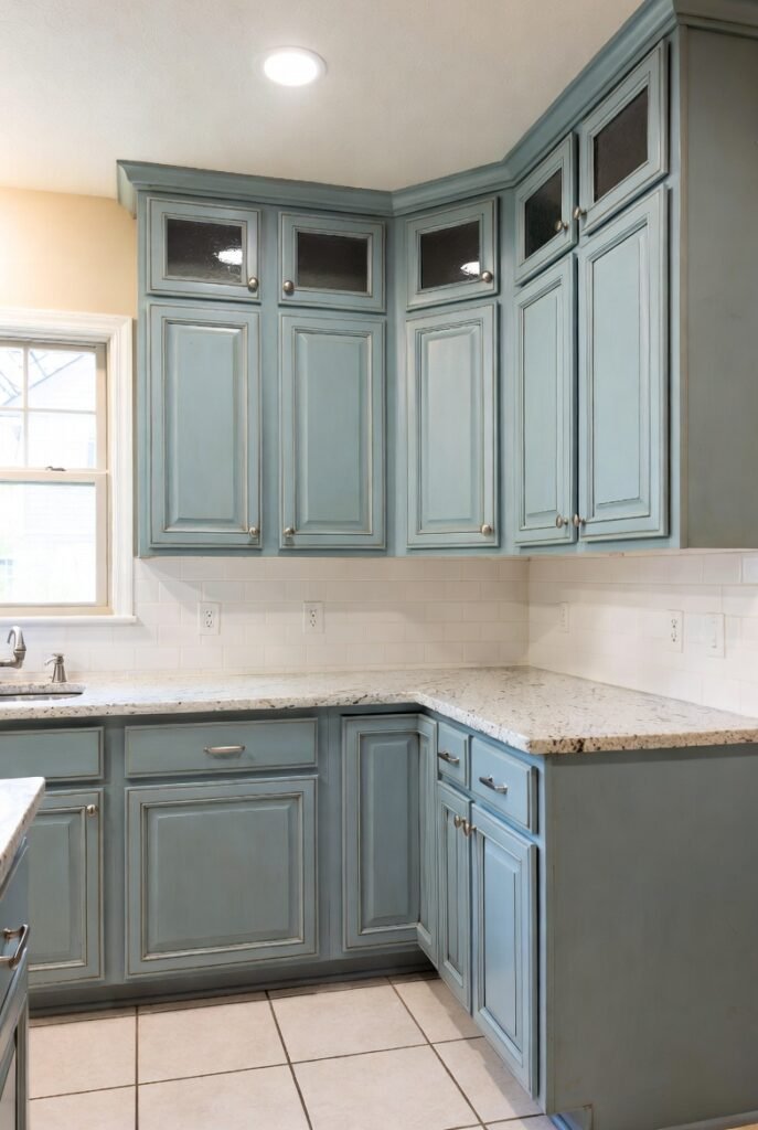
5. Sherwin-Williams Sea Salt (SW 6204)

Trends are shifting toward organic vibes, and blue-greens are leading the charge. Sea Salt is incredibly popular because it changes with the light.
In bright daylight, I see a soft aqua. In the evening, it settles into a muted gray-green. It brings a spa-like calmness to the heart of the home.
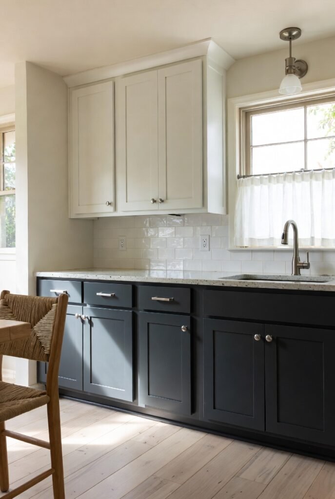
6. Sherwin-Williams Naval (SW 6244)
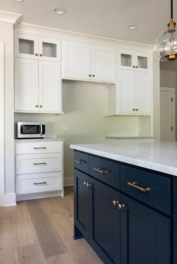
I love a high-contrast island. Painting your perimeter cabinets white and your island Naval creates a stunning focal point without overwhelming the room.
This deep navy blue commands attention but remains classic. It pairs exceptionally well with brass hardware and marble countertops.
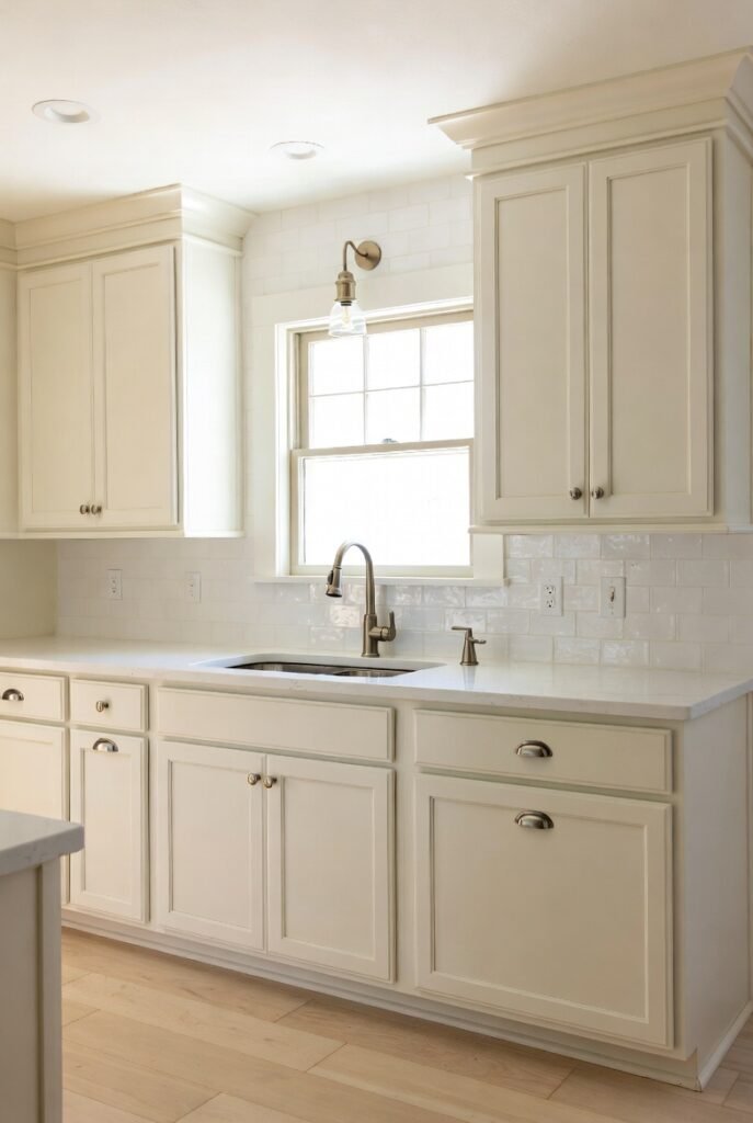
7. Benjamin Moore Cloud White (OC-130)
Cloud White is a legend in the design world. For years, it was the default choice for a traditional, timeless kitchen renovation.
It has a distinct creamy undertone. I find it works best in homes with warm wood trim or beige tile floors, as it ties those warmer elements together.
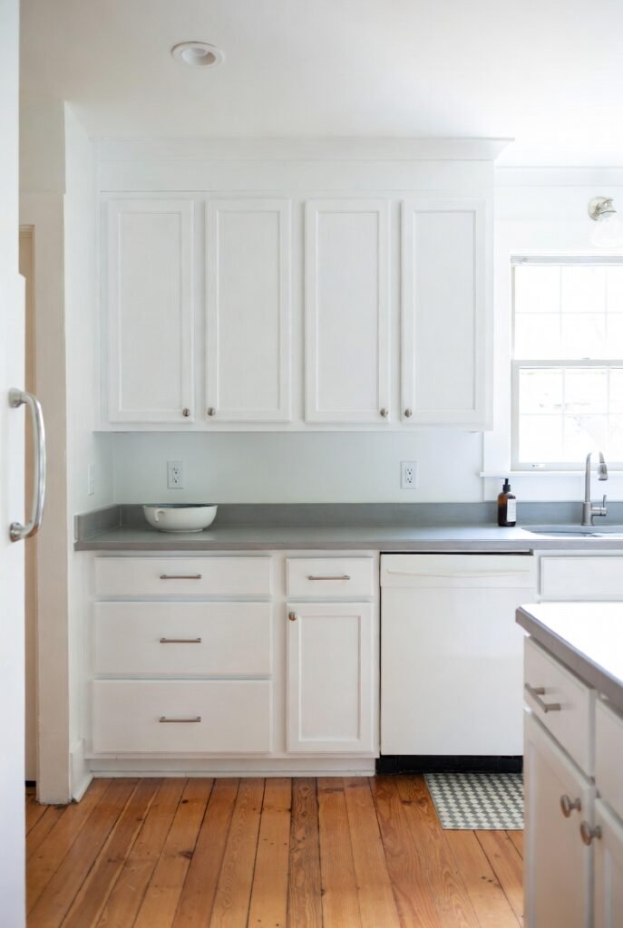
8. Sherwin-Williams Iron Ore (SW 7069)
If true black feels too harsh for you, try Iron Ore. It is a rich, soft charcoal that adds drama without absorbing all the light in the room.
I often use this on lower cabinets in a two-tone kitchen. It grounds the space and hides scuff marks from shoes better than white ever could.
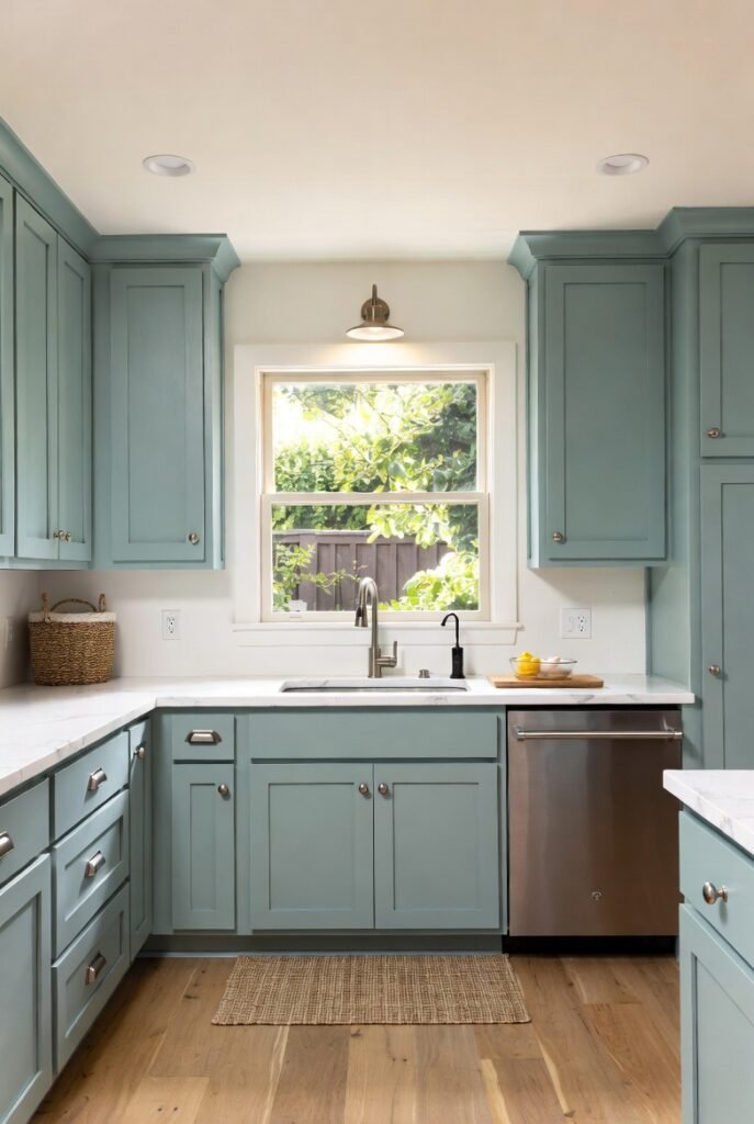
9. Benjamin Moore Beach Glass (1564)
Kylie M Interiors notes that blue-green blends are currently the most popular color family for cabinets. Beach Glass is a standout in this category.
It has a gray undertone that keeps it sophisticated. I appreciate that it adds color to the kitchen without feeling like a nursery or a playroom.
10. Sherwin-Williams Rainwashed (SW 6211)
Rainwashed is similar to Sea Salt but leans slightly more green. It feels organic and fresh, perfect for a kitchen with windows looking out onto a garden.
I suggest this color if you want your kitchen to feel airy. It pairs beautifully with light oak flooring and natural woven accents.
11. Sherwin-Williams Evergreen Fog (SW 9130)
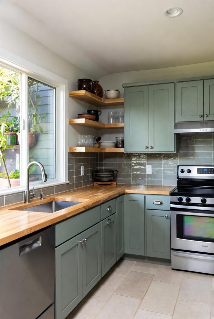
Green is the new neutral for cabinetry. Evergreen Fog is a subtle, chameleon-like color that shifts between green and gray depending on the time of day.
It feels grounded and earthy. I love using this in modern organic kitchens where you want to bring the outdoors in.
12. Sherwin-Williams White Snow (SW 9541)
This shade is part of the Sherwin-Williams 2025 Color Capsule. It boasts an LRV of 90, making it incredibly bright and reflective.
I recommend this for anyone looking to embrace the shift toward “luxe organic” tones. It feels fresh and modern but avoids the cold blue undertones of older bright whites.
13. Benjamin Moore Boothbay Gray (HC-165)
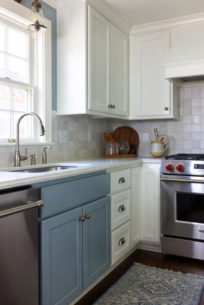
True grays can feel chilly, but Boothbay Gray has a lovely blue undertone. It creates a coastal, serene vibe that fits perfectly in transitional kitchens.
I often use this on an island to add a pop of personality. It looks fantastic against crisp white perimeter cabinets and chrome hardware.
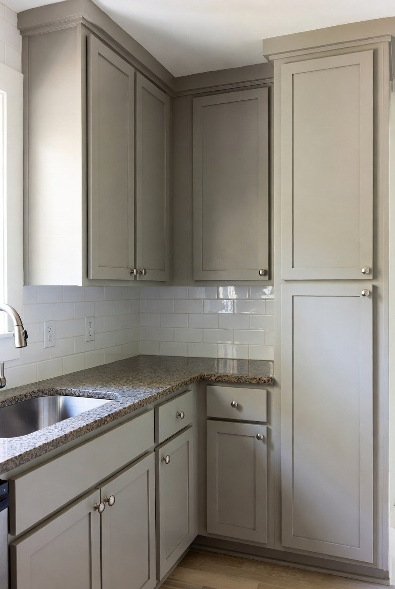
14. Sherwin-Williams Agreeable Gray (SW 7029)
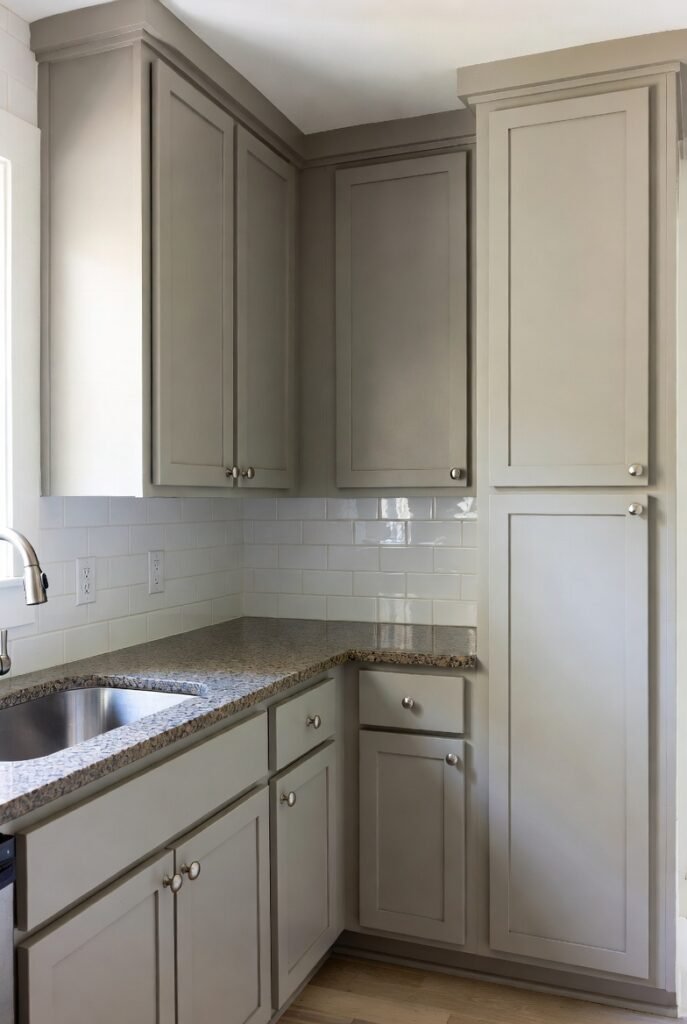
Agreeable Gray is the ultimate “greige” (gray + beige). It solves the problem of choosing between a cool gray and a warm beige by giving you both.
This color works with almost any granite or tile. If you plan to sell your home soon, this is a safe, crowd-pleasing bet.
15. Sherwin-Williams Sunbleached (SW 9585)
Another pick from the 2025 trends, Sunbleached is a light neutral that is deeper than white but not quite a full beige.
I see this working well in minimalist kitchens. It adds depth and texture to the walls and cabinets without creating visual clutter.
16. Sherwin-Williams Origami White (SW 7636)
Origami White is a shape-shifter. It reads as white, but it has enough gray and beige in it to stand out against white trim.
I like this for open-concept homes. It flows easily from the kitchen into the living areas without jarring color transitions.
Final Words
Choosing a color is just the first step. Before you commit to gallons of paint, I urge you to test your top choices.
Buy sample pots and paint large poster boards. Move them around your kitchen at different times of day—morning coffee light looks very different from dinner prep lighting.
Once you find the winner, grab your brushes and get to work. You will be amazed at what a fresh coat of paint can do for your home’s value and your daily mood.