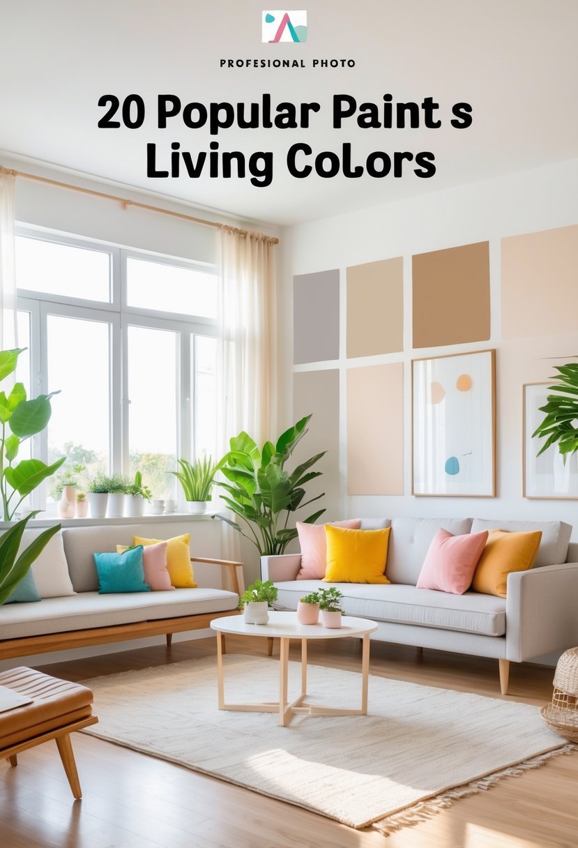
20 Best Paint Colors for Living Room To Enhance Style and Comfort
Choosing the right paint color for your living room can change the whole feel of the space. I know that picking a color is not always easy, especially with so many options available. The right shade can make your living room feel cozy, bright, or even more spacious.
The best living room paint colors strike a balance between style and comfort, helping you create a space that fits your personality and needs.
This article will guide you through 20 top colors that work well in different living room settings.
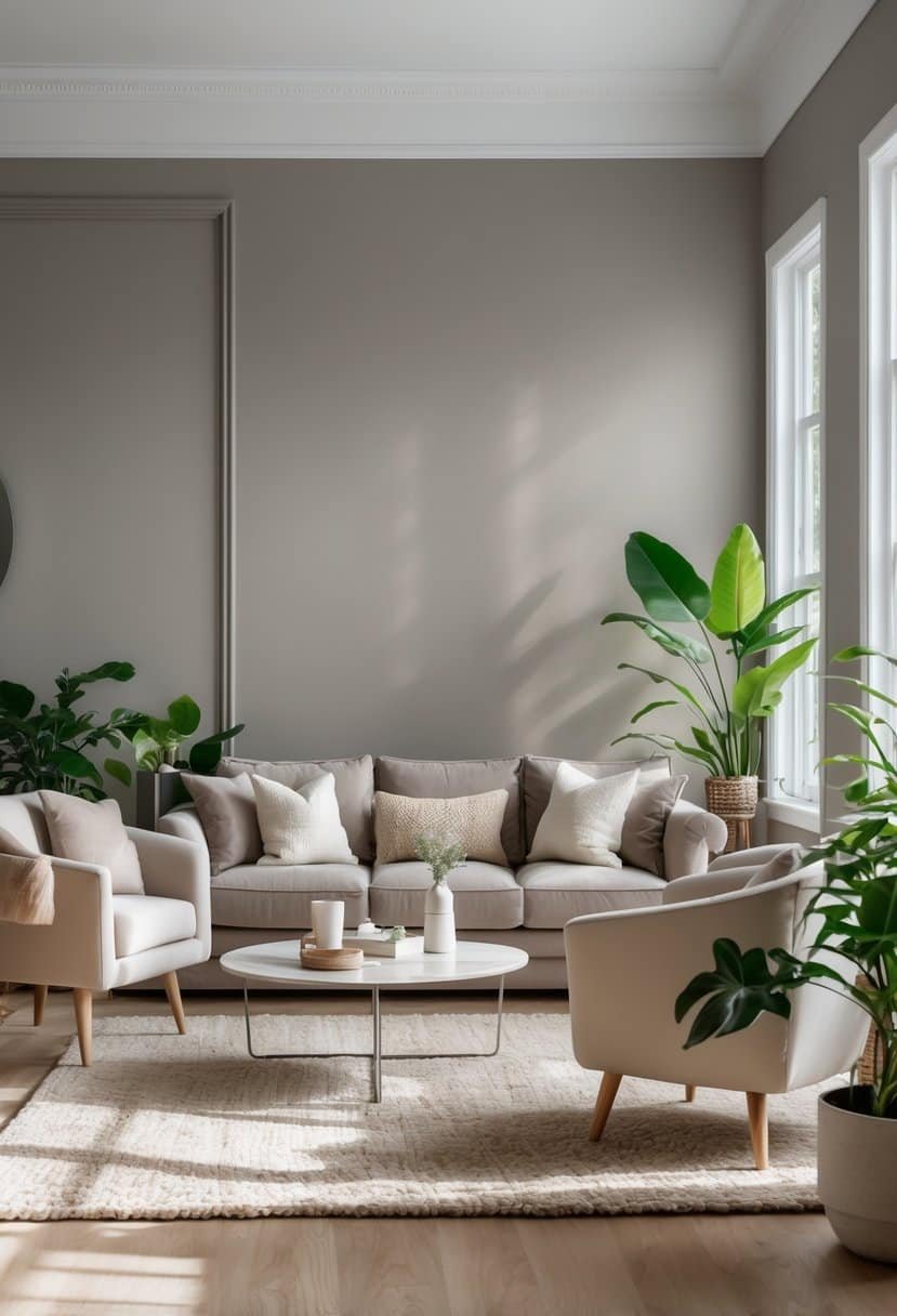
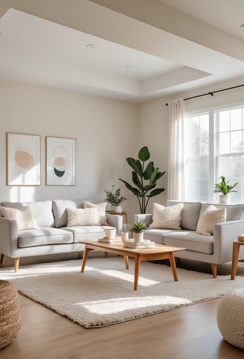
1) Benjamin Moore Revere Pewter
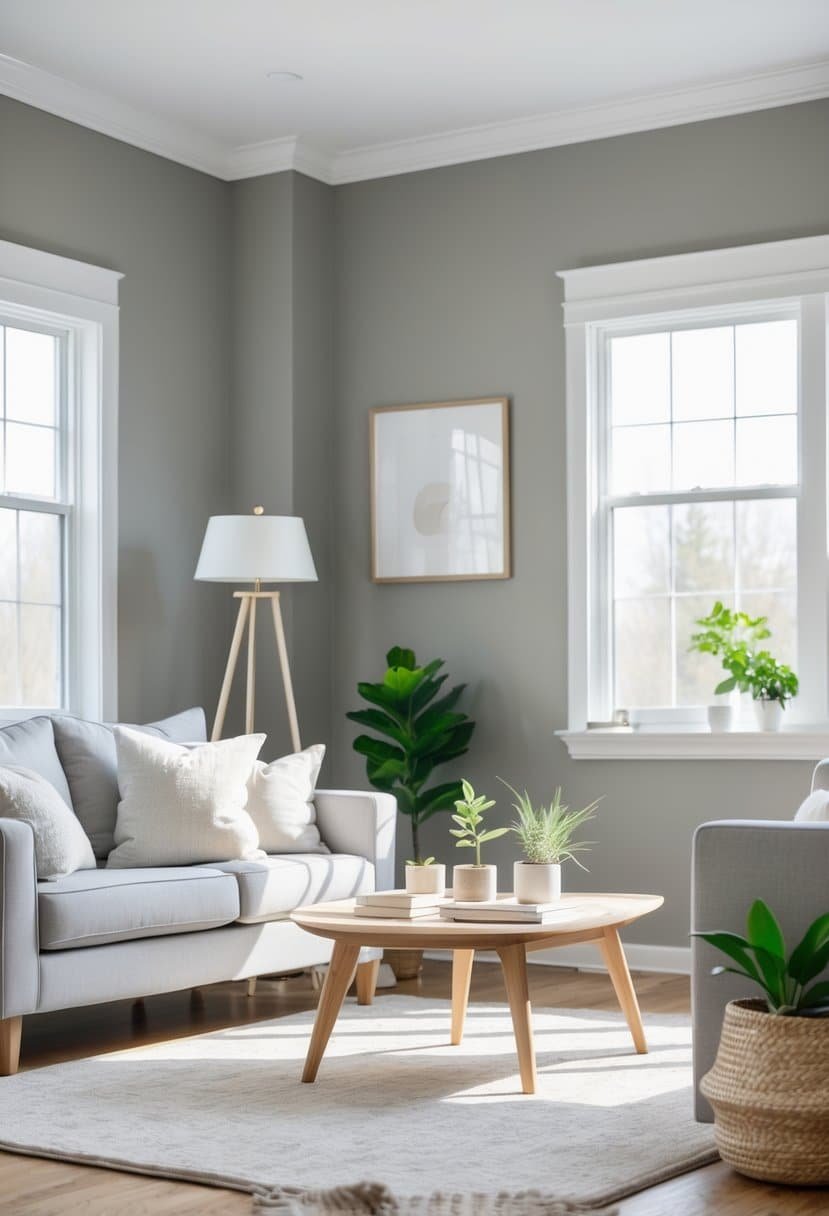
I find Benjamin Moore Revere Pewter to be a highly versatile paint color for living rooms. It strikes a balance between gray and beige, often called “greige,” which helps it feel warm without being dull.
This color adapts well to different lighting, making rooms feel cozy yet fresh. It pairs nicely with both modern and traditional décor styles, offering a timeless look that doesn’t go out of fashion.
If you want a neutral but inviting base that works with many color schemes, Revere Pewter is a strong choice. You can learn more about its uses and color pairings at this guide to Benjamin Moore Revere Pewter.
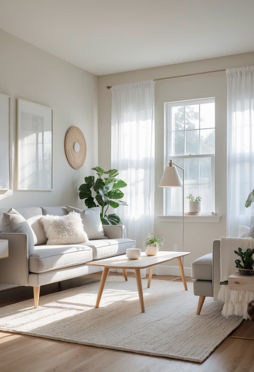
2) Sherwin-Williams Dover White
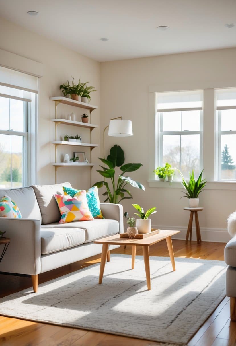
I find Sherwin-Williams Dover White to be a great choice for living rooms. It’s a warm off-white with soft yellow undertones that add a cozy feel without being too strong.
This color works well in rooms with less natural light because it helps brighten the space while keeping it inviting. I often recommend it for both walls and trims because it pairs nicely with many styles, from modern farmhouse to classic designs.
Dover White brings a subtle warmth that feels fresh but comfortable. It really helps create a calm, welcoming space. You can see more about Dover White’s qualities and uses at the Sherwin-Williams living room paint colors page.
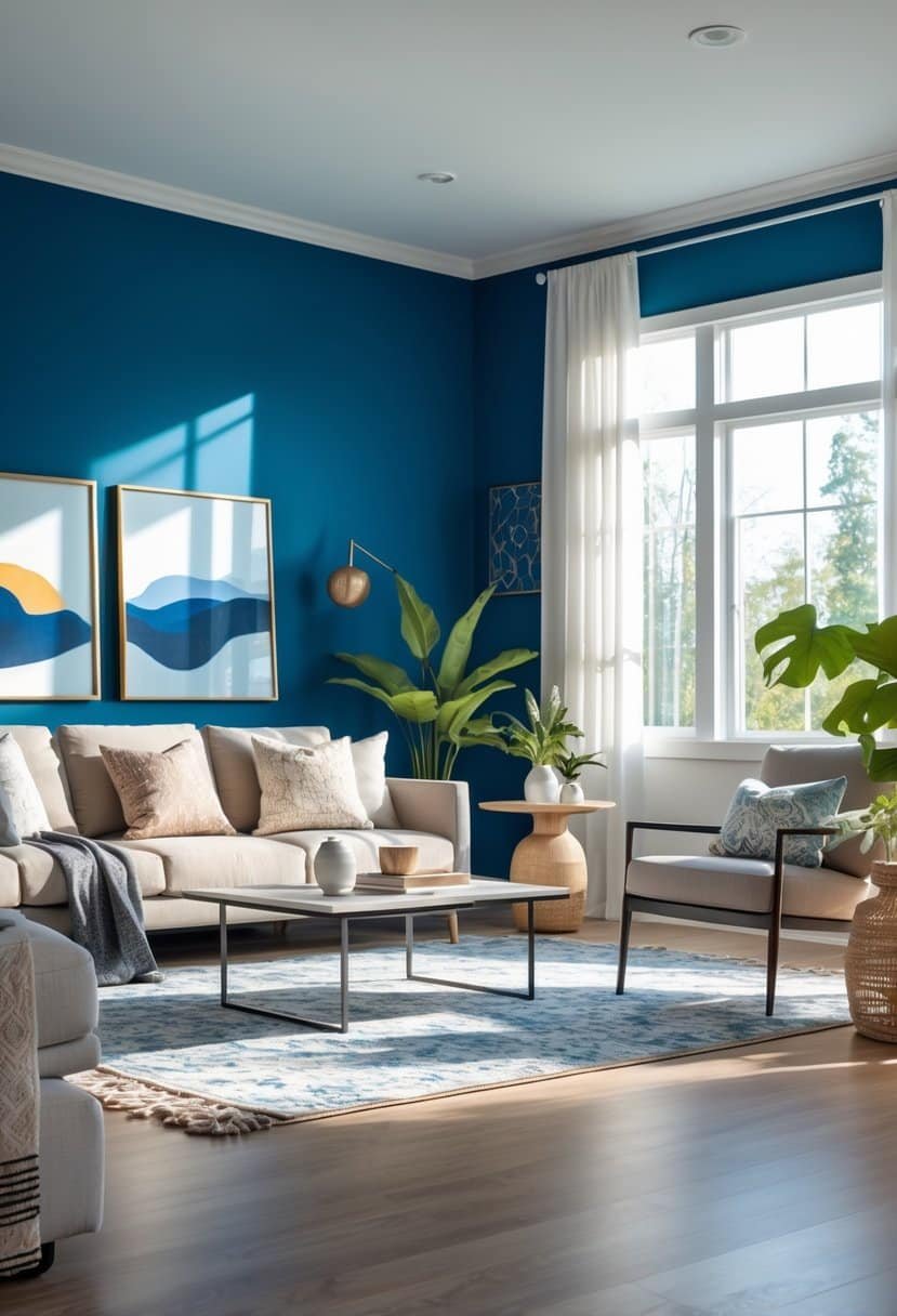
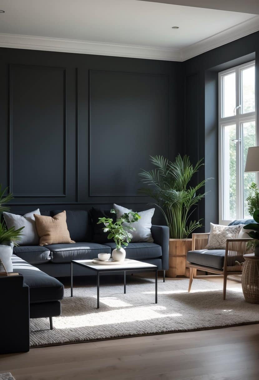
3) Farrow & Ball Hague Blue
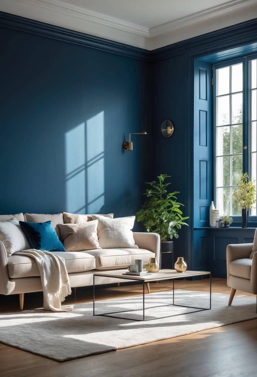
I find Farrow & Ball Hague Blue to be a great choice for living rooms. It’s a deep, rich blue with green undertones, adding depth without feeling too dark.
This color works well in many styles, from modern to classic. It creates a cozy and elegant atmosphere. I like pairing it with light wood floors or white ceilings to keep the space balanced.
If you want a bold but versatile look, Hague Blue is worth considering. You can see how it performs in real rooms and find ideas for matching colors in this Farrow & Ball Hague Blue color review.
4) Benjamin Moore Simply White
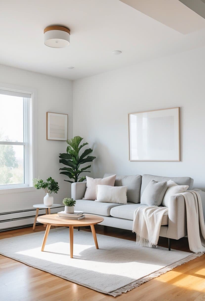
I find Benjamin Moore Simply White a reliable choice for living rooms. It’s a clean, neutral white that works well in many styles. This paint brightens spaces without feeling cold or sterile.
Simply White blends smoothly with warm tones like brass or greige. It also creates a fresh backdrop for colorful accents. I’ve seen it used in both modern and traditional settings.
The color offers flexibility. It can make a room feel open and airy or cozy and inviting, depending on the lighting. For a classic, timeless look, Simply White is worth considering.
You can see more about its uses and features at Benjamin Moore Simply White details.
5) Sherwin-Williams Sweater Weather
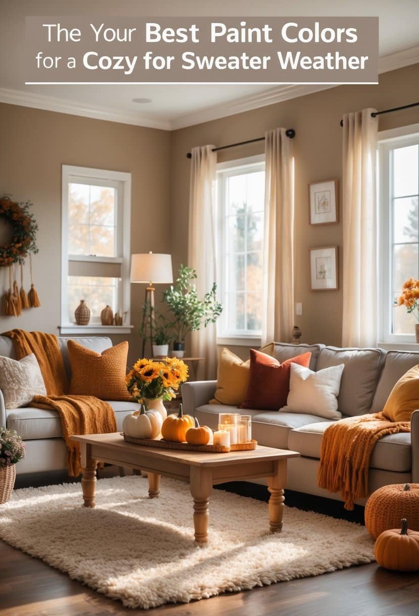
I like Sherwin-Williams Sweater Weather because it strikes a good balance between warm and cool tones. It feels neutral but still adds some depth to a living room.
This color works well with many different palettes, making it easy to pair with other shades in your home. I’ve noticed it looks great in natural light but can shift slightly depending on the room’s direction.
You can combine Sweater Weather with crisp whites for contrast or soft beiges for a calm, modern feel. It’s a solid choice for anyone wanting a versatile, stylish neutral. More details can be found in this Sweater Weather paint review.
6) Behr Swiss Coffee
I like Behr Swiss Coffee because it is a warm, creamy white that works well in many living rooms. It creates a cozy feel without being too yellow or too stark. This color pairs nicely with both cool and warm tones, giving you plenty of options for furniture and decor.
Swiss Coffee reflects enough light to keep a room bright but still feels inviting. I often suggest it for spaces where people gather, like living rooms and kitchens. Its versatility makes it a reliable choice if you want a neutral backdrop that feels soft and welcoming. You can see more details about this color at the Behr Swiss Coffee color review.
7) Benjamin Moore Hale Navy
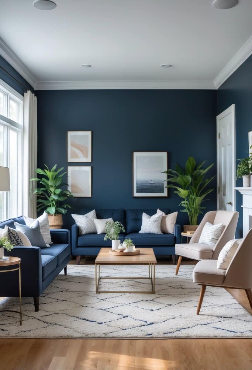
I find Benjamin Moore Hale Navy to be a strong, classic navy blue that works well in many living rooms. It has subtle gray undertones, giving it a calm yet deep look.
This color pairs nicely with soft neutrals like cream or light gray. It also looks great with warmer tones like taupe or even brighter colors such as red.
For me, Hale Navy creates a timeless and sophisticated feeling without being too dark or overwhelming. It fits well in modern or traditional spaces. You can see more details about this paint color here.
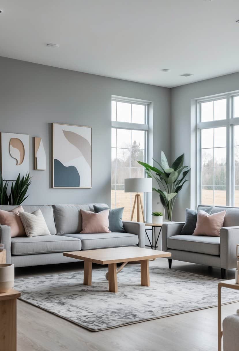
8) Sherwin-Williams Agreeable Gray
I prefer Sherwin-Williams Agreeable Gray for its warm, neutral tone. It’s a versatile shade that works well in many living rooms. The color feels soft but not dull, making it easy to pair with other colors.
Agreeable Gray has subtle greige undertones. This means it blends gray and beige, creating a balanced look that adapts to different lighting. I find it especially good for rooms where you want a calm, inviting atmosphere.
Many designers and homeowners choose it because it matches well with white trim and wood accents. You can see how it transforms spaces in various real home settings here.
9) Farrow & Ball Cornforth White
I find Farrow & Ball Cornforth White a very reliable choice for living rooms. It’s a soft grey that balances warm and cool tones well. That makes it versatile in different lighting conditions.
This color works great for creating a calm, neutral background. It pairs easily with both bold and subtle accent colors. I also like that it doesn’t feel too stark like pure white.
Using Cornforth White on walls or trim helps open up a space without losing warmth. You can explore its full potential through this detailed review.
10) Benjamin Moore Edgecomb Gray
I like Benjamin Moore Edgecomb Gray because it strikes a nice balance between gray and beige. It’s a warm greige that feels cozy without being too dark or dull. This color works well in living rooms that aim for a calm and inviting look.
Edgecomb Gray pairs easily with many other colors, making it flexible for different styles. Whether your furniture is modern or classic, this shade fits in smoothly. I’ve seen it used on walls, cabinets, and even exterior trims.
If you want a neutral that won’t overpower your space, Edgecomb Gray is a smart choice. You can learn more about it at this Edgecomb Gray color guide.
11) Sherwin-Williams Anonymous
I find Sherwin-Williams Anonymous to be a very balanced neutral. It’s a deep gray with slight brown undertones that makes it feel warm without being too dark or cold.
This color works well in many spaces because it pairs easily with both warm and cool tones. I like using it in living rooms where I want a calm, sophisticated look.
Anonymous also has a lower light reflectance value, so it adds depth but won’t make a room feel too dim. It’s a versatile choice that feels modern yet timeless. You can see more about Anonymous on this page about Sherwin-Williams Anonymous paint color.
12) Benjamin Moore Chantilly Lace
I like Benjamin Moore Chantilly Lace for living rooms because it is a clean, crisp white that feels fresh. It has subtle blue undertones, which keeps it from looking too warm or yellow.
This paint works well with many styles, from modern to classic. It brightens the space and pairs nicely with both cool and warm colors. I often suggest combining it with navy or soft grays for a balanced look.
Its versatility makes Chantilly Lace a smart choice if you want a timeless and neutral backdrop in your living room. You can see examples and color ideas here.
13) Farrow & Ball Elephant’s Breath
I like using Farrow & Ball Elephant’s Breath because it’s a warm grey with subtle taupe undertones. It changes based on the light, sometimes looking almost lilac in cooler, west-facing rooms.
This color works well in living rooms, especially if you want a cozy but modern feel. It pairs easily with both light and dark furnishings.
Elephant’s Breath is also versatile enough for ceilings, trims, or walls. It adds depth without feeling too dark or cold. You can see real examples and ideas for this shade here.
14) Sherwin-Williams Sea Salt
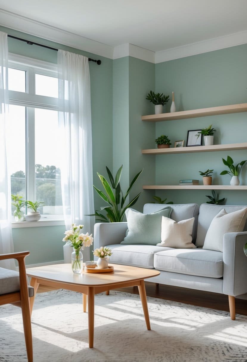
I like using Sherwin-Williams Sea Salt because it brings a soft, calm feel to any living room. It is a blend of green, blue, and gray, which makes it versatile for many styles.
Sea Salt works well with both neutral shades and deeper colors. I often pair it with whites and soft wood tones to create a peaceful, balanced space.
This color adapts well to different lighting, so it stays fresh and inviting all day. It’s a great choice if you want a subtle yet stylish look. You can see more on how this color fits in homes at Sherwin-Williams Sea Salt coordinating colors.
15) Benjamin Moore Gray Owl
I recommend Benjamin Moore Gray Owl for its soft, balanced look. It’s a light gray with subtle green and blue undertones that change depending on the light. This makes it very versatile in different living rooms.
Gray Owl reflects a good amount of light, so it can brighten up a space without feeling cold or stark. I like that it works well with both warm and cool color schemes.
If you want a neutral gray that doesn’t feel flat, Gray Owl is a strong choice. You can learn more about it at Opple House’s top Benjamin Moore gray paint colors.
16) Behr Bohemian Blue
I find Behr Bohemian Blue to be a strong choice for a living room paint color. It has a rich, deep tone that adds character without feeling too dark. This blue works well with warm neutrals and natural wood finishes, creating a cozy atmosphere.
The color fits many styles, from modern to classic. It helps balance bold decor while keeping the space calm. I like how it pairs with off-white and soft earth tones for a fresh, inviting look.
For me, Bohemian Blue brings depth and personality without overwhelming the room. You can see color ideas and combos in the Behr BOHEMIAN Color Palette.
17) Sherwin-Williams Alabaster
I often choose Sherwin-Williams Alabaster because it is a soft, warm white that adds a calm feel to any living room. It is not too bright or cold but has a cozy, inviting tone that works well with many styles.
This color helps highlight furniture and decor without overpowering the room. I like how it pairs easily with both bold and neutral accents, making it versatile for different looks.
If you want a balanced, timeless shade, Alabaster offers a clean background that feels fresh yet comfortable. You can see more about its uses and coordinating colors here.
18) Benjamin Moore White Dove
I find Benjamin Moore White Dove to be one of the most versatile paint colors for living rooms. Its soft, warm undertones create a calm, inviting space without feeling stark or cold.
White Dove works well with many décor styles, from traditional to modern. It also brightens the room and makes spaces appear larger and more open.
I often recommend it for walls, trim, and even ceilings because it provides a clean, fresh look. If you want a timeless white that complements almost any color scheme, White Dove is a strong choice. You can see more ideas about it in this Benjamin Moore White Dove living room inspiration.
19) Farrow & Ball Railings
I like Farrow & Ball Railings for its deep, rich look. It’s a blue-black shade that changes with the light. Sometimes it looks more blue, other times closer to black.
This color works well in living rooms, especially if you want a bold but elegant feel. It pairs nicely with white trim to keep the space balanced.
Railings adds depth without feeling too dark or heavy. It’s a versatile choice that can work in both modern and classic rooms. You can see more about its tone and uses at Farrow & Ball’s Railings color review.
20) Sherwin-Williams Accessible Beige
I find Sherwin-Williams Accessible Beige to be a reliable choice for living rooms. It has a warm, soft greige tone that balances beige and gray perfectly. This makes it versatile for many styles, from modern to classic.
Accessible Beige doesn’t feel cold or too yellow. Instead, it creates a calm and inviting space. It pairs well with a wide range of colors, which gives me freedom when decorating.
If you want a neutral that feels fresh but not plain, Accessible Beige is worth considering. You can learn more about its qualities and coordinating colors at this detailed Accessible Beige guide.