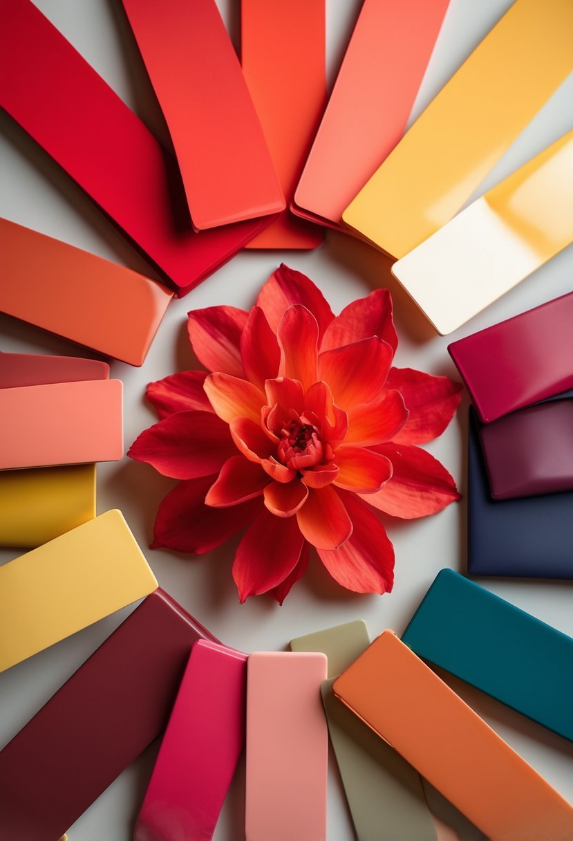
17 Colors That Go With Red For Stylish and Versatile Combos
When working with red in interior design, choosing the right colors to pair with it can transform a space. Red is a strong and vibrant color that demands careful selection of complementary shades to create balance and harmony.
I have found that understanding which colors work well with red helps make any room feel both dynamic and inviting. This article explores 17 colors that can enhance red’s presence without overpowering it, offering practical ideas for various design styles.
1) Red and Black – classic and bold contrast
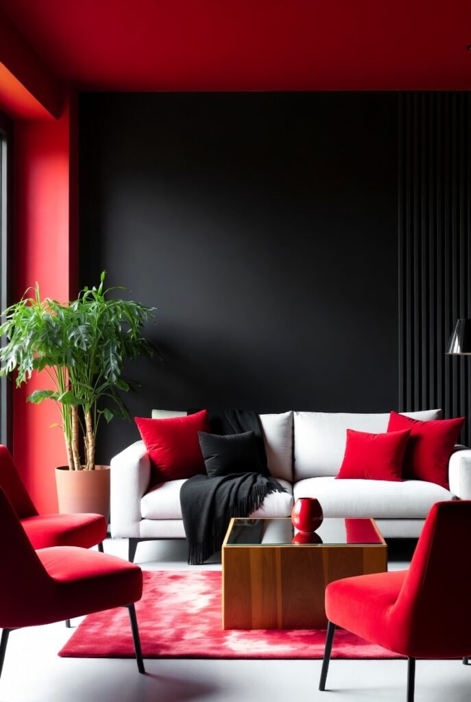
I find red and black to be one of the most striking combinations in interior design. The deep black tones provide a strong backdrop that intensifies red’s vividness without overwhelming the space.
Using this palette, I often recommend black walls or furniture paired with red accents like chairs or cushions. This creates a balanced look that feels both daring and elegant, perfect for dining rooms or bedrooms.
The contrast is bold but controlled, offering a timeless aesthetic that suits modern and traditional interiors alike.
2) Red and White – clean, fresh, and timeless
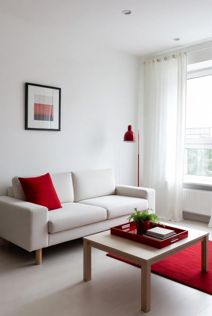
I find the red and white combination to be one of the most versatile color schemes in interior design. It creates a clean and fresh atmosphere while maintaining a timeless appeal.
This pairing works well in both modern and traditional spaces, offering contrast without overwhelming a room. Using white as the dominant color lets red accents stand out, making the space feel energetic yet balanced.
In my experience, red and white can transform any room into a bright and inviting area, perfect for kitchens, living rooms, or bedrooms.
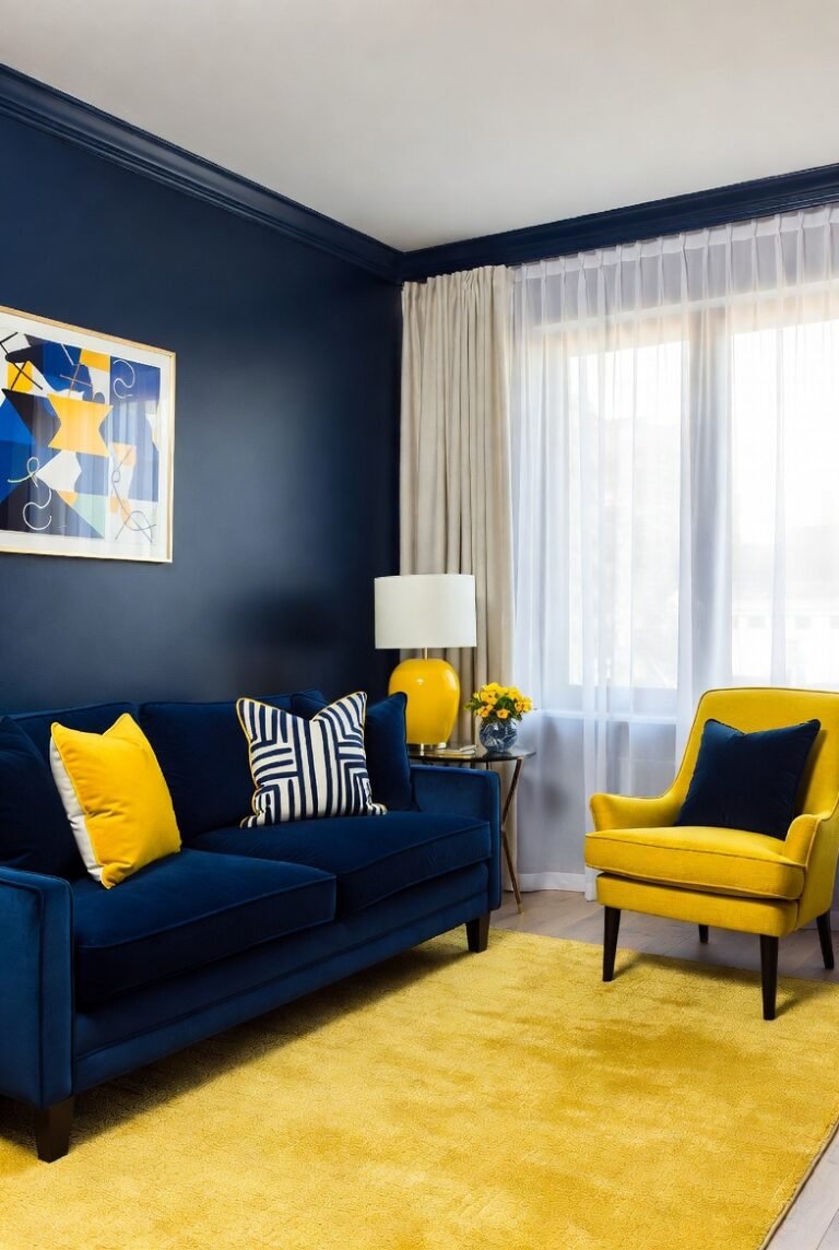
3) Red and Navy Blue – sophisticated and strong
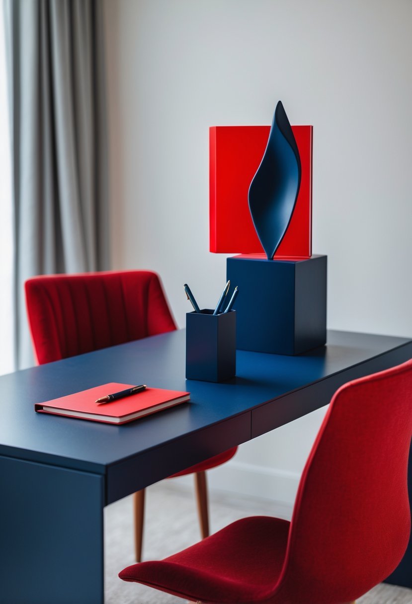
I find red and navy blue create a balanced and refined look in interior design. Navy’s deep, calming tone grounds the boldness of red, preventing it from overwhelming a space.
This combination works well in living rooms or offices where a sense of strength and elegance is desired. Adding white or neutral accents can soften the contrast and keep the palette cohesive.
In my experience, using navy and red together emphasizes sophistication without sacrificing warmth or character.
4) Red and Gold – luxurious and warm
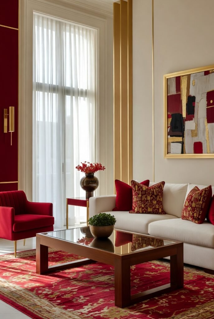
I find red and gold create a sophisticated, warm atmosphere in any room. The richness of red paired with gold accents brings a subtle luxury without overwhelming the space.
Using gold details like lamps or frames can elevate red’s intensity, making the room feel elegant yet cozy. To keep the balance, I often add neutral tones, such as beige or white, to soften the boldness and maintain harmony.
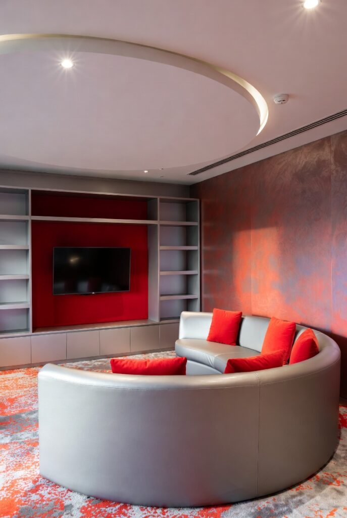
5) Red and Gray – modern and balanced
I find red and gray to be a striking combination in interior design. The warmth of red contrasts well with the cool neutrality of gray, creating a balanced look.
This pairing works perfectly in contemporary spaces where you want energy without overwhelming intensity. Gray tones provide a sophisticated backdrop, allowing red accents to stand out.
Whether used in furniture, walls, or decor, the mix of red and gray adds depth and a modern edge to any room. It’s a versatile scheme that feels both lively and controlled.
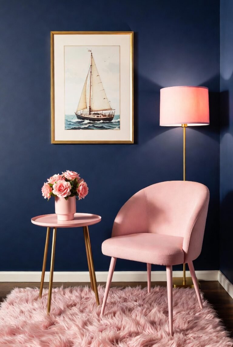
6) Red and Pink – vibrant and playful
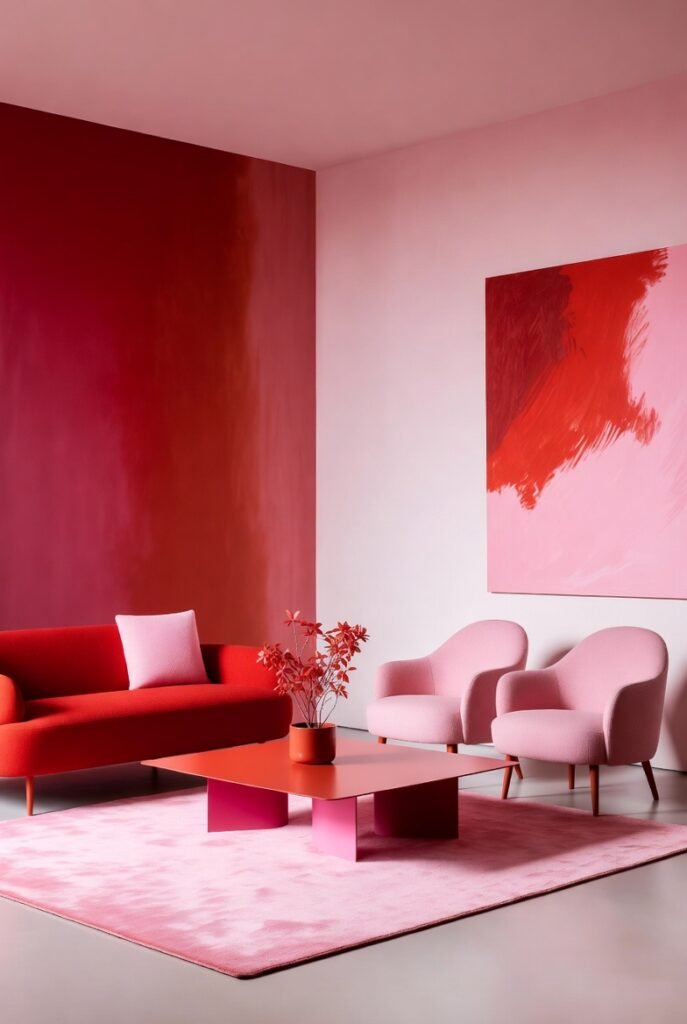
I find the combination of red and pink adds a lively and playful energy to interior spaces. These adjacent hues on the color wheel create a warm, dynamic contrast that can brighten any room.
In my experience, pairing red and pink with neutral tones like white or beige helps balance the vibrancy. This blend works well in living rooms or bedrooms where you want a bold yet inviting atmosphere.
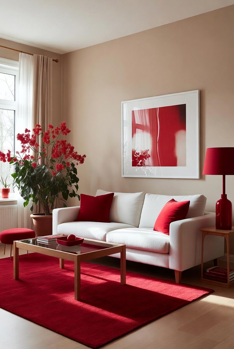
7) Red and Beige – soft and neutral
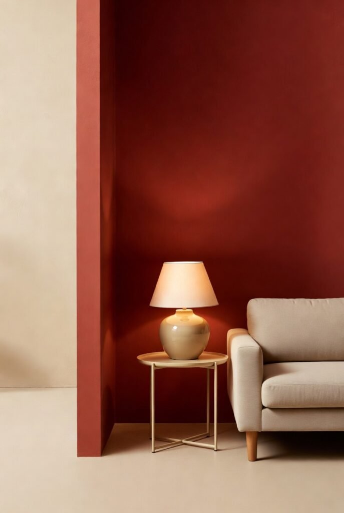
I find red and beige to be a balanced duo in interior design. Beige acts as a soft, neutral backdrop that tones down red’s intensity without dulling its warmth.
Using beige alongside red creates a cozy and inviting space. The combination feels natural and calming, making it versatile for many room styles.
Beige’s subtlety helps red stand out without overwhelming. This mix allows me to bring energy to a room while keeping it grounded and comfortable.
8) Red and Emerald Green – rich and dramatic
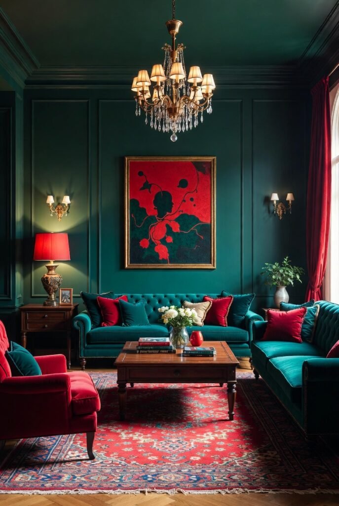
I find the combination of red and emerald green striking for creating rich, dramatic interiors. Emerald green’s deep, jewel tone balances the bold intensity of red, making spaces feel sophisticated yet vibrant.
In my experience, using emerald green on larger surfaces like walls or sofas works well. I then add red in smaller accents—pillows, rugs, or artwork—to keep the look balanced without overwhelming the room.
This pairing feels luxurious and can evoke a timeless elegance when paired with plush textures like velvet or silk. It’s a powerful duo for statement spaces.
9) Red and Turquoise – bright and energetic
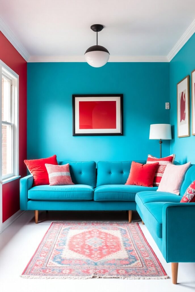
I find red and turquoise to be a striking combination in interior design. The boldness of red contrasts well with the soothing quality of turquoise, creating a balanced yet lively space.
This pairing works best in areas where energy is welcome, like kitchens or living rooms. Adding white accents can keep the look fresh and prevent it from feeling overwhelming.
Using turquoise alongside red introduces a playful, modern vibe. It brightens the room while maintaining a clean, inviting atmosphere.
10) Red and Purple – deep and regal
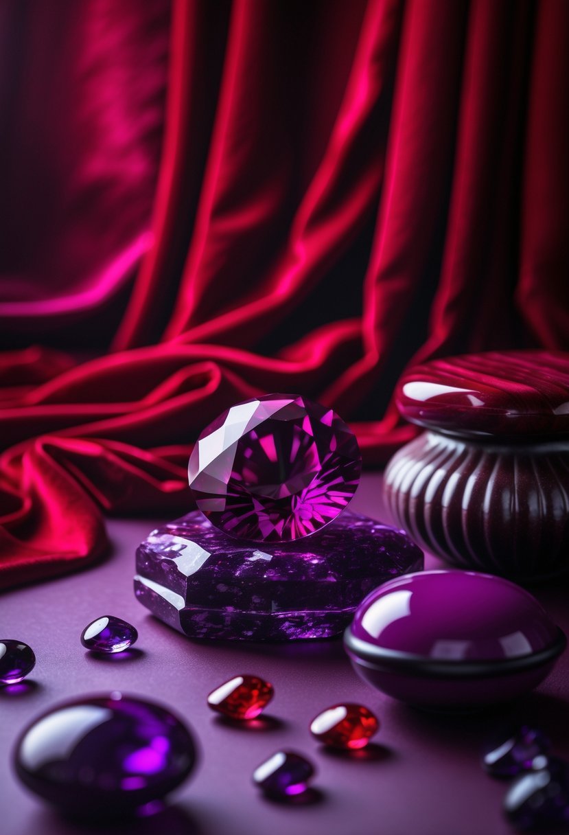
I find the combination of red and purple creates a bold, sophisticated atmosphere in interior design. This pairing blends the energy of red with the calm richness of purple, perfect for accent walls or statement pieces.
Using deep reds with royal purples can add warmth and luxury to living rooms or bedrooms. I like balancing these colors with neutral tones to avoid overwhelming the space while keeping the regal vibe intact.
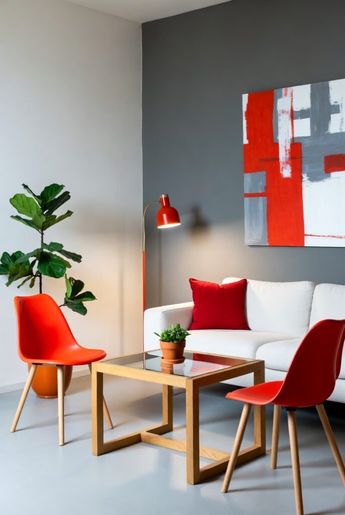
11) Red and Orange – fiery and dynamic
I find red and orange to be a bold choice in interior design, delivering a vibrant and energetic atmosphere. These colors work well together because they share warm undertones but still offer enough contrast to keep a space visually interesting.
When used thoughtfully, this duo can stimulate creativity and warmth. I often recommend it for areas like creative studios or social spaces where energy and enthusiasm are desired. Balancing these colors with neutral tones helps prevent overwhelming the room.
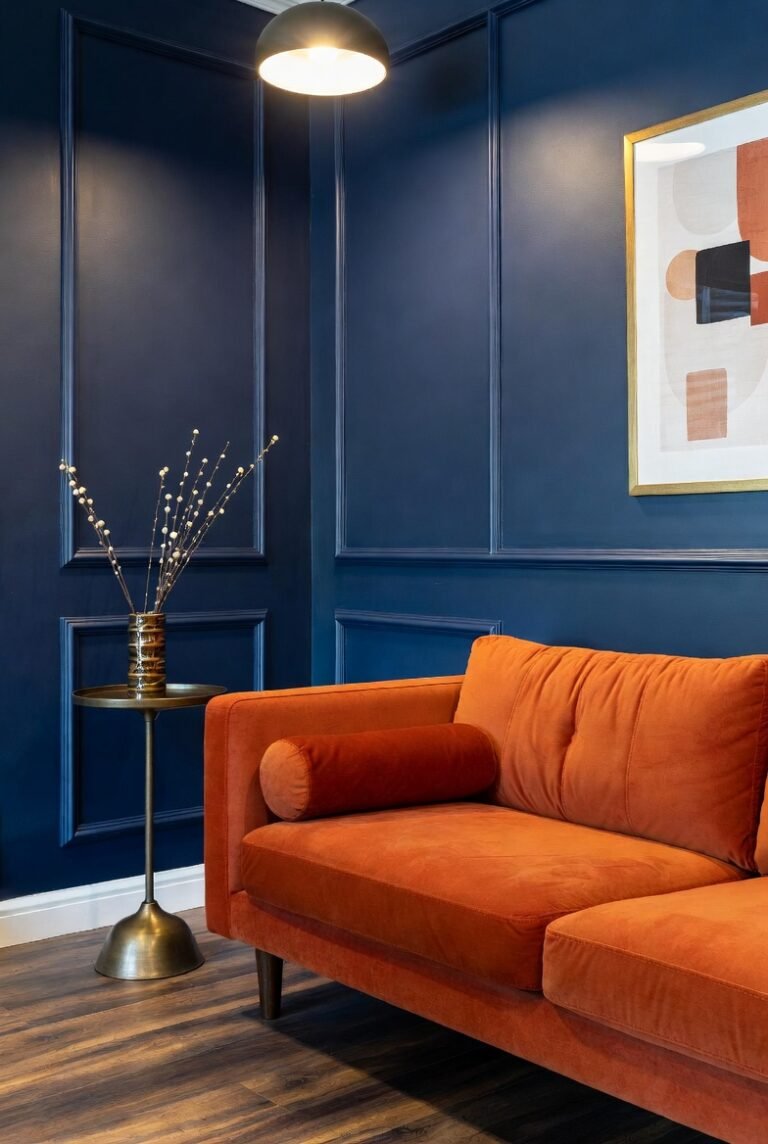
12) Red and Brown – earthy and grounded
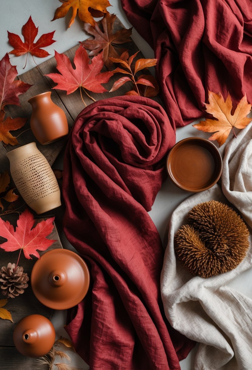
I find red and brown to create a warm, earthy color scheme that feels very natural in interior design. The deep tones of brown balance the vibrancy of red, making spaces feel both inviting and stable.
When using this combination, I prefer mixing rich browns like mahogany with muted reds, such as brick or rust. This pairing works well in living rooms or offices where a grounded, comfortable atmosphere is desired.
13) Red and Silver – sleek and contemporary
I find red and silver to be a striking combination in interior design. The boldness of red contrasts sharply with the cool, reflective quality of silver, creating a modern and polished look.
This pairing works well in spaces where you want a clean, contemporary vibe. Silver accents, like metallic fixtures or furniture legs, add sophistication without overwhelming the red.
Using silver tones softens red’s intensity, balancing warmth with sleekness. It’s a suitable scheme for living rooms, kitchens, or even offices aiming for a stylish edge.
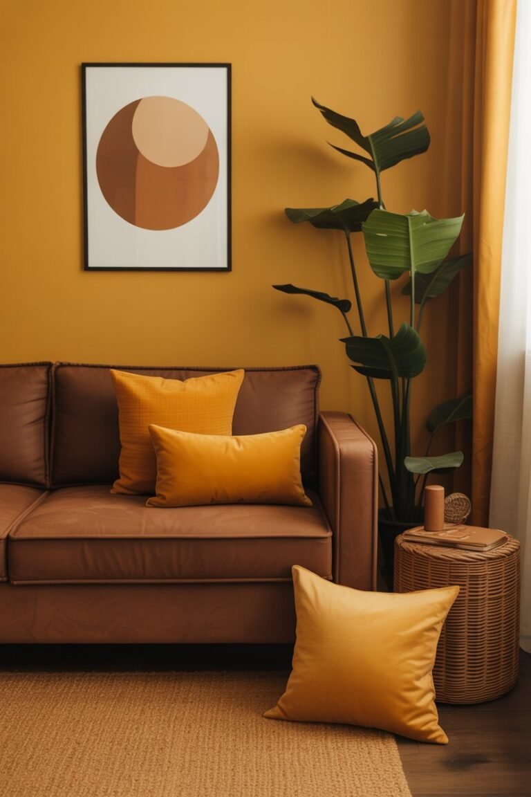
14) Red and Mustard Yellow – retro and cheerful
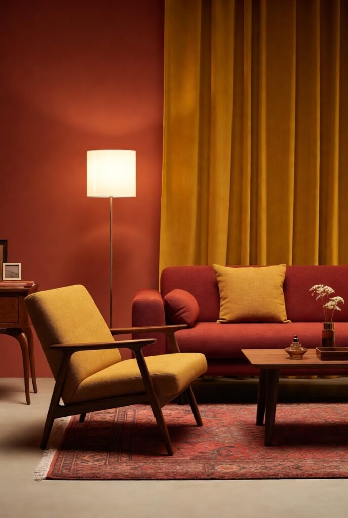
I find the combination of red and mustard yellow adds a distinct retro vibe to interiors. This pairing works well to create a warm and cheerful atmosphere without overwhelming a space.
Mustard yellow’s muted warmth balances red’s intensity, making the colors feel both bold and inviting. It’s a versatile scheme, especially effective when used with vintage furniture or textured fabrics.
In my experience, using mustard yellow as accents—like cushions or curtains—against red walls or upholstery gives the room character without feeling dated. It’s a classic look with a fresh energy.
15) Red and Teal – balanced and cool
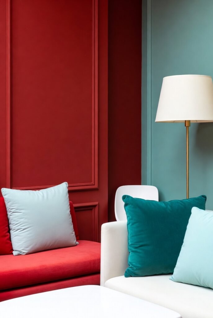
I find the combination of red and teal striking for interior design. The warm intensity of red contrasts well with the cool undertones of teal, creating balance.
In a room, teal cushions or accents can soften bold red furniture or walls. This mix feels both vibrant and calming, avoiding overwhelming the space.
Adding white or neutral elements enhances this scheme, making it inviting without losing energy. It’s a versatile palette that works in various styles, from modern to eclectic.
16) Red and Lavender – soft and unexpected
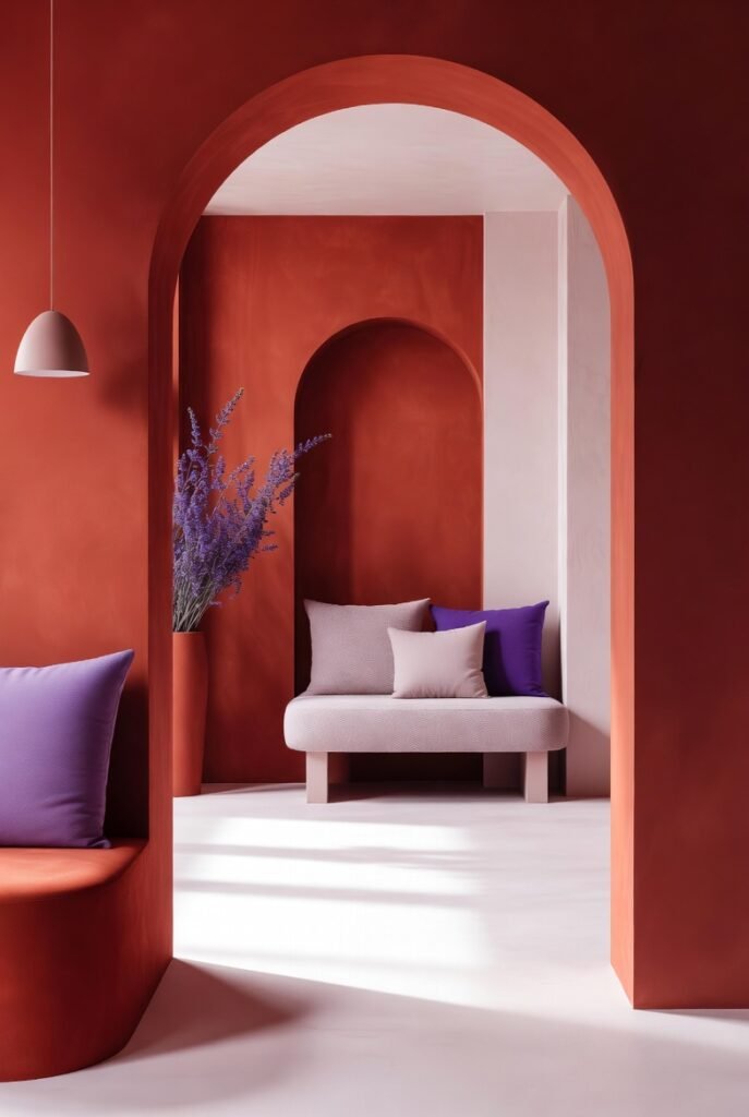
I find red and lavender to be a surprisingly soothing combination in interior design. The boldness of red balances well with the gentle, calming tone of lavender.
Using lavender softens the intensity of red, creating a space that feels vibrant yet relaxed. This pairing works especially well in living rooms or bedrooms where a subtle touch of drama is desired without overwhelming the senses.
In my experience, incorporating lavender accents—such as cushions or curtains—against red walls or furniture brings unexpected harmony to a room.
17) Red and Olive Green – natural and muted
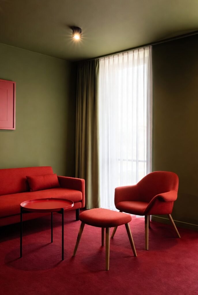
I find red paired with olive green creates a grounded, natural look in interior design. Olive green’s earthy tone softens red’s intensity, making the combination balanced and inviting.
This palette works well in spaces where a calm, organic atmosphere is desired. Adding neutrals like tan or beige can enhance the muted, nature-inspired feel.
In my experience, the contrast between red and olive green adds depth without overwhelming a room. It’s perfect for adding warmth with subtle sophistication.