17 Colors That Go With Gray for Stylish and Versatile Design Choices
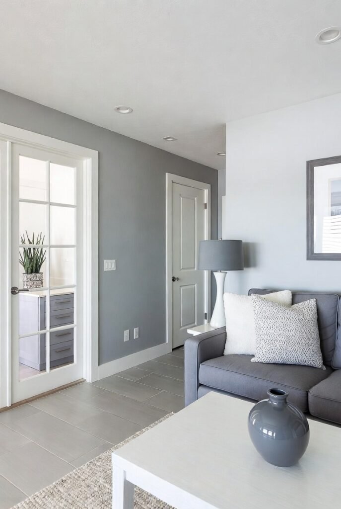
Gray is a versatile color that serves as a solid foundation for many interior design schemes. Its neutrality allows it to blend seamlessly with a wide range of colors, making it suitable for various styles from modern to rustic.
Understanding which colors complement gray can help create balanced and appealing spaces in any room. Knowing how to combine gray with other hues is key to achieving the right mood and aesthetic in your home.
1) Classic White
I often pair gray with classic white to create a clean and timeless look. White brightens spaces and balances gray’s cooler tones, making rooms feel open and fresh.
Using white alongside various shades of gray works well in modern and traditional interiors. This combination suits walls, furniture, and decor, offering a neutral but elegant backdrop.
In my experience, layering different textures in gray and white adds depth without overwhelming the simplicity. It’s a reliable choice for a calm, minimalist aesthetic.
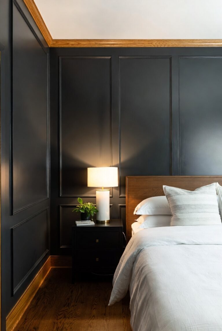
2) Charcoal Black
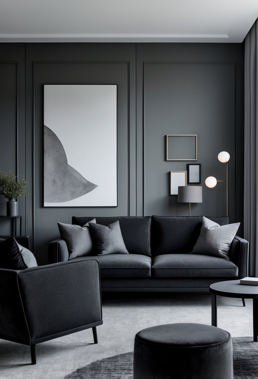
I find charcoal black to be a powerful choice when pairing with gray. It creates a monochromatic scheme that feels modern and sophisticated.
Using charcoal black alongside lighter grays adds depth without overwhelming a space. This pairing works well in living rooms or bedrooms where a sleek, understated look is preferred.
In my experience, balancing these tones with white or soft accents prevents the room from feeling too dark or heavy. It keeps the overall design clean and contemporary.
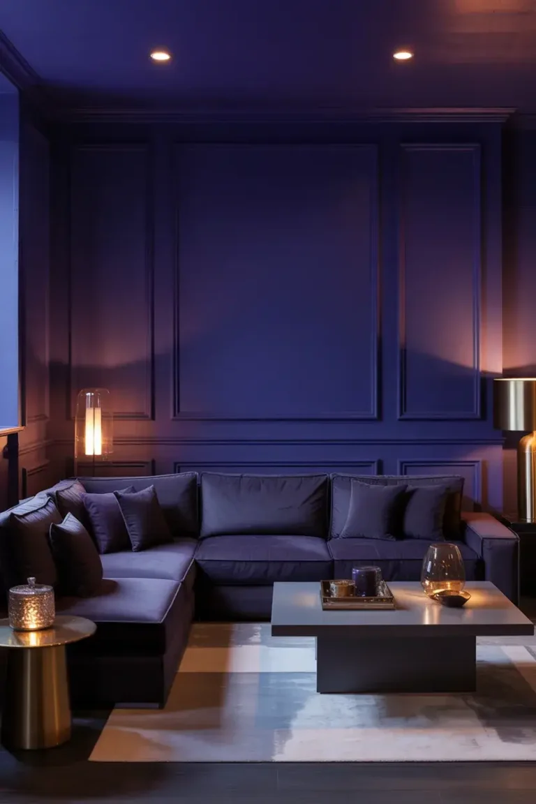
3) Navy Blue
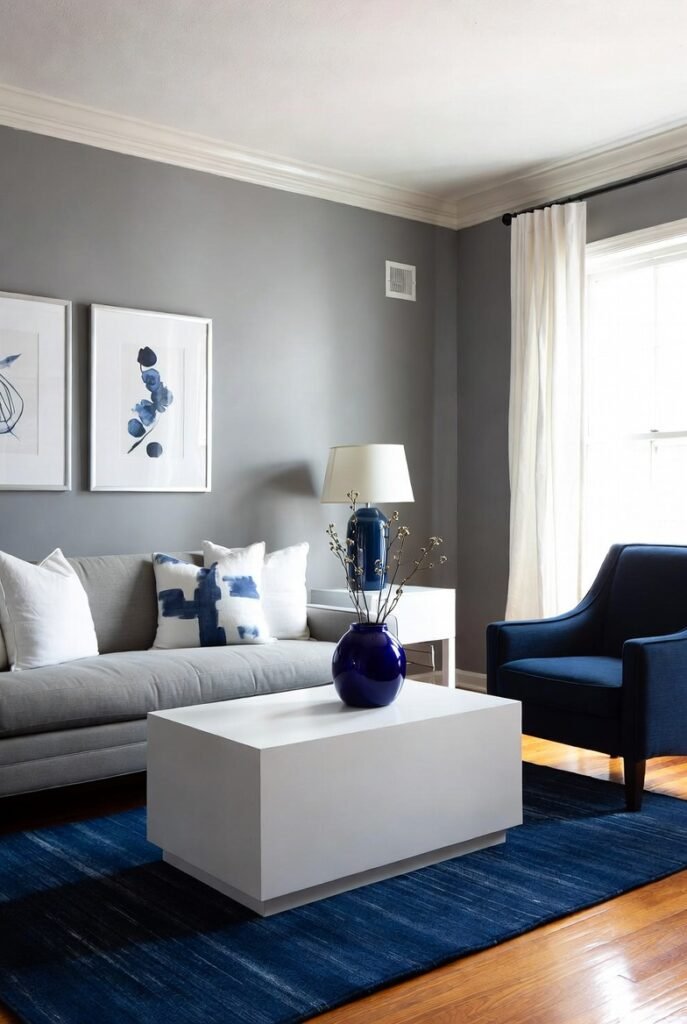
I find navy blue to be a sophisticated choice when paired with gray. It adds depth and contrast without overwhelming the space.
In interior design, navy brings a classic yet modern feel, balancing well with both light and dark gray tones. The combination creates a calm, grounded atmosphere suitable for living rooms or bedrooms.
Navy also works beautifully with gray in various styles—from coastal to contemporary. It allows for flexibility with accent colors like white or gold to brighten the overall palette.
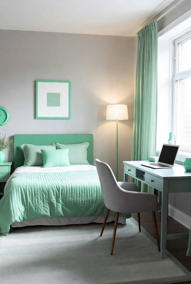
4) Soft Pink
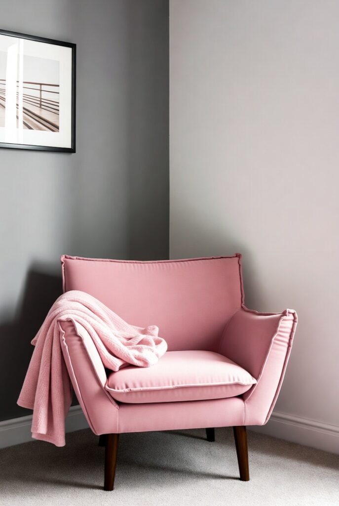
I find soft pink pairs effortlessly with gray, creating a delicate balance between warmth and neutrality. This combination works well in bedrooms or living spaces where I want a calm, inviting atmosphere.
Soft pink adds a subtle touch of femininity without overpowering the space. When paired with light or dark gray walls, it provides depth and a modern edge.
In my experience, incorporating plush pink accents like cushions or chairs against gray backgrounds brings both contrast and cohesion to a room.
5) Mustard Yellow
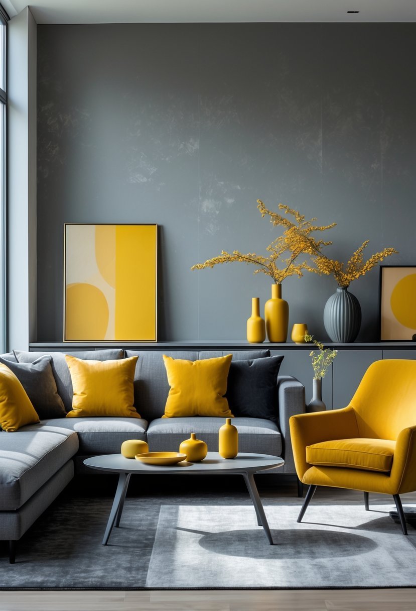
I find mustard yellow brings a warm, vibrant energy when paired with gray. The neutral tones of gray balance the boldness of mustard, creating a sophisticated contrast that works well in living rooms or offices.
Using mustard yellow as an accent—through pillows, rugs, or artwork—adds depth without overwhelming the space. For larger areas like walls or sofas, I prefer sticking to softer gray shades to maintain calmness while letting the mustard pop.
6) Emerald Green
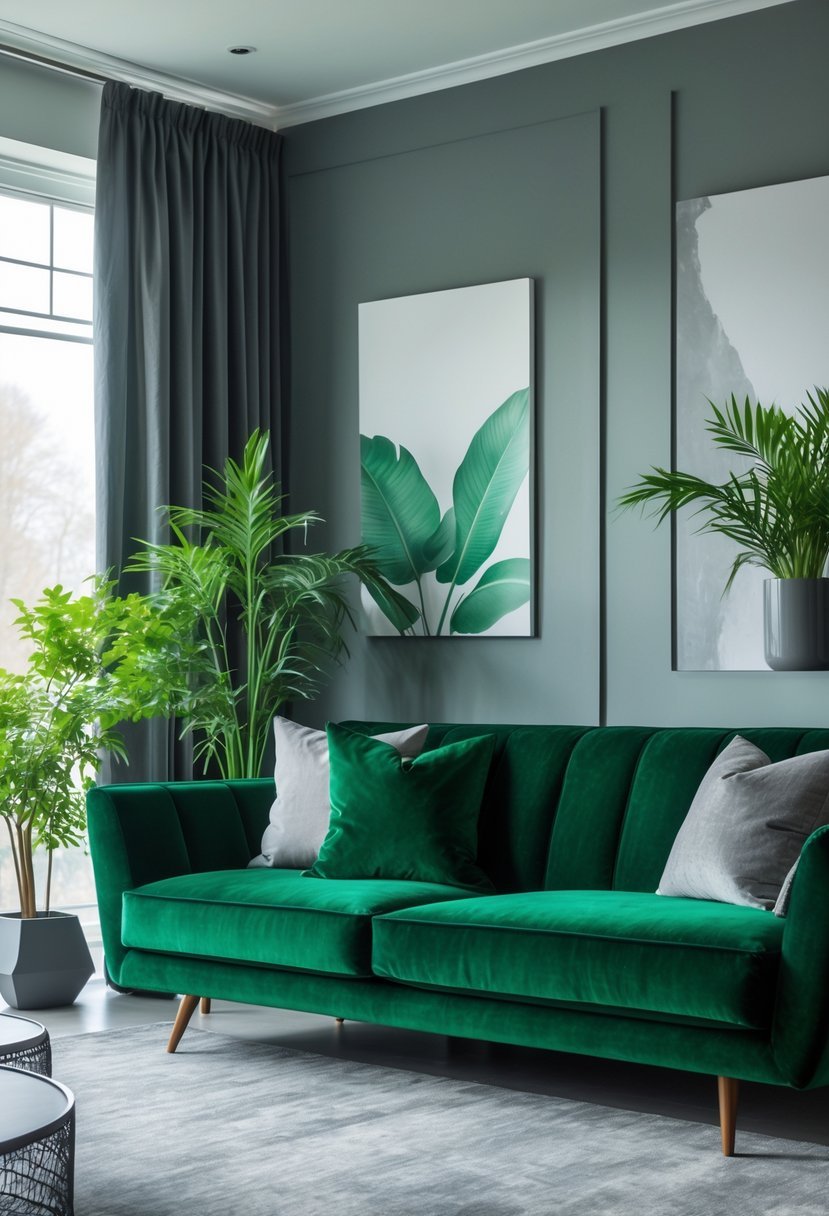
I find emerald green pairs exceptionally well with gray, creating a sophisticated and modern look. The richness of emerald green adds depth, while gray tones balance it with a neutral calm.
Using emerald as an accent in furniture or décor against gray walls can elevate the space. Adding wood or textured fabrics helps soften the contrast and bring warmth to the room.
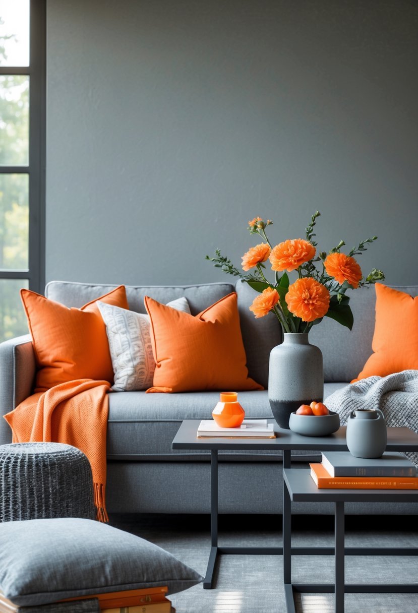
7) Burnt Orange
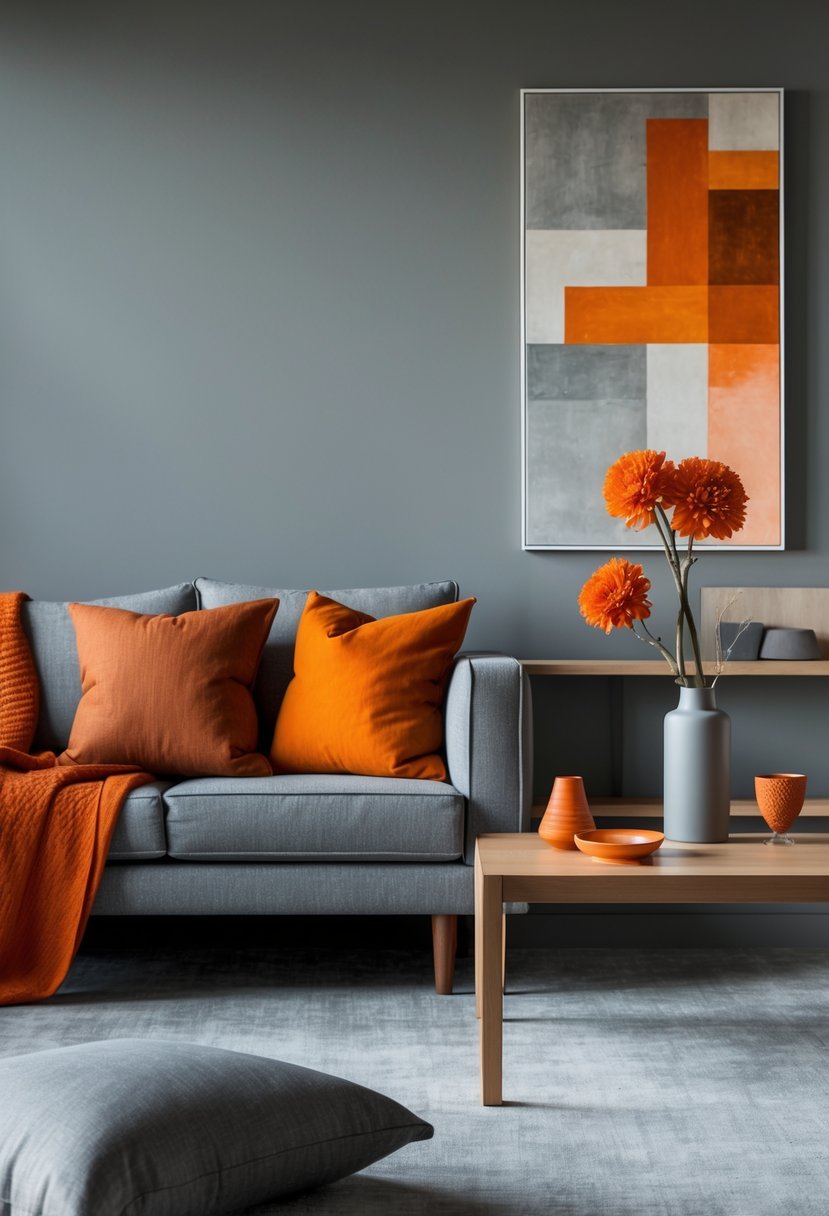
I find burnt orange adds warmth and energy to gray interiors without overwhelming the space. It works well with mid-tone or dark gray shades, creating a balanced, inviting atmosphere.
In my experience, using burnt orange on accents like pillows, rugs, or artwork introduces a subtle pop of color that complements gray’s neutrality. This pairing suits living rooms and creative spaces where warmth and style are important.
8) Cerulean Blue
I find cerulean blue pairs beautifully with shades of gray in interior design. The cool, calming tone of cerulean adds depth without overpowering a neutral palette.
Using cerulean blue with light to medium grays creates a balanced, sophisticated look. It works well in living rooms or bedrooms where a peaceful atmosphere is key.
For contrast, I sometimes add warmer accents like coral or gold to complement cerulean, enhancing the overall vibrancy while keeping the gray grounded.
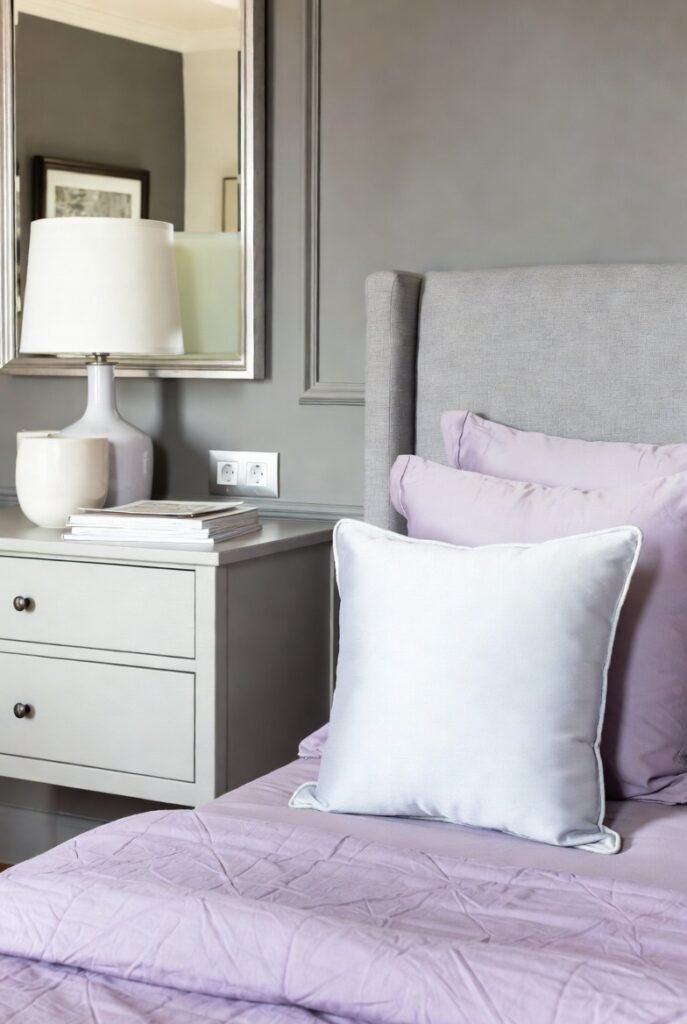
9) Lilac
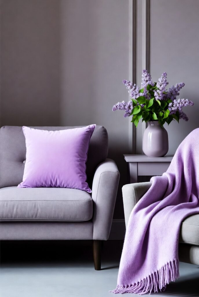
I find lilac pairs beautifully with gray in interior design. The soft, muted tones of lilac add a gentle pop against the neutral backdrop of gray. This combination creates a calming and elegant atmosphere.
Lilac’s subtle warmth can balance gray’s coolness, making spaces feel inviting without overwhelming. I often use lilac accents like cushions or rugs to soften a room dominated by gray walls or furniture.
This pairing works well in bedrooms or living rooms where a peaceful, harmonious color scheme is desired.
10) Cherry Red
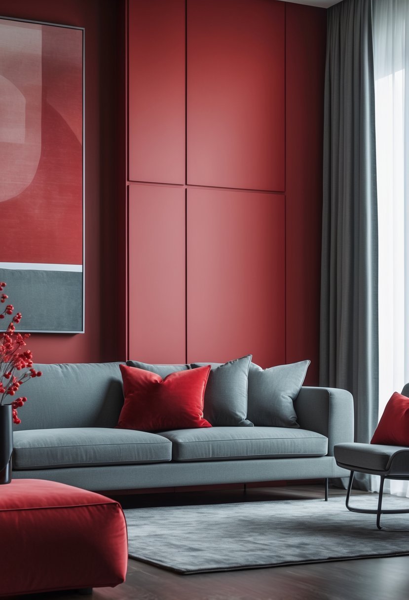
I find cherry red pairs beautifully with gray in interior design. The combination creates a dynamic contrast that adds warmth without overwhelming the space.
Using cherry red accents, like cushions or artwork, against gray walls brings energy and sophistication. It works well in living rooms or dining areas where you want a bold yet balanced look.
I often recommend soft grays to complement cherry red, as they tone down the intensity while keeping the overall feel modern and inviting.
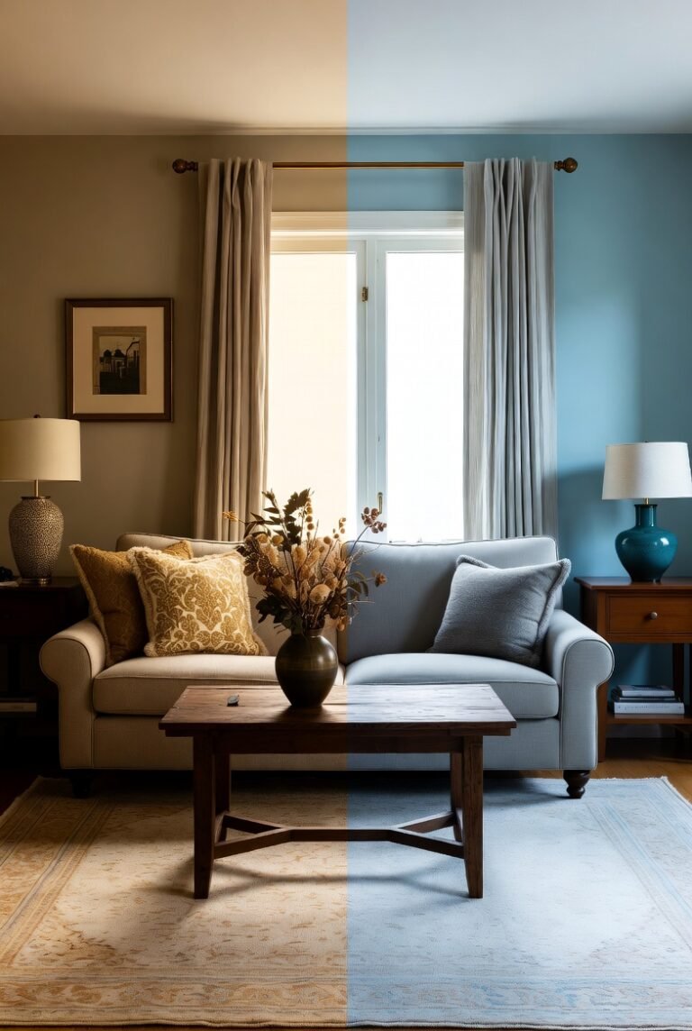
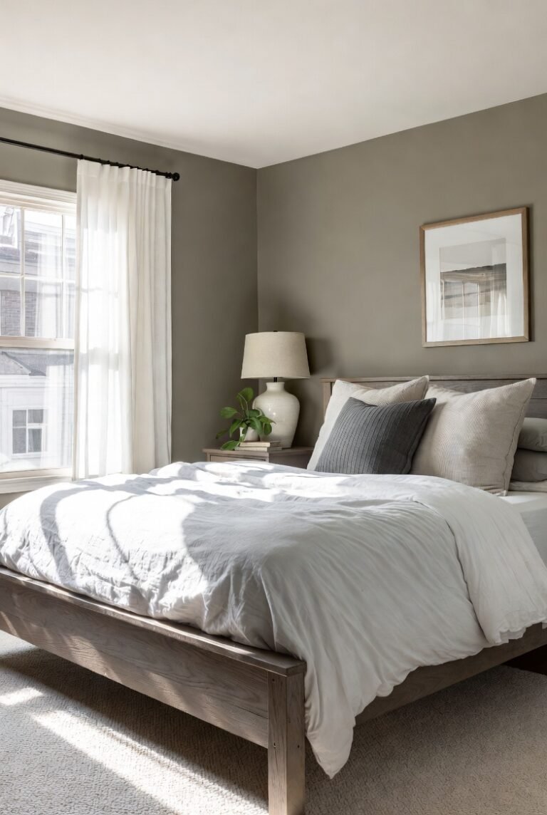
11) Warm Beige
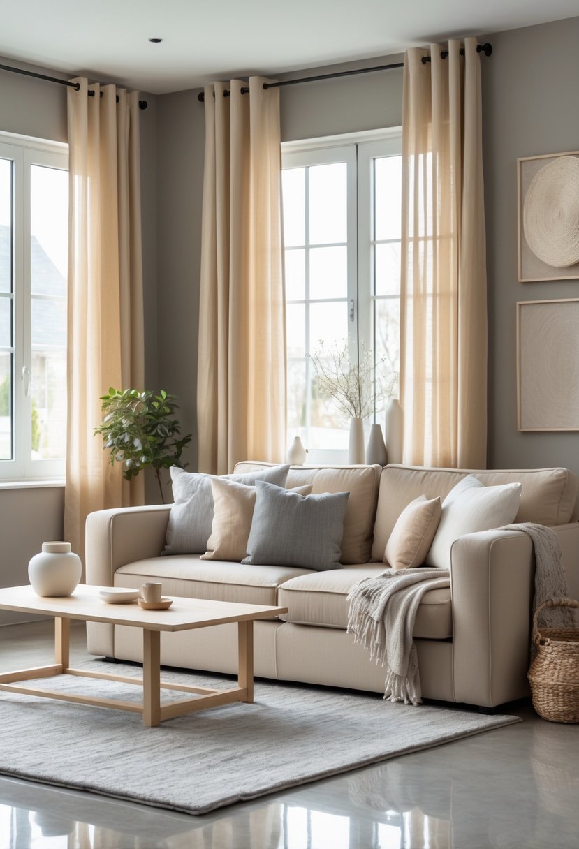
I find warm beige pairs beautifully with gray, creating a balanced and inviting color scheme. The warmth of beige softens gray’s cooler tones, adding a sense of comfort and coziness.
Using lighter warm beige shades can modernize a space, while deeper beiges introduce a classic, grounded feel. This combination works well in living rooms and bedrooms, where a calm atmosphere is desired.
12) Teal
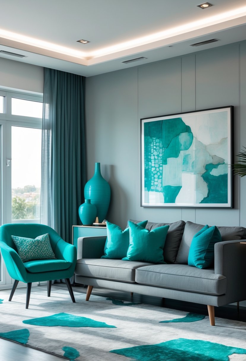
I find teal pairs exceptionally well with gray in interior design, creating a balanced and sophisticated look. The cool, blue-green hue of teal adds depth without overwhelming the neutrality of gray.
Teal works both as a bold accent or a main color alongside gray, helping spaces feel modern yet inviting. I often use it with textured fabrics or matte finishes to enhance subtle contrasts.
Together, teal and gray offer versatility. Whether aiming for a calming atmosphere or a vibrant edge, this combination adapts smoothly to different styles.
13) Tangerine
I find tangerine adds a vibrant, warm contrast to gray’s neutrality. It livens up a space without overwhelming it, especially when paired with softer grays.
Using tangerine as an accent color—through cushions or artwork—can create an inviting, energetic vibe. It works well in living rooms or kitchens where a pop of color is needed to energize the atmosphere.
14) Pale Silver
I find pale silver to be an elegant choice when pairing with gray. Its subtle metallic sheen adds a touch of softness without overpowering the room.
Using pale silver alongside gray creates a layered, sophisticated look. It works well in spaces where you want a calm, reflective atmosphere, especially with light or mid-tone grays.
This combination is versatile enough for modern or classic interiors. I often suggest adding textured fabrics or simple metallic accents to enhance the depth pale silver brings.
15) Rich Burgundy
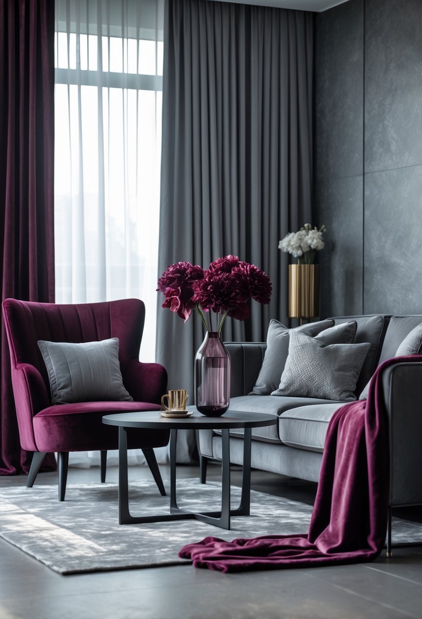
I find rich burgundy pairs beautifully with gray in interior design. The deep, warm tone of burgundy adds depth and sophistication to the cool neutrality of gray.
Using burgundy accents in pillows, rugs, or artwork can create a balanced and inviting space. It works well in both modern and traditional rooms, providing a touch of elegance without overwhelming the overall palette.
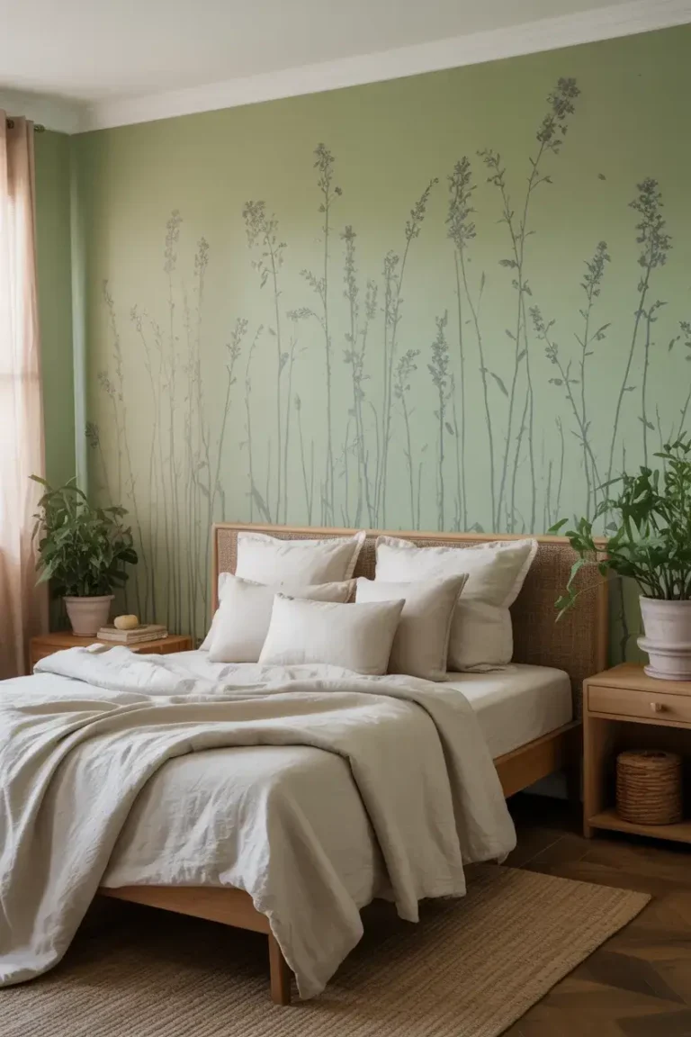
16) Olive Green
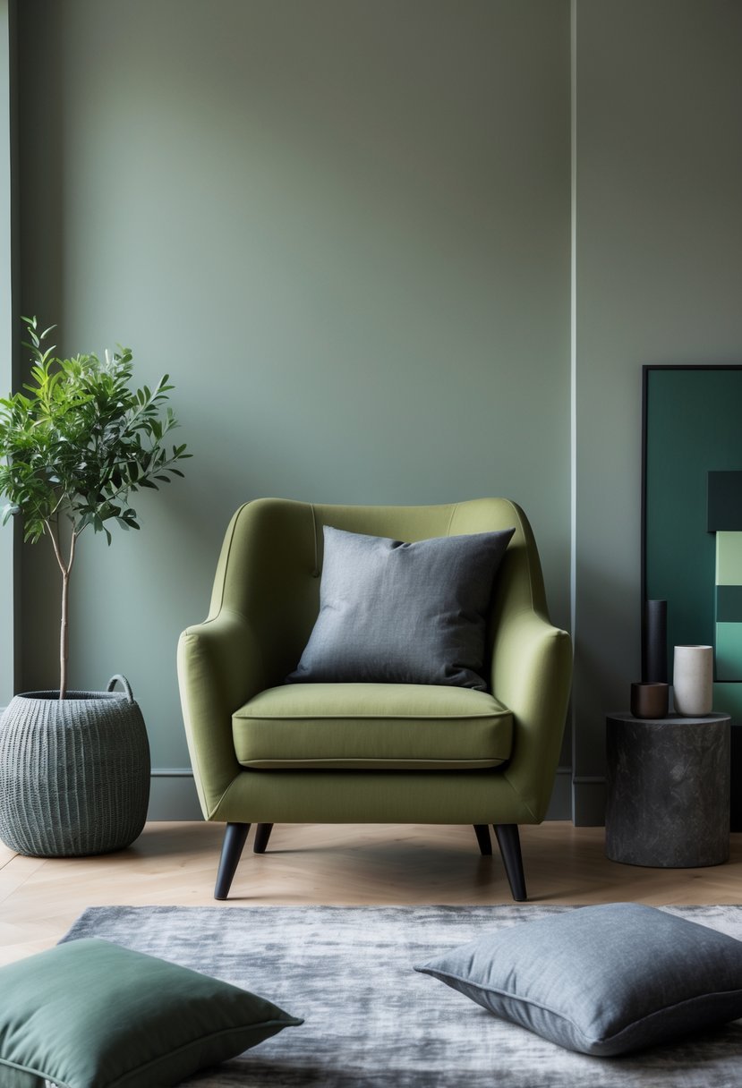
I find olive green to be a versatile choice when paired with gray. Its muted, earthy tone adds natural warmth and depth to gray interiors without overpowering the space.
In my experience, cool olive greens work best with grays that have blue or green undertones. Lighter gray walls paired with deeper olive furnishings create a balanced, sophisticated look.
Olive green also suits both modern and rustic styles, making it easy to incorporate whether you want a subtle accent or a bold statement.
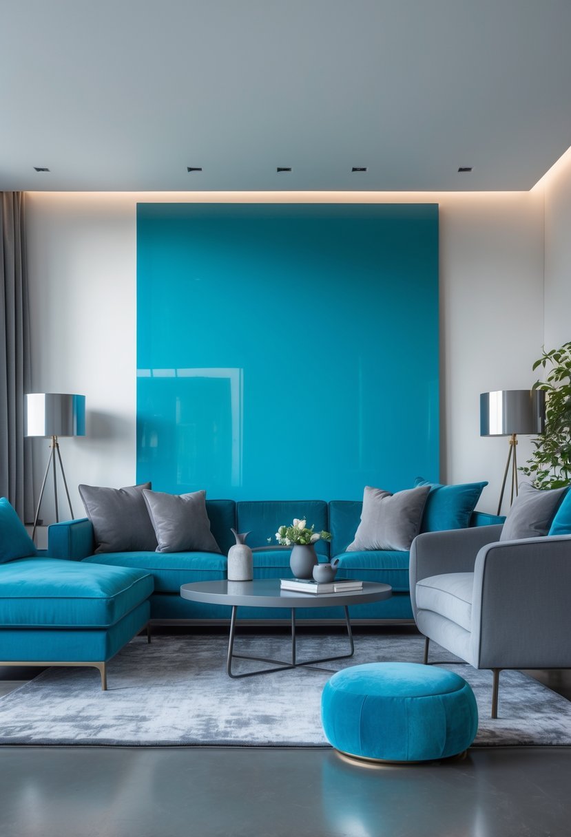
17) Turquoise
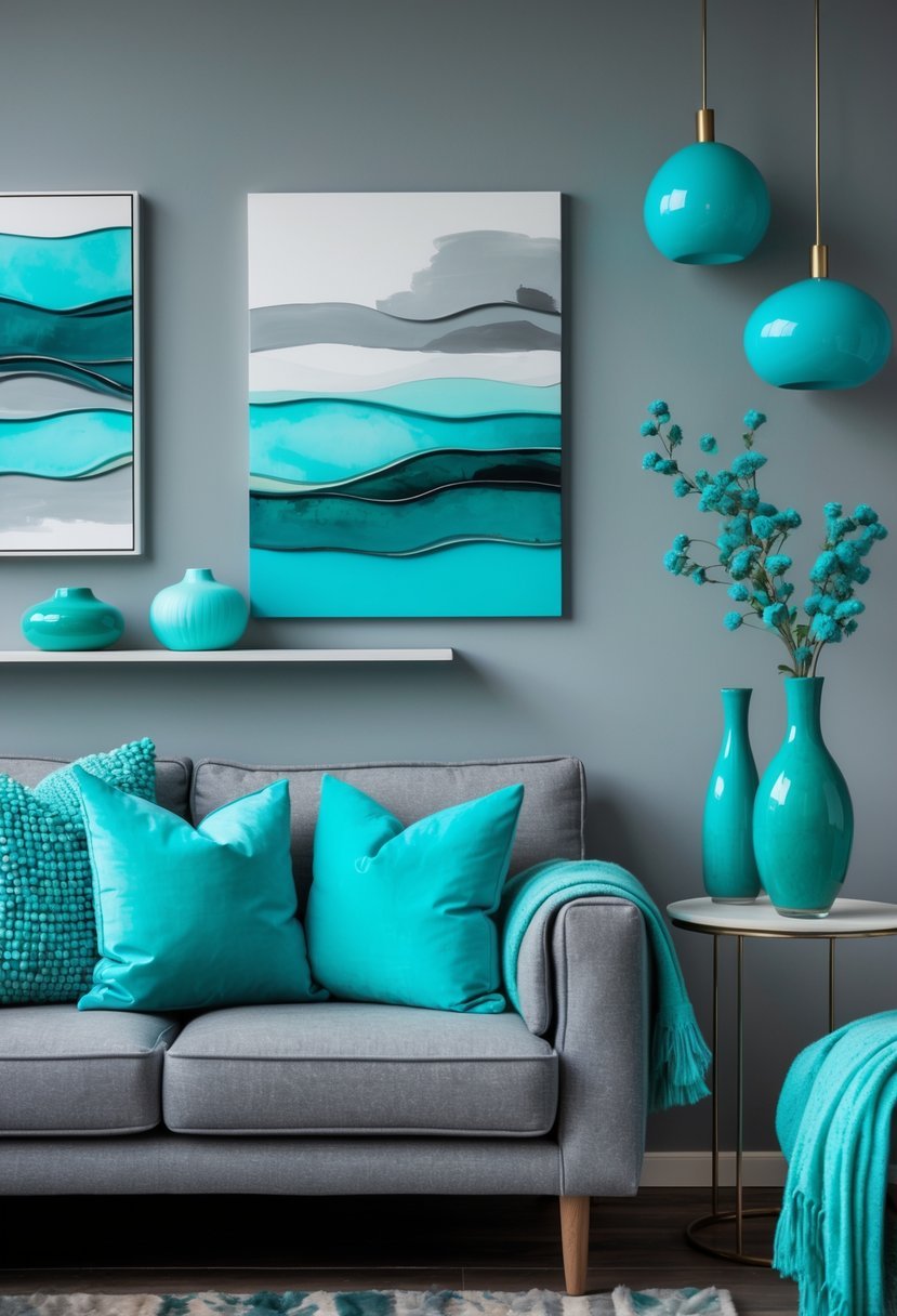
I find turquoise pairs exceptionally well with gray in interior design. The coolness of gray balances the vibrancy of turquoise, creating a stylish and fresh atmosphere.
Using turquoise accents, like cushions or artwork, can add a lively touch without overwhelming the space. The combination works in modern or transitional rooms, providing both energy and calm.
Choosing the right gray undertone matters; cooler grays enhance turquoise’s brightness, while warmer grays create a softer, muted effect. This pairing invites creativity in both bold and subtle designs.