How to Make Gray Paint: Methods, Shades, and Expert Tips
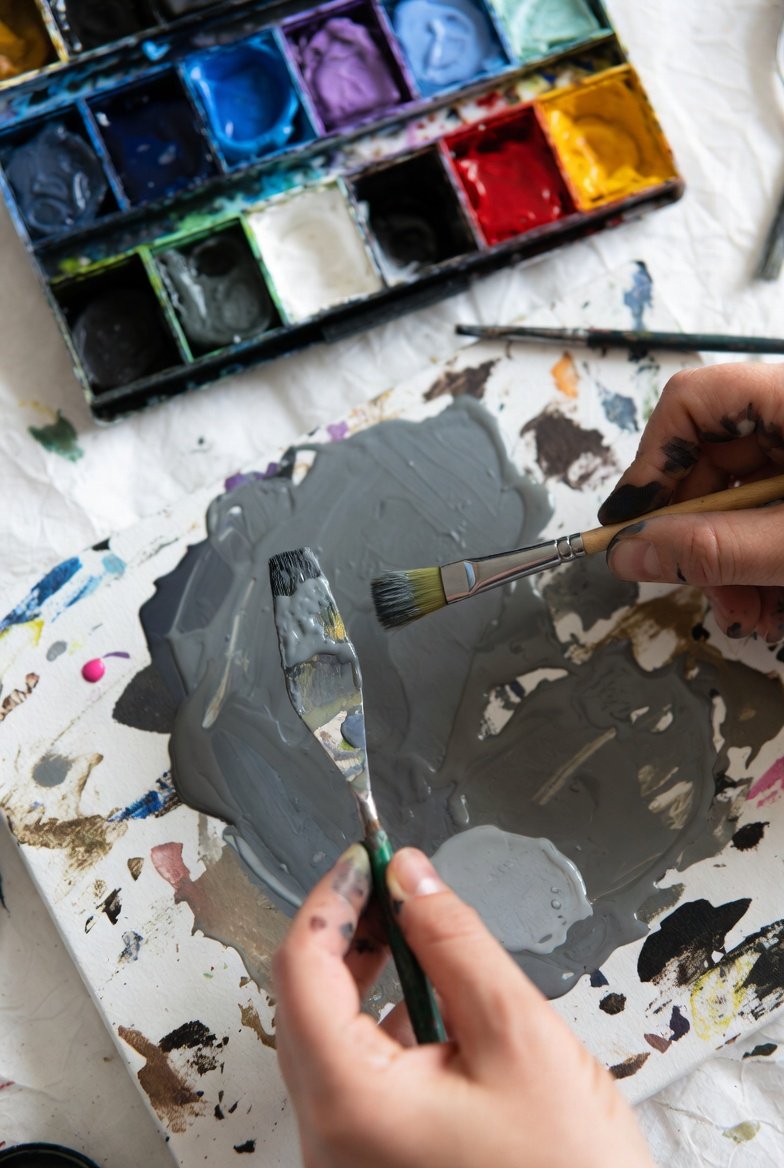
Making gray paint is simpler than many expect. To create a basic gray, mix equal parts of black and white paint. Adjust the ratio to lighten or darken the shade depending on the desired look. This straightforward method provides a reliable foundation for any project needing neutral tones.
Gray paint can also be customized by incorporating complementary or primary colors. Adding colors like blue, red, or yellow shifts the gray toward cooler or warmer tones, giving it subtle undertones that add depth and personality. This approach allows for more creative control over the final shade.
Understanding how to make gray paint this way opens many possibilities for both art and design. Whether mixing a versatile neutral or experimenting with layered hues, having the knowledge to create tailored grays supports a range of projects from interior walls to fine artwork.
Essential Methods for Making Gray Paint
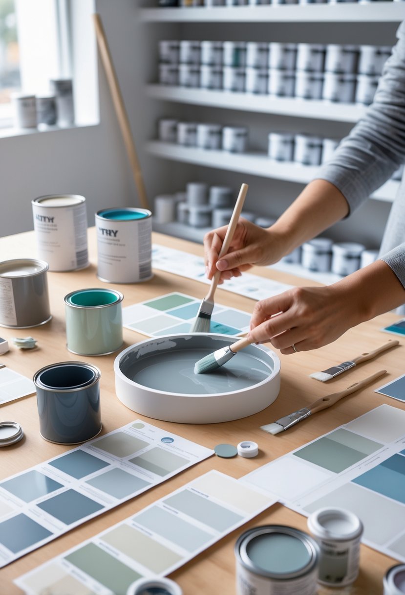
Gray paint can be created through several reliable techniques, each yielding different tones and characteristics. The main approaches involve using black and white for simple grays, blending complementary colors for more natural hues, or mixing primary colors for custom shades with subtle undertones.
Mixing Black and White for Neutral Gray
Mixing black and white paint is the most straightforward way to achieve a neutral gray. White paint acts as the base, with black added gradually to darken the mixture. The ratio controls the shade: more white produces light grays, while more black results in deeper tones.
To ensure a consistent color, small increments of black should be added and stirred thoroughly. Using a color reference during this process helps match the desired shade. This method creates a balanced gray that lacks strong warm or cool undertones, making it versatile for any environment.
Using Complementary Colors
Complementary colors sit opposite each other on the color wheel—such as red and green, blue and orange, or yellow and purple. Mixing these pairs produces gray tones with more natural and complex hues than simple black-and-white mixes.
The outcome depends on the balance of the pair. For example, more red in a red-green mix can add warmth, while more green shifts it cooler. This technique allows control over subtle color temperature shifts, creating gray paint that harmonizes better with specific color schemes.
Blending Primary Colors for Gray
Primary colors—red, yellow, and blue—combine to form gray or brown depending on proportions. By adjusting these amounts carefully, one can make gray paint with tailored warm or cool undertones.
A common approach is to mix blue and red first to get a purple base, then add yellow to neutralize and lighten the tone. More blue can create cool grays; more red or yellow will warm it up. Adding white manages the lightness, while small additions of black deepen the shade. Testing in small batches is essential to replicate the perfect gray tone consistently.
Adjusting the Shade: Light, Dark, and Everything In Between
Adjusting gray paint involves manipulating the balance between black and white, as well as fine-tuning the tone with subtle color additions. This process allows for a wide range of grays, from soft light grays to deep dark grays, each created by precise blending and consistent ratios.
Making Light Gray and Tints
To produce a light gray, the painter begins with a base mix of titanium white and black paint, favoring titanium white significantly. Adding large amounts of white reduces the intensity of the black, resulting in a pale, airy gray that retains neutrality. This type of light gray works well as a background color or a soft shade for subtle accents.
For tints, white is added not only to lighten the base gray but also to create variations like pastel grays. Slight touches of burnt sienna or ultramarine blue can warm or cool the tint respectively without overpowering the lightness. Testing small batches ensures control over color shifts and prevents the shade from becoming too diluted.
Creating Dark Gray and Shades
Dark gray is achieved by increasing the proportion of black paint relative to white, moving toward shades like charcoal gray. Careful addition of black produces deeper, richer grays with more visual weight. Dark grays are suitable for dramatic contrasts or grounding elements in a project.
To deepen these shades further without making the gray look flat, painters may add hints of complementary colors or earth tones such as burnt sienna. This addition introduces warmth or complexity, preventing the color from appearing dull. Gradual mixing allows for precise control over darkness and undertone intensity.
Balancing Proportions and Intensity
Maintaining the right balance in gray paint starts with consistent measurement of black and white. Keeping a record of exact ratios helps to replicate a desired shade on subsequent mixes. Small adjustments to black or white can dramatically alter the value, so incremental changes are key.
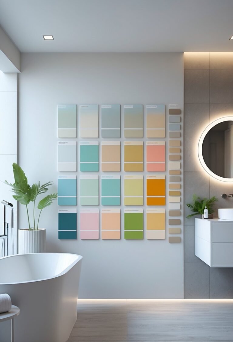
Intensity can also be managed through the addition of subtle undertones. For example, including a tiny amount of burnt sienna or ultramarine may shift a neutral gray toward warm or cool, respectively. Testing paint samples under natural light ensures the gray’s appearance matches the intended atmosphere and avoids unexpected results once dry.
Choosing and Customizing Undertones
Selecting the right undertone is essential for crafting gray paint that suits a specific mood or setting. Adjusting undertones changes the perceived temperature and character of the gray, making it either cool, warm, or uniquely balanced. The following approaches show how to intentionally shift gray’s hue with precise color additions.
How to Achieve Cool Gray
Cool gray is characterized by subtle hints of blue, green, or purple. To create cool gray, one often adds small amounts of ultramarine blue or green-based pigments to the neutral gray mix of black and white. Ultramarine blue is particularly effective for lending a sleek, modern finish without overpowering the gray’s neutrality.
This type of gray works well in spaces seeking calmness or sophistication, such as bedrooms or offices. The cool undertones help the gray feel fresh and crisp, especially under natural or bright lighting. When mixing, it’s important to add color gradually, as too much blue can shift the gray toward an unwanted indigo or teal.
How to Create Warm Gray
Warm gray contains tinges of red, yellow, or brown. Adding subtle quantities of pigments like cadmium orange, red, or yellow can warm up an otherwise neutral gray base. These warm undertones produce a cozy and inviting atmosphere, ideal for living rooms and dining areas.
When mixing warm gray, it helps to start with a neutral gray and introduce small amounts of warm colors, carefully balancing so the gray remains dominant but carries warmth. This approach prevents the gray from looking muddy or overly tinted, preserving its versatility while enhancing room comfort.
Complementary Gray Variations
Complementary gray involves mixing pairs of colors opposite each other on the color wheel, such as ultramarine blue with cadmium orange. When combined, these colors neutralize each other, producing complex grays with subtle undertones that can be customized further.
This method broadens the tonal possibilities beyond simple black-and-white mixtures. For example:
- Blue and orange mixtures yield a cool gray with added vibrancy.
- Adjusting proportions can lead to grays that feel warmer or cooler depending on which complementary color dominates.
Experimenting with complementary colors offers a sophisticated way to develop grays with unique depth and personality tailored to specific design needs.
Tips for Consistent Mixing and Paint Quality
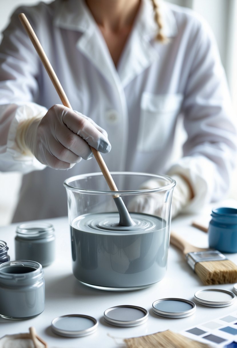
Achieving uniform gray paint requires precision in measuring and the right mixing tools. Consistency depends on careful ratio control and thorough blending to avoid uneven colors or streaks.
Measuring Ratios Accurately
Precise measurement of each color component ensures that the gray paint shade remains consistent. When mixing black and white for neutral gray, using tools like measuring spoons, syringes, or small cups marked with volume can help maintain the exact proportions.
For primary gray, which involves mixing red, yellow, and blue in equal amounts, it’s crucial to keep the quantities balanced. Slight deviations can shift the undertones, changing the warmth or coolness of the gray.
Keeping a written record of the ratios used is recommended. This allows replicating the exact shade later. Testing small batches first avoids wasting paint and makes it easier to adjust the mixture gradually.
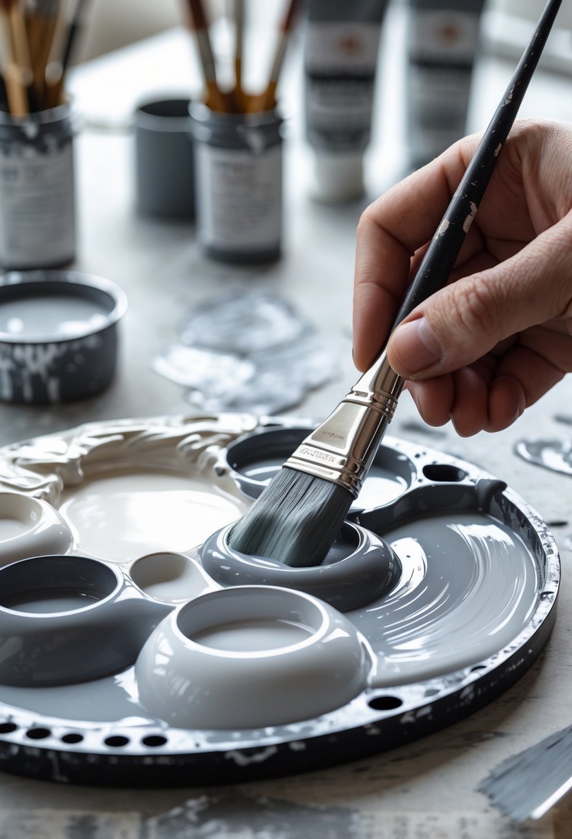
Best Tools for Mixing Paint
Using the right tools significantly impacts the smoothness and quality of gray paint. A sturdy mixing palette or a clean, flat container provides enough space for blending.
A palette knife or a stiff spatula is ideal for thorough mixing, ensuring all colors blend uniformly. Brushes alone may not mix paints evenly, often leaving streaks.
For larger paint batches, a mechanical stirrer or drill attachment can maintain a consistent blend without much effort. Regardless of the tool, scraping the sides and bottom of the container during mixing helps prevent uneven spots.
Good lighting during mixing supports accurate color evaluation, preventing surprises once the paint dries.
Popular Uses and Applications of Custom Gray Paint
Custom gray paint serves many practical and aesthetic purposes across different settings. Its versatility allows for tailored shades that enhance both artistic projects and living spaces. Understanding where and how these shades of gray work best helps maximize their impact and functionality.
Gray Paint in Art and Interior Design
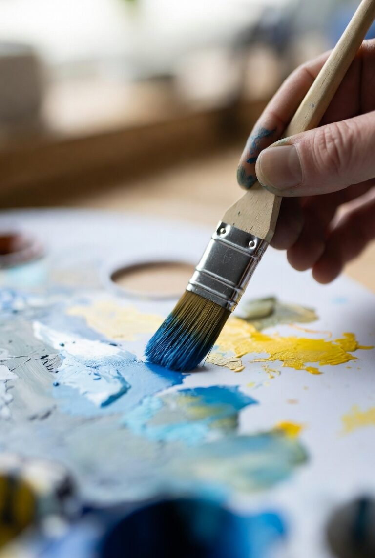
Artists often rely on custom gray paint to achieve subtle nuances in their work. By mixing specific ratios of black and white or incorporating primary and complementary colors, they create shades of gray that convey depth and texture. Adding cool undertones like blue or green can give paintings a modern, sleek feel, while warm undertones like red or yellow provide softness and warmth.
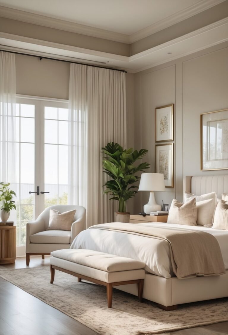
In interior design, gray paint is frequently chosen for its ability to support other colors without overwhelming them. Designers select specific gray shades to set moods—cool grays bring a calm, focused atmosphere suitable for offices or bedrooms. Warm grays, on the other hand, enrich social areas like living rooms by creating an inviting environment.
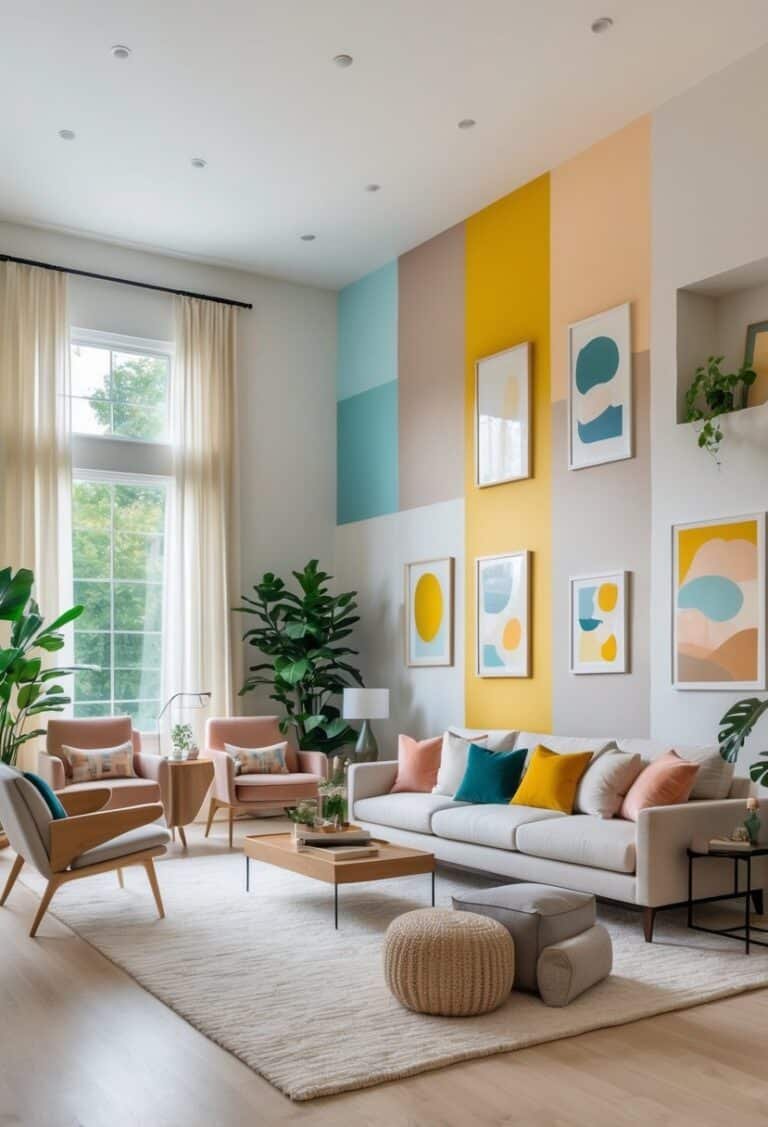
Gray as a Neutral Backdrop
Gray’s role as a neutral backdrop makes it a popular choice for walls and large surfaces. It balances bold accent colors and metallic finishes while maintaining a timeless appeal. Custom gray paint allows homeowners and designers to fine-tune the brightness or darkness to complement lighting conditions and furniture.
Lighter grays reflect natural light, making small rooms feel more open and airy. Darker grays add sophistication and contrast but require careful use to avoid making spaces feel cramped. Layering textures or using different shades of gray can prevent monotony, adding dimension and interest without detracting from other design elements.