20 House Color Schemes Interior to Transform Your Living Space Effortlessly
Choosing the right color scheme for your home can shape the atmosphere and style of every room. I understand how challenging it is to find combinations that balance harmony and personality. The purpose of this article is to present 20 house interior color schemes that help create cohesive and appealing living spaces.
Color influences how you feel in a room and can enhance the flow between areas without overwhelming the senses. Whether you prefer subtle neutrals or bold contrasts, understanding different palettes gives you the confidence to transform your home thoughtfully.
1) Classic Blue and White
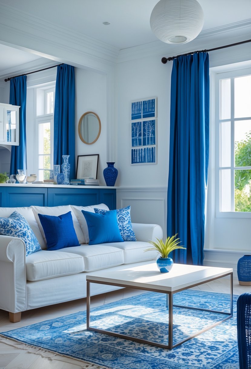
I find the blue and white color scheme timeless and versatile. It creates a balanced mix of freshness and calm, making any room feel inviting.
This combination works well in various styles, from coastal cottages to modern apartments. I often use different shades of blue — navy, teal, or aqua — paired with crisp white walls or furniture to achieve sophistication without overwhelming the space.
Blue and white is a reliable choice when aiming for a clean, elegant look that remains popular across different home designs.
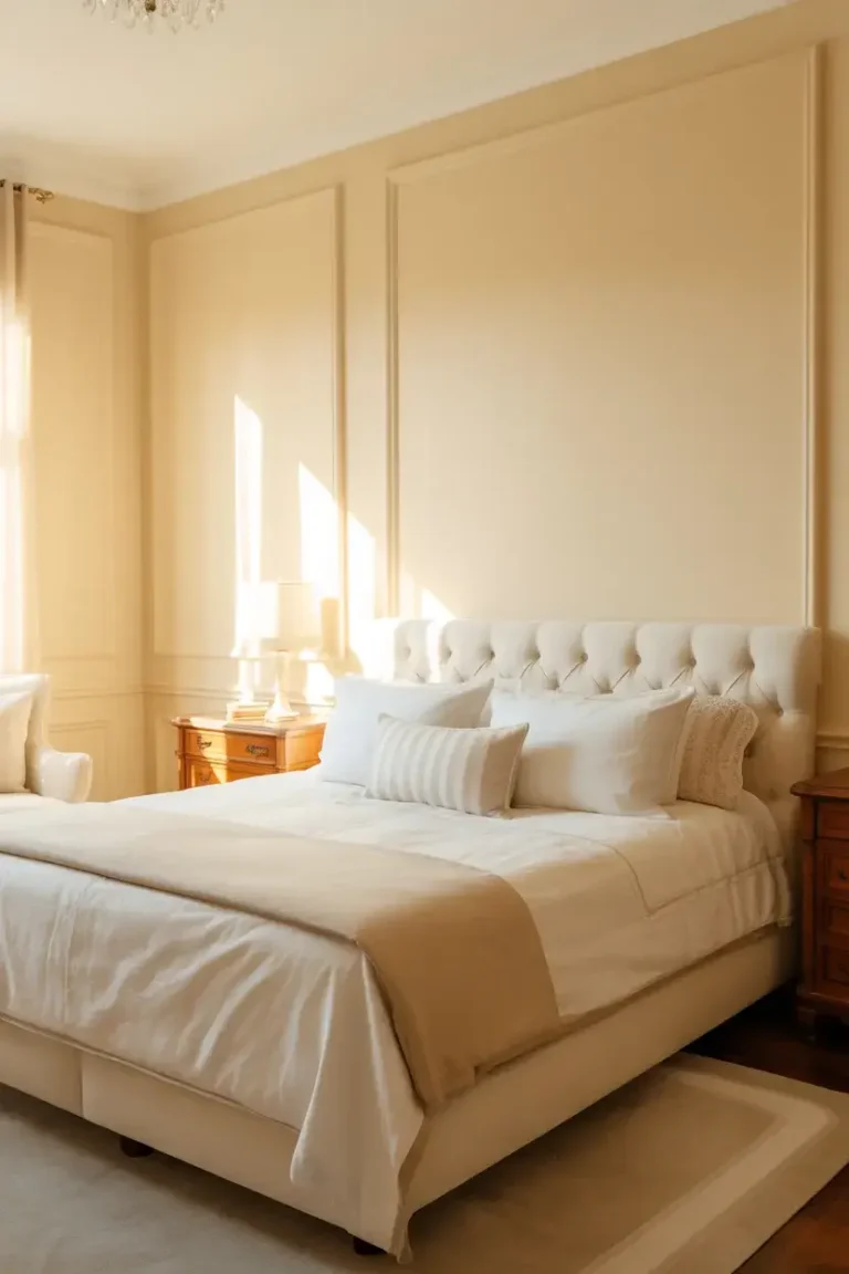
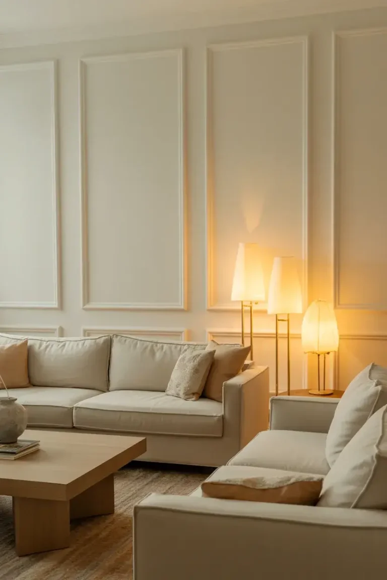
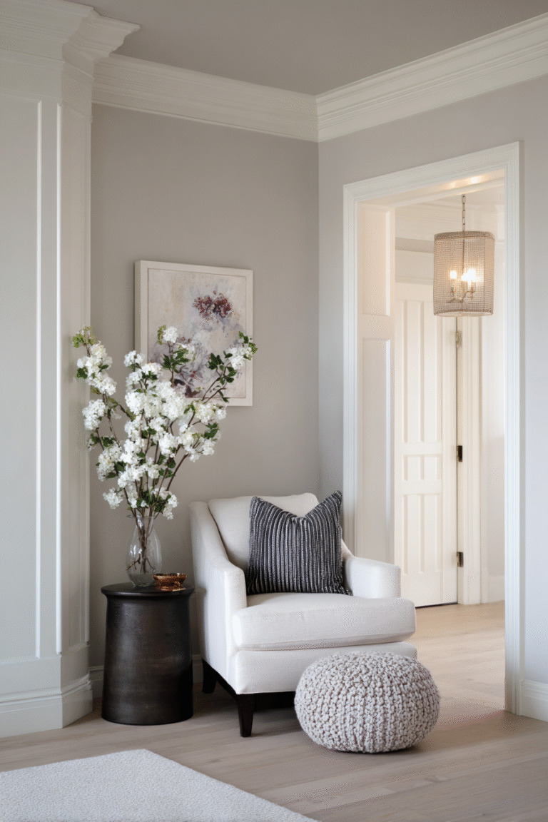
2) Warm Neutrals with Soft Taupe
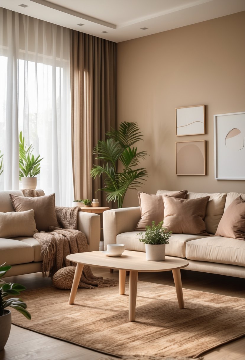
I find warm neutrals paired with soft taupe create a calm and inviting atmosphere. Soft taupe blends gray and brown tones, giving rooms an earthy yet modern feel.
This color works well as a backdrop for various decor styles without feeling heavy. I often use it with crisp white trim for subtle contrast and brightness.
Warm taupe also pairs nicely with muted purples or richer neutrals, adding depth while maintaining versatility. It’s a practical choice for living rooms, bedrooms, and even kitchens.
3) Charcoal Gray and Mustard Yellow
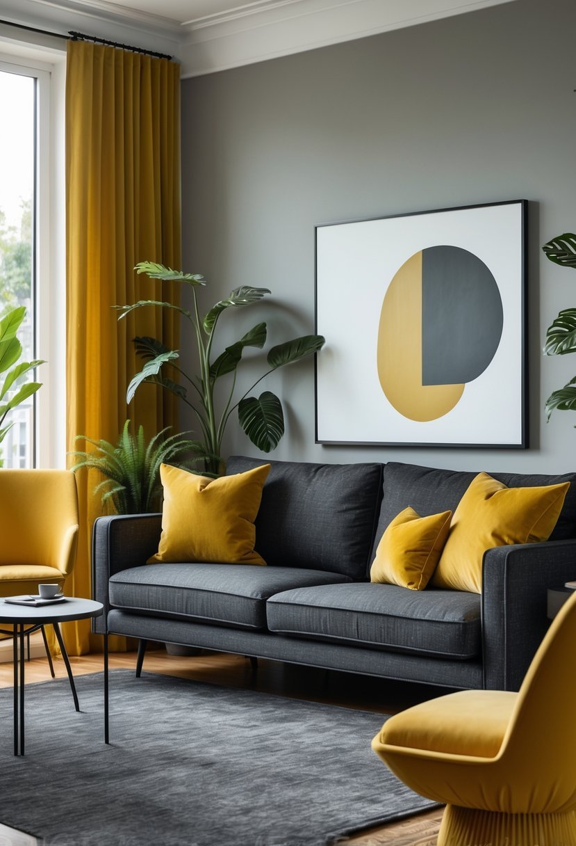
I find the combination of charcoal gray and mustard yellow both modern and timeless. Charcoal gray offers a neutral, grounding presence that balances the warmth and vibrancy of mustard yellow.
Using charcoal gray on large surfaces like walls or furniture creates a sophisticated backdrop. Mustard yellow works well as an accent in pillows, artwork, or smaller pieces. This pairing adds depth without overwhelming a space.
It’s a smart choice when you want an interior that feels contemporary but still inviting. I appreciate how it can adapt to various styles, from industrial to classic.
4) Soft Sage Green and Cream
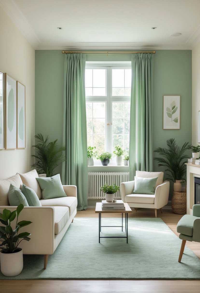
I find soft sage green paired with cream creates a calm, balanced atmosphere in any room. The earthy green brings a subtle natural tone, while cream adds warmth and light without overwhelming the space.
This combination works well across styles, from modern to classic. It also allows for flexibility with textures and accents. Using sage green on walls and cream in furnishings or trim helps maintain a cohesive yet inviting environment.
5) Bold Navy with Coral Accents
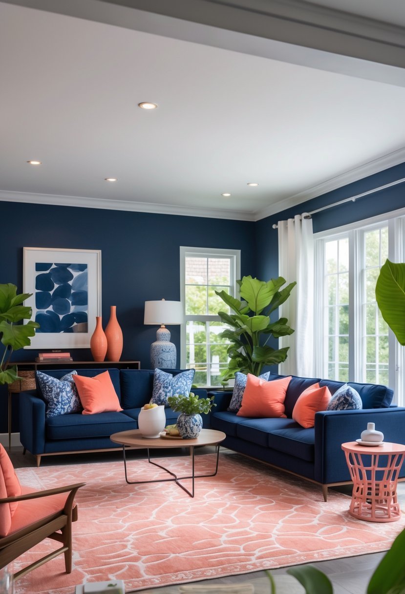
I find that bold navy creates a strong foundation for any room. Its deep, rich tone feels both modern and timeless. Adding coral accents introduces warmth and energy without overwhelming the space.
In my experience, coral works well in small doses—pillows, artwork, or an accent chair stand out beautifully against navy walls or furniture. Pairing these colors with gray or warm wood tones helps balance the look. Metallic touches like gold can also enhance the overall sophistication.
6) Earthy Terracotta and Sand
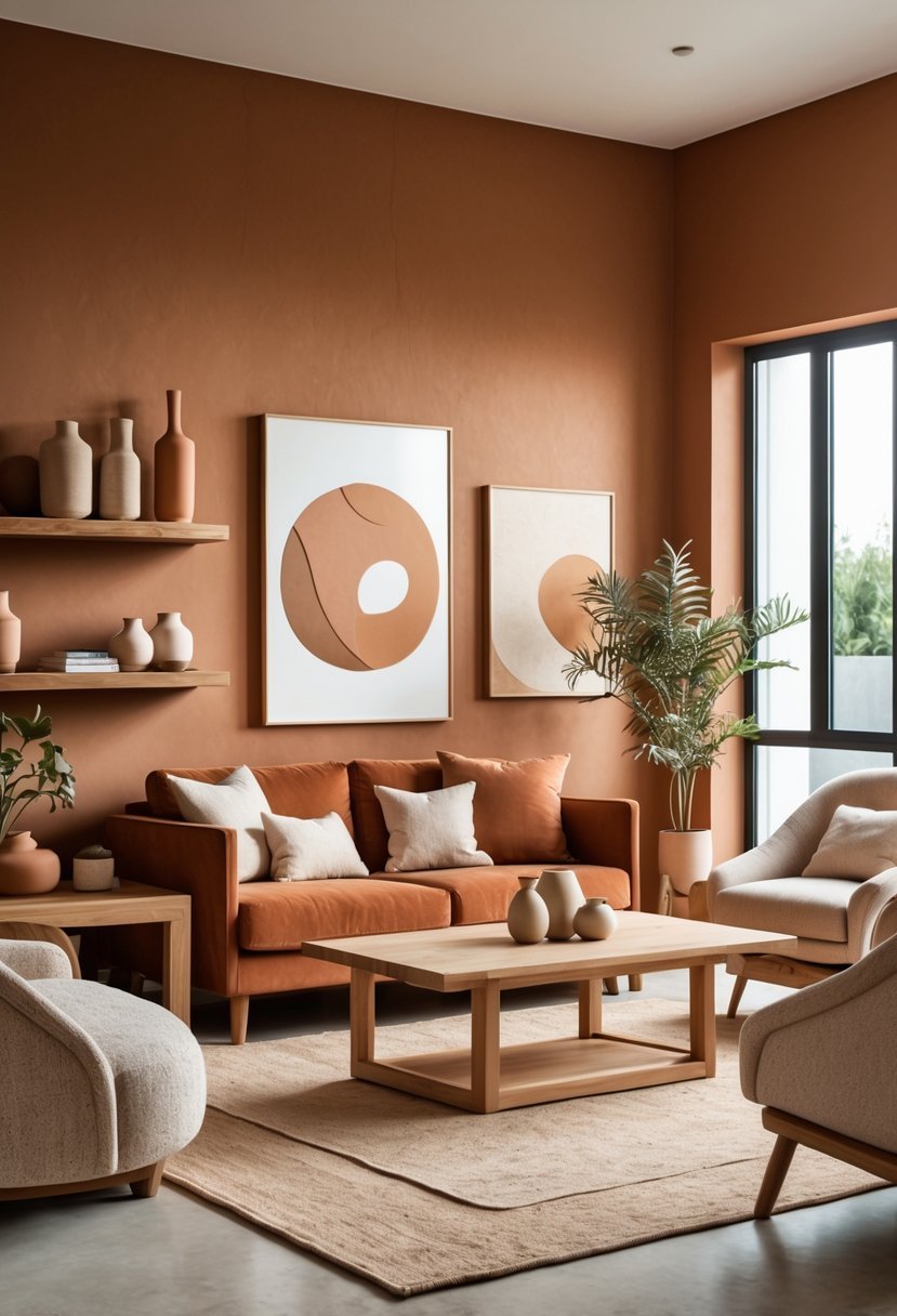
I find earthy terracotta paired with soft sand tones creates a warm, inviting atmosphere in any room. These colors work well together because terracotta adds depth, while sand keeps the space balanced and light.
Using this combination, I often aim for natural textures to complement the hues. It feels grounded and timeless, ideal for living areas or bedrooms where comfort matters most.
The blend of these colors encourages calmness and a connection to nature, which suits my design goals perfectly. It’s a simple yet effective way to create harmony without overwhelming a space.
7) Muted Lavender with Light Gray
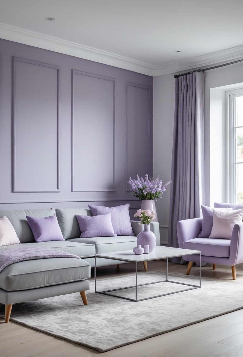
I find muted lavender paired with light gray creates a calm, sophisticated space. The softness of lavender adds subtle color without overwhelming, while light gray keeps the look neutral and modern.
This combination works well in bedrooms and living rooms where a peaceful atmosphere is desired. It balances warmth and coolness, making the room feel inviting yet fresh. I often use this palette when aiming for an elegant and understated design.
8) Rich Burgundy and Warm Beige
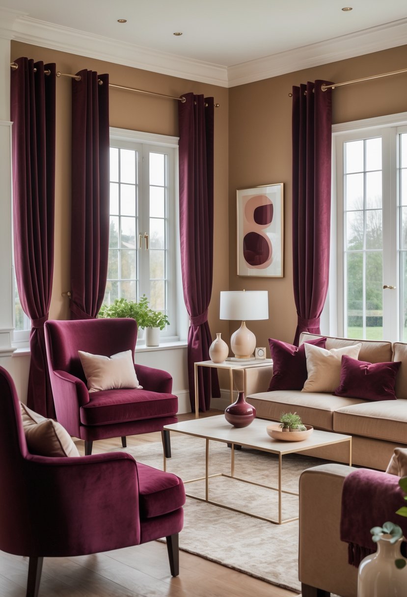
I find rich burgundy paired with warm beige creates a balanced yet striking color scheme. Burgundy brings depth and a sophisticated warmth, while beige adds a light, neutral backdrop that softens the intensity.
This combination works well in living rooms and dining areas, giving a cozy but elegant atmosphere. Using beige allows burgundy to stand out without overwhelming the space. It’s a versatile pairing that suits both modern and classic interiors.
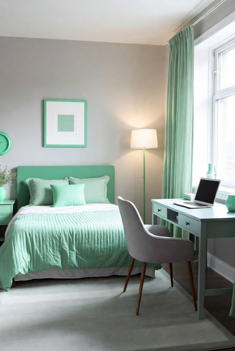
9) Cool Mint and Crisp White
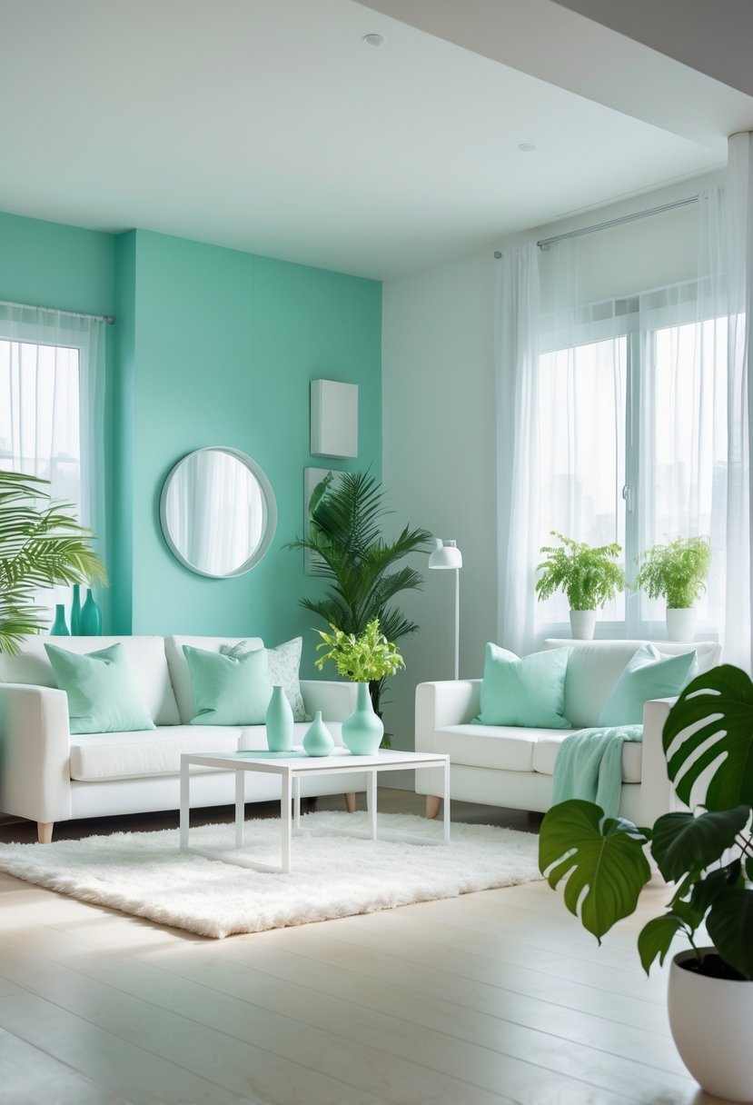
I find the combination of cool mint and crisp white to be both refreshing and bright. Mint adds a soft, playful touch that helps lift the mood of any room.
Pairing it with crisp white creates a clean, airy environment that feels open and inviting. This scheme works particularly well in kitchens and children’s rooms, where light and energy matter most.
10) Deep Forest Green and Natural Wood
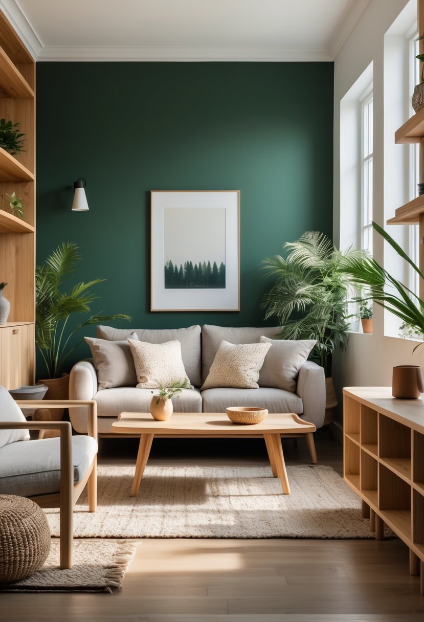
I find deep forest green paired with natural wood creates a rich, grounded atmosphere. The green evokes nature’s calm, while wood adds warmth and texture.
This combination works well in living rooms or kitchens where you want a cozy yet elegant feel. Using forest green on walls or cabinets makes the wood tones stand out without overwhelming the space.
For balance, I suggest choosing wood with medium to dark finishes. This keeps the look cohesive and avoids contrast that feels too sharp.
11) Sunset Orange with Warm Gray
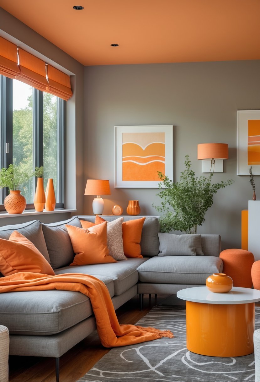
I find the combination of sunset orange and warm gray both inviting and balanced. The vibrant orange adds energy to a space, while gray tones provide a calm, grounding effect.
This pairing works well in living rooms or bedrooms where you want a cozy yet lively atmosphere. Using warm gray as a base with orange accents lets the colors complement without overwhelming each other.
In my experience, this palette suits modern and rustic styles alike, giving flexibility in decor choices. It’s a practical way to bring warmth without sacrificing sophistication.
12) Powder Blue and Soft Peach
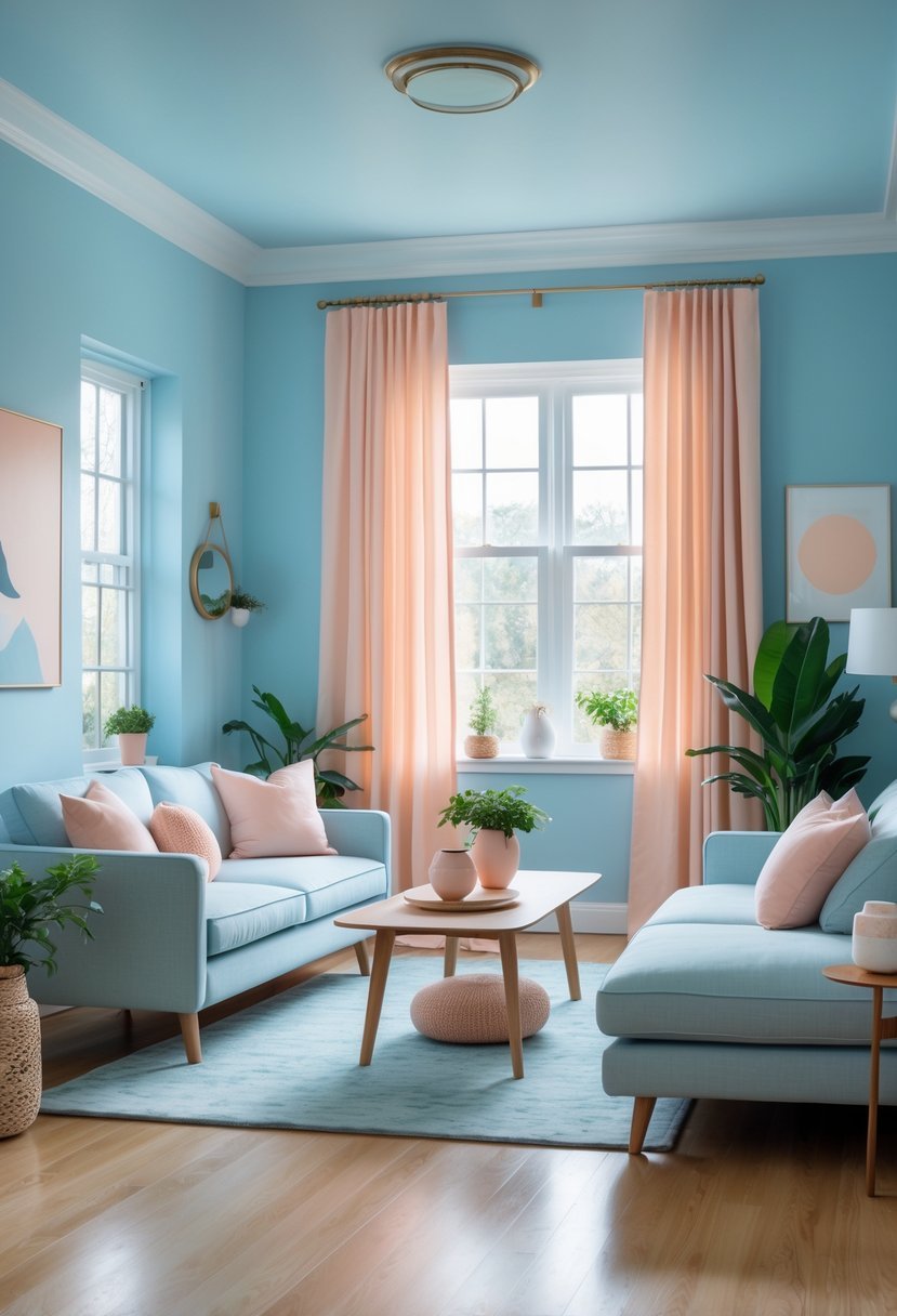
I find powder blue and soft peach create a balanced and inviting atmosphere. The coolness of powder blue pairs well with the warmth of peach, offering a gentle contrast that feels fresh yet cozy.
Using these shades throughout a room—from walls to accessories—helps maintain harmony. I like how this combination works in living spaces or bedrooms, promoting calmness with a touch of warmth. It’s versatile enough for modern or traditional interiors.
13) Sleek Black and White Contrast
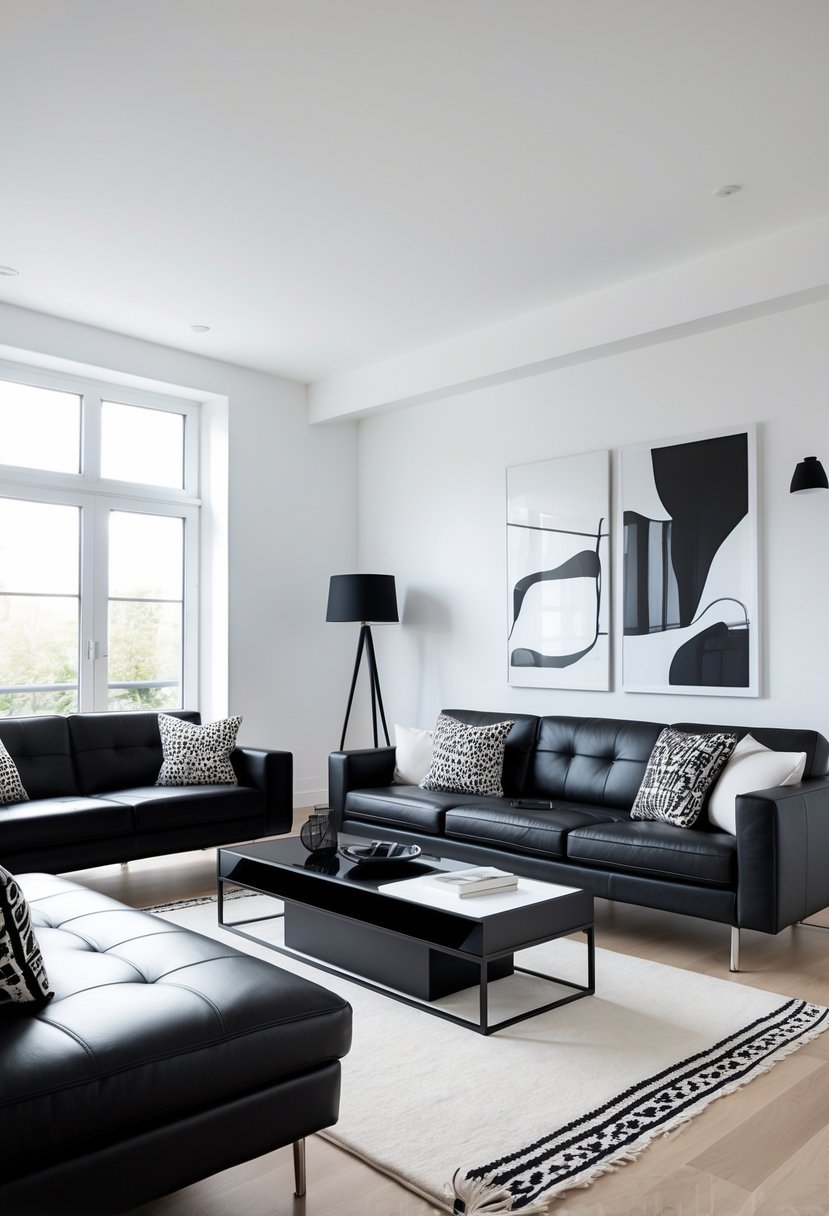
I find sleek black and white interiors offer a timeless, sharp contrast that balances sophistication with simplicity. This color scheme brings depth and drama without overwhelming the space.
Using texture and shape alongside these colors helps add dimension. I like to incorporate accents like metallics or greenery to break up the contrast and add visual interest. The result is a modern yet classic look adaptable to many styles.
14) Pale Pink and Charcoal
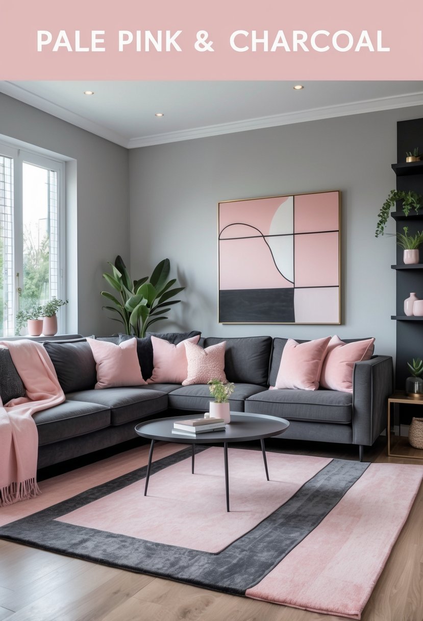
I find the combination of pale pink and charcoal to be both sophisticated and calming. The softness of pale pink adds warmth, while charcoal brings depth and modernity to a room.
This color pairing works well in living spaces or bedrooms where balance is key. Pale pink creates a gentle, inviting atmosphere, and charcoal grounds the palette without overwhelming it.
Using these tones together can result in a stylish and versatile interior. I appreciate how they complement each other without competing for attention.
15) Vibrant Turquoise and Neutral Gray
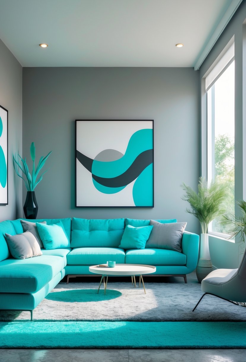
I find the combination of vibrant turquoise and neutral gray both refreshing and balanced. Turquoise adds a lively pop of color without overwhelming the space.
Gray acts as a calm backdrop, grounding the brightness of turquoise. This mix works well in living rooms or entryways where a modern yet inviting atmosphere is desired.
Using gray with touches of turquoise allows me to create contrast while keeping the overall look cohesive. The colors complement each other, making the space feel both energetic and composed.
16) Soft Gold and Ivory
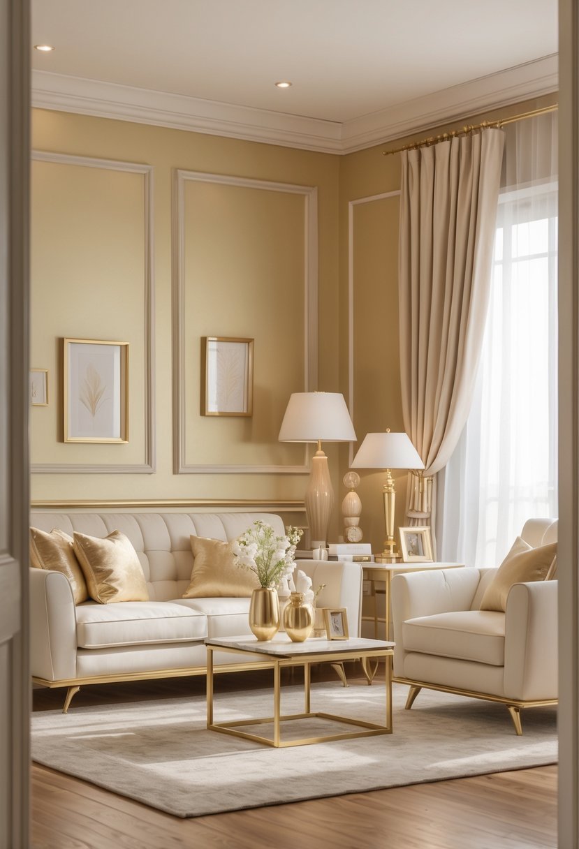
I find the combination of soft gold and ivory creates a warm, elegant atmosphere. Ivory’s creamy softness balances gold’s subtle shine without overwhelming the space. This pairing works well in living rooms and bedrooms, adding a touch of sophistication.
Using soft gold accents against ivory walls brings depth while keeping the environment light. It’s a timeless choice that feels both classic and modern. I often recommend this scheme for those wanting understated luxury.
17) Rustic Brown and Olive Green
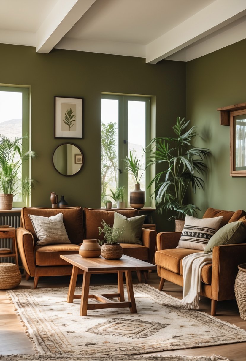
I find the combination of rustic brown and olive green creates a grounded, natural atmosphere in any room. The earthy tones work well together to evoke warmth and simplicity.
Using olive green on walls or accents pairs beautifully with brown furniture or wooden elements. This mix adds depth while maintaining a calm and organic feel.
For balance, I recommend incorporating textured materials like jute rugs or leather sofas. These elements enhance the rustic charm without overwhelming the space.
18) Crisp White with Navy Blue Trim
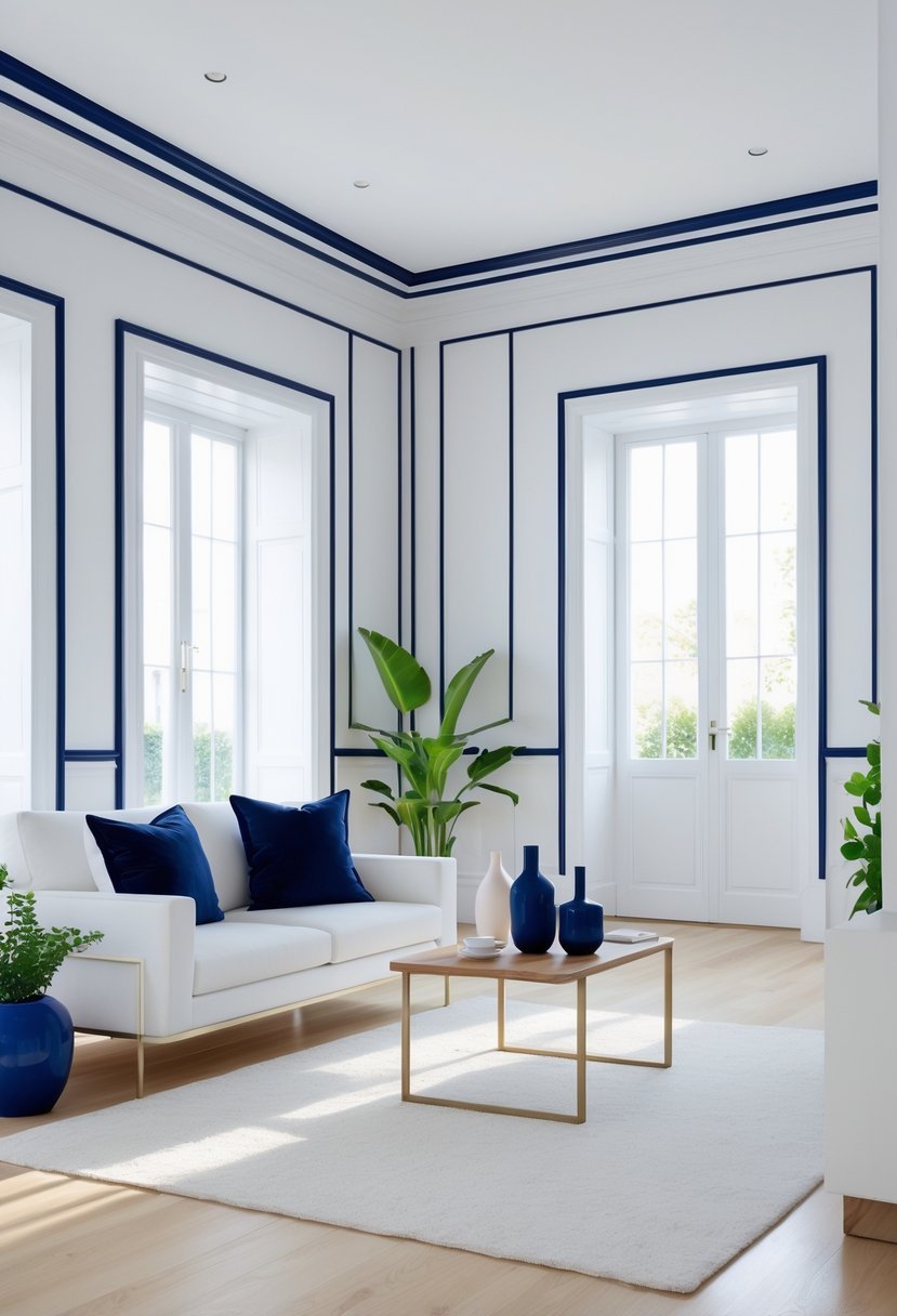
I find the combination of crisp white walls and navy blue trim both clean and striking. The white creates a fresh, bright backdrop while the navy adds depth and definition. This pairing highlights architectural details like moldings or window frames effectively.
Using navy for trim keeps the overall look classic and grounded without overwhelming the space. It works well in both traditional and modern interiors. I often recommend this scheme for those wanting a balanced, timeless design.
19) Warm Blush and Cool Stone
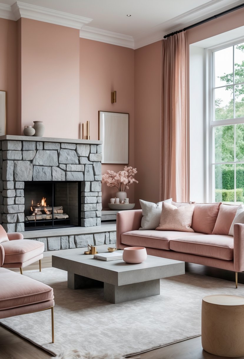
I find the combination of warm blush and cool stone creates a balanced, peaceful space. The soft blush adds warmth and subtle energy without overwhelming the room.
Cool stone tones, like gray or taupe, bring calm and contrast to the warmth. Together, they create a sophisticated palette that works well in living rooms or bedrooms.
Using blush on larger surfaces like walls helps soften the space, while stone accents in furniture or decor add depth. This mix feels both inviting and modern.
20) Deep Plum and Warm Copper
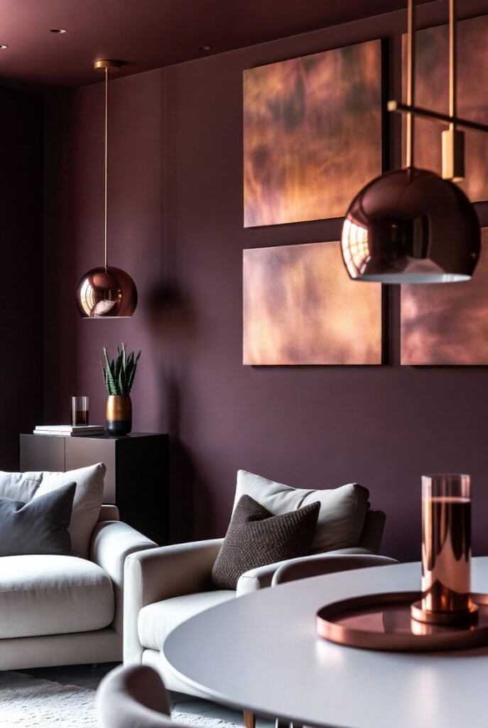
I appreciate how deep plum adds a rich, sophisticated tone to any room. It brings warmth without overwhelming the space.
Pairing it with warm copper creates a balanced contrast that feels inviting and elegant. Copper accents, like lighting fixtures or hardware, add depth and a subtle metallic shimmer.
This color scheme works well in living rooms or dining areas where you want a cozy yet refined atmosphere. I find it especially effective when paired with neutral backgrounds to let the colors stand out.