18 Dining Room Paint Colors For Modern and Timeless Interiors
Choosing the right paint color for a dining room can significantly impact the atmosphere and feel of the space. I understand how selecting from countless options can be overwhelming, but finding the right hue helps create a welcoming environment for both everyday meals and special gatherings.
The best dining room paint colors balance style and mood, making the space inviting and reflective of your personal taste. My goal is to guide you through 18 carefully picked colors that can elevate your dining experience while fitting various styles and preferences.
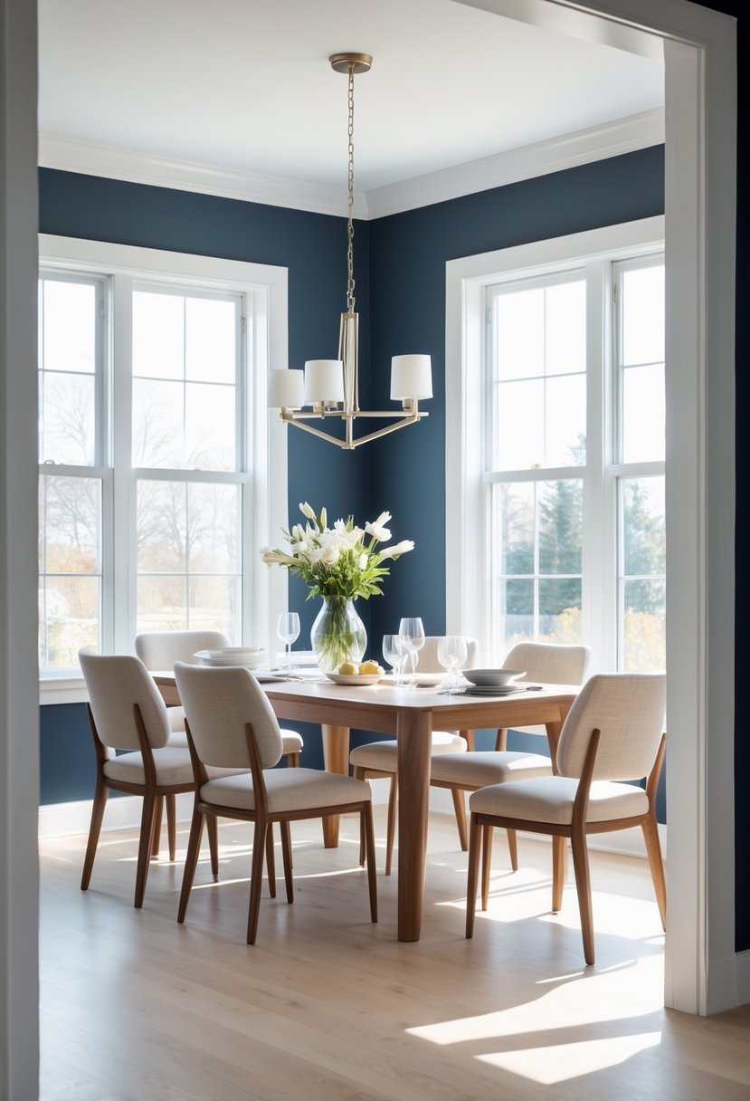
1) Benjamin Moore Hale Navy
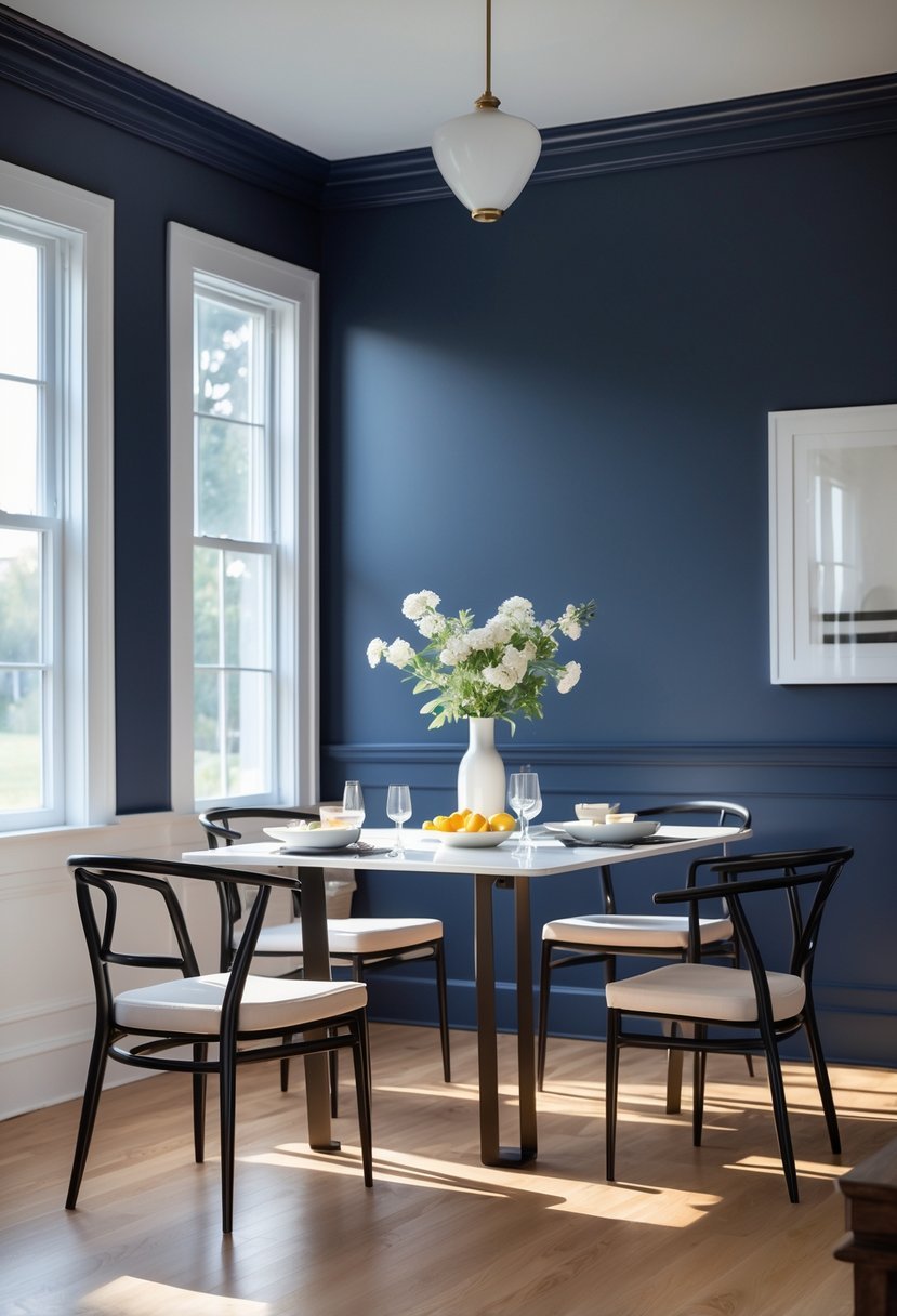
I chose Benjamin Moore Hale Navy for its deep, classic shade of navy blue. It brings a strong sense of sophistication and works well in dining rooms to create an inviting, elegant atmosphere.
This color pairs beautifully with crisp whites and soft greys, which highlights its richness without overpowering the space.
In my experience, Hale Navy complements various styles, from traditional to modern. Its versatility makes it a dependable choice when seeking a timeless look.
2) Sherwin-Williams City Loft SW 7631
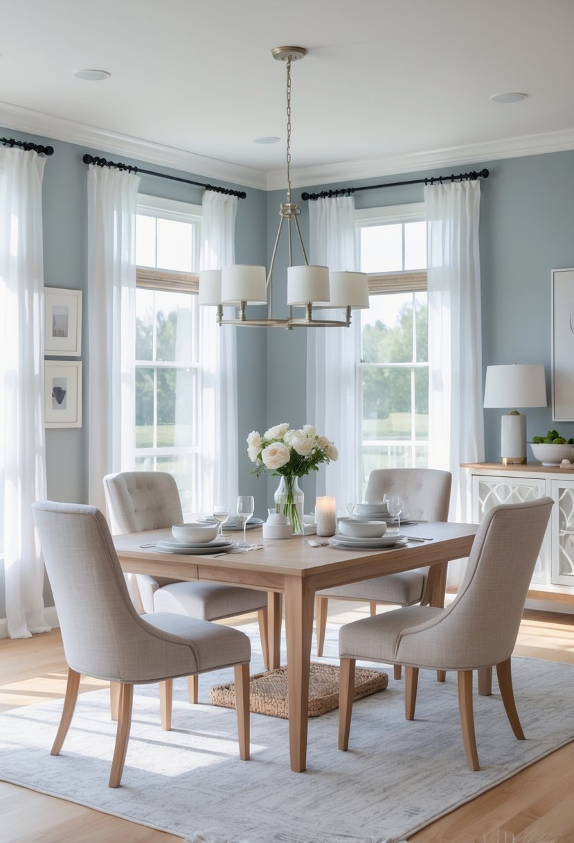
I recommend Sherwin-Williams City Loft SW 7631 for a dining room because it offers a soft, neutral greige tone that works well with many styles. The color has warm undertones, bringing subtle warmth without overpowering the space.
City Loft has a light reflectance value of 70, which helps keep the room feeling bright and airy. I find it balances nicely with wood accents and vintage elements, making it versatile for both modern and traditional dining rooms.
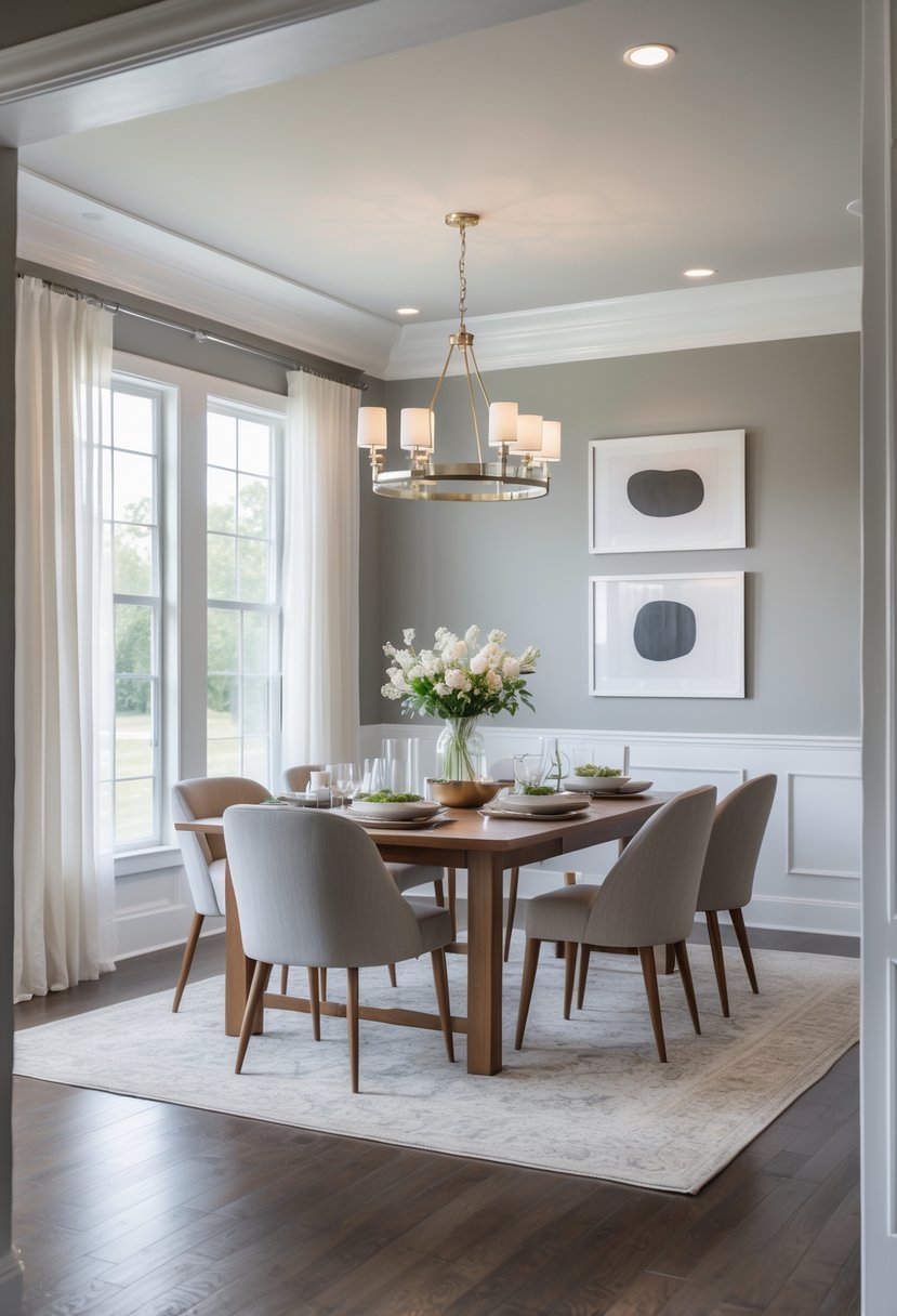
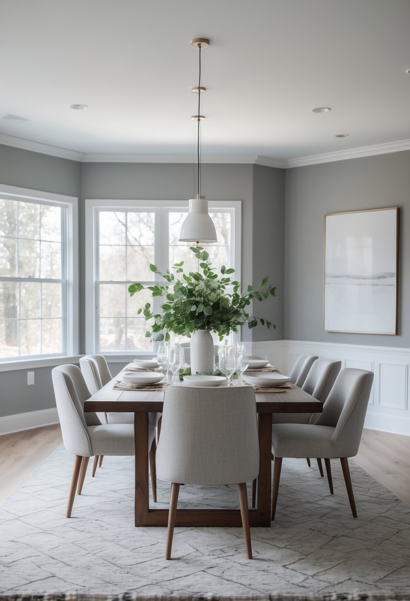
3) Benjamin Moore Revere Pewter
I find Benjamin Moore Revere Pewter to be a reliable choice for dining rooms. It’s a warm gray with subtle beige undertones, often called a “greige,” which makes it very versatile.
The color adapts well to different lighting, keeping the room inviting without overpowering other elements. It balances modern and classic styles, fitting well with both clean and cozy décor.
For me, this paint creates a neutral backdrop that allows furniture and artwork to stand out naturally. It’s practical and timeless, making it a solid option for dining spaces.
4) Sherwin-Williams Aleutian SW 6241
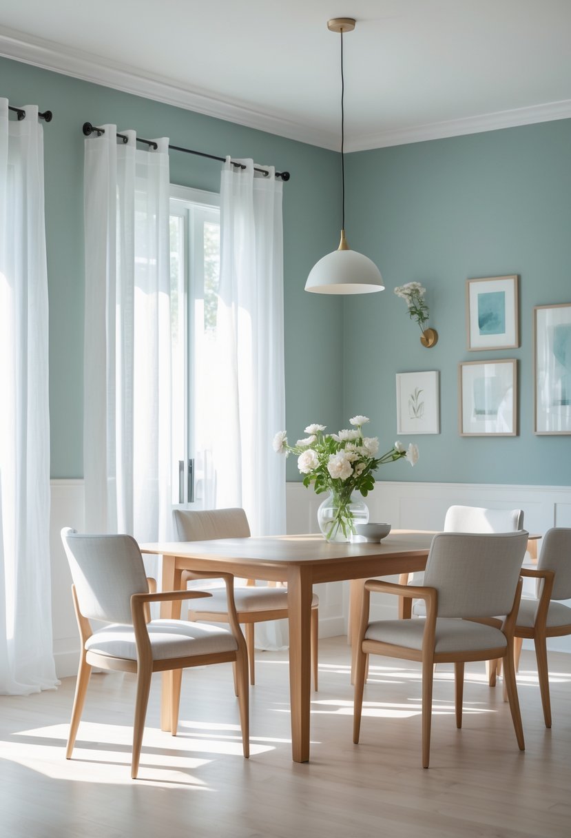
I find Aleutian SW 6241 to be a versatile choice for dining rooms. Its blue-green tone with gray undertones creates a calm and sophisticated atmosphere.
This color pairs well with crisp white or warm neutrals, which can help balance its coolness. It works especially well in spaces where I want a relaxed yet elegant feel. Aleutian offers depth without overwhelming the room, making it a solid option for various styles.
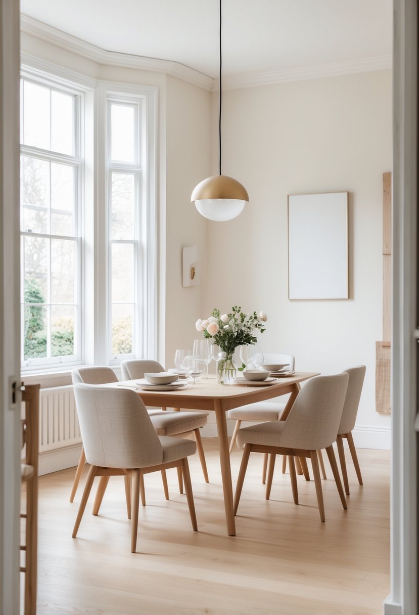
5) Benjamin Moore White Dove
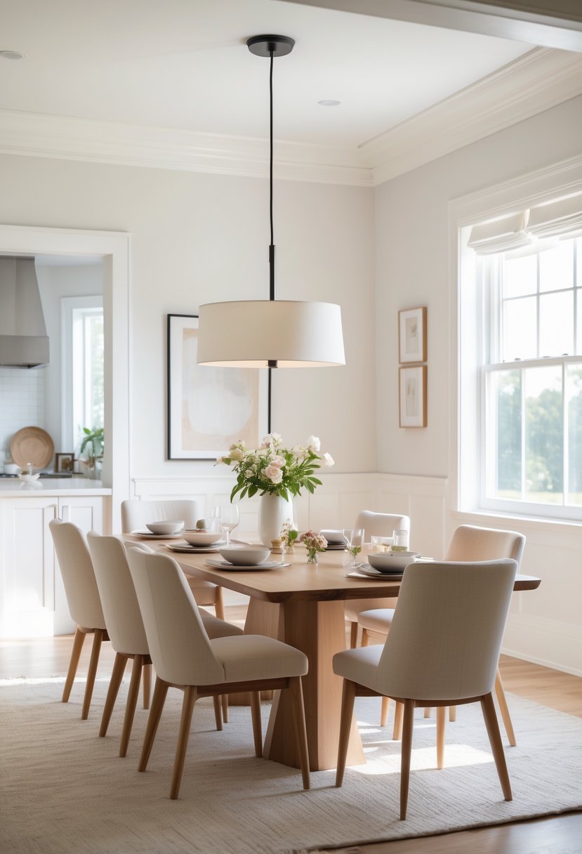
I appreciate Benjamin Moore White Dove for its warm off-white tone with subtle gray undertones. It creates a clean, inviting backdrop that brightens the dining room without feeling cold or stark.
The color pairs well with both modern and traditional decor, especially warm wood accents. It provides flexibility in design, making it easy to change your room’s style over time without repainting.
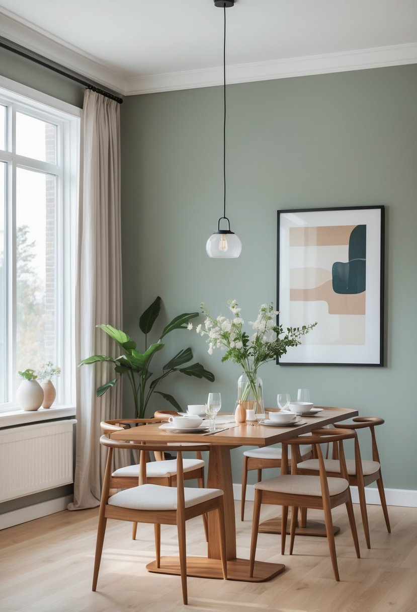
6) Sherwin-Williams Taiga SW 9654
I find Sherwin-Williams Taiga SW 9654 to be a calm, neutral color with a subtle green-gray undertone. It works well in dining rooms, offering a grounded yet modern feel.
The color’s light reflectance value (LRV) is moderate, so it balances natural and artificial light effectively.
Pairing Taiga with off-white trim or soft blues can enhance the room’s tranquility. It’s a versatile choice that suits both casual and formal dining spaces without overwhelming the décor.
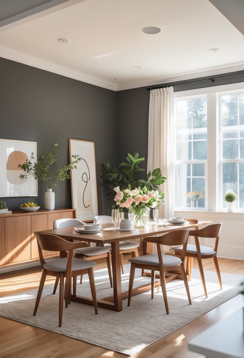
7) Benjamin Moore Kendall Charcoal
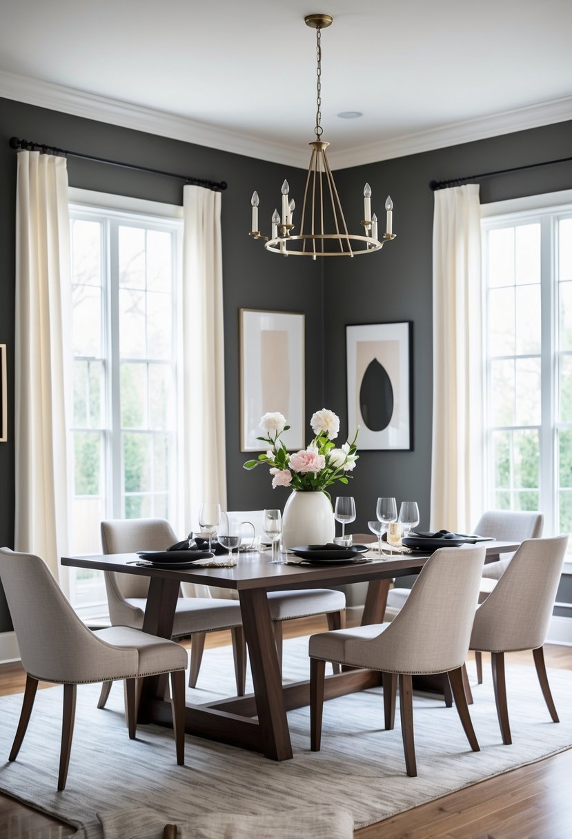
I appreciate Kendall Charcoal for its deep, slate gray tone that adds sophistication to a dining room. It works well as an accent or on all walls, creating a modern, moody backdrop without feeling too dark.
Pairing it with crisp whites or warm earth tones helps balance the space. I find it versatile enough to suit both contemporary and classic styles, making it a reliable choice for a stylish dining area.
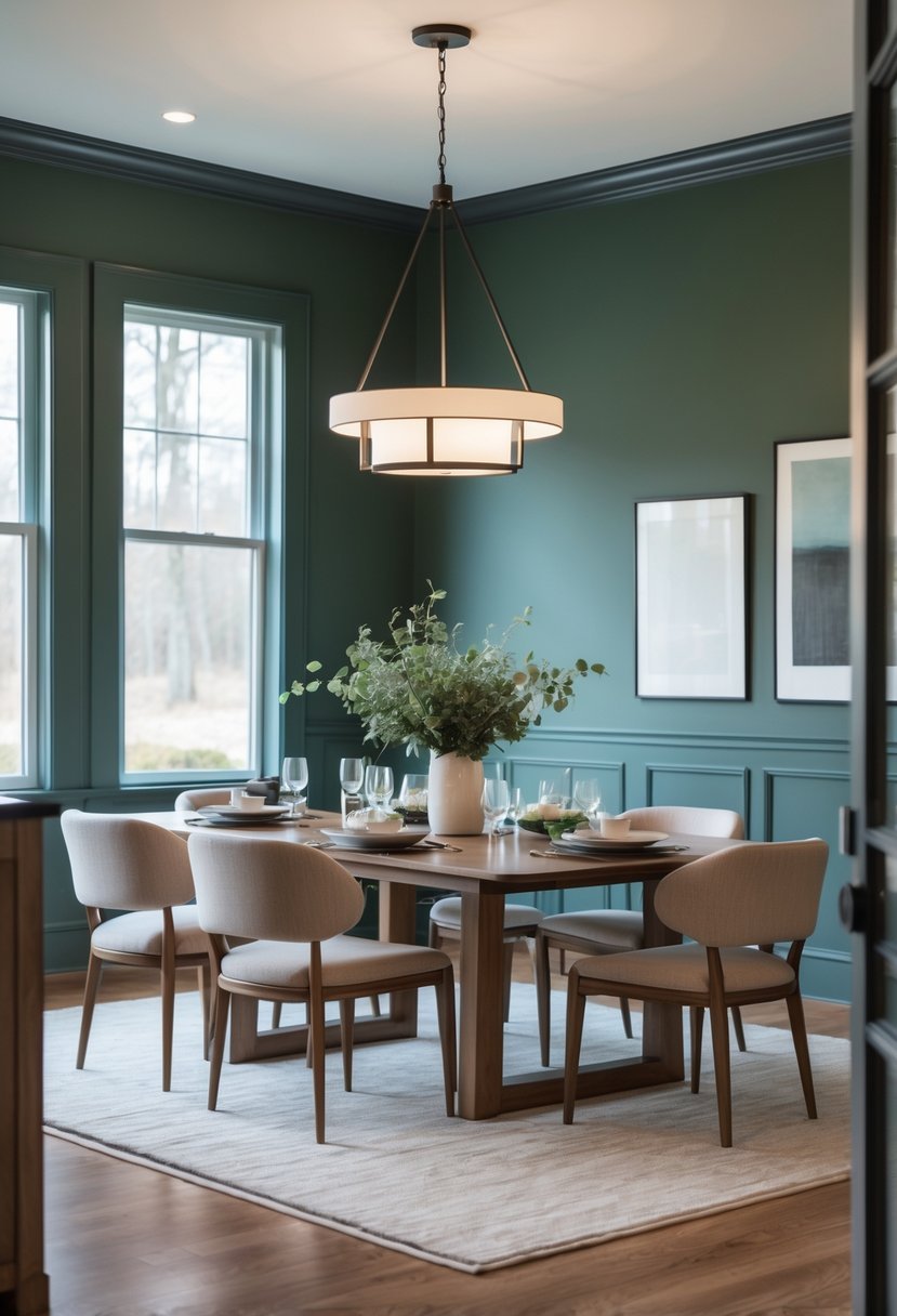
8) Sherwin-Williams Saguaro SW 6419
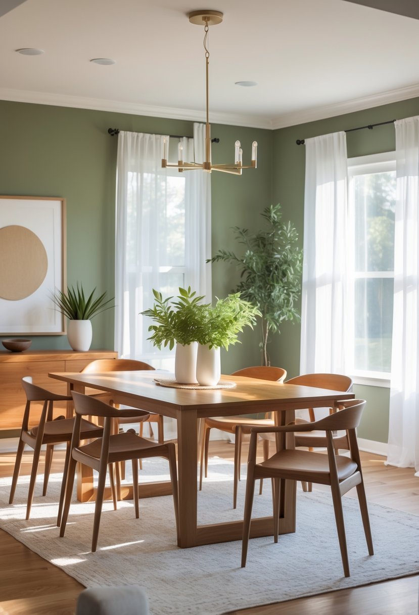
I find Sherwin-Williams Saguaro SW 6419 to be a solid choice for dining rooms. Its earthy green tone carries subtle gray undertones, giving the space a calm and grounded feel.
This color pairs well with white trim and warm wood accents, which enhances its natural, sophisticated vibe. The low light reflectance value means it works best in well-lit rooms to keep the atmosphere from feeling too dark.
For coordinating colors, I often consider soft neutrals or metallic finishes to balance the depth of Saguaro.
9) Benjamin Moore Edgecomb Gray
I find Benjamin Moore Edgecomb Gray to be a versatile choice for dining rooms. It’s a soft greige that strikes a balance between gray and beige, making it adaptable to various styles.
The color brings warmth without feeling yellow, especially in well-lit spaces. In darker rooms, it shifts toward a cooler gray tone, which adds depth.
Edgecomb Gray works well with both traditional and modern decor. Its subtle undertones create a welcoming atmosphere without overwhelming the space.
10) Sherwin-Williams Accessible Beige SW 7036
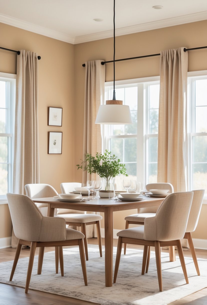
I chose Accessible Beige for its balanced warmth and versatility. It’s a soft greige with subtle gray undertones, which keeps it from feeling too yellow or cold.
This color has an LRV around 58, so it reflects a good deal of light, making dining rooms feel open without being washed out. I find it works well with both modern and traditional styles.
11) Benjamin Moore Chelsea Gray
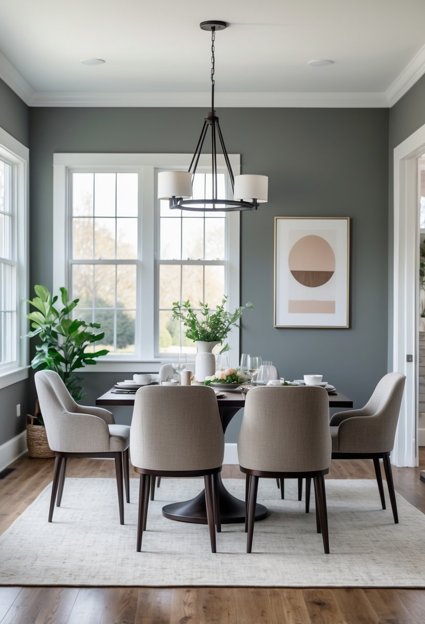
I find Benjamin Moore Chelsea Gray to be a versatile medium-dark gray with warm undertones. It brings depth without feeling too heavy, making it suitable for dining rooms where you want a balance of sophistication and comfort.
The color works well on walls but also looks great on cabinets and trim. I often pair it with soft whites like White Dove or Pure White to keep the space bright and clean.
Chelsea Gray adapts well to various lighting conditions, which helps maintain a consistent look throughout the day.
12) Sherwin-Williams Oyster Bay SW 6206
I appreciate Sherwin-Williams Oyster Bay for its balanced mix of green, gray, and blue tones. It’s a muted, medium-toned color that adds calmness without overpowering the room.
In my experience, it works well in dining rooms by creating a serene atmosphere. Oyster Bay pairs nicely with soft neutrals or deeper accents like navy or charcoal, offering flexibility in design.
Its versatility makes it suitable for both modern and traditional styles, and it responds interestingly to different lighting throughout the day.
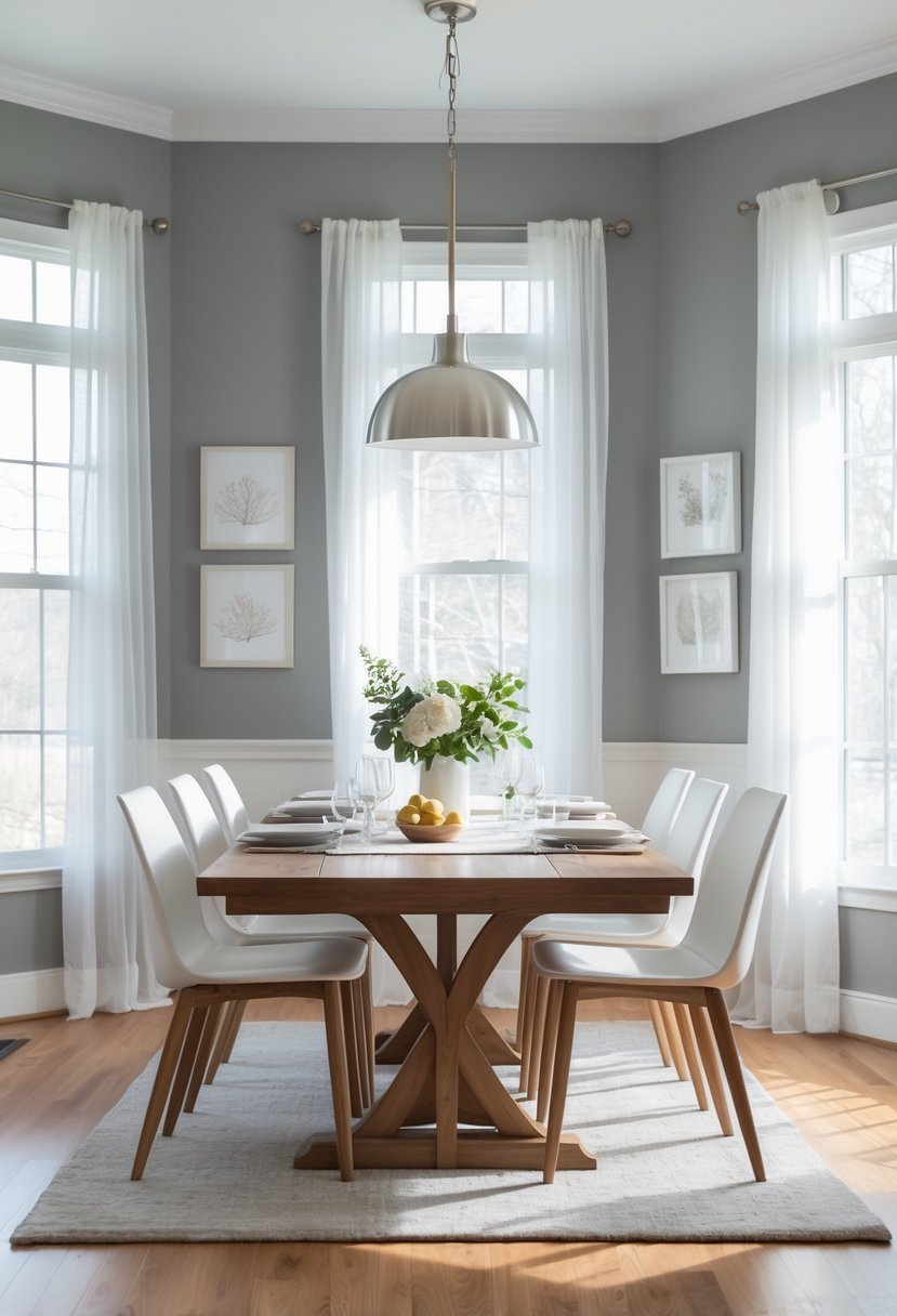
13) Benjamin Moore Gray Owl
I chose Benjamin Moore Gray Owl because it’s a versatile light gray with subtle green undertones. It adapts well to different lighting, sometimes appearing cooler or warmer.
This color works well in dining rooms, providing a neutral but inviting backdrop. Pairing it with crisp whites or soft blues adds harmony without overwhelming the space. I appreciate its ability to feel fresh without being sterile.
14) Sherwin-Williams Naval SW 6244
I find Sherwin-Williams Naval SW 6244 to be a sophisticated navy blue that adds depth without overpowering a dining room. Its cool gray undertones create a balanced, elegant look that works well with both modern and traditional styles.
This color handles light differently depending on your room’s natural lighting, shifting from deep blue to nearly black in low light. It pairs nicely with polished metals, wood tones, and neutral accents, making it versatile for various dining room designs.
15) Benjamin Moore Wickham Gray
I appreciate Benjamin Moore Wickham Gray for its balance of gray with subtle blue undertones. It creates a calm, sophisticated atmosphere without feeling too cold or sterile.
This color works well in dining rooms where you want to encourage a relaxed yet elegant vibe. It pairs nicely with both modern and traditional decor, making it a versatile choice.
I recommend testing it in your specific lighting, as north-facing rooms can make it appear cooler. Overall, it’s a refined, timeless gray worth considering.
16) Sherwin-Williams Rainwashed SW 6211
I find Sherwin-Williams Rainwashed to be a versatile choice for dining rooms. It blends blue and green tones with a subtle gray undertone, creating a calm and inviting atmosphere.
The color shifts depending on the light, sometimes leaning more blue, other times more green. This adaptability allows me to pair it easily with various decor styles, from modern to classic.
Its soft, tranquil quality makes it ideal when I want a space that feels fresh but not overwhelming. Rainwashed adds just enough color while maintaining a peaceful vibe.
17) Benjamin Moore Pale Oak
I appreciate Benjamin Moore Pale Oak for its versatility and subtle warmth. It’s a soft greige that shifts depending on lighting—natural light brings out beige tones, while artificial light emphasizes its gray undertones.
This color creates a calm, inviting atmosphere, perfect for dining rooms where you want comfort without overwhelming warmth. I find it pairs well with both bold and neutral accents, making it an adaptable choice for many styles.
18) Sherwin-Williams Iron Ore SW 7069
I chose Sherwin-Williams Iron Ore SW 7069 for its deep charcoal gray tone that borders on black without feeling too harsh. It brings a modern, sophisticated feel to the dining room.
The color has subtle brown undertones, adding warmth and depth. It pairs well with both light and bold accents, enhancing various styles from contemporary to classic.
Using Iron Ore here creates a cozy, intimate atmosphere without overwhelming the space. This makes it a strong candidate when you want a dramatic yet approachable wall color.