16 Paint Colors for Home Office Walls to Boost Productivity
I believe the color of your workspace is just as important as the desk you sit at or the coffee you drink. The right shade can completely transform your day, shifting your mindset from stressed to focused in an instant.
If you’re staring at dull, uninspired walls while trying to grind through your to-do list, it’s time for a change.
I’ve curated a list of 16 paint colors that do more than just look good—they help you work better. From calming greens to energizing yellows, here is how you can revamp your home office.
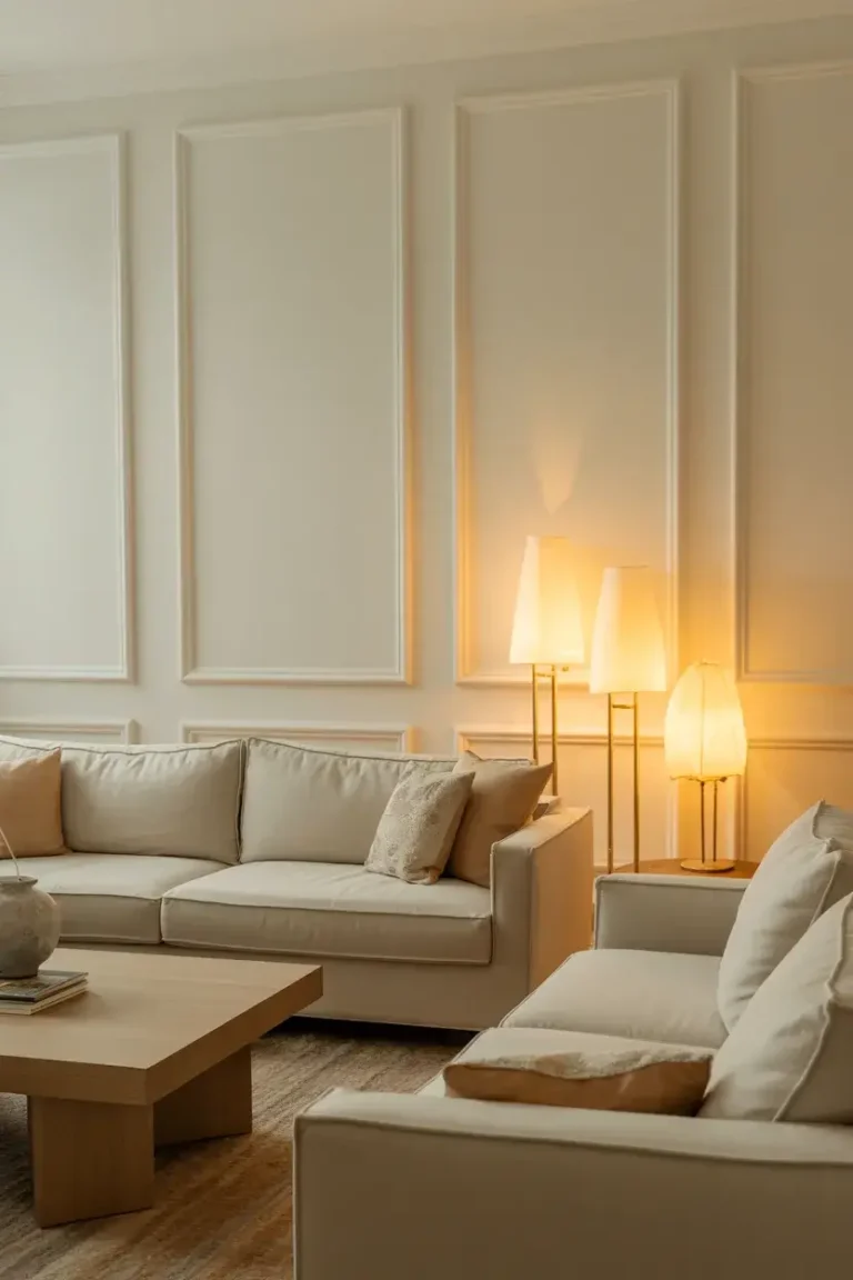
1. Classic Off-White
I always start with the basics because they work. An off-white shade with warm undertones prevents your office from feeling stark or clinical. It reflects light beautifully, making small spaces feel larger and more open.
This color is perfect if you deal with visual clutter. It provides a clean slate that lets your mind focus on the task at hand without distractions. Pair it with wood accents for a cozy, approachable vibe.
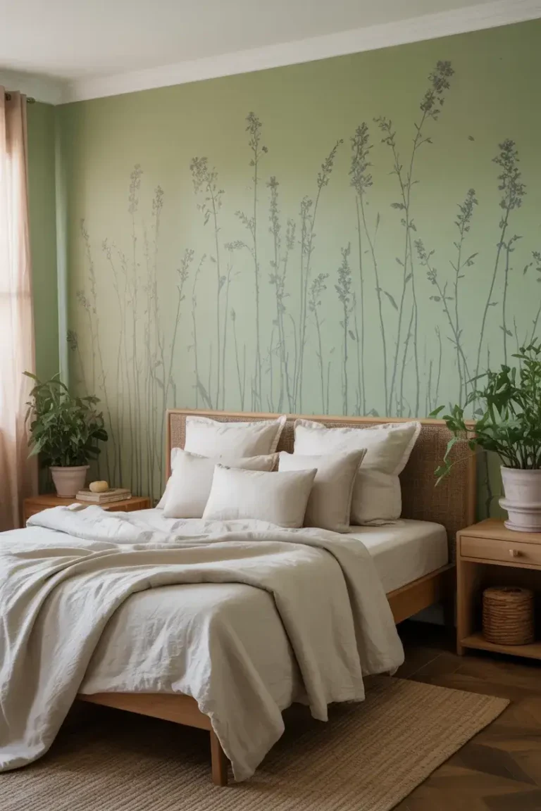
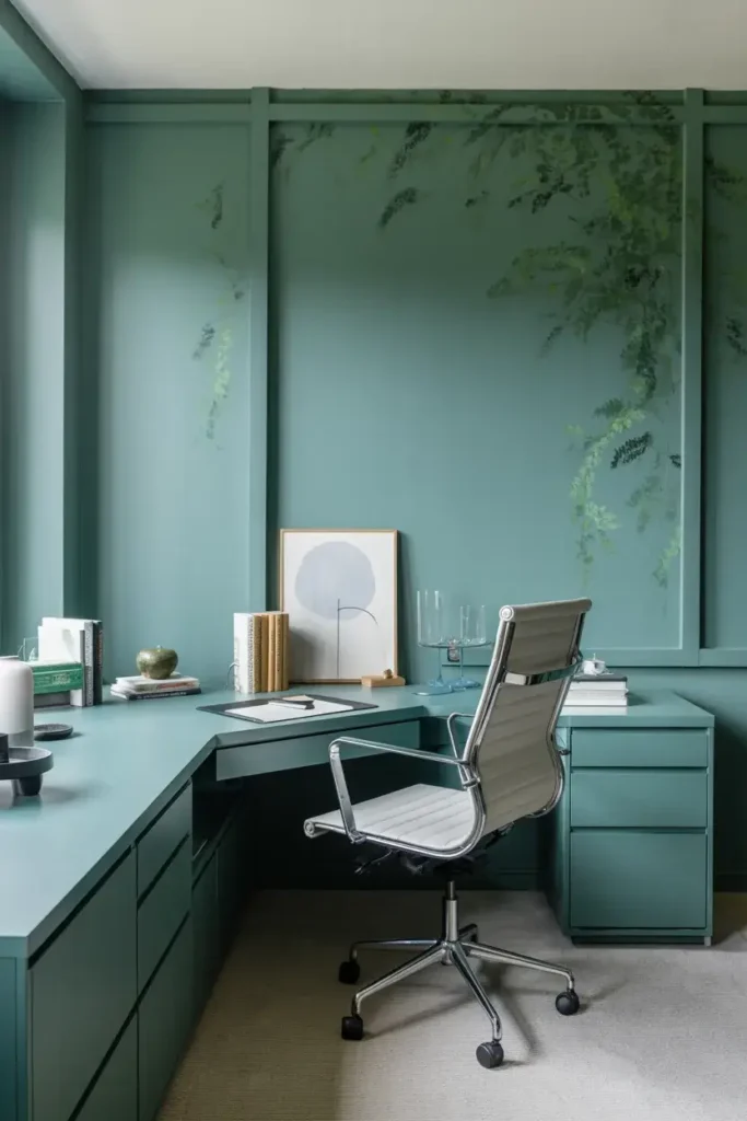
2. Soft Sage Green
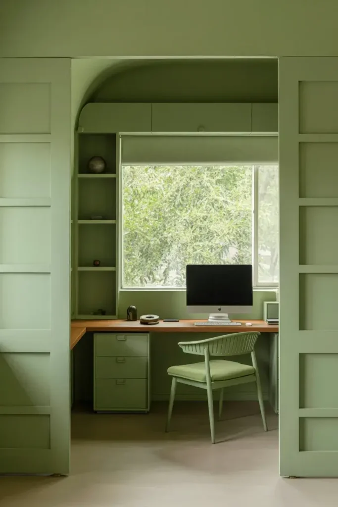
Green is my top recommendation for reducing eye strain. Sage green brings the calming properties of nature indoors, which researchers link to reduced stress levels. It’s subtle enough to act as a neutral but interesting enough to add character.
If you spend hours looking at a screen, this color offers a gentle place for your eyes to rest. It works exceptionally well in rooms with plenty of natural light, bridging the gap between the outdoors and your desk.
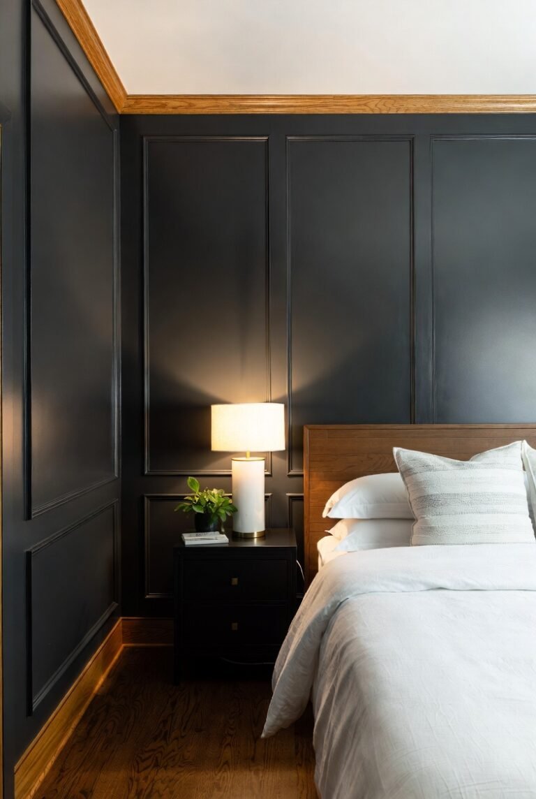
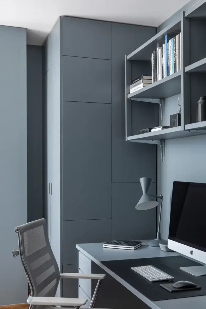
3. Deep Charcoal Gray
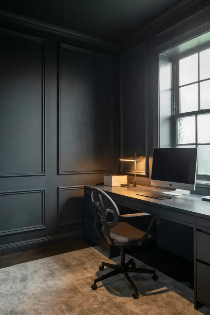
I love a dramatic office. A deep charcoal gray creates a cozy, cocoon-like atmosphere that eliminates distractions. It feels sophisticated and modern, commanding authority and focus.
This color works best in spaces where you need deep concentration, like writing or coding. Make sure you have good lighting—either a large window or quality lamps—so the room doesn’t feel like a cave.
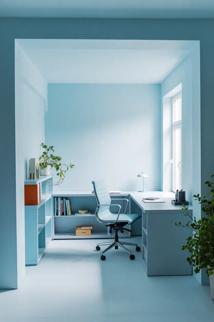
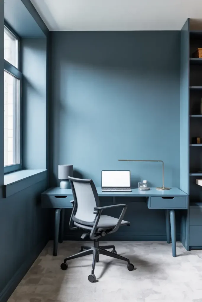
4. Pale Sky Blue

Blue is widely recognized for boosting productivity and creativity. A pale sky blue evokes a sense of openness and tranquility, keeping your stress levels low during high-pressure meetings.
I find this shade particularly helpful if your work involves a lot of communication or brainstorming. It keeps the energy light and airy, preventing the mid-afternoon slump from taking over.
5. Warm Terracotta
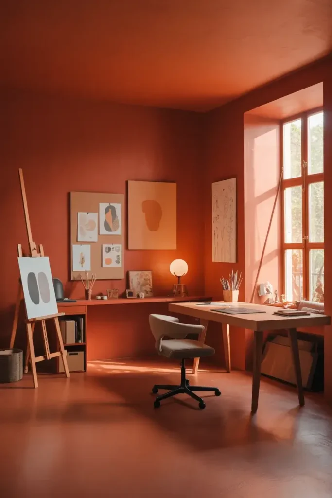
If you need energy, go for terracotta. This earthy, reddish-orange hue adds warmth and vitality without the aggression of a bright red. It feels grounded yet stimulating.
I recommend this color for creative professionals who need a spark of inspiration. It wraps the room in a comforting glow that makes late-night work sessions feel less draining.
6. Crisp Navy Blue
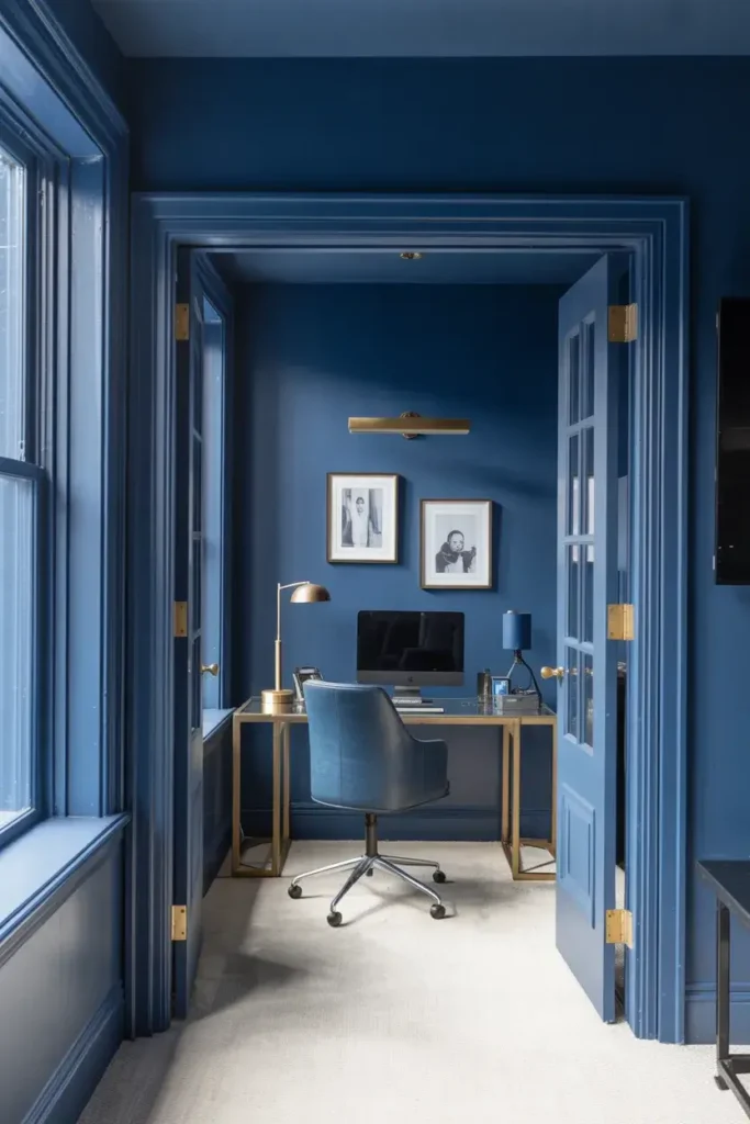
Navy blue is the color of success. It projects confidence and stability, making it an excellent choice for a backdrop during video calls. It commands respect without saying a word.
This shade pairs beautifully with white trim and metallic accents like brass or gold. It creates a professional environment that signals to your brain that it is time to get down to business.
7. Muted Teal
Teal combines the calming stability of blue with the renewal qualities of green. A muted version of this color is sophisticated and unique, offering a creative twist on standard office colors.
I suggest this for anyone who wants a workspace that feels personal and inspiring. It’s distinct enough to spark joy but muted enough not to overwhelm your senses during a busy day.
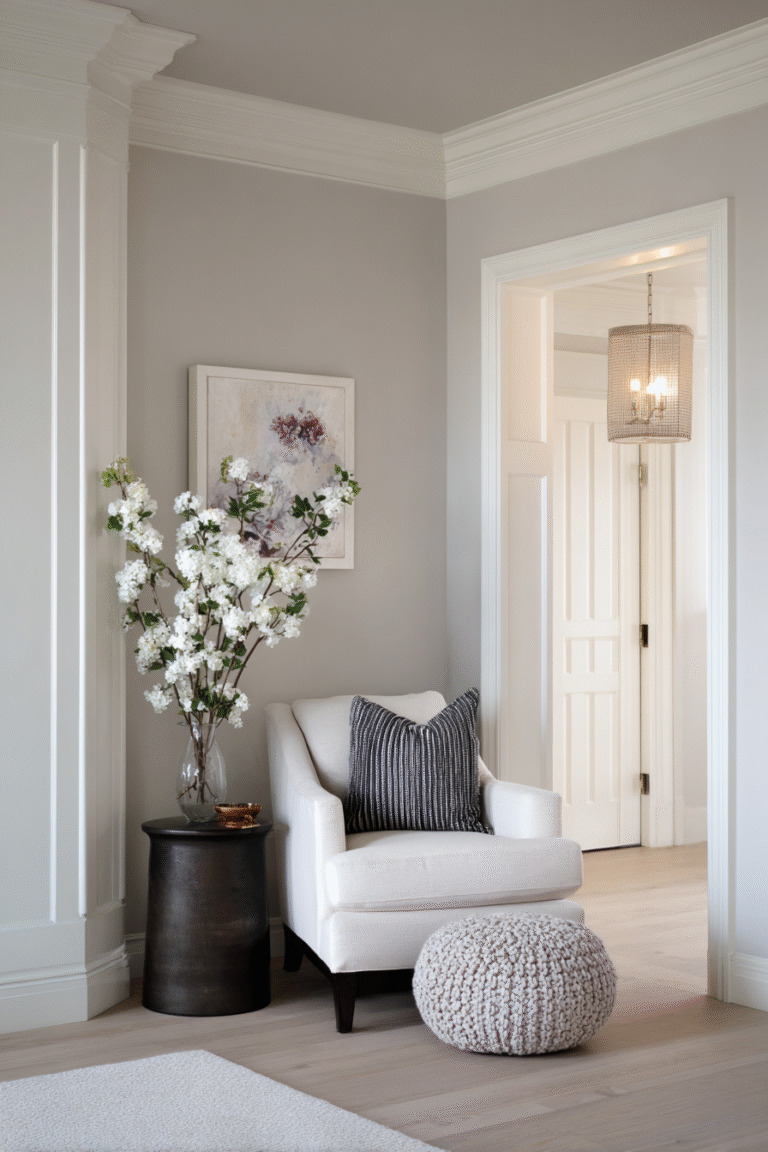
8. Light Greige
Greige—a blend of gray and beige—is the ultimate flexible neutral. It has the modern feel of gray but the warmth of beige, making it adaptable to almost any lighting condition.
I use this color when I want the walls to fade into the background. It allows your furniture and art to take center stage, creating a harmonious environment that feels organized and balanced.
9. Energizing Yellow
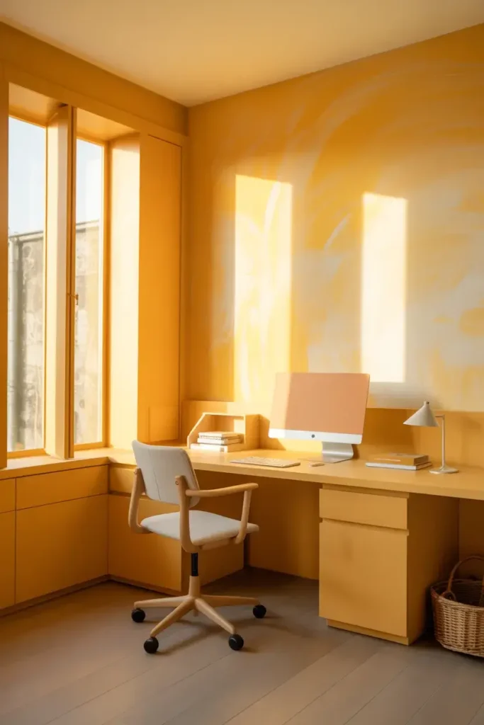
Yellow is synonymous with optimism. A soft, buttery yellow can lift your spirits the moment you walk into the room. It stimulates the mind and encourages innovation.
Be careful not to go too bright, as neon shades can cause anxiety. I prefer a muted, sunny tone that mimics natural sunlight, keeping you alert and happy throughout the day.
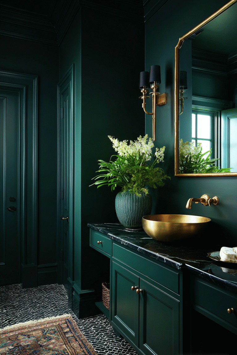
10. Moody Forest Green
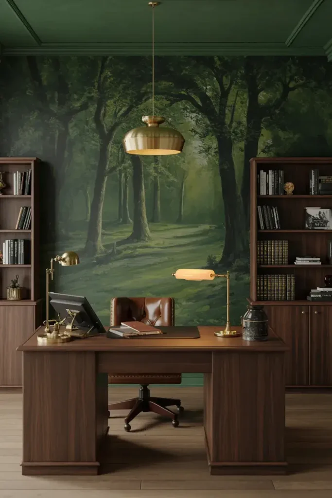
Forest green is arguably the most relaxing color on this list. It mimics the deep shade of a dense forest, promoting a slow, steady rhythm of work. It is excellent for reading and research.
I love pairing this dark hue with dark wood furniture for a studious, academic library feel. It adds a layer of depth and seriousness that helps you tackle complex problems with patience.
11. Clean Slate Gray
A medium, true gray is the perfect middle ground. It is cool, professional, and entirely unemotional. This makes it ideal for high-stress jobs where you need to maintain a level head.
I find this color works well with industrial or modern decor. It provides a sleek, tech-forward look that keeps you feeling efficient and organized, no matter how chaotic your inbox gets.
12. Soft Lavender
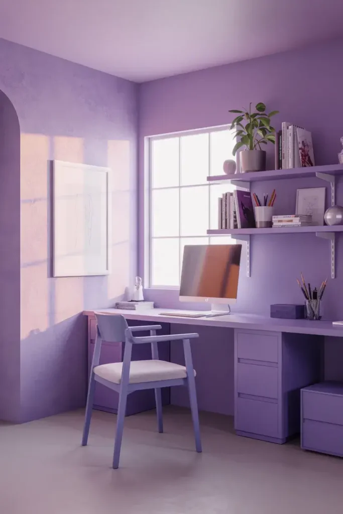
Purple is often associated with imagination. A very pale, dusty lavender can stimulate the creative side of your brain while maintaining a sense of calm. It is a unique choice that sets your space apart.
I recommend this for writers, designers, or anyone in artistic fields. It provides a gentle nudge to think outside the box without being as loud or demanding as a brighter purple.
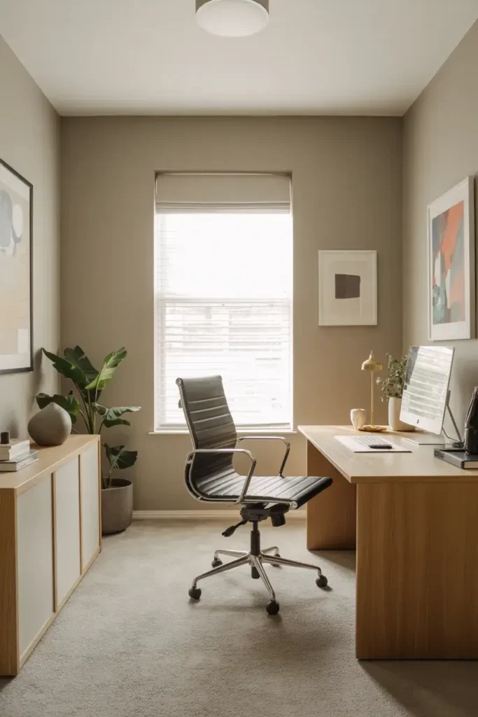
13. Warm Beige
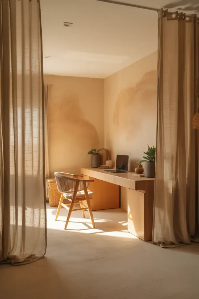
Beige is making a comeback, and for good reason. A warm, sandy beige grounds the room and creates a sense of stability. It feels natural and organic, reducing the harshness of artificial office lighting.
I like using this shade to create a zen-like sanctuary. When you surround yourself with warm neutrals, it becomes easier to breathe deeply and approach your work with a calm demeanor.
14. Rich Burgundy
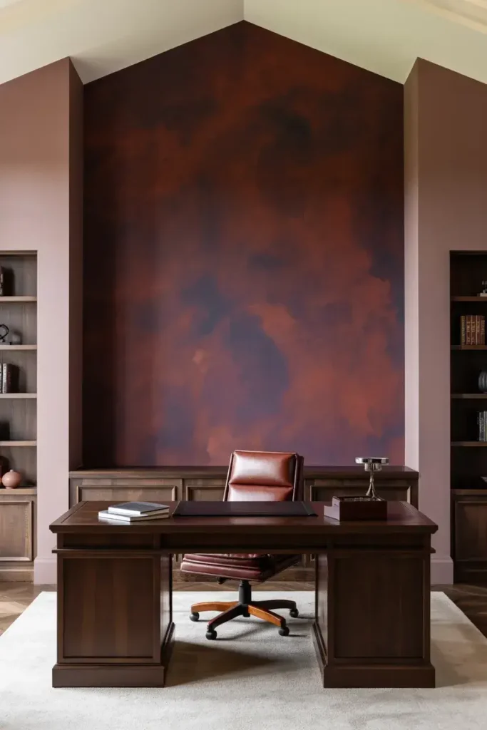
Burgundy is a power color. It has the intensity of red but is tempered by brown and purple undertones. It feels luxurious and thoughtful, perfect for a home office that doubles as a study.
I use this color sparingly, often as an accent wall or in a room with tall ceilings. It stimulates conversation and activity, making it great for spaces where you host clients or take frequent calls.
15. Misty Blue-Gray
If you can’t decide between blue and gray, choose both. A misty blue-gray offers the best of both worlds: the soothing nature of blue and the focus of gray. It changes subtly with the light throughout the day.
This color is incredibly versatile. It feels fresh in the morning light and cozy in the evening. It is a safe, stylish bet that guarantees a professional-looking backdrop.
16. Pure Bright White
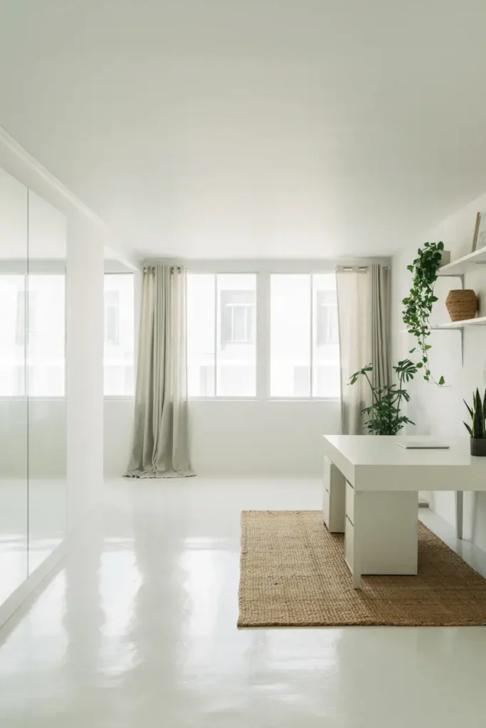
Sometimes, the best color is no color at all. Pure bright white reflects the most light, maximizing the brightness of your room. It feels clean, crisp, and full of possibility.
I advise using this in small or dark rooms to open them up. Just be sure to add texture through rugs, plants, and curtains so the space doesn’t feel sterile. It is the ultimate productivity booster for those who love minimalism.
Conclusion
Your environment shapes your work habits more than you realize. By choosing a color that aligns with your goals—whether that is calm, energy, or focus—you set yourself up for success.
If you are ready to take your productivity to the next level, grab a few samples of these shades and see how they look in your light. A fresh coat of paint might be the best business investment you make this year.