16 Creamy White Paint Colors That Will Transform Your Home
I believe there is nothing quite as refreshing as a fresh coat of white paint. It instantly brightens a room, makes spaces feel larger, and provides a clean slate for your decor. But if you have ever stood in front of a paint display, you know that “white” isn’t just one color.
There are hundreds of shades, and choosing the wrong one can leave your walls looking sterile and hospital-like. That is why I love creamy white paint colors. They possess warm undertones that make a home feel cozy and inviting rather than cold.
In this guide, I will walk you through 16 of the best creamy white paint colors. You will learn about their unique undertones, the best rooms to use them in, and how to create a space that feels effortlessly stylish.
1. Benjamin Moore Simply White (OC-117)
Simply White is one of my absolute favorites because it strikes a perfect balance. It is bright and clean, yet it holds just enough warmth to keep it from feeling stark.
With a Light Reflectance Value (LRV) of 89.52, this color reflects a significant amount of light. This makes it an excellent choice for dimly lit rooms that need a boost of brightness.
Practical Tip: Use Simply White on your trim and ceilings as well as your walls. By using different sheens (flat for ceiling, eggshell for walls, semi-gloss for trim), you create a sophisticated, layered look without changing colors.
2. Sherwin-Williams Alabaster (SW 7008)
I often recommend Alabaster to clients who want a peaceful retreat. It is a soft, balanced white that doesn’t lean too yellow, making it incredibly versatile.
In 2016, Sherwin-Williams actually named this their Color of the Year, and it remains popular for good reason. It reads as a true, soft white in natural light but cozies up beautifully in the evening.
Practical Tip: This shade pairs wonderfully with warm wood tones. Try painting your living room walls Alabaster if you have hardwood floors or rustic wooden furniture to highlight the natural grain.
3. Sherwin-Williams Dover White (SW 6385)
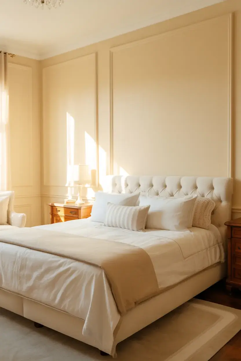
If you love a sun-splashed look, Dover White is the color for you. I find this shade has a distinct creamy yellow undertone that feels like bottled sunshine.
It is particularly effective in older homes or spaces with traditional architecture. The warmth in the paint complements intricate molding and details better than a cool, stark white would.
Practical Tip: Be careful with your lighting. I suggest using warm white LED bulbs (around 2700K or 3000K) to enhance the cozy vibe of Dover White without making it look too yellow.
4. Benjamin Moore White Dove (OC-17)
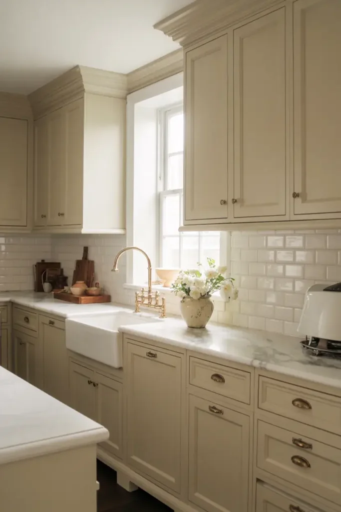
White Dove is a cult classic in the design world. I consider it a foolproof option because it has a tiny touch of gray that neutralizes the yellow, creating a soft, creamy off-white.
With an LRV of around 85, it is slightly softer than Simply White. It is universally flattering and works in almost any style of home, from modern farmhouses to colonial estates.
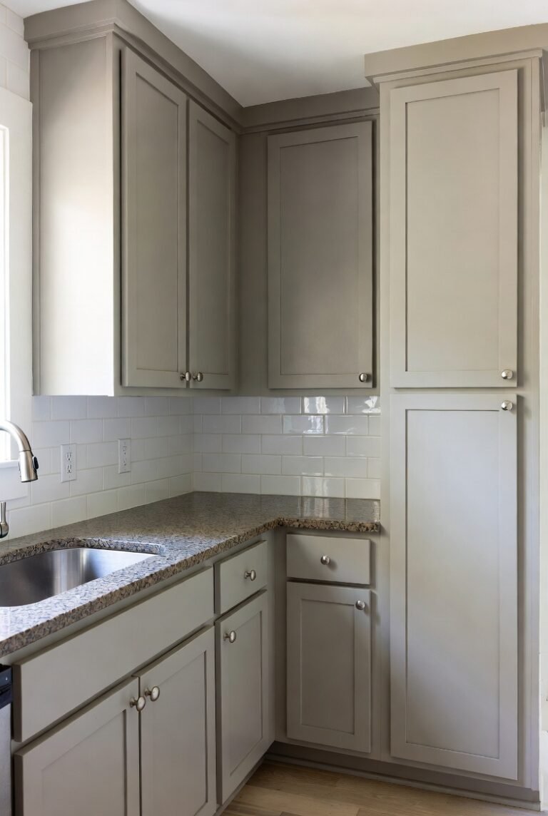
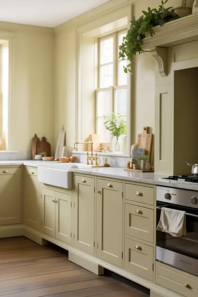
Practical Tip: Use this color on kitchen cabinets. It provides a clean, high-end look that hides fingerprints slightly better than a stark bright white.
5. Benjamin Moore Swiss Coffee (OC-45)
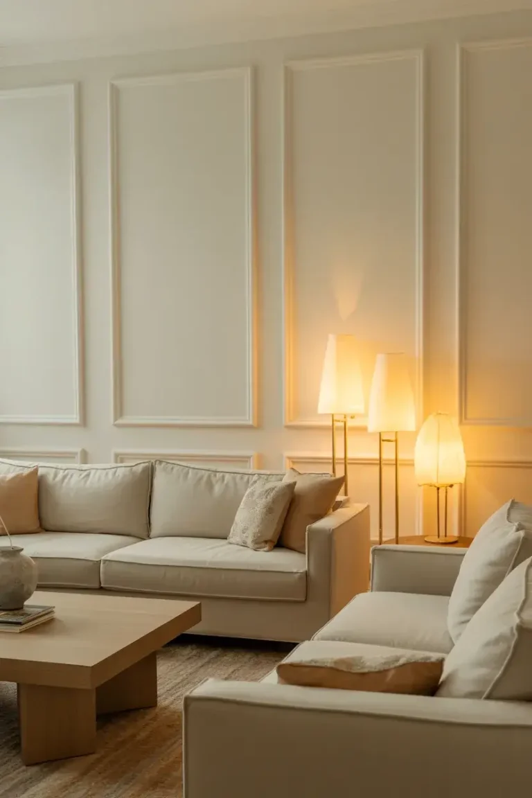
I adore Swiss Coffee for its rich, sophisticated depth. It is creamy without being overly yellow, offering a milky warmth that feels very luxurious.
Designers often use this shade in living rooms and bedrooms where comfort is key. It creates a serene backdrop that allows your art and furniture to stand out.
Practical Tip: This color looks stunning at 75% strength if you want something slightly lighter. Ask your paint store to mix it at "75% formula" for a subtle twist on this classic.
6. Sherwin-Williams Creamy (SW 7012)

The name says it all. Creamy is a luscious, warm white that completely avoids gray undertones. I find it creates a very traditional, elegant feel in a room.
It has an LRV of 81, which means it holds its color well and won’t wash out in bright sunlight. It reads as a definitive cream rather than just an off-white.
Practical Tip: Pair this with cool accents like navy blue or sage green. The contrast between the warm walls and cool decor creates a balanced and professional interior design look.
7. Farrow & Ball Pointing (No. 2003)
Pointing is named after the lime pointing used in traditional brickwork. I love this Farrow & Ball shade because it has a red base, which gives it a warm, rosy glow.
It feels incredible in spaces that get morning light. The sun hits those warm undertones and makes the entire room feel cheerful and welcoming.
Practical Tip: This is a premium paint that offers unmatched depth. Use it in a smaller space like a powder room or entryway where you can really appreciate the quality of the finish.
8. Farrow & Ball White Tie (No. 2002)
White Tie is the prettiest of the yellow-based whites. I find it brings a gentle luminosity to a room, reminiscent of old starched cotton.
It is slightly creamier than Pointing and works beautifully in kitchens. It adds a touch of freshness that feels organic and unforced.
Practical Tip: Use this color in rooms with low ceilings. The warmth helps blur the lines of the room, making the space feel less confined and more airy.
9. Behr Swiss Coffee (12)
Not to be confused with the Benjamin Moore version, Behr’s Swiss Coffee is a go-to for many DIYers. I appreciate that it is accessible and consistently looks good in rental properties or quick renovations.
It leans slightly more yellow than its counterpart but is still very versatile. It is a warm, inviting white that works well in active family spaces.
Practical Tip: This is a great exterior paint color. I recommend using it on your home's siding to create a welcoming facade that stands out against green landscaping.
10. Benjamin Moore Cloud White (OC-130)
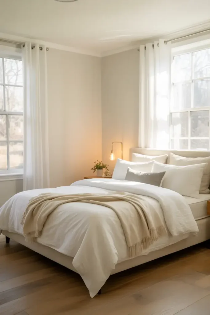
Cloud White is a balanced, soft white that sits right in the middle of the spectrum. I use this when a client is terrified of yellow undertones but still wants warmth.
It feels airy and light, just like a cloud. It is lighter than White Dove but has a similar ability to bridge the gap between modern and traditional.
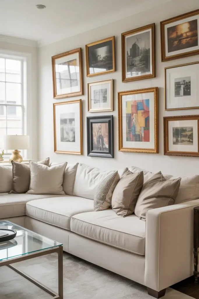
Practical Tip: This is an excellent choice for a gallery wall. The soft background lets your framed photos and artwork pop without competing for attention.
11. Sherwin-Williams Greek Villa (SW 7551)
Greek Villa is a sunny, warm white that feels like a vacation. I love how it captures the essence of Mediterranean architecture with its soft, illuminating presence.
With an LRV of 84, it is bright but grounded. It pairs exceptionally well with terra cotta pots, woven textures, and indoor plants.
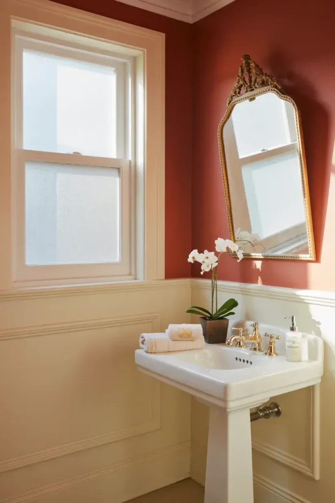
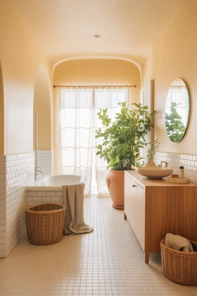
Practical Tip: Paint your bathroom in Greek Villa. It softens the harsh reflections from mirrors and porcelain fixtures, making your morning routine feel a bit more spa-like.
12. PPG Timeless (PPG1095-3)
Timeless is exactly what it claims to be. I find this color to be a true neutral off-white that works with almost any color palette you throw at it.
It is less creamy than Dover White but warmer than a pure white. It serves as a reliable backdrop that won’t clash with your changing style over the years.
Practical Tip: If you change your decor seasonally, pick this color. It looks just as good with fall pumpkins and oranges as it does with spring pastels.
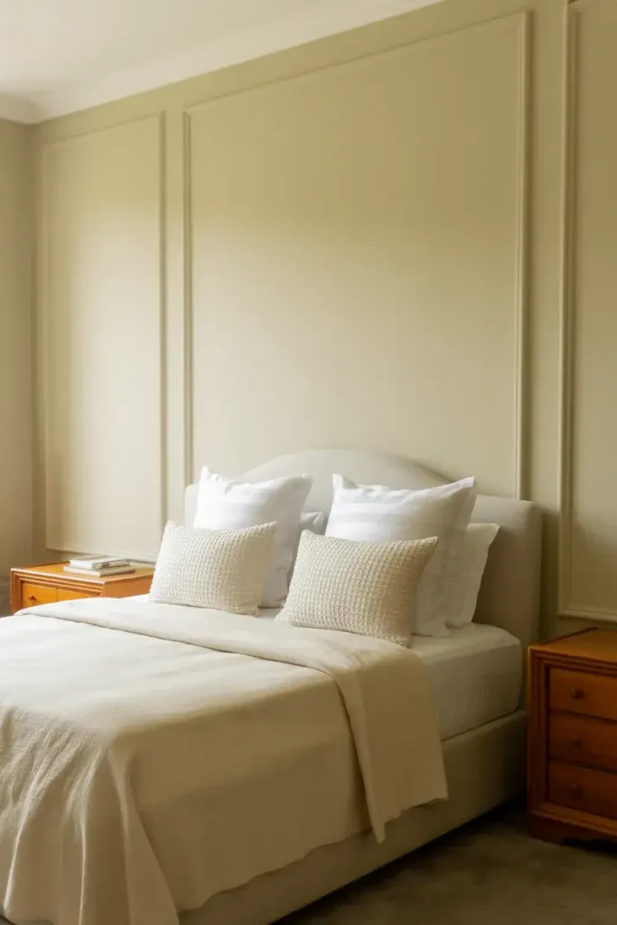
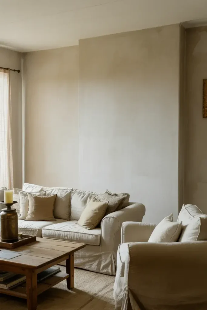
13. Valspar Cream in My Coffee (3003-10C)
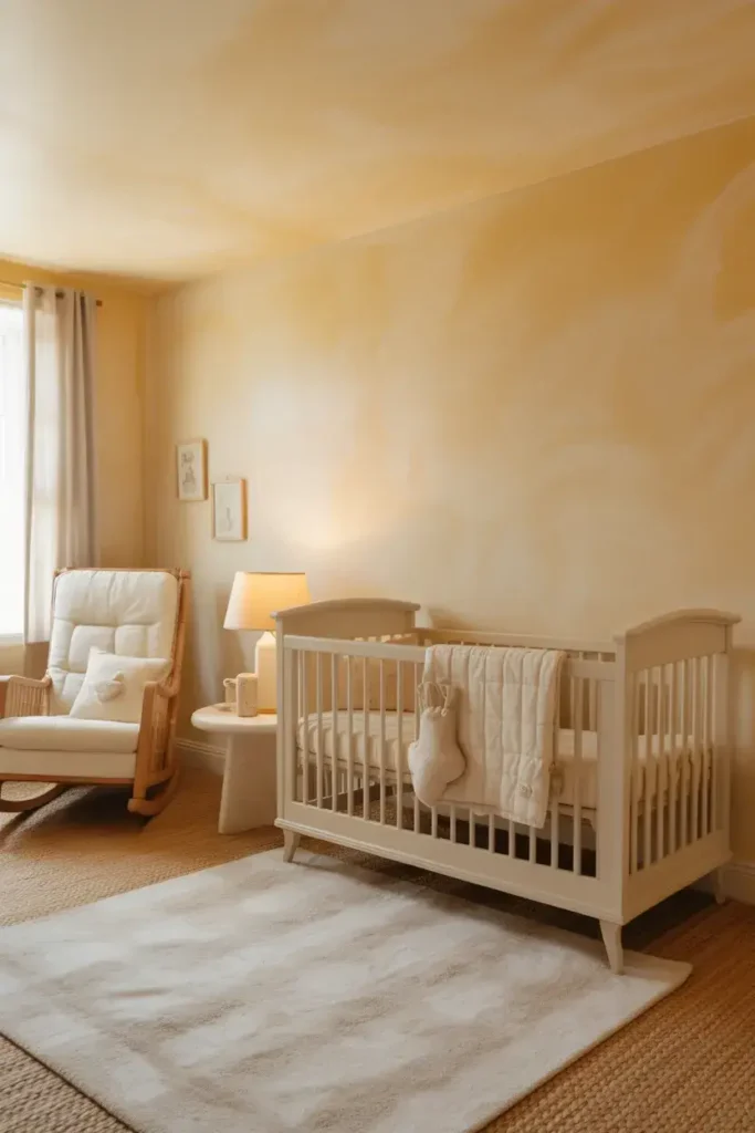
This color is deeper and richer than many others on this list. I suggest Cream in My Coffee for spaces where you want a cozy, “hugged” feeling, like a den or a nursery.
It definitely reads as a beige-white or heavy cream. It brings texture and warmth to walls that might otherwise feel flat.
Practical Tip: Use crisp bright white trim with this color. The high contrast will make the creamy wall color look intentional and sophisticated, rather than dingy.
14. Benjamin Moore Navajo White (OC-95)
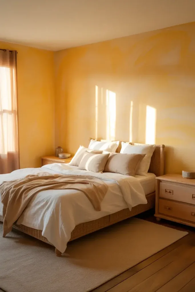
Navajo White is known for its yellow-orange undertones. I think it is one of the best choices for north-facing rooms that lack natural warm light.
In a cool, dark room, this paint simulates sunlight. It warms up the shadows and makes the space feel inhabited and cheerful.
Practical Tip: Avoid this color in south-facing rooms with abundant light, as it can look intensely yellow. Test a swatch on the wall and observe it for 24 hours before committing.
15. Sherwin-Williams Westhighland White (SW 7566)
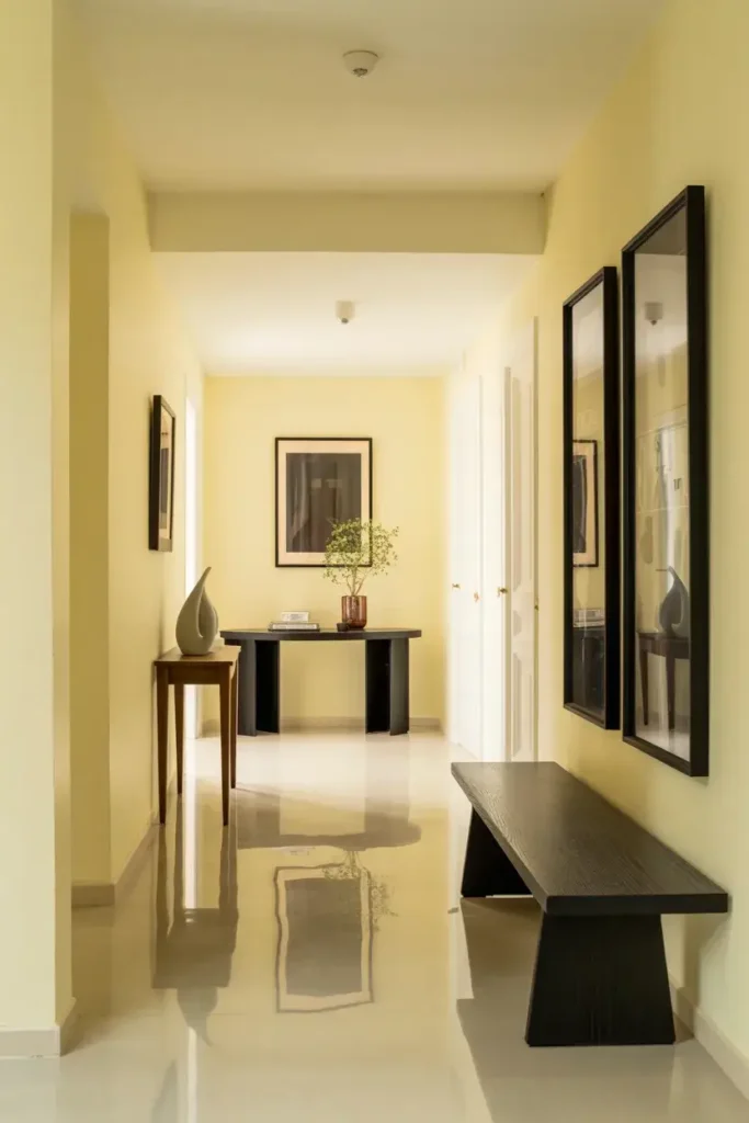
Westhighland White is a bright, creamy white that feels very active and energetic. I like using this in hallways and foyers to create a welcoming first impression.
It has a high LRV of 86, so it bounces light around corners effectively. It opens up narrow spaces and makes them feel wider.
Practical Tip: Pair this with black hardware. The sharp contrast between the creamy walls and matte black door handles or light fixtures is a timeless design trend.
16. Farrow & Ball School House White (No. 291)
School House White is designed to look like a white that has aged naturally over time. I am a fan of its muted, pared-back quality that feels grounded and calm.
It lacks the cool undertones of cheap commercial paints. Instead, it offers a soft, nostalgic feel that turns a house into a home.
Practical Tip: Use this on wainscoting or paneling. The depth of the color highlights architectural details beautifully, adding character to plain rooms.
Conclusion
Choosing the right creamy white paint can completely change how your home feels. Whether you want the sunny warmth of Dover White or the sophisticated depth of Swiss Coffee, there is a perfect shade here for you.
I encourage you to grab a few samples and start testing them on your walls today. You will be amazed at how a simple coat of paint can bring fresh energy and warmth to your life.