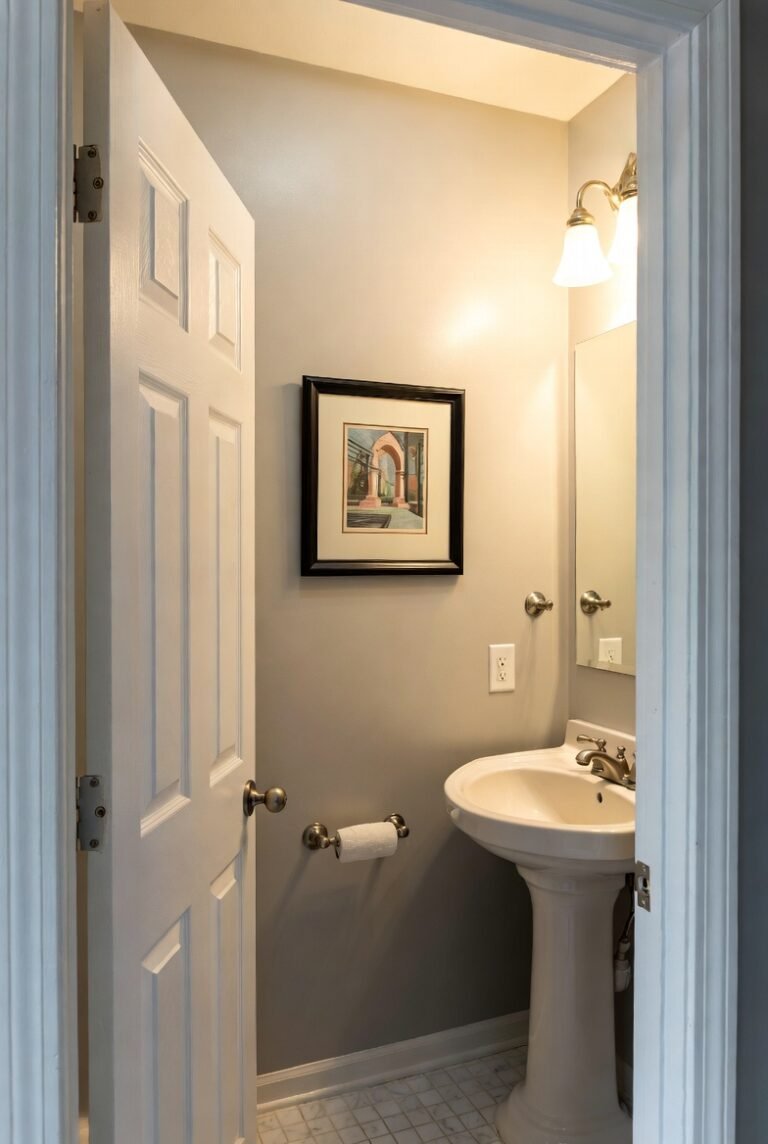
16 Warm Paint Colors for Your Living Room
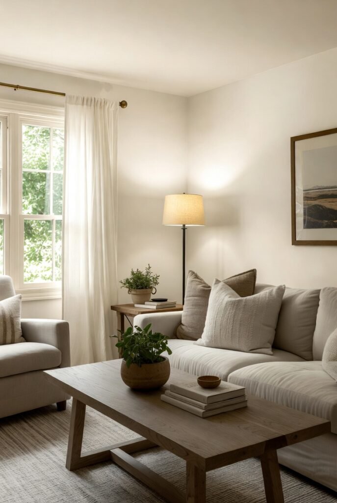
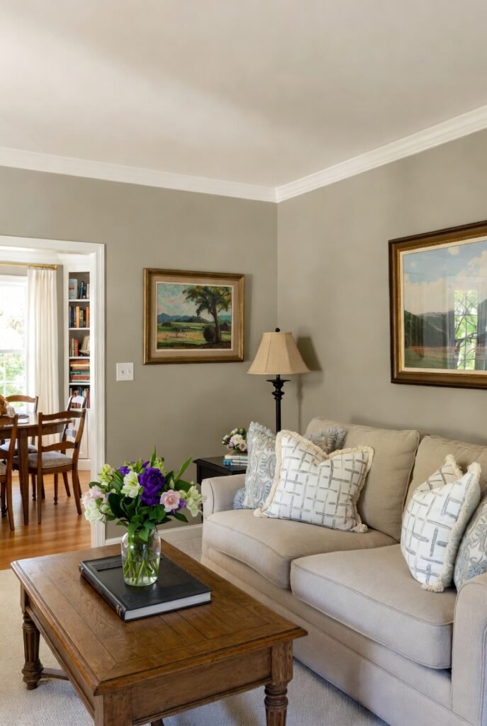
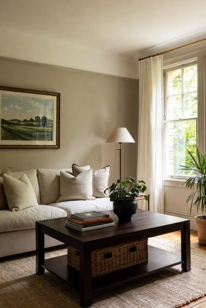
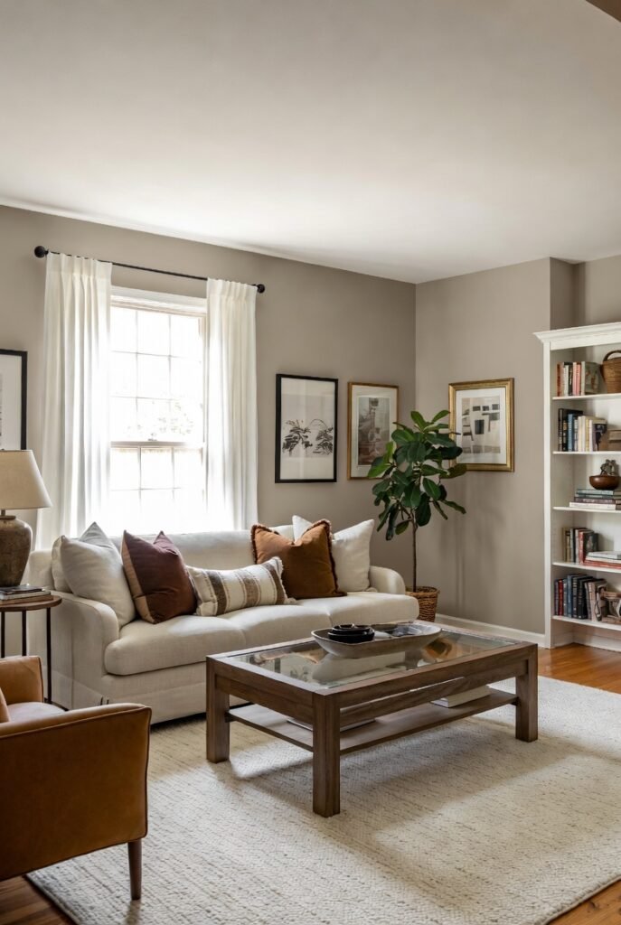
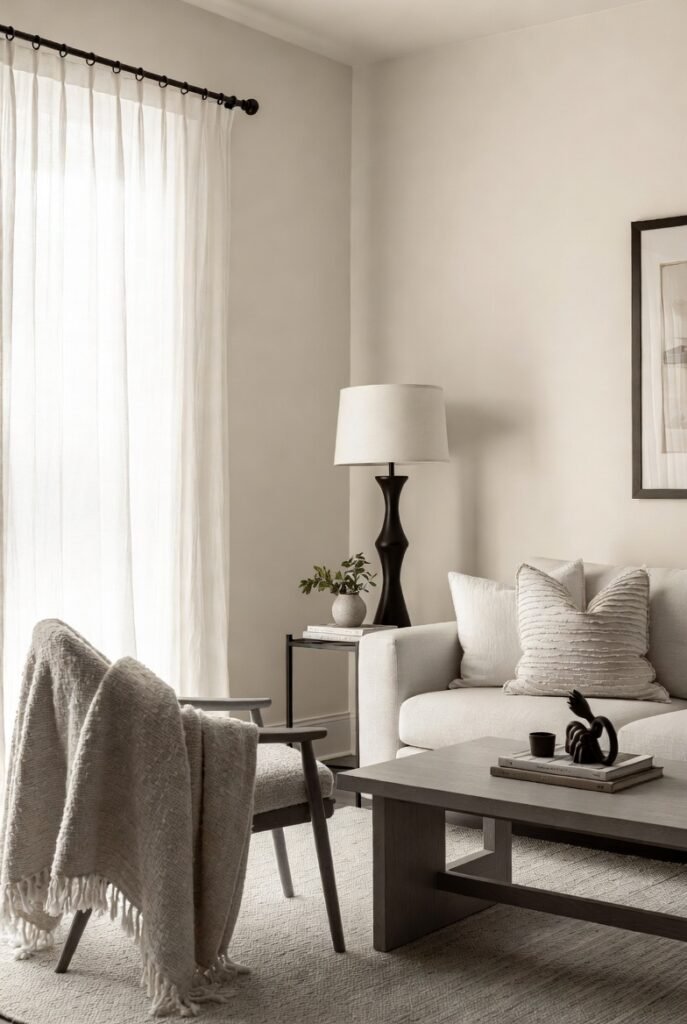
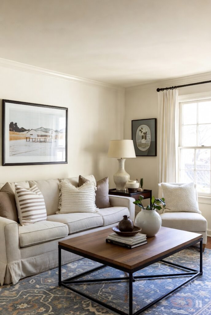
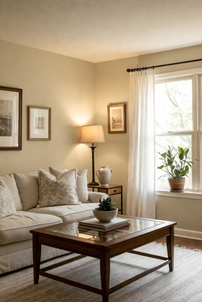
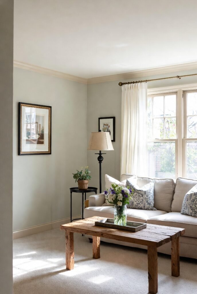
Choosing the right paint color for your living room is one of the most impactful design decisions you can make. It sets the mood for the entire home, serving as the backdrop for movie nights, family gatherings, and quiet Sunday mornings. While cool tones had their moment, I am seeing a massive shift back toward warmth.
Warm paint colors—think creamy whites, soft beiges, and earthy terracottas—make a space feel inviting and cozy. In this guide, I will share 16 of the best warm paint colors that can transform your living room into a welcoming sanctuary, along with practical tips to help you get the look right.
1. Sherwin-Williams Alabaster (SW 7008)
I love recommending Alabaster because it is the perfect warm white that never feels yellow. It strikes a balance between crisp and cozy, making it an excellent choice if you want a bright living room that doesn’t feel sterile.
With an LRV (Light Reflectance Value) of 82, it reflects a significant amount of light, which helps small rooms feel larger. It pairs beautifully with natural wood tones and soft textures like linen or wool.
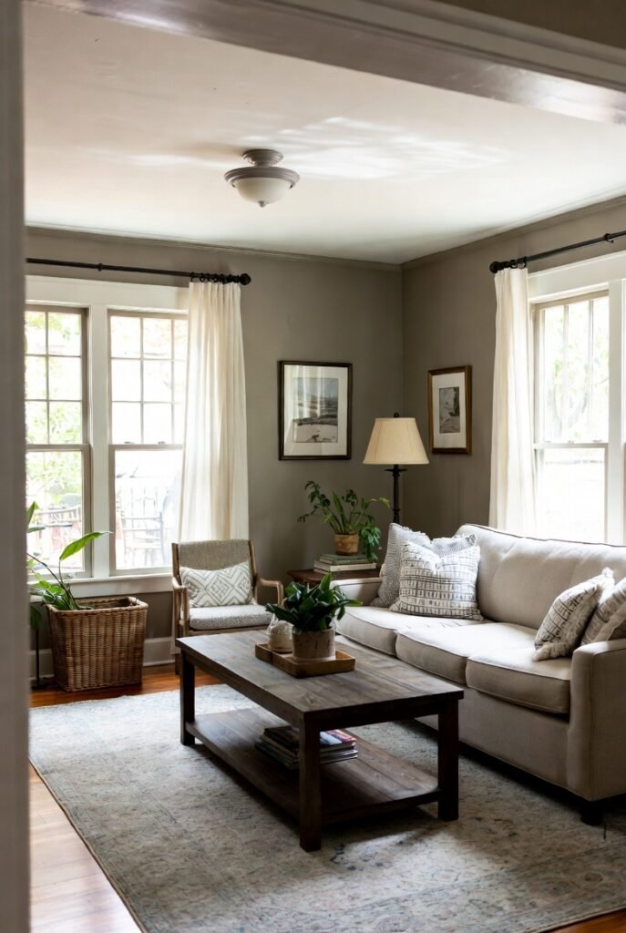
2. Benjamin Moore Revere Pewter (HC-172)
Revere Pewter is often called the “perfect greige” because it bridges the gap between gray and beige effortlessly. It is an incredibly versatile color that adapts to its surroundings, looking warmer in south-facing rooms and slightly cooler in north-facing ones.
If you have an open-concept living area, this color acts as a fantastic bridge between different spaces. It provides enough depth to contrast with white trim but remains light enough to keep the room feeling airy.
3. Farrow & Ball Joa’s White (No. 226)
Named after Farrow & Ball’s first color consultant, Joa’s White is a sophisticated, light taupe with a hint of black pigment. This unique mix gives it a grounded, earthy feel that standard creams often lack.
I find this color works exceptionally well in contemporary homes that use materials like limestone, leather, and linen. It creates a soft, enveloping atmosphere that feels both modern and timeless.
4. Sherwin-Williams Accessible Beige (SW 7036)
Accessible Beige is a staple for a reason. Unlike traditional beiges that can read as orange or yellow, this shade has gray undertones that keep it grounded and modern. It creates a warm, welcoming vibe without looking dated.
This color has an LRV of 58, meaning it holds its own against bright natural light without getting washed out. It is a safe, reliable choice if you are transitioning away from cooler grays but aren’t ready for a full brown.
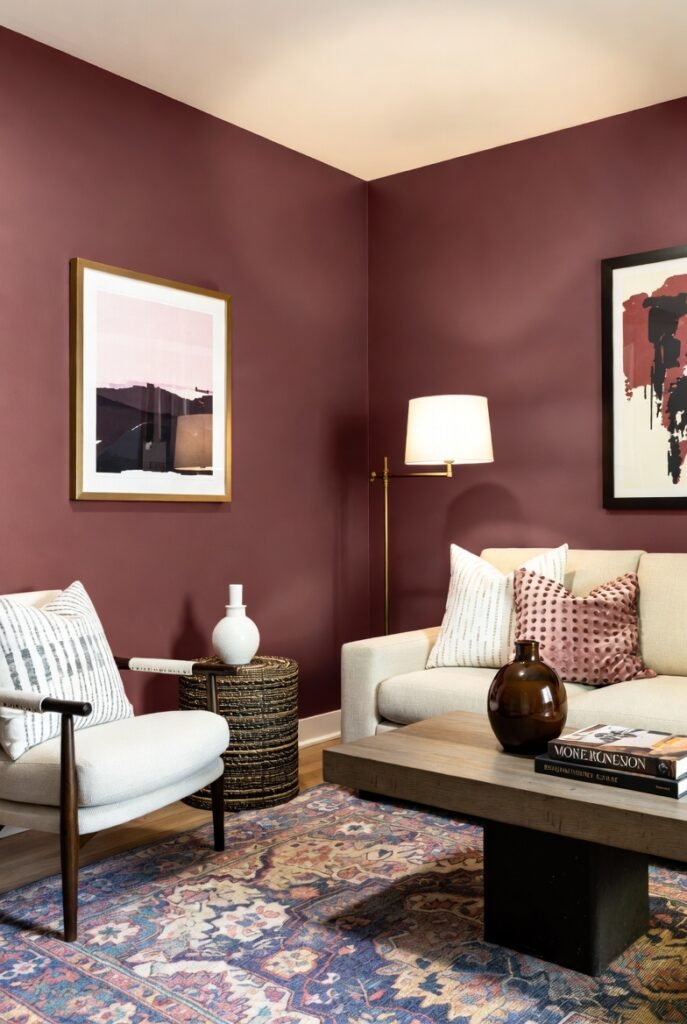
5. Benjamin Moore Cinnamon Slate (2113-40)
If you are looking for something bolder, look no further than Benjamin Moore’s Color of the Year 2025, Cinnamon Slate. This stunning mix of heathered plum and velvety brown brings a rich, modern warmth to any living space.
It is perfect for creating a cozy, “jewel-box” effect in a smaller living room or den. I suggest pairing it with brass accents or creamy neutral furniture to let the color truly shine.
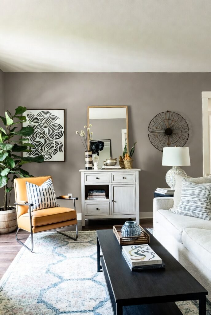
6. Sherwin-Williams Agreeable Gray (SW 7029)
Agreeable Gray is widely considered the ultimate crowd-pleaser. It is a warm “greige” that leans slightly more toward gray than Accessible Beige, making it perfect if you want warmth without committing to a full beige palette.
Because it works with almost any flooring or furniture style, it is a fantastic backdrop for eclectic decor. It allows your art and furniture to take center stage while keeping the room feeling unified.
7. Benjamin Moore Edgecomb Gray (HC-173)
Edgecomb Gray is a soft, airy greige that sits somewhere between a gray and a cream. It is incredibly adaptable and tends to take on the characteristics of the light in the room.
I often suggest this shade for living rooms that get a lot of natural light, as it creates a soft, organic warmth. It looks particularly elegant when paired with crisp white trim like Benjamin Moore’s Chantilly Lace.
8. Farrow & Ball Elephant’s Breath (No. 229)
Don’t let the quirky name fool you; Elephant’s Breath is a stunning, warm mid-grey with a hint of magenta. This subtle violet undertone gives it a unique warmth that looks incredible in west-facing rooms where the afternoon sun hits.
It pairs beautifully with natural materials like wood and leather. If you want a neutral that feels sophisticated and slightly moody, this is a fantastic contender.
9. Sherwin-Williams Shoji White (SW 7042)
Shoji White is a creamy, warm white that leans slightly toward greige. It is lighter than Accessible Beige but has more body than Alabaster, making it a great middle-ground option.
This color is perfect for creating a “Japandi” or minimalist aesthetic. It brings a sense of calm and serenity to a living room, especially when layered with other textures in similar monochrome tones.
10. Benjamin Moore Swiss Coffee (OC-45)
Swiss Coffee is a favorite among interior designers for its ability to add instant warmth to a space. It is a creamy off-white that feels luxurious and inviting, rather than stark or hospital-like.
I love using this color on walls, trim, and ceilings for a seamless, dipped look. It softens the hard edges of a room and creates a cozy, enveloping background for your daily life.
11. Sherwin-Williams Natural Linen (SW 9109)
Natural Linen acts exactly as its name implies—it looks like clean, unbleached fabric. It is a straightforward, warm neutral that avoids pink or yellow undertones, making it very easy to work with.
With an LRV of 66, it is light enough to brighten up a dark corner but saturated enough to contrast beautifully against white trim. It creates a breezy, effortless vibe in any living area.
12. Benjamin Moore Classic Gray (OC-23)
Despite its name, Classic Gray reads as a very pale, warm off-white in most lighting conditions. It is perfect for those who want the clean look of white walls but need just a hint of pigment to warm things up.
It is an excellent choice for north-facing rooms that tend to feel cool or blue. The subtle warmth in Classic Gray counteracts those cool shadows, making the room feel more inviting.
13. Farrow & Ball Setting Plaster (No. 231)
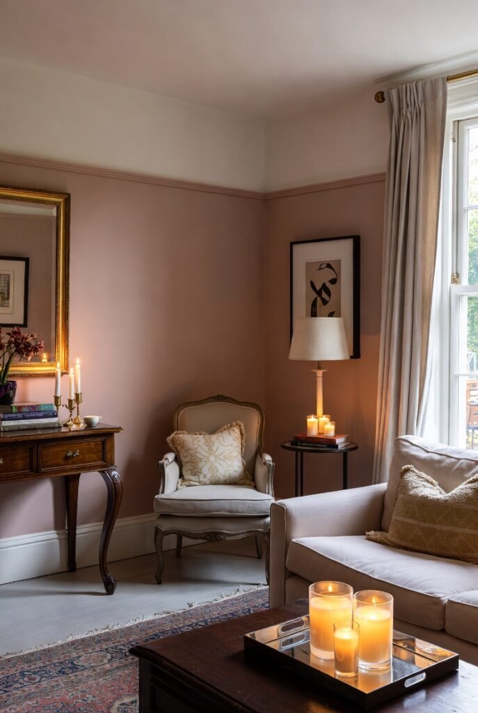
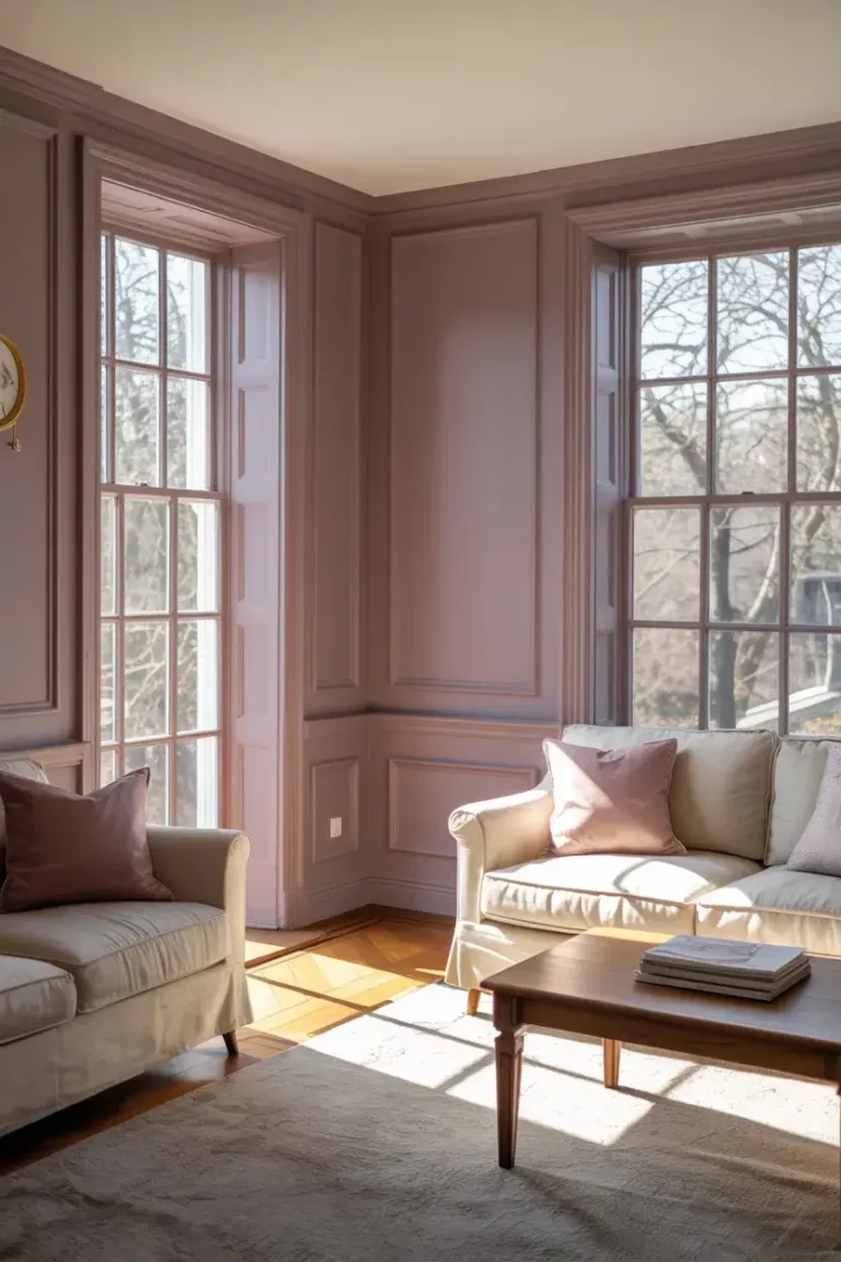
For those willing to embrace color, Setting Plaster is a dusty pink named after the color of newly plastered walls. It acts as a wonderful warm neutral that feels historic and comforting rather than overly feminine.
I recommend this shade if you want your living room to feel like a warm hug. It glows beautifully in candlelight and creates a truly unique, sophisticated backdrop for antiques or modern furniture alike.
14. Sherwin-Williams Cavern Clay (SW 7701)
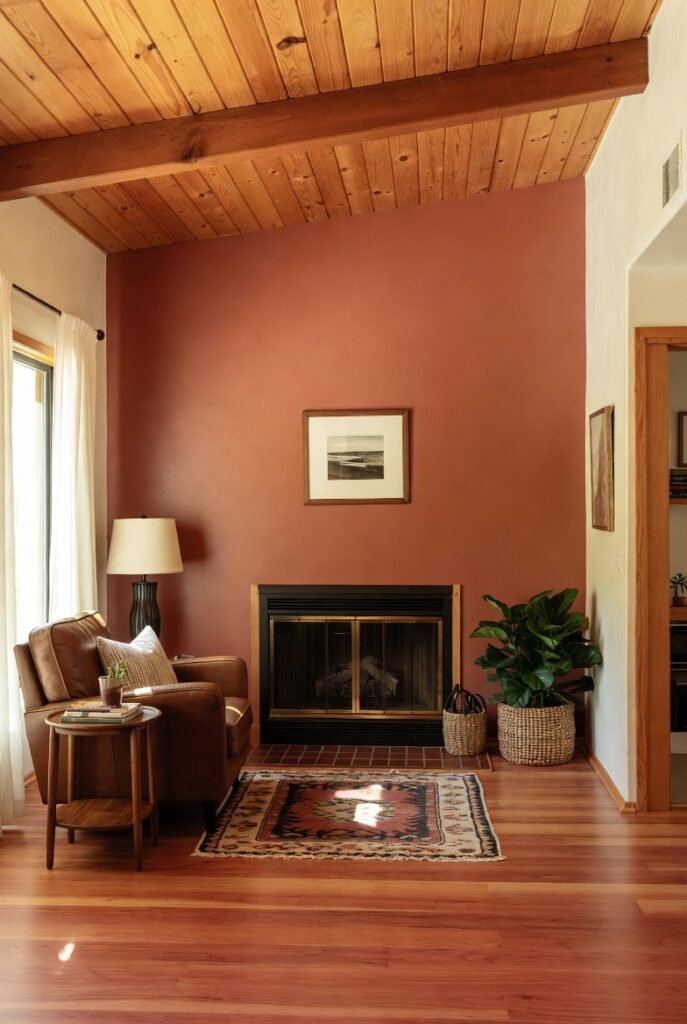
Cavern Clay is a warm, earthy terracotta that brings the outdoors in. It nods to mid-century modern style and the American Southwest, offering a rich, sun-baked quality.
You don’t have to paint the whole room to make an impact; try this shade on an accent wall behind a fireplace or media console. It pairs exceptionally well with warm wood tones, leather furniture, and greenery.
15. Benjamin Moore White Dove (OC-17)
White Dove is a soft, warm white that has been a bestseller for years. It has a tiny hint of yellow that prevents it from looking gray, but it never feels overly creamy or buttery.
It is a fantastic choice if you want to paint your walls, trim, and ceiling different sheens of the same color. It reflects light beautifully and creates a soft, luminous quality in the room.
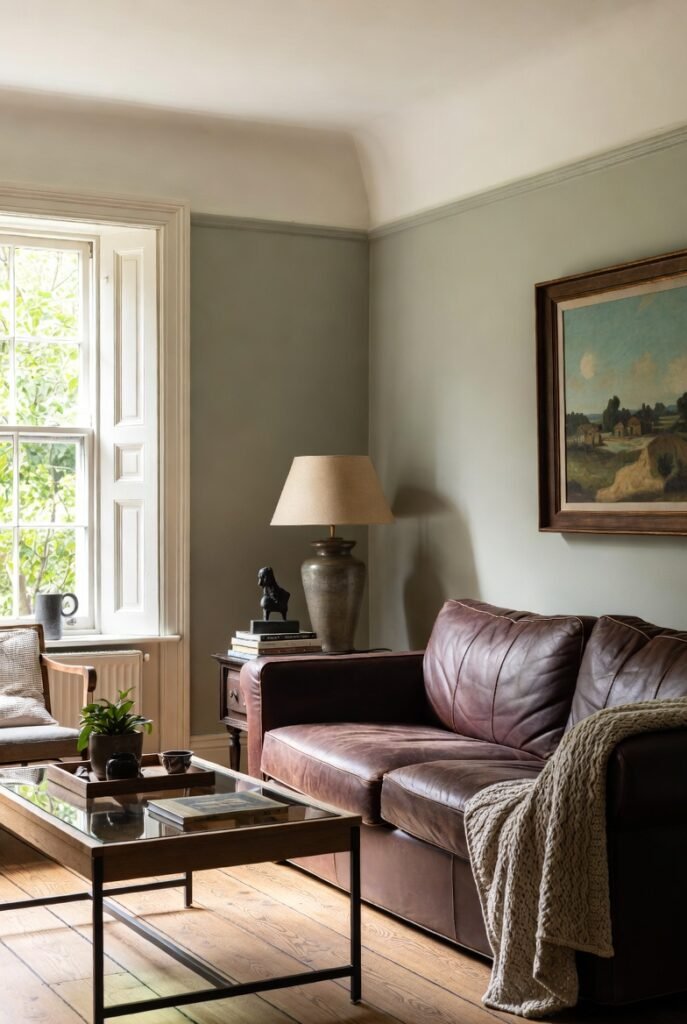
16. Sherwin-Williams Evergreen Fog (SW 9130)
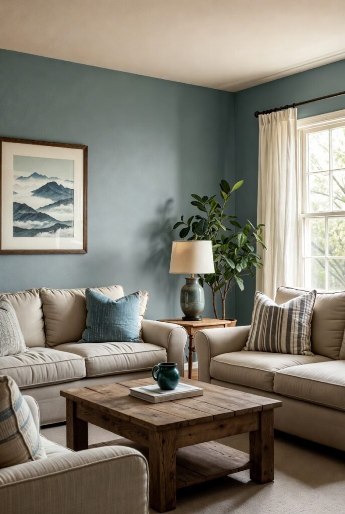
While technically a green, Evergreen Fog is a warm, chameleon-like color that acts as a neutral. It is a soothing, gray-green that brings a sense of organic calm to a living space.
I love this color because it pairs so well with warm neutrals like beige and tan. It brings a touch of nature indoors without being overwhelming, making your living room feel grounded and peaceful.
Conclusion
Finding the perfect paint color can feel overwhelming, but focusing on warm tones is a surefire way to create a space you’ll love spending time in. Whether you choose a barely-there white or a rich terracotta, the goal is to create a feeling of comfort and ease.
If you are ready to refresh your space but feel unsure where to start, our team is here to help. Schedule a consultation with our design experts today to find the perfect shade for your home.


