16 Colors That Go With Beige: A Designer’s Guide to Perfect Pairings
If you think beige is boring, I have some news that might change your mind. Far from being “blah,” beige is actually the design world’s secret weapon—a chameleon that brings warmth, stability, and endless versatility to any room.
But here is the trick: beige only truly shines when it has the right partner. I’ve seen countless rooms fall flat simply because the undertones clashed or the contrast was missing.
In this guide, I’ll walk you through 16 incredible colors that pair perfectly with beige, helping you transform your home into a space that feels curated, cozy, and effortlessly stylish.
1. Crisp White
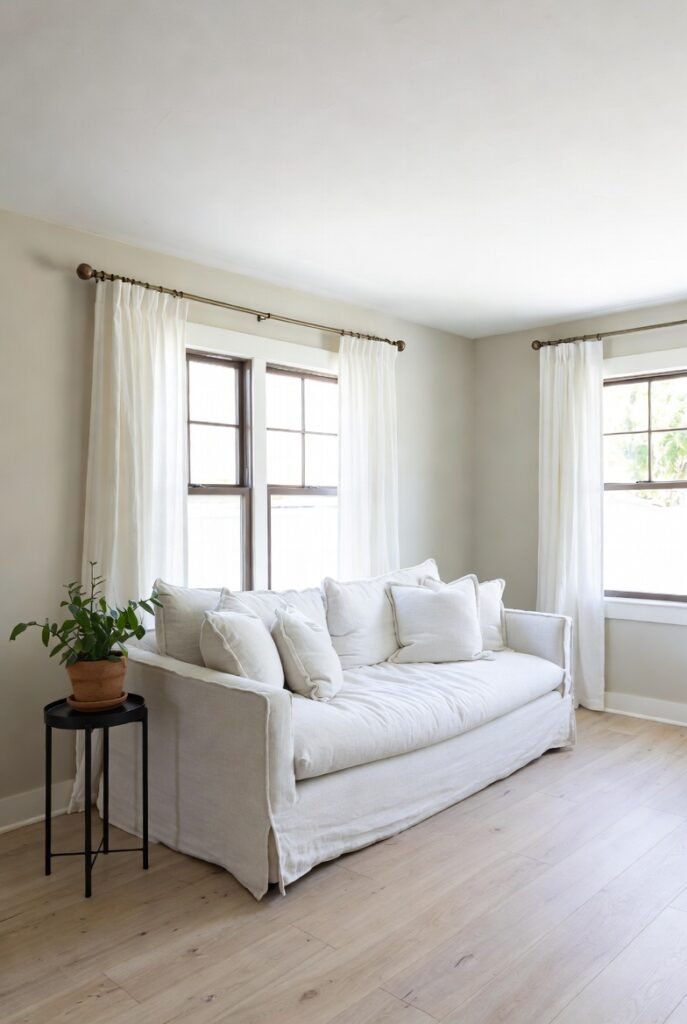
If I had to pick the most foolproof partner for beige, it would be crisp white. This combination is the backbone of the “coastal grandmother” and minimalist trends that have taken over social media feeds recently.
The key here is contrast. I always recommend using a bright, clean white for trims and ceilings to cut through the warmth of beige walls. This prevents the room from feeling muddy. For a living room, try a white linen sofa against beige walls—it instantly makes the space feel airy and expensive.
Tip: Check the Light Reflectance Value (LRV) of your paint. A white with an LRV of 85+ will pop beautifully against a medium beige.
2. Charcoal Gray
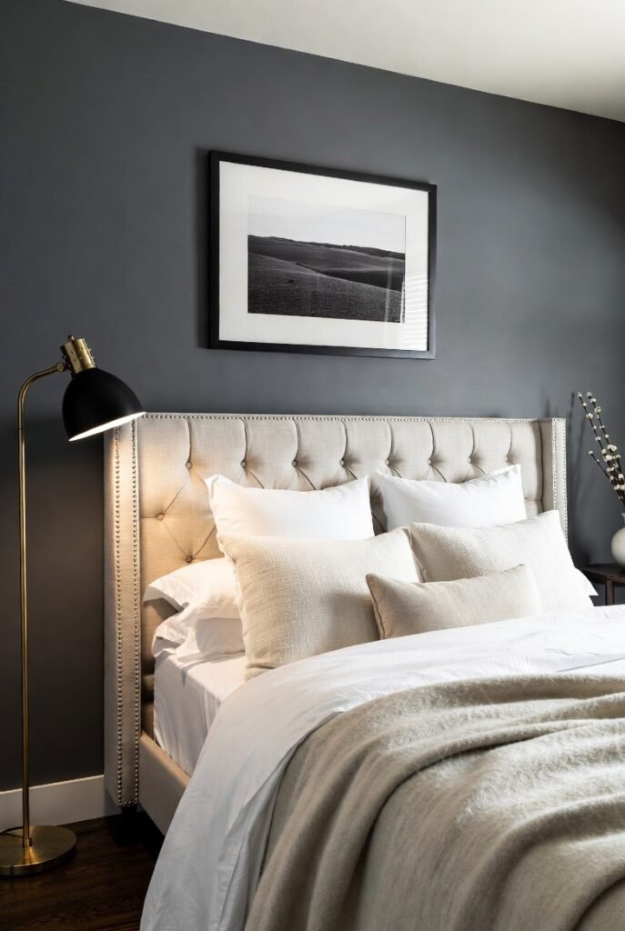
When clients tell me they want drama without the harshness of black, I turn to charcoal gray. This deep, moody shade grounds the lightness of beige and adds a sophisticated, masculine edge.
I love using this duo in bedrooms. Picture a beige upholstered headboard against a charcoal accent wall. The beige softens the darkness, while the gray prevents the beige from looking too traditional. It is a balancing act that works every time.
Tip: Use charcoal in matte finishes (like velvet cushions or matte paint) to add depth rather than shine.
3. Sage Green
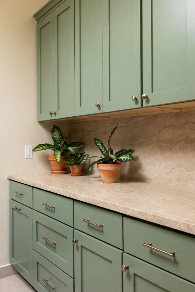
Bringing the outdoors in is a design principle I swear by, and sage green is the perfect way to do it. Because beige is an earth tone, it naturally harmonizes with the muted, organic vibes of sage.
This pairing is particularly effective in bathrooms or kitchens. I often suggest sage green cabinetry with beige stone countertops. It creates a serene, spa-like atmosphere that feels fresh but not sterile.
Tip: Add real plants to bridge the gap between your paint colors and your decor.
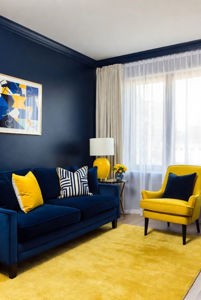
4. Navy Blue
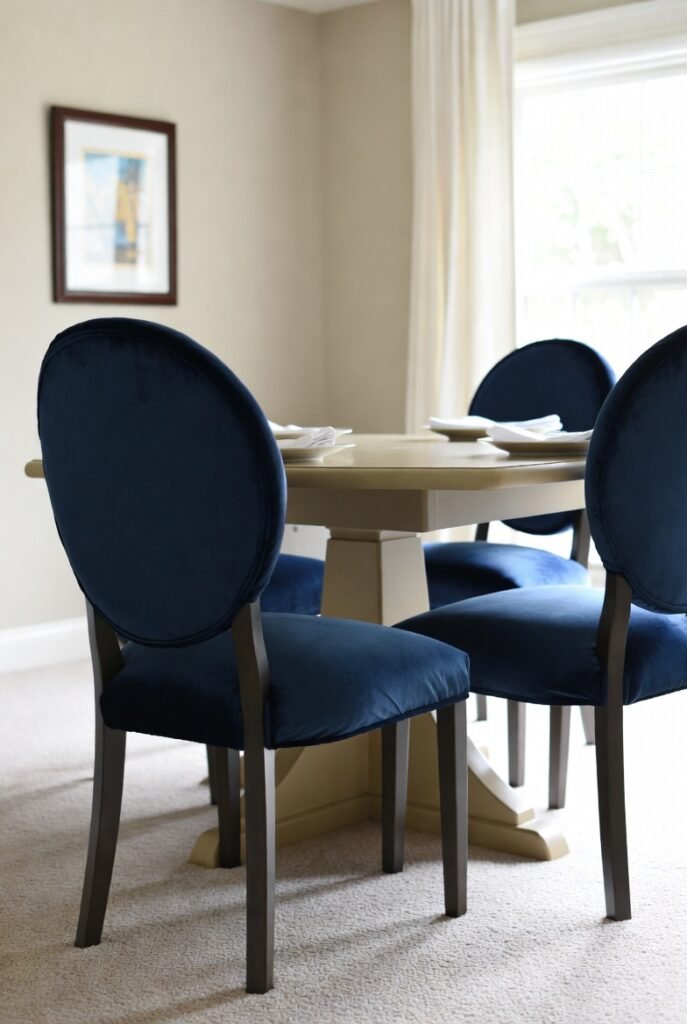
If you want a look that screams “classic luxury,” pair beige with navy blue. This combination is a staple in nautical and preppy interior design because it feels established and timeless.
I find that navy adds a necessary visual weight to beige rooms. In a dining room, try navy velvet dining chairs around a light beige wooden table. The deep blue anchors the space, while the beige keeps it inviting.
Tip: Use gold or brass hardware as a third accent to elevate this look to pure elegance.
5. Terracotta
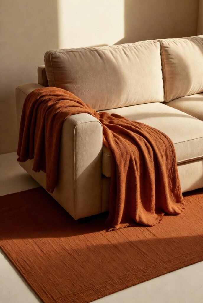
For those who love warmth, pairing beige with terracotta is a no-brainer. Both colors share warm, orange-red undertones, making them a monochromatic match made in heaven.
I love using this combination in living areas to create a cozy, “golden hour” feeling all day long. A terracotta rug or throw blanket on a beige sofa adds heat and energy without overwhelming the eye.
Tip: Layer different textures like clay pots, wool rugs, and linen throws to keep this warm palette interesting.
6. Blush Pink
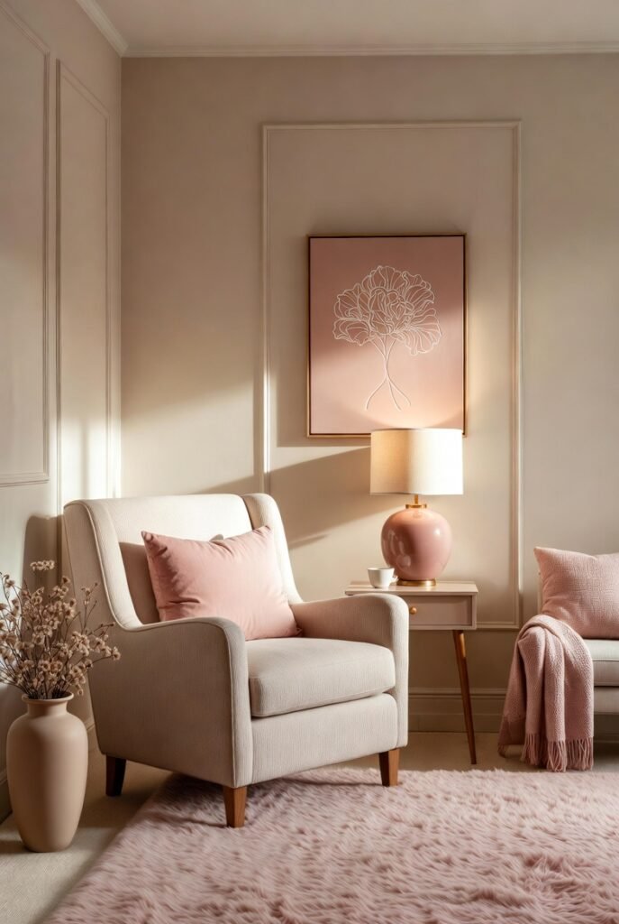
Beige and blush pink is a combination I use when a space needs softness. It’s romantic and feminine but stays grounded thanks to the neutral beige base.
This works wonders in a nursery or a calm home office. I suggest using blush for accents—like throw pillows, artwork, or a rug—while keeping the main furniture pieces beige. It feels sophisticated, not sugary.
Tip: Choose a “dusty” pink rather than a bright bubblegum shade for a more mature look.
7. Olive Green
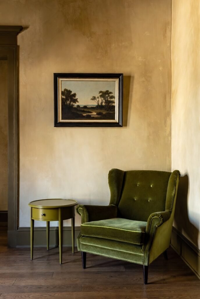
While sage is soft, olive green is bold and earthy. I find that olive green brings out the richness in darker beiges and tans, creating a library-chic or mid-century modern aesthetic.
I recently saw a study with an olive green velvet armchair placed against warm beige walls, and it looked incredible. The green adds a moody, historical feel that gives the beige character.
Tip: Pair this duo with dark walnut wood furniture to enhance the moody, earth-tone vibe.
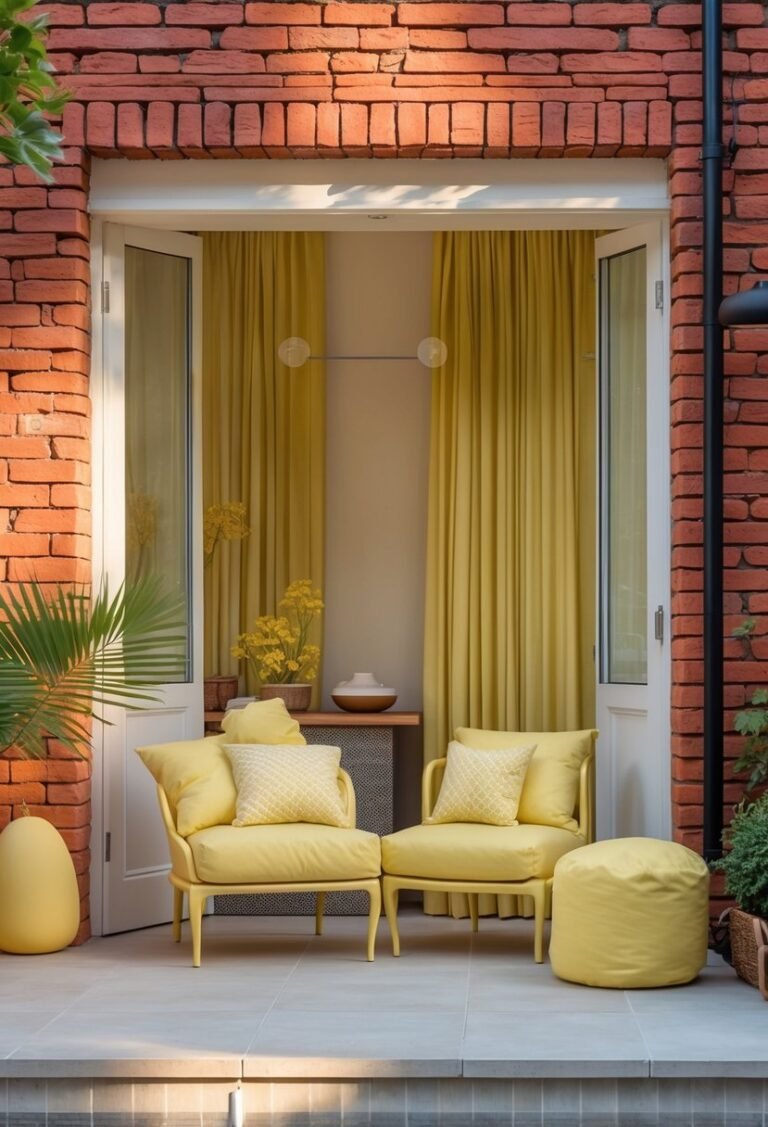
8. Mustard Yellow
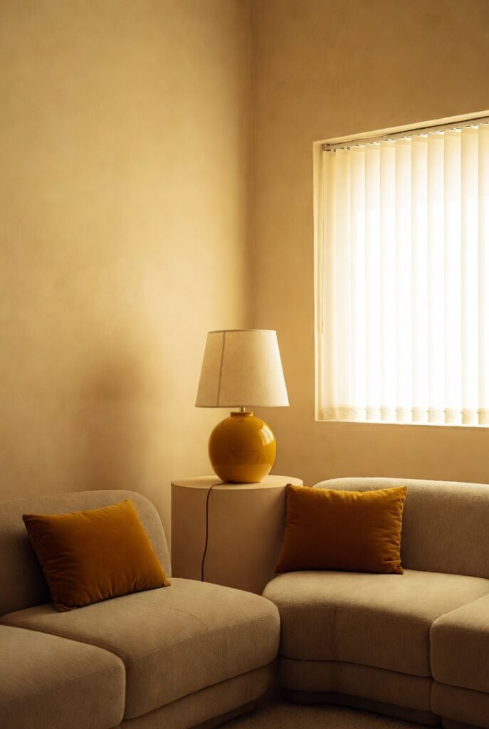
If your beige room feels a little lifeless, mustard yellow is the caffeine kick it needs. This zesty hue picks up on the yellow undertones in many cream and beige shades, creating a sunny and cohesive look.
I use this sparingly but effectively. Think mustard throw pillows on a beige sectional or a yellow ceramic lamp on a beige side table. It adds a retro, 70s-inspired flair that is very trendy right now.
Tip: Keep the mustard usage to about 10% of the room to avoid overwhelming the space.
9. Black
Sometimes, you just need high contrast. Black acts as punctuation in a sentence—it stops the eye and defines the space. Without it, a beige room can sometimes float away.
I recommend using black for hardware, picture frames, and lighting fixtures. In a beige kitchen, matte black cabinet handles look stunning and modern. It sharpens the soft edges of the beige.
Tip: Use thin black lines (like in frames or table legs) for a modern, graphic look.
10. Burgundy
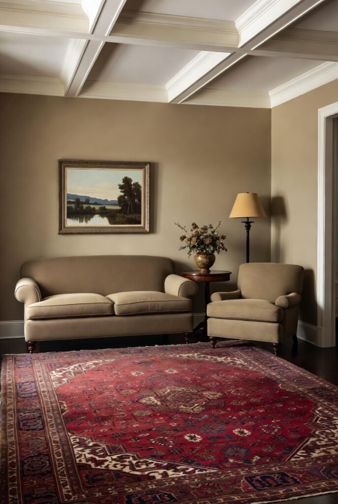
Burgundy is having a major comeback, and I am here for it. When paired with beige, it feels regal and heritage-inspired. It strips away the “dated” feel of burgundy and makes it feel fresh again.
I love this for a formal living room or entryway. A burgundy Persian rug creates a rich foundation for beige furniture. It feels curated and collected, rather than stiff.
Tip: Ensure your beige leans towards warm (yellow/orange undertones) rather than cool (gray) to harmonize with the red in burgundy.
11. Sky Blue
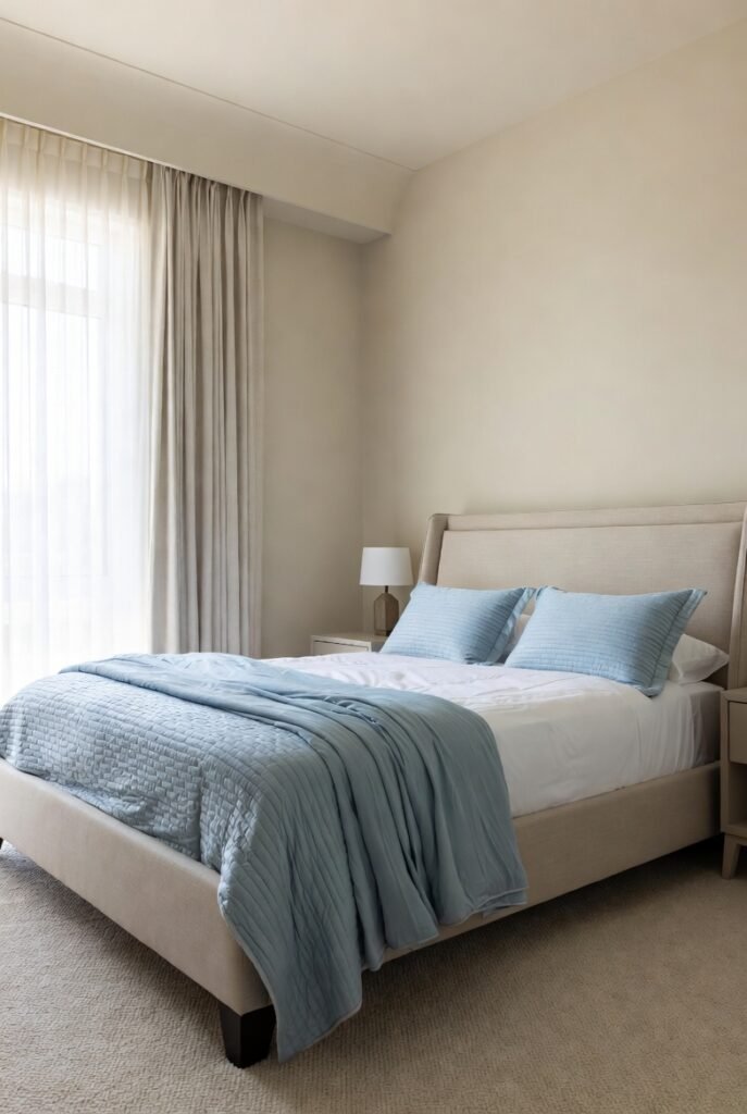
For a breezy, airy vibe, sky blue is my go-to. It cools down the warmth of beige, creating a balanced temperature in the room that feels very calming.
This is my top pick for bedrooms. Soft blue bedding on a beige upholstered bed frame looks dreamy and inviting. It’s the visual equivalent of a fresh breath of air.
Tip: Keep the saturation levels similar—pair a soft, pastel beige with a soft, pastel blue.
12. Chocolate Brown
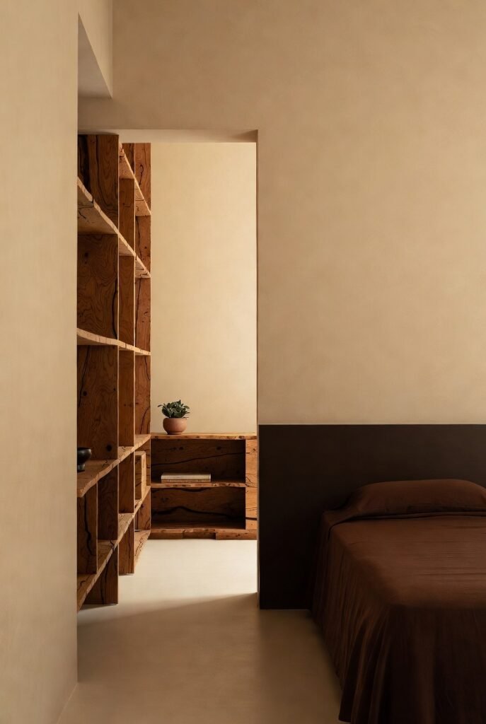
Monochromatic styling is huge right now, and pairing beige with its darker cousin, chocolate brown, creates a stunning tone-on-tone effect.
I find this incredibly soothing because the eye doesn’t have to work hard to process the contrast. It feels organic and cozy. Try dark brown wood furniture against creamy beige walls for a look that is steeped in nature.
Tip: Vary your textures (leather, wood, wool) to stop the room from looking flat.
13. Teal
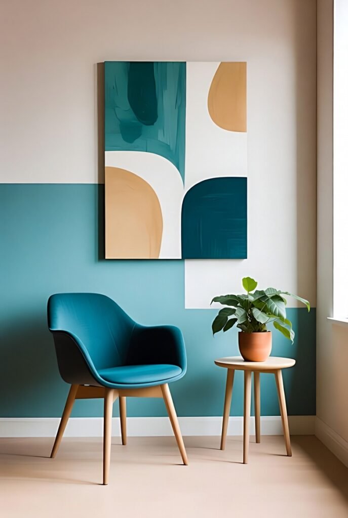
Teal is a complex color—part blue, part green—that brings energy to a beige room. It offers the calm of blue with the vitality of green, making it a versatile accent.
I like using teal in creative spaces like offices or playrooms. A teal accent chair or a piece of large-scale art can serve as a fantastic focal point in an otherwise neutral beige room.
Tip: Use a deep, jewel-tone teal for a more luxurious feel, rather than a bright turquoise.
14. Burnt Orange
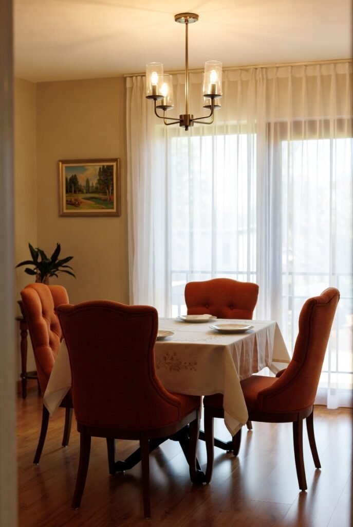
Similar to terracotta but punchier, burnt orange brings a vibrant energy that beige desperately needs sometimes. It is autumnal, warm, and inviting.
I often suggest this for dining rooms. Upholstered dining chairs in a burnt orange fabric look incredible against a beige wall. It stimulates appetite and conversation!
Tip: Pair this combo with brass accents to enhance the warmth.
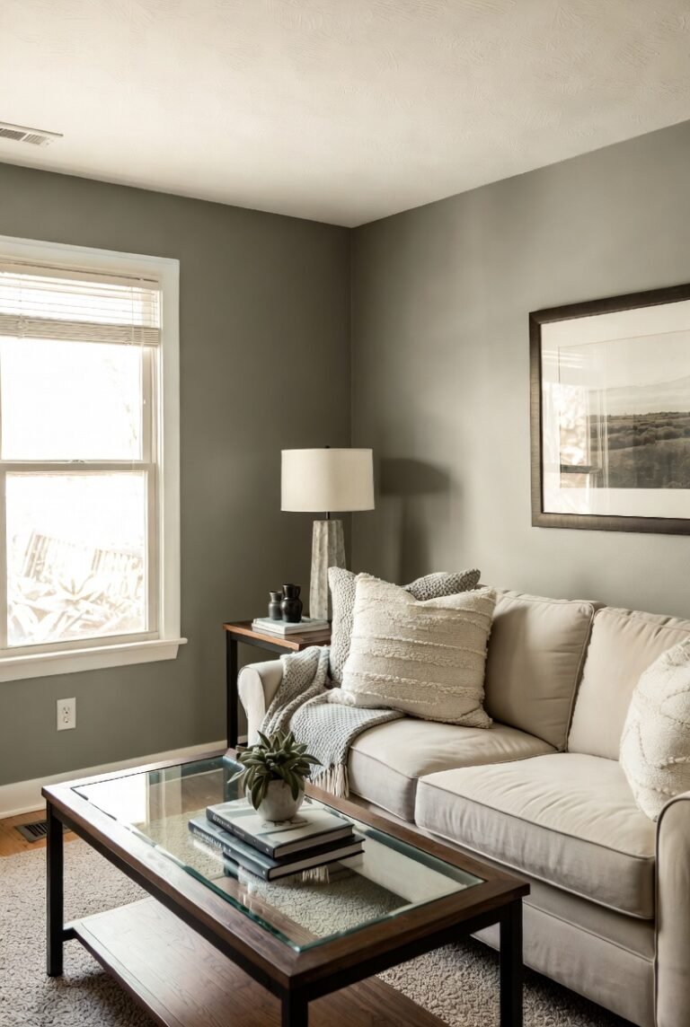
15. Greige (Gray-Beige)
Okay, this is technically cheating, but layering different depths of “greige” with true beige creates a sophisticated, multi-dimensional look. It’s the “no-makeup makeup” look of interior design.
I use this to create depth. If your walls are light beige, choose a sofa in a deeper greige. It adds subtle contrast without breaking the neutral palette.
Tip: Make sure you mix warm and cool undertones carefully so they don’t clash.
16. Emerald Green
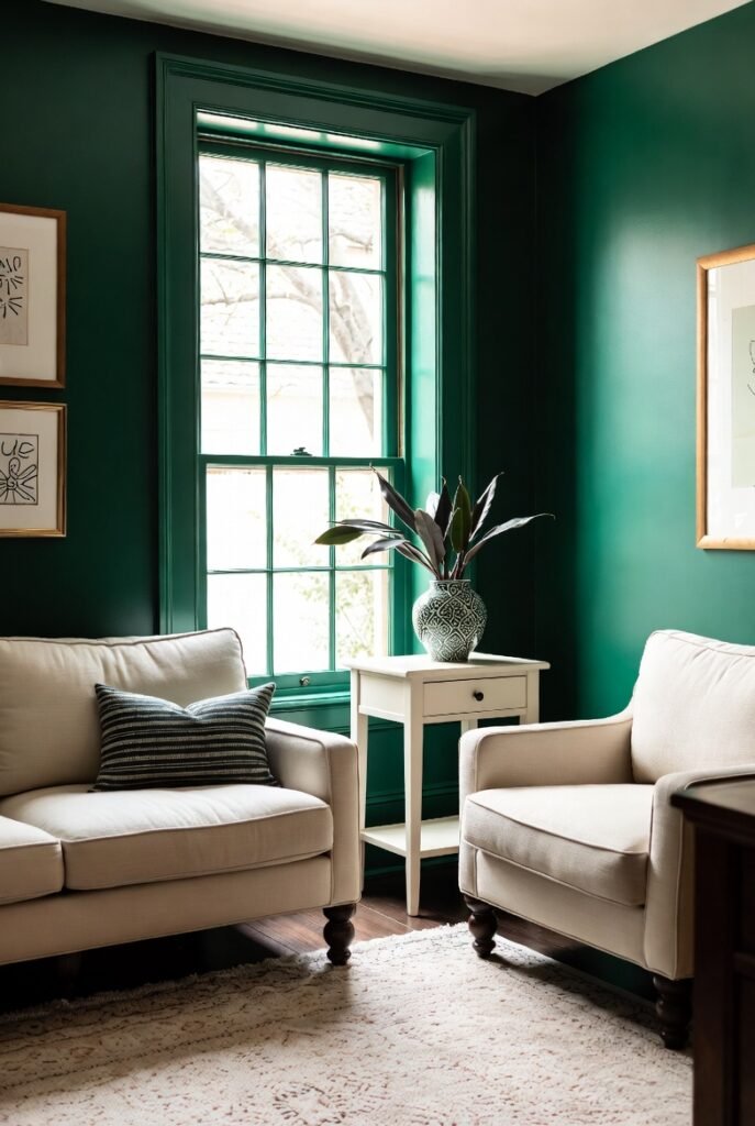
For a jewel-box effect, emerald green is stunning. It is luxurious and bold, and beige provides the quiet backdrop that lets this color truly sparkle.
I love seeing emerald green velvet drapes in a room with beige walls. It feels historic and grand. The beige keeps the room from feeling too dark, while the green brings the drama.
Tip: Use this in rooms with little natural light to lean into the moody, cozy vibe.
Final Words
Choosing the right color palette is just the first step in creating a home you love. Beige is far from boring—it is the canvas waiting for your personal touch.
If you are feeling inspired but need a little extra help pulling it all together, why not book a consultation with our design team? We can help you pick the perfect shade of beige and the ideal accent colors to match your unique style.