17 Lounge Room Paint Ideas to Transform Your Space
Your lounge room is the heart of your home. It is where you unwind after a long day, host friends, and make memories with family.
Choosing the right paint color changes everything. I know how overwhelming it feels to stand in front of a wall of paint chips, wondering which shade will look best.
In this guide, I will walk you through 17 inspiring paint ideas that range from trending 2025 colors to timeless classics. You will discover how different hues affect your mood and learn practical tips to get the perfect finish.
1. Embrace the 2025 Color of the Year
If you want your home to feel modern and stylish, I recommend starting with the latest trends. Benjamin Moore recently announced “Cinnamon Slate” as their Color of the Year for 2025.
This beautiful mix of heathered plum and velvety brown brings a smooth familiarity to any design. It offers a unique balance of warmth and sophistication that instantly elevates a lounge room.
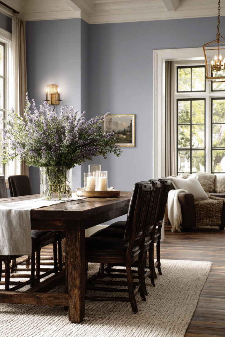
2. Create Calm with Cool Blues
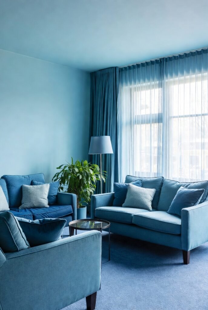
I always suggest blue for anyone wanting a relaxing atmosphere. Research shows that blue is the most preferred interior color, with nearly 35% of people choosing it for their spaces.
Try a soft “Copen Blue” or a similar airy shade. These cool tones lower stress levels and make your lounge room feel like a peaceful sanctuary.
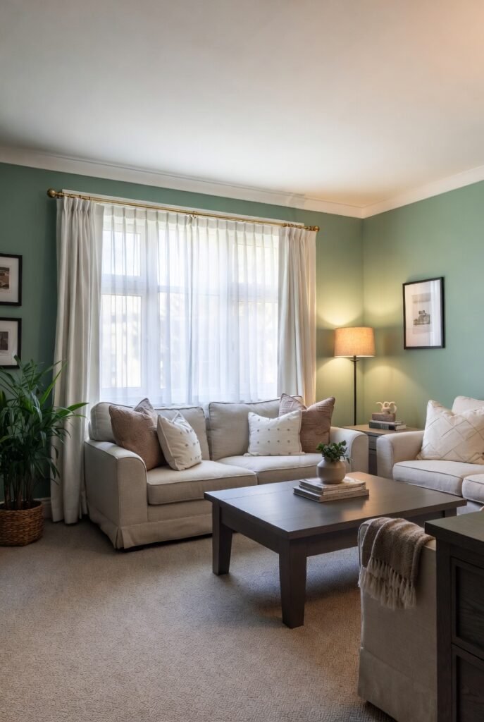
3. Bring the Outdoors In with Green
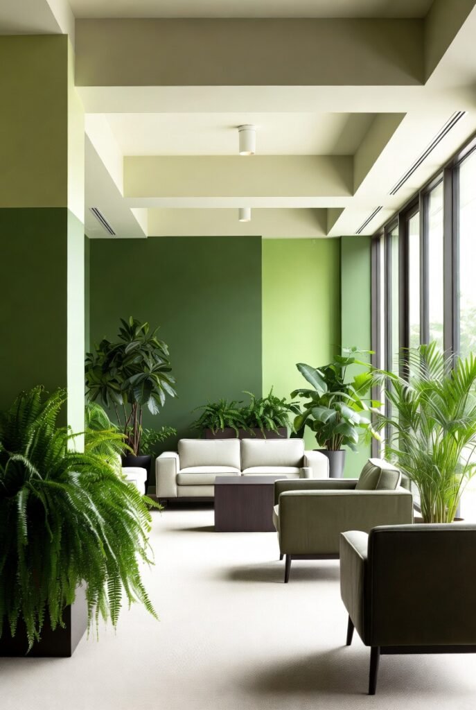
Green is another top contender for living spaces, favored by about 23% of homeowners. I love using nature-inspired shades like “Ashwood Moss” to bridge the gap between indoors and outdoors.
Green promotes a sense of balance and harmony. It works exceptionally well in rooms with large windows or plenty of indoor plants.
4. Warm Up with Earthy Neutrals
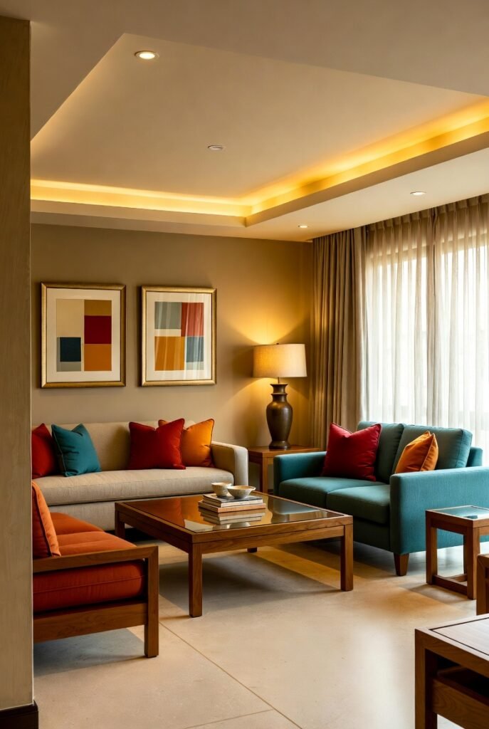
Grey had its moment, but I am now seeing a huge shift toward warmer neutrals. Colors like “Macadamia” or “Sands of Time” add a cozy, welcoming vibe that stark greys often lack.
These shades act as a perfect backdrop for colorful furniture. They reflect light gently, making your space feel open yet intimate.
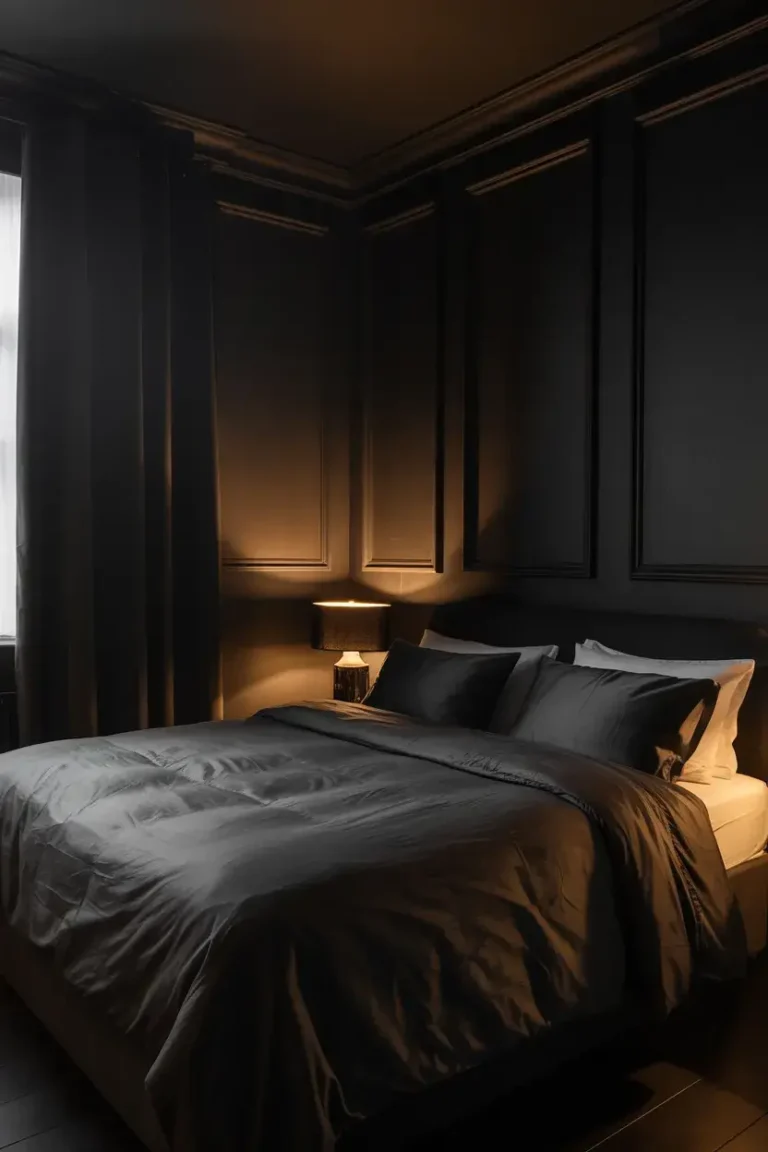
5. Go Moody with Deep Navy
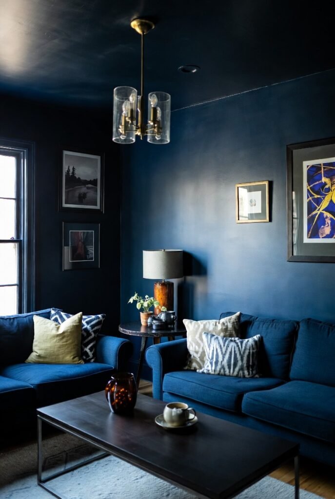
For a lounge room that feels like a cozy den, I love using a deep, dark blue like “Dark Night.” Darker colors can surprisingly make a room feel larger by blurring the corners of the space.
Use this on all four walls for a dramatic effect. Just make sure you have good lighting to keep the room from feeling too cave-like.
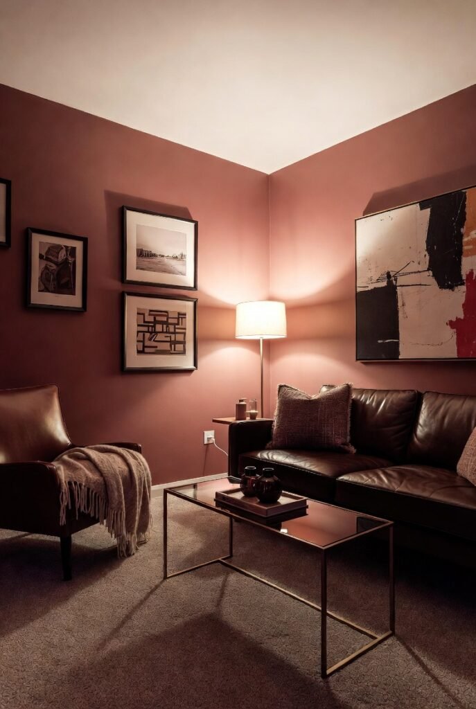
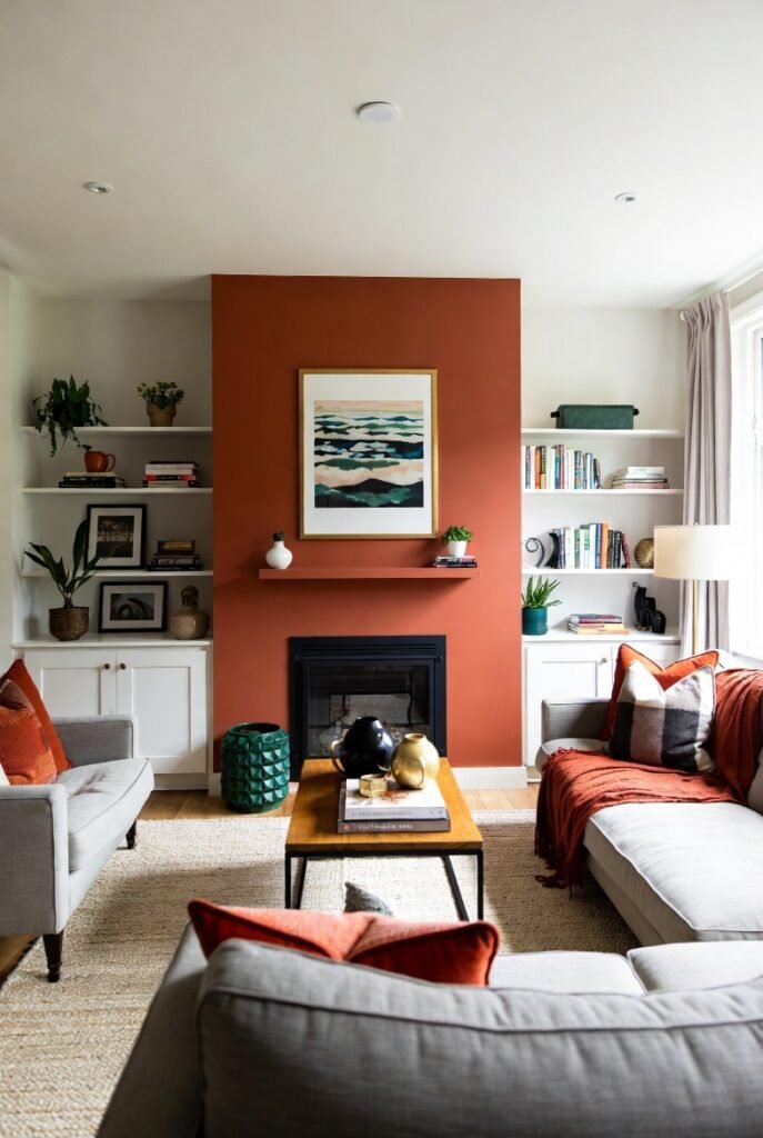
6. Spice It Up with Terracotta
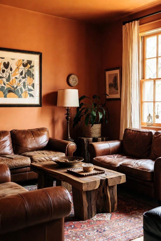
If you want energy in your room without the aggression of bright red, I recommend a spiced cider or terracotta shade. These earthy reds add unmatched warmth and character.
They pair beautifully with leather furniture and natural wood accents. It creates a rustic, craftsman-style look that feels very grounded.
7. Soften the Space with Sage
Sage green, like “Svelte Sage,” is a sophisticated alternative to brighter greens. I find this color works as a neutral because it pairs well with almost anything.
It feels organic and restful. This is a great choice if you want color on your walls but are afraid of it being too overwhelming.
8. Stick to Crisp, Classic White
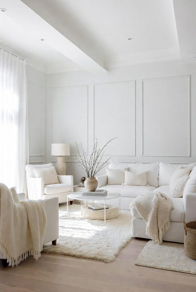
You can never go wrong with a clean slate. A shade like “Glacier White” reflects the most light and makes small lounge rooms feel airy and spacious.
I suggest using various textures in your furniture and rugs to stop the room from feeling clinical. Layering whites and creams looks incredibly chic.
9. Don’t Forget the Fifth Wall
Most people ignore the ceiling, but I think it is a crucial design element. Studies show that nearly 85% of people prefer white ceilings, which helps lift the room and make it feel taller.
However, if you have high ceilings, painting them a darker shade can bring the room down and make it feel cozier.
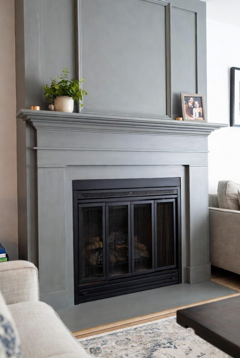
10. Anchor the Room with Charcoal
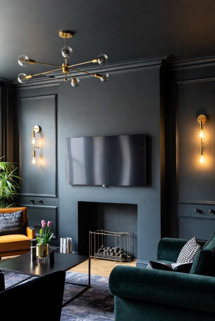
A deep charcoal or “Grizzle Gray” adds instant drama. I like using this color to create a focal point, perhaps behind a fireplace or a TV unit.
It provides a modern edge and makes metallic accents, like gold or brass light fixtures, pop beautifully against the dark background.
11. Add a Touch of Romance with Tissue Pink
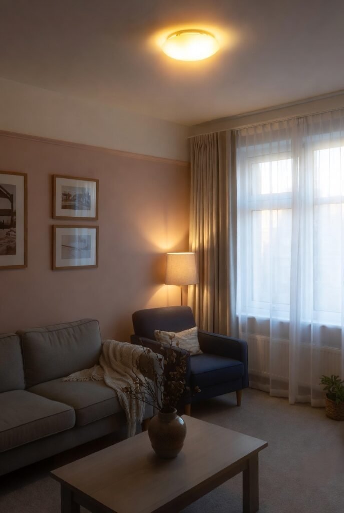
Pink doesn’t have to be for nurseries. A subtle “Tissue Pink” acts as a warm neutral that gives everyone in the room a healthy glow.
I recommend pairing it with grey or navy furniture to keep the look grounded and mature. It creates a soft, inviting light that is perfect for evenings.
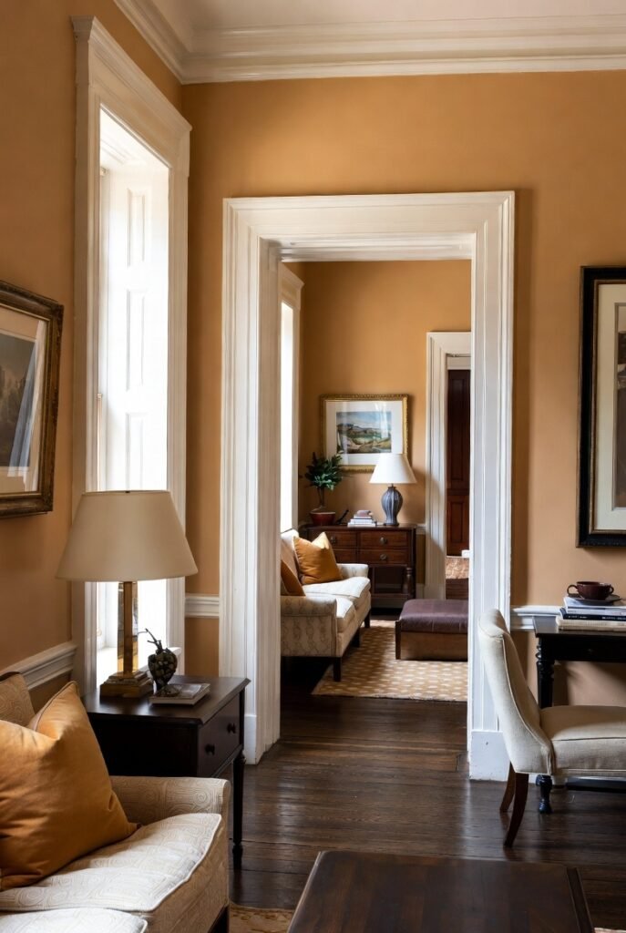
12. Ground the Space with Saddle Brown
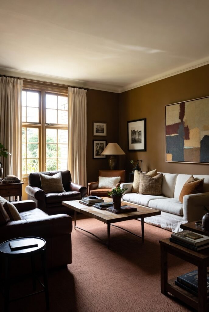
Rich browns are making a comeback. A color like “Leather Saddle Brown” adds a sense of history and stability to a lounge room.
I find this works best in rooms with plenty of natural light. It pairs perfectly with cream accents and textured fabrics like wool or linen.
13. Breathe Easy with Sea Salt
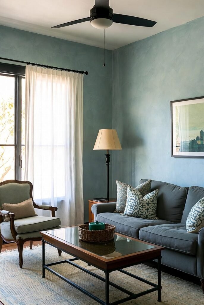
For a coastal vibe without the cliché nautical themes, I use “Sea Salt.” It is a complex grey-green-blue hybrid that changes with the light throughout the day.
It feels incredibly fresh and clean. This color is perfect for creating a breezy, relaxed environment where you can truly unwind.
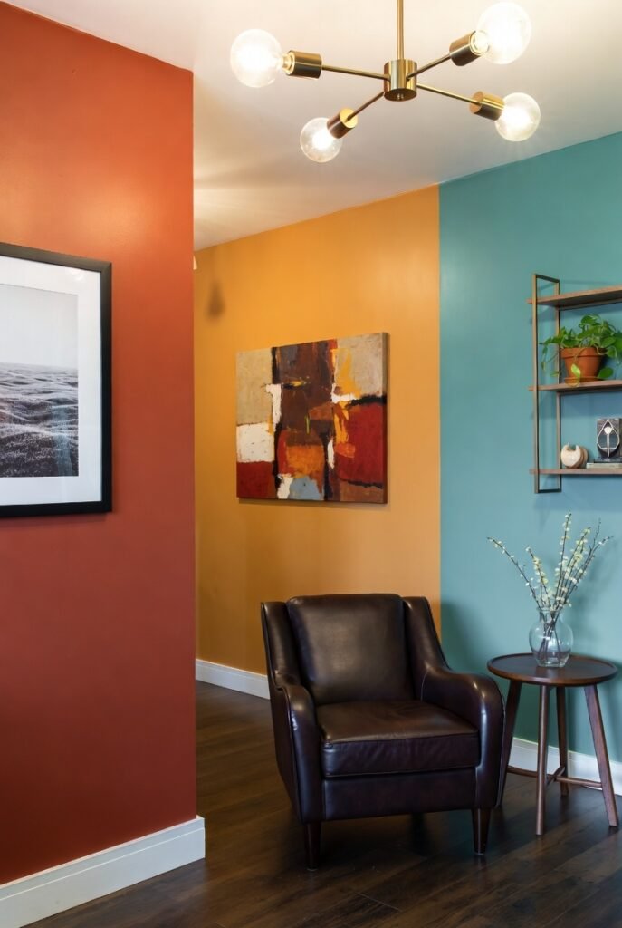
14. Define Zones with Accent Walls
If painting the whole room feels too risky, I suggest starting with one wall. An accent wall in a bold color allows you to experiment without full commitment.
Choose the wall that naturally draws the eye, usually the one with the fireplace or the sofa. It anchors the furniture and adds depth to the room.
15. Try the Two-Toned Look
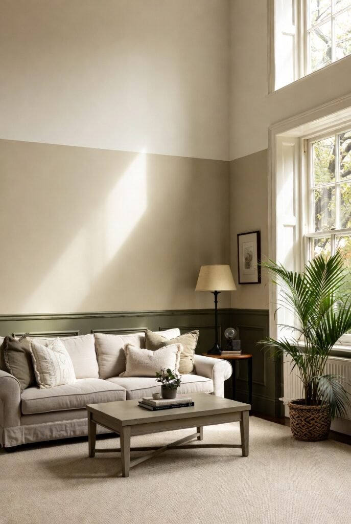
I love the architectural interest that two-toned walls add. You can paint the bottom half of the wall a darker shade like “Ashwood Moss” and the top half a lighter neutral.
This mimics the look of wainscoting without the carpentry work. It is a smart way to add color while keeping the room feeling light and tall.
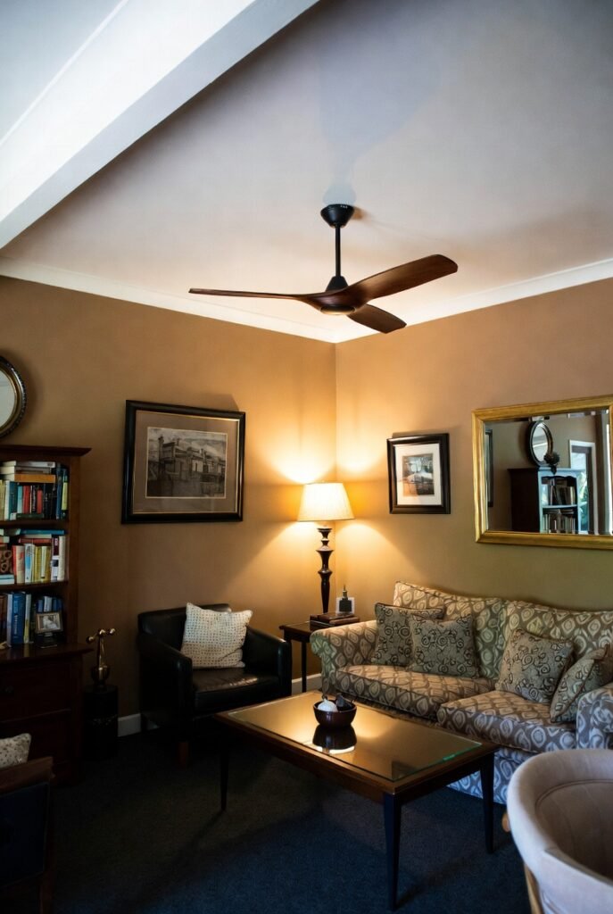
16. Cozy Up with Tan
Tan is shedding its boring reputation. A shade like “Chowning’s Tan” feels historic and elegant, especially when paired with white trim.
I find it creates a library-like atmosphere that is perfect for reading. It is warmer than beige and has more personality than off-white.
17. Always Test Before You Paint
My final and most important tip is to test your colors. Paint looks different on a screen than it does on your wall.
I recommend buying sample pots and painting large squares on different walls. Watch how the color changes in the morning light versus artificial evening light before you commit.
Conclusion
Choosing a paint color is the first step toward building a home you love. If you are ready to get started, grab a few samples this weekend and see which one speaks to you. Your perfect lounge room is just a coat of paint away.