16 Neutral Nursery Paint Colors That Calm and Comfort
I remember standing in the middle of an empty nursery, staring at a wall full of paint swatches. I wanted the room to feel peaceful, safe, and welcoming, but choosing the right shade of “white” felt harder than naming the baby.
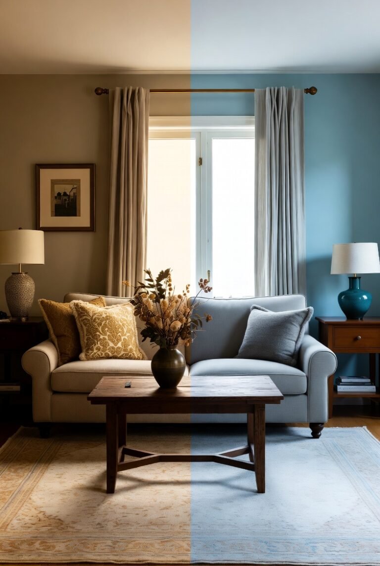
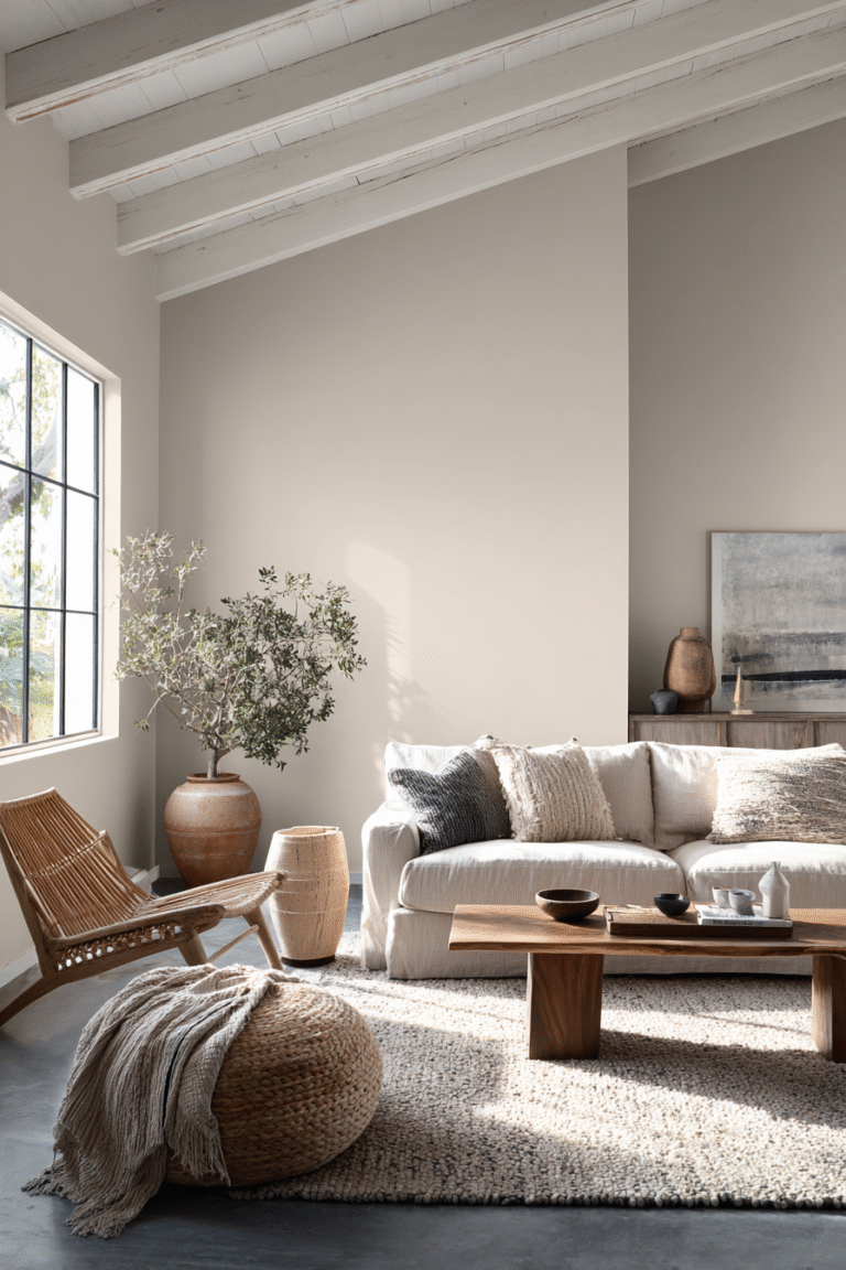
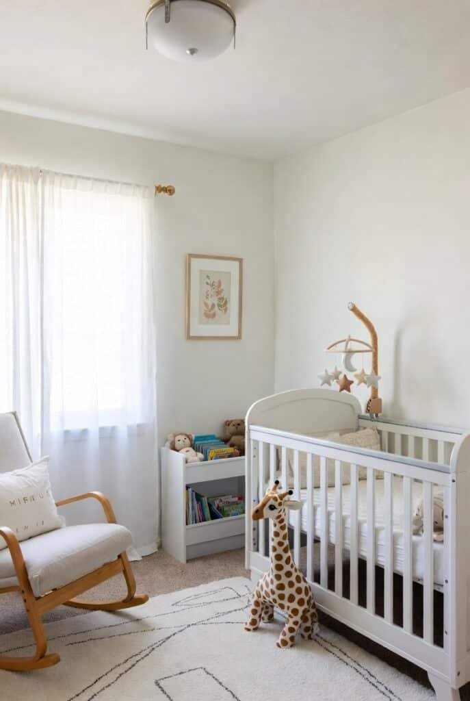
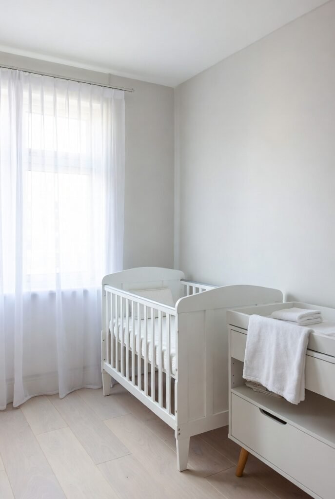
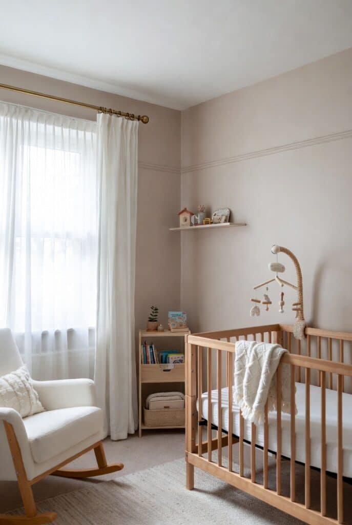
If you are currently drowning in beige samples, I have good news. A neutral palette is the perfect choice for a nursery because it creates a serene environment that grows with your child. Research even suggests that soft, muted tones like warm whites and greiges promote relaxation and better sleep patterns for babies.
Here are 16 beautiful neutral paint colors to help you build a dreamy, calming sanctuary for your little one.
1. Sherwin-Williams Alabaster
This is one of my absolute favorites for a reason. Alabaster offers a soft, warm white that keeps the room feeling bright without the harshness of a pure, clinical white.
It acts as a gentle backdrop for any decor style, from modern to farmhouse. I love pairing this with natural wood furniture to enhance its cozy undertones.
2. Benjamin Moore Pale Oak
If you want a color that isn’t quite gray and isn’t quite beige, Pale Oak is your answer. It is a sophisticated “greige” that adds warmth to the walls while remaining light and airy.
I find this color works exceptionally well in rooms with changing daylight. It shifts subtly throughout the day but always maintains its elegant, comforting character.
3. Farrow & Ball Skimming Stone
For a timeless look, I recommend Skimming Stone. It is a warm gray with a distinct stonelike feel that brings an instant sense of history and depth to a new nursery.
This shade sits perfectly behind colorful toys and books. It provides a solid, grounding foundation that prevents the room from feeling cluttered or chaotic.
4. Benjamin Moore Cloud White
Cloud White is a versatile off-white that lives up to its name. It feels soft and pillowy, making it an ideal choice for a space dedicated to sleeping and snuggling.
I appreciate how balanced this shade is. It doesn’t lean too yellow or too blue, making it a foolproof choice if you are unsure about undertones.
5. Farrow & Ball Great White
Despite the name, Great White actually reads as a very pale lilac-tinted gray in certain lights. It brings a crisp, clean feeling to the nursery that feels incredibly fresh.
I love using this in smaller rooms. Its brightness reflects light beautifully, which helps make a cozy nursery feel a bit more spacious and open.
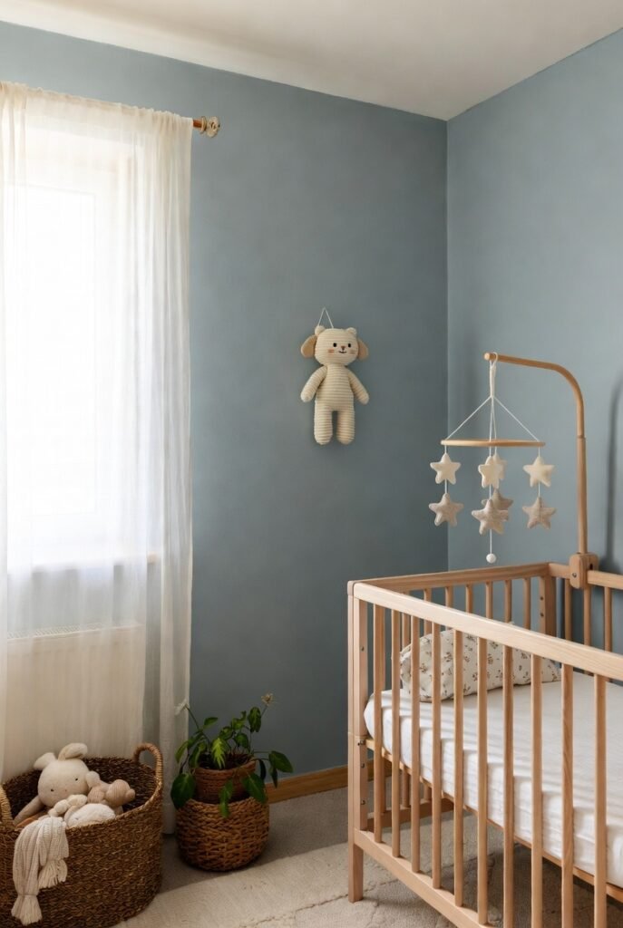
6. Benjamin Moore Wickham Gray
Neutrals don’t always have to be brown or white. Wickham Gray is a light gray with subtle blue undertones that works beautifully as a gender-neutral option.
It creates a cool, peaceful atmosphere. I suggest pairing it with white trim and soft linen textiles to play up its calming, spa-like qualities.
7. Sherwin-Williams Shoji White
Shoji White is a creamy, warm white that feels like a hug. It borders on beige, giving the room a richness that flat whites just can’t achieve.
I find this color pairs wonderfully with the popular trend of paneling or wainscoting. It adds dimension and warmth without overwhelming the senses.
8. Farrow & Ball Drop Cloth
If you prefer a darker neutral for a cozy, “cocooning” vibe, Drop Cloth is a fantastic option. It is a sturdy beige-gray that feels earthy and organic.
I think this color works best in nurseries with plenty of natural light. It grounds the space and creates a restful environment perfect for nap time.
9. Portola Paints Roman Clay ‘Monterey’
Texture adds a whole new layer to neutral colors. Monterey in a Roman Clay finish offers a sandy beige that introduces subtle movement and warmth to your walls.
I love how this finish mimics natural stone. It gives the nursery an artisanal, handcrafted feel that standard flat paint simply cannot replicate.
10. Portola Paints Roman Clay ‘Dolomite’
Dolomite is a creamy off-white that creates a cloud-like effect on the walls. When applied with a textured finish, it softens the entire room.
I recommend this for parents who want a minimalist nursery that still feels warm. The texture catches the light, making the walls feel alive and interesting.
11. Color Atelier Lime Wash ‘Grigio’
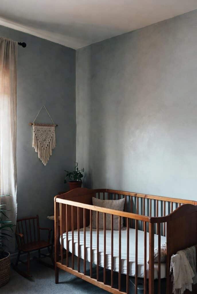
For a moodier aesthetic, Grigio offers a soft gray with a luxurious lime wash finish. The natural brush strokes visible in lime wash add an artistic element to the room.
I find that lime wash paints often have a beautiful matte quality. This creates a velvety look that absorbs light and makes the room feel incredibly quiet and still.
12. Color Atelier Lime Wash ‘Fog’
Fog is a dreamy blue-gray that fits perfectly into the “new neutral” category. It brings a hint of color while remaining desaturated enough to act as a background shade.
I think this shade is perfect for a nature-inspired theme. It evokes the feeling of a misty morning, which is wonderful for encouraging sleep.
13. Portola Paints Roman Clay ‘Washi’
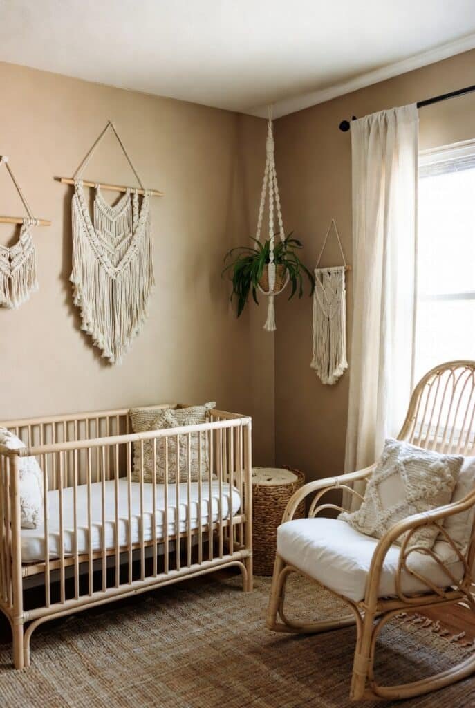
Washi is an earthy, organic tone that feels very grounded. It has a paper-bag hue that brings a natural, boho-chic vibe to the nursery.
I love pairing this with rattan furniture and macrame decor. It ties natural elements together seamlessly for a cohesive, stylish look.
14. Benjamin Moore Healing Aloe
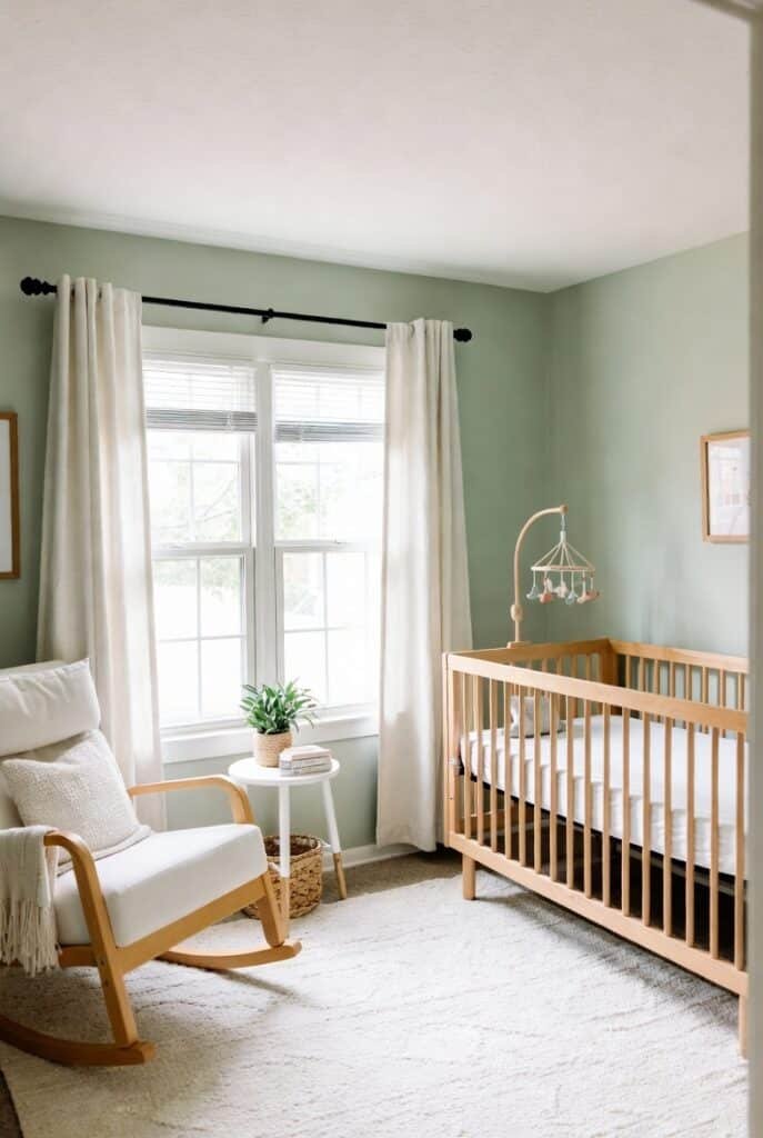
Green can be a neutral too, especially when it’s as soft as Healing Aloe. This soothing minty green brings the outdoors in without being loud or distracting.
Research shows that shades of green promote relaxation. I use this color when I want to create a restorative space that feels fresh and healthy.
15. Farrow & Ball Vert De Terre
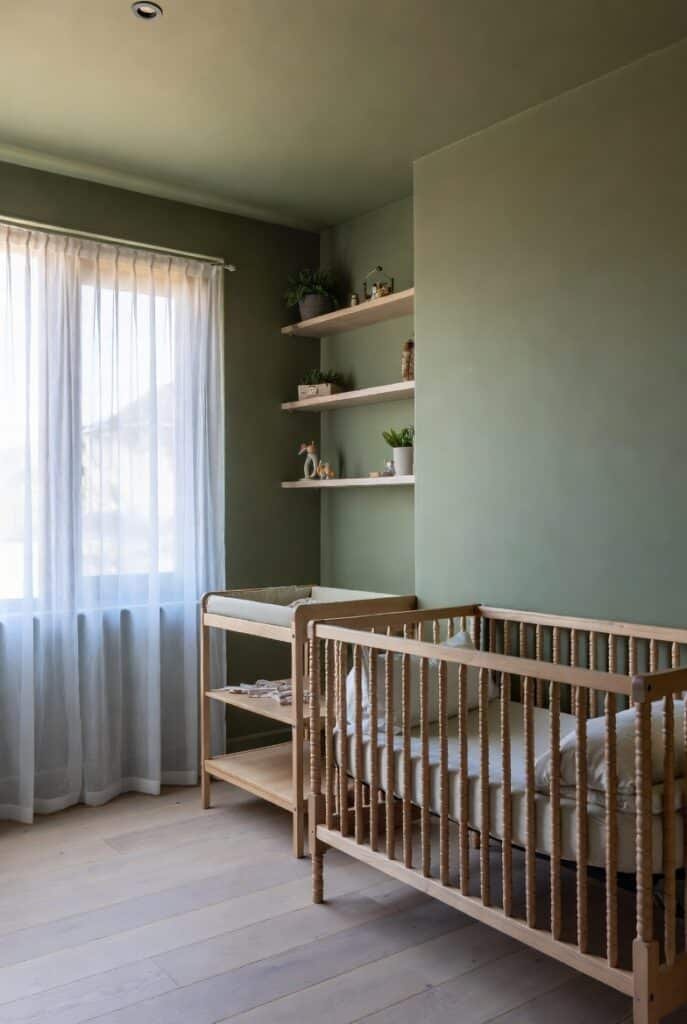
This is a muted, age-old green that feels very sophisticated. Vert De Terre works well with natural wood accents and connects the room to nature.
I find this color grows with the child very well. It looks just as good in a teenager’s room as it does in a nursery, making it a smart long-term investment.
16. Farrow & Ball Calamine
Calamine is a delicate pink with a touch of gray, which stops it from being sugary. It reads as a warm, neutral blush that adds a lovely glow to the room.
I treat this color like a warm beige. It pairs surprisingly well with grays and natural woods, offering a soft, nurturing embrace for your baby.
Safety Tip: Watch those VOCs
When you choose your paint, look beyond the color. Volatile Organic Compounds (VOCs) are gases released from paint that can linger in the air.
I always recommend choosing paints labeled “Zero VOC” or “Greenguard Gold Certified.” Some brands, like ECOS Paints, even have formulas that filter the air; in tests, they removed up to 76% of total VOCs. Your baby’s health is worth the extra check!
Conclusion
Building a nursery is about creating a space where you and your baby can bond in peace. These neutral shades provide the perfect canvas for those first precious memories.
Grab a few peel-and-stick samples of your favorites today and see how they look in your unique lighting—it is the best way to find “the one.”