16 Dining Room Paint Ideas to Revitalize Your Gathering Space
The dining room is more than just a place to eat; it is the heart of hospitality in the home, a backdrop for holiday feasts, intimate dinner parties, and daily connection. Yet, it often gets overlooked in favor of high-traffic areas like the kitchen or living room. One of the most effective and affordable ways to breathe new life into this space is with a fresh coat of paint.
As we move into 2025, the trend of sterile, all-white boxes is fading. Designers and homeowners alike are shifting toward “layered, soulful spaces” that feel personal and lived-in.
Whether you prefer the grounding nature of earthy browns or the bold energy of a ruby red, the right color can completely transform the mood of your meals.
Here are 16 dining room paint ideas to help you find the perfect palette for your home.
1. Embrace Nuanced Plum-Browns
Move over, basic beige. Complex, heathered hues are taking center stage in 2025. A prime example is Cinnamon Slate, a delicate mix of heathered plum and velvety brown designated as Benjamin Moore’s Color of the Year 2025.
This color offers a smooth familiarity that feels both modern and enduring. It works exceptionally well in dining rooms where you want to create a cozy, enveloping atmosphere without committing to a harsh dark color.
Tip: Pair this shade with textured fabrics like velvet or linen to enhance its cozy, "quiet luxury" appeal.
2. Make a Statement with Ruby Red
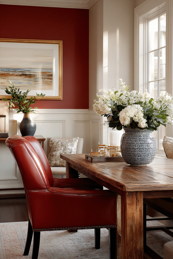
Red is experiencing a renaissance. According to research by Behr Paint, three-quarters of Americans would consider painting a room red, with accent walls top of mind. Their 2025 Color of the Year, Rumors, is a dynamic ruby red that adds instant energy and warmth. Red has long been known to stimulate appetite and conversation, making it a classic—yet bold—choice for dining areas.
Tip: If painting four walls red feels too intense, try a "color drenching" technique in a small powder room or stick to a single focal wall in the dining room to anchor the space.
3. Opt for Dusty Violet
For a sophisticated departure from standard grays, consider a dusty violet with mauve undertones, such as Purple Basil (PPG’s 2025 Color of the Year). This shade signifies a movement away from airy hues toward deeper, richer colors. It strikes a balance between bold and neutral, imparting a sense of serenity and elegance that fits both traditional and edgy designs.
Tip: This color pairs beautifully with gold or brass light fixtures, which pop against the muted purple background.
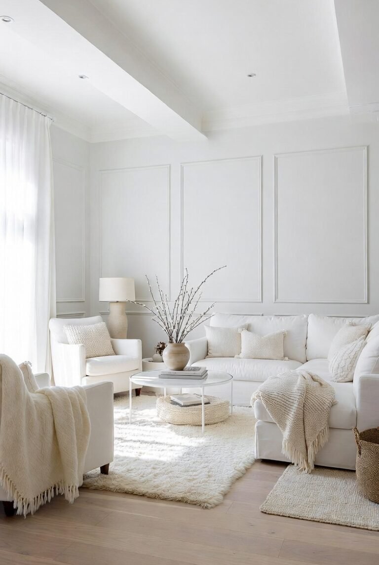
4. Keep it Airy with Adaptable Neutrals
If you prefer a lighter palette but want to avoid the starkness of pure white, look for “adaptable” neutrals. Sherwin-Williams highlights Sunbleached in their 2025 Color Capsule, describing it as poised between warm and cool—deeper than white but not quite gray. This type of shade provides a clean, airy backdrop that allows your furniture and food to take center stage.
Tip: Use this shade in rooms with plenty of natural light to maximize its breezy, open feel.
5. Ground the Space with Earthy Brown
Brown is back as a dominant neutral, offering stability and richness. A color like Grounded by Sherwin-Williams creates a “refined earthen tone” that envelops the space in comfort. Darker browns can make large dining rooms feel more intimate, while lighter cocoa shades add warmth without closing the room in.
Tip: To keep the room from feeling heavy, balance earthy brown walls with light-colored trim (like a soft cream) and light wood furniture.
6. Go Rustic with Warm Grays
For a farmhouse or rustic vibe, steer clear of cool, blue-based grays. Instead, opt for grays with brown undertones, such as Iron Gate. Benjamin Moore suggests pairing these warm grays with off-white trim like Soft Chamois to create an inviting atmosphere perfect for comforting meals.
Tip: Incorporate natural wood elements and greenery to complement the rustic undertones of the paint.
7. Create Drama with Jewel Tones
If you want your dining room to feel like a destination, jewel tones are the way to go. Deep teals, emerald greens, and sapphire blues—like Adriatic Sea or Rainforest Foliage—create a lush, indulgent space. These colors are particularly effective for evening entertaining, as they look stunning under candlelight or dim chandeliers.
Tip: High-gloss finishes can make jewel tones pop even more, reflecting light to create a glowing, jewel-box effect.
8. Paint the “Fifth Wall”
Don’t forget the ceiling. Painting your ceiling a contrasting color can add unexpected dimension and drama. For a sumptuous look, Benjamin Moore recommends using warm reds or corals, like Rosy Apple, on the ceiling. This draws the eye upward and can make the room feel grander and more curated.
Tip: If you have crown molding, keep it white or a light neutral to create a crisp separation between the wall and the colorful ceiling.
9. Define Nooks in Open Concepts
In open-concept homes, distinct dining rooms are rare. You can use paint to visually carve out a dining area from a larger living space. Try painting a corner or a specific section of the wall in a bold hue to delineate the “dining nook.” For example, elevate a neutral wall with a dark green on the wainscoting and trim to anchor the dining table.
Tip: Use area rugs in coordinating colors to further define the zone on the floor level.
10. Refresh with Coastal Blues
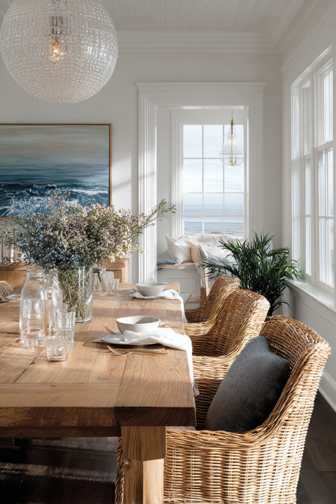
For a relaxed, breezy vibe, look to coastal-inspired colors. Luminous shades like St. John’s Bay bring a beachy feel that is perfect for casual dining. These hues pair wonderfully with white trim and light wood or rattan furniture, creating a space that feels like a permanent vacation.
Tip: This style works best in rooms with good natural light; in dark rooms, light blues can sometimes read as cold or gray.
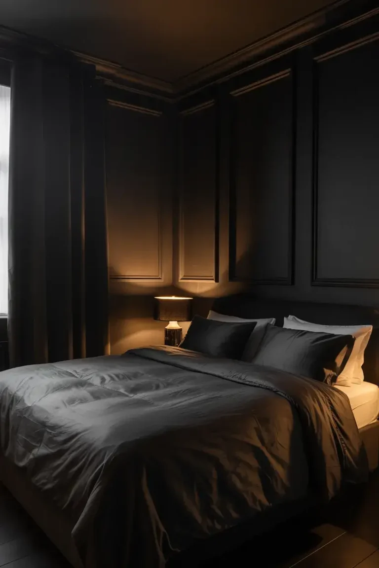
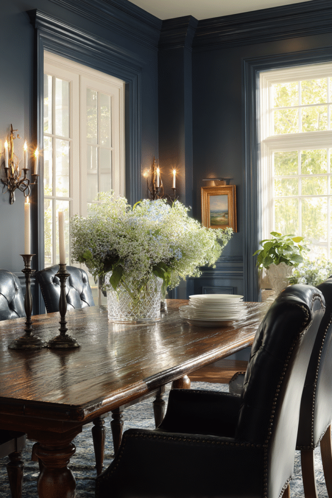
11. Embrace “Dark and Moody”
Charcoal and near-black shades are trending as a sophisticated alternative to pure black. Colors like Kendall Charcoal or Black Tar add depth and modernity. These moody hues provide a striking contrast to white dishes and table linens, making your table setting pop.
Tip: Ensure you have adequate lighting—both natural and artificial—so the room feels cozy rather than cave-like.
12. Highlight Architectural Features
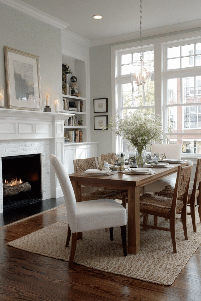
If your dining room has a fireplace or built-in shelving, use paint to turn it into a focal point. Painting a mantel a soft, neutral gray like Horizon against a crisp white trim creates a timeless, elegant look. Alternatively, painting the inside of built-in bookshelves a darker color can add depth and interest.
Tip: Choose a finish with a slight sheen (satin or semi-gloss) for mantels and trim to make them stand out against matte walls.
13. Use “Greige” for Minimalism
Minimalism doesn’t have to be boring. “Greige” (a blend of gray and beige) offers a warm, versatile backdrop that fits a minimalist aesthetic without feeling sterile. Shades like Paper White or Edgecomb Gray provide a clean canvas that enhances the room’s open feel while maintaining a sense of warmth.
Tip: Layer different textures—like a wool rug, linen curtains, and a wood table—to add interest to a monochromatic greige room.
14. Add Warmth with Terracotta
Boho style thrives on earthy, easygoing colors. Terracotta and clay tones, such as Terra Mauve, reflect a relaxed vibe and add literal warmth to the room. These shades change beautifully with the light, glowing in the morning sun and turning rich and moody in the evening.
Tip: Pair terracotta walls with plenty of plants and natural fiber accents like jute or wicker.
15. Paint Your Cabinetry
If you have a china cabinet or a sideboard in the dining room, consider painting it a bold hue. This is a lower-stakes way to introduce color than painting all four walls. Shades like Dorset Gold or Antique Jade on cabinetry can inject playfulness or calmness into the room respectively.
Tip: Use a durable, high-quality enamel paint for furniture to ensure it withstands daily use and resists chipping.
16. Consider Color Flow
Finally, consider how your dining room color relates to the adjacent rooms. You don’t have to match colors exactly, but they should relate harmoniously. For example, a Windmill Wings blue in the back room can play “peekaboo” with a First Light pink in the dining room, creating a peaceful transition.
Tip: Test paint swatches on the wall and view them from the adjoining room to ensure the transition feels natural and pleasing to the eye.
Conclusion
Whether you are looking to create a dramatic entertaining space with 2025’s ruby reds and deep violets, or a calm sanctuary with warm neutrals and greiges, paint offers endless possibilities.
Remember to test your chosen colors at different times of day to see how the light affects them before committing.