14 Dark Green Paint Colors Designers Are Loving Right Now
Forget the sterile whites and exhausted grays that have dominated the last decade of interior design. We are officially in the era of moody, sophisticated color, and dark green is leading the charge.
From deep forest hues that ground a room to blackened olives that act as dramatic neutrals, dark green offers a connection to nature that feels both grounding and luxurious. According to a recent study published in Scientific Reports, visual exposure to green elements in indoor environments can significantly reduce psychophysiological stress levels, making these paint choices not just a stylistic preference, but a wellness upgrade for your home.
Whether you are looking to drench a powder room in drama or paint your kitchen cabinets for a fresh look, here are 14 of the best dark green paint colors to transform your space.
1. Evergreen Fog (SW 9130) by Sherwin-Williams
As the 2022 Color of the Year, Evergreen Fog remains a massive favorite among designers. It is described as a “chameleon color,” bridging the gap between green and gray with just a hint of blue. It creates a calming, organic backdrop that isn’t as harsh as a pure forest green, making it incredibly versatile.
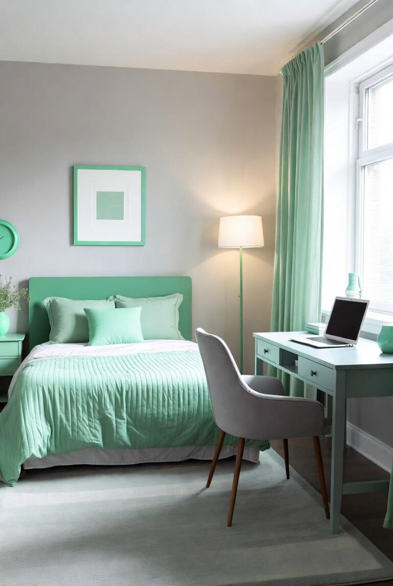
Best for: Bedrooms or living rooms where you want a soothing, restorative atmosphere.
2. Salamander (2050-10) by Benjamin Moore
If you are ready to embrace the dark side, Salamander is a showstopper. Benjamin Moore describes it as a mix of black, blue, and green. With a Light Reflectance Value (LRV) of just 5.72, it absorbs light beautifully, creating a cozy, envelope-like feeling in a room. It reads as a soft black in low light and a rich teal-green in sunlight.
Best for: Libraries, home offices, or moody powder rooms.
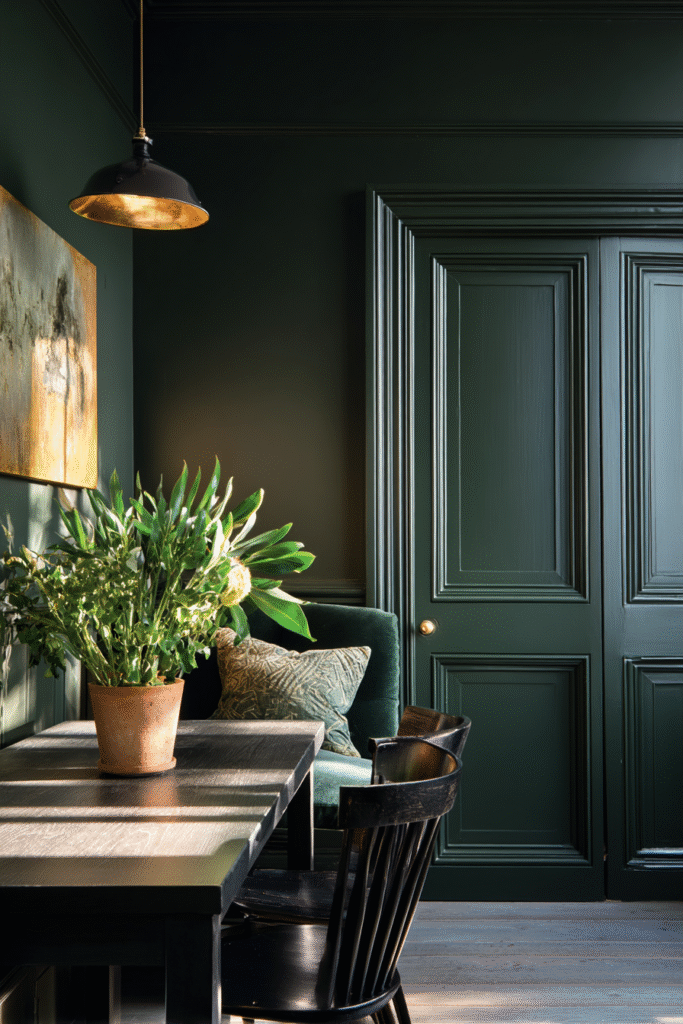
3. Green Smoke (No. 47) by Farrow & Ball
This color evokes the weathered familiarity of 19th-century interiors. It is a smoky green-blue that feels historic yet undeniably modern. Because it has a “lived-in” quality, it brings instant character to new builds that might otherwise feel featureless.
Best for: Cozy snugs, exterior doors, or kitchen islands.
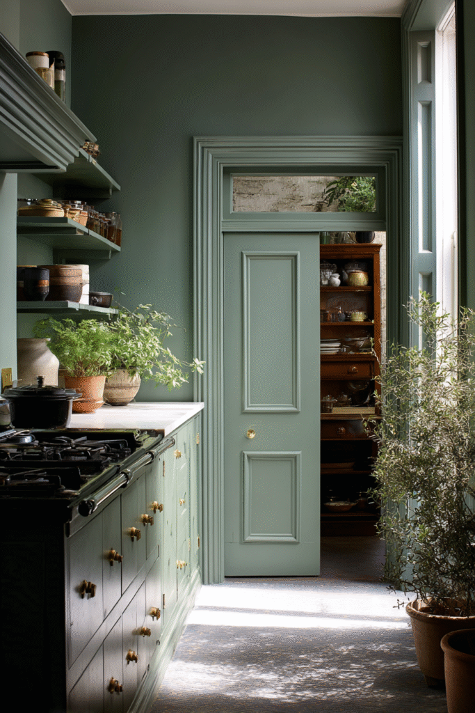
4. Ripe Olive (SW 6209) by Sherwin-Williams
For those who prefer their green without the teal undertones, Ripe Olive is a deep, warm olive shade. It is arguably one of the best “neutral” greens because it pairs so well with natural wood tones, leather furniture, and brass hardware. It offers a bold and colorful statement while maintaining sophistication.
Best for: Kitchen cabinetry or a dining room accent wall.
5. Vine Leaf (N400-7) by Behr
Vine Leaf is a dignified, bold green that feels pulled straight from a manicured garden. With an LRV of 10, it is dark enough to be dramatic but vibrant enough to still clearly read as green. It pairs exceptionally well with crisp whites like Behr’s Ultra Pure White for a high-contrast, preppy aesthetic.
Best for: Formal dining rooms or front doors.
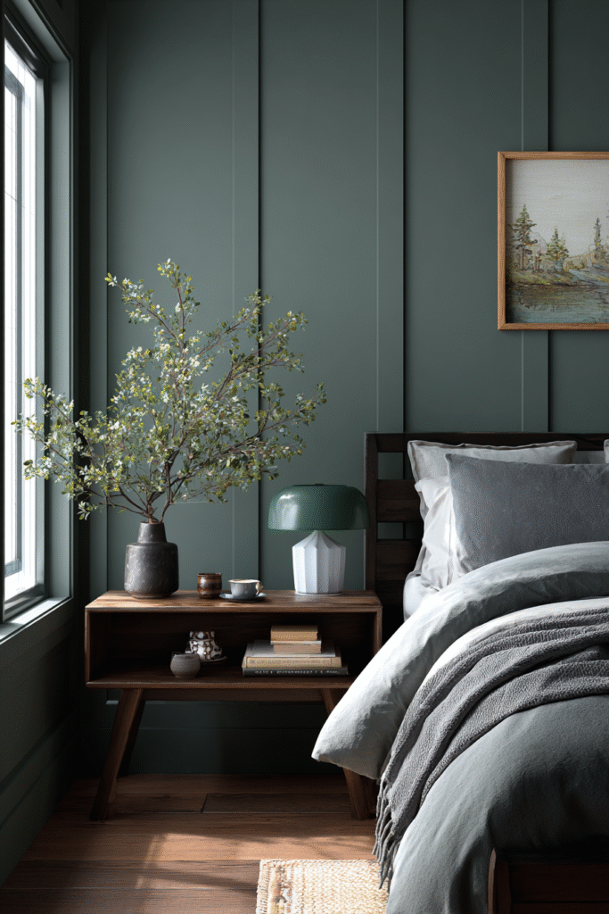
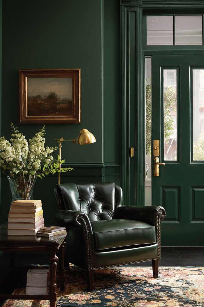
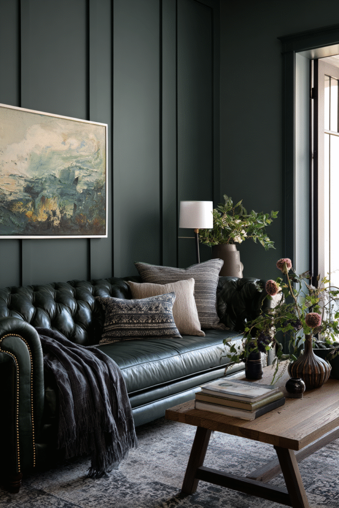
6. Backwoods (469) by Benjamin Moore
If you are looking for a classic forest shade, this is it. Backwoods is a blackened shade of forest green that carries a hint of welcoming warmth. It creates a sense of heritage and tradition, making it perfect for homes with historic architectural details.
Best for: Entryways or spaces with heavy white trim.
7. Duck Green (W55) by Farrow & Ball
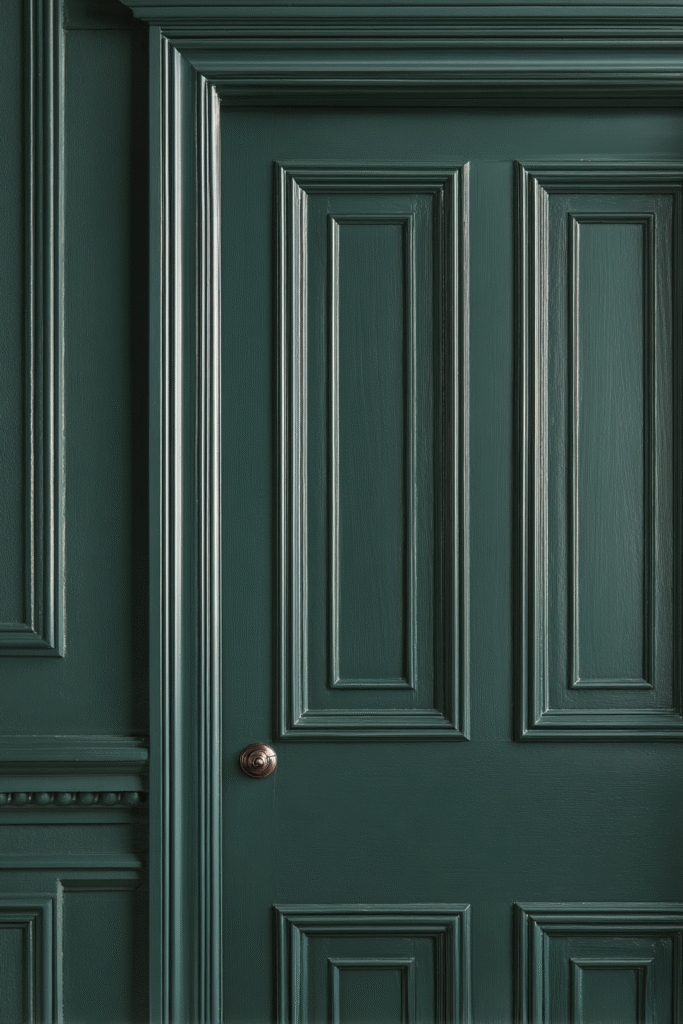
Named after the exquisite plumage of a mallard, this color offers a strong but subdued alternative to charcoal. It feels organic and rich, serving as a reminder of the colors of nature. It creates a beautiful depth of color that minimizes imperfections on walls.
Best for: Millwork, bookshelves, or contemporary living spaces.
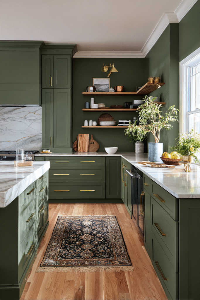
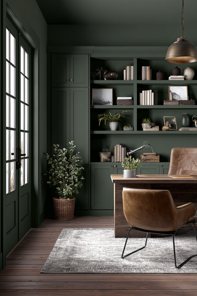
8. Pewter Green (SW 6208) by Sherwin-Williams
Pewter Green is a cool, dark green-gray that feels incredibly earthy. It is less saturated than an emerald or moss, leaning heavily into the gray spectrum. This makes it an excellent choice for exteriors, where natural sunlight will pull out the green tones without making the house look like a crayon box.
Best for: Home exteriors or modern kitchen cabinets.
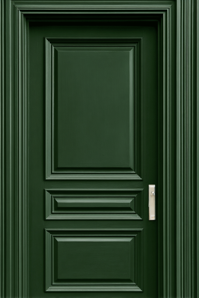
9. Essex Green (HC-188) by Benjamin Moore
Part of the Historical Collection, Essex Green is a deep, majestic emerald that is practically royalty in the paint world. It is a very dark green that brings a sense of history and elegance to a space. It looks stunning in high-gloss finishes, which highlight its rich undertones.
Best for: Front doors or lacquered library walls.
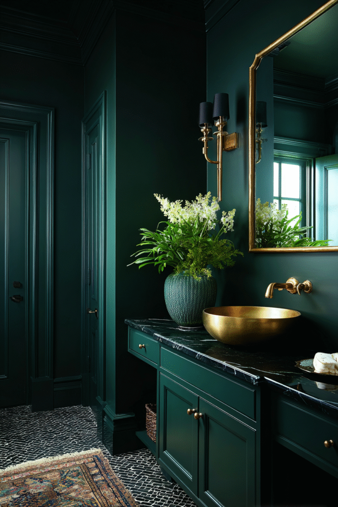
10. Dark Everglade (HDC-CL-21A) by Behr
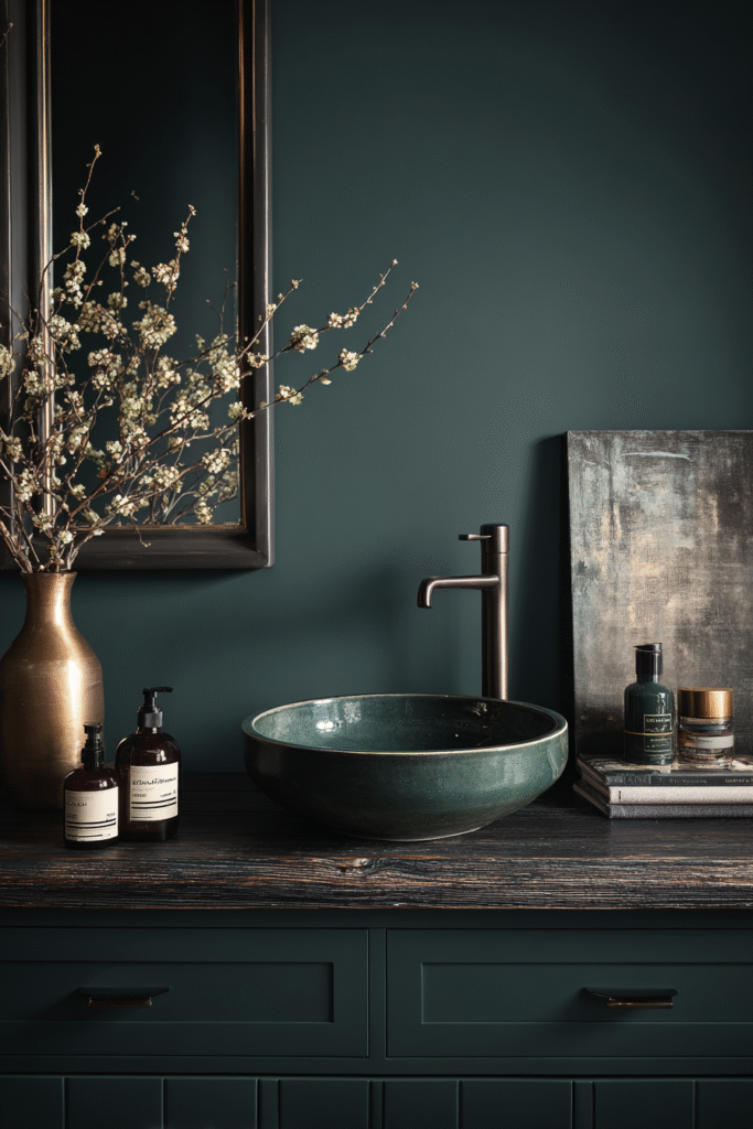
Drawing inspiration from wetlands and coastal mangroves, Dark Everglade is a shady, blackened green. With an LRV of 8, it is moody and intense. It works particularly well in spaces where you want to create a “jewel box” effect, pairing beautifully with dark woods and metallic accents.
Best for: Bathrooms or small creative studios.
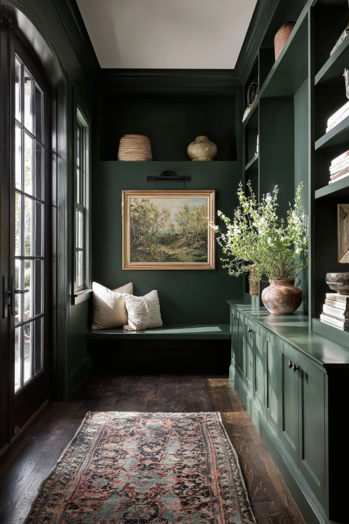
11. Vintage Vogue (462) by Benjamin Moore
Vintage Vogue represents a smoky, sophisticated side of green. It is softer than a hunter green but darker than a sage. It has a mysterious quality that makes art pop off the walls, and it transitions beautifully from day to night.
Best for: Living rooms or art gallery walls.
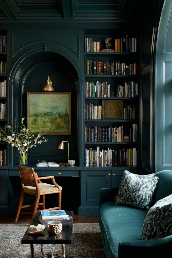
12. Studio Green (No. 93) by Farrow & Ball
This is the darkest green in the Farrow & Ball archive. In many lights, it will appear almost black, but when the sun hits it, the rich green pigments come alive. It is an uncompromisingly dark color that serves as a stunning alternative to stark black.
Best for: Media rooms or spaces where you want total immersion.
13. Jasper (SW 6216) by Sherwin-Williams
Jasper is a deep, elegant hue that acts as a bridge between navy and green. It is cool, confident, and pairs wonderfully with greige (gray-beige) decor. It’s a favorite for those who want a dark wall color that doesn’t feel oppressive.
Best for: A masculine office or a bedroom feature wall.
14. Hunter Green (2041-10) by Benjamin Moore
No list of dark greens is complete without the timeless Hunter Green. While it had its heyday in the 90s, it has returned as a classic staple. It creates a rich, stately atmosphere that feels established and moneyed.
Best for: Traditional studies or wainscoting.
Tips for Choosing the Right Dark Green
Before you commit to a gallon, consider these three factors to ensure you pick the perfect shade:
- Check the LRV: The Light Reflectance Value tells you how much light a color reflects. A lower number (0-10) means the color is darker and absorbs more light. If your room lacks natural light, a low LRV green like Salamander will look black.
- Identify the Undertones: Green is rarely just green. It usually leans yellow (olive/moss), blue (teal/spruce), or gray (sage/pewter). Match the undertone to your existing flooring and furniture.
- Sample, Sample, Sample: Dark colors can change drastically throughout the day. Paint a large swatch on multiple walls and observe it in morning, afternoon, and artificial night light.
Conclusion
Dark green paints are more than just a trend; they are a design staple that brings the restorative power of nature indoors. Whether you choose the historic charm of Farrow & Ball’s Green Smoke or the modern depth of Benjamin Moore’s Salamander, these shades promise to make your home feel grounded, sophisticated, and serene.
For more design inspiration and to find the perfect palette for your renovation, explore our full design archives on the website.